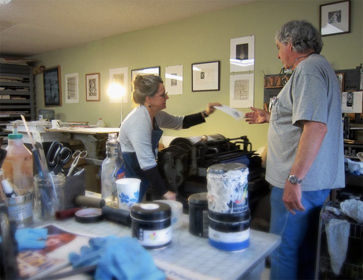
A new year and a fresh new decade signals one thing: a new wave of brilliant letterpress! We polled our printers here at Boxcar Press to give us their quick, top printing tips to help jumpstart 2020. Perhaps a few of these nuggets of wisdom will make their way into your next printing adventure!
Want to share your top tip? Let us know in the comments section below!
If you have a thin rule line or the end of a line of type that is getting too blobby, try using an “end cap” of a scrap photopolymer plate (like a small rectangle of it) and put it beyond the trim area. This is so that the rollers use it like an inking roller bearer strip. It helps keep the pressure off that one trouble spot.
When beginning a job, do a dry paper test run. There shouldn’t be any impression or ink. This run is so you can adjust the tilt sucker bar to where you want it, make sure it isn’t double-feeding, adjust the tempo of the paper pick-up and more. Getting this out of the way is one less thing you don’t have to fuss with while in the middle of a job.
For foil on a Kluge, make sure you are using the correct suckers and are maintaining them. Metal suckers work for text weight and envelope liners. Rubber suckers are good for text weight, coaster stock, thinner leather, or textiles. To keep them in shape, I’ll use a bent paper clip or something small to clean out any fibers or lint that may get up there.
Printing envelopes on the Windmill with a lay pin is a bit labor-intensive but it can work. You’ll need to cut out a shape in the tympan where the lay pin will “nestle” into. This is so that the pin has a place to rest into and not mark the envelope when the press closes. Or alternatively, use our Boxcar Press swing away lay gauge so you don’t have to worry about marks.
When working to print lighter pastel ink colors on the Heidelberg Windmill try the following:
First, use an aggressive cleaner (Putz Pomade comes to mind) to help clean out any remaining ink from a previous run.
Make sure the ink is mixed up correctly and proportionately. Having a ready-to-go pre-mixed stock of ink is very handy (like Cool Grey 1 or other ink colors that contain a lot of Transparent White).
Use a very small bit of ink (small dabs or dots) and slowly add it to the roller. This first ink test run will mostly be checking consistency and to see if there is any ink leftover from a previous run. Run make-ready scrap through the press to see where you stand.
If you are running large solids for foil on a Kluge and are only getting the center to print, adjust the base itself using the screws. Most of the time, the base isn’t hitting flush and making these adjustments will help. Use glass board with soft packing on top. Try using a glue stick to glue the soft packing together as well. The compressed paper and glue makes for an even surface.
When doing foil on the Windmill, getting the right temperature for release can be tricky. Start by keeping good notes at regular intervals on foil release temperatures & times to keep things organized. A journal, jotter, or dedicated scrap of paper will do. When on the press for a job, regularly write down the temperatures so you can go back to it if you need to re-run the job. This helps a lot.
Wear comfortable shoes and don’t be distracted by smartphones as you’ll need to be listening to the sounds your press is making. For example, there is a subtle difference in the whooshing sound when the suckers are picking up the paper correctly…. and when it’s not.
If you are printing black letterpress on a Heidelberg and want a richer, deeper coverage, try a double-hit of the black ink runs (two regular ink run passes — one on top of the other). This helps reduce over-inking. Take care that you are in perfect registration.
Use transparent tape on the Windmill rails to help even out high and low spots. A piece here or there can make all the difference in the laying down of ink along the rails.
Like most letterpress-loving people, we are drawn to the fascinating and the intriguing. This newest installment of the Inquisitive Printers focuses our attentions on cool history of playing cards (and Nintendo!) plus a portable printing museum, a Miami-based high school teacher and printer, and much more. Enjoy!
Nintendo’s release of the latest Pokemon video game is not where I thought I’d find my printerly inquisition focused this month, admittedly; bear with me and I’ll lay out why it’s tickling my fancy so.
Pokemon began as a GameBoy title, but at the turn of the millennium it reached an outstanding level of cultural clout in its incarnation as a strategy and trading card game. Many of my generation heeded that none-too-subtle imperative “gotta catch ‘em all” filled school recesses and study hall periods with sharp-eyed trades and tournament play.
While it was never quite my scene, I did admire the quality finishing that went into the cards, with the full-color printing and foil embellishment on the various rare specimens. A much greater fascination to me is the fact that the entire Nintendo games empire had its beginning as a manufacturer of playing cards all the way back to 1889!
This culture-defining behemoth of our video game era plugs directly backward into the larger and wilder story of playing cards, which themselves are deliciously wrapped up in the origins of the printing arts themselves.
Squint at them and you can see how dice, dominoes, and chess games are the simpler, sturdier parents of playing cards. For there to be cards, there has to be paper and printing, and so, of course, the first playing cards emerge in China. Unfortunately, since paper is so fragile and cards are objects much-handled, the earliest examples don’t survive into history. An early reference to their existence comes in 1294 A.D., documenting the arrest of two gamblers and the confiscation of both their game cards and the woodblocks that printed them. These cards weren’t merely for making wagers with, but themselves actually served as tokens exchangeable for money or drinks at the tavern: valuable collectible items, indeed!
Papermaking, printing, and playing cards traveled as a pack from China to Samarkand (Uzbekistan), then on to Baghdad to spread across the Mediterranean through the Muslim caliphates and the remnants of the Byzantine empire. Taking shape in Egypt and exported quickly across trade routes into Moorish Spain, the Arabic “mamluk” card game had already assumed a form familiar to the modern playing deck: 52 cards, arranged in four suits, ordered by ranks culminating in royal court figures. “Mamluk” means “property”, referring to a class of enslaved mercenary soldiers within the prevailing caste system. Puts one in mind of the more disturbing aspects of the Pokemon life cycle, with trainers “catching ‘em all” then making them fight each other for the trainers’ glory. (Just sayin’.)
By the 14th century, these playing cards were spread across Europe and quickly became nativized. Mamluks easily translated into the aristocratic ranks of Europe’s feudal system, and those original four suits — polo sticks, swords, cups, and coins — mutated based on local culture. Spanish, German, Swiss, and Italian styled suits survive into the 20th century right alongside the French style we in the Anglo-American world are most familiar with: clubs, spades, hearts, and diamonds. (Tarot enthusiasts will note that those original mamluk suits are exactly those that became our beloved and much-mystified oracle deck, but that also-very-printerly story needs another time for telling.)
As the printers of Marseilles, Nürnburg, and Venice stamped out the cards in varying grades of quality, so too did the traders vend these printed goods to the world. Portuguese traders arrived in Japan in 1543, carrying Iberian playing cards in their holds. The Portuguese word “carta” became the Japanese “karuta”, and caught on well among the wealthy samurai. The isolationist Tokugawa shogunate soon banned them as a foreign influence, however, and so playing cards in Japan took on their own particular evolution, as printers and gamers worked around the restrictions.
Variant decks multiplied, fusing older indigenous Japanese gaming traditions and innovating new ones. Some of those older traditions involved matching paintings on shells, or poems on squares of wood, and translated easily to paper cards. These poetry cards and other literary variants became popular educational tools for children.
The card ban wasn’t formally lifted until late in the Meiji period, when Japan was “westernizing”. Clandestine cardplayer Fusajiro Yamauchi founded Nintendo in 1889 and began manufacturing the popular Hanafuda (“Flower Game”) deck, which has 12 suits of 4 cards each.
I imagine that Nintendo, innovative from the start, was among those early 20th century card manufacturers to produce “obake karuta”, card decks depicting mythological monsters (“obake”) and their names and attributes. Sound familiar?
After the Second World War, Nintendo also began making western-style playing cards and began to branch out into toys and other goods. The first mega-hit toy product was, uncannily enough, an extending arm based on the pantograph — another printing-related hit in the story. From there, toy-making brought the company into electronics in the early 1970s, and from there, card pips turn to pixels and then once again we come to Pokemon.
So from East, to West, to East again, and then to global cultural dominance, the humble playing card moves, shakes, and shapes the world. Are we ultimately so sure it’s us playing them, I wonder, or is our game perhaps also playingus?
Based in Miami, Florida, printer/teacher Tom Virgin of Extra Virgin Press appears on the Art & Company podcast. He talks about introducing the tangible craft of printing to students in the classroom and about the future of printing at large. Come take a listen!
Next up is the Tiny Type Museum & Time Capsule project. This nifty concept is a printing (and history) lover’s dream. It is a small, portable collection that celebrates type & printing.
The Museum contains unique printing artifacts & resources spanning decades. The fit-on-your-bookshelf Museum features cast pieces of hot-metal, wood, and metal foundry type, scale-model replica of a California Job case and many more items to discover.
The project is helmed by Seattle, Washington-based Glenn Fleishman and in collaboration with many artists, printers, museums, and foundries.
We hope you explore some of our links and perhaps share in our enjoyment about what intrigues us here at Boxcar Press. Email us at info@boxcarpress.com with the things that inspire you as well!
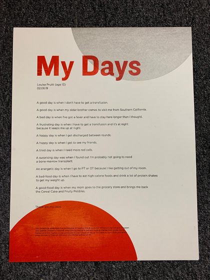
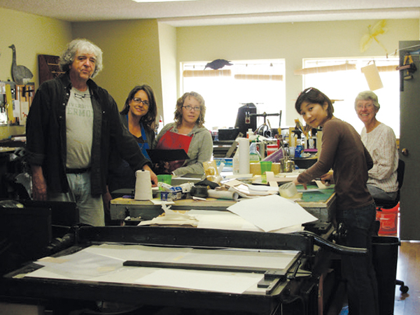
For our ninth year, we here at Boxcar Press have enjoyed the honor of supporting this year’s 2019 Seattle Children’s Hospital Broadside project. It is helmed by Sierra Nelson and Ann Teplick of the Writers in the Schools program (WITS) and the School of Visual Concepts in Seattle. This year’s creative young poets and printer/artists joined forces to build a magnificent collection of 20 broadsides in a limited run of 110 editions.
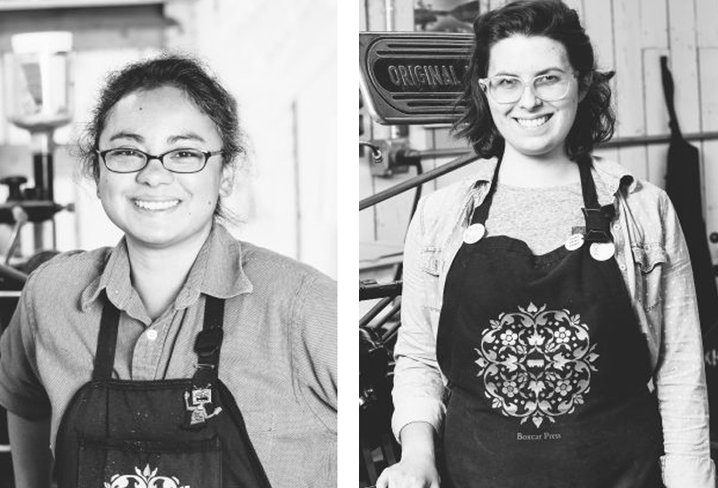
The works of arts are a collaboration of kindhearted printers bringing alive the thoughts of long-term patients from the Seattle Children’s Hospital. The result is nothing short of fun, colorful, whimsical, and inspiring. This first installment of a two-part blog highlights four printers who share their creative processes and showcase the magic of the children’s writing. Enjoy!
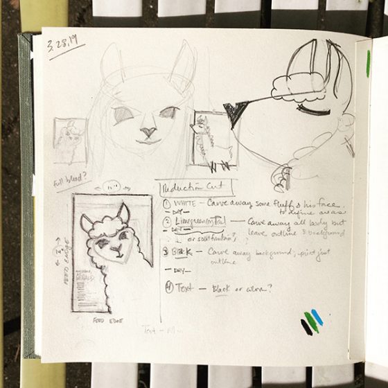
When we gathered at SVC to kick off this year’s series with the reading of the kid’s poems, I was convinced Gerald was a real llama. I wasn’t alone. After Ann Teplick (one of the lead poets for this project) finished reading Liam’s poem, she said she’d met Gerald. “He’s real?” another printer asked. “Oh no,” she replied. “He’s a stuffed toy, but he seems real.” Liam’s words had brought Gerald to life, a feeling that stuck with me through the creative process. We spent a lot of time together, me and Gerald. And he is quite a lovable little stinker.
Sketches of Gerald (all photos courtesy of Amy Redmond)
His larger-than-life personality demanded the same dominating presence on the page. Picturing a simple illustration with a large color background, I set about figuring out how to turn the sketch into a reduction cut.
Reduction cut study: using my office door as a lightbox.
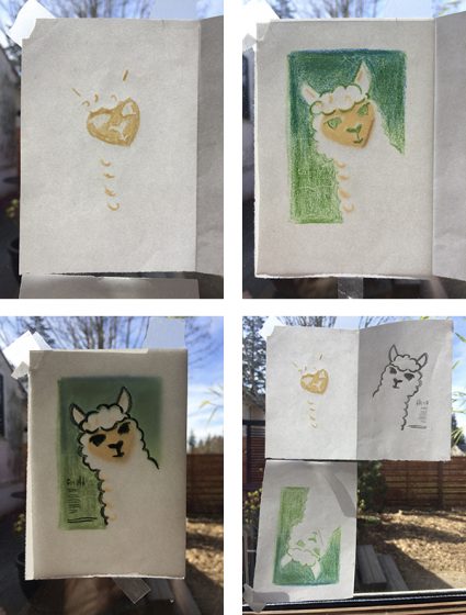
Not wanting to leave anything to chance, I tested my sketches on a small 2×3 inch linoleum block and printed a run of 200 so that I could play with color & the reduction cut process. Remember how I said Gerald was a stinker? Yep. He bit me. Twice. (Some may say my carving tool slipped, but they weren’t there. Gerald knows what he did.)
Gerald feigns innocence as he regards my bandaged fingers.
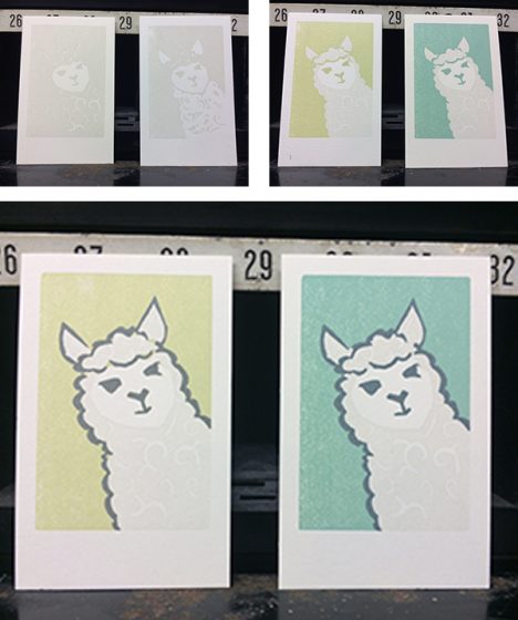
These tests were really informative. I quickly learned how opaque white ink would look on the cream-colored paper: in short, not as I expected. To make Gerald appear “white” I found it best to shift from my original plan of printing his entire body in white, to only printing the suggestion of his curly locks. I also played with the background color, and how to best define Gerald’s outline. These “Gerald trading cards,” as I came to view them, were later sent out to members of the Amalgamated Printers Association in the monthly letterpress bundle.
Mini reduction cut studies of Gerald.
I like to create full size mock-ups to nail down the details before getting on press. The design of the broadside didn’t change much from these 2×3″ tests to the final 9×12 image; just a little rotation of the angle at which Gerald would be peeking out of the corner, in order to make room for the type.
My full-size sketch of the broadside.Carving the first part of a 3-part reduction cut.
The first pass through the press was Gerald’s curls and face. To prep my platen press (a 13×19 motorized Colt’s Armory), I let it run with opaque white ink for about 20 minutes to draw out any trace remains of other ink hiding in the rollers. I cleaned it with Putz Pomade and roller wash, and inked it up again with opaque white and began printing. The effect was subtle, but enough to make the non-printed parts of the page appear “whiter” than they actually were.
The subtle effects of opaque white on a cream-colored paper.
Carving the second part of the reduction cut was easy, even if Gerald wasn’t thrilled to receive the haircut. Removing his curls was deliciously satisfying.
Gerald begrudgingly gets shorn.
I decided — with the help of an informal Instagram poll comparing my test prints — to set Gerald on a blue background, rather than a green one. At one point it was going to be a split fountain of the 2, but that was just a symptom of indecision.
Passes 2 (blue) and 3 (gray) of the reduction cut aren’t well-documented, but I did snag a photo of my alignment tests on make-ready from previous year broadsides. In these 4 prints you can see evidence of Home Life(2017), Self-Portrait Poem (2016), How to Fix a Laptop (2015), and Favorite Things (2013).
Re-using make-ready from older print runs can yield some fun results.
The fourth and final pass through the press was the metal type, printed in the same gray as Gerald’s eyes, nose, mouth, and outline. The title was set in Boul Mich, a typeface designed by Chicago’s Ozwald Cooper in the spirit of the trendy Broadway typeface of the 1920s. The body and colophon are set in Spartan, my house sans-serif face.
Gerald gets a good scrub during his type wash bath.
Working with Liam’s poem was a treat, and things that are important to Liam are clear in his description of his beloved confidante: strength, tenderness, and a co-conspirator willing to weather the highs and lows of life. May we all be so lucky to have someone like Gerald, stinky as he may be, by our side.
The finished print, in which Gerald smiles for his close-up.
Demian Johnston
Every year as I contemplate and work on this project, it has tremendous importance to me. Yet, I never feel like I do enough. Some artists meet their poets or the poet’s family if the poet had passed. I have never done that. I don’t know if my heart can handle it. I have done 5 or 6 of these. I have cried each time. Even the funny poems hit me and not for any specific reason, although I experience so many feelings. It’s simply just how human the poems are.
You get this unique, precious look into another person’s life—and sometimes death. It’s a rare thing, especially in this era of phony social media where our curated personalities pretend to connect with others. I really wish I had taken more photos, particularly of process photos of my last print but I did have some fun with this one. I used Boxcar plates for all of my printing.
I had played with clean lines and texture. I ended up printing everything clean and then carved away parts of the plates. I used sandpaper and wood cut knives to distress the plates and then I overprinted again. I also wiped away a little ink on each pass. I wanted there to be some “grit” below the surface.
The poem is clean and neat. It’s really tight but there is some real agony beneath it. Happiness, too… but I wanted to lean into the darkness without doing something traditionally dark. As always, I feel very lucky to be part of this project and to exercise my skills.
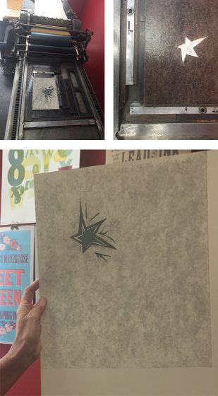
My poem was an excerpt of a longer poem, written by Isaac Gardner, age 24. I was lucky and got to meet him a few weeks before I started the project. He was incredibly open and excited about seeing his poem in print.
Isaac’s poem was very powerful, and the excerpt I had was in reference to darkness and light, and how he had a star in his pocket that grew brightly as he called upon it for help in the darkness.
I was immediately drawn to the star, and to creating a dark, stormy background with a path of light cutting through. I’m interested in textures and colors as opposed to using literal images, but did use a star as a sort of centerpiece. Boxcar made the poem excerpt in polymer, and the rest of the broadside was done by hand.
I began by making a linoleum cut of a star and printing it as my first pass. Next I created a collagraph–I mounted bookboard and painted it with acrylic medium with brush strokes for texture. This was my second pass.
For the third pass, I wanted to make a dark area to surround the star, and so hand-cut linoleum sheets mounted to a piece of shelving, and printed this background in a dark bluish color over the textured collagraph. I had to make sure the blue was transparent enough to show the texture while still being dark and moody. It was tricky!
Finally, I printed the polymer plate with the excerpt of the poem in a dark reddish color to contrast with the blue.
I was happy with the overall result! And was thrilled to meet Isaac and participate in this meaningful project. Thank you Boxcar!
In the spring of 2019, myself and a lucky group of other letterpress printers gather to be part of the Children’s Hospital Broadside Project. This was the ninth year of the project. We listen as the poems are read and choose (and sometimes negotiate) which poem we will print.
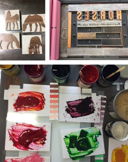
Sierra and Ann are able to share a little bit about each poet and I learned that my young one, Finnley Foster, was already an accomplished rider and had her own horse named Norman. Because she was so young, I wanted to keep the colors of the broadside gay and colorful, suggesting a carousel. And yet, I wanted to keep the horses lifelike because she described them so specifically and because she really knew what horses look like.
I enlisted the help of one of the other printers, Laura Walczak, because she is more savvy than I am with cleaning up images on a computer to get them ready for reproduction and because she has a laser cutter. I found several copyright free images on-line which I thought suited the lines that Finnley had written. Laura was able to work on the images and create the wooden laser cuts in a matter of hours.
I worked out and mixed all the colors in advance to create a harmonious palette for the run of seven colors. I did many mock-ups of hand cuts shapes of the horses before settling on the positions for each one. I printed the text on my Vandercook SP-15 but I printed each of the horses on my 1926 10 x 15 Chandler & Price. The horses required quite a bit of ink to get full coverage on each image and I was able to achieve this more easily on the C&P although it did require some careful paper handling as the sheet was over-sized relative to the press.
Throughout all the press runs, each broadside had a slipsheet laid between them so the ink would not offset from the front to the back of the next. Even so, I laid all the broadsides out on my work table to dry for several days before the final trimming.
At the completion of the project, we gather to read the broadsides to one another and talk about the process of working on them. Then we wrap up a complete set of the broadsides in a portfolio along with ten copies of the poet’s own piece which are later presented to the young poet and/or their family. Because of Finnley’s enthusiastic interest in horses, I gave them all of the laser cuts in case she would like to play with them.
It is both moving and inspiring to be part of this project for nine years. I am grateful I am invited to be even a small part of the young poet’s journey as they are so sweetly encouraged to write by Sierra and Ann. The generous support of businesses like Boxcar Press, Ecological Fibers, Neenah Paper, Puget Bindery and Evolution Press working with all involved makes this possible.
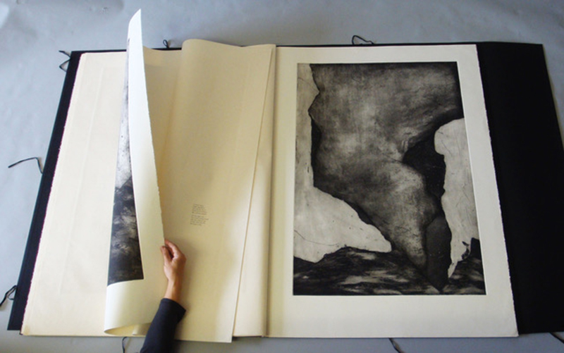
Michele Burgess of Brighton Press is a fine arts book artist, creative soundboard, and part-time university professor who loves to share printing with those around her. For three decades, Michele and her husband have been enjoying the fruits of their collaborative efforts one pulled print at a time.
AN ARTIST BY NATURE I am a visual artist obsessed with working in book form. My husband, Bill Kelly, founded our press in 1985 and it has morphed and grown before our eyes.
THE LURE OF LETTERPRESS I went to the Cranbrook Academy of Art for my MFA in the mid-’80s. There was a very funky letterpress there and small, crumbly piles of type. I enjoy the intentionality, the craft, the beauty of its collaboration with paper.
CREATIVE COLLECTIVE We are a small band of like-minded people using the studio as a creative laboratory. We create and publish collaborative artists’ books that braid the visions of both poets and visual artists. Everything is original and achieved by hand.
Bill Kelly, who founded the press, Nelle Martin, associate director/production designer/letterpress printer and I collaborate creatively with whoever the artist and poet might be. Most often, one of us is one or the other, or, in Bill’s case, both. We also often collaborate with papermakers such as those at Twinrocker, Cave paper, and the Morgan Conservatory to get a certain color or weight that we’re looking for.
Sonja Jones, in her 80’s and a previous librarian, has been a guardian angel and does our boxmaking. Kathi George, our crackerjack copy editor who makes sure we don’t have a plate made with a typo in it. Jenny Yoshida Park also works closely with us on typography and website and catalog design.
Recent poets include Bill Kelly, Chard deNiord, Bianca Stone, and Martha Serpas. Recent artists, besides myself and Bill include: Jinane Abbadi, Ian Tyson, Miya Hannan, Jenny Yoshida Park. A full list of artists and writers can be found on our website—34 years worth.
Sometimes we work with outside bookbinders Mark Tomlinson, Claudia Cohen, and Lisa Van Pelt, who have added creative ideas to the bindings. There’s a lot of back and forth regarding structure and content until it all melds together.
My favorite thing about it is that we never know what the final outcome will be until the B.A.T. (from the French phrase “bon a tirer” — good to pull. The subsequent prints should look like that one) is complete and that we can never remember whose idea certain things were. Synergy.
COAST-TO-COAST PRINTING We are bi-coastal now. We do most of the production in San Diego, which is getting a little less cool every year, and we do a lot of the creative work in Vermont in relative solitude. We also work in other artist’s studios sometimes or at the dinner tables of our writers.
PRINTING MENTORS Gerald Lange, Michael Bixler, Robin Price, Walter Hamady have been my letterpress mentors. William Blake, Sonja Delaunay, Ken Campbell, Anslem Kiefer, and Barbara Fahrner have been my book art mentors. The poets I work with inspire me. I get energy and fortitude from my collaborators at the press.
PART-TIME PRINTING, FULL-TIME FUN We decided years ago not to require the press to support us physically, so we teach at universities part-time.
THE ARTISTIC PROCESSES I start a book from a small kernel of inspiration which is always mysterious in its origin. Sometimes, the poet is my muse or his/her words. From there, I usually start working on visual images that expand on, rather than illustrate the text. The best scenario is when the poet and I are working together from a kernel and we’re spinning a web together.
PRINTING FEATS I’m proud of the meandering path we’ve taken, despite the hardships. With regards to a project: A Woman Hit by a Meteor. Our paper was MUCH too large for the press, so we folded it and through that limitation were able to imbue it with a sensibility of folded maps in ancient, celestial atlases.
PRESS HISTORY Vandercook 219, old style. I love the Vandercook, the sound, the weight, the intuitive simplicity of the machine.
BOXCAR’S ROLE Boxcar has helped us realize some visual formats that we couldn’t have done with lead type. Also, we were able to create Arabic calligraphy, Chinese and Japanese text that we couldn’t have done otherwise. Boxcar has been super-efficient, patiently helpful, both with my classroom needs and for Brighton Press.
PRINTING TIPS: Perhaps a useful letterpress printing technique? Slightly more punch, less ink.
WHAT’S COMING NEXT A book called WHERE AND HOW BLOOD WAS MADE with poet Chard deNiord. It will be my most complex book to date.
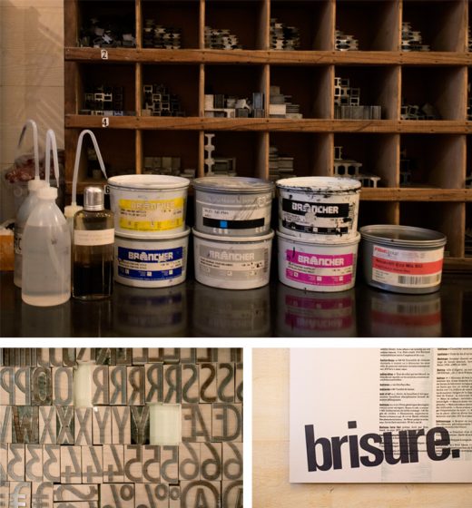
L’Imprimerie Bâtard is a Northeastern France-based letterpress printshop that enjoys working with handset type and learning as much as they can. Pauline and Gaëtan work and breathe letterpress in their printshop where they blend old-world craftsmanship with a daring for experimenting.
(A note for our readers: This article appears in both English and French for all lovers of letterpress to read! The French translation appears in italics. Huge round of applause out to Pauline and Gaëtan for the French translations!)
PRINTING IN FRANCE L’Imprimerie Bâtard -literally The Bastard Printer’s- is a new design and printing workshop in Nancy, France run by Pauline (24 yo) and Gaëtan (35 yo). We are hosted by a youth and cultural center called la MJC Lillebonne, which is super cool because it makes our everyday life at work very lively.
L’Imprimerie Bâtard -littéralement Bastard Printer’s- est un tout nouvel atelier de design et d’impression à Nancy en France géré par deux personnes : Pauline (24 ans) et Gaëtan (35 ans). Nous sommes hébergés dans une Maison de la Jeunesse et de la Culture, la MJC Lillebonne, un lieu super cool qui met plein de vie dans notre quotidien.
LETTERPRESS BEGINNINGS Pauline discovered letterpress during her fine arts studies, which she completed last year. Her school had a letterpress workshop led by a specialized teacher so she had the opportunity to learn the basics of the letterpress technique in different contexts such as personal editorial works or workshops that her teachers used to organize.
Gaëtan founded a nonprofit publishing house several years ago so he already knew a bit about graphic design and printing. He first practiced letterpress at his friends’ printshop. They had organized a week to produce a gazette combining text and illustration only printed by hand. They had invited other typographers so this first approach of letterpress revealed to be very enriching to him.
Pauline a découvert la typographie manuelle lors de ses études aux Beaux-Arts, qui se sont terminées l’année dernière. Dans son école, il y avait un atelier géré par un professeur spécialisé, elle a donc pu apprendre les bases de la technique dans différents contextes : des projets éditoriaux personnels ou encore des ateliers organisés par les professeurs.
Gaëtan, lui, a fondé une maison d’édition associative il y a plusieurs années, il avait donc déjà été au contact de l’univers du graphisme et de l’impression. Il a pratiqué la typographie pour la première fois dans l’imprimerie d’amis à lui. Ils avaient organisé une semaine pour créer une gazette mélant texte et illustration complètement imprimée à la main. Ils avaient invité d’autres typographes, cette première approche a donc été très riche en découvertes et en apprentissages.
THE PRINTSHOP One of our favorite things about our workshop is also one of the things we hate the most: it is very small. When people visit us, we like to tell them that we have the smallest printing atelier in the world. On the one hand, it makes the atmosphere warm and cozy. The office part, with its old desk and granny carpet, definitely makes us feel at home. On the other hand, a so small working place requires loads of tricks to optimize the storage of our tools and equipment.
Une des choses que nous préférons à propos de notre imprimerie est également une des choses que nous détestons le plus : elle est très petite. Quand nous faisons des visites, nous nous amusons à dire que c’est la plus petite imprimerie du monde. D’un côté, ça donne une ambiance chaleureuse, cosy. On s’y sent à la maison, surtout dans la partie bureau où il y a une vieille table et un vieux tapis. D’un autre côté, une si petite surface de travail nous oblige à redoubler d’inventivité pour optimiser le rangement de notre matériel.
HISTORIC NEIGHBORHOOD Absolutely. The cultural center accommodating us is based in an old private hotel built during the Renaissance, so the place is very picturesque. Another cool thing about this center is that it is so huge that it has many different arts and crafts workshops, such as engraving, bookbinding, drawing, silkscreen printing, pottery, sculpture.
We are surrounded by many interesting practices and crafts. Also, the whole neighborhood is the oldest part of the city and certainly one of its most beautiful areas. It covers many wonderful Renaissance landmarks, like a Gothic church, a ducal palace turned into a museum and ancient city gates.
Tout à fait. La MJC qui nous loge est basée dans un ancien hôtel particulier construit à la Renaissance, le bâtiment est donc très pittoresque. Ce qui est aussi génial dans le fait d’être hébergés dans une MJC aussi grande, c’est la quantité et la diversité des ateliers d’artisanat qui y sont proposés : gravure, reliure, dessin, sérigraphie, poterie, sculpture… Nous sommes entourés de pratiques et de savoirs tous plus intéressants les uns que les autres. Au delà du bâtiment en lui-même, le quartier entier est une des plus anciennes parties de la ville et sans doute une des plus belles. Il comprend de nombreux monuments datant de la Renaissance, comme une église gothique, un palais ducal transformé en musée, ainsi que les anciennes portes de la ville.
PRINTING MENTORS Our inspirations are diverse and come from different movements: absurdism and Oulipo (a French movement about constrained writing) for the writing of the texts, and some graphic designers who played with letterpress such as Robert Massin and Jan Tschichold for the design part of our work. We wouldn’t say that we have specific “mentors” but we had the opportunity to meet some old printers and typographers who learned letterpress as a craft and they gave us some advice. We also usually save good printing ideas we find on the internet, mostly on Instagram, and try to reuse them in our work.
Nos inspirations sont variées et nous viennent de différents mouvements: l’absurde et l’Oulipo (un mouvement français d’écriture sous contrainte) en ce qui concerne l’écriture des textes, et plusieurs graphistes ayant joué avec la typographie comme Robert Massin et Jan Tschichold pour la partie création de notre travail. Nous ne pourrions pas nommer de réels “mentors” mais notre travail se base à la fois sur les bonnes idées que nous trouvons sur internet, notamment sur Instagram, et sur les précieux conseils des quelques imprimeurs typographes dont c’est le métier que nous avons eu la chance de rencontrer.
FULL TIME FUN Yes, we do [full time] ! It’s been 6 months since our atelier was set up. At the beginning, we wanted to do it as a pass-time in our garden shed, but when we had the opportunity to buy our press and our first cases, it became obvious for us that we would make it our new job.
Oui ! Ça fait 6 mois que notre atelier est installé. Au début, nous voulions faire de la typographie un passe-temps et occuper l’atelier au fond de notre jardin, mais quand nous avons eu l’occasion d’acheter notre presse et nos premières casses, ça nous est paru évident que nous en ferions notre nouveau métier.
DESIGNING A CUSTOM PIECE. The first step of our design process is the phase of creation, which includes the writing of the texts and the making of the illustrations (we mainly use linocut). Then, we compose the texts we wrote, testing different types: metal types for the body of the text and wood types for the titles. We’ll try (as much as possible) to avoid using plates and linotype to keep our work the more handmade. After choosing the most coherent characters in relation to the project, we print the texts and illustrations on transparent plastic paper on our proof press so that we can modulate the elements and decide on the final layout. We got this trick from our friend Guillaume Guilpart, who is a typographer at a workshop called Paris Print Club. We also take advantage of this step to do an orthotypographic correction of the texts. We make the color and paper choices and finally we can print on our bigger press.
La première étape de notre processus de design est la phase de création, c’est-à-dire l’écriture des textes et la réalisation des illustrations (nous utilisons avant tout la gravure sur lino). Ensuite, nous composons les textes en testant plusieurs typographies : les caractères plomb pour le labeur (autrement dit le corps de texte) et des caractères en bois pour les titres. Nous essayerons au maximum de nous passer de clichés et de linotypie afin de conserver l’idée d’artisanat. Après avoir choisi les typographies les plus cohérentes avec le projet, nous imprimons les textes et les illustrations sur du papier rhodoïd sur notre presse à épreuve afin de pouvoir agencer les éléments entre eux et décider de la mise en page finale. Cette astuce nous a été donnée par Guillaume Guilpart, un ami typographe à l’atelier Paris Print Club. Nous profitons également de cette étape pour faire la correction orthotypographique des textes. Nous faisons un choix de couleurs et de papier et nous pouvons finalement imprimer sur notre plus grosse presse.
PRINTING FEATS Above all, we are proud of our atelier. Just one year ago, we had no idea that it would be so thriving and fulfilling today, that we would have so many tools and materials to work with. It has been a lot of work and we’re still motivated to make this place more enjoyable and more practical. We also consider all the knowledge we got these past months just by practicing our passion and by meeting people with whom we share that passion as a big accomplishment. We can almost say that we are self-made typographers and that definitely rocks.
Moreover, this past year, we had the time to work on two big creations that we would like to point out. First, we designed a numerical font using the software Glyphs (and the precious help of a type designer friend) and we made a wood type of it using a laser printer. We called it “la typo bâtard” (“the bastard font”) in reference to our printer’s name. The second work we’d like to talk about is a poster we did for “la Fête de l’Estampe” (the National Print Day). It is composed by two prints of wood planks, a long text in two columns above these prints, which is the page of the dictionary that contains the word bâtard (bastard), and an extract of this page as a title covering a bit of the text and printed with wood types.
Nous sommes avant tout fièr·e·s de notre atelier. Il y a tout juste un an, on ne s’imaginait pas que tout s’y passerait aussi bien aujourd’hui, qu’on aurait autant d’outils, de matériel de travail et d’opportunités. Ça a été beaucoup de boulot mais nous sommes toujours aussi motivés à rendre cet endroit le plus agréable et le plus pratique possible. Nous considérons également comme un accomplissement tout le savoir que nous avons acquis ces derniers mois simplement en cultivant notre passion et en rencontrant des personnes avec qui partager cette passion. Nous pouvons presque dire que nous sommes des self-made typographes et c’est trop cool.
En plus de ça, cette année, nous avons passé beaucoup de temps sur deux créations en particulier dont nous aimerions parler. D’abord, nous avons dessiné une police de caractères numérique sur le logiciel Glyphs (et grâce à la précieuse aide d’un ami dessinateur de caractères) et nous en avons fait une série de caractères en bois avec une graveuse laser. Nous l’avons appelée « la typo bâtard » en référence au nom de notre imprimerie. Le second travail dont nous aimerions vous parler est une affiche que nous avons réalisée pour la Fête de l’Estampe. Elle est composée de deux empreintes de morceaux de bois, d’un long texte en deux colonnes sur ces empreintes, qui reprend la page du dictionnaire qui contient le mot « bâtard », et un extrait de cette page comme titre, qui couvre une partie du labeur et imprimé avec des caractères bois.
PRESS HISTORY Our first press is a big red flatbed cylinder press, a Korrex press manufactured by Simmel in 1969. This specific model is called “Berlin”. But we mostly call it by its pet name: Simone.
Notre toute première presse est une grosse presse rouge à cylindre, une Korrex fabriquée par Simmel en 1969. Ce modèle s’appelle « Berlin ». Mais nous l’appelons principalement par son petit surnom : Simone.
BOXCAR’S ROLE We’re grateful to Boxcar Press for their interest in our little printing house. We were glad to see that the passion for letterpress could cross the borders between different countries. It was a pleasure to read their blog and discover so many other printers and their techniques. They provide a really extensive and necessary work of investigation about letterpress. As far as we’re concerned, their questions enabled us to look back at the past year and to realize what we have achieved until now. So we can thank them for the dissemination of this article about us and for letting us translate it to share it with our French community.
Nous sommes reconnaissant pour l’intérêt qu’a porté Boxcar Press à notre petite imprimerie. Nous étions enchanté·e·s de voir que la passion pour l’impression typographique pouvait traverser les frontières. Ça a été un plaisir pour nous de lire leur blog et de découvrir autant d’autres imprimeurs ainsi que leurs techniques. Ils proposent un travail d’investigation du monde de la typographie vraiment complet et nécessaire. En ce qui nous concerne, nous avons pu, en répondant à leurs questions, faire le bilan de notre année passée et nous rendre compte que tout ce que nous avions accompli jusqu’à maintenant. Nous pouvons donc les remercier pour la diffusion de cet article et pour nous avoir permis de le traduire afin de le partager avec notre communauté en France.
PRINTING TIPS The most important advice that we could give is to try things. Letterpress is an open door to a world of creation with a lot of variables: characters, colors, shapes, layouts. They are some fundamental rules to respect such as the type height, but once you’re sure about these basics, you’re completely able to explore, imagine, make, invent new things. That was the case when we had the idea to print pallet planks to draw the shape of columns in the background of our poster… After all, why not?
Le conseil le plus important que nous pourrions donner est d’essayer des choses. La typographie est une porte ouverte à un monde de création avec des tas de variables : les caractères, les couleurs, les formes, les mises en page… Il y a certaines règles fondamentales à respecter, comme la hauteur typo, mais une fois les bases intégrées, on peut complètement se permettre d’explorer, d’imaginer, de fabriquer et d’inventer de nouvelles choses. Ça a été notre cas quand nous avons eu l’idée d’imprimer des planches de palettes pour dessiner la forme de colonnes en arrière plan de notre affiche. Après tout, pourquoi pas ?
WHAT’S COMING NEXT Our main plan for the upcoming year is to open our atelier to people and to give letterpress lessons. Starting from January 2020, we’ll give a three-hour lesson twice a week. In addition to that, we’ll try to organize workshops over one or several days in our atelier, sometimes soliciting the other arts and crafts workshops of our big house in order to provide an overview of the process for making a real printed object by hand. We would also like to offer classes outside our workshop, in other cultural or specialized structures such as schools, with our little proof press and some previously selected characters. We are absolutely willing to share our know-how, especially from the perspective of doing popular education.
Notre principal projet pour l’année qui arrive est d’ouvrir notre atelier aux gens et de donner des cours de typographie. À partir de janvier 2020, nous donnerons des cours de trois heures deux fois par semaine. En plus de ça, nous essayerons d’organiser des ateliers sur un ou plusieurs jours dans notre imprimerie, parfois en sollicitant les autres ateliers d’artisanat de notre grande maison afin de donner un aperçu du processus de fabrication d’un vrai objet imprimé à la main. Nous aimerions aussi proposer des ateliers en dehors de notre imprimerie, dans d’autres structures culturelles ou spécialisées comme des écoles, avec notre petite presse à épreuve et quelques caractères préalablement sélectionnés. Nous sommes complètement partant·e·s pour partager notre savoir-faire, notamment dans une optique d’éducation populaire.
Get out your loupes and magnifying glasses for our cool printing press edition of Spot the Differences! There are 20 differences in all. Can you spot them?
And don’t forget, we’re keeping the fun going all week long for Letterpress Appreciation Week.
Answers and results will be revealed on Friday, September 20th, 2019 so stay tuned!
Louise Rowe of the Mackenzie Printery and Newspaper Museum in Queenston, Canada, shares how the Museum stands as a pillar of the printing community. Benefiting from a printing revival in the area, the Museum blends modern techniques with letterpress’ rich history.
I found letterpress in a very roundabout way. I have a vague fine art background; this precedes my twelve-year career in customer service and events. So the only printing I ever did focused on traditional etching techniques. When I was gifted a proofing press by my boyfriend, I quite literally had no clue what it was, let alone how to set it up and use it. However, it was, and is to this day, the best gift I have ever received.
For starters, nobody has ever given me anything that romantic. Secondly, it was the motivation I needed to start my own business – Out of Sorts Studio. Finally, my Potter Proof Press is how we ended up becoming members of the Mackenzie Printery. I reached out to them in the hopes that they might be able to shed some light on the one-tonne-beast, which suddenly occupied a space in our basement.
The Mackenzie Printery and Newspaper Museum is a charity founded in 1993 and to this day is run completely by volunteers. They own a vast collection of printing equipment spanning 500 years of history. The collection is housed in the restored home of William Lyon Mackenzie, which is owned by the Niagara Parks Commission and during the summer they open the heritage site to the public as a working museum.
Whilst continuing to maintain a very impressive collection of printing equipment, the charity is now moving forward in efforts to preserve more than the just the physical pieces.
For the most part our members are older and have struggled with finding people in younger generations who are remotely interested in hearing about their experiences, let alone finding ones who actually wish to learn any of the processes. That’s not to say these people don’t exist, just that they are hard to find in our neck of the woods.
In recent years, under the Chairmanship of Ron Schroder, the group has been focused on the organization of the entire collection; ensuring it is managed and preserved to the highest museum standards. With such a large collection, that includes a vast selection of type, it has been a long process. With this now well under way the group can turn some of its attention to the presses themselves. It isn’t just about keeping them all shiny and dust-free, we want to make sure that we always have someone who knows how to operate them.
Vice Chairman, Art Ellis, along with our Collections Executive, John Hunt, have been in charge of all things related to the restoration and working order of our printing presses for the majority of the last three decades. As new members, we found it a heartbreaking prospect that their knowledge could just be lost should they no longer be able to participate.
Obviously the charity gaining me as a member is great because I’m awesome. However, in reality, Carl (my boyfriend) has proven to be a far more useful asset. He is a mechanic by trade, with a deep appreciation for antiques and a desire to know how things work. His passion for cars is deeply rooted in hot rods and this love took us to the Syracuse Nationals in July, which also provided us with the perfect opportunity to take a tour around Boxcar Press: a place dreams are made of!
Honestly, I don’t think we could have a better first candidate for learning how to set up, maintain and repair the printing presses.
He started small, bringing home a rather rusty slug cutter, a mini paper cutter that didn’t cut and a brayer with broken handles. After some research, he took apart each item, carefully cleaned every piece, repaired what he could and fashioned new parts where necessary. Parts were then painted and reassembled, leaving us with three pieces that could either be added into the museum’s collection or sold.
The next logical step was for him to start learning the basics of some of the larger pieces of equipment. John began by showing him how to run our Heidelberg Windmill and has since moved on to showing Carl what he has to do to keep this press in good working order.
The printery also has in its collection an 1894 Whitlock press. This press, weighing in around eight tonnes, is too large for Mackenzie House and is instead a permanent feature at the Marshville Heritage site in Wainfleet, Ontario. Every year, this press is used at The Marshville Heritage Festival to print a festival calendar and until this year, Art has been searching for someone to teach how to run it. Buoyed by Carl’s natural aptitude, Art taught Carl everything he needed to know about running and maintaining the Whitlock; she’s got a few quirks, which is understandable given she’s 125 years old.
At the same event, after it stopped delivering us our slugs, Carl received a crash course from John on the insides of a Ludlow Type Caster and together they formulated a plan to repair it, which Carl then executed.
While the experts tinker with the big stuff, it falls on the rest of our core work group to continue with sorting through the storage bunker and the many, many, many cabinets of type. Members Marvyn, Dennis, Francis and Tim have the most patience I have ever seen and make type sorting look easy.
With letterpress now considered more of an art or craft, rather than a pillar of society, it is fascinating to see all the modern-day interpretations of an industrial process so rooted in history. As Executive Secretary for the group, I am now looking to the future and how we can continue to sustain our organisation. With much of our surplus stock now sold, it is time to get creative and I couldn’t be more excited to see what we can collectively do.
If you would like more information on the museum, any of the aforementioned members, and how to join or support The Mackenzie Printery and Newspaper Museum, please take a look at our website: https://mackenzieprintery.org/
Time to roll up those sleeves and dust off those printing terminology books! We’ve got a wonderful printing-themed crossword puzzle for all you ink-in-the-blood aficionados!
Boxcar Press is proud to display the talent and creativity of our team members via our annual mini On My Own Time exhibit. This is our ninth year participating in this wonderful opportunity. The show is in partnership with CNY Arts’ On My Own Time larger exhibit at the Everson Museum in Syracuse, New York. We hope you enjoy!
* This mark denotes an artist that was selected to have one of their pieces in the upcoming 46th annual On My Own Time exhibit at the Everson Museum of Art in Syracuse, New York. The group exhibit celebrates Central New York businesses and their creative team members. The show runs from October 12 – November 17th, 2019.
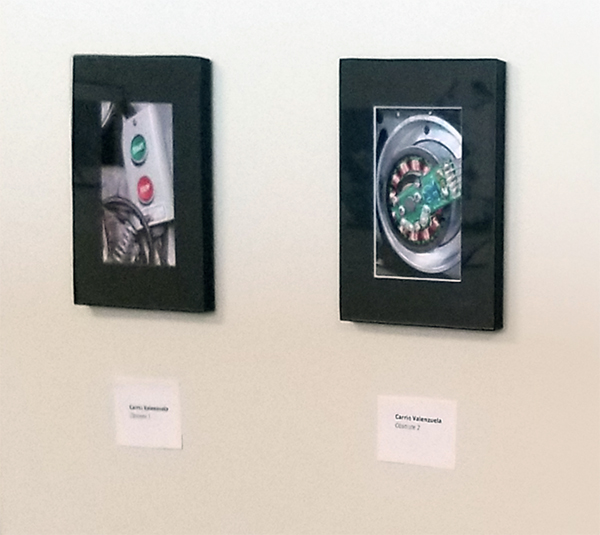
This photography work is definitely not my usual repertoire. It’s quick & immediate gratification to take a picture instead of all the process & detailed drawn-out steps that goes into printmaking or bookbinding that I’m normally used to.
I’m drawn to weird things: lots of textures, patterns, mechanical things, antiques, fossils, decay, etc. For the photos at this year’s On My Own Time show, the subject focus was obsolete machinery. The Press Lounge (our storage area here at Boxcar Press) was getting tidied up and I always love to see the old forgotten things in there. I like the shapes & the look… like 1980’s machinery with big knobs you turn with your whole hand or curvy cast iron parts with raised lettering that takes forever to fade away. These photos were like documenting fossils – blocky, colorful; the guts of the old machinery. Bins of old wires and piles of old telephones were such a contrast to modern, sleek, white plastic minimalism. I took pictures to remember how things used to look.
It’s so interesting to see what artwork everyone is doing. Everybody is busy working but there’s so many interesting people & their stories here. We have people who make incredible embroidered boxes, creepy figurines, intricate multimedia drawings, delicious macaroons, etc. Seeing what my co-workers & friends make is so fun! I love learning about their techniques, what interests others & knowing that we all want to put our hands & hearts to making something.
Much of my work combines studies and exercises done in various institutions and studios. The piece exhibited in On My Own Time showcases a collage of materials from when I screen-printed at The Ink Shop in Ithaca and from the tail-end of a master’s program in SUNY New Paltz for printmaking.
In researching On My Own Time from past years, I believe it does a great job in constructing a forum for those who wish to pursue a creative means and expand upon the skills they’ve already attained. I would say to tune yourself into the methodology of others and remain curious as to how one can manipulate the materials we often take for granted. It’s all quite limited and special to behold.
Jen De Roberts
This body of work is comprised of acrylic pour paintings.
This piece originally started as a large experiment. I wanted to learn how to best draw on tar paper in regards to painting, printing or drawing. This material was a curbside find back in 2014. I have been slowly learning what works and what doesn’t work on this roofing paper. In my artistic practice, I am fond of watercolor and inks. However, this paper is designed to be waterproof and I was forced to try out dry mediums.
In March this year, I was gifted a set of pastel pencils and a new drawing supply shifted my progress on this project. The vibrant colors and lines are all brought out by the pastel pencils and truly brought this work into completion. The vibrance from the vegetation stands out from the black background. It was also very interesting to bring out a subtle middle layer and stark whites from the black paper.
The inspiration behind the imagery is from a recent trip to Joshua Tree, CA. I really enjoy illustrating imaginary landscapes, yet I include memories of places that I travel. The high desert received a great amount of rain this year, resulting in striking spring flora in a place I understood to be dry and rather desolate.
On My Own Time is an opportunity for me to showcase my larger works. Because this is a local show in town, I do not have to be concerned with shipping and handling. Removing that hassle, I can confidently select bigger drawings and prints.
Additionally, I really enjoy the moment before the jurors select works for the OMOT exhibit when everyone at Boxcar shows their work in a mini-exhibition. Seeing other artwork and discussing artistic practices with coworkers is energizing as an artist.
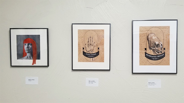
Portrait (far lefthand side of the photo) came from an idea while I was mending and doing seamstress work. All the extra thread tails heaped up on a pile looked like a mess of hair. The concept evolved from there. The piece is influenced by both contemporary textile artists working in embroidery and artists who break the fourth wall in some unusual or clever manner.
The other two pieces were part of a larger illustration series called “The Body Oddity“. The illustration series focuses on bone “oddities” — be it normal genetics or human-made alterations. The two pieces in this mini-show are “Sixth Finger (Polydactyl)” and “Elongated Skulls (Lipombo)“. Resources for the hand-drawn illustrations included x-rays of the bone conditions and photography from the Mutter Museum in Philadelphia, Pennslyvania. Osteology has fascinated me for quite some time.
On My Own Time is a great avenue for artists from all media to get a chance to share what drives them creatively. From Boxcar co-workers to team members in different business sectors across our area, this show gives local central New York artists a great opportunity to display their work.
This week’s Inquisitive Printer focuses on a new chapter for a letterpress printer, the cool printing history of Basel, Switzerland and a creative idea for sketch-booking in the summer.
It’s wonderful to see our letterpress friends grow and be on the move. Earlier this month, a cool Chicago-based letterpress printer, A Favorite Design, did just that. After a successful Kickstarter campaign, Amber Favorite & her husband have been able to move into their own brick-and-mortar store in the Albany park area. Way to go and congratulations!
A significant other’s trip to Europe became an occasion for me to do a little poking into the history of Basel, Switzerland. I couldn’t — and really, still can’t — put my finger on any one reason why Basel feels significant to me, as prominent as it has been in the back of mind. Perhaps it’s some subconscious awareness that many of my cultural heroes are alumni of the old university, like Friedrich Nietzsche, Carl Gustav Jung, and Herman Hesse.
In the Renaissance, it was home to father of pharmacology, the astrologer and alchemist Paracelsus; in the modern era, it was the site of chemist Albert Hoffman’s famous bicycle ride over the course of which he became aware of the effects of the lysergic acid diethylamide he’d just invented. What a cute set of Basel historical bookends marking either end of the modern era of hard science, between magical herblore on one side and psychedelic cybernetics on the other.
This is the time when I just want to be active and outside. Taking in as much sunlight and warm weather as possible before the next season arrives. I relish these moments, yet have the feeling that I am not focused on my studio work. This little bit of guilt follows me around, but WAIT!!! I have dissolved this worry by combining my two favorite things: drawing and playing outdoors.
Wherever I go on adventures, I make sure to always have space in my bag for a small notebook and a set for drawing tools. Pens, fine tipped markers and a handmade notebook.
The sketchbooks are simple to make and can be constructed in a pinch. Yay bookbinding skills!!! Any found and recycled materials such as copy paper, string or staples are used to bind together this booklet. And there you are, ready for summer action and capturing your favorite moments.
Above are images I have included are from a 2015 sketchbook. These were made while spending the weekend in a remote cabin in central New York. Below are this year’s (2019) sketches of some recent adventures.
I can captures new experiences and practice my artistic skills all in this small item. I have even asked my friends to contribute to some pages. These become great collection pieces over time. I can look back at these works and enjoy my artistic practice through the summer months.
Have something that you find intriguing? Let us know in the comments below!


