2020 Seattle Children’s Hospital Broadside: Part 1

It is always a treat to share the joy and delight of the Seattle Children’s Hospital Broadside collection.  The colorful stories and broadside prints are a testament to the hearty spirits of the participants. They include:  the folks at the Writers in the Schools program working with the children at the Seattle Children’s Hospital, and the letterpress printers of Partners in Print (formerly part of the letterpress family at Seattle’s School of Visual Concepts – SVC).  Together, this collaboration crafts memorable letterpress broadsides of poetry. 

At Boxcar Press, we are honored every year to be a part of this project.  This first installment of a two-part blog covers the 2020 edition of the Portfolio, titled I Know What It Means to Be Brave. Read on about three printers who share the love through wood and metal type, aligning the stars (literally) while on press, and more.

Bonnie Thompson Norman

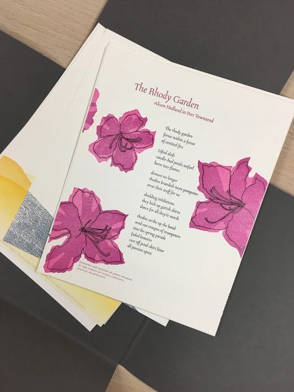
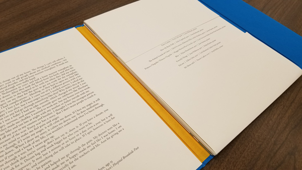
We usually know very little about the poets whose poems we have chosen to print. We go by the feeling or inspiration we take from reading and re-reading the poems. I was drawn to Darian Parker’s poem because it felt like a benediction. The young man was 16 when he wrote his poem. I wanted to create something that felt a little more ‘grown-up’ by using a palette that seemed rather more sophisticated than child-like. 

In the poem, he thanks someone for giving him a second chance. One infers from the text that Darian is the recipient of a transplant. I placed circular shapes at the top and bottom of the broadside, one in a grey, the other in a golden color to give the feeling that he had gone from a dark place to one that was much lighter. Darian’s poem recites how he is thankful for the gift he has received.  I tried to convey the feeling of that second chance by having a large golden shape seem to be rising from the bottom of the broadside as in a sunrise. I find his poem to be a beautiful expression of gratitude and it moves me each time I read it.

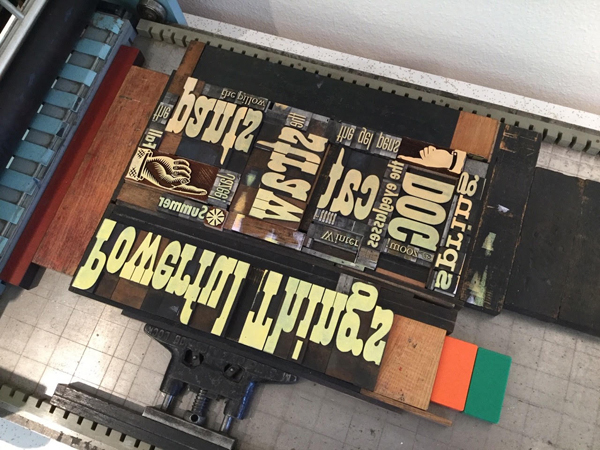
The type for this broadside is all handset using both metal and wood types. The metal types are 18 point Albertus and 8 point Bernhard Gothic Light. The wood type is 8 line. I used both linoleum and ⅛” plastic for the circular shapes and printed the broadside on both a Vandercook SP 15 and a 10 x 15 Chandler & Price. The text for the poem went on the Vandercook as well as the title because these were large forms. The shapes, poet’s name and age, and the colophon were printed on the C&P. Using two presses makes it easier to move along in the production of the piece. While printing, I slip-sheeted each broadside so that the ink would not offset from the front of one sheet to the back of the next because there was so much ink coverage. I left the slip sheets in until after I had done the final trim.

Due to COVID-19, we were not able to gather together as a group to create the portfolios. I bound all of them in my home studio on my own. Gathering to bind the portfolios is a wonderful process for all of the printers. It is an enjoyable chance to visit with one another, talk about our work on our broadsides,and catch up on everything else as well. It wasn’t difficult for me to bind the portfolios by myself as I have been a commercial hand binder for a number of years but I did miss our camaraderie.

My co-leader in the binding of the Children’s Hospital broadside project over the years has been Jules Remedios Faye. Jules chose the color scheme for this year’s portfolio and created the beautiful letterpress printed label for the front cover. After all of the portfolio covers were completed, I used the entire table surface of my studio to collate the broadsides. It is always a wonderful opportunity to see all of them together and marvel at the originality and creativity that each designer/printer brings to the text of their poet. Instead of our usual wrap-up for this project when we have gotten together to read the poems out loud and talk about our design process, I was able to hand off each printer’s portfolio individually as they came to my house (safely!) to collect their copy. It was both a celebration to deliver a complete portfolio and an affirmation that we can continue to do good and meaningful work despite the challenges we faced.

Robin Kessler

My poem is “Powerful Things” by Jazee Holloway (her first name is pronounced JUH-zay and rhymes with sauté).

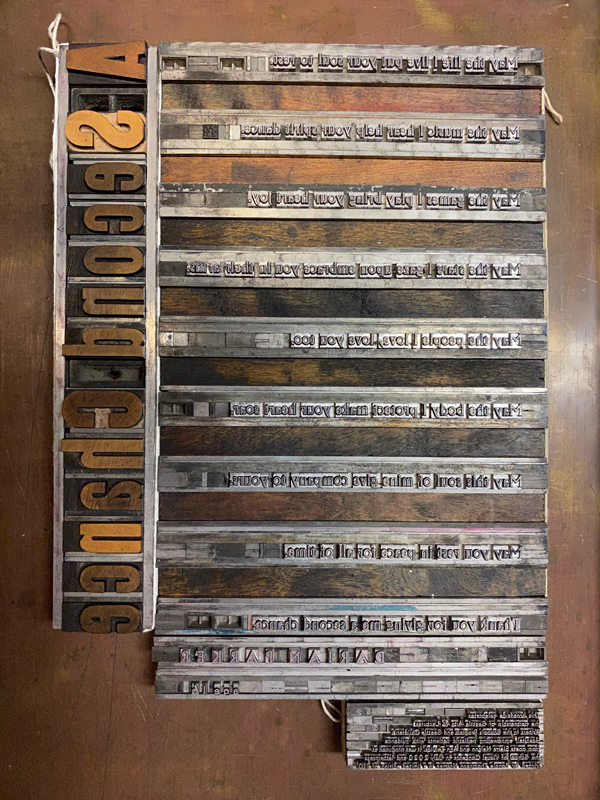
This poem has many images, and as usual for me, I really dithered over how to illustrate them. In the end, I went with my love of wood type and decided to highlight the words as image. 

Because of the pandemic, our options for printing on a Vandercook at SVC or other printers’ studios became very limited. So I decided to print this broadside at home, hand-inking the edition of 110 on my 14” x 24” sign press. I’m retired, and all my usual activities had been cancelled, so what the heck – I had plenty of time!

 (I use Caligo Safe Wash ink, which I thicken with magnesium carbonate)

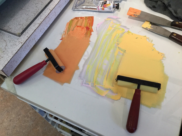
I used my limited but beloved collection of wood and metal type for the background, and inked it in two colors. Some of the prints have a graduated or ombre look, but I abandoned that after a while. I printed the backgrounds over the course of 3 days – this is a VERY variable edition!

The text, title, and colophon are photopolymer from Boxcar. I was afraid I wouldn’t get a crisp print for the black text, but it worked out fine. I think I also spent 3 days printing the black run. 

This was a satisfying experience in “making do” with what is at hand. I’m lucky to have a couple small presses and a bit of type at home. As always, it’s an honor to participate in the Children’s Hospital Broadside project. We had our final celebration via Zoom in September – it was wonderful to see all the prints and share our printing trials and triumphs. 

Carol Clifford

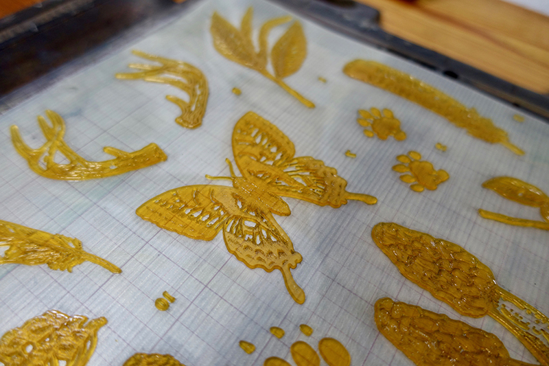
I have worked with constellation imagery in two previous broadsides for Children Hospital poems. I enjoy the challenge and the depth of color you can get when creating a nighttime sky. Plus, I am a fan of using gold metallic ink and it works nicely when printed on top of a dark color. In “Constellations” I appreciated the imagery Dylan was conjuring up with the many constellations.

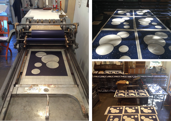
I thought about how best to present the poem to this young poet. I had the good fortune this summer to camp under the stars for 6 nights and I thought of how I could convey this experience to Dylan. When I go camping I love the fact that the sky doesn’t have the light pollution we have in the city. I wanted to capture that awesomeness we rarely get to experience. I wanted Dylan to feel the expanse of a clear, pollution-free starry night. I added the dark silhouette of a figure with binoculars at the bottom to not only provide a sense of perspective but to also show a curiosity to see more than what you can see with the naked eye.

I began working on the ideas for this piece shortly after picking the poem in March. However, when the pandemic began, I found myself constantly distracted and struggling to find the headspace to focus. I was relieved when a new deadline was set for August because it allowed me to get my head back in the game and provided a pleasant diversion from the big picture.

I had budgeted just the minimum amount of time to order plates (3), have them arrive in 2 days (I still find that turnaround time a miracle), print, wait for the broadsides to dry, trim, and deliver. Every day counted. I did not allow any time for mishaps and so when there was a shipping glitch, just like that I was behind schedule. A hearty thank you shout out to Boxcar who helped me in my 12th hour. They offered to resend at least the first plate (they sent the first two!) to help me stay on schedule and I was able to because of their thoughtfulness! It takes a village.

Once I was on course to print, the process, thankfully, went smoothly. This wasn’t so much a happy accident as it was just a huge relief. It doesn’t always go as smoothly. The stars must have aligned for me this year (pun intended).

Stay tuned for Part 2 of the 2020 Children’s Broadsides project!  We would like to thank all of the young writers & their families, printers, and organizers who help make the 2020 Broadsides project one of enchantment and spirit.  You can view all of the prints from all the years at the Partners In Print website here.

London-based Linocut Artist Kate Guy

Kate Guy is a London, UK-based linocut and fine printmaking artist. She incorporates bold use of flora, fauna, colors and her cat into her works. From early beginnings at the press in her family’s workshops to enjoying where the creative process takes her, Kate shares how she is carving out her own printing path.

Kate Guy is a London, UK, based linocut and fine printmaking artist.

BOLD LINOCUTS, GRACEFUL ART I live and work in London UK, I trained as a graphic designer but now I am doing what I love most. I am a printmaker working with traditional techniques on paper and fabric. My main subject area is illustrated recipe linocuts. My unique system uses individual ingredients prints which I combine to make recipes, which I then turn into quality homewares. My designs are boldly graphic and colorful giving them a modern feel whilst also celebrating a strong tradition of print and quality in British manufacturing. My products are all designed by me and made in the UK, everything is printed on organic cotton using eco-friendly inks to be as kind to the planet as possible.

Kate Guy is a London, UK, based linocut and fine printmaking artist.

EARLY BEGINNINGS My father was a graphic designer and he bought a Victorian printing press in the 1960s which fascinated me as I was growing up. I first used it when I was 7 – see comments below.

I have built up a collection of wooden type which I use to create signs and posters and also combine with my linocuts. I guess my first proper project was at Art School in the 1980s where I really began my obsession with typography.

Kate Guy is a London, UK, based linocut and fine printmaking artist.

PRINTING IN THE UK I print in my studio in Camden, my favorite thing has to be the vibrant area and the light. The studio has windows all down one side and looks out over the rooftops of North London. When I’m printing on a larger scale I go to my mother’s studio in Putney, South London. My mother is an artist and has our lovely old cast iron Victorian Albion printing press from 1857 at her studio as well as an etching and a lithography press.

Kate Guy is a London, UK, based linocut and fine printmaking artist.

LONDON LIVING My studio is in Camden, North London – famous for its trendy market and boutique shops. Once a mecca for punks and goths – you can still see a few around these days and the market still retains much of its original independent charm having (so far) resisted the chain stores and high street homogenization.

Kate Guy is a London, UK, based linocut and fine printmaking artist.

I also have the whole of London on my doorstep to use as inspiration, with its wonderful galleries and museums – most of which are free.

PRINTING MENTORS I love the work of the English linocut artists from the early 20th century – people like Edward Bawden, Eric Ravilious, and Cyril Power from the Grosvenor School. My father, although he died when I was only 9, is still a source of inspiration. It is thanks to him that we have our Albion press and I believe he instilled a love of the traditional techniques in me.

PRINTING FULL-TIME FUN Yes! Well… I do in theory, but I seem to spend most of my time these days doing marketing – I have just ‘finished’ my website. I was an Art teacher in secondary (high) school until 5 years ago when I quit following my dream of being a full-time printmaker and designer.

Kate Guy is a London, UK, based linocut and fine printmaking artist.

THE DESIGN PROCESS All my designs start with drawings, usually from life but sometimes I work from a photo. I have made a film about my process – from initial idea to the final edition of prints created during the recent lockdown (seen here: ‘Lockdown Cat with Mexican Cushion’).

PRINTING FEATS Too many to list here! (ha ha, no not really).

I have done lots of different things in my life; I’ve been a graphic designer, animator, illustrator, glass artist, teacher, and mother to name a few. Now I have the time to be the printmaker and designer which I think I was always meant to be.

Kate Guy is a London, UK, based linocut and fine printmaking artist.

PRESS HISTORY I grew up in a house with two studios – one for my mother and one for my father and a beautiful old Albion press. On this press, I made my first linocut and letterpress print aged 7, ‘Ereh si a tac‘. Basically, as a know-it-all 7-year-old, I wouldn’t be told how to lay out the letters to go with my little linocut of a Cat…

You can read all about it on my blog.

The first press I bought myself was a Victorian book press which I found in a ‘Marche au Puce’ (Flea market) in the South of France.

Kate Guy is a London, UK, based linocut and fine printmaking artist.

BOXCAR’S ROLE I find your work and ethos inspirational and was delighted to be asked to complete an interview for you. Sadly I am a bit far away (London UK) to visit in person at this time. I also share your obsession with heavy antique printing equipment.

Kate Guy is a London, UK, based linocut and fine printmaking artist.

PRINTING TIPS Always keep your dirty area and your clean area separate and use folded paper ‘tongs’ to pick up your paper for printing. I always get very messy printing (one of the fun parts) usually with ink on my face and everywhere else, but there is nothing more annoying than a perfect print with a big old thumbprint on it!

Kate Guy is a London, UK, based linocut and fine printmaking artist.

WHAT’S COMING NEXT My plans have been very much affected by the pandemic. I had lots of live events planned, I had taken a stall with a demonstration area at shows across the South of England, a couple of these are still holding out but most have been canceled. I am hoping we will be able to be back to normal for this upcoming Christmas season.

I was also planning lots of printmaking teaching and workshops in my studio but…[unusual times have happened].

2021 Mother’s Day Letterpress Gift Guide

We scouted out for your gifting pleasure some of the most delightful & heartfelt Mother’s Day gifts & cards. Peruse the many items here that show your affection for the #1 Mom in your life. Catch something we missed?  Let us know in the comments below!

1. 6” Soft Rubber Brayer from Takach  |  2. Loving Me Through My Messes letterpress card from Thimblepress  |  3. Mother’s Day Dogwood letterpress card by LetterpressPDX  |  4. Letterpress Boxcar Press t -shirts from Boxcar Press  |  5. Southern Sayings letterpress coasters from Ancesserie (For the mom whose kids never seem to remember to put their drinks on a coaster)

 6. Grandma letterpress card  from Kiss and Punch (don’t forget the Grandma in your life!)  |  7. Masy Chighizola – Dahlia and Rose art print from Blackbird Letterpress (A bouquet print that never fades or drops its petals)  |  8. Book earrings from PurgatoryPiePressINK |  9. PANTONE Notebook Set by PANTONE  |  10. Font Hoarder enamel pin by itsgeoffrey

Top 10 Valentine’s Day Letterpress Picks for 2021

Looking for inspiration for that special printer in your life? Come check out our quick list of ten favorite gifts for this upcoming Valentine’s Day 2021—featuring fresh, hilarious, sweet, and extra special gifts for that certain someone.

Inspired by our Valentine’s list?  Let us know in the comments below!

Valentine's Day 2021 Gift Guide

1. Field Notes T-shirt and Field Notes from Field Notes Brand  | 2. Love Song from Fickle Hill Press | 3. Chandler & Price Platen Press enamel pin from the paper carnival | 4. Johannes Guttenberg sticker by WritersSpot | 5. Trump valentine letterpress card from DeLuce Design

Valentine's Day 2021 Gift Guide

6. Seahorse Lovers print from Anomal Press  | 7. 12″ or 18″ Line Gauge from Boxcar Press | 8.  Hedge Hug letterpress card from Dogwood Letterpress | 9.  Giant Mighty Love letterpress card from Benchpressed | 10. Wine glass stem tags from Laughing Owl Press

Free Print-themed ZOOM Background Downloads

Fellow letterpress lovers – please enjoy these images at your next Zoom meeting . Download the file and upload to your ZOOM settings in your account. [Hint: Right-click on a photo and save the file to your local desktop.]

We’ll be revealing one each day so come back + check in often!

Need help applying these cool ZOOM backgrounds to your next meeting?Easy-to-follow instructions are at this link.  The artwork is intentionally flipped. This will show right-reading text when you are using your camera in your ZOOM meeting.

This will be perfect at these upcoming events:
-Ladies of Letterpress Virtual Conference – September 25-27, 2020
-Awayzgoose at Hamilton Wood Type – November 5-8, 2020

Monday, September 14th, 2020 Free Download: Heidelberg Windmill

Tuesday, September 15th, 2020 Free Download: Manicules

Wednesday, September 16th, 2020 Free Download: Vandercook

Thursday, September 17th, 2020 Free Download: Wooden Ornaments

Friday, September 18th, 2020 Free Download: Vandercook Bed Height Gauge

Standing Together – The Printing Community

It’s hard to put into words how much our world has changed (both locally and globally) in just a short period of time. We struggle to keep up with daily reports and advisements.  However, out of this comes sharing and goodness from those around us and our own printing community.

Here at Boxcar Press, we’d like to share with you a little bit of that goodness offered online (from a safe social distance in these times). It’s inspiring to know that there are good folks out there spreading some cheer!

If you’d like to shine the spotlight on someone, let us know! We’d love to hear from you!

Live Daily Readings of Children’s Books With Mary Bruno (of Bruno Press) via Instagram. Come share a good time from Minnesota with Mary every day starting at 12 Noon Central Time!

Mary Bruno - Bruno Press
(image courtesy of Mary Bruno of Bruno Press)

Wilderness of Social Distancing letterpress card from Waterknot Press (from Portland, Oregon).

Waterknot-Wilderness Social Distancing
(image courtesy of Waterknot Press)

Waterknot will be offering a buy 4 get one free special on their website — indefinitely. No code required. Just put 5 cards in your cart and you will only be charged for 4 of them. (via their IG account)

Free Downloadable Color Book PDF – cool creatures and fantastic beasts from Isaac Bidwell of Pickled Punks. Grab a set of crayons and have some fun from this fellow Syracuse-based artist!

PickledPunks - free coloring book PDF downloadable
(image courtesy of Isaac Bidwell of Pickled Punks)

(Fun fact: Isaac Bidwell is an artist that works in the same building as us — the Delavan Center in Syracuse, NY!).

Spring Ephemerals of New York State “Color Your Own Letterpress Print” from Lion Tail Press of Ithaca, New York.

Laurin Ramsey (via IG): “Hey friends! In these uncertain times, when so many of us are isolated indoors, it’s more important than ever to bring beauty and sunshine in however we can. Spring is coming, so I’ve created my first “color your own” letterpress print for us adults and kids, too! Printed on 100% cotton, acid-free paper, this takes beautifully to watercolors, colored pencils, markers, or whatever coloring tool strikes your fancy. Keep for yourself to brighten your home, or send to a loved one who could use some comfort.

Letterpress Community - Standing Together. letterpress print coloring page
(image courtesy of Laurin Ramsey of Lion Tail Press)

Starting today, I’m also offering a 15% site-wide discount at liontailpress.com, when you enter code SHOPSMALL at checkout. This COVID discount also applies to LP e-gift cards AND custom design work going forward! Thank you so much for your continued love and support through this time, for reaching out to loved ones and neighbors, taking good care of yourselves, and taking all of it one day at a time. We’re in this together!”

Watch “Making Faces: Metal Type in the 21st Century” for free via Vimeo. Grab a bowl of popcorn, your favorite snack & enjoy the beautifully documented film on making metal type by P22 Type Foundry and Rich Kegler (Rochester, New York).

Use code: OMEGA22 at the P22 Vimeo On Demand Page.

Making Faces film poster
(image courtesy of Richard Kegler / P22.)

Daily Art Challenge. Stretch those creative muscles daily with Raven’s Wish Gallery art challenge! Raven’s Wish (in Janesville, Wisconsin) posts daily on their Facebook the next thing to make, post, photograph, or do! There is sure to be a challenge theme that will rev your artistic juices.

Try A New Printing Technique (or Revisit a Favorite One!) Have fun pulling out some of your printing and printmaking books to brainstorm a new print project. Need ideas? The Printmaking Ideas Book by Frances Stanfield and Lucy McGeown is chock full of great projects!

(image courtesy of Frances Stanfield)

Printing With Kitchen Items Can’t get to your press? Never fear – embrace your wooden or kitchen spoon to make a print! You’ll use the metal or wooden spoon as a baren to make fun, fantastic prints!

These suggestions are a drop in the bucket of all the ideas out there for creativity, entertainment, and boredom-fighting while you isolate and distance. Share yours with us! We’re curious to see what you’ve got going on!

Let’s See That Printed: Washington Poetic Routes, Poems of Place

We are thrilled to share with you photographs of a beautiful collaboration between the Washington Poetic Routes project and a small group of Washington-based artisanal printers. The project itself is a digital poetry-mapping program that explores Washington state’s bountiful geographical terrain and that of the human relationships within.

The enterprise has joined together Seattle’s School of Visual Concepts, countless wonderful poets across the state, and eight letterpress artists to create the beautiful letterpress broadsides. At Boxcar Press, we are privileged to showcase and highlight this magnum opus of creativity. Below are photos of the process, as well as few shots of the incredibly crafted pieces. Enjoy!

Jenny Wilkson

Claudia Castro Luna, the creator of the Washington Poetic Routes website and SVC’s Designer in Residence from 2018–2019, has this to say:

I think of the poems on this map as heartbeats. Red beats full of candor and intimacy the way only a poem can transmit. My hope is that when reading them one after the other the dots shape in the reader’s mind a new set of travel routes, a complement and an alternative to the to the road routes drawn in on the map. The green routes take us physically from Point A to Point B. Depending on how the reader clicks on them, the dots will create a new constellation of routes: emotional, spiritual routes that tap into memory, into history, into joy, into our desires and frustrations, into land, trees, fish and bird song.

My hope is that together, through our own poems of place we will have a new, different way of engaging with each other as citizens. Together we create a living map of what is like to live in this wonderful place we share called Washington State.

The portfolio includes a diverse representation of poems from across the state. I chose “The Rhody Garden” because not only is the rhododendron our state flower and I happen to have a whole forest of them in my backyard, but I loved the poet’s whimsical description of their bloom cycle.

This broadside was printed in 3 passes. The text and line art were printed in black with a Boxcar photopolymer plate. Then, I overprinted the black pass with a linocut, first in bright pink, then cutting away from the same linoleum block and printing it again in darker magenta—a very straightforward reduction cut!

Though I am usually so careful, somehow I managed to impale the palm of my hand with my carving tool while working on this. A quick trip to urgent care and some super glue fixed me right up, and now I have a scar to scare my students with.

Carl Youngmann of The North Press

This project involved teamwork at several levels. Arts agencies, our state’s poet laureate, Seattle’s fantastic School of Visual Concepts, and eight letterpress artists. I was one of them. And, oh—my wife and printing partner. She dove in as facilitator of the whole shebang (lots of emails, a little guidance). Everyone’s team spirit resulted in eight poetry broadsides, all collected into a stunning folio constructed by Windowpane Press.

My wife and I operate The North Press in Port Townsend, Washington. Poetry broadsides are about ninety percent of what we print. I selected Sandra Meade’s “Blackbird Sings at Night”; for its shape: tall and narrow—and because it’s a terrific Poem.

Our experience is that it’s best to start the design process with the body of the poem, to look at how it will occupy the page—what type, what size, what placement—and then the poem title and the author’s name, followed by subtitle, attributions, etc. I try to keep in mind that I’m working with someone else’s creative work, so there’s no messing with the poem’s alignment or indents. My job is to elevate the poem and not overshadow it with graphic whizbangs. That said, I’m comfortable with some sort of illustration secondary to the poem, and Ms. Meade gave me plenty to work with.

We teach a workshop called “Pixels to Print”. It’s about converting digital photographs to high-contrast art (what we used to call “camera ready”). The grass beneath the rural mailbox is an example of making a polymer plate from a continuous tone, full color photograph. With the right sequence of steps, many images—even blurry snapshots like the one we took on a road trip in South Dakota—can be converted to high-contrast and printed from polymer. For this composite illustration, I began with the grass. Then the mailbox. Then the cancellation and, finally, the bird. We had Pablo Neruda’s signature from a previous Project.

I ran black, gray, and red inks on the press. In that order. The red was the smallest plate I’ve ever printed, but there was no question that the blackbird’s wing would get its own impression. I love the poem’s reference to the mailman’s/blackbird’s “official shoulder patches”.

As I said, my broadside was only part of this project. Credit should go to Ellie Mathews for facilitating and to the other printers involved: Amy Redmond, Annabelle Larner, Heidi Hespelt, Chris Copley, Marie Kuch-Stanofsky, Jenny Wilkson, and Sukhie Patel. Midway through the process, we managed to gather for a critique session in which everyone shared their design considerations. Working in concert with these artists was both inspiring and humbling. I think I can speak for the group of us to say that we are grateful to Boxcar Press for sponsoring the project, and to Neenah Paper for contributing enough Neenah Cotton in Pearl White for the eight, 8×10 inch broadsides plus the cover sheet explaining the project. Teamwork!

Annabelle Larner

I was honored to be part of the Washington Poetic Routes: Poems of Place project. I was immediately drawn to Luther Allen’s poem, dropping down the west side of the cascades. I love the way he transitions from the mountains of Steven’s Pass (about 80 miles east of Seattle) to the ocean, and how he depicts change in the environment. And he really captured the mossy green wetness of our area. Here’s the poem: 

By Luther Allen, at Steven’s Pass
this is it. the smell of green
of damp rot, of slugs and ferns
and staggering grand trees
the smell of festering tidal flats
the burst of orcas through
a rain-matted sea.
the smell of gulls and sea lions
salmon and cedar longhouses
of pulp mills and seattle traffic
shrouded in mysterious islands
and miles and miles and miles
of raw ocean.

I always want to try new things when a project presents itself to me (sometimes frustrating myself for experimenting under a deadline!), so I thought of printing on wood because it felt right for the poem. I found a beautiful piece with whorls and knots, which looked both watery and woodsy.

For the background I mixed a mossy greenish color that had enough transparent in it to also feel layered like water. For the first pass on the wood I used a pressure print to create a mountain silhouette. This was a challenge, and took a lot of tests in order to not lose the whorls and details of the wood while pressure printing, so I ended double-inking each one.

The poem was hand-set set in the slab-serif, Stymie, which I felt befitted his words and I liked the way the type looked with the wood. I played with various layouts for the poem and was happy to stagger the title a bit, to reflect the dropping down words. 

Let’s See That Printed: Field Guide Prints

We delighted in the delicate linework in the field guide prints that came across our desks. Illustration artist Clara Cline & letterpress printer Colby Beck of Post Rider Press bring these gorgeous (and highly informative) American field guides to life via letterpress.

Field Guides , Illustration artist Clara Cline & letterpress printer Colby Beck of Post Rider Press bring naturalist-themed American field guides to life via letterpress.

ILLUSTRATING FOR LETTERPRESS

CLARA CLINE: I’ve always loved nature, but when I first created the guide for my home state of Virginia I didn’t intend for it to become a series. The print seemed to resonate with folks and I started getting requests for more states, and as I did more I became absorbed in learning about each state’s local ecosystems. It wasn’t until I listened to a podcast about John Audubon’s quest to draw every bird in North America that I decided I wanted to commit to a larger project exploring native species and biogeography. 

I’m a big proponent of tailoring your work to the production medium, but I feel like letterpress has influenced my illustration style even more than I expected. As I see the detail Colby’s capable of putting into each print, I find myself pushing more fine lines in my own work. I really value having a print partner who can provide feedback and guidance to ensure that what I deliver is going to translate the best way possible. 

THE FINE DETAILS WHILE ON PRESS

COLBY BECK: My press is a 10×15 Chandler & Price made in 1952 and equipped with a variable speed motor. I named it Carl after it’s previous owner who printed commercially in Northern Virginia and even printed some work for the US government. Carl, the man, passed away and his press was left in the back of a friend’s machine repair shop. We dug it out and moved it down to Richmond, Virginia where I began Post Rider Press.

Field Guides , Illustration artist Clara Cline & letterpress printer Colby Beck of Post Rider Press bring naturalist-themed American field guides to life via letterpress.

The Field Guide prints are 11×17 and since I run a 10 x 15 platen press, I have to print them in two sections. The illustrations get printed first because they take more finessing and then the type is printed second. When printing one design in two sections, the key is to keep the ink coverage as consistent as possible. You really have to keep a close eye on them to make sure the type is matching the illustrations so that it appears it was printed all at once.

Field Guides , Illustration artist Clara Cline & letterpress printer Colby Beck of Post Rider Press bring naturalist-themed American field guides to life via letterpress.

It really depends on the amount we are printing but the print runs can take at least a full day in the studio. Due to their size, the Field Guides require a good amount of ink, which means stopping to re-ink between every 15-20 prints.

Field Guides , Illustration artist Clara Cline & letterpress printer Colby Beck of Post Rider Press bring naturalist-themed American field guides to life via letterpress.

FAVORITE PART OF THE PROJECT

CLARA: That’s such a tough question! There’s so many different phases of this project that I appreciate in their own way. I do quite a bit of research to get a balanced group of species for each state, and it’s been really rewarding learning more about biogeography and our environmental balances.

That being said, as an illustrator it’s such a treat to see your work in letterpress. It’s wildly different going from a flat ink drawing to the richness of texture that letterpress allows, so every time a new guide arrives I feel like a kid at Christmas.

Field Guides , Illustration artist Clara Cline & letterpress printer Colby Beck of Post Rider Press bring naturalist-themed American field guides to life via letterpress.

COLBY: I so admire Clara as an illustrator and to watch the detailed lines of her pen work come to life through letterpress printing is magical. I get so excited every time we print another state. It never gets old to watch the ridges of a shell or hair of an animal create a beautiful texture in the paper.

Field Guides , Illustration artist Clara Cline & letterpress printer Colby Beck of Post Rider Press bring naturalist-themed American field guides to life via letterpress.

Inquisitive Printers – Cool Things That Caught Our Eye

We’re still very much the same questioning, searching, and inquisitive bunch of folks and this month’s installment is a good testament to this. We enjoy the wonderful, creative, and just plain cool things that catch our eye day in and day out. In this latest installment that made us oooh and ahhhh, we bring you a cool kickstarter giving new life to an Okuma litho proof press, a hue-tastic interactive color exhibit, beautiful traditional bookbinding and much more! 

From Maddie:

Lithosphere: The Story of Big Dreams and A Big Press

Shelley Thornstensen of the Printmakers Open Forum has successfully completed a kickstarter that involves moving & setting up a big, beautiful Okuma flatbed lithography offset proof press. Thornstensen envisions a new life for large scale equipment for her print shop in Oxford, Pennsylvania. This press, 13.5 feet long and over 10,000 pounds is a versatile piece of equipment that will print woodblocks, litho plates, or litho stones. She has unique techniques to use on this press and looks forward to sharing this knowledge with other printmakers (please check out her summer print camp!).

Printmakers Open Forum Okuma Press Kickstarter
(image courtesy of Shelley Thornstensen and her Kickstarter)

In completing her financing campaign to move and perform maintenance on the press, she has found a wonderful amount of support and a lot of encouragement from the printmaking, as well as an online community. Thornstensen returns the favor with many rewards for participating in the fundraiser. These include stickers, totes, fine arts prints, and t-shirts with a bear design designed by Andrew Mullaly (fun fact: Okuma means “bear” in Japanese!).

Check out her social media page ( Facebook, Instagram, Tumbler ) to see the latest developments on this cool project and see the new press for yourself. Leave her a comment just to say “hey” and to remind her how awesome she is!

From Rebecca:

Hue Oughta Know: The Color Factory Exhibit in NYC

Grab your Pantone swatch book, camera, and sense of playful wonder for The Color Factory exhibit in the SoHo area in NYC!

TheColorFactory-NYC-exhibit
(images courtesy of The Color Factory)

The enchanting all-ages interactive exhibit features brilliantly colored rooms to dazzle the senses — from a light blue ball pit room, a history & origin of colors room (so cool!), custom-colored macarons in their gift shop, and more.

TheColorFactory-NYC-exhibit
(images courtesy of The Color Factory)

Originally based & started in 2017 in San Francisco, the exhibit’s popularity soon blossomed into the NYC and a Houston installment exhibit.  Currently, the pop-up experience exhibit is going from now until April 2020.

Grab tickets NYC here (https://colorfactory.co/tickets)! The Color factory is located at 251 Spring Street, New York, NY 10013.

New Archeology Find in Upstate New York: The World’s Oldest Forest 

Upstate New York is full of hidden science-y good gems: The Museum of Science & Technology, Herkimer Diamond mines, and the awesome Corning Museum of Glass. Recently, scientists and researchers in Cairo, New York have added another one:  evidence of perhaps the world’s oldest forest. 

Upstate New York Worlds Oldest Forest-1
(image photography credit: Cell Press / Current Biology science journal / William Stein)

A tree root system that is 385 million years old was discovered in the Catskills region in the fossil soils near Cairo, New York (about a 3-hour-ish car drive from us here at Boxcar Press). The findings show potential forests and flora evolved during the Devonian age (the age of fish as well as early forms of sharks, spiders, and insects).

For reference, the Tyrannosaurus rex was living between 68-66 million years ago. Woah!

From Cathy 

I enjoy all videos that show letterpress printing, printmaking and book arts.  This one appeals to me because it’s serene and zen-like.  It is pleasing to the eye with the colorful paper and the tools and watching her work.  Her voice and hands just soothe.  I hope it pleases you.

bookbinding - bbc - Judith Ivry
Click the image above to watch the video!

Photo and video courtesy of BBC.com

We hope you explore some of our links and perhaps learn a little bit more about what interests us here at Boxcar Press.  Email us at info@boxcarpress.com the things that delight you also!

TOP 14 Valentine’s Day Letterpress – 2020

Come check out our list of the top 14 favorite gifts for this upcoming Valentine’s Day 2020 —from funny to fantastic gifts, letterpress cards, and more to let your printing sweetie know who’s tops.

Spot the gift you are going to nab for your Valentine this year? Let us know in the comments below!

2020 Valentine's Day Letterpress Gift and Card Guide; featuring beautifully printed cards, gifts, drinks, and more!

1. Redamancy note card by Kenspeckle Press  | 2. Red Boom Boom letterpress card by Lemarquis De Moon | 3. Letterpress Limoncello by Letterpress Distilling  | 4. Lead Is Not Dead ringer tee – by A+D Marketplace | 5. Vintage letterpress printing block or cut (Go to ebay, search for “letterpress heart”  and find a block for your sweetheart! Enjoy!)

2020 Valentine's Day Letterpress Gift and Card Guide; featuring beautifully printed cards, gifts, drinks, and more!

6. Press On  coffee mug – by tonibaloney | 7. Aristotle Love Quote letterpress card by Blush Publishing | 8. Tear-off Valentine’s Day cards by Laughing Owl Press | 9. Nerdy Letterpress Valentine’s Day card by Black Shell Press | 10. Hamilton Wood Type and Printing scarf from Hamilton Wood Type & Printing Museum | 11. You’re My Everything Bagel card by Fishcake Design Studio

2020 Valentine's Day Letterpress Gift and Card Guide; featuring beautifully printed cards, gifts, drinks, and more!

12.  Lock N’ Roll enamel pin by The Paper Carnival | 13. Letterpress Soap set by Letterpress Soaps | 14.  Handmade Recycled botanical-infused paper by Fox Hill Llamas