Let’s See That Printed: Washington Poetic Routes, Poems of Place

We are thrilled to share with you photographs of a beautiful collaboration between the Washington Poetic Routes project and a small group of Washington-based artisanal printers. The project itself is a digital poetry-mapping program that explores Washington state’s bountiful geographical terrain and that of the human relationships within.

The enterprise has joined together Seattle’s School of Visual Concepts, countless wonderful poets across the state, and eight letterpress artists to create the beautiful letterpress broadsides. At Boxcar Press, we are privileged to showcase and highlight this magnum opus of creativity. Below are photos of the process, as well as few shots of the incredibly crafted pieces. Enjoy!
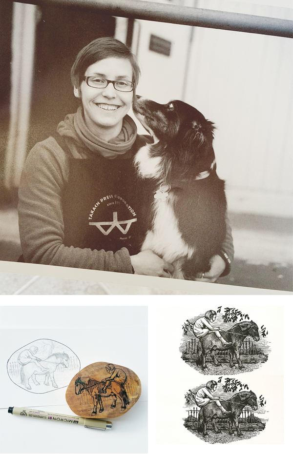
Jenny Wilkson

Claudia Castro Luna, the creator of the Washington Poetic Routes website and SVC’s Designer in Residence from 2018–2019, has this to say:

I think of the poems on this map as heartbeats. Red beats full of candor and intimacy the way only a poem can transmit. My hope is that when reading them one after the other the dots shape in the reader’s mind a new set of travel routes, a complement and an alternative to the to the road routes drawn in on the map. The green routes take us physically from Point A to Point B. Depending on how the reader clicks on them, the dots will create a new constellation of routes: emotional, spiritual routes that tap into memory, into history, into joy, into our desires and frustrations, into land, trees, fish and bird song.

My hope is that together, through our own poems of place we will have a new, different way of engaging with each other as citizens. Together we create a living map of what is like to live in this wonderful place we share called Washington State.

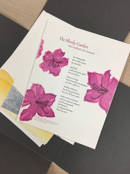
The portfolio includes a diverse representation of poems from across the state. I chose “The Rhody Garden” because not only is the rhododendron our state flower and I happen to have a whole forest of them in my backyard, but I loved the poet’s whimsical description of their bloom cycle.

This broadside was printed in 3 passes. The text and line art were printed in black with a Boxcar photopolymer plate. Then, I overprinted the black pass with a linocut, first in bright pink, then cutting away from the same linoleum block and printing it again in darker magenta—a very straightforward reduction cut!

Though I am usually so careful, somehow I managed to impale the palm of my hand with my carving tool while working on this. A quick trip to urgent care and some super glue fixed me right up, and now I have a scar to scare my students with.

Carl Youngmann of The North Press

This project involved teamwork at several levels. Arts agencies, our state’s poet laureate, Seattle’s fantastic School of Visual Concepts, and eight letterpress artists. I was one of them. And, oh—my wife and printing partner. She dove in as facilitator of the whole shebang (lots of emails, a little guidance). Everyone’s team spirit resulted in eight poetry broadsides, all collected into a stunning folio constructed by Windowpane Press.

My wife and I operate The North Press in Port Townsend, Washington. Poetry broadsides are about ninety percent of what we print. I selected Sandra Meade’s “Blackbird Sings at Night”; for its shape: tall and narrow—and because it’s a terrific Poem.

Our experience is that it’s best to start the design process with the body of the poem, to look at how it will occupy the page—what type, what size, what placement—and then the poem title and the author’s name, followed by subtitle, attributions, etc. I try to keep in mind that I’m working with someone else’s creative work, so there’s no messing with the poem’s alignment or indents. My job is to elevate the poem and not overshadow it with graphic whizbangs. That said, I’m comfortable with some sort of illustration secondary to the poem, and Ms. Meade gave me plenty to work with.

We teach a workshop called “Pixels to Print”. It’s about converting digital photographs to high-contrast art (what we used to call “camera ready”). The grass beneath the rural mailbox is an example of making a polymer plate from a continuous tone, full color photograph. With the right sequence of steps, many images—even blurry snapshots like the one we took on a road trip in South Dakota—can be converted to high-contrast and printed from polymer. For this composite illustration, I began with the grass. Then the mailbox. Then the cancellation and, finally, the bird. We had Pablo Neruda’s signature from a previous Project.

I ran black, gray, and red inks on the press. In that order. The red was the smallest plate I’ve ever printed, but there was no question that the blackbird’s wing would get its own impression. I love the poem’s reference to the mailman’s/blackbird’s “official shoulder patches”.

As I said, my broadside was only part of this project. Credit should go to Ellie Mathews for facilitating and to the other printers involved: Amy Redmond, Annabelle Larner, Heidi Hespelt, Chris Copley, Marie Kuch-Stanofsky, Jenny Wilkson, and Sukhie Patel. Midway through the process, we managed to gather for a critique session in which everyone shared their design considerations. Working in concert with these artists was both inspiring and humbling. I think I can speak for the group of us to say that we are grateful to Boxcar Press for sponsoring the project, and to Neenah Paper for contributing enough Neenah Cotton in Pearl White for the eight, 8×10 inch broadsides plus the cover sheet explaining the project. Teamwork!

Annabelle Larner

I was honored to be part of the Washington Poetic Routes: Poems of Place project. I was immediately drawn to Luther Allen’s poem, dropping down the west side of the cascades. I love the way he transitions from the mountains of Steven’s Pass (about 80 miles east of Seattle) to the ocean, and how he depicts change in the environment. And he really captured the mossy green wetness of our area. Here’s the poem: 

By Luther Allen, at Steven’s Pass
this is it. the smell of green
of damp rot, of slugs and ferns
and staggering grand trees
the smell of festering tidal flats
the burst of orcas through
a rain-matted sea.
the smell of gulls and sea lions
salmon and cedar longhouses
of pulp mills and seattle traffic
shrouded in mysterious islands
and miles and miles and miles
of raw ocean.

I always want to try new things when a project presents itself to me (sometimes frustrating myself for experimenting under a deadline!), so I thought of printing on wood because it felt right for the poem. I found a beautiful piece with whorls and knots, which looked both watery and woodsy.

For the background I mixed a mossy greenish color that had enough transparent in it to also feel layered like water. For the first pass on the wood I used a pressure print to create a mountain silhouette. This was a challenge, and took a lot of tests in order to not lose the whorls and details of the wood while pressure printing, so I ended double-inking each one.

The poem was hand-set set in the slab-serif, Stymie, which I felt befitted his words and I liked the way the type looked with the wood. I played with various layouts for the poem and was happy to stagger the title a bit, to reflect the dropping down words. 

Let’s See That Printed: Eleonore Lee’s Printing Tribute to Freddie Mercury

Sometimes the words on a person’s platemaking order just leap off the page and catch our attention. That was true with Eleonore Lee’s curving and falling text layout. Add in that they were lyrics by Queen’s Freddie Mercury and we just “had to see that printed”.  We hope this strikes a chord with you too.

Eleonore Lee's "Lover Of Life, Singer of Songs" fine art print tribute to Freddie Mercury of Queen strikes a chord with the heart.

In spring 2017, the Fine Press Book Association sent out a call for entries for their annual fundraising portfolio.  Since I already had a huge project to complete before heading off on a trip, it seemed fitting to add another project to my docket.  

Eleonore Lee's "Lover Of Life, Singer of Songs" fine art print tribute to Freddie Mercury of Queen strikes a chord with the heart.

This project was especially enticing as it would support their fine press journal, Parenthesis, and the portfolio would be shared among other printers. Last year was a year in which I was re-discovering myself after a good decade of hardcore parenting. An exchange portfolio would allow others to discover me too.

Eleonore Lee's "Lover Of Life, Singer of Songs" fine art print tribute to Freddie Mercury of Queen strikes a chord with the heart.

Like a lot of printmakers, I am a sucker for exchange portfolios. Something I particularly appreciate about letterpress and handmade paper exchanges is that they are a lot more lenient about format. The parameters for this portfolio were generous … produce 125 prints. Within these parameters, it was definitely possible to consider a less likely subject matter.

If you do not know, most often Fine Press work has a tendency to publish known and lauded dead poets. Always the contrarian, I felt like shaking it up a little with less-predictable words. My work aims to ask questions or bring attention to something you might not usually notice.  

Because music means so much to me, I have been considering making art about the music that pervades my life. Whilst at work I am known as “that person who wears their headphones and sings out loud”.  One epic late night, two BFA students and I had a lot of paper to make. We loudly sang through 2 CDs of Queen’s Greatest hits. That was my inspiration.

Eleonore Lee's "Lover Of Life, Singer of Songs" fine art print tribute to Freddie Mercury of Queen strikes a chord with the heart.

I was not a huge Queen fan in my youth, finding Freddie overwhelmingly exuberant. However, I grew into Queen. I learned the lyrics intimately in the same way that I spend a lot of time with the poems I work with. Singing along both joyfully and studiously, so that I could be as accurate as possible with the pacing and the sounds. By including the breaths, the uh’s and drawn out syllables, the project was most enjoyable.

I also revelled in the details: The paper is Neenah’s Flash Pearl Starwhite. Not only is it shiny pearlescent like some of Freddie’s leggings, but it also covers Flash, for Flash Gordon’s theme song, by Queen.

The font is Montserrat. Freddie had a dream to perform with and finally collaborated with Montserrat Caballé on the album Barcelona. And of course, I did my research: Freddie loved red and yellow, bold loud colors. The rhythm of the song is included in the yellow and red dots. They are foam dots, with 2” dots representing a full beat, 1” dots a half beat and ½” dots a ¼ beat.

I wanted a mix of more iconic images of Freddie as well as images from his videos. I chose the song because the lyrics combined with the video spoke volumes about Freddie.

He lived flamboyantly and boldly in public, at a time when being gay was a crime in most countries. In ‘I want to Break Free’ the band appears dressed as working class women. We first see Brian May wake up, with curlers in his hair, very rapidly followed by a hairy arm wearing bangles brandishing a vacuum. After a few swipes, all of Freddie scurries out boldly, staring right at the camera and gives us a brief, contented smirk before proceeding with some very sexy vacuuming (to the music). He dances and sings and winks appearing to enjoy himself a lot. It may seem run-of-the-mill today. It was bold back then, especially for a shy, cat-loving man wrestling with his sexuality. All of these words and images worked well on the tri-fold design I had in mind.

Eleonore Lee's "Lover Of Life, Singer of Songs" fine art print tribute to Freddie Mercury of Queen strikes a chord with the heart.

Although the images have enough small details and fine lines, I would never have attempted type with such fine details so I thank Boxcar Press for the plates. They also provided a fine press discount on the plates for this project.  

I hope others in this exchange enjoyed this project as much as I did envisioning and printing it.
You can learn more about Eleonore’s project with Parentheses at  FPBA.com.


Mirka Hokkanen: Linocuts and Letterpress

As a full-time mom and part-time printer, naturalist Mirka Hokkanen exemplifies the can-do printing spirit. The fine arts printer has enjoyed the challenges and joys that also come with relocation as her wonderful husband is active in the Army. The results are astounding and show the love she has for the printing tradition as seen in her beautifully detailed nature-themed linocuts and letterpress print work. We sat down with Mirka to talk shop, what it’s like to catch up with letterpress after all these years, and of course her upcoming wood engraving teaching position in Finland next summer.

 Mirka Hokkanen of Texas prints beautiful letterpress and linocut fine art prints.

THE TRAVELED PRINTER I’m a printmaker, mom, army wife, Finn, and an animal and nature lover. I was born and raised in Finland and came to the US after high school to go to college as an international student. I took a printmaking class my first semester and have been printing ever since. After my MFA, I got married to an Army guy, and we have been traveling the US (and Europe) since. Our family now consists of my husband and I, two kids, a doggie and fish.

The kids are finally old enough to be at a part time day care, and I am starting to work in the studio more efficiently. I feel like there is so much work to catch up with after being a full(er) time mom for several years. We love spending time outside (as much as the Texas heat will let us). The kids are just as interested in exploring nature as I am.   

Mirka Hokkanen of Texas prints beautiful letterpress and linocut fine art prints.

FOR THE LOVE OF LETTERPRESS There were some awesome letterpresses at the University of Dallas, where I got my MFA from. No one knew how to use them, so for my graduate work, I set some type on my own, and did embossing for a book project I had. The experiment was fun, and as a printmaker, I love all presses, no matter how they print. The seeds of letterpress were sown and I went on my way with etchings. Fast forward about six years, and several state-to-state moves. I was trying to look for a medium that was easier to move than etching equipment, but something I could get high detail in. I exposed polymer plates at home for intaglio, and was getting into color reduction linocuts. Letterpress drew me in, because of the ease of registering multiple plates. I proceeded to drive an hour and a half to take letterpress classes at SVC in Seattle and met Carl Montford who then taught and got me involved with wood engraving.   

Mirka Hokkanen prints beautifully detailed linocut prints.

PRESS HISTORY My very first press was a blue Dick Blick etching press. I used it quite a lot, but when I started getting into letterpress, I first got a tiny Sigwalt from eBay for almost nothing (because it was in horrible shape). Obviously that did not take me too far after fixing it up (I don’t think I ever printed anything with it) and within a couple years, my studio had an assortment of about 5 letterpresses in all shapes and sizes. 

Mirka Hokkanen prints on a Vandercook beautiful nature-themed linocut prints.

PRINTER ON THE MOVE Wherever we move, we do our best to get a house with enough room to have a studio in it. That way I can be at home and pop to work in the studio as much as possible. Compared to most other printers, my shop needs to pick up and move every three years, which limits the amount of things I can accumulate. I barely have any type for that reason or huge presses, and use polymer plates or carve linoleum if I need text in my work. My current studio is tiny, I can’t teach classes in it, but the best part about it is that it is right here, and I can go in there whenever I have a spare moment.

If I had to pick one thing to save in case of a fire, I’d grab my Morgan Lin-o-scribe press. I think everything else I could bare to part with or could replace. It’s like a loyal old dog: he follows me around everywhere we move, is a little shaggy and rough around the edges, waits for me patiently when I can’t get to printing for months, and makes a great impression whenever I need to get work done quickly.      

Mirka Hokkanen prints on a Vandercook beautiful nature-themed linocut prints.

THE PRINTER AND DESIGNER I’ve always considered myself a printmaker, but recently I’ve been becoming more of a proper business owner too. I come from a fine art background, so I’ve always done everything from designing the images, and carving the plates, to hands-on printing and then photographing and marketing to sell the finished product and sending them off to their new homes. 

THE CREATIVE PROCESS I usually have a mix of ideas in my head for new prints. I think it kind of looks like alphabet soup in there. Over time, I might sketch things on paper and let them marinate some more. Sometimes things will mull for over a year before the time is right to start working on them. When I finally have the finished idea of what I want to do, the execution goes pretty fast.

I often don’t sketch things too much. Many times it’s just one drawing that I might work over and over, which gets transferred onto a block and then carved. It’s fairly mechanical after the idea is complete. For multiple plate blocks, with several colors, I might do thumbnail sketches with watercolors, or scan my drawing and play with color options in Photoshop.

Cutting and printing with linocuts by fine arts printmaker Mirka Hokkannen.


PART TIME PRINTING, FULLTIME FUN
I’d say I work as an art business as close to full time as I get from the kids. I’ve done my fair share of odd jobs over the years, from adjunct teaching, to volunteering and then staying at home with kids. With the moving, my studio is the only thing that travels with me and that I can work on consistently. My dream one day is to make prints full time and have an assistant who would do some of the business end of things. It won’t be until after we settle down one day, though. It’s fun to dream in the meantime, though.

Mirka Hokkanen prints beautifully detailed linocut prints. "Mr. Carpey".

PRINTING FEATS I’m proud that I’m still printing with passion after all these years. I have more confidence than ever in my work, and have figured out how to challenge myself and grow without the consistent support of a local artist/printer/gallery community that many others have. My friends live far and wide, and the peer community who I rely on offers support through emails, phone calls, and social media groups.

On the flip-side; picking up every three years, has forced me (a sworn introvert) to become super fast at networking every time we land in a new town.  

BOXCAR’S ROLE I’ve been ordering unexposed plates from Boxcar for about 5 years now, and the service has always been flawless. I’ve even ordered a couple ready made plates, when I wanted something to turn out perfect or needed lots of detail that I didn’t want to risk exposing myself. I have some ideas for prints with larger plates, that I care not to carve as engravings, and Boxcar will be my go-to plate source at that point.

PRINTING TIPS I usually print linocuts and engravings, which in some ways is different than type. I’ve got a lot of tricks up my sleeve to get things to print right. First, I almost always prefer to ink by hand, which gives me more leverage on ink coverage, and how the paper lays on the plate while printing.

In this video, you can see I use pieces of foam on big prints to keep paper off the plate until the press rolls over it. It keeps the ink from making stretch marks in solid areas. If you use a different system, like a Vandercook or an iron hand press where the paper meets the plate differently, this wouldn’t make a difference.

Really, the biggest advice I can share is: have lots of patience and have a group of people who you can call on for advice. The best way to learn is just to do lots of it. You will have a different problem with each edition to solve, so you become really smart by the time you’re a seasoned printer. LOL! I try to keep up with a blog of tips and tricks. It’s a record for myself to remember the things I’ve done with editions and hope it’s something for students to reference also. You can find it here!

  Mirka Hokkanen prints on a Vandercook beautiful nature-themed linocut prints.

WHAT’S NEXT At this point it looks like we will be moving overseas in the middle of 2017. Packing and unpacking will take up most of the year, so I am working really hard to build up a mailing list now, and release a collection of prints in March-April before we pack up. Join the mailing list here!

Secondly, I am also really excited to be teaching a wood engraving beginners class in Finland next summer. The technique is all but died out there, so I hope to invigorate and inject some enthusiasm about engraving into graphic artists there.  

A big round of thanks out to Mirka for letting us get a sneak peak at her beautiful printing world!