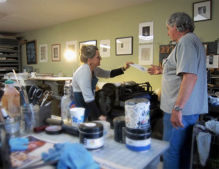
When Michael first met Patricia, she saw his printing press and said, “I’ve always wanted to have a greeting card company.” That’s all it took. Three years later, the duo has over 200 card designs via Sweet Bippy Press; a 1,000-square-foot shop, and is having more fun than adults should be allowed to have.
As co-owners, Michael and Patricia love coming up with ideas for new cards. For the last 30 years, the pair has been honing their skills—Michael in national consumer advertising and Patricia in sales and customer success. It’s a perfect match (the title of one of their card designs, coincidentally). Michael sat down with us to talk shop, vintage guitars, and a beloved press called “Vanderhalen”.
INK IN THE BLOOD “In 2002, I went on a press check at Full Circle Press in Nevada City. The owner, Judith Berliner, convinced me to buy my first press, a Chandler and Price. From the time I pulled my first print, I was hooked. Over the next couple of years, Judith went on to train me on her Windmills. She’s truly an angel”, said Michael.
PRINTING PARADISE We have an industrial space in an amazing warehouse in Petaluma, California. It’s called Watershed, and it’s a wonderfully creative building filled with fine artists, photographers, and woodworkers. We feel lucky and blessed to be here. The shop has a pretty minimalist decor. We painted the back wall PMS 137 to give it some energy. We are right on the Petaluma River. You’ll likely spot some competitive rowers, along with the resident egrets and Great blue herons.
ALL IN THE NEIGHBORHOOD Just down the block is an amazing artist, Marco Cochrane, who makes three-story-tall sculptures out of metal. We also face Petaluma River Park with a sculpture by Mark Di Suvero.
PRINTING MENTORS Judith Berliner of Full Circle Press. She’s taught me everything. Sometimes her methods are not “by the book,” but they often work better. We have fun trading printing tips.
THE CREATIVE SPIRIT “Beginning in 2023”, Michael says, “I’ve been printing full time and loving every minute of it. I approach design from my advertising experience. Then, I start with a pencil and paper (Blackwings are my weapon of choice). I find it helpful to get ideas from my brain to the page quickly. The winning sketch gets redrawn (often in Illustrator) and finally, good old polymer plates. I sometimes dream about having cabinets full of type, but I just don’t have the room.”
PRINTING FEATS I’m proud of our “Famous Guitar” series of greeting cards. Each features a different guitar from some of my favorite musicians. There’s Willie’s old Martin “Trigger,” George Harrison’s “Rocky” Stratocaster, and a bunch more. They are unique in that they are scored on the short side so that you can open them up and see the entire instrument. They also come with a custom Sweet Bippy pick.
PRESS HISTORY Our first press was a 1905 Chandler & Price platen press.
In addition to the C&P, we own three Heidelberg Windmills, two for ink printing and one—named “Metallica”—which is dedicated to foiling and die-cutting. Our latest purchase is a Vandercook No. 4, which we call “Vanderhalen”, says Michael.
BOXCAR’S ROLE Michael recalls, “When I started out, I didn’t have much of a printing network, and I was craving information. Boxcar’s site is chock full of great tips and information. I was an early adopter of Flurry paper—I think you offered it as a Kickstarter at the beginning. I love that paper. And the Swing Away Lay Gauge is amazing. All three Windmills have one. (Currently, one of them is hiding in the dark cavity below, but I will rescue it one of these days.)”
PRINTING TIPS 90% of printing issues are ink-related, so start light and add slowly!
WHAT’S COMING NEXT We keep adding to our Northern California collection of cards, and this year we plan to expand to SoCal and perhaps other states.
Bright pops of color, clean designs, and a hearty dose of whimsical humor can be seen in the letterpress works of Ryan Tempro (and team!) at M.C. Pressure. The Florida-based printer sat down with us to talk shop about Kelsey tabletop beginnings and expanding out with new presses & custom-printed works in tow. Read on to hear about the satisfying pride that goes into seeing the printed pieces being transformed into one-of-kind crafted pieces.
PRINTING IN THE SUNSHINE STATE M.C. Pressure is a print shop in St. Augustine, Florida specializing in letterpress, foil stamping, die-cutting and embossing. I started the company in 2014 after printing a couple years at a small stationery shop while I was in college. We have a lot of capabilities for a small shop. It’s been exciting to see the clients we’ve been able to work with and the creative things they come up with! We also design and create our own line of products that range from greeting cards to coasters to notepads and more.
INK IN THE BLOOD I first learned about letterpress and what it was while going through the graphic design department at Flagler College, here in St. Augustine, Florida. I was able to get a job at a local stationery shop operating their 8×12 Chandler and Price. I fell in love with the tactility of letterpress and being able to create something with my hands and away from the computer.
After I graduated from college I spent a summer in New York for an internship with an artist and was exposed to a lot of different print and production methods. When I returned I started a job at a screen printing shop that had an old Kluge for die-cutting decals. My boss saw my interest in the machine and introduced me to a friend of his who was an old timer in town who ran letterpresses for years.
He had a few small tabletop Kelsey presses that needed some work, but had all the parts! I bought them and cleaned them up and started a little shop on the side when I had time and clients. Over the next few years, I grew from a little tabletop press to several larger presses and a full time shop for myself and a couple of employees!
PRINTSHOP PARADISE Our shop is a modest 1300-ish sq/ft warehouse. We have a 30″ Challenge Paper cutter, an Orbital 8 Poly Plate Maker, 2 Heidelberg Windmills 10×15, 1 Heidelberg GTP 13×18, and 1 Heidelberg KSBA Cylinder Press. I love the capabilities we can accomplish with these machines. They are incredible workhorses. Some days they can be very temperamental, but overall they are wonderful and I’m very fortunate to have the machines I do. My favorite is probably the KSBA, it’s such an accurate press in all aspects of register and inking. I’d be lying to say as a printer that I didn’t love to print large, and that press allows us to really work on a larger format.
Our shop is located in St. Augustine, Florida which is the nation’s oldest city. It’s also a pretty small area so the community as a whole has been very accepting and welcoming of us and our small business. St. Augustine has a lot of rich history and a lot of great local makers and restaurants… a lot of which we’ve become friends with over the years. It’s truly a great community to be in support of and help others follow their passions.
CHILL NEIGHBORHOOD We have a city guide online for sale with a lot of our favorite places. The downtown area is where a lot of people visit when they come into town, though it’s also filled with the most touristy things in town. We are off of the West King Neighborhood and we love it! I’d say if you’re in town check out the Blue Hen Cafe for breakfast or SunDay. Dos and The Kookaburra for coffee. Juniper Market for a snack. Really there are so many great spots in town!
PRINTING MENTORS The print community as a whole has been very helpful. I’d say our biggest contacts are Dan over at Clove St. Press. He is probably one of the best I’ve seen, and I have to include Matt at Matte Gold in Australia. They also have GTP Foil Windmills and were a huge help in learning more about that machine specifically. I always love seeing the content and machines running from Studio on Fire and their capabilities are truly incredible. We have a shoutout to Letterpress Mechanic and Chris at FI Letterpress as well for troubleshooting. Really, there are folks all over we keep in touch with and love to see work from.
FULL TIME FUN I started M.C. Pressure in 2014 and worked on it part-time until the beginning of 2017 when I went full-time with it! I can say that I honestly love my job and love what I do.
THE CREATIVE ENERGIES I went to school for graphic design so some things are still designed by me. At the moment though most of my time is spent on press and business admin tasks. We have an employee, Lauren, who focuses the most on graphics for us. She graduated from Flagler College as well. We use a lot of digital processes in the work-flow. We use the Apple iPad and Pencil for a lot of the illustration work and typically finish up type in the computer through the Adobe suite.
We usually think up a funny idea and work on visualizing it. Or we have an image we want to create and work to create a use for it. Sometimes we get feedback from customers on looking for a type of product or more of a certain type of thing and can work to make them. For example, more birthday cards, or something to say I like you, but maybe don’t love you quite yet.
PRINTING FEATS Hmm, I’m always really proud of the packaging projects we work on here. Seeing the printed pieces being cut down and transformed into a three-dimensional object is always so satisfying. Most recently we printed a pretty complex and accurate carton for Hellcats USA for their Devilish Scent. A black outer sleeve with matte red foil and a red tonal letterpress printed on red for the inner carton. It had a cutout that needed to line-up perfectly with the print inside, and assemble to be snug enough to hold itself together. Clark Orr worked on the dieline and he truly nailed it with this project!
PRESS HISTORY Our very first press was a 5×8 Kelsey Table Top. It was a great start, but thank goodness we don’t have to work on such a manual press anymore!
BOXCAR’S ROLE In the early days of us starting out, we used Boxcar Press for all things! We got a set of inks, letterpress base, printing plates, and would use their resources to help figure out how to use the machines we acquired over the years. Though we don’t use Boxcar Press much these days, they were a huge help in getting us started on projects and understanding the things we use.
LETTERPRESS TIPS It isn’t always possible, but I almost always print with crop marks. I know it makes for a larger plate and paper size AND requires trimming. However, It really saves so much time, I think, on press to be able to utilize the grid on the Boxcar Base. It also allows for what I think is easier spotting if things start to bounce or get out of register.
WHAT’S COMING NEXT Over the last couple of years we’ve acquired various pieces of machines. This year we hope to not do that as much and really focus on the things we have to be as streamlined and efficient as possible! We don’t have a dedicated retail space, but we are working on some ideas to change that and hopefully get things out there more in our community!
A double round of applause & thanks out to Ryan Tempro at M.C. Pressure for letting us take a sneak peek at his wonderful plus fun printing realm!
Printing on press is as much a personal creative time as it is an experience you just can’t wait to share with others. This is an observation from Thom Caraway of the Spokane Print & Publishing Center. The full-time teacher and Center organizer has enjoyed creating a space where all interested in the craft could roll-up their sleeves and get inky. We spent time with Thom to talk shop, and to see how the printing world in Spokane is being discovered by others at their printing paradise.
GEARING UP FOR PRINTING ADVENTURES I’m a university English professor in Spokane, Washington via Whitworth University. I write poetry and teach classes in editing, book design, and print culture.
In 2015, I inherited a C&P from a printmaking professor who didn’t want it in the school art studio anymore. I was excited about it but had no idea what to do with it (or even how it worked). Shortly after, I met Bethany Taylor, who was getting her shop off the ground, and we decided to make a place where neophytes could come learn. She’d been to the Independent Publishers Resource Center (IPRC) in Portland, and we modeled ourselves off of their space and got going.
PRINTING CENTER COMMUNITY We closed Iteration one in 2018 when our lease ran out, and moved into the new space as Spokane Print & Publishing Center in 2019. With the bigger space, we were able to add more presses and expand from letterpress and screenprint into relief and etching as well. Later, we added book arts and digital design and printing. My favorite thing is when there are members spread out across the shop all working on different awesome things, especially if several presses are going at once.
ALL IN THE NEIGHBORHOOD We’re a 5-minute drive from the Kendall Yards neighborhood and the Spokane River. Downtown is just across the river, so we are close to food and shopping.
PART-TIME PRINTER, FULL-TIME FUN This is a side hustle from my day job teaching. I would love to get to a point where I could print full time though.
THE CREATIVE PROCESS I’m becoming more of a planner, but mostly I’m a seat-of-my-pants designer. I like seeing what happens with different applications of color, and big messy press beds full of wood type. From there, I might layer in a quote or phrase, or play around with the letterforms of larger wood type to see what happens.
PRINTING FEATS Making a more formal turn from writing to printing in the last four years has been a lot of fun, if a little nerve-wracking at times. But mostly I’m proud of our little shop. We’ve weathered COVID well, and offer classes pretty much every week now. I feel like we’re really developing Spokane’s appetite for the print and book arts, and training up a bunch of new printers!
PRESS HISTORY I have that first press – a C&P Old Style with a broken flywheel axle. Have still never gotten that thing fully functional.
BOXCAR’S ROLE We’ve gotten a bunch of ink from Boxcar, and had some plates made. And we’ve been meaning to order some logo plates, too!
PRINTING TIPS & TECHNIQUES I print mostly now on a Vandercook 14, which is really basic, so no ink rollers. Everything is applied by hand. My advice for letterpress printers is don’t be afraid to mess it up a bit. I love a nice clean print as much as anyone, but I’m also really interested in the accidents and goofs. Those are usually my favorites.
WHAT’S COMING NEXT I’ve got a full slate of letterpress classes spread through the year. I am hoping to grow our membership base once things open back up, and continue developing our Print Town USA events, which get the public into the shop for sales and demos, and are just a lot of (socially-distanced) fun.
A double round of applause & thanks out to Thom of Spokane Print & Publishing Center for letting us take a sneak peak at the wonderful community-driven printing center!
Kate Guy is a London, UK-based linocut and fine printmaking artist. She incorporates bold use of flora, fauna, colors and her cat into her works. From early beginnings at the press in her family’s workshops to enjoying where the creative process takes her, Kate shares how she is carving out her own printing path.
BOLD LINOCUTS, GRACEFUL ART I live and work in London UK, I trained as a graphic designer but now I am doing what I love most. I am a printmaker working with traditional techniques on paper and fabric. My main subject area is illustrated recipe linocuts. My unique system uses individual ingredients prints which I combine to make recipes, which I then turn into quality homewares. My designs are boldly graphic and colorful giving them a modern feel whilst also celebrating a strong tradition of print and quality in British manufacturing. My products are all designed by me and made in the UK, everything is printed on organic cotton using eco-friendly inks to be as kind to the planet as possible.
EARLY BEGINNINGS My father was a graphic designer and he bought a Victorian printing press in the 1960s which fascinated me as I was growing up. I first used it when I was 7 – see comments below.
I have built up a collection of wooden type which I use to create signs and posters and also combine with my linocuts. I guess my first proper project was at Art School in the 1980s where I really began my obsession with typography.
PRINTING IN THE UK I print in my studio in Camden, my favorite thing has to be the vibrant area and the light. The studio has windows all down one side and looks out over the rooftops of North London. When I’m printing on a larger scale I go to my mother’s studio in Putney, South London. My mother is an artist and has our lovely old cast iron Victorian Albion printing press from 1857 at her studio as well as an etching and a lithography press.
LONDON LIVING My studio is in Camden, North London – famous for its trendy market and boutique shops. Once a mecca for punks and goths – you can still see a few around these days and the market still retains much of its original independent charm having (so far) resisted the chain stores and high street homogenization.
I also have the whole of London on my doorstep to use as inspiration, with its wonderful galleries and museums – most of which are free.
PRINTING MENTORS I love the work of the English linocut artists from the early 20th century – people like Edward Bawden, Eric Ravilious, and Cyril Power from the Grosvenor School. My father, although he died when I was only 9, is still a source of inspiration. It is thanks to him that we have our Albion press and I believe he instilled a love of the traditional techniques in me.
PRINTING FULL-TIME FUN Yes! Well… I do in theory, but I seem to spend most of my time these days doing marketing – I have just ‘finished’ my website. I was an Art teacher in secondary (high) school until 5 years ago when I quit following my dream of being a full-time printmaker and designer.
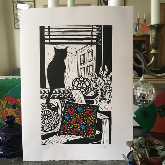
THE DESIGN PROCESS All my designs start with drawings, usually from life but sometimes I work from a photo. I have made a film about my process – from initial idea to the final edition of prints created during the recent lockdown (seen here: ‘Lockdown Cat with Mexican Cushion’).
PRINTING FEATS Too many to list here! (ha ha, no not really).
I have done lots of different things in my life; I’ve been a graphic designer, animator, illustrator, glass artist, teacher, and mother to name a few. Now I have the time to be the printmaker and designer which I think I was always meant to be.
PRESS HISTORY I grew up in a house with two studios – one for my mother and one for my father and a beautiful old Albion press. On this press, I made my first linocut and letterpress print aged 7, ‘Ereh si a tac‘. Basically, as a know-it-all 7-year-old, I wouldn’t be told how to lay out the letters to go with my little linocut of a Cat…
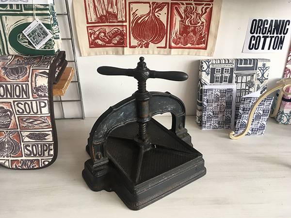
The first press I bought myself was a Victorian book press which I found in a ‘Marche au Puce’ (Flea market) in the South of France.
BOXCAR’S ROLE I find your work and ethos inspirational and was delighted to be asked to complete an interview for you. Sadly I am a bit far away (London UK) to visit in person at this time. I also share your obsession with heavy antique printing equipment.
PRINTING TIPS Always keep your dirty area and your clean area separate and use folded paper ‘tongs’ to pick up your paper for printing. I always get very messy printing (one of the fun parts) usually with ink on my face and everywhere else, but there is nothing more annoying than a perfect print with a big old thumbprint on it!
WHAT’S COMING NEXT My plans have been very much affected by the pandemic. I had lots of live events planned, I had taken a stall with a demonstration area at shows across the South of England, a couple of these are still holding out but most have been canceled. I am hoping we will be able to be back to normal for this upcoming Christmas season.
I was also planning lots of printmaking teaching and workshops in my studio but…[unusual times have happened].
Michele Burgess of Brighton Press is a fine arts book artist, creative soundboard, and part-time university professor who loves to share printing with those around her. For three decades, Michele and her husband have been enjoying the fruits of their collaborative efforts one pulled print at a time.
AN ARTIST BY NATURE I am a visual artist obsessed with working in book form. My husband, Bill Kelly, founded our press in 1985 and it has morphed and grown before our eyes.
THE LURE OF LETTERPRESS I went to the Cranbrook Academy of Art for my MFA in the mid-’80s. There was a very funky letterpress there and small, crumbly piles of type. I enjoy the intentionality, the craft, the beauty of its collaboration with paper.
CREATIVE COLLECTIVE We are a small band of like-minded people using the studio as a creative laboratory. We create and publish collaborative artists’ books that braid the visions of both poets and visual artists. Everything is original and achieved by hand.
Bill Kelly, who founded the press, Nelle Martin, associate director/production designer/letterpress printer and I collaborate creatively with whoever the artist and poet might be. Most often, one of us is one or the other, or, in Bill’s case, both. We also often collaborate with papermakers such as those at Twinrocker, Cave paper, and the Morgan Conservatory to get a certain color or weight that we’re looking for.
Sonja Jones, in her 80’s and a previous librarian, has been a guardian angel and does our boxmaking. Kathi George, our crackerjack copy editor who makes sure we don’t have a plate made with a typo in it. Jenny Yoshida Park also works closely with us on typography and website and catalog design.
Recent poets include Bill Kelly, Chard deNiord, Bianca Stone, and Martha Serpas. Recent artists, besides myself and Bill include: Jinane Abbadi, Ian Tyson, Miya Hannan, Jenny Yoshida Park. A full list of artists and writers can be found on our website—34 years worth.
Sometimes we work with outside bookbinders Mark Tomlinson, Claudia Cohen, and Lisa Van Pelt, who have added creative ideas to the bindings. There’s a lot of back and forth regarding structure and content until it all melds together.
My favorite thing about it is that we never know what the final outcome will be until the B.A.T. (from the French phrase “bon a tirer” — good to pull. The subsequent prints should look like that one) is complete and that we can never remember whose idea certain things were. Synergy.
COAST-TO-COAST PRINTING We are bi-coastal now. We do most of the production in San Diego, which is getting a little less cool every year, and we do a lot of the creative work in Vermont in relative solitude. We also work in other artist’s studios sometimes or at the dinner tables of our writers.
PRINTING MENTORS Gerald Lange, Michael Bixler, Robin Price, Walter Hamady have been my letterpress mentors. William Blake, Sonja Delaunay, Ken Campbell, Anslem Kiefer, and Barbara Fahrner have been my book art mentors. The poets I work with inspire me. I get energy and fortitude from my collaborators at the press.
PART-TIME PRINTING, FULL-TIME FUN We decided years ago not to require the press to support us physically, so we teach at universities part-time.
THE ARTISTIC PROCESSES I start a book from a small kernel of inspiration which is always mysterious in its origin. Sometimes, the poet is my muse or his/her words. From there, I usually start working on visual images that expand on, rather than illustrate the text. The best scenario is when the poet and I are working together from a kernel and we’re spinning a web together.
PRINTING FEATS I’m proud of the meandering path we’ve taken, despite the hardships. With regards to a project: A Woman Hit by a Meteor. Our paper was MUCH too large for the press, so we folded it and through that limitation were able to imbue it with a sensibility of folded maps in ancient, celestial atlases.
PRESS HISTORY Vandercook 219, old style. I love the Vandercook, the sound, the weight, the intuitive simplicity of the machine.
BOXCAR’S ROLE Boxcar has helped us realize some visual formats that we couldn’t have done with lead type. Also, we were able to create Arabic calligraphy, Chinese and Japanese text that we couldn’t have done otherwise. Boxcar has been super-efficient, patiently helpful, both with my classroom needs and for Brighton Press.
PRINTING TIPS: Perhaps a useful letterpress printing technique? Slightly more punch, less ink.
WHAT’S COMING NEXT A book called WHERE AND HOW BLOOD WAS MADE with poet Chard deNiord. It will be my most complex book to date.
L’Imprimerie Bâtard is a Northeastern France-based letterpress printshop that enjoys working with handset type and learning as much as they can. Pauline and Gaëtan work and breathe letterpress in their printshop where they blend old-world craftsmanship with a daring for experimenting.
(A note for our readers: This article appears in both English and French for all lovers of letterpress to read! The French translation appears in italics. Huge round of applause out to Pauline and Gaëtan for the French translations!)
PRINTING IN FRANCE L’Imprimerie Bâtard -literally The Bastard Printer’s- is a new design and printing workshop in Nancy, France run by Pauline (24 yo) and Gaëtan (35 yo). We are hosted by a youth and cultural center called la MJC Lillebonne, which is super cool because it makes our everyday life at work very lively.
L’Imprimerie Bâtard -littéralement Bastard Printer’s- est un tout nouvel atelier de design et d’impression à Nancy en France géré par deux personnes : Pauline (24 ans) et Gaëtan (35 ans). Nous sommes hébergés dans une Maison de la Jeunesse et de la Culture, la MJC Lillebonne, un lieu super cool qui met plein de vie dans notre quotidien.
LETTERPRESS BEGINNINGS Pauline discovered letterpress during her fine arts studies, which she completed last year. Her school had a letterpress workshop led by a specialized teacher so she had the opportunity to learn the basics of the letterpress technique in different contexts such as personal editorial works or workshops that her teachers used to organize.
Gaëtan founded a nonprofit publishing house several years ago so he already knew a bit about graphic design and printing. He first practiced letterpress at his friends’ printshop. They had organized a week to produce a gazette combining text and illustration only printed by hand. They had invited other typographers so this first approach of letterpress revealed to be very enriching to him.
Pauline a découvert la typographie manuelle lors de ses études aux Beaux-Arts, qui se sont terminées l’année dernière. Dans son école, il y avait un atelier géré par un professeur spécialisé, elle a donc pu apprendre les bases de la technique dans différents contextes : des projets éditoriaux personnels ou encore des ateliers organisés par les professeurs.
Gaëtan, lui, a fondé une maison d’édition associative il y a plusieurs années, il avait donc déjà été au contact de l’univers du graphisme et de l’impression. Il a pratiqué la typographie pour la première fois dans l’imprimerie d’amis à lui. Ils avaient organisé une semaine pour créer une gazette mélant texte et illustration complètement imprimée à la main. Ils avaient invité d’autres typographes, cette première approche a donc été très riche en découvertes et en apprentissages.
THE PRINTSHOP One of our favorite things about our workshop is also one of the things we hate the most: it is very small. When people visit us, we like to tell them that we have the smallest printing atelier in the world. On the one hand, it makes the atmosphere warm and cozy. The office part, with its old desk and granny carpet, definitely makes us feel at home. On the other hand, a so small working place requires loads of tricks to optimize the storage of our tools and equipment.
Une des choses que nous préférons à propos de notre imprimerie est également une des choses que nous détestons le plus : elle est très petite. Quand nous faisons des visites, nous nous amusons à dire que c’est la plus petite imprimerie du monde. D’un côté, ça donne une ambiance chaleureuse, cosy. On s’y sent à la maison, surtout dans la partie bureau où il y a une vieille table et un vieux tapis. D’un autre côté, une si petite surface de travail nous oblige à redoubler d’inventivité pour optimiser le rangement de notre matériel.
HISTORIC NEIGHBORHOOD Absolutely. The cultural center accommodating us is based in an old private hotel built during the Renaissance, so the place is very picturesque. Another cool thing about this center is that it is so huge that it has many different arts and crafts workshops, such as engraving, bookbinding, drawing, silkscreen printing, pottery, sculpture.
We are surrounded by many interesting practices and crafts. Also, the whole neighborhood is the oldest part of the city and certainly one of its most beautiful areas. It covers many wonderful Renaissance landmarks, like a Gothic church, a ducal palace turned into a museum and ancient city gates.
Tout à fait. La MJC qui nous loge est basée dans un ancien hôtel particulier construit à la Renaissance, le bâtiment est donc très pittoresque. Ce qui est aussi génial dans le fait d’être hébergés dans une MJC aussi grande, c’est la quantité et la diversité des ateliers d’artisanat qui y sont proposés : gravure, reliure, dessin, sérigraphie, poterie, sculpture… Nous sommes entourés de pratiques et de savoirs tous plus intéressants les uns que les autres. Au delà du bâtiment en lui-même, le quartier entier est une des plus anciennes parties de la ville et sans doute une des plus belles. Il comprend de nombreux monuments datant de la Renaissance, comme une église gothique, un palais ducal transformé en musée, ainsi que les anciennes portes de la ville.
PRINTING MENTORS Our inspirations are diverse and come from different movements: absurdism and Oulipo (a French movement about constrained writing) for the writing of the texts, and some graphic designers who played with letterpress such as Robert Massin and Jan Tschichold for the design part of our work. We wouldn’t say that we have specific “mentors” but we had the opportunity to meet some old printers and typographers who learned letterpress as a craft and they gave us some advice. We also usually save good printing ideas we find on the internet, mostly on Instagram, and try to reuse them in our work.
Nos inspirations sont variées et nous viennent de différents mouvements: l’absurde et l’Oulipo (un mouvement français d’écriture sous contrainte) en ce qui concerne l’écriture des textes, et plusieurs graphistes ayant joué avec la typographie comme Robert Massin et Jan Tschichold pour la partie création de notre travail. Nous ne pourrions pas nommer de réels “mentors” mais notre travail se base à la fois sur les bonnes idées que nous trouvons sur internet, notamment sur Instagram, et sur les précieux conseils des quelques imprimeurs typographes dont c’est le métier que nous avons eu la chance de rencontrer.
FULL TIME FUN Yes, we do [full time] ! It’s been 6 months since our atelier was set up. At the beginning, we wanted to do it as a pass-time in our garden shed, but when we had the opportunity to buy our press and our first cases, it became obvious for us that we would make it our new job.
Oui ! Ça fait 6 mois que notre atelier est installé. Au début, nous voulions faire de la typographie un passe-temps et occuper l’atelier au fond de notre jardin, mais quand nous avons eu l’occasion d’acheter notre presse et nos premières casses, ça nous est paru évident que nous en ferions notre nouveau métier.
DESIGNING A CUSTOM PIECE. The first step of our design process is the phase of creation, which includes the writing of the texts and the making of the illustrations (we mainly use linocut). Then, we compose the texts we wrote, testing different types: metal types for the body of the text and wood types for the titles. We’ll try (as much as possible) to avoid using plates and linotype to keep our work the more handmade. After choosing the most coherent characters in relation to the project, we print the texts and illustrations on transparent plastic paper on our proof press so that we can modulate the elements and decide on the final layout. We got this trick from our friend Guillaume Guilpart, who is a typographer at a workshop called Paris Print Club. We also take advantage of this step to do an orthotypographic correction of the texts. We make the color and paper choices and finally we can print on our bigger press.
La première étape de notre processus de design est la phase de création, c’est-à-dire l’écriture des textes et la réalisation des illustrations (nous utilisons avant tout la gravure sur lino). Ensuite, nous composons les textes en testant plusieurs typographies : les caractères plomb pour le labeur (autrement dit le corps de texte) et des caractères en bois pour les titres. Nous essayerons au maximum de nous passer de clichés et de linotypie afin de conserver l’idée d’artisanat. Après avoir choisi les typographies les plus cohérentes avec le projet, nous imprimons les textes et les illustrations sur du papier rhodoïd sur notre presse à épreuve afin de pouvoir agencer les éléments entre eux et décider de la mise en page finale. Cette astuce nous a été donnée par Guillaume Guilpart, un ami typographe à l’atelier Paris Print Club. Nous profitons également de cette étape pour faire la correction orthotypographique des textes. Nous faisons un choix de couleurs et de papier et nous pouvons finalement imprimer sur notre plus grosse presse.
PRINTING FEATS Above all, we are proud of our atelier. Just one year ago, we had no idea that it would be so thriving and fulfilling today, that we would have so many tools and materials to work with. It has been a lot of work and we’re still motivated to make this place more enjoyable and more practical. We also consider all the knowledge we got these past months just by practicing our passion and by meeting people with whom we share that passion as a big accomplishment. We can almost say that we are self-made typographers and that definitely rocks.
Moreover, this past year, we had the time to work on two big creations that we would like to point out. First, we designed a numerical font using the software Glyphs (and the precious help of a type designer friend) and we made a wood type of it using a laser printer. We called it “la typo bâtard” (“the bastard font”) in reference to our printer’s name. The second work we’d like to talk about is a poster we did for “la Fête de l’Estampe” (the National Print Day). It is composed by two prints of wood planks, a long text in two columns above these prints, which is the page of the dictionary that contains the word bâtard (bastard), and an extract of this page as a title covering a bit of the text and printed with wood types.
Nous sommes avant tout fièr·e·s de notre atelier. Il y a tout juste un an, on ne s’imaginait pas que tout s’y passerait aussi bien aujourd’hui, qu’on aurait autant d’outils, de matériel de travail et d’opportunités. Ça a été beaucoup de boulot mais nous sommes toujours aussi motivés à rendre cet endroit le plus agréable et le plus pratique possible. Nous considérons également comme un accomplissement tout le savoir que nous avons acquis ces derniers mois simplement en cultivant notre passion et en rencontrant des personnes avec qui partager cette passion. Nous pouvons presque dire que nous sommes des self-made typographes et c’est trop cool.
En plus de ça, cette année, nous avons passé beaucoup de temps sur deux créations en particulier dont nous aimerions parler. D’abord, nous avons dessiné une police de caractères numérique sur le logiciel Glyphs (et grâce à la précieuse aide d’un ami dessinateur de caractères) et nous en avons fait une série de caractères en bois avec une graveuse laser. Nous l’avons appelée « la typo bâtard » en référence au nom de notre imprimerie. Le second travail dont nous aimerions vous parler est une affiche que nous avons réalisée pour la Fête de l’Estampe. Elle est composée de deux empreintes de morceaux de bois, d’un long texte en deux colonnes sur ces empreintes, qui reprend la page du dictionnaire qui contient le mot « bâtard », et un extrait de cette page comme titre, qui couvre une partie du labeur et imprimé avec des caractères bois.
PRESS HISTORY Our first press is a big red flatbed cylinder press, a Korrex press manufactured by Simmel in 1969. This specific model is called “Berlin”. But we mostly call it by its pet name: Simone.
Notre toute première presse est une grosse presse rouge à cylindre, une Korrex fabriquée par Simmel en 1969. Ce modèle s’appelle « Berlin ». Mais nous l’appelons principalement par son petit surnom : Simone.
BOXCAR’S ROLE We’re grateful to Boxcar Press for their interest in our little printing house. We were glad to see that the passion for letterpress could cross the borders between different countries. It was a pleasure to read their blog and discover so many other printers and their techniques. They provide a really extensive and necessary work of investigation about letterpress. As far as we’re concerned, their questions enabled us to look back at the past year and to realize what we have achieved until now. So we can thank them for the dissemination of this article about us and for letting us translate it to share it with our French community.
Nous sommes reconnaissant pour l’intérêt qu’a porté Boxcar Press à notre petite imprimerie. Nous étions enchanté·e·s de voir que la passion pour l’impression typographique pouvait traverser les frontières. Ça a été un plaisir pour nous de lire leur blog et de découvrir autant d’autres imprimeurs ainsi que leurs techniques. Ils proposent un travail d’investigation du monde de la typographie vraiment complet et nécessaire. En ce qui nous concerne, nous avons pu, en répondant à leurs questions, faire le bilan de notre année passée et nous rendre compte que tout ce que nous avions accompli jusqu’à maintenant. Nous pouvons donc les remercier pour la diffusion de cet article et pour nous avoir permis de le traduire afin de le partager avec notre communauté en France.
PRINTING TIPS The most important advice that we could give is to try things. Letterpress is an open door to a world of creation with a lot of variables: characters, colors, shapes, layouts. They are some fundamental rules to respect such as the type height, but once you’re sure about these basics, you’re completely able to explore, imagine, make, invent new things. That was the case when we had the idea to print pallet planks to draw the shape of columns in the background of our poster… After all, why not?
Le conseil le plus important que nous pourrions donner est d’essayer des choses. La typographie est une porte ouverte à un monde de création avec des tas de variables : les caractères, les couleurs, les formes, les mises en page… Il y a certaines règles fondamentales à respecter, comme la hauteur typo, mais une fois les bases intégrées, on peut complètement se permettre d’explorer, d’imaginer, de fabriquer et d’inventer de nouvelles choses. Ça a été notre cas quand nous avons eu l’idée d’imprimer des planches de palettes pour dessiner la forme de colonnes en arrière plan de notre affiche. Après tout, pourquoi pas ?
WHAT’S COMING NEXT Our main plan for the upcoming year is to open our atelier to people and to give letterpress lessons. Starting from January 2020, we’ll give a three-hour lesson twice a week. In addition to that, we’ll try to organize workshops over one or several days in our atelier, sometimes soliciting the other arts and crafts workshops of our big house in order to provide an overview of the process for making a real printed object by hand. We would also like to offer classes outside our workshop, in other cultural or specialized structures such as schools, with our little proof press and some previously selected characters. We are absolutely willing to share our know-how, especially from the perspective of doing popular education.
Notre principal projet pour l’année qui arrive est d’ouvrir notre atelier aux gens et de donner des cours de typographie. À partir de janvier 2020, nous donnerons des cours de trois heures deux fois par semaine. En plus de ça, nous essayerons d’organiser des ateliers sur un ou plusieurs jours dans notre imprimerie, parfois en sollicitant les autres ateliers d’artisanat de notre grande maison afin de donner un aperçu du processus de fabrication d’un vrai objet imprimé à la main. Nous aimerions aussi proposer des ateliers en dehors de notre imprimerie, dans d’autres structures culturelles ou spécialisées comme des écoles, avec notre petite presse à épreuve et quelques caractères préalablement sélectionnés. Nous sommes complètement partant·e·s pour partager notre savoir-faire, notamment dans une optique d’éducation populaire.
Debra Barclay of Ancora Press is a well-travelled printer who was inspired by the work of William Blake. She creates in her garage-turned-printshop and shares with us her lifelong printing mentors / friends she’s made along her print journey (as well as a favorite printing moment involving a Girl Scout Troop and a Vandercook).
WASHINGTON STATE PRINTER
My name is Debra Barclay, and I am a letterpress printer in Woodinville, WA. I live in Woodinville with my husband, 7-year-old daughter, 6-year-old son, 6-month-old Labradoodle, and two pretty lucky black cats, Uno and Tres. I’m a New Jersey transplant by way of Brooklyn, Virginia, Rhode Island, and Oregon. My favorite color at the moment is PMS 310 (light teal).
THE LURE OF LETTERPRESS
For my undergraduate degree, I attended Providence College in Rhode Island. My degree is in English Lit/Creative Writing and Printmaking. My senior year, I took a course on Romantic Literature and fell deeply in love with William Blake’s work. William Blake was a poet and printmaker who developed techniques to bring his poetry into a more visual realm. He combined text and image in a way that I had never seen up to that point. His poetry became visual as much as text-based, and he made it so the poem’s meaning was directly enhanced by the calligraphic lettering, colors he chose, and the overall design. In this way, he elevated the printing of information into a visual experience rather than just a transfer of data. At that point, I knew that I had to integrate my two passions: creative writing and printmaking.
After I graduated, I started looking into bookmaking classes. I found a school that had a very small but well equipped Book Arts Program. This was when I found the Oregon College of Art and Craft. I immediately enrolled in a few classes, packed my bags, and moved to Portland.
I really didn’t know what I was getting into, as far as letterpress printing goes. But there I was, learning to handset type and run a Vandercook under the tutelage of two women. Kathy Kuehn is a master printer at Pace Editions in NYC and Caryl Herfort, a letterpress printer from Texas who was there as the Artist in Residence. Many may know of Caryl from Roto Press (Rest in Peace, Caryl). Both of these women inspired me to experiment and play with the medium.
A CREATIVE ADVENTURE
As I continued to set the type for a short story I had written, my mind exploded. It was so crazy to be able to touch thoughts and ideas – letterforms as material objects with a history and life of their own just struck me on a very philosophical level. I then locked up my form in the school’s Vandercook Universal, and ended up a bit deflated. This was off course from my Blake path, as Blake didn’t use handset type in his work, possibly for this reason. Yes, typesetting is intimate, but once it gets on press and you print it with great craftsmanship, it does not show any of the depth or meaning that it had taken on when I handled it.
It was much more sterile and generic than I had envisioned my piece to be, given how emotionally and physically closer I had become to the words. This created some friction between me, the machine, and process. I moved my printing over to a hand rolled proof press, where I was determined to get the “hand of the maker” involved. Then, I hand-inked each pull, and ran the pages through one by one, skewing the registration so they would all be unique.
I actually still have a scar from this very first print run I did, as my thumb got caught in the cogs of the press as I was enthusiastically running pages through. The end result was a very artistic interpretation of letterpress! I created an art installation with the small edition of books I made with this experiment. I filled three walls of a gallery with the pages, and set up three of the spiral bound books on pedestals where viewers could flip-through the pages. The only requirement was that they wear white gloves, as is common practice when looking through fine press books.
However, the white gloves I provided were covered in black printers’ ink. So, the viewer/reader added and changed the book as they engaged with it – a visual representation of how we all change and alter language as we use it. It becomes a relationship where both parties – the ideas/text/ poetry and the reader/viewer – are changed through the interaction. We are all changed in sometimes undetectable ways by every interaction we have.
I then began to approach letterpress a bit differently, and started to think more about how words are laid out on the page, how the colors might interact with one another either through size, proximity, or overprint. I also started to notice the beautiful impression that letterpress machinery gives to the paper, making the text both a visual AND tactile experience for the viewer/reader.
A LETTERPRESS CONNECTION
Through this experience, I reconciled and truly fell in love with the exacting nature of letterpress machinery. It was through these experiments that I concluded that when I create, I am collaborating WITH the machine. With this finely engineered letterpress machinery, the ability to disseminate information in a way that allows for the content to be given the entire spotlight would now be possible. We are true partners. With that, my deep connection with letterpress continued to grow and develop into where it is today. I utilize the impeccable precision of the machinery to allow me to elevate letterforms, words, ideas, and everyday life moments into experiences with tactile beauty and time-tested craftsmanship.
HOME GROWN PRINTING
Ancora Letterpress is a custom letterpress print shop located about fifteen miles Northeast of downtown Seattle. We do custom designs working directly with clients as well as printing for graphic designers and other print shops who come to us with a pre-existing design of their own.
My shop feels like home. Mostly because it’s attached to it – in my garage! I have two 10×15 Heidelberg Windmills and an 8×12 Chandler and Price. I also have a photopolymer platemaker and a small guillotine paper cutter. My favorite thing about my shop is that I get to create there! Truly, it’s a dream come true. I also really like the commute.
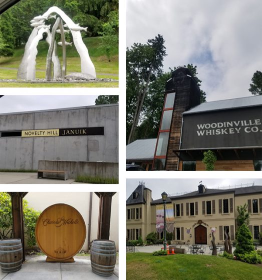
WOODINVILLE WONDERS
Woodinville is a tourist destination, as we have over 100 tasting rooms, wineries, distilleries, and breweries within a stone’s throw from my shop. This can be dangerous, but it’s really quite convenient mostly. Chateau St Michelle is probably the largest winery in the area. They have concerts on the lawn in the summers and beautiful grounds to walk around and picnic on. In the summer, we can hear the music from our backyard, which is usually a good thing. We also have a really cool theatre production company in town called Teatro Zinzanni, which recently moved to Woodinville from Lower Queen Anne in Seattle. From their website: “Teatro ZinZanni…is a three-hour whirlwind of international cirque, comedy, and cabaret artists…”
I really love living here because it’s quiet and we have lots of space. Our house is nestled into trees at the end of a cul-de-sac, yet we are incredibly close to the city. Woodinville is described as “subrural” as it is somewhere between suburban and farmland. One of our neighbors has a horse grazing in her front lawn pretty regularly, and the one across from her has over a dozen chickens on his property. We have a growing Arts community thanks to the Woodinville Arts Alliance in town.
PRINTING MENTORS
Oh gosh! This is a hard question! So many people have helped me get to where I am today. Esther Smith and Dikko Faust of Purgatory Pie Press were my first inspirations, as they were my first apprenticeship out of school. Dikko’s skills as a printer always inspire me, and Esther’s vision and ability to draw inspiration in the everyday is joyous.
My former boss Scott Hill of Workhorse Press is a great mentor as I continue to build my business. He’s readily available to help me with any questions I have about presses, printing, or the business side of things. I’ll be forever grateful to him for taking me on as an employee and teaching me so much about the production side of letterpress. Scott is a printer by trade, with a very keen eye for how to bring a design to life on paper.
Jami Heinricher of Sherwood Press is my most recent mentor and inspiration. She taught me how to run a Heidelberg platen, and for that I am forever grateful. She helped me troubleshoot one of my presses’ weird quirky problems, and even helped me back out my stuck Windmill, after my press pulled 6 sheets of 236# Flurry Cotton paper! I admire her business model, and her tips and tricks have saved me hours of time. My friend George Feakes of Impressive Inkreations has been an incredible mentor, giving me both sage printing and business advice, insights on efficiency, and an amazing amount of support.
All of my local letterpress trade guys are all absolutely my savior. After running letterpress for 40 years a piece, they collectively know everything, and there’s nothing they can’t make run correctly with just a little bit of tape and 18 point card stock. They’re also really down to earth and easy to talk to, and I love hanging out with them.
My husband, while not a printer, has been an amazing source of inspiration and strength. He single handedly moved my C&P and first Windmill up from Portland and got them situated on the garage floor. He also gave up a large portion of his workspace to allow me to have my studio. We are now looking into building him a lovely shed in the backyard for his woodworking tools for when I get a few more pieces of equipment this coming year.
GROWING THE DREAM
My business works out to be part time at the moment. I bought some equipment in early 2018, and spent about 6 months getting myself up to speed on the equipment and its particular quirks and what-have-you. Technically I’ve only been available to the public for about 7 months. I do plan to continue to solicit work and build relationships with designers, as well as develop a personal line of designs that I can offer to clients. Full time is my goal. I want to generate enough consistent job and print work so that I can take on an employee. There’s only one thing better than being a letterpress printer, and that’s sharing the workload!
THE CREATIVE FLOW
My process always begins by sitting down with the client and getting to know them a bit. I love getting to talk to people about their vision and translating that into a printed piece. I spend a fair amount of time gathering as much information as possible from the client. If it’s a wedding invitation, for example, I ask the bride to describe the ceremony and the type of event they’re going for. Is it modern, traditional, minimal, outdoor, etc? This narrows things down a bit. I get their wedding colors and match them to a PMS color that we all agree on pretty early on. I show them samples of my previous design work and see if anything stands out to them, either by way of technique (blind emboss, overprinting, etc) or if the tone of anything resonates with them.
At that point, I will begin a preliminary design. I find that this is really when the fun begins. It’s important to have a jumping off point, even if the design itself isn’t the final vision. It’s much easier for people to point out what they don’t like and for me to come up with alternatives to that, rather than envisioning something out of thin air. This has really worked well for me so far. I really enjoy the collaborative process during this stage of design.
PRINTING FEATS
I was the Arts Director of the Virginia Center for the Book from 2001-2003. While I was there, I helped run workshops and host events that built community involvement in the letterpress shop. I also created panel talks and art installations for Charlottesville’s annual Festival of the Book, which is a week-long event covering all aspects of books, from publishing, illustrating, designing, and reading. I also taught a class in the Art Department at the University of Virginia.
What I loved most about my time there was introducing the history and craft of letterpress to so many people in a variety of settings. One of my favorite moments was teaching an outreach program for a local Girl Scouts troop. I had the girls (who were all about 7 years old) run a pass through the Vandercook Universal. While I was in another room showing a group how to fold and slit the paper into a book, a girl came running out of the print shop in tears. Her mom asked her what was wrong, and she said through her sobs, “My print is over-inked!”
PRESS FAMILY
The very first presses I owned are my current ones – a 10×15 Heidelberg Windmill and an 8×12 Chandler and Price treadle that’s been converted with a motor. It’s funny that my first presses are both platens, since I learned to print on Cylinders. By the time I was ready to buy and had the space to have presses, Vandercooks were way out of my price range. Before this, I had always managed to access community print shops or presses belonging to friends.
BOXCAR’S ROLE
Boxcar has helped me in so many ways! Mainly, making resources readily available has been key. It’s a one-stop-shopping kind of place. They have given me the luxury of going slowly in building up my knowledge by offering a place to get it all done, and with such ease! The Boxcar Base has made life so much easier.
Before the Base, I was using magnesium plates. I found them to be much softer and more unpredictable, requiring more make ready due to being mounted to wood (not consistently flat on the bottom, and easily prone to warping). Being able to have predictable quality in my tools has allowed me to focus on perfecting my skills as a craftsman. The ability to buy paper, envelopes, order plates, and pick up a random thing I might need here or there (can of ink, roller gauge) has been fantastic. I can’t say enough good things about the Boxcar Press website flow. It is extremely user friendly, is quick and easy to navigate, and borders on foolproof!
I also love the How-To tutorials, which have increased my knowledge of my presses. Also, I cannot say enough great things about the staff. I have had random moments of panic where I’d forgotten to upload a small file for platemaking, only to call out an S.O.S. to Rebecca Miller, who swiftly and promptly put out the fire and saved the day! Working with Boxcar Press is like having a staff of knowledgeable and kind pre-press geniuses just an email away!
SHOP TIPS
Get the crop marks! This is something I don’t always do myself, and pretty much every time a two or three color cropless job goes to press, I spend twice as much time trying to get position. Even with one color jobs, I like crop marks once it gets to bindery. They seem like a luxury, but really they save you a bunch of time. And time is money, as well as a whole lotta frustration!
Spend the money! I’ve been there…I have tried to get away with a short cut, or making do without a particular tool or gadget (the Swing Away Lay Gauge comes to mind here). In the end, I end up spending way too much time having to figure out a “cheap” way to do something. Again, I’ve spent money, and potentially compromise the quality of the end result of the printed piece.
If you’re running a blind deboss on a stock that isn’t 100% cotton, or super plush, you can achieve a similar effect by adding a small amount of color that matches the paper stock with a ton of transparent white. Or, if you’re running a bright white sheet, opaque white right out of the can will do the trick.
I’ve also added a touch of yellow to gold ink in order to give it the punch it needs to stand out on an absorbent stock.
PRINTING ADVICE
Letterpress is a lot of troubleshooting and problem-solving. Isolate problems, ask for help from fellow printers that you know, or reach out online. One of the things I love about letterpress is how knowledgeable and helpful the community of printers is. Also, a motto I like – Stay modest, do good work, enjoy life outside the shop.
WHAT’S COMING NEXT
For the upcoming year, I will continue to grow my clientele. I also plan to add equipment so that I can add foil and emboss to my skill set. Currently, I am creating a design line, more of my own greeting cards, and some stock offerings that can be semi customized, like monogrammed note card sets and Holiday cards. I also hope to learn to paddle board!
Chris Paul, of North Carolina-based Old North State Press, shares with us how an evening introductory printing class flourished into a love for printing machines and letterpress. From there, with the help of numerous, generous mentors and his wife/partner, Danielle, he has immersed himself happily in the craft. Read on to discover how Chris passes on the knowledge he’s learned with the letterpress community.
CRAFT AND TRADITION
At Old North State Press, we are dedicated to preserving the tradition and craft of fine letterpress printing. We started our journey with the acquisition of a simple cylinder press in 1998. The studio now boasts an impressive array of heavy, outdated machines and equally obsolete related equipment, all meticulously maintained and loved.
In addition to supporting custom client work where the unique characteristics of letterpress printing is desired, the press produces original designs for stationery, note cards, wedding invitations, birth announcements, broadsides, and other printed matter.
I am a classically-trained designer and typographer and completed my MFA in Design at Yale School of Art in 1995 where I was first introduced to traditional printing methods. I enjoy fretting over the details and coaxing beauty from these iron beasts. My wife and partner, Danielle, is a fearless editor and etiquette expert. She has a Masters in Communication. This background comes in quite handy with our clients and the work they bring us. Danielle has a keen eye for fine presswork and ensures every piece we produce measures up to our exacting standards.
GETTING THE PRINTING BUG
Back in the early 90s, while in grad school, a few of us signed up for introductory printing classes, taught once a week on Thursday evenings, at the university printing facilities. The start of the digital era in design was in high gear and while many of us had been working in print for some time, our understanding of the tradition and craft of printing was limited. I had only seen pictures of metal type in books. Greer Allen, the former University Printer at Yale and one of the instructors, would regularly shake his head at how little we knew! He was, however, a truly patient and enthusiastic teacher.
In the class, Greer and a local book designer, Howard Gralla, taught us how to set type by hand and print our simple creations on a Vandercook proof press. I was hooked immediately. The exquisite mechanics. The rich history. The endless possibilities. I vowed then and there I would learn as much as I could about letterpress and, one day, find a press of my own.
I got a job doing design at IBM in 1995. In 1998, Danielle and I moved into our first house. It had a garage and thus, room for a press. We acquired our first press, a Vandercook No. 3, soon after moving in.
THE SHOP: A CREATIVE HAVEN
Because I work in software design, I tend to think of everything as versions. We’re currently on version 3.0 of our shop which we built in 2014 after moving to the Charlotte, NC area. Our shop is about 400 sq ft and houses all of our equipment. We still have the original Vandercook No. 3 but have since added two late model 10×15 Heidelbergs. The first Heidelberg was re-built from the ground up by Graeme Smith while he was with Whittenburg in TN. It is a beauty and our most prized piece of equipment. The second Heidelberg was acquired this past summer and is in need of a good cleaning and some serious TLC. Our intent is to dedicate this second machine to foil and die-cutting.
Because of my desire to learn everything I could about traditional letterpress, I also got into hot metal typecasting in the early 2000s. With the help of some amazing mentors, I was able to acquire an English and American Thompson Sorts Casters and a small library of matrices. I first learned to cast type under the thoughtful tutelage of Pat Taylor, former proprietor of Out of Sorts Type Foundry, and Rick Newell formerly of Heritage Printers in Charlotte. We also have many cases of metal and wood type, an antique John Jacques & Son paper cutter,and all the various accoutrements you’d expect in a working shop.
What we love most about our shop is having a dedicated, climate controlled space to design, make and learn. Letterpress has a deep heritage, and these machines teach us something new every time we use them.
NORTH CAROLINA COOL
Our shop is located on our property in an older, heavily wooded and secluded neighborhood south of Charlotte, NC surrounded by horse farms. We are 10 minutes from historic downtown Waxhaw and 30 minutes from Uptown Charlotte.
PRINTING MENTORS
I am deeply indebted to many for the generosity of their time, patience and wisdom. I first learned to print from Howard Gralla and Greer Allen while a grad student at the Yale School of Art. Rick Newell helped me acquire my first press and type, and he taught me what it means to run a shop. Pat Taylor, Rich Hopkins, Mike Anderson, and Jim Walczak inspired me to give typecasting a go and encouraged me to keep at it.
Fritz Klinke of NA Graphics took me under his wing early on and instilled within me a love of the process, hot metal type, and the journey of “figuring it out.” Elias Roustom of EM Letterpress taught me more than a few tricks of the trade along the way and his work continues to inspire me. Further, where would any modern day letterpress printer be with a reliable rigger? Pete McFee has moved every press I’ve ever owned and introduced me to electricians and repair techs who know and appreciate these old machines. Priceless!
I’m also indebted to and inspired by the many designers, printers, and clients I’ve met along the way who have shared hints, tips and techniques and pushed me to learn and make.
Last but not least, sincere thanks to my partner, Danielle, who has taken this journey with me, providing support and encouragement at every step.
PART TIME PRINTER, FULL TIME FUN
I am not yet a full-time printer, however, I spend as much time as I can in the shop and am fortunate to have clients who keep coming back and pushing me to learn new things. I suspect one day I’ll be doing more printing than not, but we’re still a few years off from that goal.
THE CREATIVE PROCESS
By day, I work in technology, designing digital experiences and products. Thus, my design process for letterpress can seem to be a bit fragmented. Sometimes, an idea occurs to me and I have to get it out as quickly as possible. Other times, a fragment of an idea may sit in my head, stewing, for a few weeks/months before I act on it. Occasionally, I will start with a technique I want to learn…like die-cutting or foil stamping and create from there.
While I end up sketching quite a bit in the late process, my early iterations are almost always via writing. My sketchbooks have more words than drawings. I have an old t-shirt from Emigre with the slogan “Design Is A Good Idea” and this embodies how I approach what I do. Once I think I have something, I’ll sketch around the idea and poke at it multiple times before attempting to start something digitally.
There is so much great work out there, you never have to go too far for inspiration…old and new.
PRINTING FEATS
I’ve been a member of the American Typecasting Fellowship for over 15 years and am a graduate of Monotype University, both run by the amazing Rich Hopkins. Our shop was one of 15 that Rich choose to feature in the book, The Private Typecasters, hand-printed and bound by Henry Morris at Bird & Bull Press. We’re also featured in the book, Vandercook 100.
Most of all, we are proud of our ability to continue to learn, make beautiful things and share what we know with others.
PRESS HISTORY
Our first press was Vandercook No. 3 Proof Press, acquired from the Charlotte Composition Company with help from friend and mentor, Rick Newell. I won’t tell you how little I paid for it, but I will say they almost paid me to haul it away. I love that press because it is so simple.
One of our first real print jobs on the Vandy was the birth announcement for our son, Aidan. We did the same when Erin came along in 2003. In 2017, we printed Aidan’s high school graduation announcement on our Heidelberg.
BOXCAR’S ROLE
Boxcar has been an inspiration from the beginning: I distinctly remember my first encounter with Boxcar and how elated I felt that someone was actually running a successful business doing letterpress! I then invested in the Boxcar Base and haven’t looked back. I use Boxcar Bases on each press I own and Boxcar processes all my photopolymer plates.
What I love most about Boxcar are two things: One, Harold Kyle and the team have continued to innovate from the very beginning…helping to modernize letterpress and make it relevant for today. The Boxcar Base and Swing-Away Lay Gauge are two prime examples. Second, the team at Boxcar shares everything they know and have helped me be a better printer. I’ve not found anyone more dedicated to the current community of designers and printers.
SHOP TIPS
Perhaps a useful letterpress printing technique? If you’re just starting out with a press like a Heidelberg, focus first on mastering the paper feed. There are so many nuances to feeding and once you master it, your life with be less frustrating and your printing faster and more satisfying.
An old technique I found out about recently, the Flying Dutchman, can help you get tighter registration on a Heidelberg by taming paper bounce:
Read everything you can get your hands on about technique and setup and don’t be afraid to fail. Successfully printing on these old machines can be challenging. The most important piece is to keep at it. It takes time and experience to encounter the various challenges that will present themselves. When they do, step back and think. Frustration, failure and disappointment are how we learn.
I founded the Facebook Letterpress Group in 2007, and we are currently 4500+ members strong. Included in the group are both active and many retired printers with great experience and know-how. I turn to the group regularly when I encounter something I haven’t yet figured out. The team at Boxcar, the Letterpress Commons, and Briar Press sites are also a tremendous resource. Don’t be afraid to ask questions and keep asking until you understand.
WHAT’S COMING NEXT
This might actually be the year we get more of our custom stationery line up and running. This is a goal we’ve had for some time…but…life is what happens when you’re busy making other plans! Now that our children are older, we have more time to dedicate to our various printing projects.
We also held our first letterpress workshop recently, partnering with the Charlotte Chapter of AIGA. It was a big success so we expect to do more of the same and help spread the love for letterpress and type in the Charlotte region.
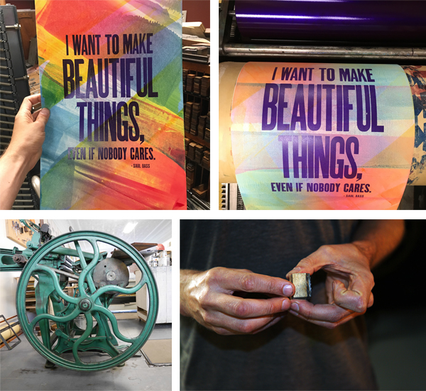
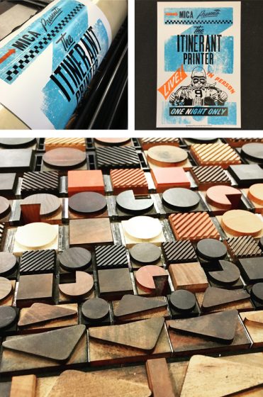
Always on the move, letterpress printer Chris Fritton just might be coming to a town near you. Chris has visited over 160 letterpress print shops in North America, where he is known as “The Itinerant Printer.” As a guest printer, he enjoys making one of a kind prints, cards and posters with his hosts, with the added bonus of the letterpress camaraderie. The Buffalo, NY, native shares with us his creative origins and printing on the go.
A PRINTER’S JOURNEY
I’m the former Studio Director of the Western New York Book Arts Center in Buffalo, NY, and for the past four years I’ve been doing The Itinerant Printer project. I travel around the US & Canada visiting different letterpress shops, and the only thing that I bring with me on the road is paper & ink. I use what those shops have in their collections (wood type, metal type, border, ornament, photopolymer plates, etc.) to create unique prints.
COMPELLING LETTERPRESS
I got into letterpress printing as a writer and a book artist. I started out by making my own cut & paste zines during my teens, and then poetry chapbooks. I learned how to screen print early on, but that never really felt like the perfect medium for me.
When I found letterpress, everything clicked. There was something so compelling about actually building the language — setting every letter in every word and stanza by hand. It was so visceral and fundamental. I was lucky enough to print at a place in Buffalo run by one of my mentors, Hal Leader: Paradise Press. It was a tiny space right in the middle of a modern print shop, and it held all of his type and presses, as well of those of his mentor, a Roycroft master printer named Emil Sahlin. I worked at Paradise Press until Richard Kegler had the idea to start the Western New York Book Arts Center. Then I got in on the ground floor of that project.
PRINTING IN NEW YORK & ON THE ROAD
WNYBAC was my baby, and that’s where I printed for six years. We had an incredible collection that we used to create gig posters, event posters, broadsides, cards, etc. I knew where every single thing was in that shop, from the tiniest ornaments to the missing sorts that were in standing formes.
My favorite thing about it was the energy. We were always experimenting, always trying something new, always using alternative materials and processes. It was an incubator, really, and a springboard for what I would do in the future.
Now, everyone’s shop is my shop, at least for a day. With The Itinerant Printer project, I’m often only in a location for 24-48 hours. I have to familiarize myself with the shop, its contents, and try to create something interesting. Often, I have no idea what I’ll find; I don’t even know what kind of presses they’ll have. It’s a never-ending challenge, but I wouldn’t have it any other way.
BEAUTIFUL BUFFALO, NEW YORK
All of Buffalo is a cool landmark. It’s a city rife with amazing architecture, copious greenspace, and a revitalized waterfront. The city is steeped in history, and its blue-collar legacy is evident everywhere you turn.
I miss it when I’m away, but so many of the shops that I visit have fantastic surroundings as well, from Menagerie Press in Terlingua, TX, among the Chisos Mountains to the School of Visual Concepts in Seattle, WA, with a view of the Space Needle. It’s impossible to choose a favorite.
PRINTING MENTORS
Although I look to the past for ideas sometimes, I tend to appreciate the work of my contemporaries just as much, if not more. I really like the work of modern letterpress printers who are combining analog & digital technologies to get intriguing results. Right now, off the top of my head, James Tucker of the Aesthetic Union, Brad Vetter, Dafi Kühne, Kathryn Hunter of Blackbird Letterpress, Lindsay Schmittle of Gingerly Press, and The Print Project in the UK are churning out astonishing work that looks like nothing else. It’s their openness — their willingness to embrace something that may or may not work, as well as their desire to make something that doesn’t look like traditional letterpress that makes their work so arresting.
FULL TIME FUN
The Itinerant Printer project is a full-time job for me, much like a traveling band. I often take a break during the summer, however, and when I’m home in Buffalo, I run commercial vessels on Lake Erie as a “day job.” It’s a nice break from printing and traveling, and often I find that I feel recharged when I return to letterpress.
THE CREATIVE FLOW
When I’m on the road, because I’m going in blind, I have to design on the fly. Because I’m normally using movable type, I design primarily on the press bed (if it’s a proofing press), and have to make decisions about color & form very quickly. The experience has made me very decisive, but also accepting of failure, because when you’re working that fast, it doesn’t always work out the way you thought it would.
PRINTING FEATS
To date, I’ve visited over 160 letterpress print shops in 45 states and 4 provinces. I’ve covered over 60,000 miles and made close to 25,000 prints on the road. That feels pretty noteworthy to me. To culminate the whole adventure, I recently finished a 320-page coffee table book comprising 1,500 photos and 130,000 words that tells the story of all the people, places, and prints along the way. The book is a monster and it had to match the scale of the project.
PRINTING TIDBIT
Here’s a fun fact: I’ve never owned a press. I have a great collection of wood type and sundries, but no presses. At this point, it wouldn’t make sense to get one either, as long as I’m on the road.
BOXCAR’S ROLE
Boxcar was elemental when we were doing jobbing or custom work at the Western New York Book Arts Center. It was the fastest, easiest, most reliable way to get the results we needed. When I’m on the road, Boxcar is the first name that comes up in every shop for photopolymer platemaking. It’s amazing to see how far its influence stretches, to every corner of the US & Canada.
PRINTING TIPS
Perhaps a useful letterpress printing technique? Baby wipes with a little bit of baby oil for cleaning your hands. It acts as a solvent for most inks and keeps you from running to the bathroom every thirty seconds to wash up. Other than that, employ as many techniques as you can to get the results you want: pressure printing, laser cutting, 3D printing, woodcut, linocut, photopolymer — don’t restrict yourself.
WHAT’S COMING NEXT
In 2019, I’ll round out The Itinerant Printer book tour. After that, I’m considering taking the project global in 2020 — The Itinerant Printer, around the world. I can’t wait to see what printers in other countries are doing, as well as spend time learning about them, about their presses, about their cultures. Logistically, it will be a lot different than the North American tour, but I know it’s possible, so keep your eyes peeled for a launch date!
Crafted with care, hypnotically delicate, and dizzyingly detailed are what instantly come to mind when viewing Ali Norman’s body of printed work. A traditional printmaker by nature, Ali enjoys expressing her vivid concepts through silkscreen, etchings, and now letterpress. The Florida-based printer shares with us the joys of learning new techniques, infusing nature motifs into her work, and pushing the limits of her art.
ALL AROUND LOVE FOR PRINTING
I’m a printmaker with a huge passion for etching, but I also love to dabble in other processes (such as letterpress!). I first learned about it from the amazing Eileen Wallace during my MFA. She helped spark my interest and encouraged me to push the limits of my polymer ideas. Learning from her was an incredible privilege!
HOME IS WHERE THE PRESS IS
Currently, I have access to etching presses at home and at work (the University of Tampa), but no real letterpress access. I’ve been lucky enough to make friends with Sarah and Phil Holt, who have the cutest little letterpress shop at home!
They were very kind to let me use their beautiful orange Vandercook to print my most recent polymer creation. I’m hoping to work with them more in the new year! You can check out Sarah’s letterpress work on instagram at @monpetitpaperco.
PRINTING MENTORS
I am really inspired by and thankful for the amazing printmaking community that has popped up on Instagram. I have “met” so many amazing artists and learned some cool techniques just from the internet. On a more personal note, I pay close attention to my dreams and am strongly attracted to old engravings, magical texts, and tattoo linework.
PART TIME PRINTER, FULL TIME FUN
I am not currently printing full time. Having just finished my MFA in the spring of 2018, I’ve been teaching part time at the University of Tampa. This gives me a good amount of free time to work on making and selling art on the side! So far I am finding it to be a really healthy and rewarding balance. Although I grew up here [in Florida], I haven’t been back for quite a while! I’m still currently exploring the area.
THE CREATIVE PROCESS
I absolutely LOVE designing for photopolymer!! I’ve found that drawing the key layer first on tracing paper allows me to then flip-flop my ideas, scan them, and easily draw color layers. I’ve tried working more digitally, but always go back to the tracing paper!
ALL IN THE DETAILS
Works take me anywhere from a week to two months to complete before printing, but I’m always working on a few things at once. I try to keep it slow and steady, drawing at least a little every day until I am satisfied. I also often work back in to images, so that can end up dragging things out… as goes printmaking!
FAVORITE PRINTING TECHNIQUE
Intaglio will always be my go-to process, but it’s not always very practical! I like to change things up, especially with quicker processes like letterpress or lithography. It is so satisfying to see a trapped layer lock perfectly in to place each time, and to feel like one with a machine. I also really enjoy how the design process for each technique is so different – it keeps me on my toes!
PRINTING FEATS
At this point in my career, I am just very proud and grateful to have made it this far! I’ve been working hard to make my passions a reality and am really seeing that come back to me lately.
PRESS HISTORY
I currently have a little tabletop Conrad E12 etching press that was found by a friend of mine at a thrift store! After some heavy cleaning, I now use it almost constantly. I’m hoping to also have a letterpress to call my own some day. Floridian printers – hook me up please!
BOXCAR PRESS’ ROLE
I had my polymer plates for my most recent print made by Boxcar Press! I was a little nervous about someone else making my matrices, and they turned out perfectly. I’m really grateful for this service.
https://www.instagram.com/p/Brg97iEjnD1/
PRINTING TIPS
I’m still quite the beginner at letterpress, but I manage to learn something new every time I print. I even managed to smash my fingers in the Vandercook once (oops!).