Glass of Vino With AJ Masthay

[Installment 5]

Next up in our Letterpress Friend chat series is AJ Masthay. We are bowled over by the mesmerizing details in his concert poster series and his bright + bold color combinations. AJ is a Connecticut-based printer who always makes us wonder “What is he up to this time?!” We sat down for a quick minute to see what’s on his Vandercook (and beyond!) via Masthay Studios.

AJ-Masthay-letterpress

Boxcar Press: So good to catch up with you! We’ve all got the printing bug and we’re just curious about when you got “bitten”!

AJ: That happened back in my sophomore year of art school when I was first introduced to old-school stone lithography. Literally drawing on pieces of limestone, using leather rollers and gum arabic to reproduce beautiful full tonal drawings. It felt like the world of magic and alchemy to me, I was hooked.

Boxcar Press: Tell us about a press you remember fondly (or not so fondly) or one you have now that you prefer to use.

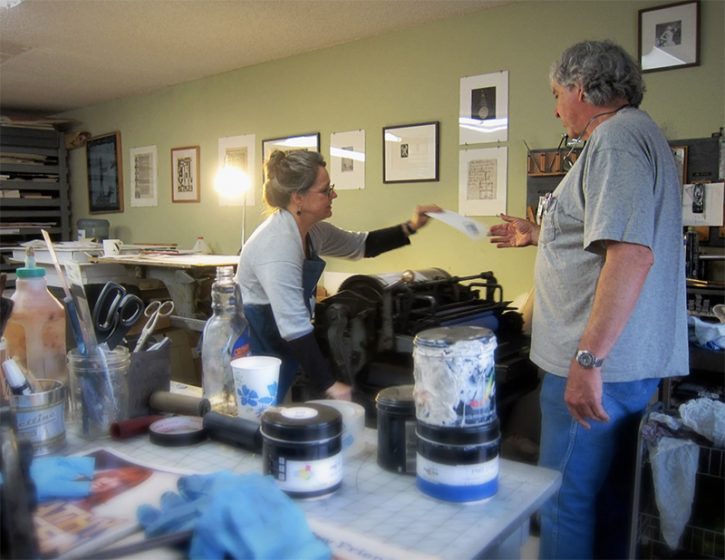
AJ: That’s my first Vandercook Universal I for sure. I found it through the help of one of my college professors, Jim Lee, a few years after I graduated. I was hoping to get an etching press as I figured that was the most versatile. Jim mentioned he knew of a Vandercook in a guy’s garage he was looking to sell. The only problem was it was completely disassembled and in pieces. 

$500 later…. it was mine and I spent the next couple of months studying the presses at my former art school to figure out how to reassemble the Uni I in my basement. That’s the press that started my entire art career but I wound up trading it for my current “go to” press which is a Universal III. The hand cranking on thousands of print passes became a bit much. The larger format and motorized aspect of the Uni III just made it way more realistic for my shop. I’m also in the process of possibly adding a large Vandercook 32-28 to my shop which is very, very exciting.

Boxcar Press: What is something people might not know about you?

AJ: People that follow me might know this already but I have a deep fascination with bones and osteology and have been collecting skulls since I was a little kid. I now have a pretty extensive collection at the studio with well over 200 skulls of various species.

Boxcar Press: What is your printing superpower? Every printer has one….

AJ: This one is easy, my printing superpower is my coworker Kait Lennon (@longlegslennon on IG) who handles almost all of the printing in my shop these days. There is no way I could crank out the amount of work I do for clients without having someone else working the press and there’s no one I trust more with my work than Kait.

Boxcar Press: Anything you want to give us a sneak peak about or a current project you have in the works? Maybe one project that you are always going to get to but it just never seems to get done? (We all have one!)

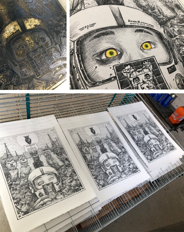
AJ: I’m currently working on a series of new art prints that I’m calling my “Pet Projects” that I plan on releasing at my November 12th open studio event. Summers tend to be very very busy for us with client work (summer tours, festivals, etc.) Once we got through all that this year I thought it would be nice to take some time to work on a few pieces that I’ve been meaning to do but always seem to get pushed off.

LOL […] I have many many projects that seem to just never get done. Hopefully, I can check a few off with this upcoming show though.

Boxcar Press: Last quick question &  just for fun(!) – Do you like to listen to podcasts or music in your shop while you create?

AJ:  Both really, depends on my mood and what’s going on that day. I find music, usually very loud music, helps me get in the creative zone when coming up with overall concepts or working out compositions/layout. Podcasts seem better when I’m diving into detail work and fleshing out/completing drawings. Neither is written in stone though.

That was a delightful time, AJ.  We’re grateful for the friendly chat! Visit his website link to delve more into the hue-filled world of masthaystudios.com.

Bourbon With Paul Moxon

[ Installment 3 ]

Our Letterpress Friend chat today is with Paul Moxon. He is synonymous with Vandercook presses.  He is the resource behind the website vandercookpress.info, author of Vandercook Presses: Maintenance, History and Resources, and a printer of letterpress books and broadsides under his press name Fameorshame Press.

There is always much to learn from a conversation with Paul, who lives in Mobile, Alabama. 

Boxcar Press: Why Vandercooks and proofing presses?  What is the appeal and draw for you?

Paul: A forlorn SP15 in the corner of a printmaking studio was the first press to which I had access. The ratio of its footprint to the printing area was appealing. Experiment and production were satisfying and different than paste-up. In time, I found joy in teaching maintenance and making repairs. Sharing this knowledge with other printers has surprisingly become my life’s work.

Boxcar Press: Is there one defining moment that you can recall or point to that was the start of your printing career or business

Paul:  Learning phototypesetting and paste-up as work-study in college.

Boxcar Press: Tell us about mentors or printers that you admire or set you on a particular path? 

Paul:  There have been so many. During college, Jocelyn Dohm (founder of the Sherwood Press) always welcomed me at her charming little job shop and endured my novice enthusiasm. Librarians Jim Holly and Elspeth Pope introduced me to fine press books. At Alabama, Glenn House, then retired, piqued an interest in maintenance. Fritz Klinke let me explore the Vandercook archives. Ian Leonard Robertson (Slow Loris Press) and I shared similar work experiences. His old school presswork and design was crisp and effortless. Most of his equipment is now in my shop, and I feel his jovial presence every day.

Boxcar Press:  If you weren’t a printer or in the printing industry, what else might have been your career path?

Paul : A machinist

Boxcar Press:  That is not surprising. You have referred to yourself as an independent educator.  

What would you tell a brand new letterpress printer today?

Paul:  Visit many shops, libraries, and museums. Attend wayzgooses, talk with everyone. Print on every kind of press you can big and small. Print every kind of form; lead, wood, copper, magnesium, and polymer. Strive for best practice. Read everything, especially old technical manuals and catalogs. Don’t be discouraged by the high prices of presses. Save-up, be patient, you become discerning over time. or grumpy old naysayers. Mistakes will make you an expert.

Boxcar Press:  Tell us about a press you remember fondly (or not so fondly) or one you have now that you prefer to use?

Paul:  I’ve printed on other makes of proof presses, jobbers, tabletops, hand presses, and even a windmill. Each had something to teach me. (Someday I want to print on a Heidelberg cylinder and a Little Giant.) I love my Vandercook No. 4. It’s great for production and teaching maintenance. I’ve printed on, tuned up, or inspected thirty Vandercook models, including some rare ones—nearly a thousand in all. But there are still a few I haven’t worked with, such as the 30-26 four-color press. Hopefully, post-COVID.

Boxcar Press:  You have mentioned that you are fascinated by the vintage equipment and tools.  Tell us about one of the best or most used or most admired printing tools you can think of?

Paul:  Hard to choose: my loupe, paper thickness measure, and Align-mate are essential. But I love the elk-bone folder/plate lifter I made at Penland twenty years ago when I met Jim Croft.

Boxcar Press:  What is something people might not know about you that would surprise them?

Paul:  I can’t type, just hunt-and-peck. But I can handset type like a motherfucker.

Boxcar Press: What is your printing superpower?

Paul:  Being able to diagnose presswork and mechanical issues.

Boxcar Press:  Anything you want to reveal about a current project you are working on – even a hint or clue?

Paul:   Right now I’m into printing postcards. My last one is about the USPS and Trump enabler Louis DeJoy.

Boxcar Press:  What is that one project that you are always going to get to but it just never seems to get done?

Paul:  A book of three poems by a deceased, local author. I commissioned lino-cuts from Lauren Faulkenberry (Firebrand Press) a few years ago, but I fear that they may be drying out.

Boxcar Press:  Last question – Do you listen to podcasts or music in your shop while you create? 

Paul:  Music is essential. Big Joanie, Dinner Party, the Hu, and Idles and are in heavy rotation. The rest of the time I’m streaming KEXP.

That was an enjoyable time, Paul.  Thank you for the friendly chat and we’ll plan another.  Paul is also involved with the American Printing History Association, that encourages the study of the history of printing and related arts and crafts.  Visit his links to vandercookpress and fameorshamepress.

Brilliant Printing at Brighton Press

Michele Burgess of Brighton Press is a fine arts book artist, creative soundboard, and part-time university professor who loves to share printing with those around her. For three decades, Michele and her husband have been enjoying the fruits of their collaborative efforts one pulled print at a time.

Michele Burgess-Brighton Press

AN ARTIST BY NATURE I am a visual artist obsessed with working in book form. My husband, Bill Kelly, founded our press in 1985 and it has morphed and grown before our eyes.

THE LURE OF LETTERPRESS I went to the Cranbrook Academy of Art for my MFA in the mid-’80s. There was a very funky letterpress there and small, crumbly piles of type. I enjoy the intentionality, the craft, the beauty of its collaboration with paper.

Michele Burgess-Brighton Press

CREATIVE COLLECTIVE We are a small band of like-minded people using the studio as a creative laboratory. We create and publish collaborative artists’ books that braid the visions of both poets and visual artists. Everything is original and achieved by hand.

Bill Kelly, who founded the press, Nelle Martin, associate director/production designer/letterpress printer and I collaborate creatively with whoever the artist and poet might be. Most often, one of us is one or the other, or, in Bill’s case, both. We also often collaborate with papermakers such as those at Twinrocker, Cave paper, and the Morgan Conservatory to get a certain color or weight that we’re looking for.

Sonja Jones, in her 80’s and a previous librarian, has been a guardian angel and does our boxmaking. Kathi George, our crackerjack copy editor who makes sure we don’t have a plate made with a typo in it. Jenny Yoshida Park also works closely with us on typography and website and catalog design.

Recent poets include Bill Kelly, Chard deNiord, Bianca Stone, and Martha Serpas. Recent artists, besides myself and Bill include:  Jinane Abbadi, Ian Tyson, Miya Hannan, Jenny Yoshida Park. A full list of artists and writers can be found on our website—34 years worth.

Sometimes we work with outside bookbinders Mark Tomlinson, Claudia Cohen, and Lisa Van Pelt, who have added creative ideas to the bindings. There’s a lot of back and forth regarding structure and content until it all melds together.

My favorite thing about it is that we never know what the final outcome will be until the B.A.T. (from the French phrase “bon a tirer” — good to pull. The subsequent prints should look like that one) is complete and that we can never remember whose idea certain things were. Synergy.

Michele Burgess-Brighton Press

COAST-TO-COAST PRINTING We are bi-coastal now. We do most of the production in San Diego, which is getting a little less cool every year, and we do a lot of the creative work in Vermont in relative solitude. We also work in other artist’s studios sometimes or at the dinner tables of our writers.

Michele Burgess-Brighton Press

PRINTING MENTORS Gerald Lange, Michael Bixler, Robin Price, Walter Hamady have been my letterpress mentors. William Blake, Sonja Delaunay, Ken Campbell, Anslem Kiefer, and Barbara Fahrner have been my book art mentors. The poets I work with inspire me. I get energy and fortitude from my collaborators at the press.

PART-TIME PRINTING, FULL-TIME FUN We decided years ago not to require the press to support us physically, so we teach at universities part-time.

Michele Burgess-Brighton Press

THE ARTISTIC PROCESSES I start a book from a small kernel of inspiration which is always mysterious in its origin. Sometimes, the poet is my muse or his/her words. From there, I usually start working on visual images that expand on, rather than illustrate the text. The best scenario is when the poet and I are working together from a kernel and we’re spinning a web together.

PRINTING FEATS I’m proud of the meandering path we’ve taken, despite the hardships. With regards to a project: A Woman Hit by a Meteor. Our paper was MUCH too large for the press, so we folded it and through that limitation were able to imbue it with a sensibility of folded maps in ancient, celestial atlases.

PRESS HISTORY Vandercook 219, old style.  I love the Vandercook, the sound, the weight, the intuitive simplicity of the machine.

BOXCAR’S ROLE Boxcar has helped us realize some visual formats that we couldn’t have done with lead type. Also, we were able to create Arabic calligraphy, Chinese and Japanese text that we couldn’t have done otherwise. Boxcar has been super-efficient, patiently helpful, both with my classroom needs and for Brighton Press.

Michele Burgess-Brighton Press

PRINTING TIPS: Perhaps a useful letterpress printing technique? Slightly more punch, less ink.

WHAT’S COMING NEXT A book called WHERE AND HOW BLOOD WAS MADE with poet Chard deNiord. It will be my most complex book to date.

Spot the Differences: Printing Press Edition

Get out your loupes and magnifying glasses for our cool printing press edition of Spot the Differences! There are 20 differences in all. Can you spot them?

And don’t forget, we’re keeping the fun going all week long for Letterpress Appreciation Week.

Spot-the-difference-Control-Group
Spot-the-difference-Variable-Group

Answers and results will be revealed on Friday, September 20th, 2019 so stay tuned!

All In The Printing Family With Two Tone Press

Thirteen years ago, printer and illustrator Michelle Dreher began the roots of Two Tone Press in Kansas City, Missouri. Joining forces with her sister, Angie, who helms the business side, brought exciting changes. It catapulted the growing letterpress print shop into a well-run machine full of creativity, fun & eye-catching prints and cards. They branched out with their blossoming printmaking community workshop. Michelle recounts the adventures of buying a building, expanding her studio for her sky-high printing visions, and what’s just around the bend.

EAST OR WEST, LETTERPRESS IS BEST

I grew up in a military family, so we moved around a lot. We lived in Germany and South Korea for several years before ending up back in the US. I later came to Kansas City to attend the Kansas City Art Institute and loved the city so much I never left.

Michelle Dreher of Two Tone Press (Kansas City, Missouri) creates beautifully printed letterpress cards, invitation suites, and more.

FALLING FOR THE PRECISION OF LETTERPRESS

At the Kansas City Art Institute, my degree was in illustration, but I spent a couple semesters in printmaking. While there, an interim instructor introduced me to the Vandercook. I immediately fell in love with its hairline precision and registration which made multi-color relief printing so easy.

ALL IN THE FAMILY

I started Two Tone Press in 2005 in a super-drafty warehouse loft on the top floor of an industrial brick building. I was later joined by my sister Angie in 2011 after buying a building in a soon-to-be up & coming neighborhood. She has a business background paired with a love for art and helped whip this place into shape. Together we built our own studio with a modest storefront and lots of open space and high ceilings. It’s been a long eight-year renovation journey but the studio is finally taking the shape of our initial vision.

KANSAS CITY COOL

When I purchased our building, there really wasn’t much going on around us. It has since started to flourish with other creative-minded folks who have banded together to build our own unique neighborhood.

Michelle Dreher of Two Tone Press (Kansas City, Missouri) creates beautifully printed letterpress cards, invitation suites, and more.

We even named our new area TowerEast District based on the very orange and prominent tv tower right next to us. It’s been interesting being a part of something new.

Michelle Dreher of Two Tone Press (Kansas City, Missouri) creates beautifully printed letterpress cards, invitation suites, and more.

PRINTING MENTORS

My passion lies in creating colorful relief block prints so I draw inspiration from my peers in the field. Our favorite shops are The Firecracker Press in St. Louis, MO and Tugboat Printshop in Pittsburgh, PA.

FULL TIME FUN

Two Tone Press is where I spend most of my time, but I do love to teach. I have been a part-time studio art instructor at the Nelson-Atkins Museum of Art for over 10 years. And just last year in 2017, my sister and I along with another colleague, Ani Volkan, started our own community printshop called Print League KC. It shares the same studio space as Two Tone Press. In addition to letterpress, Print League KC offers workshops of other print processes such as etching, lithography, and silkscreen.

Michelle Dreher of Two Tone Press (Kansas City, Missouri) creates beautifully printed letterpress cards, invitation suites, and more.

THE CREATIVE FLOW

At our studio, we create everything from custom wedding invitations to business cards. When there’s “free” time, we create our own line of colorful poster prints and cards. Due to my illustration background, I tend to incorporate hand-carved block images where I can.

Michelle Dreher of Two Tone Press (Kansas City, Missouri) creates beautifully printed letterpress cards, invitation suites, and more.

PRINTING FEATS

With the immense support of my family, buying my own building to create our unique studio was a huge accomplishment. And later, being able to give back by starting a community printshop felt really good. I enjoy sharing my passion for printmaking with others.

Michelle Dreher of Two Tone Press (Kansas City, Missouri) creates beautifully printed letterpress cards, invitation suites, and more.

PRESS HISTORY

I gained a lot of experience working at another local print shop, Hammerpress, for several years after I graduated college. Then in 2004, Brady Vest, the owner of Hammerpress, offered to sell me a Vandercook No. 3 for $400. I jumped at the opportunity.

Michelle Dreher of Two Tone Press (Kansas City, Missouri) creates beautifully printed letterpress cards, invitation suites, and more.

It was a clunky machine that had no motor and a funny little hand crank to distribute the ink. Once I started my own studio, I later traded it for an SP15 from Indianapolis which is still my favorite press to this day.

Michelle Dreher of Two Tone Press (Kansas City, Missouri) creates beautifully printed letterpress cards, invitation suites, and more.

BOXCAR PRESS’ ROLE

We started by using metal-backed polymer plates that we spray-mounted to MDF boards. This made precision printing challenging because the boards were never perfectly flat. Then in 2013, my sister recommended we finally invest in a Boxcar Base so we bought the biggest one that would fit on our Vandercook, a 19×13.

Michelle Dreher of Two Tone Press (Kansas City, Missouri) creates beautifully printed letterpress cards, invitation suites, and more.

I can’t even express how much it changed our whole world by making setup so much faster and easier. The grid marks were totally worth it. I’ve never regretted the purchase for even a second and can’t believe I didn’t invest in one sooner.

PRINTING TIPS

Here is one of our useful letterpress printing techniques. We like using a sheet of mylar on top of the tympan sheets around the cylinder to keep a clean surface and then we also like to use removable sticker paper on it to bump up certain areas of the print.

WHAT’S NEXT

We look forward to expanding our store to offer print work from all over the world. We also recently bought the building next door which now has a gallery space on the second floor. We’re excited to put together interesting exhibits that will include letterpress and other print work.

Let’s See That Printed: Isle of Dogs by AJ Masthay

As soon as AJ Masthay’s “Isle of Dogs” print passed through our platemaking department, we had to know more. Discover as we catch up with AJ of Masthay Studio, and this sneak peek. Find out what is the inspiration for this ultra-detailed piece… and where can you enjoy this piece.

The piece was created for an upcoming Isle of Dogs group exhibition hosted by SpokeArt NYC at the Parasol Project, 213 Bowery, NYC. From their Facebook event page:

“Spoke Art is pleased to present the Isle of Dogs Art Show. This is an officially licensed art exhibition tribute to Wes Anderson’s most recent film. The dynamic group show features over one hundred artists, painters, sculptors and print makers, debuting one weekend only in New York City’s Lower East Side.

Isle of Dogs Wes Anderson AJ Masthay letterpress print

Isle of Dogs

Isle of Dogs, Wes Anderson’s most recent project, is a stop-motion animated film set in a Japanese dystopian future. The story follows a boy’s journey to find his dog after the species is banished to an island following the outbreak of canine flu. Inspired by the adventurous tale that Anderson brought forth, a select group of artists have created character portraits and highly detailed environments and scenes inspired by Isle of Dogs. Featuring a diverse array of painting, sculpture and limited edition prints, each artist offers their own unique perspective and interpretation of the Wes Anderson film. This whimsical and canine filled pop-up exhibition is an absolute must see.

About the Piece

I personally love the quirky works of Wes Anderson and am a huge dog lover. I have two very spoiled Labrador Retrievers Dexter & Halley. When asked to participate in this exhibition I immediately said YES!

My piece features the main characters from the film, both human and canine. As well as, the scene in which they debate whether to attack. Spoiler alert – they realize he has come searching for his own dog “Spots” and decide to help him in his quest. 

Isle of Dogs Wes Anderson AJ Masthay letterpress print

The print is a reproduction of a detailed graphite drawing utilizing a Boxcar Press’ photopolymer plate with a 133 LPI halftone screen applied. We’ve found that once dialed in on our Vandercook Universal III, these halftone plates reproduce tonal drawings beautifully. They come very close to the detail typically found in lithographs.

To mimic the graphite work we do the following steps. First, we mix a fairly stiff, dark gray ink with a touch of brown to warm it up a bit. Next, we use a paper that is soft and supple, such as Arches 88. Finally, we finish the piece with a hint of hand-applied color in the pilot’s eyes. As a result, this slight variation adds a personal touch of individuality. The hand coloring piece complements the printing perfectly.

Isle of Dogs Wes Anderson AJ Masthay letterpress print

The Final Edition size is 100 signed, numbered and titled, 15”x20” on Arches 88. Prints are available to purchase at the event. Remaining prints will be made available online following the event, through SpokeArt.

The Isle of Dogs Art Show group art exhibit is running from November 9th, 2018 – November 11th, 2018. For more details, check out their Facebook page here.

Keeping the Printing Rhythm With Tom Virgin

From Midwest to Miami and to teaching art by-day and printing-by-night, Tom Virgin of Extra Virgin Press weaves a letterpress journey of printmaking.  We caught up with Tom after hours on what makes his printing clock tick, the tales of teaching art in the high-school classroom, and the excellent food fare that is a must for a late night printing session in Miami.

Tom Virgin of Extra Virgin Press prints on a Vandercook.

PRINTING, SLUGS & ROCK’N’ROLL I was born and raised in the Midwest, just outside of Detroit. Fueled by blues, jazz, Motown, and rock & roll, I made my first print in 1972. I am now in my sixth childhood, having spent twice as much time in South Florida than in my native Great Lakes State.

IN TYPE-TOP SHAPE In 2004, I took a letterpress class with Kerry McAleer at Pyramid Atlantic Center in Silver Springs, Maryland. We made cards with a short quotation of our choice. Mine was:

“The course of true love nevər did run smooth.”– William Shakespeare, A Midsummer Night’s Dream | Act 1, Scene 1

I quickly realized my mistake, reset the type, and reprinted. I decided the typo was more in the spirit of the original quote, and returned the position of the second “e” to the first version. This is my first love of letterpress story.

THE PRINTING TRANSITION I am a bookworm (and a storyteller). Printmaking eventually led me to book arts. The ability to create archival editions from press printed text and images was what made me finally get into letterpress.

Tom Virgin of Extra Virgin Press prints beautiful broadsides.

I have always worked in communal studios as a printmaker, so the transition to letterpress was a natural step. The first presses I printed on solo, were at the Jaffe Center for Book Arts in Boca Raton, Florida. Arthur Jaffe bought my very first book for the Jaffe Collection, and mentored me for the rest of his life.

SPLENDID IN THE SUNSHINE STATE Nestled in the middle of Little Haiti just north of Downtown Miami, I am a five minute drive from Korean fusion BBQ, Haitian cuisine, Thai food, awesome burgers and, right next door, Clive’s Jamaican Jerk Shop. Four blocks away is the Little Haiti Cultural Center. I am a white guy in Miami, living the cushiest minority experience on the planet. Extra Virgin Press has a Vandercook 4 Proof Press (formerly owned by Gaylord Schanilec, and lovingly donated to EVP by Regula Russelle of Cedar Fence Press- both from the Twin Cities in Minnesota). Our second press is a Challenge 15KP. Both presses are bringing back letterpress printing to the Miami community. The presses keep me from eating all of that amazing food, every waking hour.

The printing abode of Extra Virgin Press in Miami, Florida.

PRINTING MENTORS I am fortunate to have had many teachers and mentors, all of whom have contributed mightily to my printing practice. I am especially indebted to Arthur Jaffe, who welcomed me to the Jaffe Center for Book Arts, and John Cutrone (Convivio Books/Jaffe Center) in South Florida. Stephanie Shieldhouse at Highway Press, in Jacksonville, Florida gave critical support when Extra Virgin Press became a reality in 2016.

In Red Wing, Minnesota, in my home-away-from-home, the Anderson Center at Tower View, I have been well schooled by the proprietor of Red Dragonfly Press, Scott King. Scott and Robert Hedin, the retired Director of the Anderson Center also introduced me to Regula Russelle (Cedar Fence Press), Chip Schilling (Indulgence Press), Monica Edwards Larson (Sister Black Press), Amanda Degener (Cave Paper), CB Sherlock (Seymour Press), Gaylord Schanilec (Midnight Paper Sales), and Richard Stephens, all from Minnesota Center for Book Arts, one way or the other. Moe Snyder and Maria Cardenas set me straight in Portland, Oregon. Many others have lent me assistance and support.

Tom Virgin of Extra Virgin Press prints beautiful broadsides.

GETTING INSPIRED My Instagram feed is a constant inspiration. I follow all I can find. Regula’s Russelle’s books offer me a sublime view of the world of color that helps me escape from black and white woodcut prints. (Mary) Bruno Press, another Minnesota great, keeps me smiling, Amos Kennedy in Detroit offers a powerful moral compass, and damn fine work to back it up. Another Motown great is Signal-Return. When I grow up, I hope to create a community of dedicated printers like Lynne Avadenka has, in Downtown Detroit. Can I just say, “Hatch Show Print in Nashville?” Writers have enriched my life immeasurably.

THE CREATIVE PROCESS My visual arts practice included printing, painting, drawing, book arts, and public art, prior to my entry into letterpress printing.

Teaching high schoolers letterpress printing with Tom Virgin.

Teaching a full spectrum of arts classes in Title I Public High Schools in the fourth largest school district in the United States helped me with design. I suspect the students teach me more than I teach them. My colleagues in grad school, as well as fellow Professors, Adjunct Professors, and working artists have helped me to bring some skills to the letterpress world.

Tom Virgin and helper set-up Vandercook printing press.

PART TIME PRINTER, FULL TIME FUN At this point, I am printing after school and on weekends. That is the bulk of my waking hours. My retirement from the public schools will make it possible for me to print full time.

PRINTING FEATS —In 2006 I received the Florida Artist Book Prize for Right There, an artist’s book about Sleeping Bear Dunes National Lakeshore, and a semi accurate account of my childhood in Michigan.

–I have taught five or six thousand teenagers about art.

–Extra Virgin Press has received support from the Knight Foundation, Cannonball Miami’s Wavemaker/Long Haul Grant, Miami Dade County Cultural Affairs, and the Miami Foundation, in its quest to bring letterpress back to Miami.

PRESS HISTORY [My very first press was] a Vandercook 4 Proof Press, Serial #13622.

Vandercook presses inside Extra Virgin Press in Miami, Florida.

BOXCAR’S ROLE Cathy and Rebecca make it possible for me to function in a letterpress world, answering far more questions than can be reasonably expected. The words on the website about setting up a letterpress shop are revelatory. Thank you Harold and Company.

SHOP (AND LIFE) TIPS I am still learning, but you will be the first to know.

WHAT’S NEXT I look forward to more printing, more books, more kids, more grant applications, and teaching new printers, so that I can run both presses every day.

A triple round of applause & thanks out to Tom Virgin of Extra Virgin Press for letting us take a sneak peek at his wonderful + tropical printing world!

Vintage Cool: WE ARE 1976

The creative trio behind WE ARE 1976 effortlessly combines fun, eclectic, and world-wide inspirations to create hand-made letterpress paper goods in the heart of Dallas, Texas. From punches of color to fun & funky illustrations & prints, the shop is a happy culmination of the team’s love of learning, community printmaking workshops, and the ambition to keep the creative juices flowing. The crew caught us up on eight (and counting!) joyous years honing their craft, incorporating letterpress in their day-to-day lives, and enjoying the rich printing community that surrounds them.

FUNKY + FUN Hello! We’re Vynsie, Jully, and Derek and we own a small shop and letterpress design studio in Dallas, Texas called WE ARE 1976.  We opened our shop 8 years ago and we carry handmade and beautifully designed objects (ceramics, jewelry, and home goods) and paper goods (stationery, cards, and prints) from independent makers from all over the world. 

About four years ago, we started making our own line of stationery and art prints and have added custom branding, design, and letterpress printing to what we offer. We also teach printmaking workshops and host guest instructors that teach workshops such as calligraphy, water coloring, and jewelry stamping. We all grew up around the Dallas area and love being a part of the creative community here.

FIRST TASTE OF PRINTING Vynsie’s background is in graphic design. She got her first taste of letterpress and antique printmaking techniques at Graham Bignell’s Paper Conservation in London many years ago (cleaning old type cabinets in exchange for press time).

She also worked at Peter Harrington’s Rare Books (at their sister antiquarian print shop, formerly known as Old Church Galleries) which deals in rare books and antique prints made from wood, copper and steel engravings.

We carried the same vision and love of printmaking when we started our business. We have a diverse collection of art prints from illustrators, designers, printers (letterpress and screenprint) from the United States, Europe, Japan and Australia. Dallas also has a really tight letterpress community and we’ve been fortunate enough to get to work with them in various ways – the amazing people at Inky Lips PressMissing Q PressColor Box Studio, and Studio 204 were very generous with their time, expertise, and the work they shared in our shop. Five years ago we decided to make letterpress a permanent part of our shop. We started taking more letterpress workshops from places like Punch Press in Austin and San Francisco Center of the Book and with a bit of patience, we were able to locate two presses. We started printing immediately, teaching ourselves and each other.

BIG PRINTS IN TEXAS We moved to our current location because we needed a bigger space to fit our letterpress studio, which takes about half of our shop space. We’re in a charming historic district called The Bishop Arts District in Oak Cliff, Dallas. We’re across the street from a wonderful pie shop, Emporium Pies, and cute shops like Green PetNeighborhood, and Wild Detective. Most of the businesses are independently owned and we feel incredibly lucky to be here. There’s also amazing food and drinks on every corner in Oak Cliff –  Small Brewpub, Hattie’sEl Si Hay and Spiral Diner. Also, The Texas Theatre is a revitalized theatre with independent programming, fun events, and they host new art exhibitions monthly at their Safe Room gallery.

PRINTING MENTORS One of our presses is from the Art Larson’s Studio Hortan Tank Graphics. When the press was shipped to use, his colleague Joe Riedel came down to help us set up and was invaluable in teaching us the fundamentals of running and operating our presses. And, as mentioned above, we were really encouraged and motivated by many in the Dallas letterpress circle – Casey McGarr of Inky Lips Press, Jason McDaniels of Missing Q Press, Rhona Warren of Color Box Studio and Kim Neiman and Virgil Scott of Studio 204. Also, in our shop, we carry work from other illustrators/printmakers that really inspire us – Daria TesslerNate DuvallNaoshiDeth P Sun and Kelly Puissegur

DESIGNERS + PRINTERS We’re both. We’re a family business and work on most projects together whether it’s just exchanging ideas initially or packaging finished projects. It’s so important for us to create unique and beautifully crafted pieces for us and for our clients so there’s lots of discussion and brainstorming before we even start designing or printing. We usually go through a few rounds of roughs and concepts before we get to a finished piece. We have a nice collection of antique type, so we work on many typeset posters, digitally design work, and use Boxcar plates.

FULL TIME FUN With our custom work, own line of stationery and our workshops we’ve been printing full-time for 4 years now. We’re lucky that we have really good team here so if we’re not printing that day, we’re designing something new, or trying to come up with new ideas. 

PRINTING FEATS As simple as this sounds, just operating these complex machines is something we’re proud of. Whether it’s just servicing the press, troubleshooting to get the perfect impression, or finding a solution for a squeaky part, learning to trust our instinct with the mechanics of these antique presses while producing beautiful high quality print work brings a new kind of confidence that we don’t get from our normal day-to-day life. We’ve been very proud to do more custom work – wedding invitations, branding projects, personal stationery. All of these moments and projects are important to our our clients and we’re so honored to be a part of it.


PRESS HISTORY Vandercook 325 and Challenge Proof Press. We have added a Vandercook 219 and tabletop Pilot.

BOXCAR’S ROLE Boxcar has made it so much easier for us to create custom work for our clients and for our own line of paper goods. Super helpful with file prep questions and any changes or adjustments. 

WHAT’S NEXT Designing and printing more! 

An amazingly large round of thanks out to Vynsie + team of WE ARE 1976. Keep up the phenomenal & beautiful letterpress work!

Let’s See That Printed: Dana Kadison’s Exotic Flamingo Letterpress Prints

When the intricately-detailed illustrated flamingo graphic passed through our platemaking service, we were eager to learn more about what was to become of this plate and the resulting final pulled print. The printer behind the design, Dana Kadison, let us in on how the illustration project came to be and how she turned a long-mused-over concept into reality.

An illustration by Dana Kadison being made into a letterpress plate by Boxcar Press

Dana filled us in on beautiful (and long-term) project details: “As a photographer and collector, I have built a library of images and ephemera that is the foundation for an ongoing series based on the Mexican bingo game Loteria. Currently there are eight Loteria images. Each one exists in more than one “state”: my CMYK proofs, which will eventually have reverses and be printed as cards in a boxed set; monoprints, which I produce whenever I want to work out an idea or a reverse (like the Yeats Mariachis); soon, the editioned prints which include letterpress layers; and finally, Ofrendas, of which the Flamingo is the first. The Ofrendas, or offerings, are simpler statements of the ideas in the Loteria card series.”

Dana Kadison on press with a Vandercook printing press.

“The Flamingo Ofrenda is casual and references Jose Guadalupe Posada’s work. About two years ago, inspired by a set of Players cigarette cards, I was thinking about, and scratching, all kinds of birds, particularly finches, but also hornbills, crossbeaks, frogmouths, macaws, etc., and finally settled on a flamingo for card #2. The flamingo, for Americans at least, is undeniably iconic and the males and females look alike.”

“Now there is a suite of 8 images ready for editioning on 18×24 sheets of paper. Each one synthesized from a myriad of “stuff”: you know, the words, texts, images, objects, conversations that make up a life. And the first thing I wanted to add to each image is the text that will be on the reverse each of card when they become actual cards. For the viewer the text would be a clue to what I was thinking. Of course I wanted it in my own handwriting. And this is where letterpress comes into play. It all started with the idea of plates of text in my own handwriting.”

“So I took a class at Robert Blackburn on a Vandy 4. The flamingo, my first plate from Boxcar, was for that class. Using that Vandercook 4, I printed the flamingo two ways, straight and then over monotypes. All the prints have the same degree of impression. I like the straight prints, but am still deciding about paper. The monotype backgrounds please me the most, perhaps because I did not try to register them with the plate. Knowing that, once set, the Vandy would take care of itself, part of this exercise was to let go of the urge to register. While all of this is happening, I did press my first image with Pilar Nadal at Pickwick Independent Press in Portland ME.”

Dana Kaddison prints beautiful letterpress flamingo monoprints with Pilar Nadil.

“Letterpress is an aesthetically and physically freeing experience. We all know that paper is not really 2D, that it has depth. Letterpress layers add visible texture that can be seen with or without ink. And a letterpress registers. It is a little unsettling to use a press, completely unlike pulling the screens myself. Atmospheric conditions in the NYC studio are so variable and water-based inks misbehave in such interesting and frustrating ways that achieving consistency in CMYK prints takes great physical and mental stamina.

With letterpress I can imagine more and physically achieve more. For the editions of the first 8 images, I chose to set the 6.5×10.25 card faces on 18×24 sheets of paper and handwrite the text from each reverse below the screenprint of its card face. The handwritten texts are becoming letterpress plates. And there was more beautiful white space available. So parts of the reverse images are now finding their places as letterpress in that white space. For example, #2 will be embedded in the enlarged body of my scratchwork flamingo.”

A large heaping round of thanks out to Dana for letting us get a sneak peek at the brilliant flamingo designs!