Big Beautiful Prints At Tiny Dog Press

While managing a Baltimore, Maryland stationery store, Kari Miller of Tiny Dog Press fell in love with letterpress printing while attending a weekend class in Austin, Texas. Fast forward a few years later, and the happy-go-lucky printing gal set-up shop in her cozy (but comfortable) 20’ x 20’ garage. Packed to the brim with printing sights, smells (ah! the smell of fresh ink), and studio canine pals, Kari has carved out a slice of printing heaven at home. We caught up with the Baltimore-based printer as she talks shop about an amazing love for letterpress, urban gardening, and the kicking off a new card line.

Kari Miller of Tiny Dog Press produces big, bold, and colorful prints in her cozy Baltimore-based garage printshop.(all photography courtesy of Side-A Photography)

PRINTING, PUPS, & PASSION I am a Baltimore-based, Texas native with a deep love of printing, color, and urban farming.

I am the owner of Tiny Dog Press in Baltimore, Maryland. I am married to my loving & supportive husband and we currently have 2 dogs and 2 cats who love driving me crazy by barking at every bird in our yard while I am printing.  I have a Bachelor of Fine Arts in Studio Art with an emphasis in Printmaking from Baylor University in Waco, Texas.

I love city life and love living in Baltimore, Maryland which has a rich history in culture and printing.

When not in the studio, I spend time planting and tending my urban farm, otherwise known as the jungle of my backyard. During summer months, I can be found leaving boxes of vegetables on neighbor’s porches.

FOR THE LOVE OF LETTERPRESS While at Baylor University and searching for a degree that would intrigue me, I landed on Studio Art in Printmaking. At the time, my most recent art class was from elementary school. The dean allowed me to take Drawing 1 and 4-1/2 years later I graduated awarded as one of the top students.

Unfortunately, Baylor did not have a letterpress. That was the only print form I did not study in college. Years later I was managing a stationery store in Baltimore and was introduced to the commercial side of printmaking. I immediately fell in love with several letterpress companies (all of who I still follow). I understood letterpress printing by concept at that point, but did not learn the actual process until a few years later when I attended a weekend class in Austin, Texas.

Kari Miller of Tiny Dog Press produces big, bold, and colorful prints in her cozy Baltimore-based garage printshop.

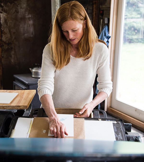
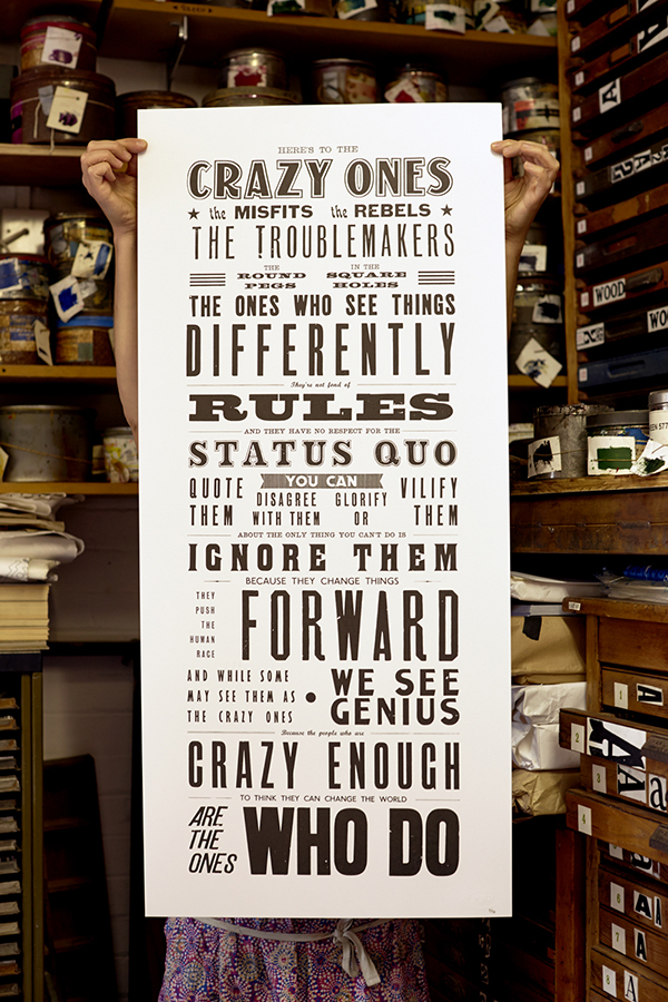
The love of paper, smell of ink and physical labor required drew me to printmaking. I loved being able to reproduce one image and share it with multiple people. I love the feel of the impression with letterpress printing. At markets, I ask each customer if they would like to feel a card. I believe the handling of the paper and experiencing the impression gives a greater joy to the receiver of the card than one that is printed digitally.

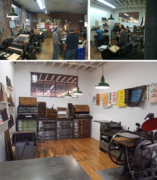
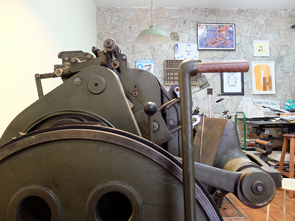
TINY SPACE, BIG HEART Tiny Dog Press’ print shop is in my 20’x 20’ garage. We purchased our home knowing I would need a studio workspace. Few houses in Baltimore have garages and ours happens to be a detached garage which makes it into its own separate building. I love my little garage. Shortly after moving in, we renovated the space which included rebuilding 2 termite damaged walls, adding windows, a sink, new walls, cement floor, lighting and doors. At the end I was told by our contractors that it would have probably been better to do a full demo and rebuild. Little did they know that printers love restoring old and broken things in order to make new and beautiful work.

The best part about the location of my studio is that I stay within my neighborhood/community. During most months, my windows display my garden. School days I hear, see and wave to the kiddos walking past after school. During the summer months, I open the studio up for neighborhood kids to produce work with artistic mentorship. I love receiving knocks on the door from kids who know they can come in to draw, paint or print for 15-20mins before running back out to play. One young lady has been my apprentice for the past 3 years. She started with helping fold & package cards. This past summer, I taught her how to print, mix ink and general up keep of the shop.  During August, she designed and printed her own cards and then sold them at a holiday market! All of which she loved doing while it helped her push herself to new levels within her creativity and abilities to sell her products. I love when I receive random knocks on the door with kids showing me their recent design ideas! If I was in a traditional location, I know this would not happen as organically.

PRINTING MENTORS Kyle VanHorn & Kim Bently have been great mentors as I have started my business. I started Tiny Dog Press while renting print time at The Baltimore Print Studios.

Kari Miller of Tiny Dog Press produces big, bold, and colorful prints in her cozy Baltimore-based garage printshop.

As for printers who inspire, I will always love the work of Kiki Smith for its artistic beauty. For commercial printers, I was first drawn to letterpress through Mr. Boddington’s Studio and Hello Lucky.

DESIGNED FOR PRINTING I am a printer at heart. From the touch of the paper to the smell of the ink, my happy place is being behind a press.  I have a love-hate relationship with the computer. I design due to its necessity to grow a design-print business. I love printing for graphic designers, which is an area that I hope to grow in my business.

Kari Miller of Tiny Dog Press produces big, bold, and colorful prints in her cozy Baltimore-based garage printshop.

FULL TIME FUN I have been running Tiny Dog Press as my full-time job since March 2013. At the time, I was also running another small creative business. Now I only focus on letterpress printing through Tiny Dog Press. I have focused my business to grow organically, building the business with profits it produces. This year I will start paying myself from the business! My husband and I wanted the business to be self-sufficient from the start, so we have focused all profit back into growing the business.

PRINTING FEATS 2016 was a year of many accomplished goals within the business. Each accomplished goal brings great joy. The two that I was most proud: first time a product published in the Baltimore Magazine local shopping guide {August 2016 edition} and bringing on 5 new retail stores, one of which I had been wanting to have product at for over 3 years! 2017 has started off great with a first time mention in the Mid-Atlantic edition of The Knot Magazine!

Kari Miller of Tiny Dog Press produces big, bold, and colorful prints in her cozy Baltimore-based garage printshop.

Besides those goals being accomplished, as a business I am most proud of being able to use my business for more than producing products but also to reach my community for something bigger than the stationery I produce. This past November, I was proud to organize and host the Benefit Baltimore Market that brought more than 500 people out on a cold & rainy “Giving” Tuesday evening to a local brewery in support of 5 Baltimore City non-profits. Through beer, food and vendor sales, collectively we raised $2,000 which were donated to the 5 non-profits. In August, I collaborated with a local retail store to create and sell cards that would benefit a popular area that experienced severe flooding. I love having a small business that gives back to the community where it is placed. I love having the financial ability within my business to be able to give back to the community. I hope this is something Tiny Dog Press is able to continue and grow further into.

PRESS HISTORY Besides working on presses as a college student, my “first” press is the L Letterpress. Embarrassing, but we all have to start somewhere. After taking a class in letterpress printing and not having access to a press or permanent location to house a press, I purchased the L Letterpress to print mine and a friend’s wedding invitations. I still have the press and use it for kid workshops.

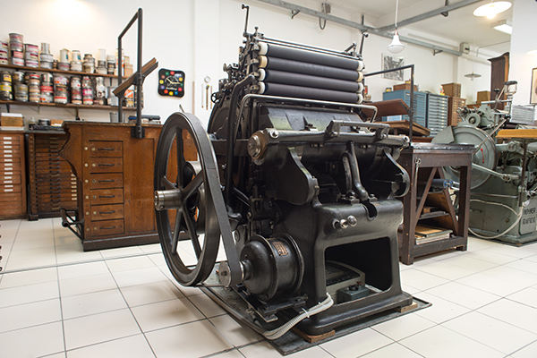
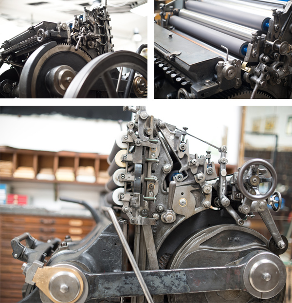
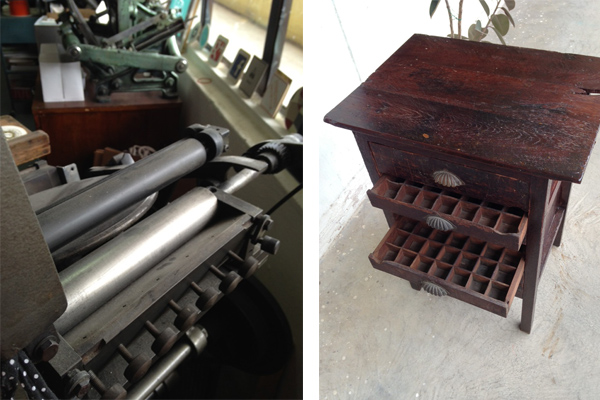
After moving back to Baltimore, I was able to focus on letterpress printing by renting time at The Baltimore Print Studios printing on a Vandercock SP20. I purchased my 1949 Chandler & Price press in 2014 and finally finished restoring it in 2016!

Kari Miller of Tiny Dog Press produces big, bold, and colorful prints in her cozy Baltimore-based garage printshop.

BOXCAR’S ROLE I purchased my first printing plates from Boxcar Press back in 2010 when I was printing on the L Letterpress. Since then they have been a great resource for plates and materials. When setting up my studio, I purchased my base, ink and several small supply items through the Boxcar store.

SHOP TIPS Any advice I have, others gave to me. If you are looking to start your own print shop, don’t fret – a press will come on your radar at the right time! Don’t try to force that time to happen sooner than it should. I was working on having a C&P press shipped to me from Texas which I found in an antique store, when suddenly the press I now own came on the market and was located less than a mile from my house. Huge cost and logistics saving.

When switching to a new press, give yourself time and grace. Each press prints differently. Different is not worse or wrong, it is just different. Learn how to design towards those differences or learn how to use those differences as a positive in product development.

Also, remember to ALWAYS check your crop mark line thickness or Boxcar will call you when you are at the grocery store.

WHAT’S NEXT Spend more time in the studio designing new cards and getting my hands dirty with ink! I am also looking at hosting a kids maker camp this summer and several kid focused workshops.

Huge round of thanks out to Kari at Tiny Dog Press. Catch her amazing new work on Instagram, Facebook, Twitter! Printed goodies can be purchased here on Etsy.

Printer’s Wonderland at Ice Pond Press

Molly Douma Brewer of Ice Pond Press is a self-taught, Montana-based letterpress printer and life-loving extraordinaire. From imbibing in the lush, raw natural beauty of her home state, she translates that creative power to form airy, beautiful, and bright eye-popping colored prints.  Seven years and counting, Molly still lives up to her own inspiring words – “there are many creative ways to reach a beautiful result.” She sat down with us to talk about her new card line, creating beautiful printed goodies, and taking the time to enjoy the natural gems that surround her daily.

Molly Douma Brewer of Ice Pond Press is self-taught Montana-based letterpress printer and life-loving extraordinaire

(All photography courtesy of Susan Beth Breuner Elements of Light Photography, Emma Light Photography, and Ice Pond Press)

PRINTING MARVELS IN MONTANA I live in Bozeman, Montana by way of Utah, Colorado and Michigan. Past job titles include: dog photographer, public relations director, professional skier and cookie cart peddler. I ski, fly fish, mountain bike, trail run and pretty much eat up everything Montana has to offer, most often with my husband and big white dog. And then we drink some beer.

Blind deboss business card from Molly Douma Brewer of Ice Pond Press is self-taught Montana-based letterpress printer and life-loving extraordinaire

SELF-TAUGHT CREATIVE I don’t hold an MFA or graphic design degree, have never taken a printmaking class, and I hadn’t used a press until I purchased one so you might say I am a homespun case. I have embraced the concept that there are many creative ways to reach a beautiful result.

I’ve had my backyard letterpress studio, Ice Pond Press, for seven years. I parlayed a full-time career in public relations straight into full-time letterpress. I suddenly had a need to create something tangible by using words, images, art, ideas and gorgeous paper. The extra reward is that this work could all come together into a product that makes people happy.

Knowing I was on the search for a press, my father-in-law spotted a gigantic Chandler & Price Craftsman at his printer in Utah. After an epic journey involving several U-Hauls, massive machinery, a mountain pass and a road trip with my in-laws, we delivered my press to the studio my husband had just finished building in our back yard in Bozeman.

Molly Douma Brewer of Ice Pond Press is self-taught Montana-based letterpress printer and life-loving extraordinaire

PRINTING ABODE I feel so lucky to have my little studio. My husband BJ had his sights set on building a sauna with wood from an old family barn. Plans were under way and it really sounded nice but I jumped in with big plans for a letterpress studio. Luckily he was not only supportive but speed-built the studio (with the help of builder friends,) hanging the barn door just in time for the C&P to arrive. We rented a Spider Lift to deliver it from the driveway to the backyard. It was a tenuous trek and several tree branches haven’t been the same since. Still, the 2.5 ton press was gently placed on the studio floor on a diagonal, facing the window and allowing for a view of surrounding trees and wildlife. It is an absolute delight to be in my studio space; it offers me peace and a lovingly created space where I feel good working hard. 

Molly Douma Brewer of Ice Pond Press is self-taught Montana-based letterpress printer and life-loving extraordinaire

PRINTER AT HEART I do some of the design, particularly if it involves stick people, flowers or text-only. Mostly I work with designers; my #1 being Michael Johnson. It’s like he has a view into my brain…he can translate my heady explanations of concepts into works of brilliance.

Molly Douma Brewer of Ice Pond Press is self-taught Montana-based letterpress printer and life-loving extraordinaire

FAVORITE DESIGN SOFTWARE I love Adobe Illustrator Draw.

Red and blue traditional wedding invitation from Ice Pond Press.

FULL TIME PRINTING FUN Yes, for the past five years. (After two years of learning and printing small jobs.)

PRINTING TRIUMPHS In my early days of Ice Pond Press, I was contracted to print a poster for a private Keith Urban concert. The job forced me to purchase a large Boxcar Base which was a turning point because now I do a lot of larger format posters and art prints. I feel a personal triumph each time I collaborate with artists to create beautiful letterpress prints that allow them a different medium for their art.

Also, I’m happy & excited to be a part of the Boxcar Blog’s printer profile series!

BOXCAR’S ROLE Boxcar is like no other partner I know. Every single time I upload an order I have the feeling that everything will be expertly done and will arrive on time. In fact, just today Rebecca fixed a phantom crop mark I didn’t even know was in my file. It’s things like that that create 100% trust. I can call and ask their opinion on how a file will work for platemaking and that helps me know if I can help a client’s wishes come true. Boxcar helps me create my weekly printing schedule because I know exactly when plates will arrive. Their efficiency helps my efficiency.

Boxcar Base in action at Ice Pond Press.Molly Douma Brewer of Ice Pond Press is self-taught Montana-based letterpress printer and life-loving extraordinaire

PRESS HISTORY My current press is my one and only: Chandler & Price 14 1/2″ x 22″ Super Heavy Duty Craftsman Press

Blind deboss business card from Molly Douma Brewer of Ice Pond Press is self-taught Montana-based letterpress printer and life-loving extraordinaire

SHOP TIPS As a self taught printer, I think everything I do might be a trick or a hack. One that’s tangible is HENRY GAGE PINS! They can take a beating and their malleability makes them invaluable. Also, crop marks on plates for pre-cut paper. I typically register by printing a blind deboss on my tympan (which is actually butcher paper,) using the impression of the crop marks to register and finally trimming off the crops before inking. Or, if my press is already inked, I tape a piece of tracing paper my setup, make an impression and then follow the same steps. 

WHAT’S NEXT I’ll roll out a talking vegetable card line and keep up with the year-round wedding season. I’m generally forging on into the wilderness of this wonderful letterpress world.

Immense round of applause out to Molly of Ice Pond Press for taking the time to let us discover the hidden printing gem in Montana’s backyard!

Let’s See That Printed: Dana Kadison’s Exotic Flamingo Letterpress Prints

When the intricately-detailed illustrated flamingo graphic passed through our platemaking service, we were eager to learn more about what was to become of this plate and the resulting final pulled print. The printer behind the design, Dana Kadison, let us in on how the illustration project came to be and how she turned a long-mused-over concept into reality.

An illustration by Dana Kadison being made into a letterpress plate by Boxcar Press

Dana filled us in on beautiful (and long-term) project details: “As a photographer and collector, I have built a library of images and ephemera that is the foundation for an ongoing series based on the Mexican bingo game Loteria. Currently there are eight Loteria images. Each one exists in more than one “state”: my CMYK proofs, which will eventually have reverses and be printed as cards in a boxed set; monoprints, which I produce whenever I want to work out an idea or a reverse (like the Yeats Mariachis); soon, the editioned prints which include letterpress layers; and finally, Ofrendas, of which the Flamingo is the first. The Ofrendas, or offerings, are simpler statements of the ideas in the Loteria card series.”

Dana Kadison on press with a Vandercook printing press.

“The Flamingo Ofrenda is casual and references Jose Guadalupe Posada’s work. About two years ago, inspired by a set of Players cigarette cards, I was thinking about, and scratching, all kinds of birds, particularly finches, but also hornbills, crossbeaks, frogmouths, macaws, etc., and finally settled on a flamingo for card #2. The flamingo, for Americans at least, is undeniably iconic and the males and females look alike.”

“Now there is a suite of 8 images ready for editioning on 18×24 sheets of paper. Each one synthesized from a myriad of “stuff”: you know, the words, texts, images, objects, conversations that make up a life. And the first thing I wanted to add to each image is the text that will be on the reverse each of card when they become actual cards. For the viewer the text would be a clue to what I was thinking. Of course I wanted it in my own handwriting. And this is where letterpress comes into play. It all started with the idea of plates of text in my own handwriting.”

“So I took a class at Robert Blackburn on a Vandy 4. The flamingo, my first plate from Boxcar, was for that class. Using that Vandercook 4, I printed the flamingo two ways, straight and then over monotypes. All the prints have the same degree of impression. I like the straight prints, but am still deciding about paper. The monotype backgrounds please me the most, perhaps because I did not try to register them with the plate. Knowing that, once set, the Vandy would take care of itself, part of this exercise was to let go of the urge to register. While all of this is happening, I did press my first image with Pilar Nadal at Pickwick Independent Press in Portland ME.”

Dana Kaddison prints beautiful letterpress flamingo monoprints with Pilar Nadil.

“Letterpress is an aesthetically and physically freeing experience. We all know that paper is not really 2D, that it has depth. Letterpress layers add visible texture that can be seen with or without ink. And a letterpress registers. It is a little unsettling to use a press, completely unlike pulling the screens myself. Atmospheric conditions in the NYC studio are so variable and water-based inks misbehave in such interesting and frustrating ways that achieving consistency in CMYK prints takes great physical and mental stamina.

With letterpress I can imagine more and physically achieve more. For the editions of the first 8 images, I chose to set the 6.5×10.25 card faces on 18×24 sheets of paper and handwrite the text from each reverse below the screenprint of its card face. The handwritten texts are becoming letterpress plates. And there was more beautiful white space available. So parts of the reverse images are now finding their places as letterpress in that white space. For example, #2 will be embedded in the enlarged body of my scratchwork flamingo.”

A large heaping round of thanks out to Dana for letting us get a sneak peek at the brilliant flamingo designs!

The Printing Realm of Genghis Kern

A decade has passed and the creative gleam in Jason Wedekind’s eye still outshines even the brightest of metallic ink accent in his impressive printing portfolio. The Colorado-based printing realm of Genghis Kern has grown from two dozen cases of lead type & a single press to setting-up camp (and shop) in his dream workspace (not to mention acquiring a drool-worthy collection of hand-set and metal type). With one foot rooted in both the design & job world, Jason and his exceptionally gifted team have repeatedly pushed letterpress printing boundaries and amped up the creative oomph to their printed work. We stopped in to chat with Jason about the joys of printing, working with his mentor Tom Parsons, balancing life with two wonderful kids, and keeping up with the flow of community workshops.

Jason Wedekind (left) of Genghis Kern in his Colorado-based letterpress printshop.
(from left to right: Jason Wedekind and Jeff Shepherd of Genghis Kern)

DECADE OF PRINTING INGENUITY I founded Genghis Kern 10 years ago this May when I started printing for friends while working as an art director for a small design firm in Denver. I still remember the day when I bought my first press, leaving with 24 cases of lead type banging around in the back of my SUV and saying “what the hell did I just do? I don’t even know if I like this?!?!” I had been introduced into this wonderful world by Tom Parson, Denver’s poet/printer grandfather of letterpress, and founder of the Englewood Depot Letterpress Museum. The letterpress bug bit hard and hasn’t stopped biting yet. I spent many a night printing all sorts of fun stuff while learning the trade.

Silver metallic letterpress printed invitation piece amps up the wow-factor at Genghis Kern.

The firm I worked for got hit hard during 2009 and I was thrust into the world of self employment. With an 18month old daughter, it was stressful, but the payoff was rewarding. From day one it’s been a nice mix of design work and job work, with the goal being producing tactile work that makes both us and our clients proud. “One foot rooted in each world” is how a recent shop visitor described what we’ve built.

CREATIVE IN COLORADO Our current shop is my dream space. I drove by it in 1999 and said “That’d be a cool place to work” and now we do. It was a Hispanic Furniture and Record shop 2 blocks from my house. We have 2,000 square feet up front which we turned into a co-working space for creative types, and our 1,000 square foot print shop is in the back.

Pressman and presses alike convene beautifully at the commercial letterpress printshop that is Genghis Kern.

When I brought my current pressman/designer Jeff Shepherd on over a year ago, he mentioned he had a windmill in his folks’ garage. My garage shop was full to the gills at that time, but I knew growth was in our future. You see, I had moved my design arm of Genghis Kern out of my bedroom 2 years prior into a shared work space with 4 other creative firms. When I brought a pressman on, they worked in my garage and I ran back and forth the 5 blocks from the new “office” to the print shop. It worked, but grew tiresome. Let alone having to keep my house clean in case they needed to pee. I started looking for a new space that would allow us to combine a print shop and office space, and reached out to the owner of the furniture store blocks from my house. It had been vacant since 2005.

He agreed to my crazy plan and we broke ground in January of 2015, gutting the space and crossing our fingers that our floorplan for the pressroom would work out. Then the dominoes began to fall. We started with my original 10×15 C&P, an Asbern ADR-1 (German SP-15 Clone), a 10×15 Windmill, and a 30″ Challenge cutter. While doing the buildout Jeff saw a Heidlberg KSBA at auction that had inkers on it. My “dream” press. So we added that to the mix, quickly shuffling our floor plan to be to make room. Then one of the printers from our bimonthly printer’s lunch in Denver walked into our garage and said “Did you guys see that Vandercook for sale on the western slope?” Jeff ran inside and put an offer down on it. HIS dream press, a Vandercook 4.

Pressman and presses alike convene beautifully at the commercial letterpress printshop that is Genghis Kern.

We figured we’d deal with the floorplan when we had a floor to plan. SOON. So that became our current shop. We set the two proof presses up in our “type alley” where we host an occasional workshop. It’s fun having different presses to turn to when something goes south.

TL;DR: Our shop started out in my garage 10 years ago. 1 C&P and a cutter. I then moved 3 blocks and built my second “garage” shop, large enough to fit a C&P, Proof press (not yet owned), and a windmill (not yet owned), a stone and a cutter. What I neglected to tell my wife when we were designing the floor plan, was that if the presses were to move out one day, my dad’s vintage BMW motorcycle collection could slide right in where the presses once stood.

Colorado-based Jason Wedekind of Genghis Kern prints letterpress with creativity and panache.

INTRIGUED BY LETTERPRESS While working as an art director back in 2003, someone brought in a beautiful custom duplexed letterpress/foil stamped card and said they wanted to add 3 initials to their name in 6pt. I looked at my print broker and asked “How the hell are we going to do that?” She told me letterpress. Hand-fed letterpress. I was intrigued. I knew of letterpress from the design annuals but had never been up close. That was about to change in a big way. I walked into the printshop of Tom Parson, our local “godfather” of letterpress and was transported to a different time. Tom printed that job and I said “I want a press (like every designer in the mid 2000s)” and he put me on the list. I asked him to teach me the process and he showed me how to do everything from hand washing plates to treadling. When it came time to print, he started kicking and I asked if I could try. He let me. The rest is history. I ended up kicking 600 cards in 40 minutes to which Tom asked “where did you learn how to do that?”. I told him my childhood was spent working in a decorating tool factory in Chicago, our family business which was started in 1908. Slave labor at its finest. But that slave labor instilled some hand eye coordination that I surely don’t complain about now.

The beautiful printing presses gleam in the sunshine of Genghis Kern (Colorado).

FIRST PRESS 1922 10×15 C&P

PRINTING MENTORS Tom Parson will always be my first mentor, but my inspirations are the people out there pushing the boundaries and keeping the art of letterpress alive like Jen Farrell of Starshaped Press in Chicago. A day rarely goes by when I’m not wiping drool of my phone thanks to her instagram feed.

DESIGNED FOR PRINT I’m a designer and a printer. I’ve been hiring designers and printers. And we’re on a quest to turn some designers into printers. Feet in both worlds.

THE CREATIVE PROCESS My design process has been greatly influenced by the door that letterpress opened to the typographic world. Being faced with a design challenge and combining passions when applicable is the best feeling. Whether it be typographically or texturally, or both.

Jaw-dropping tight registration and beautiful letterpress printing are regulars at Genghis Kern (Colorado).

FULL TIME FUN, ALL YEAR ROUND Lately I’ve been printing a little more, but as the workload grows, I find myself printing less and less but enjoying the time in front of the presses even more. I’m also a member of the Amalgamated Printers Association, which is an incredible group of 150 printers from around the world who print 4x or more times a year. Each member gets a monthly envelope with everyone’s work in it. So creating for that keeps me on my toes and up to my elbows in type.

PRINTING FEATS I’m proud that I’ve been able to grow a business from a passion, and employ people with similar passions. I’m also proud to keep these ancient machines and type from the scrap heap. Those two kids I’m trying to instill a work ethic in before it’s too late? They make me proud on a daily basis. I think I complained more about “helping Dad” when I was their age. Eva and Jasper? Thanks for putting up with me!

BOXCAR’S ROLE The quality of Boxcar plates are unparalleled in my opinion. We have local photopolymer plate makers but letterpress isn’t their main focus. I know that if I get my artwork in on time, I’m going to get plates back quickly. And when there’s an issue with my plates, the help that the staff provides is top notch.

Eye-popping color and beautiful blind deboss letterpress pieces are hand-crafted with care at Genghis Kern (Colorado).

SHOP TIPS Embrace your local community. The amount of knowledge gained by the “olds” out there who aren’t getting younger, by the way, is invaluable. And most of them love sharing. If there’s no active community that you know of, start one by inviting over some old printers for coffee and donuts.

WHAT’S NEXT Just keep on organizing our new space. Offer a few more workshops. Streamline work flow. And continue to produce work we’re all proud of.

A huge round of applause (and thanks!) out to Jason of Genghis Kern for letting us get a sneak peek at his wonderfully creative printing world.

Unique International Printing Presses

Across the globe, letterpress printing has captured the heart of many a printer, be they from Italy, Brazil, the U.K. and beyond. Each country has dipped its own pen and added to our collective letterpress history through the beautiful creation of presses and the ingenious pressman at the helm of these metal beauties. We reached out to some our printing colleagues to check out what unique international printing presses are founded in their country or rare presses they have had the honor to ink up. Some are of their own countries’ origin in production and some are foreign-born masterpieces. Either way, the global letterpress community grows stronger as more of these special presses are inked up and shared with others.

Davide Tomatis – Italy – Archivio Tipografico  our latest press is a Schelter&Giesecke – Phoenix IV. This press is a sliding platen press, designed and produced in Leipzig at the beginning of last century (around 1905). The maximum printable format is 40 x 66 cm and its weight reaches 1600 Kg. It has 4 inking rollers that work in couples: one couple inks the form on its way down and the other couple on its way up. It’s a very sophisticated inking system that we’ve only ever seen on this kind of press. It ensures a perfect inking of the form, as the active inking rollers are always evenly inked and don’t carry back on the form the sign of the type they just inked.

Davide Tomatis of Archivio Tipografico (Italy) prints on a Phoenix IV (German press) | Unique International Printing Presses feature

We acquired it in January 2015; our friend Luca of Anonima Impressori told us about a place near Bologna with an incredible collection of platen and piano-cylinder presses. We weren’t in need of any new press but – as you can imagine –  we couldn’t help ourselves. We immediately went there and what we found was a very big, dark, cold and humid warehouse with presses everywhere. We never saw such a large place before.

Most of the machines were quite conventional: Saroglia, Heidelberg, Nebiolo… but just around a corner, hidden by a Nebiolo Urania 70×100, Emanuele couldn’t believe his expert eyes when he recognized his dream press: the Phoenix!

Davide Tomatis of Archivio Tipografico (Italy) prints on a Phoenix IV (German press)

The Phoenix press series, produced by Schelter & Giesecke, are a particularly big and sturdy model of presses and one of the biggest ever built in the history of printing. As far as we knew the only working Phoenix in Italy was in Enrico Tallone’s printshop; what’s more, the model in the warehouse, was the biggest one of the series. No need to specify that seconds after the discovery a decision was taken: we had to make place for her in our printshop. We had a lot of work to do on her: she had no inking rollers, no engine, no cleaning system and she was covered in years and years of dust and dried ink.

Davide Tomatis of Archivio Tipografico (Italy) prints on a Phoenix IV (German press)

The restoration was quite a long and difficult process; as we didn’t have any manual or technical info we pretty much had to guess everything, from the size of the rollers to the right kind of engine. After a few tries we found the right size of the rollers and we were very lucky with the discovery of a super engine by our trusted and experienced electrician (a beautiful original AEG model). After that we engineered a cleaning system for maximum practicality of use.

Davide Tomatis of Archivio Tipografico (Italy) prints on a Phoenix IV (German press) | Unique International Printing Presses feature

We had to come up with an original solution as the machine wasn’t originally equipped with any cleaning system: the printer had to dismantle the rollers after each use and clean them manually. Lastly, to look as beautiful and as majestic as she deserves, we restored the amazing details embossed in cast-iron on the body of the machine, as Schelter & Giesecke mark on the side of the press and the name of the model on the front and we brought them back to their original golden color.

Davide Tomatis of Archivio Tipografico (Italy) prints on a Phoenix IV (German press)

Now the Phoenix press holds pride of place in our space: it’s the most elegant, powerful and historically relevant press we’ve ever owned, and we’re very proud for having brought her back into printing shape!

Marcelo Pinheiro – Brazil – Carimbo Studio The first press we had was a small tabletop one. We found it with a guy who buys and sells graphic equipment here in Brazil. He also had some metal type with it (in fact he was going to sell it to the junkyard and have all the type melt). Its original colour was black, but they had it painted with this green hammered textured paint, that helps disguise imperfections, but on the other hand is good for cleaning with solvents.

It is a Japanese press, manufactured by Osaka Printing Ink company (serial number L603) but we don’t know much more about it.

Osaka Printing Ink Company press | Unique International Printing Presses

Here in Brazil this kind of press is called ‘socadeira’ or ‘prelo de soco’ as you have to pull the lever to make an impression (punch = soco, in Portuguese). We are trying to get this press back to its glory days and we plan to use it to show people how letterpress printing works, demonstration and such, as it’s very simple to operate (once you have already made all previous adjustments).

Another press we have in the shop is from a Brazilian manufacturer called Catu (meaning ‘Very Good’ in Tupi Guarani – Brazilian indians’ language). I think that “Minerva” – like the Goddess of Wisdom and Arts – is kind of a generic name that all platen presses are called here and on Latin America as well. The company was founded by German immigrants and started producing printing equipment in 1946 – and they still make offset equipment nowadays. It’s very common around here, but despite that, we can’t find much information about it – we don’t know when it was made and we don’t have a manual. It was still working as a printing press when we found it, but people also modify it for die cutting, thus removing all the inking system and all rollers.

This model is often referred to as Minerva Catu 1/4 – as its printing size corresponds for a quarter of a 99×66 cm (Brazilian standard) paper sheet. We heard that its design is based on some German model, but we really don’t know. It’s a hand fed platen press and it has adjustments for rail height and printing pressure. We find interesting the lever for turning the flywheel on – and off, as it also works as a break. It has adjustable speed but we like to run it slowly and appreciate the work as we go!

Marcelo Pinheiro of Carimbo Studio (Brazil) prints with a Minerva Catu press, a press made originally in Brazil.Marcelo Pinheiro of Carimbo Studio (Brazil) prints with a Minerva Catu press, a press made originally in Brazil.

Marcelo Pinheiro of Carimbo Studio (Brazil) prints with a Minerva Catu press, a press made originally in Brazil.

There are lots of these presses here in Brazil, but they ended up mostly used for finishing (die cutting, scoring, numbering). We have seen people painting Catus with all sorts of colors (black, white, red, etc.) but we like ours as it was made and its greenish industrial paint. But we made special leather grippers for the impression handle and the start / stop lever. It gives our press a much cooler look! Coincidentally, we ended up buying it from the same person that we bought our Heidelberg Windmill from, but it was totally random.

Marcelo Pinheiro of Carimbo Studio (Brazil) prints with a Minerva Catu press, a press made originally in Brazil.

It weights over 2500 pounds (1150 Kg) and has a printing area of 13 x 19 inches (335 x 487 mm). On our Catu we have printed album covers for a French / Brazilian Music label and we made posters for Association Typographique Internationale  and for Englewood Letterpress Depot, besides several other projects. It is our press of choice when running larger pieces.

The Catus are always accompanied by two side tables to keep the paper sheets: on one side you leave the blank paper and on the other one you put the sheets that were just printed as you are hand feeding the press.

We find it easy to setup and it has a feature that I haven’t seen on other presses: it is possible to adjust the parallelism of the platen vs. the form. This is sometimes useful when adjusting makeready. The maintenance is somewhat curious, mainly because of spare parts… Even with just one model, not all Catu Minervas have exactly the same design on parts and holes. It is said that if you disassemble 3 Heidelberg Windmills you will be able to reassemble the 3 machines again perfectly. But if you disassemble 3 Catus and mix all parts you won’t get 1 single machine assembled back again!

There are other machines on the Catu family though. It has a younger sister: Catu Mirim (something like Small Catu) – as the name says, the printing size area is smaller. They also used to make cylinder letterpresses as well and that’s something that we are considering adding to our roster, too!

Marcelo Pinheiro of Carimbo Studio (Brazil) prints with a Minerva Catu press, a press made originally in Brazil.

Pamella Farrell – UK – Farrell Press We currently have three beautiful presses in studio, a 15×10 Arab Press c1894, an 8×5 No.1 Cropperette Press c1888 and an 8×5 Adana Press which were all lovingly restored by my husband.

I started out printing on the Adana, I’m mainly self-taught. I was the first letterpress printer in Ireland to reintroduce the craft to brides and grooms, offering letterpress wedding stationery in 2008 and the business has gone from strength to strength. As demand grew I knew I had to invest in a larger press. I searched throughout Ireland to no avail, I found out a lot of presses had been sold for scrap when litho printing became popular!

I then looked at the feasibility of importing a press from the UK or the US. I was lucky to stumble across a sale ad for the Cropperette and the Arab press. They were owned by a photographer in London, UK, who was moving house and found them while emptying his garage. He hadn’t used them in over 20 years. Myself and my husband took the ferry over to the UK and drove to London in a van to collect them.

Pamela Farrell of Farrell & Chase (UK) has a delightful Arab press in her printshop.

The Arab had to be taken apart as it was too heavy for us to lift, lucky they were designed to be “flat packed” and with the manual my husband (who is a construction plant fitter), knew what he was doing. A nerve-wracking journey home and a few days later, the two presses were up and running with thanks to my husband’s skill.

“The Arab is claimed by some to be the finest hand-fed platen in the World. In terms of cost and weight, it out-performs other machines; and the fact it is designed to be dis-assembled and rebuilt makes it easier to trans­port than other, sim­ilar, presses.” (source: http://britishletterpress.co.uk)

The Arab Presses were produced in the North of England and our Arab press is still painted the original blue with red accents and has a spoked flywheel which was later replaced by a solid wheel to reduce accidents.

The Cropperette is a very rare British press built in Nottingham by The Cropper Company, if you have ever heard the term ‘to come a cropper’, a common phrase in Ireland and the UK, it relates to printers catching their hands in the printing press! The Cropperette is the more beautiful press of the two and has been very hard to find information on. It’s painted black with gold accents and a beautiful heart shaped foot peddle. It is lovely and free, very light to use with foot power where as the Arab is a very heavy press and difficult to operate by foot power alone. I have since added a motor to run the Arab press.

Pamela Farrell of Farrell & Chase (UK) has a delightful Cropperette press in her printshop.

The Arab press is the work horse which I use daily, the Cropperette is reserved for smaller jobs like labels and business cards and is used quite rarely and the Adana has become redundant. I have toyed with selling it but just can’t let go of my first letterpress.

Fabiano Santos – Brazil – Pergam Press The press is a Model “Minerva Catu” also known as “Catuzinha” here. I’m not sure what year it was manufactured, but I believe it is around the 1960s. The origin of the Catu press manufacturer company has been through a family coming from Hamburg, Germany, and they began manufacturing the machines here in Brazil around the 1940s.

Fabiano Santos of Pergram Press (Brazil) prints with a Minerva Catu press, a press made originally in Brazil.

Like the Windmill, it has all settings right at your fingertips, and it functions as an extension of our arms. It is very easy to adjust something on the press (according to the job being printed) because she “accepts” any setting. Even wire to hold up a few pieces of barnates tape for roller height adjustment. It is not widely used in Brazil. Some graphic design/print shops rarely use it for die cuts, but I have never seen anyone use it here to print other projects.

Fabiano Santos of Pergram Press (Brazil) prints with a Minerva Catu press, a press made originally in Brazil.

When I started looking for a machine to work with letterpress printing, I visited many old printers wondering where they had left their old equipment, and it was on one of these visits I met an experienced operator/printer who worked during the height of Minerva Catu. He had kept one of them in his garage. Since he had retired and no longer operated the machine, I bought it from him and now she has won a special place at our shop.

Corby – Singapore – Papypress Our press is a Super Ace on the machine with serial number 3361 on it. The labels are all in Japanese, and it’s an 8” x 10” Platen. Is this machine good? Not really, it has quite a few silly features that I haven’t quite figured out yet actually.

Corby of Papypress (Singapore) prints on a Japanese Super Ace press (detail: inkwell).).

This is the ink fountain.The knobs, as you would already know, control the flow of ink. However this is not a cylinder inking plate. It is an ink plate that rotates like an Adana. That means I can’t play with colors like one would do on a Vandercook. So why have knobs? Looks cool though.

Corby of Papypress (Singapore) prints on a Japanese Super Ace press (detail: inkwell).

This flywheel is like the tiniest thing I have ever seen. No bigger than 10” in diameter.

Corby of Papypress (Singapore) prints on a Japanese Super Ace press (detail: flywheel).

Sometimes when I want to print with a heavier depression the platen jams up and I would have to give it a manual push. But once you get the hang of it you’ll know what to do. Nonetheless it’s a nice “semi-automatic” machine to have around and not as bulky as a C&P. We use if for smaller cards that have images really close to the edge. By hand feeding, I can minimize gauge pin space.

Once we were at an old print shop looking for wooden stools to use in the studio (these type of wooden stools are always found in old print shops in Asia). In the corner of the shop I first saw the inking plate in the corner, when I asked if the machine was still around he pulled the cloth off and showed it to me. He said why would I want something like that? Why not buy a digital machine? Best deal I ever made.

Corby of Papypress (Singapore) prints on a Japanese Super Ace press (detail: wooden stool).

Presses like these were common in our region, the more common ones were even more block looking. Space was always an issue in Singapore, and these machines were built with big motors and smaller flywheels. I guess deep impressions only came much later and it would have worked perfectly for “kiss” printing.

If you have a unique printing press you’d like to share & gush about, join in on the conversation and post it in our comments section!

Perfect Aim With The Hunter Press

For those curious enough to venture into the beautiful and gentle rolling hills of the Scottish countryside, a thirty minute serene drive southwest from Edinburgh will find you in the company of friendly smiles, a easy-going pace of lifestyle, and the private farm workshop that is The Hunter Press. Lyndsey Hunter is the energetic entrepreneur manning the presses there and she let us in for a tour of her printing paradise — a true gem found in the heart of Scotland. She sat down with us between ink runs to talk shop, about her passions as a printer, and bringing more letterpress to the Scottish community.

Take a virtual tour of The Hunter Press, a private farm workshop that is home to Scottish printer Lyndsey Hunter.Take a virtual tour of The Hunter Press, a private farm workshop that is home to Scottish printer Lyndsey Hunter.

THE LOCATION The print studio is located on an arable farm just 12 miles outside of Edinburgh. It’s a nice peaceful spot, not too far from the nearest town but quiet enough to feel as though we’re in the countryside. The print space is adjoined to my husband’s blacksmiths workshop so things can get a little noisy at times. We’re currently restoring a 300 year old property further north in Highland Perthshire which we plan to relocate to within the next year. The print studio will then be located in one of the adjoining cottages.

I like to have a central hub which I can access from every point within the studio. Ours is a large prep/finishing table which often doubles as a set up area, computer station and photography surface.

SHOP SIZE 500 square feet.

FAVORITE THING ABOUT THE SHOP It’s quiet on the farm, away from traffic and city hustle and bustle, which really fuels my creativity. Within the studio, my favourite thing would have to be the old type cabinets which are used to hold surplus paper stock and our cutting dies. The drawers have taken a bit of a beating over the years, but add so much warmth to the space.

FLOORING MATERIAL Sturdy painted concrete below the printing presses. We added some comfy hard wearing carpet across the rest of the space. The studio can get really cold so it’s nice to have a little bit of comfort during those cold months.

TYPE OF SHOP Commercial but closed to visitors.

THE PRESSES 3 Heidelberg Windmills 10×15, one of which has been converted for Foil Printing, 1 Harrild and Sons Proofing Press in need of full restoration, and we are hoping to replace one of the Windmills with a Korrex Berlin Proofing Press very soon.

MOST VALUABLE SHOP TOOL Not a tool exactly but I definitely couldn’t run things without my wood burner on those chillier days! I’m not too sure how I managed without it at the beginning now.

FAVORITE INK + COLOR Ink of choice would be VanSon Rubber Based Inks. I often use oil based for specials. Current favourite colour to mix would be mint green.

CLEAN-UP ROUTINE Clean up is my least favorite part of the day!  Luckily the Windmills are fairly straightforward to clean.  I use a water-miscible roller and blanket solution with cotton rags and blue roll.

OIL OF CHOICE Castrol Magna 150 Mineral Circulating Oil.

CLEAN UP RAG OF CHOICE Old tshirts and sheets donated from the family.

PIED TYPE A very small amount of odds which we picked up with the presses.

BOXCAR BASE + PLATE SYSTEM I always work with Polymer Plates KF95. I had a couple of aluminum bases made locally when I started printing in 2012, they’re still going strong.

WORKSPACE ORGANIZATION TIPS Keeping things clean, especially the ink station.  I don’t like to leave the studio without carrying out a full ink clean up ready for the next day.  I also like to file and label all polymer plates from past projects.

PRINTING TIPS I’m completely self taught so I feel as though I’ve ticked my way through every mistake in the book and I still feel like I learn something new every day. It’s been said before but ink application was a big lesson! I started out using way too much ink, which in turn led to me wasting a lot and also spending too much time adjusting the roller heights. It’s best to start with a minimal amount of ink and build up to the desired effect. It’s much easier to add to than to run out and have to remix an entire custom colour. And always mix slightly more than needed (custom colour) in case of reprint. Oh, and oil those machines regularly!

Take a virtual tour of The Hunter Press, a private farm workshop that is home to Scottish printer Lyndsey Hunter.

A huge  round of thanks out to Lyndsey for this wonderful look inside The Hunter Press! Check out Lyndsey’s Pinterest page to see more of her work and inspiration!

Keeping Creative in California with Alissa Bell

Armed with a Chandler & Price 12×18, Alissa Bell flexes her creative muscles by balancing both business sense and creative aspirations. The cheery, go get-em gal has been in love with letterpress since she took her first class at the San Francisco Center for the Book, and has flourished as the Artist in Residence at the Kit and Ace Pasadena store, an iconic staple of creativity in Los Angeles. We caught up with Alissa between ink runs to catch up on her beautiful letterpress greeting card line and how her children are growing up with letterpress all around them.

We caught up with LA-based letterpress printer Alissa Bell of Alissa Bell Press about printing passions, flexing the creative muscles, and enjoying letterpress in sunny California.

CREATING BALANCE WITH LETTERPRESS I run a letterpress and design studio in Los Angeles with two girls, Hanna and Audra, and my dog Henry. Before I got into letterpress, I worked in public accounting for 4 years. I’m naturally a classic, type A person, but also love exercising my creativity. Creating my business gave me a perfect balance of both.

LOVE AT FIRST SIGHT I first took a class in San Francisco at The Center for the Book. That’s where I got hooked.

LIVE IN CALIFORNIA Currently we are the Artist in Residence at the Kit and Ace Pasadena store. It’s definitely a unique opportunity to be doing our thing inside the shop while people browse the clothing and wander the neighborhood. My favorite thing about the space is that, compared to any of our previous locations, it’s the shiniest. Also, for this season, we are able to give people access to watch letterpress live, which is rare.

We caught up with LA-based letterpress printer Alissa Bell of Alissa Bell Press about printing passions, flexing the creative muscles, and enjoying letterpress in sunny California.

THE DESIGNER & THE PRINTER We do a little bit of both. I’m lucky to have a nice balance in our work that allows us to both flex our creative muscles, as well as execute another business or designer’s vision. I have been running the business for four years, three of which were full time.

We caught up with LA-based letterpress printer Alissa Bell of Alissa Bell Press about printing passions, flexing the creative muscles, and enjoying letterpress in sunny California.

THE CREATIVE PROCESS Giving my brain clear space to create is most important. So, cleaning my home or studio are musts, and sometimes getting out of my normal environment, either a coffee shop, or lately, RVCC in Downtown LA. The actual inception of an idea comes differently for me each time. Sometimes I have to just put a lot of things down on a page and see what I can pull from. Other times I’ll have a quick flash of an idea, in the shower or wherever, which are the easiest to materialize.

PRINTING FEATS I’m proud of my team. I’m proud that we’re working in Kit and Ace. I’m also excited we have grown, and are able to make creating our own collections of greeting cards a priority.

We caught up with LA-based letterpress printer Alissa Bell of Alissa Bell Press about printing passions, flexing the creative muscles, and enjoying letterpress in sunny California.

PRESS HISTORY A Chandler and Price, 12” x 18” was my first and my last.

BOXCAR’S ROLE Boxcar has been an amazing resource since the beginning. Even when I didn’t know what I was doing, Rebecca sat with me on the phone and talked me through what kind of base I would need and what kind of plates to order. Since then, I’ve used them for all of my plates. They always catch my errors, show me grace in the ordering process, and present a great product. I love them.

We caught up with LA-based letterpress printer Alissa Bell of Alissa Bell Press about printing passions, flexing the creative muscles, and enjoying letterpress in sunny California.

SHOP TIPS This may not be new to many people, but this year we got to experiment with ombré ink on a platen press. We were able to tie back the part of the press that rotates the ink disc so the color was applied unevenly, allowing us to create both color ombré and a black and white gradient.

We caught up with LA-based letterpress printer Alissa Bell of Alissa Bell Press about printing passions, flexing the creative muscles, and enjoying letterpress in sunny California.

WHAT’S NEXT For the next year, we’re working on finding a new location after our residency at Kit and Ace, focusing on continuing to teach Hanna how to print, and having a good time. Last year we launched our ready to order stationery collection, and in 2016 we hope to build our collection of ready to order wedding invitations on our site.

A huge appreciative round of applause (and thanks!) out to Alissa for letting us get a glimpse of her wonderful printing world out in sunny California!

New North Press Pushes Printing Boundaries

Richard Ardagh of New North Press pushes printing boundaries by uniting technology and old-world printing traditions. The UK-based letterpress printer melds his traditional printing background, his reverence for type (and boy does New North Press have a few fonts… 700+(!) typefaces), and his love for technology. We caught up with Richard about how working with the 3-D printed typeface A23D (a first of its kind) continues to inspire him on a daily basis.

Richard Ardagh of New North Press pushes printing boundaries by uniting technology and old-world printing traditions.

LETTERPRESS IN LONDON My name is Richard Ardagh, I’m a partner of New North Press letterpress studio in London, UK. I studied graphic design at Central St. Martins and that’s where I was first got a flavour for letterpress. A few years after graduating, around 2008, I met Graham Bignell (who had founded NNP in 1986) and we began working together producing posters. In 2010, with the help of Beatrice Bless, we held an exhibition called Reverting to Type, showcasing contemporary letterpress from all over the world. New North Press is now run as a partnership, focusing on keeping the craft alive through teaching, working on commissions, and producing our own work.

Richard Ardagh of New North Press pushes printing boundaries by uniting technology and old-world printing traditions.

SHOP STORIES The building we’re in is an old shoe factory on a cobbled street in Hoxton, a previously industrial and now increasingly gentrified area of East London. The press shop is full to the rafters of type treasure. I love seeing people’s expressions when they visit for the first time. We have over 700 wood and metal fonts and three large cast iron hand-pull presses – two Albions and a Columbian – plus two proofing presses and an Adana.

Richard Ardagh of New North Press pushes printing boundaries by uniting technology and old-world printing traditions.

PRINTING MENTORS Beatrice and I are hugely fortunate to benefit from Graham’s 30 years of experience and enthusiasm.

DESIGNED FOR PRINT We set type by hand, so design is an integral part of what we do. We’re lucky to have clients who appreciate that and want to work with us because of it. It’s also an important part of our teaching to help people understand how to best communicate their intended message.

THE CREATIVE PROCESS Personally I start with a pencil and paper, getting ideas down and thinking through how to order the information. I prefer to start with a fairly clear vision, but have learnt to accept and work with the quirks of the process.

PRINTING FEATS In 2015 I ran a project to produce a 3D-printed letterpress font, with the idea of making a prototype that connected the newest and oldest forms of print technology. Thanks to an Arts Council grant I was able to commission the best people I could think of to work with: A2-Type to design the font and Chalk studios to fabricate it. The result, called A23D, is a font like no other; a wireframe design with each character made up of 0.3mm lines giving them a 3-dimensional appearance similar to an architectural plan. I’m very proud of it and hope it inspires the next generation to keep evolving what letterpress is and can be.

PRESS HISTORY Graham’s first press was the Albion and this was the press I learnt on too.

Richard Ardagh of New North Press pushes printing boundaries by uniting technology and old-world printing traditions.

PRINTING TIPS Pressmanship is a complex art, I seem to learn something on each job I print.  There are a million little tricks with hand-presses, ways of using the tympan for makeready and masking using the frisket.

WHAT’S NEXT We’ve been invited to be part of some exciting projects and also hope to attend the International Letterpress Workers Summit in Milan again.

A huge round of thanks to Richard of New North Press for letting us catch up with the delights of his printing abode.

Heidelberg Alert – Printing Press At Work On Screen

Though the popular USA Network series “White Collar” is now in it’s 4th season, a nostalgic look back at the series pilot shows a Heidelberg windmill going full tilt in the final minutes of action.  The press is supposedly printing counterfeit, multi-color Spanish Victory Bonds.

( image credit: USA Networks © 2009 )

The bad guys are trying to finish printing and box up the bonds before the FBI breaks down the doors.  It’s often a game of “Spot the Mistakes” when a printing press is used in a movie or television.  However,  it’s also a source of pride to see and say “hey, it’s a (fill in the blank) press” when you come across one.  You’ll probably admit that, when possible, you back up the action to take a second and even third look at the press (it’s okay, so do we). Just remember — this Heidelberg windmill was forced to do these illegal deeds.

Also spotted recently (with some very careful sleuthing) is a cameo appearance of another Heidelberg Windmill tucked away in the corner of print shop in the Academy Award-nominated 2002 film, “Catch Me If You Can”, starring Leonardo DiCaprio and Tom Hanks.


( image credit: Dreamworks Pictures © 2002 )

The scene in question opens up with Tom Hanks’ character, Carl Hanratty, doing some of his own detective work with a few ink-in-the-blood printers while trying to locate where the crafty con-man, Frank William Abignale, might be next. In the far right, a sneaky Heidelberg graces the scene for a few seconds, but steals our heart for the rest of the film.


Workspace Spotlight: Slow Print

Nestled next to the hearty Mississippi River, Iowa’s own Slow Print hangs back in the thriving old Warehouse District in Dubuque and houses extraordinary letterpress work, a neatly arranged showcase of letterpresses spanning from a 1900s Chandler & Price to a 1960s 10×15 Heidelberg Windmill, and as many letterpress stories as there are ink cans. Peter Fraterdeus of Slow Print let’s us take a look at what’s inside.

Workspace Spotlight at the Slow Print letterpress shop in Dubuque

THE PRESSES: 1960s Original Heidelberg “Windmill” 10×15 – Red Ball, main workhorse production press; 1950s Original Heidelberg “Windmill” 10×15 – Black Ball, mostly die-cutting and fail-over; 1940s Vandercook 219 Proofer 19×26; 1930sMiehle Vertical V36 Cylinder 13×19.5, and a 1900s Chandler & Price Gordon Old-Style 10×15.

THE LOCATION: My shop is in Dubuque’s Historic Millwork district, a few blocks from the Mississippi River, and in fact, I’ve been one of the “flagship” tenants. In the past two years, a public-private partnership has upgraded the District, including all the streets & sidewalks and a full-block quadrangle building to the tune of well over $20 million. I just hope I don’t get gentrified out – but the arts are a primary core function of the newly active district.

I’m a block from the Voices Warehouse Gallery and a block from the new Dubuque Community Food Co-op, so it’s an exciting time to be in the area. The building is an early 20th century brick warehouse. The space I’m in was converted to offices many years ago, but it’s surrounded on the 1st floor by raw warehouse, currently inhabited by an ‘architectural salvage’ and antiques dealer.

FAVORITE THING ABOUT THE SHOP: My large blue oriental rug in the coffee/lounge area (about 100 years old, it’s nearly worn out) with the futon couch and 1960s LaPavoni espresso maker.

NUMBER OF PRINTERS IN THE SPACE: One, just me and my new apprentice for the summer, Rachel.

MOST VALUABLE SHOP TOOL: Other than the Heidelberg Red Ball, and my MacBook Pro (without which there would be no business!), the most valuable tool is my loupe.

PLATE AND BASE OF CHOICE: I use KF95 on a locally machined aluminum base. I bought a 24×48 slab of .875 aluminum and had it machined down and cut into numerous smaller sections from 18″x24″ (used on the Vandercook) down to 2″x3″. It’s been in use since about 2007.

FAVORITE INK:  Oil-based – either VanSon or others as needed.

SOLVENT OF CHOICE: WM Wash from LithCo. I use Putz Pomade on the rollers after wash-up, which keeps any remaining medium from drying into the surface. The slightly pumice gritty stuff also helps keep the rollers from glazing. I’ve been using rollers from Advance in Los Angeles with very, very good results.

OIL OF CHOICE: 30W non-detergent

FLOORING MATERIAL: Hardwood floors.

PIED TYPE: Plenty. Much of it is wood type, as I purchased a barrel full on ebay some years ago. Couldn’t stand to see it auctioned off a handful at a time. I have one galley full of 24 point Legend, the beautiful Ernst Schneidler calligraphic type, purchased from an eminent printer who was closing up his shop a few years ago.

He shipped the type in the cases, with nothing but a sheet of single-corrugated cardboard on top. When the shipment arrived, the UPS driver set it on its side (although it was marked “keep flat”) and all the type was pied in a mound under the wrapping. I was not at all happy. Took hours just to get it into the galley, and I still haven’t figured out how to read Legend backwards. Major headache.

ORGANIZATION ADVICE: High tables and work surfaces with plenty of storage underneath.

PRINTING ADVICE: These are hardly secrets, but for the auto-didacts who haven’t yet figured it out, these will help a lot.

  • Don’t add white to color. Add color to white.
  • There’s nothing worse than slimy long ink for sharp printing. But don’t add too much mag, or the ink won’t want to come off the roller!
  • There’s no point to adjusting the rollers if there’s too much ink on them.
  • How much is “Too Much” ink or “Too Long” ink is entirely dependent on the form being printed.

Deep impression only makes sense with deep paper, otherwise it’s just gauche. (Note to clients: you can’t have deep impression on both sides of the same sheet – unless there’s no overlap from back to front)

Slow Print Workspace spotlight