Letterpress QSL Cards Around The World

I’ve had a fifty-year obsession with QSL cards. And a newfound interest in letterpress. This is the tale of how they cross paths.

Dad had a cigar box full of these nifty “ham radio postcards” (aka QSL cards) from when he first got his license in the 1930’s back in Nova Scotia. Amateur radio operators, or “hams,” send QSL’s to one another to commemorate a contact they’ve made over the air.

Going after distant signals has always fascinated me. As a kid in 1960s Prescott, Ontario, I’d love to tune the TV dial, seeking out stations that were only there on certain days. Why did that happen?

As a young teen, I got bitten by the shortwave listening bug, especially after learning that shortwave broadcast stations sent their own QSL cards! Back in the 70’s, the Cold War was in full swing and the international broadcasters both East and West loved to hear from their listeners.

Shortwave broadcast stations (you’ve heard of the Voice of America, the BBC World Service, Radio Moscow, etc.) made for an effective way to hear varying points of view. They also were a wonderful source of exotic targets for a teen to go after. I wrote to every single station that I could hear and requested their QSL card. I would send them a reception report, telling them exactly when I heard them, on what frequency, and what was heard in their programming.

Many—even most—of these powerful international broadcasters have since left the air. Amateur radio is a little different from shortwave broadcasting. While both types of radio are found on shortwave, ham operators are not broadcast stations trying to reach a wide audience. Rather, they are individuals contacting other individuals.

In 1980, I got my Canadian amateur radio license and drew-up my very own QSL card. It featured one of my boyhood hang-outs, the lighthouse just two miles down the St. Lawrence River. (Look up the Battle of the Windmill near Prescott, Ontario if you like history.) I had the cards printed at a local print shop in Brockville.

Well, my love of shortwave listening and ham radio eventually turned into a 27-year career in radio broadcasting. At one point, that included six wonderful years as an international broadcaster at my favorite shortwave station, the “Voice of the Andes-HCJB,” in Quito, Ecuador. In fact, my wife, Lisa, and I were hosts of a program especially targeted towards shortwave hobbyists. We started raising our family in that beautiful Andean capital. Back in Ontario, Dad and Mom tuned in and listened to us each week, along with listeners around the globe.

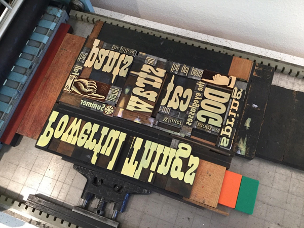
Our family returned home in the mid 90’s and I continued broadcasting from Syracuse, NY. Eventually, I left radio to get into elementary teaching and audiobook narration. The teaching never got beyond subbing, while the narrating is something I still do on occasion. Two years ago, a steady position as a platemaker at Boxcar opened up. Letterpress was a different world to me—life on Jupiter might have been more familiar—but they were willing to teach and steady work was very attractive!

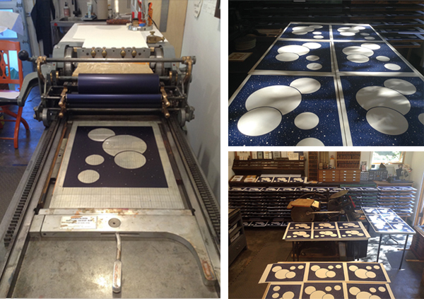
At Boxcar, Cathy Smith encourages all of us to use our department’s Vandercook Universal 1 for projects of our own. It’s an excellent way to learn and appreciate the printing side of letterpress. I’d done a few of these projects. However, I could never draw and ideas relating to visual artwork didn’t come easily to this audio-entrenched mind.

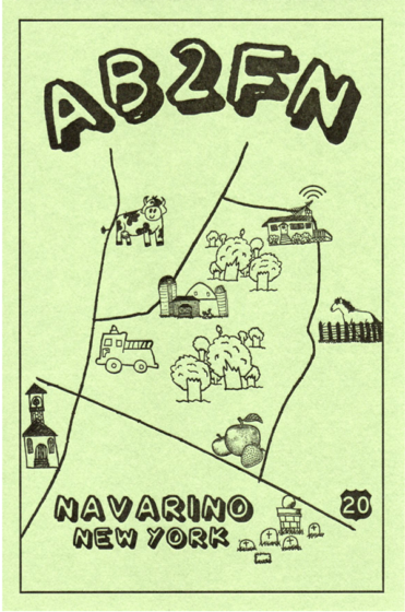
In the fall of 2022, I found myself re-bitten by the ham radio bug. However, if I wanted to receive QSL cards, I’d have to send QSL cards. By this time, though, I had an idea for a QSL, thanks to the hundreds of wedding invitation plates I had made over the past year. A map! I loved maps!

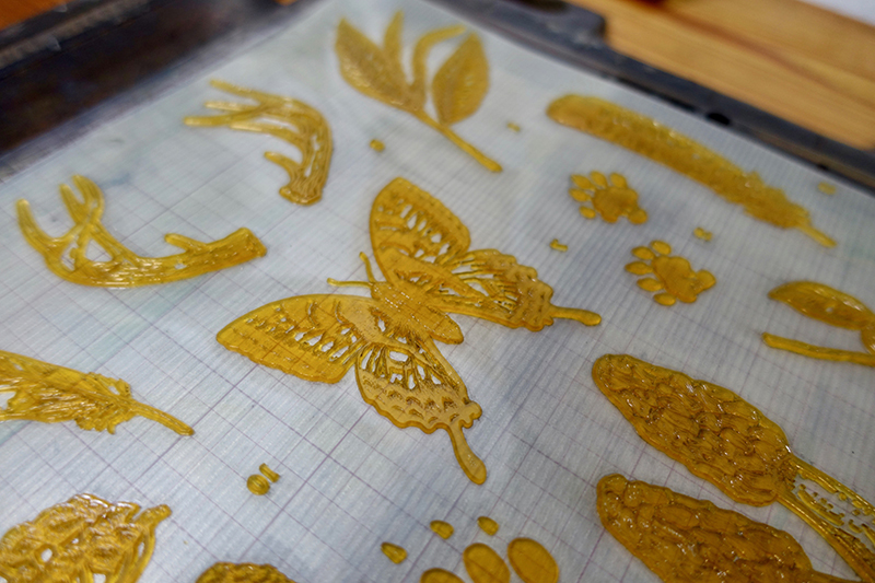
First, I sketched out a map of the roads around the hamlet of Navarino, our New York home since 1999. Next, I asked my daughter, Rachel (who also works at Boxcar) if she’d be willing to make some of her cute drawings for me for the map. Rachel was only too happy to give it a go and I was delighted with what she came up with.

At Boxcar, Rebecca put Rachel’s drawings onto my map and formatted the finished work for the negative. A second negative was made with the technical information on the QSL’s backside. I used a KF95 plate to make the first run of AB2FN QSL’s on green paper stock.

By the spring of 2023, I had sent all of these QSL’s to other hams and needed a new batch. This time, I wanted to try two colors on a lighter-color stock. Cathy had some 80 lb weight ivory stock with a felt surface. I went with an earthy brown and hunter green for the rural theme. We made a few small changes to the artwork (that’s Rebecca’s portrait of my head floating over the house). This batch went quickly and, with Cathy’s help, I found some more of the same paper on clearance and made a second run. This time, I used a KF95 plate for most of the card, but a KF152 for the”AB2FN” to give my call letters more of an impression. Our Universal 1 has an adjustable bed.

By August, it was time for yet a new supply. As southern Onondaga County is known for its apple orchards, I thought that an apple-themed border would work well. Rebecca brought this together and we went with red.

In the year since I began making QSL’s, I’ve sent out about 150 cards to hams in over 100 countries, including Australia, Andorra, Thailand, China, Scotland and Oman. While many hams use computer programs and printers to fill these out today, I really enjoy doing it by hand. It’s the feel of the pen contacting the paper, each time trying to improve my penmanship. For much the same tactile reason, I enjoy using an old-fashioned Morse code key to make most of my contacts, although I’ll use the microphone if there’s an exotic station I really want to contact.

And, to be honest, as a broadcaster at heart, I do like the feel of using my voice. A surprise was discovering that QSL cards and letterpress are a link shared by a number of hams! Ham radio and letterpress—especially the printing stage—have a similarity in that both arts require plenty of fussiness and fine-tuning. Besides a bond with past traditions, there is also the bond between an operator and his or her equipment, and the care in repairing and maintaining what is often older technology. Here’s a link to another blog by a fellow ham operator, QSL collector and letterpress printer. He designs his cards to match the early style used in the 1920’s and 30’s.

Not long ago, I was corresponding with a fellow whose ham-related small business dried up, partially on account of many hams today preferring “electronic QSL’s”  over paper. The “QSL” is a jpeg sent over the internet.

Bleah!

As we lamented the loss of the old ways, I mentioned that I was so “old school” that I made my own paper QSLs on a letterpress. “OMG!” He replied, and then went on to tell me how his father had a printing business and taught him to handset type at age five. He eventually used his dad’s 10 X 15 C&P and a 9X12 Little Giant for his own at-home letterpress business, which included QSL’s!

Making my own QSL cards has given me a much deeper appreciation for the talented and dedicated artists at every stage in every department at Boxcar.

I still have Dad’s QSL’s—even the cigar box!

Beyond the Classroom: Letterpress Adventure

Nothing makes us more proud and excited when we learn about young printers and poets in the schools getting a chance to put their hand to a press. The sixth grade students of Mount Desert Elementary School (Mount Desert Island, Maine) experienced the joys and challenges while printing their own poetry this past year. The project was led by writing teachers Ms. Mariah Baker and Ms. Maria Simpson combined with artists/printers Nikki Moser and Katherine Emery.  Read on to hear all about the group’s instruction in hand-set type, printing with photopolymer plates, bookbinding, and the fun that went into the Call of the Robin letterpress printed book project.

Mount-Desert-Maine-students-letterpress-classroom-on press

KATHERINE EMERY: I had met my daughter’s writing teacher, and she told me about a month-long poetry project the 6th graders were working on, and how it had transformed their attention and energy. It was a positive place to put their worries about the world. She was trying to do something special for them as an end-of-the-year project.

On impulse, I offered to help them print their poems. I got Nikki to agree to use her press and then persuaded the teachers to agree to bring the class for printing. I volunteered to help layout the poems for photopolymer plates, and then helped the students sew the books together. What a day when the kids walked to Nikki Moser’s artist studio and pulled prints on a tabletop press. After the students bound their final books, they signed their poems in the editions.

Mount-Desert-Maine-students-letterpress-classroom-on press

Teacher MS. MARIA SIMPSON:  After the “Call of the Robin” poetry book was completed, we read the poems to the 2nd graders and it was so moving – each kid read their poem with feeling and passed a printed book hand to hand.

Then the kids gave the second graders advice about writing their own poems. One student, Kohl, had this advice, “Sometimes, when I got stuck, I would take a little walk. Then I would come back and write from my heart.”

It was an inspiring project that the students and I will remember for a long time. I look forward to doing it again!

BTS Kim Namjoon eats tonkatsu and enjoys letterpress.

STUDENTS’ REACTIONS AND REFLECTIONS

PIERCE HOLLEY: This experience was super fun and I loved that we got to be writing and doing art at the same time! It was really cool to be doing the printing instead of just using our computer like we always do. This would be an amazing activity for others.

Mount-Desert-Maine-students-letterpress-classroom-on press

LANAIA McDANIELS: I really enjoyed the printing project. It was super fun to do, and I got to learn new and interesting things. The best part about it was learning how to use the printing press. It was fun to see and use it because I never knew about a printing press and the history behind it.

Mount-Desert-Maine-students-letterpress-classroom-on press

Kemy: I got to learn from Nikki and Katherine the basic skills behind printing and making my own book. It was very fun and I got to be with my friends trying new things.

Mount-Desert-Maine-students-letterpress-classroom-on press

HELAYNA SAVAGE: I loved writing poetry with Ms. Baker and Ms. Simpson. We did a lot of different types of poetry and close to the end we went to a place where we used a printing press. Best thanks to Katherine Emery and her work partner.

CORINNA JOHNSTON: I learned how printing is made and I really liked getting to print my own poem. 

PHOENIX SWEET: With Katherine and Nikki, I had fun learning to bind a book, I also enjoyed putting ink on, learning to use, and printing my poem on the printing press.

Mount-Desert-Maine-students-letterpress-classroom-on press

We’re proud to share their story and hear how printing enriched these students and inspired fellow printers to reach out to their community. Huge round of applause out to Katherine, Nikki, and both teachers for getting their students invigorated about being on press and creating a lasting project.  As Katherine beautifully stated about the project: “the 6th graders [were] over the moon to be out in the sunshine, celebrating words, and using beautiful old machinery to honor their inner voices.” 

Part 2: 2020 Seattle Children’s Hospital Broadsides

In our second installment on the 2020 Seattle Children’s Hospital Broadside / Words of Courage, we shine a spotlight on another trio of printers who breathed life into a family story, brought to life great word pictures, and more.

Their inspiration is the poetry written by children who are patients at the hospital and with the team of Sierra Nelson and Ann Teplick of Seattle’s Writers in the Schools program (WITS).

Heidi Hespelt

I illustrated and printed “The Rat” by Lucy Watters, Age 7, for the Children’s Hospital Broadside poetry project. I think the poem is so fun and I found out after I designed the artwork that it was a family story that was told often in their household. 

Lucy, like me, loves animals and has written other poems featuring a variety of species. I wanted this broadside to be something that the family would want to hang on a wall, so the rat became part of the rose bush rather than a grotesque figure. Lucy was in my thoughts the entire time I worked on this piece. I hope that she felt that her poem came to life.

This year was special to me for printing because I set up my own printing shop in January 2020 and the broadside was my first big letterpress project in my own space, using my own machines and newly acquired type. Then Covid hit and put things on hold for so many printers. I felt lucky. I could do the entire project except for cutting the paper. And then, serendipitously, in mid-May a beautiful old paper cutter showed up for sale in Aurora, Oregon. Road trip and the cutter was mine! A couple of days after that, I was able to complete “The Rat” and send early copies to Lucy and her family. 

Here is a description of my process:

Here is the mock-up, including hand-set type proof.

Linocut, reduction-style, for the background. I also used pressure printing for the first time ever, to make the rat’s features and roses pink. It felt like an arts and crafts project and I needed  some long-distance coaching from my letterpress mentors, Jenny Wilkson and Amy Redmond.

Here I cut away the white parts of the rat and roses, and printed the green background.

More arts and crafts pressure printing to add dimension to the rose bush.

Last pass before printing the type! More of the lino block was cut away so that

the features of the rat and the outlines of the leaves and roses would pop with a darker green.

Here is the final product, before cutting to size.

And one last photo of my new shop, my printer’s helper Sheraton, and of the paper cutter that finished the job so Lucy and her family could receive the prints early. 

Annabelle Larner

I was immediately drawn to Peyton Bartz’s poem titled Something New because of the beautiful words about a mermaid tree. I loved Peyton’s descriptions – lumpy, flowing, green, honey-dew melon, rough, scratchy, hard as glass, soft. These words made me think of coral and its magical properties. Everything was hand done but the type was a polymer plate from Boxcar. I found a lovely font, Josefin Slab, to create the poem, which felt contemporary and clean. I knew I wanted to do layers and textures to match the poet’s descriptions, so I forged ahead. 

The broadside was created with five separate printing steps on the press: 

First pass: I used a piece of wood to create a subtle textured background, and printed it in a warm yellow. Second pass: I drew and cut out the coral-like tree on chipboard, glued it to wood, sealed it with acrylic medium, then printed it in a mossy green. Third pass: I created a mermaid with coral-like qualities to blend in with the tree (and used the same cutout/glued process as the tree), then printed her in blue.

I wanted to give the mermaid more features, so I carved linoleum for her face and tail, and did this fourth pass in light green to match Peyton’s descriptions. 

And finally, the fifth and final pass was the poem itself, laying on top of the entire picture so it would stand out. I felt the colors and layers of the elements looked nice and hopefully reflected Peyton’s words! 

Sarah Kulfan

This is my seventh year participating in the Seattle Children’s broadside project. I was so happy to join in on its 10th year anniversary! This year, I printed a poem that was written by 16 year old Darren Lagbao, titled ‘My Mom And I’. This poem is a loving tribute to his mom and his words honor her strength, patience and attentiveness, whether she is making adobo with pork sauce and boiled eggs or reading him to sleep.

From an imagery stand point, there is so much in Darren’s poem to inspire. I chose to illustrate the lines where he talks about his mom’s patience in teaching him to care for the family’s 5 dogs. This is something that I have in common as my extended family includes 5 dogs as well.

The image is printed from a reduction cut, or a lino-block that is carved away in between each color layer. I started with a thick paintbrush to paint directly onto the lino-block and then carved around all the little detailed edges to get the dynamic brush strokes in the blue background layer. Then I carved and printed two more layers of brown ink for the mom and the group of dogs.

There is so much in this project to be grateful for, especially this year which was fraught with challenges. I’m grateful to have been able to print Darrens’ words; to work alongside a group of amazingly talented printers; to have so much support in this project from WITS,  the School of Visual Concepts (now Partners in Print) and Seattle Children’s Hospital.

Our leadership team is 100% behind this project every year as they guide our team of printers and our sponsor partners encourage us.  For more behind-the-scenes, check out Sarah’s blog article about the project here.

Did you miss Part 1 of the 2020 Children’s Broadsides project?  Read more and visit Partners in Print to see previous years efforts and news on the 2021 Project. A thousand heartfelt thanks go out to all the printers, young poets & their families, and organizers who continue to make this Broadside collection special every year.

2020 Seattle Children’s Hospital Broadside: Part 1

It is always a treat to share the joy and delight of the Seattle Children’s Hospital Broadside collection.  The colorful stories and broadside prints are a testament to the hearty spirits of the participants. They include:  the folks at the Writers in the Schools program working with the children at the Seattle Children’s Hospital, and the letterpress printers of Partners in Print (formerly part of the letterpress family at Seattle’s School of Visual Concepts – SVC).  Together, this collaboration crafts memorable letterpress broadsides of poetry. 

At Boxcar Press, we are honored every year to be a part of this project.  This first installment of a two-part blog covers the 2020 edition of the Portfolio, titled I Know What It Means to Be Brave. Read on about three printers who share the love through wood and metal type, aligning the stars (literally) while on press, and more.

Bonnie Thompson Norman

We usually know very little about the poets whose poems we have chosen to print. We go by the feeling or inspiration we take from reading and re-reading the poems. I was drawn to Darian Parker’s poem because it felt like a benediction. The young man was 16 when he wrote his poem. I wanted to create something that felt a little more ‘grown-up’ by using a palette that seemed rather more sophisticated than child-like. 

In the poem, he thanks someone for giving him a second chance. One infers from the text that Darian is the recipient of a transplant. I placed circular shapes at the top and bottom of the broadside, one in a grey, the other in a golden color to give the feeling that he had gone from a dark place to one that was much lighter. Darian’s poem recites how he is thankful for the gift he has received.  I tried to convey the feeling of that second chance by having a large golden shape seem to be rising from the bottom of the broadside as in a sunrise. I find his poem to be a beautiful expression of gratitude and it moves me each time I read it.

The type for this broadside is all handset using both metal and wood types. The metal types are 18 point Albertus and 8 point Bernhard Gothic Light. The wood type is 8 line. I used both linoleum and ⅛” plastic for the circular shapes and printed the broadside on both a Vandercook SP 15 and a 10 x 15 Chandler & Price. The text for the poem went on the Vandercook as well as the title because these were large forms. The shapes, poet’s name and age, and the colophon were printed on the C&P. Using two presses makes it easier to move along in the production of the piece. While printing, I slip-sheeted each broadside so that the ink would not offset from the front of one sheet to the back of the next because there was so much ink coverage. I left the slip sheets in until after I had done the final trim.

Due to COVID-19, we were not able to gather together as a group to create the portfolios. I bound all of them in my home studio on my own. Gathering to bind the portfolios is a wonderful process for all of the printers. It is an enjoyable chance to visit with one another, talk about our work on our broadsides,and catch up on everything else as well. It wasn’t difficult for me to bind the portfolios by myself as I have been a commercial hand binder for a number of years but I did miss our camaraderie.

My co-leader in the binding of the Children’s Hospital broadside project over the years has been Jules Remedios Faye. Jules chose the color scheme for this year’s portfolio and created the beautiful letterpress printed label for the front cover. After all of the portfolio covers were completed, I used the entire table surface of my studio to collate the broadsides. It is always a wonderful opportunity to see all of them together and marvel at the originality and creativity that each designer/printer brings to the text of their poet. Instead of our usual wrap-up for this project when we have gotten together to read the poems out loud and talk about our design process, I was able to hand off each printer’s portfolio individually as they came to my house (safely!) to collect their copy. It was both a celebration to deliver a complete portfolio and an affirmation that we can continue to do good and meaningful work despite the challenges we faced.

Robin Kessler

My poem is “Powerful Things” by Jazee Holloway (her first name is pronounced JUH-zay and rhymes with sauté).

This poem has many images, and as usual for me, I really dithered over how to illustrate them. In the end, I went with my love of wood type and decided to highlight the words as image. 

Because of the pandemic, our options for printing on a Vandercook at SVC or other printers’ studios became very limited. So I decided to print this broadside at home, hand-inking the edition of 110 on my 14” x 24” sign press. I’m retired, and all my usual activities had been cancelled, so what the heck – I had plenty of time!

 (I use Caligo Safe Wash ink, which I thicken with magnesium carbonate)

I used my limited but beloved collection of wood and metal type for the background, and inked it in two colors. Some of the prints have a graduated or ombre look, but I abandoned that after a while. I printed the backgrounds over the course of 3 days – this is a VERY variable edition!

The text, title, and colophon are photopolymer from Boxcar. I was afraid I wouldn’t get a crisp print for the black text, but it worked out fine. I think I also spent 3 days printing the black run. 

This was a satisfying experience in “making do” with what is at hand. I’m lucky to have a couple small presses and a bit of type at home. As always, it’s an honor to participate in the Children’s Hospital Broadside project. We had our final celebration via Zoom in September – it was wonderful to see all the prints and share our printing trials and triumphs. 

Carol Clifford

I have worked with constellation imagery in two previous broadsides for Children Hospital poems. I enjoy the challenge and the depth of color you can get when creating a nighttime sky. Plus, I am a fan of using gold metallic ink and it works nicely when printed on top of a dark color. In “Constellations” I appreciated the imagery Dylan was conjuring up with the many constellations.

I thought about how best to present the poem to this young poet. I had the good fortune this summer to camp under the stars for 6 nights and I thought of how I could convey this experience to Dylan. When I go camping I love the fact that the sky doesn’t have the light pollution we have in the city. I wanted to capture that awesomeness we rarely get to experience. I wanted Dylan to feel the expanse of a clear, pollution-free starry night. I added the dark silhouette of a figure with binoculars at the bottom to not only provide a sense of perspective but to also show a curiosity to see more than what you can see with the naked eye.

I began working on the ideas for this piece shortly after picking the poem in March. However, when the pandemic began, I found myself constantly distracted and struggling to find the headspace to focus. I was relieved when a new deadline was set for August because it allowed me to get my head back in the game and provided a pleasant diversion from the big picture.

I had budgeted just the minimum amount of time to order plates (3), have them arrive in 2 days (I still find that turnaround time a miracle), print, wait for the broadsides to dry, trim, and deliver. Every day counted. I did not allow any time for mishaps and so when there was a shipping glitch, just like that I was behind schedule. A hearty thank you shout out to Boxcar who helped me in my 12th hour. They offered to resend at least the first plate (they sent the first two!) to help me stay on schedule and I was able to because of their thoughtfulness! It takes a village.

Once I was on course to print, the process, thankfully, went smoothly. This wasn’t so much a happy accident as it was just a huge relief. It doesn’t always go as smoothly. The stars must have aligned for me this year (pun intended).

Stay tuned for Part 2 of the 2020 Children’s Broadsides project!  We would like to thank all of the young writers & their families, printers, and organizers who help make the 2020 Broadsides project one of enchantment and spirit.  You can view all of the prints from all the years at the Partners In Print website here.

Let’s See That Printed: Washington Poetic Routes, Poems of Place

We are thrilled to share with you photographs of a beautiful collaboration between the Washington Poetic Routes project and a small group of Washington-based artisanal printers. The project itself is a digital poetry-mapping program that explores Washington state’s bountiful geographical terrain and that of the human relationships within.

The enterprise has joined together Seattle’s School of Visual Concepts, countless wonderful poets across the state, and eight letterpress artists to create the beautiful letterpress broadsides. At Boxcar Press, we are privileged to showcase and highlight this magnum opus of creativity. Below are photos of the process, as well as few shots of the incredibly crafted pieces. Enjoy!

Jenny Wilkson

Claudia Castro Luna, the creator of the Washington Poetic Routes website and SVC’s Designer in Residence from 2018–2019, has this to say:

I think of the poems on this map as heartbeats. Red beats full of candor and intimacy the way only a poem can transmit. My hope is that when reading them one after the other the dots shape in the reader’s mind a new set of travel routes, a complement and an alternative to the to the road routes drawn in on the map. The green routes take us physically from Point A to Point B. Depending on how the reader clicks on them, the dots will create a new constellation of routes: emotional, spiritual routes that tap into memory, into history, into joy, into our desires and frustrations, into land, trees, fish and bird song.

My hope is that together, through our own poems of place we will have a new, different way of engaging with each other as citizens. Together we create a living map of what is like to live in this wonderful place we share called Washington State.

The portfolio includes a diverse representation of poems from across the state. I chose “The Rhody Garden” because not only is the rhododendron our state flower and I happen to have a whole forest of them in my backyard, but I loved the poet’s whimsical description of their bloom cycle.

This broadside was printed in 3 passes. The text and line art were printed in black with a Boxcar photopolymer plate. Then, I overprinted the black pass with a linocut, first in bright pink, then cutting away from the same linoleum block and printing it again in darker magenta—a very straightforward reduction cut!

Though I am usually so careful, somehow I managed to impale the palm of my hand with my carving tool while working on this. A quick trip to urgent care and some super glue fixed me right up, and now I have a scar to scare my students with.

Carl Youngmann of The North Press

This project involved teamwork at several levels. Arts agencies, our state’s poet laureate, Seattle’s fantastic School of Visual Concepts, and eight letterpress artists. I was one of them. And, oh—my wife and printing partner. She dove in as facilitator of the whole shebang (lots of emails, a little guidance). Everyone’s team spirit resulted in eight poetry broadsides, all collected into a stunning folio constructed by Windowpane Press.

My wife and I operate The North Press in Port Townsend, Washington. Poetry broadsides are about ninety percent of what we print. I selected Sandra Meade’s “Blackbird Sings at Night”; for its shape: tall and narrow—and because it’s a terrific Poem.

Our experience is that it’s best to start the design process with the body of the poem, to look at how it will occupy the page—what type, what size, what placement—and then the poem title and the author’s name, followed by subtitle, attributions, etc. I try to keep in mind that I’m working with someone else’s creative work, so there’s no messing with the poem’s alignment or indents. My job is to elevate the poem and not overshadow it with graphic whizbangs. That said, I’m comfortable with some sort of illustration secondary to the poem, and Ms. Meade gave me plenty to work with.

We teach a workshop called “Pixels to Print”. It’s about converting digital photographs to high-contrast art (what we used to call “camera ready”). The grass beneath the rural mailbox is an example of making a polymer plate from a continuous tone, full color photograph. With the right sequence of steps, many images—even blurry snapshots like the one we took on a road trip in South Dakota—can be converted to high-contrast and printed from polymer. For this composite illustration, I began with the grass. Then the mailbox. Then the cancellation and, finally, the bird. We had Pablo Neruda’s signature from a previous Project.

I ran black, gray, and red inks on the press. In that order. The red was the smallest plate I’ve ever printed, but there was no question that the blackbird’s wing would get its own impression. I love the poem’s reference to the mailman’s/blackbird’s “official shoulder patches”.

As I said, my broadside was only part of this project. Credit should go to Ellie Mathews for facilitating and to the other printers involved: Amy Redmond, Annabelle Larner, Heidi Hespelt, Chris Copley, Marie Kuch-Stanofsky, Jenny Wilkson, and Sukhie Patel. Midway through the process, we managed to gather for a critique session in which everyone shared their design considerations. Working in concert with these artists was both inspiring and humbling. I think I can speak for the group of us to say that we are grateful to Boxcar Press for sponsoring the project, and to Neenah Paper for contributing enough Neenah Cotton in Pearl White for the eight, 8×10 inch broadsides plus the cover sheet explaining the project. Teamwork!

Annabelle Larner

I was honored to be part of the Washington Poetic Routes: Poems of Place project. I was immediately drawn to Luther Allen’s poem, dropping down the west side of the cascades. I love the way he transitions from the mountains of Steven’s Pass (about 80 miles east of Seattle) to the ocean, and how he depicts change in the environment. And he really captured the mossy green wetness of our area. Here’s the poem: 

By Luther Allen, at Steven’s Pass
this is it. the smell of green
of damp rot, of slugs and ferns
and staggering grand trees
the smell of festering tidal flats
the burst of orcas through
a rain-matted sea.
the smell of gulls and sea lions
salmon and cedar longhouses
of pulp mills and seattle traffic
shrouded in mysterious islands
and miles and miles and miles
of raw ocean.

I always want to try new things when a project presents itself to me (sometimes frustrating myself for experimenting under a deadline!), so I thought of printing on wood because it felt right for the poem. I found a beautiful piece with whorls and knots, which looked both watery and woodsy.

For the background I mixed a mossy greenish color that had enough transparent in it to also feel layered like water. For the first pass on the wood I used a pressure print to create a mountain silhouette. This was a challenge, and took a lot of tests in order to not lose the whorls and details of the wood while pressure printing, so I ended double-inking each one.

The poem was hand-set set in the slab-serif, Stymie, which I felt befitted his words and I liked the way the type looked with the wood. I played with various layouts for the poem and was happy to stagger the title a bit, to reflect the dropping down words. 

Let’s See That Printed: Field Guide Prints

We delighted in the delicate linework in the field guide prints that came across our desks. Illustration artist Clara Cline & letterpress printer Colby Beck of Post Rider Press bring these gorgeous (and highly informative) American field guides to life via letterpress.

Field Guides , Illustration artist Clara Cline & letterpress printer Colby Beck of Post Rider Press bring naturalist-themed American field guides to life via letterpress.

ILLUSTRATING FOR LETTERPRESS

CLARA CLINE: I’ve always loved nature, but when I first created the guide for my home state of Virginia I didn’t intend for it to become a series. The print seemed to resonate with folks and I started getting requests for more states, and as I did more I became absorbed in learning about each state’s local ecosystems. It wasn’t until I listened to a podcast about John Audubon’s quest to draw every bird in North America that I decided I wanted to commit to a larger project exploring native species and biogeography. 

I’m a big proponent of tailoring your work to the production medium, but I feel like letterpress has influenced my illustration style even more than I expected. As I see the detail Colby’s capable of putting into each print, I find myself pushing more fine lines in my own work. I really value having a print partner who can provide feedback and guidance to ensure that what I deliver is going to translate the best way possible. 

THE FINE DETAILS WHILE ON PRESS

COLBY BECK: My press is a 10×15 Chandler & Price made in 1952 and equipped with a variable speed motor. I named it Carl after it’s previous owner who printed commercially in Northern Virginia and even printed some work for the US government. Carl, the man, passed away and his press was left in the back of a friend’s machine repair shop. We dug it out and moved it down to Richmond, Virginia where I began Post Rider Press.

Field Guides , Illustration artist Clara Cline & letterpress printer Colby Beck of Post Rider Press bring naturalist-themed American field guides to life via letterpress.

The Field Guide prints are 11×17 and since I run a 10 x 15 platen press, I have to print them in two sections. The illustrations get printed first because they take more finessing and then the type is printed second. When printing one design in two sections, the key is to keep the ink coverage as consistent as possible. You really have to keep a close eye on them to make sure the type is matching the illustrations so that it appears it was printed all at once.

Field Guides , Illustration artist Clara Cline & letterpress printer Colby Beck of Post Rider Press bring naturalist-themed American field guides to life via letterpress.

It really depends on the amount we are printing but the print runs can take at least a full day in the studio. Due to their size, the Field Guides require a good amount of ink, which means stopping to re-ink between every 15-20 prints.

Field Guides , Illustration artist Clara Cline & letterpress printer Colby Beck of Post Rider Press bring naturalist-themed American field guides to life via letterpress.

FAVORITE PART OF THE PROJECT

CLARA: That’s such a tough question! There’s so many different phases of this project that I appreciate in their own way. I do quite a bit of research to get a balanced group of species for each state, and it’s been really rewarding learning more about biogeography and our environmental balances.

That being said, as an illustrator it’s such a treat to see your work in letterpress. It’s wildly different going from a flat ink drawing to the richness of texture that letterpress allows, so every time a new guide arrives I feel like a kid at Christmas.

Field Guides , Illustration artist Clara Cline & letterpress printer Colby Beck of Post Rider Press bring naturalist-themed American field guides to life via letterpress.

COLBY: I so admire Clara as an illustrator and to watch the detailed lines of her pen work come to life through letterpress printing is magical. I get so excited every time we print another state. It never gets old to watch the ridges of a shell or hair of an animal create a beautiful texture in the paper.

Field Guides , Illustration artist Clara Cline & letterpress printer Colby Beck of Post Rider Press bring naturalist-themed American field guides to life via letterpress.

Trying My Hand At Book Printing From Dale Raby of Ampersand Press

At Boxcar we enjoy the tales and trials shared by printers as they tackle a new project or skill.  We feel like we are right along with them (cheering) as they figure out each step, particularly when we can be a small part of the process.  And we love when someone sends us the final fruits of their labors. You are our heroes and we’d like to introduce to you one pressman who explored Book Printing.  In his own words, meet Dale Raby.

Dale Raby Sasquatch's Dilemma letterpress printed fine arts book; Let's See That Printed!

A little bit about me – Ampersand Storybooks produces primarily small single-signature books, written by myself, though we may soon be branching out to begin printing stuff written by others.  Our usual fare is serialized runs of just over a hundred impressions.

Dale Raby Sasquatch's Dilemma letterpress printed fine arts book; Let's See That Printed!

I have been writing for a few years now.  My first novel, The Wives of Jacob, Book I, In the Beginning, was and is only available as an ebook.  Now, while most of the customers at my day job were impressed that I had written even one book, let alone three, they were decidedly non-plussed when they found out that my books were only collections of pixels, not “real” books. 

I investigated the possibility of getting my work printed into “real” books, but like most beginning writers, I lacked the capital.  

Having had a brief introduction to letterpress printing some fifty-odd years ago, I did think about the possibility of a hand-operated tabletop platen press, if I could find one somewhere.  I did a little checking and discovered that most presses suitable for this kind of project were also beyond my means.

One day I met a man who was a printer and happened to have an old Craftsmen Superior for sale.  A price was named and the deal was done. Three weeks later we moved the press from his pickup truck to mine.  Now, like most semi-discarded platen presses, it needed some work, but eventually I was able to start making impressions.

At first I used standard copy paper to print things like receipt templates. Then I went to a local office supply store and ordered a quantity of business cards with nothing printed on them.  By the next week, I had some usable business cards, though they were not as flashy as “professional” cards.

I started to frequent Briar Press and Ladies of Letterpress among other locales on the web.  I exchanged countless emails with the folks at Boxcar Press, picking the brains of many people there.  I’m pretty sure that somebody there must’ve drawn the short straw there every time I got a response to an email!  I discovered the magic of photopolymer plates and the Boxcar Base. I gradually acquired more movable type fonts, a couple of line gauges and assorted other items of printer’s paraphernalia.  I took a rare day off from work and visited the Hamilton Wood Type Museum in Two Rivers, Wisconsin, which was a very educational trip.  Eventually, the dining room became the print shop. I still had much to learn, but by gosh, I was a printer of sorts!  

Dale Raby Sasquatch's Dilemma letterpress printed fine arts book; Let's See That Printed!

I thought that for my first “real” book project, I would do a single-signature book.  The Sasquatch’s Dilemma has only seven pages. The first page is my title page and is not numbered.  I decided right away that I wanted my books printed on some good stuff, not copy paper.  I did some investigating, got a few swatch books and eventually discovered Flurry paper – a 100% cotton paper.

As Flurry was associated with Boxcar Press, who would be making my plates, I decided that this was a good choice.  I did have some concerns at first. I was afraid that the text-weight paper would be too thin and the ink would bleed through it.  My initial fears proved unfounded.

Dale Raby Sasquatch's Dilemma letterpress printed fine arts book; Let's See That Printed!

The pages are printed upon Flurry cotton text-weight paper and the book covers are made from Flurry 118# pre-scored blank cards.  I use a three-hole pamphlet stitch with tails on the outside of the cover for binding. Each book comes in its own envelope, which was designed to fit the card that forms the cover.  I plan to continue using the envelope as long as the book is thin enough to fit.  

Did I mention I had a lot to learn? There was the question of format.  I hit upon the idea of using a pre-scored greeting card as a book cover quite early on.  The only thing then was to determine the optimal size. I gave myself headaches learning about paper grain and the proper use of a bone folder.  I developed a jig for binding my books. The stitching jig did not look like much, but it worked. After much consideration I decided upon the Flurry 10.5” x 7.25” greeting card.  The pages could be cut to 7” x 10” for a folded size of 5” x 7” out of the Flurry text-weight paper. This would give a nice cover overlap such as a hard-cover book might have.

I resurrected an old photo trimmer from my film photography days and learned to trim my pages a few at a time, keeping the scraps to be used eventually for business cards for myself and a couple of other local businesses. The text-weight paper is not really optimal for business cards, but it gets the job done.

Dale Raby Sasquatch's Dilemma letterpress printed fine arts book; Let's See That Printed!

Kim and Diane, known as “the Copy Editors” badgered me about various things that were decidedly outside the traditional purview of copy editors. Kim was relentless, and not above using a hammer to get things into my head, so I learned a few more things.  I did mention I had a lot to learn, didn’t I? Under Kim’s tutelage, I became familiar with terms like “small caps”, “drop caps”, “orphans” & “widows”. At the time Kim was busy with college but continued to educate me. Kim has since graduated and now works in a print shop… which I think is pretty groovy!

I found many free type fonts out there on the web along with images for my cover image.  As most of them were intended primarily for either HTML documents on the web or inkjet printers, not all of them were suitable.  Naked Chicks didn’t make the cut as Diane hated it. Kim nixed Comic Sans as “The Devil’s Font”. Crimson Text (now Crimson Pro), Alice, Black Chancery and Typographer Woodcut were all incorporated into The Sasquatch’s Dilemma

When it came time to order plates, Kim showed me some of her poetry.  Shortly thereafter, Ocean Creature was hastily assembled into a second single-signature book manuscript.  Both were submitted to Boxcar Press as PDF’s and converted into plates.

Upon receipt of my polymer plates, I started learning about how to correctly assemble the leaves into pages for my book.  For those of you who have never assembled a book before, well, suffice to say that it is not quite like one of those books you might have made in first grade bound with an office stapler.  I used the proofs provided to assemble a dummy book so I could be sure of printing my books correctly.

Dale Raby Sasquatch's Dilemma letterpress printed fine arts book; Let's See That Printed!

When it came time to print, I had to learn how to properly set up and ink the press.  Proper inking and roller clearance was fairly important when printing those Typographer Woodcut drop caps at the beginning of each chapter.  Too much ink and the fine spiderweb inside the box of the letter would block up. Too little and it would not look right either. The paper seemed very forgiving of my errors in printing the pages. 

Printing the cover introduced me to another difficulty.  The cover image for The Sasquatch’s Dilemma is not a half-tone.  All printed areas are solid ink.  Large areas of solid ink are difficult to print in letterpress.  I found that I had to add more ink to the disc after about every third impression.  Pressure had to be high. There was no finesse involved here; I just piled on packing until I was almost afraid of breaking my press.

Flurry took the ink well, despite the heavy pressure I was using.  I did experiment with wetting the paper and then printing, but while it worked, it did not work well enough to justify the extra headaches.

I chose the soft white paper hue for both the cover and the pages for The Sasquatch’s Dilemma.  This is a sort of “off white” or cream-colored hue.  They do supply a very nicely done swatch book for those who want one.

Dale Raby Sasquatch's Dilemma letterpress printed fine arts book; Let's See That Printed!

I used silver ink to print the title and my name on the cover over the top of the black sasquatch image.  Now I found that the Flurry paper did take a nice “bite” from the polymer text and the silver ink showed up well enough to read, though it was really more gray than silver.  I had wanted to print the sasquatch’s eyes in red ink, but with my relative inexperience, I reasoned that registration would be somewhat of a nightmare, so I just left them white.

Public response to The Sasquatch’s Dilemma has mostly been positive, and at $7.99 each, I have sold enough copies to just about break even.  One positive comment I got was in response to the “tactile” nature of the cover, which is primarily the  “bite” from the title and my name as well as the wood type ampersand I am using as a trademark on the rear cover.  

Kim’s book, Ocean Creature, was, in many ways, very different from The Sasquatch’s Dilemma.  The cover was formed from a sandy beach image printed with gold ink.  The effect was very delicate and the image itself quite understated. I used the soft white card for the cover of Ocean Creature as for The Sasquatch’s Dilemma, but printed the pages on bright white text paper.

As I printed Ocean Creature in a second run, I had learned quite a bit about setting up the press and keeping my grubby paws off the work.  Ocean Creature exhibits much better pressmanship, in my opinion.

Dale Raby Sasquatch's Dilemma letterpress printed fine arts book; Let's See That Printed!

Some details about paper and ink in printing these two projects: Flurry paper handled it well by taking the ink without bleeding through.  It cuts and folds and there were no issues with piercing the holes and binding it with thread. The 80 lb text-weight paper is opaque enough to handle printing on both sides.  I use oil-based ink in my printing as rubber based ink frightens me just a little bit. Kinda like polymer plates did when I first learned about them. 

Now, there are many printers who have printed a book or two.  There are many writers who have had their books printed. Many people have designed books, set type for them, made up cover art and internal illustrations, selected the ink, selected the paper, cut the paper, bound each book, pulled the operating lever of a platen press to print each page of the book, marketed the book, and sold copies of the book.  I am proud enough to say I have joined the ranks of those who have written their own book and went through all the processes listed above to eventually take the money and sell their own book to the actual person who will read it.

Dale Raby Sasquatch's Dilemma letterpress printed fine arts book; Let's See That Printed!

My book may not be a literary masterpiece.  It isn’t especially well executed and you will find smudges and more typos than I would care to admit.  I did it all myself though, and I take a certain amount of pride in that. All in all, this was an interesting journey and as I have another dozen or so manuscripts in various stages of completion, the journey is not yet finished. 

2019 Seattle Children’s Hospital Broadsides: Part 2

Part two in our blog feature of the 2019 Seattle Children’s Hospital Broadside project features five more very talented printers and young poets as part of the collaboration between Writers in the Schools program, long-term patients at Seattle Children’s Hospital, and the School of Visual Concepts in Seattle, Washington. These five printers share with us how they brought each young writer’s words to life.

Justin Gonyea

I was very excited when I first read AJ’s poem because it would allow me to mix my love of comic books and letterpress. I love that AJ wrote a poem about the Incredible Hulk that a lot of kids and adults alike could relate to. His mom translated it to Chamorro, the language of the indigenous people of the Mariana Islands. I felt honored that I was trusted with creating a print using not only AJ’s words, but also the traditional language of his family.

Hulk is a character who struggles with fear, pain, and anger but also can use strength to do a lot of good as a superhero. Since AJ’s words reference all of these darker feelings, I didn’t want to emphasize the negative with imagery. What was a way that I could compliment AJ’s words and bring a little bit of that lighthearted feeling to a character who is everything but? How about Legos? I had been looking for the right project to experiment with printing Legos, and this seemed like a perfect fit! 

I looked at a lot of inspiration for how to render Hulk using pixel art, and decided to use this as an opportunity to reference something else from my childhood. I used character sprites from the Super Nintendo video game “The Incredible Hulk” (1994) as a reference. Eric Bailey and Anthony Rosbottom were the original artists that worked on this game, and there were so many possibilities for really dynamic poses to draw from for my inspiration. In Photoshop, I created a simplified rendering of one of the sprites using a grid that was 32 pixel wide. I usually try to minimize the amount of time I’m on the computer when I’m working in letterpress, but I ended up designing every aspect of this print in Photoshop and Illustrator.

My broadside had a total of six passes on press. I rebuilt the pixel art using 1×1 Lego pieces, and a base that I made with a piece of wood and two sheets of Lego Baseplate. For the first pass, I started with the brighter green. Once the first color was printed, I slowly removed all of the Lego pieces using an ink knife. I should have gotten a plastic putty knife or some other tool to help remove these pieces as the ink knife really easily slipped and scratched the Lego pieces.

Once all the Legos were removed, I set up the pixel art for the dark green layer. I continued this process for the remaining pixel art colors. As I printed, I used a pica pole to help square off any of the Lego pieces that started moving around a bit. As they moved, it created an interesting energy/vibration that I really love the look of; as long as it didn’t get too out of alignment that is! All of my additional type for the poem, colophon, and byline were printed as my last pass on press using a photopolymer plate.

I didn’t get a chance to talk with AJ about his poem, but I hope that he enjoyed how I chose to represent his words. It’s an honor to be a part of this year’s Seattle Children’s Hospital Broadside project, and it was such a fun project to work on. I can’t wait to print with Legos again! 

Leah Stevenson-Stahly

I always feel honored to participate in the Children’s Hospital Broadside project. This is my fourth year and each time it is such a treat to work with the poems and illustrate something that will hopefully resonate with the poet. 

The poet had drawn a little comic that he used as inspiration for the poem so it only seemed right to keep that idea with the 4 sections of the poem. Rather than have a grid layout that’s common of comics, it seemed more appropriate to have it a little more freeform. The 4 sections of the poem are separated and on the page in a somewhat ordered yet almost haphazard way. Because of this, I added a light grey swoosh in the background to help draw the eye through the lines in the correct order. The final print came out with 6 colors in 6 passes (I had originally planned for a 7th but decided to skip it in the end). 

I used rather non-traditional plates for this project. I have a laser cutter at home and decided to make my plates with it. I used an acrylic sheet (a break from my normal wood) as acrylics tend to warp less. I engraved the design onto the surface and while providing a great surface for inking, printing the background offered a bit of a challenge. It was not quite low or shallow enough and transferred ink so it was a little messy.

I had to do quite a bit of sanding and scraping to keep everything clean. Despite the challenges of printing with my homemade plates, I was pleased with the outcome.

Carol Clifford

My poet this year was Chance Petrone, who wrote What I Do. I was instantly drawn to this poet simply because of his cool name.

My initial idea was to play with the image of a lightning bolt based on Chance’s imagery of his lightning quick speed but felt it was too obvious. It only spoke to one aspect of Chance that he conveys in this poem describing himself. Aside from running at lightning speed, Chance points out that he doesn’t always follow the recipe and that people are drawn to him. These two descriptions led me to the magnet image with the surrounding force field. I liked that the magnet conveyed how dynamic he is and also had a lightning bolt-like shape.

The background blue I had initially planned to pressure print. I don’t know why I say I’m going to pressure print every year, as if it is some easy-peasy technique, because I just can’t seem to make it work the way I want it! While in the 12th hour, after attempting several unsuccessful approaches to pressure printing, I put out a request to the other printers on the project for a spare large piece of linoleum. I received many responses which just shows how supportive this group of printers are. BUT, as I was in the 12th hour, I needed something asap and found a small piece of leftover Marmoleum flooring from our kitchen. I had one chance to make it work.

I transferred the magnet outline and hoped for the best. Carving away this fairly simple shape was a bit more difficult than expected. The abstract pattern of the Marmoleum is the same throughout the layers. Carving into the flooring material was easy enough but once you carve out a spot it doesn’t look any different than the un-carved part. This made it hard to read. The results were fine and similar to what I had hoped from pressure printing.

I didn’t want the angled ground shape to be solid because I thought it would look better textured next to the texture of the blue background. I created a subtle texture with cloth under the draw sheet.

After these first two layers, next came the magnet fill/force field and the text which all went smoothly.

Jenny Wilkson

One of the most evocative stanzas in Audrey’s poem describes her comforting visualization of driving home from the hospital—softly, gently, like clouds drifting away. I seized the image of clouds, and her color of freedom, “real and super shiny gold.” 

When I was sketching the design for this broadside, I was on vacation in New Mexico. There, I saw Georgia O’Keeffe’s paintings of clouds from above. I admired the gradient in the sky, from a saturated blue to almost white. I decided to abstract my clouds into geometric forms and cut the printing plate from plywood on a laser cutter. I printed the sky on my Vandercook SP-15 with a split fountain of blue to opaque white, with the clouds knocked out, in the white of the paper. The gold ink in the title is made up of a two-part gold paste and varnish concoction that is the most “real and super shiny gold” I know how to print. I first printed the title in blue in order to give the gold ink something extra smooth to sit on so it would really sparkle. 

All type was printed from photopolymer plates donated by Boxcar Press. I set everything at an angle, parallel with the clouds, and curved the left margin of the poem in a long graceful swoop to echo the shapes of the clouds and to give the broadside that “freedom feeling.” 

Laura Walczak

This was my 2nd year as a printer for this project. Last year helped set my expectations for how quick the timeline moves and how to portion out my time. I had the best intentions for getting things done early, and ahead of time, but seeing my intended imagery through ended up taking a lot more time than I had hoped for. It was a relief to know what my absolute worst case timeline would be for finishing everything up. Thanks to Boxcar with the rush plates right on time!

Almost immediately after selecting the poem I was working with, I had an idea of how I wanted to accompany the poet’s words with imagery. He had listed many things that he was, and the last section of his poem he talks about going camping with his family. I thought back to the “Hidden Pictures” in Highlights magazine, where an illustration of a scene would have various items hidden within it. This seemed like a perfect fit, having a camping scene, and then including many of the other items in the poem. 

I did my illustration in Procreate on iPad pro, which was a lot of back-and-forth… I couldn’t be entirely solid on the hidden pieces before drawing the scene. And I couldn’t draw the entire scene without figuring out how the hidden pieces would be woven in. This is definitely one of the things that ended up being a longer process than I had anticipated. I had such a vivid vision in mind of what this would eventually look like and it was harder to get that out onto screen and to paper.

When I finally got my linework of the illustration where I wanted it to be (as well as the text of the poem, of course!) and had hand-lettered the title, I worked on figuring out how to use color on the final print. I really wanted to use yellow, as that color was one of the things mentioned in the poem (and, “pee”). With the lush forest setting, I wanted green to have a presence as well. Still working in Procreate, I played with some fill layers, and settled on a light yellow and a light blue, that would (hopefully) layer to make a decent green. I exported my Procreate file to a PSD, and brought it to the desktop to do the nitty gritty of file prep and fine-tune some trapping, and get files plate-happy.

Fast-forward a couple of days, my plates arrived and my paper was on hand. I had reserved some (read: full day’s worth of) press time at SVC, cashing in a vacation day to do a weekday print marathon. I pawed through a swatch book to get a ballpark idea for ink mixing, but I’m always one more to shoot from the hip with my inks rather than precisely measure out proportions (it’s been working well for me!). Since I was planning for a lot of ink coverage and overlap, cobalt drier made its way into all three of my colors.

I got ready to print, paper counted out, press set up, my first plate stuck on to the base, and my creamy light blue ink on press. I thankfully didn’t need to do too much for makeready, and getting through my stack of 110 plus sheets went pretty quickly. Then, cleaning off the press and moving on to the light yellow I’d mixed that had a good deal of translucent white in it, aiming to get a nice green on the overlap of that with the blue areas. It worked, and the green that came out was actually better than I had been hoping for. My last run-through of the press was my key plate with all the linework and my darkest color. 

The cobalt drier seemed to help, and when I went to trim my prints out a day or two later, they were plenty dry. 

I wanted to create a broadside highlighting this poem, and enticing the viewer to keep looking, or to return later and find something new. I didn’t want to create something that was one-note, and could be digested in the first glance. I’m really pleased with how the broadside turned out. I believe I was able to breathe life into the words of a child, to share them, to memorialize the spirit that delighted in so many of the little things, and to celebrate that. 

2019 Seattle Children’s Hospital Broadsides: Part 1

For our ninth year, we here at Boxcar Press have enjoyed the honor of supporting this year’s 2019 Seattle Children’s Hospital Broadside project. It is helmed by Sierra Nelson and Ann Teplick of the Writers in the Schools program (WITS) and the School of Visual Concepts in Seattle. This year’s creative young poets and printer/artists joined forces to build a magnificent collection of 20 broadsides in a limited run of 110 editions.

Broadsides

The works of arts are a collaboration of kindhearted printers bringing alive the thoughts of long-term patients from the Seattle Children’s Hospital. The result is nothing short of fun, colorful, whimsical, and inspiring.  This first installment of a two-part blog highlights four printers who share their creative processes and showcase the magic of the children’s writing. Enjoy!

Broadsides

Amy Redmond  

When we gathered at SVC to kick off this year’s series with the reading of the kid’s poems, I was convinced Gerald was a real llama. I wasn’t alone. After Ann Teplick (one of the lead poets for this project) finished reading Liam’s poem, she said she’d met Gerald. “He’s real?” another printer asked. “Oh no,” she replied. “He’s a stuffed toy, but he seems real.” Liam’s words had brought Gerald to life, a feeling that stuck with me through the creative process. We spent a lot of time together, me and Gerald. And he is quite a lovable little stinker. 

Sketches of Gerald (all photos courtesy of Amy Redmond)

His larger-than-life personality demanded the same dominating presence on the page. Picturing a simple illustration with a large color background, I set about figuring out how to turn the sketch into a reduction cut.

Reduction cut study: using my office door as a lightbox.

Not wanting to leave anything to chance, I tested my sketches on a small 2×3 inch linoleum block and printed a run of 200 so that I could play with color & the reduction cut process. Remember how I said Gerald was a stinker? Yep. He bit me. Twice. (Some may say my carving tool slipped, but they weren’t there. Gerald knows what he did.)

Gerald feigns innocence as he regards my bandaged fingers.

These tests were really informative. I quickly learned how opaque white ink would look on the cream-colored paper: in short, not as I expected. To make Gerald appear “white” I found it best to shift from my original plan of printing his entire body in white, to only printing the suggestion of his curly locks. I also played with the background color, and how to best define Gerald’s outline. These “Gerald trading cards,” as I came to view them, were later sent out to members of the Amalgamated Printers Association in the monthly letterpress bundle.

Mini reduction cut studies of Gerald.

I like to create full size mock-ups to nail down the details before getting on press. The design of the broadside didn’t change much from these 2×3″ tests to the final 9×12 image; just a little rotation of the angle at which Gerald would be peeking out of the corner, in order to make room for the type.

My full-size sketch of the broadside.
Carving the first part of a 3-part reduction cut.

The first pass through the press was Gerald’s curls and face. To prep my platen press (a 13×19 motorized Colt’s Armory), I let it run with opaque white ink for about 20 minutes to draw out any trace remains of other ink hiding in the rollers. I cleaned it with Putz Pomade and roller wash, and inked it up again with opaque white and began printing. The effect was subtle, but enough to make the non-printed parts of the page appear “whiter” than they actually were.

The subtle effects of opaque white on a cream-colored paper.

Carving the second part of the reduction cut was easy, even if Gerald wasn’t thrilled to receive the haircut. Removing his curls was deliciously satisfying.

Gerald begrudgingly gets shorn.

I decided — with the help of an informal Instagram poll comparing my test prints — to set Gerald on a blue background, rather than a green one. At one point it was going to be a split fountain of the 2, but that was just a symptom of indecision. 

Passes 2 (blue) and 3 (gray) of the reduction cut aren’t well-documented, but I did snag a photo of my alignment tests on make-ready from previous year broadsides. In these 4 prints you can see evidence of Home Life (2017), Self-Portrait Poem (2016), How to Fix a Laptop (2015), and Favorite Things (2013).

Re-using make-ready from older print runs can yield some fun results.

The fourth and final pass through the press was the metal type, printed in the same gray as Gerald’s eyes, nose, mouth, and outline. The title was set in Boul Mich, a typeface designed by Chicago’s Ozwald Cooper in the spirit of the trendy Broadway typeface of the 1920s. The body and colophon are set in Spartan, my house sans-serif face. 

Gerald gets a good scrub during his type wash bath.

Working with Liam’s poem was a treat, and things that are important to Liam are clear in his description of his beloved confidante: strength, tenderness, and a co-conspirator willing to weather the highs and lows of life. May we all be so lucky to have someone like Gerald, stinky as he may be, by our side.

The finished print, in which Gerald smiles for his close-up.

Demian Johnston

Every year as I contemplate and work on this project, it has tremendous importance to me. Yet, I never feel like I do enough. Some artists meet their poets or the poet’s family if the poet had passed. I have never done that. I don’t know if my heart can handle it. I have done 5 or 6 of these. I have cried each time. Even the funny poems hit me and not for any specific reason, although I experience so many feelings. It’s simply just how human the poems are. 

You get this unique, precious look into another person’s life—and sometimes death. It’s a rare thing, especially in this era of phony social media where our curated personalities pretend to connect with others. I really wish I had taken more photos, particularly of process photos of my last print but I did have some fun with this one. I used Boxcar plates for all of my printing.

 I had played with clean lines and texture. I ended up printing everything clean and then carved away parts of the plates. I used sandpaper and wood cut knives to distress the plates and then I overprinted again. I also wiped away a little ink on each pass. I wanted there to be some “grit” below the surface.

The poem is clean and neat. It’s really tight but there is some real agony beneath it. Happiness, too… but I wanted to lean into the darkness without doing something traditionally dark. As always, I feel very lucky to be part of this project and to exercise my skills.

Annabelle Larner 

My poem was an excerpt of a longer poem, written by Isaac Gardner, age 24. I was lucky and got to meet him a few weeks before I started the project. He was incredibly open and excited about seeing his poem in print. 

Annabelle-Larner-IMG3

Isaac’s poem was very powerful, and the excerpt I had was in reference to darkness and light, and how he had a star in his pocket that grew brightly as he called upon it for help in the darkness. 

I was immediately drawn to the star, and to creating a dark, stormy background with a path of light cutting through. I’m interested in textures and colors as opposed to using literal images, but did use a star as a sort of centerpiece. Boxcar made the poem excerpt in polymer, and the rest of the broadside was done by hand. 

Annabelle-Larner-IMG3

I began by making a linoleum cut of a star and printing it as my first pass. Next I created a collagraph–I mounted bookboard and painted it with acrylic medium with brush strokes for texture. This was my second pass. 

For the third pass, I wanted to make a dark area to surround the star, and so hand-cut linoleum sheets mounted to a piece of shelving, and printed this background in a dark bluish color over the textured collagraph. I had to make sure the blue was transparent enough to show the texture while still being dark and moody. It was tricky! 

Annabelle-Larner-IMG3

Finally, I printed the polymer plate with the excerpt of the poem in a dark reddish color to contrast with the blue.

I was happy with the overall result! And was thrilled to meet Isaac and participate in this meaningful project. Thank you Boxcar! 

Bonnie Thompson Norman

In the spring of 2019, myself and a lucky group of other letterpress printers gather to be part of the Children’s Hospital Broadside Project. This was the ninth year of the project. We listen as the poems are read and choose (and sometimes negotiate) which poem we will print.

Finnley Foster : Horses test layouts

Sierra and Ann are able to share a little bit about each poet and I learned that my young one, Finnley Foster, was already an accomplished rider and had her own horse named Norman. Because she was so young, I wanted to keep the colors of the broadside gay and colorful, suggesting a carousel. And yet, I wanted to keep the horses lifelike because she described them so specifically and because she really knew what horses look like.

I enlisted the help of one of the other printers, Laura Walczak, because she is more savvy than I am with cleaning up images on a computer to get them ready for reproduction and because she has a laser cutter. I found several copyright free images on-line which I thought suited the lines that Finnley had written. Laura was able to work on the images and create the wooden laser cuts in a matter of hours.

I worked out and mixed all the colors in advance to create a harmonious palette for the run of seven colors. I did many mock-ups of hand cuts shapes of the horses before settling on the positions for each one. I printed the text on my Vandercook SP-15 but I printed each of the horses on my 1926 10 x 15 Chandler & Price. The horses required quite a bit of ink to get full coverage on each image and I was able to achieve this more easily on the C&P although it did require some careful paper handling as the sheet was over-sized relative to the press.

Throughout all the press runs, each broadside had a slipsheet laid between them so the ink would not offset from the front to the back of the next. Even so, I laid all the broadsides out on my work table to dry for several days before the final trimming.

At the completion of the project, we gather to read the broadsides to one another and talk about the process of working on them. Then we wrap up a complete set of the broadsides in a portfolio along with ten copies of the poet’s own piece which are later presented to the young poet and/or their family. Because of Finnley’s enthusiastic interest in horses, I gave them all of the laser cuts in case she would like to play with them.

It is both moving and inspiring to be part of this project for nine years. I am grateful I am invited to be even a small part of the young poet’s journey as they are so sweetly encouraged to write by Sierra and Ann. The generous support of businesses like Boxcar Press, Ecological Fibers, Neenah Paper, Puget Bindery and Evolution Press working with all involved makes this possible. 

Let’s See That Printed: Jenna Philpott Prints A Golden Wedding Beginning

Letterpress printer and artist Jenna Philpott adds a magical golden touch to a Jewish couple’s wedding celebration and Ketubah.

My husband’s coworker knew that I had a letterpress printing press. I had worked with him and his wife on other smaller projects, such as a custom stationery set for a house-warming gift and the like. Their son is in Rabbinical School at Hebrew University in Cincinnati. When their son got engaged, he asked for a special Ketubah.

A Ketubah is essentially a wedding contract used within the Jewish Tradition as a central part of the wedding ceremony.  As I also paint and draw, so the family thought the letterpress plus unique artwork would be a great way to celebrate their son’s marriage. 

My favorite part was the collaborative nature of the work. I am not Jewish and could not read the language either. I relied heavily on their community and mine to figure out the bits and bobs. It was also difficult to find just the right font for the couple so I made my own.  The text makes the shading of the full pomegranate in the background.

I had 3 fluent speakers review the text multiple times to make sure I got it right! I drew 613 pomegranate seeds to symbolize the 613 commandments in the Jewish faith. I then had my 4 kids and even my hairdresser help me count the seeds while I got a few highlights in! HA! My letterpress mentor helped me with my paper selection (Wild 220# white by Neenah).

Rebecca at Boxcar Press was a patient gem throughout and helped me piece the work so that I could print it just right on my C&P. After printing each section, I hand dusted the piece with gold dust to add shimmer and interest without high shine.

Ultimately, I became friends with the whole family and was invited to a wonderful wedding weekend. It was a fun, complex project that made my heart and talents sing (and my feet dance at the reception!).