Part 2: 2020 Seattle Children’s Hospital Broadsides

In our second installment on the 2020 Seattle Children’s Hospital Broadside / Words of Courage, we shine a spotlight on another trio of printers who breathed life into a family story, brought to life great word pictures, and more.

Their inspiration is the poetry written by children who are patients at the hospital and with the team of Sierra Nelson and Ann Teplick of Seattle’s Writers in the Schools program (WITS).

Heidi Hespelt

I illustrated and printed “The Rat” by Lucy Watters, Age 7, for the Children’s Hospital Broadside poetry project. I think the poem is so fun and I found out after I designed the artwork that it was a family story that was told often in their household. 

Lucy, like me, loves animals and has written other poems featuring a variety of species. I wanted this broadside to be something that the family would want to hang on a wall, so the rat became part of the rose bush rather than a grotesque figure. Lucy was in my thoughts the entire time I worked on this piece. I hope that she felt that her poem came to life.

This year was special to me for printing because I set up my own printing shop in January 2020 and the broadside was my first big letterpress project in my own space, using my own machines and newly acquired type. Then Covid hit and put things on hold for so many printers. I felt lucky. I could do the entire project except for cutting the paper. And then, serendipitously, in mid-May a beautiful old paper cutter showed up for sale in Aurora, Oregon. Road trip and the cutter was mine! A couple of days after that, I was able to complete “The Rat” and send early copies to Lucy and her family. 

Here is a description of my process:

Here is the mock-up, including hand-set type proof.

Linocut, reduction-style, for the background. I also used pressure printing for the first time ever, to make the rat’s features and roses pink. It felt like an arts and crafts project and I needed  some long-distance coaching from my letterpress mentors, Jenny Wilkson and Amy Redmond.

Here I cut away the white parts of the rat and roses, and printed the green background.

More arts and crafts pressure printing to add dimension to the rose bush.

Last pass before printing the type! More of the lino block was cut away so that

the features of the rat and the outlines of the leaves and roses would pop with a darker green.

Here is the final product, before cutting to size.

And one last photo of my new shop, my printer’s helper Sheraton, and of the paper cutter that finished the job so Lucy and her family could receive the prints early. 

Annabelle Larner

I was immediately drawn to Peyton Bartz’s poem titled Something New because of the beautiful words about a mermaid tree. I loved Peyton’s descriptions – lumpy, flowing, green, honey-dew melon, rough, scratchy, hard as glass, soft. These words made me think of coral and its magical properties. Everything was hand done but the type was a polymer plate from Boxcar. I found a lovely font, Josefin Slab, to create the poem, which felt contemporary and clean. I knew I wanted to do layers and textures to match the poet’s descriptions, so I forged ahead. 

The broadside was created with five separate printing steps on the press: 

First pass: I used a piece of wood to create a subtle textured background, and printed it in a warm yellow. Second pass: I drew and cut out the coral-like tree on chipboard, glued it to wood, sealed it with acrylic medium, then printed it in a mossy green. Third pass: I created a mermaid with coral-like qualities to blend in with the tree (and used the same cutout/glued process as the tree), then printed her in blue.

I wanted to give the mermaid more features, so I carved linoleum for her face and tail, and did this fourth pass in light green to match Peyton’s descriptions. 

And finally, the fifth and final pass was the poem itself, laying on top of the entire picture so it would stand out. I felt the colors and layers of the elements looked nice and hopefully reflected Peyton’s words! 

Sarah Kulfan

This is my seventh year participating in the Seattle Children’s broadside project. I was so happy to join in on its 10th year anniversary! This year, I printed a poem that was written by 16 year old Darren Lagbao, titled ‘My Mom And I’. This poem is a loving tribute to his mom and his words honor her strength, patience and attentiveness, whether she is making adobo with pork sauce and boiled eggs or reading him to sleep.

From an imagery stand point, there is so much in Darren’s poem to inspire. I chose to illustrate the lines where he talks about his mom’s patience in teaching him to care for the family’s 5 dogs. This is something that I have in common as my extended family includes 5 dogs as well.

The image is printed from a reduction cut, or a lino-block that is carved away in between each color layer. I started with a thick paintbrush to paint directly onto the lino-block and then carved around all the little detailed edges to get the dynamic brush strokes in the blue background layer. Then I carved and printed two more layers of brown ink for the mom and the group of dogs.

There is so much in this project to be grateful for, especially this year which was fraught with challenges. I’m grateful to have been able to print Darrens’ words; to work alongside a group of amazingly talented printers; to have so much support in this project from WITS,  the School of Visual Concepts (now Partners in Print) and Seattle Children’s Hospital.

Our leadership team is 100% behind this project every year as they guide our team of printers and our sponsor partners encourage us.  For more behind-the-scenes, check out Sarah’s blog article about the project here.

Did you miss Part 1 of the 2020 Children’s Broadsides project?  Read more and visit Partners in Print to see previous years efforts and news on the 2021 Project. A thousand heartfelt thanks go out to all the printers, young poets & their families, and organizers who continue to make this Broadside collection special every year.

2020 Seattle Children’s Hospital Broadside: Part 1

It is always a treat to share the joy and delight of the Seattle Children’s Hospital Broadside collection.  The colorful stories and broadside prints are a testament to the hearty spirits of the participants. They include:  the folks at the Writers in the Schools program working with the children at the Seattle Children’s Hospital, and the letterpress printers of Partners in Print (formerly part of the letterpress family at Seattle’s School of Visual Concepts – SVC).  Together, this collaboration crafts memorable letterpress broadsides of poetry. 

At Boxcar Press, we are honored every year to be a part of this project.  This first installment of a two-part blog covers the 2020 edition of the Portfolio, titled I Know What It Means to Be Brave. Read on about three printers who share the love through wood and metal type, aligning the stars (literally) while on press, and more.

Bonnie Thompson Norman

We usually know very little about the poets whose poems we have chosen to print. We go by the feeling or inspiration we take from reading and re-reading the poems. I was drawn to Darian Parker’s poem because it felt like a benediction. The young man was 16 when he wrote his poem. I wanted to create something that felt a little more ‘grown-up’ by using a palette that seemed rather more sophisticated than child-like. 

In the poem, he thanks someone for giving him a second chance. One infers from the text that Darian is the recipient of a transplant. I placed circular shapes at the top and bottom of the broadside, one in a grey, the other in a golden color to give the feeling that he had gone from a dark place to one that was much lighter. Darian’s poem recites how he is thankful for the gift he has received.  I tried to convey the feeling of that second chance by having a large golden shape seem to be rising from the bottom of the broadside as in a sunrise. I find his poem to be a beautiful expression of gratitude and it moves me each time I read it.

The type for this broadside is all handset using both metal and wood types. The metal types are 18 point Albertus and 8 point Bernhard Gothic Light. The wood type is 8 line. I used both linoleum and ⅛” plastic for the circular shapes and printed the broadside on both a Vandercook SP 15 and a 10 x 15 Chandler & Price. The text for the poem went on the Vandercook as well as the title because these were large forms. The shapes, poet’s name and age, and the colophon were printed on the C&P. Using two presses makes it easier to move along in the production of the piece. While printing, I slip-sheeted each broadside so that the ink would not offset from the front of one sheet to the back of the next because there was so much ink coverage. I left the slip sheets in until after I had done the final trim.

Due to COVID-19, we were not able to gather together as a group to create the portfolios. I bound all of them in my home studio on my own. Gathering to bind the portfolios is a wonderful process for all of the printers. It is an enjoyable chance to visit with one another, talk about our work on our broadsides,and catch up on everything else as well. It wasn’t difficult for me to bind the portfolios by myself as I have been a commercial hand binder for a number of years but I did miss our camaraderie.

My co-leader in the binding of the Children’s Hospital broadside project over the years has been Jules Remedios Faye. Jules chose the color scheme for this year’s portfolio and created the beautiful letterpress printed label for the front cover. After all of the portfolio covers were completed, I used the entire table surface of my studio to collate the broadsides. It is always a wonderful opportunity to see all of them together and marvel at the originality and creativity that each designer/printer brings to the text of their poet. Instead of our usual wrap-up for this project when we have gotten together to read the poems out loud and talk about our design process, I was able to hand off each printer’s portfolio individually as they came to my house (safely!) to collect their copy. It was both a celebration to deliver a complete portfolio and an affirmation that we can continue to do good and meaningful work despite the challenges we faced.

Robin Kessler

My poem is “Powerful Things” by Jazee Holloway (her first name is pronounced JUH-zay and rhymes with sauté).

This poem has many images, and as usual for me, I really dithered over how to illustrate them. In the end, I went with my love of wood type and decided to highlight the words as image. 

Because of the pandemic, our options for printing on a Vandercook at SVC or other printers’ studios became very limited. So I decided to print this broadside at home, hand-inking the edition of 110 on my 14” x 24” sign press. I’m retired, and all my usual activities had been cancelled, so what the heck – I had plenty of time!

 (I use Caligo Safe Wash ink, which I thicken with magnesium carbonate)

I used my limited but beloved collection of wood and metal type for the background, and inked it in two colors. Some of the prints have a graduated or ombre look, but I abandoned that after a while. I printed the backgrounds over the course of 3 days – this is a VERY variable edition!

The text, title, and colophon are photopolymer from Boxcar. I was afraid I wouldn’t get a crisp print for the black text, but it worked out fine. I think I also spent 3 days printing the black run. 

This was a satisfying experience in “making do” with what is at hand. I’m lucky to have a couple small presses and a bit of type at home. As always, it’s an honor to participate in the Children’s Hospital Broadside project. We had our final celebration via Zoom in September – it was wonderful to see all the prints and share our printing trials and triumphs. 

Carol Clifford

I have worked with constellation imagery in two previous broadsides for Children Hospital poems. I enjoy the challenge and the depth of color you can get when creating a nighttime sky. Plus, I am a fan of using gold metallic ink and it works nicely when printed on top of a dark color. In “Constellations” I appreciated the imagery Dylan was conjuring up with the many constellations.

I thought about how best to present the poem to this young poet. I had the good fortune this summer to camp under the stars for 6 nights and I thought of how I could convey this experience to Dylan. When I go camping I love the fact that the sky doesn’t have the light pollution we have in the city. I wanted to capture that awesomeness we rarely get to experience. I wanted Dylan to feel the expanse of a clear, pollution-free starry night. I added the dark silhouette of a figure with binoculars at the bottom to not only provide a sense of perspective but to also show a curiosity to see more than what you can see with the naked eye.

I began working on the ideas for this piece shortly after picking the poem in March. However, when the pandemic began, I found myself constantly distracted and struggling to find the headspace to focus. I was relieved when a new deadline was set for August because it allowed me to get my head back in the game and provided a pleasant diversion from the big picture.

I had budgeted just the minimum amount of time to order plates (3), have them arrive in 2 days (I still find that turnaround time a miracle), print, wait for the broadsides to dry, trim, and deliver. Every day counted. I did not allow any time for mishaps and so when there was a shipping glitch, just like that I was behind schedule. A hearty thank you shout out to Boxcar who helped me in my 12th hour. They offered to resend at least the first plate (they sent the first two!) to help me stay on schedule and I was able to because of their thoughtfulness! It takes a village.

Once I was on course to print, the process, thankfully, went smoothly. This wasn’t so much a happy accident as it was just a huge relief. It doesn’t always go as smoothly. The stars must have aligned for me this year (pun intended).

Stay tuned for Part 2 of the 2020 Children’s Broadsides project!  We would like to thank all of the young writers & their families, printers, and organizers who help make the 2020 Broadsides project one of enchantment and spirit.  You can view all of the prints from all the years at the Partners In Print website here.

2019 Seattle Children’s Hospital Broadsides: Part 2

Part two in our blog feature of the 2019 Seattle Children’s Hospital Broadside project features five more very talented printers and young poets as part of the collaboration between Writers in the Schools program, long-term patients at Seattle Children’s Hospital, and the School of Visual Concepts in Seattle, Washington. These five printers share with us how they brought each young writer’s words to life.

Justin Gonyea

I was very excited when I first read AJ’s poem because it would allow me to mix my love of comic books and letterpress. I love that AJ wrote a poem about the Incredible Hulk that a lot of kids and adults alike could relate to. His mom translated it to Chamorro, the language of the indigenous people of the Mariana Islands. I felt honored that I was trusted with creating a print using not only AJ’s words, but also the traditional language of his family.

Hulk is a character who struggles with fear, pain, and anger but also can use strength to do a lot of good as a superhero. Since AJ’s words reference all of these darker feelings, I didn’t want to emphasize the negative with imagery. What was a way that I could compliment AJ’s words and bring a little bit of that lighthearted feeling to a character who is everything but? How about Legos? I had been looking for the right project to experiment with printing Legos, and this seemed like a perfect fit! 

I looked at a lot of inspiration for how to render Hulk using pixel art, and decided to use this as an opportunity to reference something else from my childhood. I used character sprites from the Super Nintendo video game “The Incredible Hulk” (1994) as a reference. Eric Bailey and Anthony Rosbottom were the original artists that worked on this game, and there were so many possibilities for really dynamic poses to draw from for my inspiration. In Photoshop, I created a simplified rendering of one of the sprites using a grid that was 32 pixel wide. I usually try to minimize the amount of time I’m on the computer when I’m working in letterpress, but I ended up designing every aspect of this print in Photoshop and Illustrator.

My broadside had a total of six passes on press. I rebuilt the pixel art using 1×1 Lego pieces, and a base that I made with a piece of wood and two sheets of Lego Baseplate. For the first pass, I started with the brighter green. Once the first color was printed, I slowly removed all of the Lego pieces using an ink knife. I should have gotten a plastic putty knife or some other tool to help remove these pieces as the ink knife really easily slipped and scratched the Lego pieces.

Once all the Legos were removed, I set up the pixel art for the dark green layer. I continued this process for the remaining pixel art colors. As I printed, I used a pica pole to help square off any of the Lego pieces that started moving around a bit. As they moved, it created an interesting energy/vibration that I really love the look of; as long as it didn’t get too out of alignment that is! All of my additional type for the poem, colophon, and byline were printed as my last pass on press using a photopolymer plate.

I didn’t get a chance to talk with AJ about his poem, but I hope that he enjoyed how I chose to represent his words. It’s an honor to be a part of this year’s Seattle Children’s Hospital Broadside project, and it was such a fun project to work on. I can’t wait to print with Legos again! 

Leah Stevenson-Stahly

I always feel honored to participate in the Children’s Hospital Broadside project. This is my fourth year and each time it is such a treat to work with the poems and illustrate something that will hopefully resonate with the poet. 

The poet had drawn a little comic that he used as inspiration for the poem so it only seemed right to keep that idea with the 4 sections of the poem. Rather than have a grid layout that’s common of comics, it seemed more appropriate to have it a little more freeform. The 4 sections of the poem are separated and on the page in a somewhat ordered yet almost haphazard way. Because of this, I added a light grey swoosh in the background to help draw the eye through the lines in the correct order. The final print came out with 6 colors in 6 passes (I had originally planned for a 7th but decided to skip it in the end). 

I used rather non-traditional plates for this project. I have a laser cutter at home and decided to make my plates with it. I used an acrylic sheet (a break from my normal wood) as acrylics tend to warp less. I engraved the design onto the surface and while providing a great surface for inking, printing the background offered a bit of a challenge. It was not quite low or shallow enough and transferred ink so it was a little messy.

I had to do quite a bit of sanding and scraping to keep everything clean. Despite the challenges of printing with my homemade plates, I was pleased with the outcome.

Carol Clifford

My poet this year was Chance Petrone, who wrote What I Do. I was instantly drawn to this poet simply because of his cool name.

My initial idea was to play with the image of a lightning bolt based on Chance’s imagery of his lightning quick speed but felt it was too obvious. It only spoke to one aspect of Chance that he conveys in this poem describing himself. Aside from running at lightning speed, Chance points out that he doesn’t always follow the recipe and that people are drawn to him. These two descriptions led me to the magnet image with the surrounding force field. I liked that the magnet conveyed how dynamic he is and also had a lightning bolt-like shape.

The background blue I had initially planned to pressure print. I don’t know why I say I’m going to pressure print every year, as if it is some easy-peasy technique, because I just can’t seem to make it work the way I want it! While in the 12th hour, after attempting several unsuccessful approaches to pressure printing, I put out a request to the other printers on the project for a spare large piece of linoleum. I received many responses which just shows how supportive this group of printers are. BUT, as I was in the 12th hour, I needed something asap and found a small piece of leftover Marmoleum flooring from our kitchen. I had one chance to make it work.

I transferred the magnet outline and hoped for the best. Carving away this fairly simple shape was a bit more difficult than expected. The abstract pattern of the Marmoleum is the same throughout the layers. Carving into the flooring material was easy enough but once you carve out a spot it doesn’t look any different than the un-carved part. This made it hard to read. The results were fine and similar to what I had hoped from pressure printing.

I didn’t want the angled ground shape to be solid because I thought it would look better textured next to the texture of the blue background. I created a subtle texture with cloth under the draw sheet.

After these first two layers, next came the magnet fill/force field and the text which all went smoothly.

Jenny Wilkson

One of the most evocative stanzas in Audrey’s poem describes her comforting visualization of driving home from the hospital—softly, gently, like clouds drifting away. I seized the image of clouds, and her color of freedom, “real and super shiny gold.” 

When I was sketching the design for this broadside, I was on vacation in New Mexico. There, I saw Georgia O’Keeffe’s paintings of clouds from above. I admired the gradient in the sky, from a saturated blue to almost white. I decided to abstract my clouds into geometric forms and cut the printing plate from plywood on a laser cutter. I printed the sky on my Vandercook SP-15 with a split fountain of blue to opaque white, with the clouds knocked out, in the white of the paper. The gold ink in the title is made up of a two-part gold paste and varnish concoction that is the most “real and super shiny gold” I know how to print. I first printed the title in blue in order to give the gold ink something extra smooth to sit on so it would really sparkle. 

All type was printed from photopolymer plates donated by Boxcar Press. I set everything at an angle, parallel with the clouds, and curved the left margin of the poem in a long graceful swoop to echo the shapes of the clouds and to give the broadside that “freedom feeling.” 

Laura Walczak

This was my 2nd year as a printer for this project. Last year helped set my expectations for how quick the timeline moves and how to portion out my time. I had the best intentions for getting things done early, and ahead of time, but seeing my intended imagery through ended up taking a lot more time than I had hoped for. It was a relief to know what my absolute worst case timeline would be for finishing everything up. Thanks to Boxcar with the rush plates right on time!

Almost immediately after selecting the poem I was working with, I had an idea of how I wanted to accompany the poet’s words with imagery. He had listed many things that he was, and the last section of his poem he talks about going camping with his family. I thought back to the “Hidden Pictures” in Highlights magazine, where an illustration of a scene would have various items hidden within it. This seemed like a perfect fit, having a camping scene, and then including many of the other items in the poem. 

I did my illustration in Procreate on iPad pro, which was a lot of back-and-forth… I couldn’t be entirely solid on the hidden pieces before drawing the scene. And I couldn’t draw the entire scene without figuring out how the hidden pieces would be woven in. This is definitely one of the things that ended up being a longer process than I had anticipated. I had such a vivid vision in mind of what this would eventually look like and it was harder to get that out onto screen and to paper.

When I finally got my linework of the illustration where I wanted it to be (as well as the text of the poem, of course!) and had hand-lettered the title, I worked on figuring out how to use color on the final print. I really wanted to use yellow, as that color was one of the things mentioned in the poem (and, “pee”). With the lush forest setting, I wanted green to have a presence as well. Still working in Procreate, I played with some fill layers, and settled on a light yellow and a light blue, that would (hopefully) layer to make a decent green. I exported my Procreate file to a PSD, and brought it to the desktop to do the nitty gritty of file prep and fine-tune some trapping, and get files plate-happy.

Fast-forward a couple of days, my plates arrived and my paper was on hand. I had reserved some (read: full day’s worth of) press time at SVC, cashing in a vacation day to do a weekday print marathon. I pawed through a swatch book to get a ballpark idea for ink mixing, but I’m always one more to shoot from the hip with my inks rather than precisely measure out proportions (it’s been working well for me!). Since I was planning for a lot of ink coverage and overlap, cobalt drier made its way into all three of my colors.

I got ready to print, paper counted out, press set up, my first plate stuck on to the base, and my creamy light blue ink on press. I thankfully didn’t need to do too much for makeready, and getting through my stack of 110 plus sheets went pretty quickly. Then, cleaning off the press and moving on to the light yellow I’d mixed that had a good deal of translucent white in it, aiming to get a nice green on the overlap of that with the blue areas. It worked, and the green that came out was actually better than I had been hoping for. My last run-through of the press was my key plate with all the linework and my darkest color. 

The cobalt drier seemed to help, and when I went to trim my prints out a day or two later, they were plenty dry. 

I wanted to create a broadside highlighting this poem, and enticing the viewer to keep looking, or to return later and find something new. I didn’t want to create something that was one-note, and could be digested in the first glance. I’m really pleased with how the broadside turned out. I believe I was able to breathe life into the words of a child, to share them, to memorialize the spirit that delighted in so many of the little things, and to celebrate that. 

2019 Seattle Children’s Hospital Broadsides: Part 1

For our ninth year, we here at Boxcar Press have enjoyed the honor of supporting this year’s 2019 Seattle Children’s Hospital Broadside project. It is helmed by Sierra Nelson and Ann Teplick of the Writers in the Schools program (WITS) and the School of Visual Concepts in Seattle. This year’s creative young poets and printer/artists joined forces to build a magnificent collection of 20 broadsides in a limited run of 110 editions.

Broadsides

The works of arts are a collaboration of kindhearted printers bringing alive the thoughts of long-term patients from the Seattle Children’s Hospital. The result is nothing short of fun, colorful, whimsical, and inspiring.  This first installment of a two-part blog highlights four printers who share their creative processes and showcase the magic of the children’s writing. Enjoy!

Broadsides

Amy Redmond  

When we gathered at SVC to kick off this year’s series with the reading of the kid’s poems, I was convinced Gerald was a real llama. I wasn’t alone. After Ann Teplick (one of the lead poets for this project) finished reading Liam’s poem, she said she’d met Gerald. “He’s real?” another printer asked. “Oh no,” she replied. “He’s a stuffed toy, but he seems real.” Liam’s words had brought Gerald to life, a feeling that stuck with me through the creative process. We spent a lot of time together, me and Gerald. And he is quite a lovable little stinker. 

Sketches of Gerald (all photos courtesy of Amy Redmond)

His larger-than-life personality demanded the same dominating presence on the page. Picturing a simple illustration with a large color background, I set about figuring out how to turn the sketch into a reduction cut.

Reduction cut study: using my office door as a lightbox.

Not wanting to leave anything to chance, I tested my sketches on a small 2×3 inch linoleum block and printed a run of 200 so that I could play with color & the reduction cut process. Remember how I said Gerald was a stinker? Yep. He bit me. Twice. (Some may say my carving tool slipped, but they weren’t there. Gerald knows what he did.)

Gerald feigns innocence as he regards my bandaged fingers.

These tests were really informative. I quickly learned how opaque white ink would look on the cream-colored paper: in short, not as I expected. To make Gerald appear “white” I found it best to shift from my original plan of printing his entire body in white, to only printing the suggestion of his curly locks. I also played with the background color, and how to best define Gerald’s outline. These “Gerald trading cards,” as I came to view them, were later sent out to members of the Amalgamated Printers Association in the monthly letterpress bundle.

Mini reduction cut studies of Gerald.

I like to create full size mock-ups to nail down the details before getting on press. The design of the broadside didn’t change much from these 2×3″ tests to the final 9×12 image; just a little rotation of the angle at which Gerald would be peeking out of the corner, in order to make room for the type.

My full-size sketch of the broadside.
Carving the first part of a 3-part reduction cut.

The first pass through the press was Gerald’s curls and face. To prep my platen press (a 13×19 motorized Colt’s Armory), I let it run with opaque white ink for about 20 minutes to draw out any trace remains of other ink hiding in the rollers. I cleaned it with Putz Pomade and roller wash, and inked it up again with opaque white and began printing. The effect was subtle, but enough to make the non-printed parts of the page appear “whiter” than they actually were.

The subtle effects of opaque white on a cream-colored paper.

Carving the second part of the reduction cut was easy, even if Gerald wasn’t thrilled to receive the haircut. Removing his curls was deliciously satisfying.

Gerald begrudgingly gets shorn.

I decided — with the help of an informal Instagram poll comparing my test prints — to set Gerald on a blue background, rather than a green one. At one point it was going to be a split fountain of the 2, but that was just a symptom of indecision. 

Passes 2 (blue) and 3 (gray) of the reduction cut aren’t well-documented, but I did snag a photo of my alignment tests on make-ready from previous year broadsides. In these 4 prints you can see evidence of Home Life (2017), Self-Portrait Poem (2016), How to Fix a Laptop (2015), and Favorite Things (2013).

Re-using make-ready from older print runs can yield some fun results.

The fourth and final pass through the press was the metal type, printed in the same gray as Gerald’s eyes, nose, mouth, and outline. The title was set in Boul Mich, a typeface designed by Chicago’s Ozwald Cooper in the spirit of the trendy Broadway typeface of the 1920s. The body and colophon are set in Spartan, my house sans-serif face. 

Gerald gets a good scrub during his type wash bath.

Working with Liam’s poem was a treat, and things that are important to Liam are clear in his description of his beloved confidante: strength, tenderness, and a co-conspirator willing to weather the highs and lows of life. May we all be so lucky to have someone like Gerald, stinky as he may be, by our side.

The finished print, in which Gerald smiles for his close-up.

Demian Johnston

Every year as I contemplate and work on this project, it has tremendous importance to me. Yet, I never feel like I do enough. Some artists meet their poets or the poet’s family if the poet had passed. I have never done that. I don’t know if my heart can handle it. I have done 5 or 6 of these. I have cried each time. Even the funny poems hit me and not for any specific reason, although I experience so many feelings. It’s simply just how human the poems are. 

You get this unique, precious look into another person’s life—and sometimes death. It’s a rare thing, especially in this era of phony social media where our curated personalities pretend to connect with others. I really wish I had taken more photos, particularly of process photos of my last print but I did have some fun with this one. I used Boxcar plates for all of my printing.

 I had played with clean lines and texture. I ended up printing everything clean and then carved away parts of the plates. I used sandpaper and wood cut knives to distress the plates and then I overprinted again. I also wiped away a little ink on each pass. I wanted there to be some “grit” below the surface.

The poem is clean and neat. It’s really tight but there is some real agony beneath it. Happiness, too… but I wanted to lean into the darkness without doing something traditionally dark. As always, I feel very lucky to be part of this project and to exercise my skills.

Annabelle Larner 

My poem was an excerpt of a longer poem, written by Isaac Gardner, age 24. I was lucky and got to meet him a few weeks before I started the project. He was incredibly open and excited about seeing his poem in print. 

Annabelle-Larner-IMG3

Isaac’s poem was very powerful, and the excerpt I had was in reference to darkness and light, and how he had a star in his pocket that grew brightly as he called upon it for help in the darkness. 

I was immediately drawn to the star, and to creating a dark, stormy background with a path of light cutting through. I’m interested in textures and colors as opposed to using literal images, but did use a star as a sort of centerpiece. Boxcar made the poem excerpt in polymer, and the rest of the broadside was done by hand. 

Annabelle-Larner-IMG3

I began by making a linoleum cut of a star and printing it as my first pass. Next I created a collagraph–I mounted bookboard and painted it with acrylic medium with brush strokes for texture. This was my second pass. 

For the third pass, I wanted to make a dark area to surround the star, and so hand-cut linoleum sheets mounted to a piece of shelving, and printed this background in a dark bluish color over the textured collagraph. I had to make sure the blue was transparent enough to show the texture while still being dark and moody. It was tricky! 

Annabelle-Larner-IMG3

Finally, I printed the polymer plate with the excerpt of the poem in a dark reddish color to contrast with the blue.

I was happy with the overall result! And was thrilled to meet Isaac and participate in this meaningful project. Thank you Boxcar! 

Bonnie Thompson Norman

In the spring of 2019, myself and a lucky group of other letterpress printers gather to be part of the Children’s Hospital Broadside Project. This was the ninth year of the project. We listen as the poems are read and choose (and sometimes negotiate) which poem we will print.

Finnley Foster : Horses test layouts

Sierra and Ann are able to share a little bit about each poet and I learned that my young one, Finnley Foster, was already an accomplished rider and had her own horse named Norman. Because she was so young, I wanted to keep the colors of the broadside gay and colorful, suggesting a carousel. And yet, I wanted to keep the horses lifelike because she described them so specifically and because she really knew what horses look like.

I enlisted the help of one of the other printers, Laura Walczak, because she is more savvy than I am with cleaning up images on a computer to get them ready for reproduction and because she has a laser cutter. I found several copyright free images on-line which I thought suited the lines that Finnley had written. Laura was able to work on the images and create the wooden laser cuts in a matter of hours.

I worked out and mixed all the colors in advance to create a harmonious palette for the run of seven colors. I did many mock-ups of hand cuts shapes of the horses before settling on the positions for each one. I printed the text on my Vandercook SP-15 but I printed each of the horses on my 1926 10 x 15 Chandler & Price. The horses required quite a bit of ink to get full coverage on each image and I was able to achieve this more easily on the C&P although it did require some careful paper handling as the sheet was over-sized relative to the press.

Throughout all the press runs, each broadside had a slipsheet laid between them so the ink would not offset from the front to the back of the next. Even so, I laid all the broadsides out on my work table to dry for several days before the final trimming.

At the completion of the project, we gather to read the broadsides to one another and talk about the process of working on them. Then we wrap up a complete set of the broadsides in a portfolio along with ten copies of the poet’s own piece which are later presented to the young poet and/or their family. Because of Finnley’s enthusiastic interest in horses, I gave them all of the laser cuts in case she would like to play with them.

It is both moving and inspiring to be part of this project for nine years. I am grateful I am invited to be even a small part of the young poet’s journey as they are so sweetly encouraged to write by Sierra and Ann. The generous support of businesses like Boxcar Press, Ecological Fibers, Neenah Paper, Puget Bindery and Evolution Press working with all involved makes this possible. 

Letterpress Printing Journeys: Amy Redmond of Amada Press

A mindful approach to letterpress (and life) is the buzz behind Amy Redmond of Amada Press. When we last caught up with Amy, she had a ball visiting & touring the Boxcar Press press floor. Now, the Seattle-based printer, visual artist, and instructor for Seattle’s School of Visual Concepts is blending a sense of creative well-being into her craft while nurturing a closely-knit community of printers. Between collaborating on her next project, keeping the fire lit under her fingertips, and happily giving back to the community with her involvement with the SVC Childrens Broadsides project year-after-year, Amy lives up to her press’ Spanish name origins: beloved.

RENAISSANCE WOMAN + PRINTER I’m a self-employed visual designer and artist, and teach beginning and advanced letterpress classes at Seattle’s School of Visual Concepts. In my private studio, Amada Press, I work with metal and wood type, fabricating stories inspired by my collection of old ad cuts and
half-tones, and adding linocuts when inspired. In recent years, I’ve been incorporating collographs and pressure printing into my work. I primarily print on a Colt’s Armory 13×19 platen press, but also work on a Vandercook 4.

This is the form for the keepsake from my first studio tour under the name Amada Press. All photos courtesy of Amy Redmond unless otherwise indicated.

My Colt’s Armory Press has a long history of fine press book work for me to live up to; years before Stern & Faye acquired it, our friend Clifford Burke used it to produce his book “Printing Poetry.” 

View of the Amada Press studio from behind the Vandercook 4, which also came from Stern & Faye Printers.

THE LURE OF LETTERPRESS My first job out of college was as a book designer, and it turned into a quest to learn more about the finer points of typography. I was also feeling the loss of not working with my hands — computer design time had been balanced by working with tangible materials while earning my BFA. Although gainfully employed in the creative field, I was effectively starving myself creatively.

That changed when a friend saw a listing for a weekend workshop with Seattle artist Bonnie Thompson Norman (Windowpane Press), and I thought letterpress would be the perfect remedy for me. It was, and still is. Halfway through the first day, I was hooked on setting type by hand, so much that Bonnie had to politely kick me out of her studio so that she could go have dinner — promising that the type would still be waiting for me in the morning.

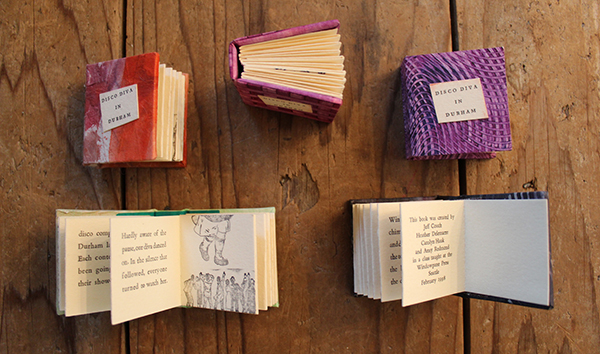
These accordion books were the first letterpress project I ever typeset and printed, in collaboration with 3 other students. Bonnie runs an admirably tight ship: we wrote, printed, and bound these in just 2 days! 

Six months later, in October of 1998, I met Chris Stern and Jules Faye (Stern & Faye, Printers) at a Seattle Literary event called Northwest Bookfest, and fell in love with their work. The following week I drove up to their Print Farm in Sedro-Woolley, Washington to share my portfolio. The interview turned into dinner, and soon after I began apprenticing one day a week in their shop, doing whatever was needed in exchange for learning. A few years later, I put all of my things in storage, moved into a small corner of the upstairs bindery in the print barn, and worked in exchange for rent.

This was Stern & Faye Printer’s “print barn” in Sedro-Woolley, WA. The concord grapes would hang heavy on the barn, and it was impossible to resist snacking off the vine every time you entered the shop. 

Here I am mixing ink at Stern & Faye Printers, sometime around 2002. This may have been taken during the 6 months I was living at the print farm. Credit: Jules Faye

The 180-mile round-trip drive up to the Skagit Valley each week was well worth it. It’s hard to believe it’s been 19 years since then; it was such a pivotal moment for me. It not only instilled a sense of creative well-being and fine craftsmanship, it also introduced me to an amazing community of artists, designers, and printers that have become dear friends.

Pictured left to right: Rebecca Gilbert, Jules Faye, Brian Bagdonas, Amy Redmond. Rebecca & Brian, of Stumptown Printers & C.C. Stern Type Foundry, recently visited me and Jules Faye at her home in the Skagit Valley. Getting together with them is always a fabulous family reunion, and never without homemade pie. Credit: Stumptown Printers

NORTH SEATTLE’S BEST KEPT SECRET My private studio, Amada Press, is just steps from my back door in a quiet neighborhood in north Seattle. I describe it as a garage with a detached house — because that’s exactly how I went about looking for space: the studio came first. When Jules Faye approached me in 2008 about becoming the next steward of Stern & Faye’s Colt’s Armory 13×19 Press, I knew it was time to get serious about buying a place. I’d been in Seattle long enough to know that I couldn’t own a press that big and be at the whim of a landlord. The stars happened to align at the right time with both work and the burst of Seattle’s real estate market, making it all possible.

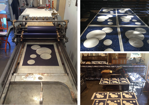
Inking up the Colt’s Armory Press. Cleaning up the press, and all 8 of its rollers, takes me about 30 minutes. 

Close-up of the badge on my Colt’s Armory Press. 

In spite of being large enough for 3 cars, my shop has never had one in it — the previous owners were also artists, and built it as their painting studio. It has flat, alley access with high overhead clearance for big trucks, smooth cement floors and plenty of outlets. What really charmed me was its wood stove — that’s exactly how we heated the Print Barn at Stern & Faye. I took all of those things, along with the apple tree (Stern & Faye also had a tiny orchard), as signs that this was the right place for me. The press was the first thing that got moved onto the property — it took another week for me to move my personal things into the house. So you can see where my priorities lay.

My shop’s sunny location makes it the perfect spot to grow tomatoes. A little bit of Seattle history lives in this photo: those red bleacher chairs are from the Kingdome, saved before it was blown up to make way for a new stadium. 

What truly makes my shop special is what’s inside of it — it has all come from local printer pals, many of whom have since passed. Most of it, like my presses and type, is from Stern & Faye and Byron Scott — but I also have a cabinet and slant top from Jim Rimmer (Pie Tree Press), and a handful of choice cuts from Maura Shapely (Day Moon Press). It’s all very beloved to me… which is how I came to choose “Amada” as my press name, the Spanish word for beloved. It also happens to be the meaning of my first name.

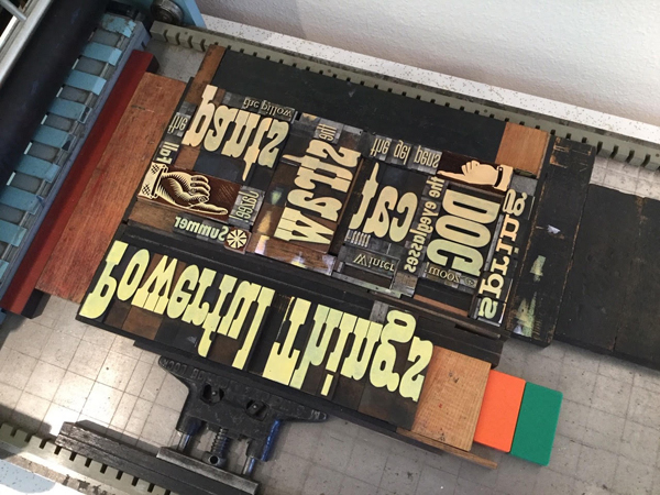
Upper lefthand photo: Everything in my studio is up on 4×4’s so that it can be easily moved with a pallet jack.  |  Upper righthand photo: Thanks to the careful curation of past printers, I have many lovely typefaces — but Spartan (ATF’s version of Futura) claims most of the space in this row of cabinets. |  Lower righthand photo: These are my two main work surfaces: the cabinet in the foreground is a staging ground for my notes, and the larger work table in the background holds my stone.  |  Lower lefthand photo:  This photos is the view when you walk into my studio — the cabinet on the far right is the very first one I got (complete with the obligatory case of Copperplate).

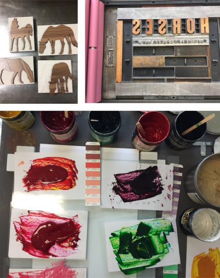
PRINTING MENTORS AND INSPIRATION Chris Stern & Jules Faye will always be my number one mentors; even though Chris passed away in 2006 and the context of my work with Jules has evolved, I consider my apprenticeship to be lifelong. They have given me so much of their time and talent, and never restrained their passion for print & typography. When the two of them collaborated on personal projects, the final print was always a tapestry of fantastic stories and captivating imagery. Their print, “The Typographic Horse,” exemplifies the “love at first sight” effect their work had on me.

Shortly after Chris Stern passed away, I wrote an article about the passionate process of artwork for the Society of Typographic Aficionados . You can view more work by Chris Stern & Jules Faye on SternAndFaye.com. 

I also find inspiration from my ever-growing network of printer pals and students — they all keep a fire lit under my fingertips, and Instagram has played a big role these past few years with feeding me a steady drip of amazing work. Those who really stand out are the ones with determination and a clear vision in their work as a whole; I really admire that — it’s not something I come by easily.

From an aesthetic standpoint, I’m drawn to the graphic design work that took place between the 1910’s and the 1950’s. As a design student I didn’t understand how the work I admired by Fortunato Depero, Piet Zwart, El Lissitzky, H.N. Werkman, and Jan Tschichold was produced — becoming a letterpress printer who works with handset type brought a whole new appreciation to it. It’s like I found a missing piece to the puzzle that is myself.

DESIGNER + PRINTER I fall into the designer/printer category; they are very intricately related and it can be hard to tear one apart from the other. Design is what led me to letterpress, but letterpress is what reinforces my attention to detail and ability to think about how a design will be produced — whether it’s a website or a printed piece. When you’re printing your own work, you’re the one that pays the price when you design something that’s hard to pull off. And so you learn how to plan.

I find the mindful approach that letterpress requires to be blissfully consuming; it’s a nice contrarian lifestyle to the on-demand parts of life. As I browse my collection of metal type and ornaments, I slow down, I notice, I contemplate, I dream, and I plan. I form connections with things I’ve seen or heard. Stories materialize as excerpts from imagined conversations.

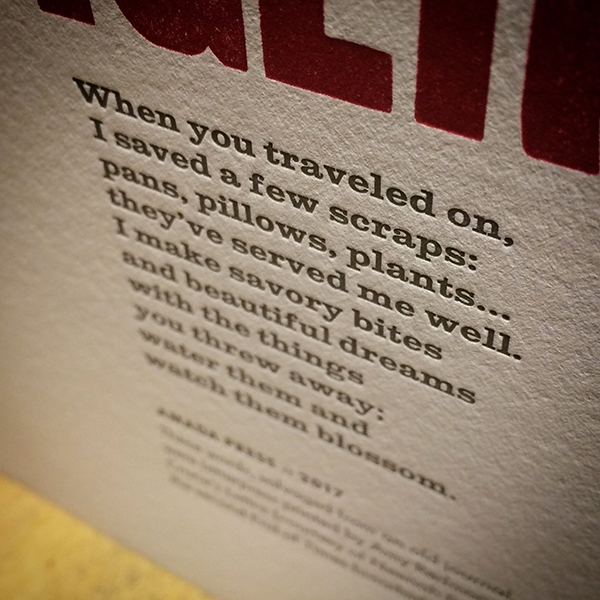
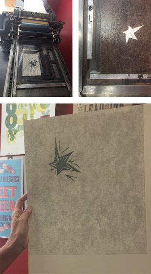
This text, from my print “Scavenger,” was taken from a scrap of paper I’ve been carrying around in a sketchbook since 2006. 

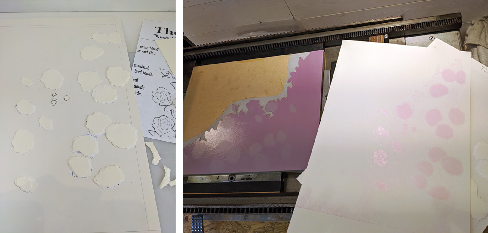
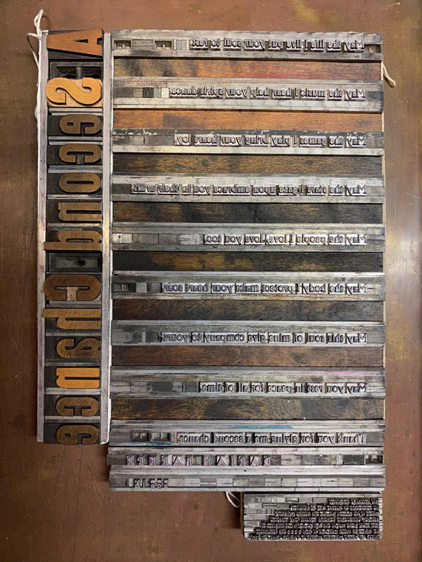
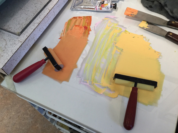
The computer has no place here — pencils, scissors, Xacto blades, and glues sticks are crucial to my work’s development; the tangible trace of my hand is evident yet invisible. Ideas become sketches, ink is drawn, mock-ups take shape. Text is set, one letter at a time. Images may be old ad cuts, or created with collographs, pressure printing, or carved linoleum.

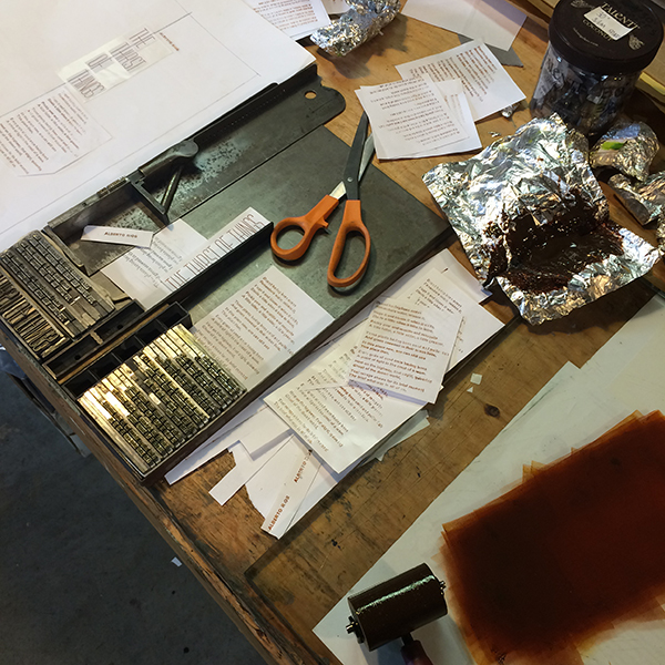
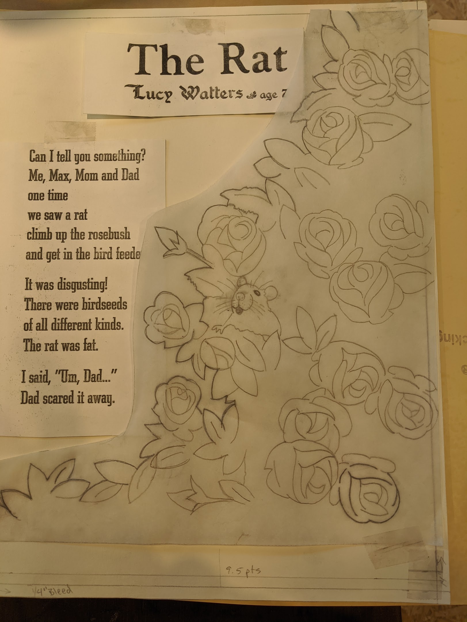
A snapshot of the design process for the broadside for “The Thirst of Things” by poet Alberto Ríos, for Copper Canyon Press. See the finished print here. 

Precision on press requires planning, but with my art I allow room for migration once ink hits paper: colors may shift, misfeeds inspire new compositions. The process of acting/reacting is cathartic; committing an idea to paper simultaneously invites resolution to old problems and invites opportunity for new ones.

In the dead of winter this mindfulness is emphasized even more: my shop is heated primarily by a wood stove, and I can’t just start printing without some planning. The night before, I bring the inks and photopolymer base into the house to warm up; I check to make sure an air quality burn ban hasn’t been triggered by a stretch of cold, windless days; I prep a pot of homemade soup for lunch. On press day I get up early and get the studio’s wood stove started so that it can pick up the electric heater’s slack, and simmer the soup on the wood stove next to my coffee. Once I get going, I hate having to stop to make lunch… and it makes for the most delicious-smelling print shop.

PART TIME PRINTER, FULL TIME FUN There are days when I think I could be a printer full time, but I don’t think I really want that — it’s having variety in my work that keeps me sane. I currently set up my work week so that I work Monday–Thursday for my design clients (web & print), and spend Fridays in my studio. Anyway you slice it I’m just a one-woman shop, so there’s a lot of pressure to stay profitable and still be able to invest in my retirement.

If I could spend my days playing on press, making art without a care for income, then yes I’d do it in a heartbeat. But if I have to take on a job printing what someone else has designed, then no — I’d rather that time be spent doing digital design, so that my print studio remains a stress-free place to be creative. There’s enough separation between how I think about the two different types of work that they fuel, rather than drain, my energy for them.

PRINTING FEATS I consider it a great honor to have been teaching letterpress at the School of Visual Concepts for the past 14 years, and to play a part in building our program. I was cautious when Jenny Wilkson first invited me, as my mentors Chris Stern & Jules Faye were also teaching there — and who was I, with just a few years at the press under my belt, to be teaching? Upon hearing my concerns, Chris and Jules invited me to assist in their class — and gave me their encouragement to accept Jenny’s offer. This wasn’t an issue of confidence; it was about respect for all the years Chris and Jules had spent in front of presses.

top photo: We have a well-appointed shop at the School of Visual Concepts, and our volunteer Teaching Assistants do their part (and then some) to making sure it remains a gem. Credit: Radford Creative. |  bottom photo: Elizabeth Mullaly (right) is one of my current Teaching Assistants. The way she quietly jumps right in when she sees something or someone that needs attention is a work ethic I admire. Credit: Sukhie Patel.

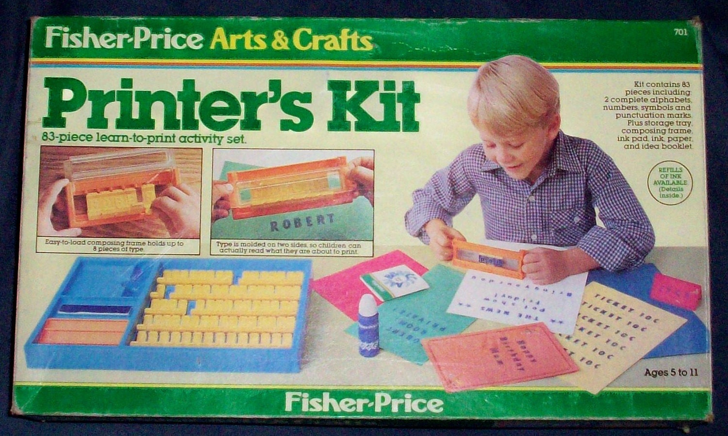
PRESS HISTORY I was about to say it was a Pilot Tabletop Press — but truly, it was a toy press given to me in elementary school, the Fisher Price Arts & Craft “Printer’s Kit”. I’m really hoping it’s still stashed in my parent’s basement, as I’d love to get it back and play around with it.

But as far as “real” presses go, the Pilot really was my first. In June of 1999, I went to Bellingham, WA with Chris Stern & Jules Faye to visit their friend Rob. We were talking about printing and I was admiring his 7×9 Pilot Press sitting in the corner on its original stand. After a while Chris turned and said, “Well Amy, you can have it if you can pick it up.” I laughed and then saw Rob nod his head — Chris was actually serious, and Jules confirmed it. Together we moved it out that day.

My first studio was efficiently tucked into a tiny breakfast nook in a shared house. We didn’t use the dishwasher, so it became my ink table— I kept ink and tools on its racks. 

Chris and Jules then helped me put together a cabinet of type from their collection, and Scotty (Byron Scott, their adopted grandfather and avid letterpress collector) contributed some things as well. I still have that cabinet today; on the back, scrawled in chalk, it says “Scotty,” and I love that. Also in that cabinet is a 50-pound case of figures from various typefaces, all displayed face-up. It had been sitting in a stack of cases in the print barn & I remembering cooing over it with Chris when he said, “Yeah it’s purdy, but ya don’t ever wanna buy a case of junk like that.” He then turned to me with a sly grin. “Ya want it?”

I lovingly refer to this 50-pound case of figures as one my apprenticeship “hazing” moments. 

I had the Pilot for 2 years, and when I moved into the bindery loft of Stern & Faye’s Print Barn, they convinced me that it was time to move on to a bigger press. To this day, the Pilot still lives in Seattle with John Marshall, former owner of Seattle’s Open Books Poetry Shop in Seattle. It’s nice to know it’s still in our Pacific Northwest literary letterpress family.

BOXCAR’S ROLE Boxcar has been making my photopolymer plates since — I think — 2003 or 2004. At that time there weren’t many options, and most required faxing in a proof of the artwork — which was a royal pain. But Boxcar spoke my design language and accepted PDF proofs (revolutionary!) and that was the hook that got me in the door.

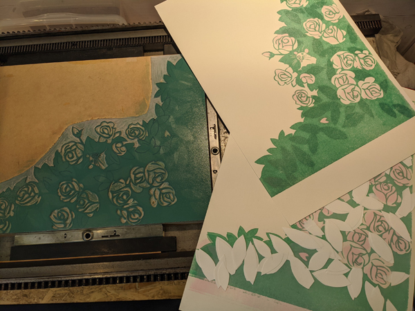
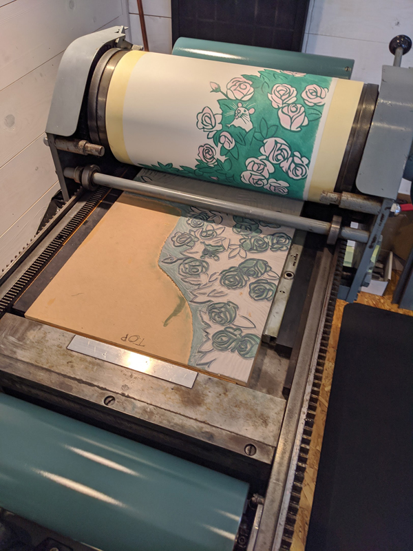
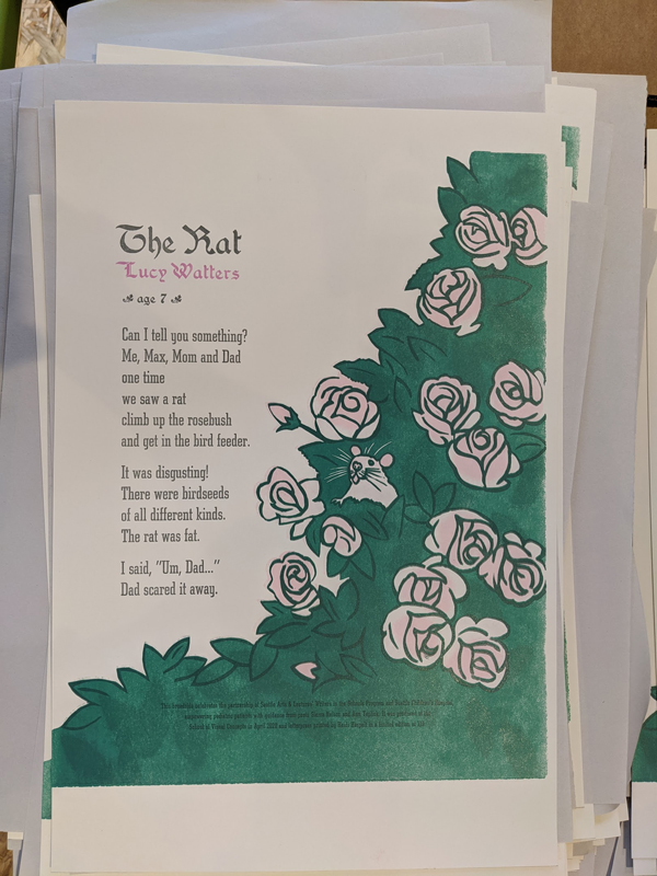
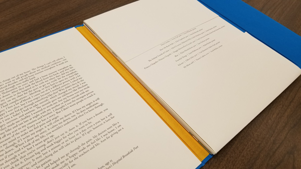
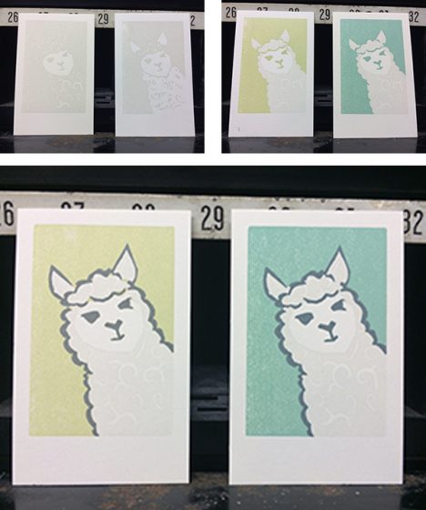
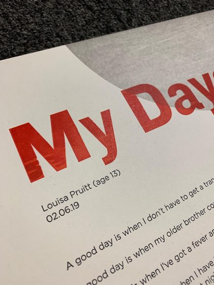
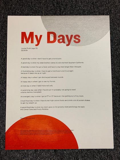
But the real reason I keep coming back is the people — everyone is so helpful and accountable to doing good work, and I appreciate the time spent helping me troubleshoot. As an instructor I know I can direct my students to Boxcar and that they’ll be well-taken care of. And as a participant in SVC’s Poetry Broadside project with Seattle Children’s Hospital and Seattle Arts & Lectures, I know that the project would not be financially possible without plate donations from Boxcar and paper donations from Neenah. On behalf of the printers at the School of Visual Concepts, thank you!

PRINTING TIPS Roller bearers are my best friends — I never lock up a form in a chase without them. Also, always use protection: slipsheet your prints. These two simple things can prevent so many problems.

Wide, type-high rule placed on the inside edges of the chase act as roller bearers, preventing ink slur as the rollers roll on/off the form. 

Document your work. David Black, another letterpress instructor at SVC, once advised starting a shop log to keep track of press maintenance. I do, and it has become so much more than just a record of press oiling. I document ideas, typeface choices, and archive my mockups. These logs are valuable resources that I refer to often.

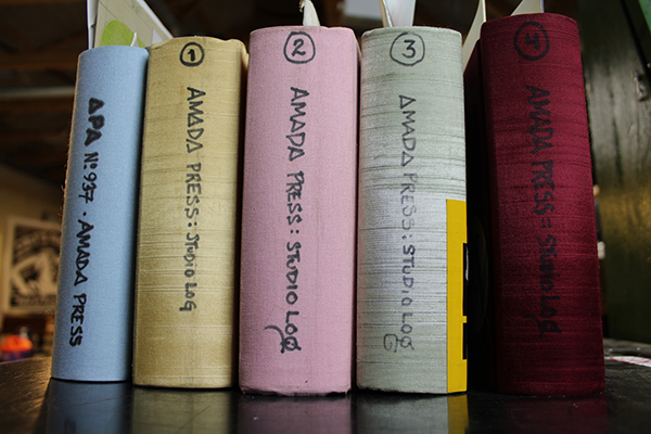
I currently have 4 studio logs, and added a fifth just for the projects I do for APA (Amalgamated Printers Association), of which I’m a member. 

And finally, when it comes to buying equipment, be patient. The right press, the right type, it will come along. Talk to people, get to know them… there’s an underground current of dedicated printers that offer a far more rewarding experience than a whirlwind bidding session on Ebay will, and you’ll meet people genuinely interested in your success if you take the time to invest in your local community.

WHAT’S NEXT I’m finally — finally!— going to set up an online store for Amada Press. I’ve been in several group and solo shows over the years, but the positive response my work received in the 2017 “Pressing On” Exhibition at Hatch Show Print really highlighted the importance of investing time into making my work more accessible.

I also have several ideas on my perpetual project list in different stages of production, including two book concepts and a long-form broadside. The more I cross off, the more room I have for new ideas. My work is fueled by motion.

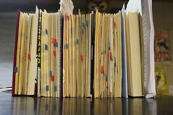
The red and blue flags in my studio logs mark ideas that have not yet been printed. I’m happy to say it’s a never-ending list. 

Immensely huge round of applause & thanks out to Amy for the gorgeous peek into the printing realm of Amada Press. Keep up the beautiful work and we look forward to seeing more of your printing adventures unfold. Find her on Instagram too (@AmadaPress)!

Green: The New Primary Color

Everywhere, from supermarkets to superstores, the move toward more environmentally friendly products is growing exponentially. What used to be offered only at stores like Whole Foods are now common at Target. Letterpress printers are joining this trend in an attempt to show their true color: green.

The renaissance of letterpress has been one huge reduce/reuse/recycle extravaganza. Proof presses considered obsolete twenty years ago are now selling in the thousands of dollars, with prices for small hobby presses rising similarly. Everything is snapped up, from orphaned wood type and single cuts to pied lead, with demand outpacing supply. As new printers join the fray, there are numerous possibilities for creating a greener shop that’s easier on the environment and makes for a safer workplace too.

Continue reading