Part two in this year’s inspiring blog feature of the Seattle Children’s Hospital Broadsides project explores the work of five more clever printers and their young poets as part of the collaborative effort between the Writers in the Schools program (WITS – a poetry program spearheaded by Sierra Nelson and Ann Teplick), long term patients at Seattle Children’s Hospital, and the School of Visual Concepts. These five printers share with us how they brought to life the young poets’ colorful imagination in a cornucopia of color, text, texture, and fun imagery.
Jane Suchan While at Seattle Children’s Hospital, 14 year old Mary McCann learned to knit and wrote the two poems used for her broadside. I was drawn to Mary’s poems because of their emotion and imagery. I work at Seattle Children’s, so I had the good fortune to visit and get to know Mary a bit.

As Mary and I were chatting she gave me some great design input: her favorite colors, the fun to be had with a ball of yarn, the sense of coziness and comfort she feels from sitting quietly and knitting. Mary is creative, energetic and playful, so I sought to reflect those characteristics in my design. Since we both have orange cats, and cats and knitting just naturally go together, I knew I wanted to include a cat somehow as our shared secret.

The big, cushy arm chair and a playful cat ready to pounce on a ball of yarn tells a little story to go along with Mary’s poems. This line in Mary’s poem “Fabric coming off the end of the needle” made me think of knitted sweaters with intarsia motifs, so that’s where I got the idea to create a stockinette pattern with Mary’s name. I printed in yellow behind the stockinette to create a fifth, blended color as a nod to Mary’s love of color. Mary’s vision is impaired, so I kept images simple, used easy to read fonts in a larger size and high contrast colors. My goal was to honor Mary and her poetry, to produce a keepsake that she would love and her family and friends would cherish.

These broadsides were printed on a Vandercook SP15 press at the School of Visual Concepts over three days. In my first pass I used a large Boxcar base to print a block of soft yellow that would become the background for Mary’s name across the top of the broadside. Printing the yellow behind the teal was an easy way to get a fifth color out of four passes on press.

I had photopolymer plates made for the rest of the design elements, and pass number two was a run of teal for the chair, Mary’s name and the colophon. Pass three was the orange cat and ball of yarn, followed by a fourth pass in dark charcoal for the poems.

The only tricky thing about my design was the tight registration of the orange cat and the back of the teal chair. I had the photopolymer plate made with the cat and chair positioned together as they would be when printed even though I knew they would be in two different colors. Before printing the chair I used an Exacto knife to carefully cut away the photopolymer plate for the cat and set it aside, along with the plate for the ball of yarn. After printing the chair, I left the photopolymer plate adhered to the Boxcar base in the press bed. I cleaned the teal ink off and added the photopolymer plate for the cat and yarn onto the base. I pulled away the photopolymer plate used for the chair and other teal elements, re-inked the press with bright orange and was ready to roll in no time.

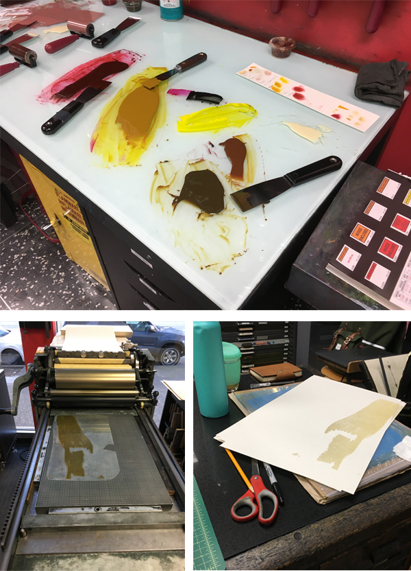
Jenny Wilkson This year, Jules Remedios Faye and I collaborated on one poetry broadside. There were three letterpress processes we were excited to use: photopolymer for the text, because our chosen poem was the longest of the bunch; laser cut imagery, just because lasers are great, and collographs for detail in the illustration, which is Jules’ specialty.

First, we double-hit a solid with straight rubine red, to achieve a saturated dark pink background. After it dried, we overprinted purple laser cut butterflies, being careful to add cobalt drier to the ink so that it would dry on top of the pink pass.

Jules created a collograph for the light purple detail in the butterfly wings by gluing lace and sealing it with acrylic gel medium on an identical laser cut block, making registration a cinch. Finally, the gold text was printed using Boxcar plates.
Laura Bentley The broadside is a three color design printed with handset metal type ornaments, metal type, and photopolymer plates. Type was set and printed on a Vandercook SP-15 printing press from the 1960s. The ornaments were arranged dripping down the page with the spacing growing such that the ornaments were breaking apart in a nod to the poem’s title.

Simple shapes in dramatic colors echo the everyday and extraordinary experiences mentioned in the poem. The poem text and colophon was printed in a fourth pass on the same press with photopolymer plates and a metal base from Boxcar Press. 
I didn’t get a chance to talk with either of the young authors this time. Sometimes with all that’s going on it isn’t possible. But I enjoyed learning about their experiences through their words. Poet Ann Teplick works with patients in this classroom and helps the students express their experiences through poetry.

While I have a good variety of metal type ornaments to print with, and found a great font to use for the author’s names, my metal type collection came up short when it came to typesetting the poem text and colophon. Using a photopolymer plate opened up the possibility to print any typeface available on the computer, but for this design I chose a digital version of a typeface (Venus) from the age of printing with metal. While I have a couple of metal fonts of Venus, none were appropriate sizes. I like that Boxcar can fill in gaps in my metal type collection!
(Laura’s full blog article goes in-depth here on this year’s printing journey)
Leah Stevenson As I was thinking about my poem for this year’s Broadside project, I was instantly inspired by the recurring presence of red and yellow/gold. I was also struck by how much more space was devoted to the thorny devil desert lizard compared to anything else Ewan wrote about in his poem. Because of that, I really wanted to have that be a focal point of this piece.
Toward the beginning of my process I received an email with some scans of drawings Ewan had done. They represented what he saw in his mind as he wrote and read his poem so I really wanted to find a way to incorporate them. While beautiful, I was a little stuck on how to use the drawings I had received from Ewan while remaining true to my own style. I ended up just starting to draw a desert lizard to see where it would take me. Eventually, I realized I could use Ewan’s drawings as little ‘tattoos’ on the lizard.

One of my favorite things about doing letterpress printing is combining my experience in digital design with the analog system of printing by hand. I was able to design the broadside digitally and used those designs to get photopolymer plates made. I printed the whole piece on a Vandercook SP15 press in SVC’s letterpress studio.

I ended up with four passes through the press. I had actually planned a fifth pass (a blue for the baseball cap to bring in the Cubs in stanza three), but was on the fence about how much it really added. Once I pulled a proof of it, I decided it wasn’t necessary and left it out, giving me some extra time for paper cutting and sorting.

Unfortunately, I was not able to meet with my author this year but I did get a little insight into his mind when I received the drawings he had made for the poem. I really loved having that extra bit of my poet’s creativity and imagination that I could incorporate into the broadside. It was fun to get a glimpse into his mind and see what he had envisioned when he was writing the poem and use that as another place to take my design.
Carol Clifford For this annual project I usually work with the assumption that the young poet will see the finished piece I created for them, and in the past my hope has been to create an image for them to grow up with. This year’s piece was different though because I learned during the poem pick meeting that sadly Julissa had passed away. Knowing this influenced the feeling I wanted to convey. I didn’t want to make something too frivolous or silly. I usually don’t, but felt particularly aware of that this time. Plus, Julissa’s poem was serious and reflective, so I wanted to honor that as well as create a piece that felt more reverent.

Initially, I had planned to combine several techniques: pressure printing, hand-set type, collagraphs, and linoleum cuts. However, I decided I didn’t want the “chatter” from pressure printing which is often a result. Nor did I want the heavier lines from linoleum cuts. I chose instead to use all polymer plates. In part for simplicity, but moreover for the clearer lines and shapes that I felt suited this poem.
My hope for Julissa’s family is that I created a piece that is quiet yet witnesses her questions. I, too, would like to believe that birds walk on the clouds.

Immense round of applause and thanks to all of the wonderful printers who donated their time and efforts to this truly beautiful project!