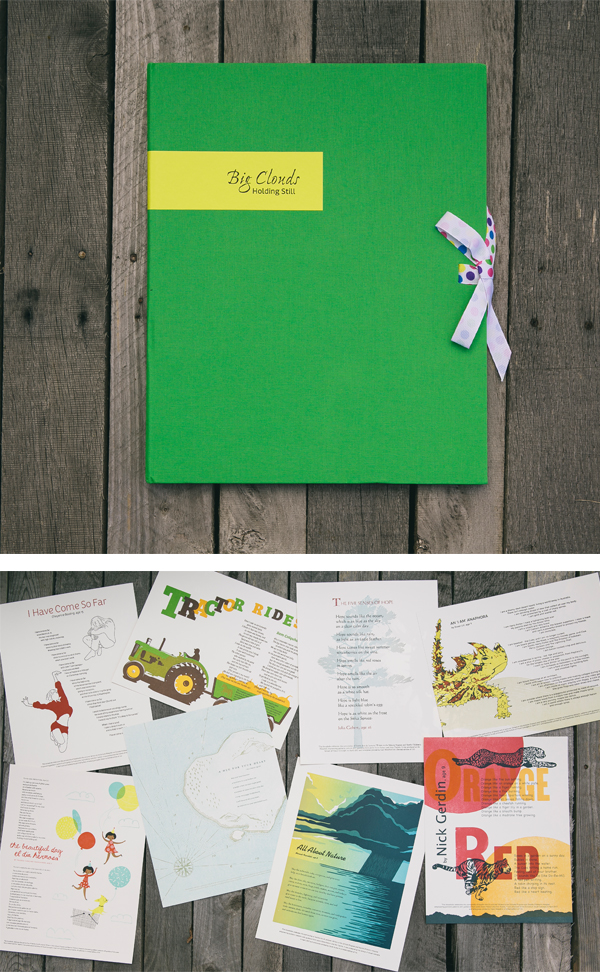
For its seventh year running, Boxcar Press has the immense pleasure of supporting the magical outcome created by this year’s 2017 Seattle Children’s Hospital Broadside project. Guided by Sierra Nelson and Ann Teplick of the Writers in the Schools program (WITS) and the School of Visual Concepts in Seattle, an inspiring group of young poets and artist/printers collaborated together to produce 21 broadsides in a limited run of 110 broadsides. WITS worked with big-hearted printers as well as long term patients at the Seattle Children’s Hospital in this exceptional opportunity for fun, creativity, and stirring works of art. This first installment of a two part blog showcases four printers who share their creative printing process and capture the wonder of the children’s writing.

Sarah Kulfan I was very excited to print Merrick’s poem for this year’s Seattle Children’s Hospital Broadside project. As someone who spends a lot of time outdoors, his colorful descriptions of the natural world resonated with me and provided a rich trove of inspiring imagery that would pair well with his words. I printed a total of 6 passes on a Universal I, combining a linoleum block, metal type, and a Boxcar plate.


This was my fifth year printing for this lovely project which brings together so many talented and generous folk. I was immediately drawn to Merrick’s poem. His words remind me of all the many blessings that nature provides, discoveries that I have found in my own wanderings outside. I haven’t met Merrick yet, but I hope to get a chance so that we can compare our adventures in nature.

This year, I wanted to try my hand at a reduction cut that would combine split fountain layers. Using high-drama imagery of a hurricane worked really well for this process as it provided a big-sky, full frame backdrop. The poem speaks to the cycles of nature and the process of destruction and darkness followed by light and new life. The gradients capture the weather transition from light to dark and the reduction cut allowed me to build up the dark layers of the passing storm clouds. There were four total passes on the reduction cut and these included two split fountains. I printed a fifth layer of metal type for the poem. The final pass was the colophon text, printed from a Boxcar photopolymer plate, which saved a lot of time hand setting and proofing tiny type.
Chris Copley Each year, I find myself wanting to push my artistic envelope in the Children’s Hospital Poetry Broadside Project — exploring a technique or concept while still making a piece of art that might appeal to people who know nothing of me or the poet or the project. I also try to reflect the feeling or personality of my poet.

Nandi, my poet this year, was not quite 5 when she wrote her piece about a huge stuffed animal that fell on her while she was in her hospital bed. The poem features strong emotions, and moves from upset and angry (at the big bunny) to loving and heartfelt (toward her mom). I tried to bring that out in the frame around the poem.


I also embedded folk-art-style drawings of animals and a few “easter eggs” in the frame, just for fun. I drew the original art on black paper, then cut it out with an Xacto knife. I scanned the cut-paper art and ordered a polymer plate from Boxcar; this was my third (and fourth) pass. The first two passes involved the technique I wanted to explore — perpendicular split fountain printing. I printed a red-to-mustard-yellow pass (the color blocks behind the text blocks), and then turned the paper 90 degrees to print a blue-to-olive-green pass (the highlight colors in the frame).
Unfortunately, in trimming the paper to permit it to fit on the press, I unthinkingly cut off my gripper edge. So when I went to print the polymer frame, I couldn’t. I quickly went through a list or three or four options for solving my disaster, and decided the least bad solution was to cut the polymer plate in half. The problem was compounded when printing the second half of the plate, when my favorite press inexplicably fish-tailed my paper a different direction on every pass, making close registration virtually impossible. I cried almost the entire run, convinced the broadside was ruined. But I finished the project, hand-setting the poem and colophon in Bodoni and printing it without a hiccup. And it didn’t look too bad, in the final analysis. Five passes through the press.
I never met Nandi, but I met her mom, Adele. Nandi was camping with Dad the week we met. We chatted for nearly an hour about Nandi’s poems and how her health crisis brought out Nandi’s strong spirit. I saw the connection between Adele and Nandi, and saw photos of the little girl and the big bunny. I wanted to bring out in my design Nandi’s playful, vibrant personality, and her love for her mother.
I used two other techniques: hand-set metal type; and pressure printing. I wanted soft edges to the color blocks behind the stanzas of Nandi’s poem, so I used the back side of a Boxcar Press base (with the swirly pattern of the grinder as a design element) and a paper pressure “plate.” I did the same thing with the color highlights in the frame. I like the contrast between the crisp polymer printing and the softer pressure-printed colors. And I like the way the metal type echoes the sharp edges of the polymer plate. This is another of those projects that turns out better than expected, with different parts contributing to a unified whole.
Heidi Hespelt As always, it was a privilege to illustrate one of these wonderful poems by these talented children. My poet was Nick Gerdin, age 9 and he wrote 2 poems, titled Orange and Red. His plan is to continue the series by writing poems about other colors of the rainbow. I love the word pictures that Nick painted. He is obviously an insightful guy.

I used several different methods to bring my illustration to life. The titles, Red and Orange, are done in large antique wood type, the rest of the type is polymer from Boxcar Press (thanks, Boxcar, for your support!), and I carved the tiger, the cheetah on lino blocks using photographs as inspiration.

The setting suns and the bottom border are also carved from lino blocks. All of the printing was done on a Vandercook press at the School of Visual Concepts in Seattle.


Much of the joy of participating in the Children’s Hospital Broadside project each year (this is my fourth year!) is the camaraderie between the printers and the creative way each printer (artist) interprets the poem that they are given. I like to think that our efforts will live long lives on the walls and in the portfolios of the poets and their families, and that our artistic visions will add a dimension to the poems that brings out a deeper meaning.
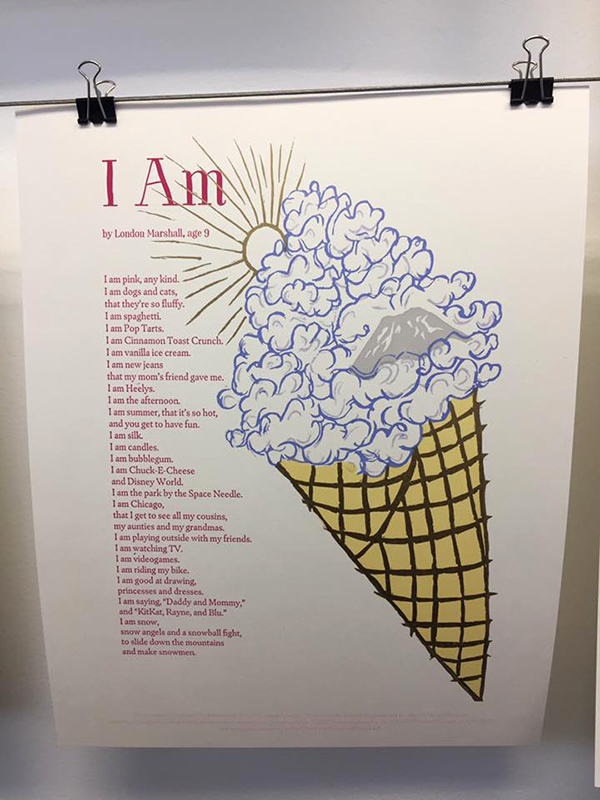
Sukhie Patel I love carving linoleum and engraving wood, so I knew I wanted to draw and then hand-carve the poem’s illustrations. Carving is, for me, a form of meditation, and it was a beautiful way to contemplate this young poet’s life and honor her through that process. It was hard to narrow down what to illustrate, as the poem had so many vibrant images to choose from. I wanted the broadside to capture as much of the visual levity and sweetness of the poem as possible, so I chose to carve this metallic gold ice cream cone of whimsical pastel cotton-candy-esque clouds, with Mount Rainier popping out amidst them. It ended up being 6 separate blocks, and including text, 8 passes.

I found out two days after receiving the poem that the lovely young poet, London Marshall, had passed away at age 9. My approach thus shifted from designing a broadside to delight a 9-year-old audience, to designing a commemorative broadside for her family. I wanted to create something the family would want to return to at different stages in their grieving, that did not preclude a path of healing, and could bring them a smile. I hoped the illustrations would capture the levity of being nine years old, the vivacity of being a young girl, the earnestness of feeling in love with the world around her. It was an honor to print London’s poem, and spend time with her words.

My print consisted of 6 hand carved linoleum blocks and two photopolymer plates. I don’t know how I would have pulled this off without the help of Boxcar. I had never printed with photopolymer before, but with the structure of this poem (each line began with “I am”), I didn’t have any cases of metal type with enough capital I’s! Incorporating photopolymer also allowed me to select a more contemporary and youthful typeface. It was such a pleasure working with Boxcar on this project, and (despite being a sucker for handset type) I can’t wait to incorporate photopolymer in more of my designs. It really did open up my eyes to a whole new set of techniques and approaches.
Stay tuned & read on about this amazing Broadside project in the upcoming Part 2. The ever-inspiring work of both poets and printers and the brilliant results are why Boxcar has a big soft spot for such an amazing tradition year after year.