2019 Seattle Children’s Hospital Broadsides: Part 2

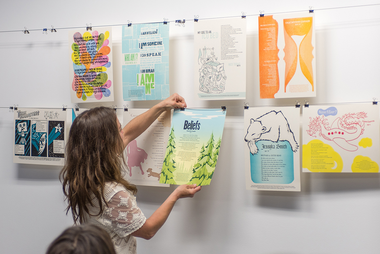
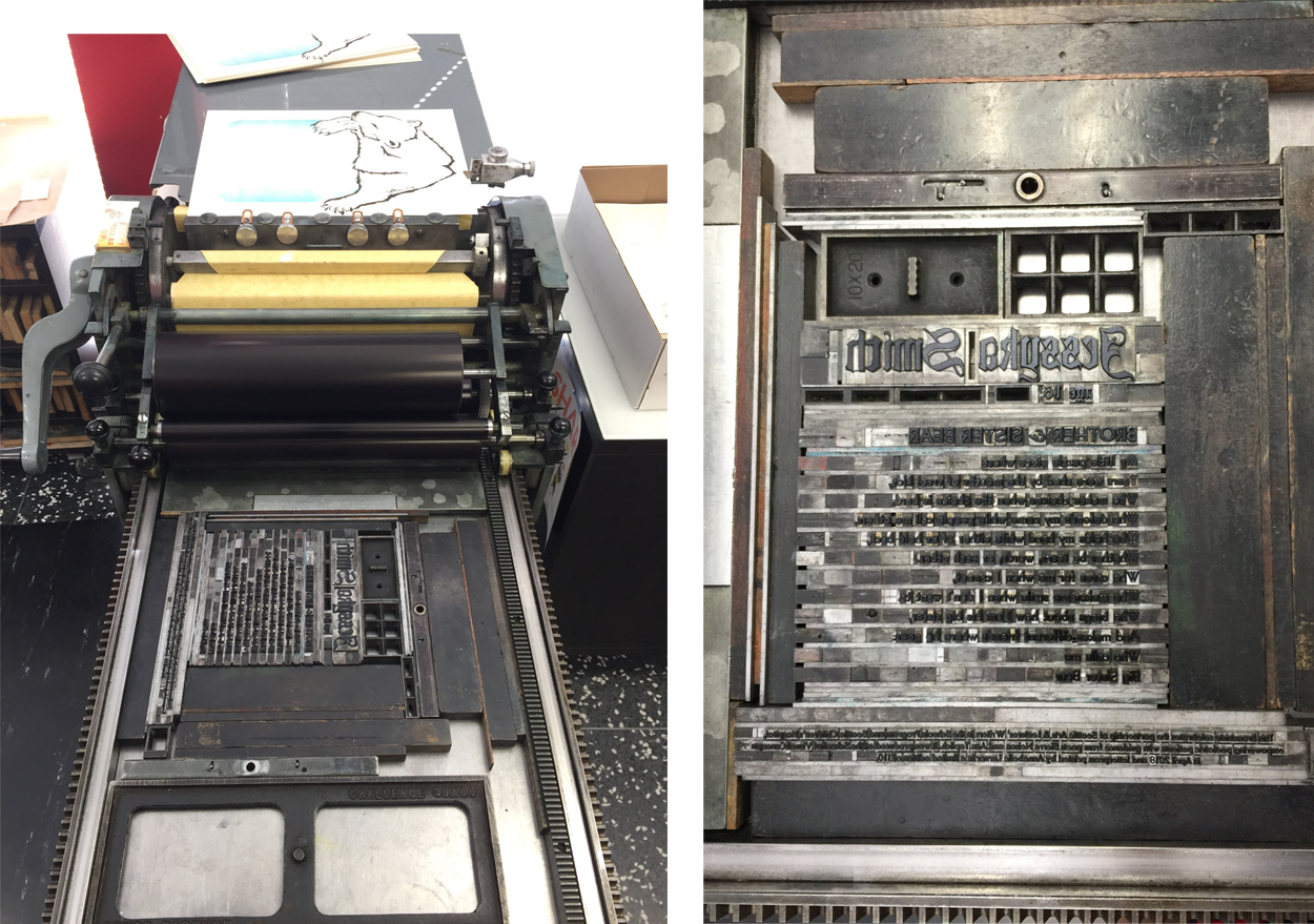
Part two in our blog feature of the 2019 Seattle Children’s Hospital Broadside project features five more very talented printers and young poets as part of the collaboration between Writers in the Schools program, long-term patients at Seattle Children’s Hospital, and the School of Visual Concepts in Seattle, Washington. These five printers share with us how they brought each young writer’s words to life.

Justin Gonyea

I was very excited when I first read AJ’s poem because it would allow me to mix my love of comic books and letterpress. I love that AJ wrote a poem about the Incredible Hulk that a lot of kids and adults alike could relate to. His mom translated it to Chamorro, the language of the indigenous people of the Mariana Islands. I felt honored that I was trusted with creating a print using not only AJ’s words, but also the traditional language of his family.

Hulk is a character who struggles with fear, pain, and anger but also can use strength to do a lot of good as a superhero. Since AJ’s words reference all of these darker feelings, I didn’t want to emphasize the negative with imagery. What was a way that I could compliment AJ’s words and bring a little bit of that lighthearted feeling to a character who is everything but? How about Legos? I had been looking for the right project to experiment with printing Legos, and this seemed like a perfect fit! 

I looked at a lot of inspiration for how to render Hulk using pixel art, and decided to use this as an opportunity to reference something else from my childhood. I used character sprites from the Super Nintendo video game “The Incredible Hulk” (1994) as a reference. Eric Bailey and Anthony Rosbottom were the original artists that worked on this game, and there were so many possibilities for really dynamic poses to draw from for my inspiration. In Photoshop, I created a simplified rendering of one of the sprites using a grid that was 32 pixel wide. I usually try to minimize the amount of time I’m on the computer when I’m working in letterpress, but I ended up designing every aspect of this print in Photoshop and Illustrator.

My broadside had a total of six passes on press. I rebuilt the pixel art using 1×1 Lego pieces, and a base that I made with a piece of wood and two sheets of Lego Baseplate. For the first pass, I started with the brighter green. Once the first color was printed, I slowly removed all of the Lego pieces using an ink knife. I should have gotten a plastic putty knife or some other tool to help remove these pieces as the ink knife really easily slipped and scratched the Lego pieces.

Once all the Legos were removed, I set up the pixel art for the dark green layer. I continued this process for the remaining pixel art colors. As I printed, I used a pica pole to help square off any of the Lego pieces that started moving around a bit. As they moved, it created an interesting energy/vibration that I really love the look of; as long as it didn’t get too out of alignment that is! All of my additional type for the poem, colophon, and byline were printed as my last pass on press using a photopolymer plate.

I didn’t get a chance to talk with AJ about his poem, but I hope that he enjoyed how I chose to represent his words. It’s an honor to be a part of this year’s Seattle Children’s Hospital Broadside project, and it was such a fun project to work on. I can’t wait to print with Legos again! 

Leah Stevenson-Stahly

I always feel honored to participate in the Children’s Hospital Broadside project. This is my fourth year and each time it is such a treat to work with the poems and illustrate something that will hopefully resonate with the poet. 

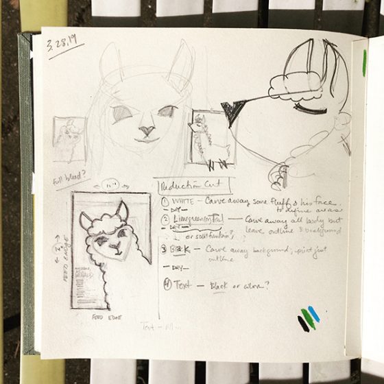
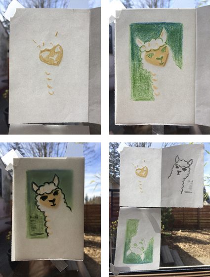
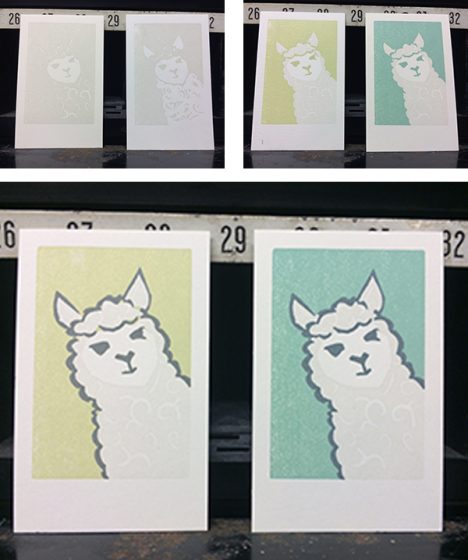
The poet had drawn a little comic that he used as inspiration for the poem so it only seemed right to keep that idea with the 4 sections of the poem. Rather than have a grid layout that’s common of comics, it seemed more appropriate to have it a little more freeform. The 4 sections of the poem are separated and on the page in a somewhat ordered yet almost haphazard way. Because of this, I added a light grey swoosh in the background to help draw the eye through the lines in the correct order. The final print came out with 6 colors in 6 passes (I had originally planned for a 7th but decided to skip it in the end). 

I used rather non-traditional plates for this project. I have a laser cutter at home and decided to make my plates with it. I used an acrylic sheet (a break from my normal wood) as acrylics tend to warp less. I engraved the design onto the surface and while providing a great surface for inking, printing the background offered a bit of a challenge. It was not quite low or shallow enough and transferred ink so it was a little messy.

I had to do quite a bit of sanding and scraping to keep everything clean. Despite the challenges of printing with my homemade plates, I was pleased with the outcome.

Carol Clifford

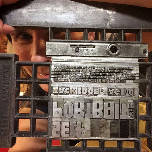
My poet this year was Chance Petrone, who wrote What I Do. I was instantly drawn to this poet simply because of his cool name.

My initial idea was to play with the image of a lightning bolt based on Chance’s imagery of his lightning quick speed but felt it was too obvious. It only spoke to one aspect of Chance that he conveys in this poem describing himself. Aside from running at lightning speed, Chance points out that he doesn’t always follow the recipe and that people are drawn to him. These two descriptions led me to the magnet image with the surrounding force field. I liked that the magnet conveyed how dynamic he is and also had a lightning bolt-like shape.

The background blue I had initially planned to pressure print. I don’t know why I say I’m going to pressure print every year, as if it is some easy-peasy technique, because I just can’t seem to make it work the way I want it! While in the 12th hour, after attempting several unsuccessful approaches to pressure printing, I put out a request to the other printers on the project for a spare large piece of linoleum. I received many responses which just shows how supportive this group of printers are. BUT, as I was in the 12th hour, I needed something asap and found a small piece of leftover Marmoleum flooring from our kitchen. I had one chance to make it work.

I transferred the magnet outline and hoped for the best. Carving away this fairly simple shape was a bit more difficult than expected. The abstract pattern of the Marmoleum is the same throughout the layers. Carving into the flooring material was easy enough but once you carve out a spot it doesn’t look any different than the un-carved part. This made it hard to read. The results were fine and similar to what I had hoped from pressure printing.

I didn’t want the angled ground shape to be solid because I thought it would look better textured next to the texture of the blue background. I created a subtle texture with cloth under the draw sheet.

After these first two layers, next came the magnet fill/force field and the text which all went smoothly.
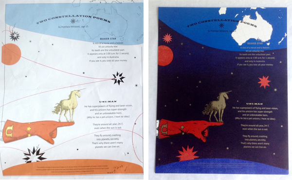
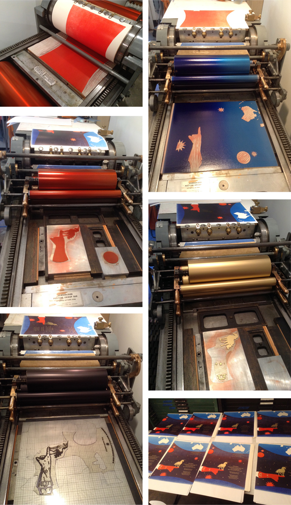
Jenny Wilkson

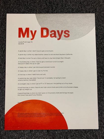
One of the most evocative stanzas in Audrey’s poem describes her comforting visualization of driving home from the hospital—softly, gently, like clouds drifting away. I seized the image of clouds, and her color of freedom, “real and super shiny gold.” 

When I was sketching the design for this broadside, I was on vacation in New Mexico. There, I saw Georgia O’Keeffe’s paintings of clouds from above. I admired the gradient in the sky, from a saturated blue to almost white. I decided to abstract my clouds into geometric forms and cut the printing plate from plywood on a laser cutter. I printed the sky on my Vandercook SP-15 with a split fountain of blue to opaque white, with the clouds knocked out, in the white of the paper. The gold ink in the title is made up of a two-part gold paste and varnish concoction that is the most “real and super shiny gold” I know how to print. I first printed the title in blue in order to give the gold ink something extra smooth to sit on so it would really sparkle. 

All type was printed from photopolymer plates donated by Boxcar Press. I set everything at an angle, parallel with the clouds, and curved the left margin of the poem in a long graceful swoop to echo the shapes of the clouds and to give the broadside that “freedom feeling.” 
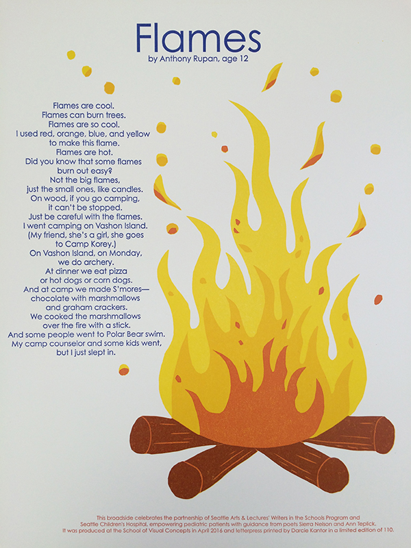
Laura Walczak

This was my 2nd year as a printer for this project. Last year helped set my expectations for how quick the timeline moves and how to portion out my time. I had the best intentions for getting things done early, and ahead of time, but seeing my intended imagery through ended up taking a lot more time than I had hoped for. It was a relief to know what my absolute worst case timeline would be for finishing everything up. Thanks to Boxcar with the rush plates right on time!

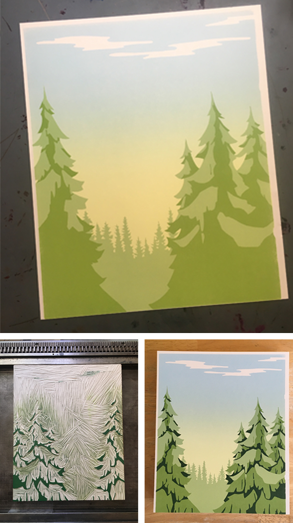
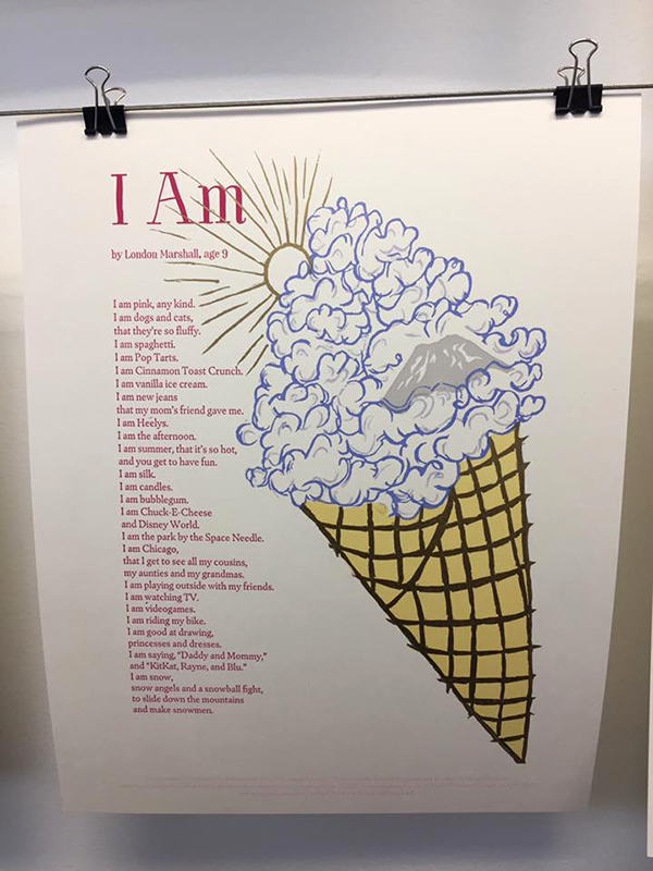
Almost immediately after selecting the poem I was working with, I had an idea of how I wanted to accompany the poet’s words with imagery. He had listed many things that he was, and the last section of his poem he talks about going camping with his family. I thought back to the “Hidden Pictures” in Highlights magazine, where an illustration of a scene would have various items hidden within it. This seemed like a perfect fit, having a camping scene, and then including many of the other items in the poem. 

I did my illustration in Procreate on iPad pro, which was a lot of back-and-forth… I couldn’t be entirely solid on the hidden pieces before drawing the scene. And I couldn’t draw the entire scene without figuring out how the hidden pieces would be woven in. This is definitely one of the things that ended up being a longer process than I had anticipated. I had such a vivid vision in mind of what this would eventually look like and it was harder to get that out onto screen and to paper.

When I finally got my linework of the illustration where I wanted it to be (as well as the text of the poem, of course!) and had hand-lettered the title, I worked on figuring out how to use color on the final print. I really wanted to use yellow, as that color was one of the things mentioned in the poem (and, “pee”). With the lush forest setting, I wanted green to have a presence as well. Still working in Procreate, I played with some fill layers, and settled on a light yellow and a light blue, that would (hopefully) layer to make a decent green. I exported my Procreate file to a PSD, and brought it to the desktop to do the nitty gritty of file prep and fine-tune some trapping, and get files plate-happy.

Fast-forward a couple of days, my plates arrived and my paper was on hand. I had reserved some (read: full day’s worth of) press time at SVC, cashing in a vacation day to do a weekday print marathon. I pawed through a swatch book to get a ballpark idea for ink mixing, but I’m always one more to shoot from the hip with my inks rather than precisely measure out proportions (it’s been working well for me!). Since I was planning for a lot of ink coverage and overlap, cobalt drier made its way into all three of my colors.

I got ready to print, paper counted out, press set up, my first plate stuck on to the base, and my creamy light blue ink on press. I thankfully didn’t need to do too much for makeready, and getting through my stack of 110 plus sheets went pretty quickly. Then, cleaning off the press and moving on to the light yellow I’d mixed that had a good deal of translucent white in it, aiming to get a nice green on the overlap of that with the blue areas. It worked, and the green that came out was actually better than I had been hoping for. My last run-through of the press was my key plate with all the linework and my darkest color. 

The cobalt drier seemed to help, and when I went to trim my prints out a day or two later, they were plenty dry. 

I wanted to create a broadside highlighting this poem, and enticing the viewer to keep looking, or to return later and find something new. I didn’t want to create something that was one-note, and could be digested in the first glance. I’m really pleased with how the broadside turned out. I believe I was able to breathe life into the words of a child, to share them, to memorialize the spirit that delighted in so many of the little things, and to celebrate that. 

2019 Seattle Children’s Hospital Broadsides: Part 1

For our ninth year, we here at Boxcar Press have enjoyed the honor of supporting this year’s 2019 Seattle Children’s Hospital Broadside project. It is helmed by Sierra Nelson and Ann Teplick of the Writers in the Schools program (WITS) and the School of Visual Concepts in Seattle. This year’s creative young poets and printer/artists joined forces to build a magnificent collection of 20 broadsides in a limited run of 110 editions.

Broadsides

The works of arts are a collaboration of kindhearted printers bringing alive the thoughts of long-term patients from the Seattle Children’s Hospital. The result is nothing short of fun, colorful, whimsical, and inspiring.  This first installment of a two-part blog highlights four printers who share their creative processes and showcase the magic of the children’s writing. Enjoy!

Broadsides

Amy Redmond  

When we gathered at SVC to kick off this year’s series with the reading of the kid’s poems, I was convinced Gerald was a real llama. I wasn’t alone. After Ann Teplick (one of the lead poets for this project) finished reading Liam’s poem, she said she’d met Gerald. “He’s real?” another printer asked. “Oh no,” she replied. “He’s a stuffed toy, but he seems real.” Liam’s words had brought Gerald to life, a feeling that stuck with me through the creative process. We spent a lot of time together, me and Gerald. And he is quite a lovable little stinker. 

Sketches of Gerald (all photos courtesy of Amy Redmond)

His larger-than-life personality demanded the same dominating presence on the page. Picturing a simple illustration with a large color background, I set about figuring out how to turn the sketch into a reduction cut.

Reduction cut study: using my office door as a lightbox.

Not wanting to leave anything to chance, I tested my sketches on a small 2×3 inch linoleum block and printed a run of 200 so that I could play with color & the reduction cut process. Remember how I said Gerald was a stinker? Yep. He bit me. Twice. (Some may say my carving tool slipped, but they weren’t there. Gerald knows what he did.)

Gerald feigns innocence as he regards my bandaged fingers.

These tests were really informative. I quickly learned how opaque white ink would look on the cream-colored paper: in short, not as I expected. To make Gerald appear “white” I found it best to shift from my original plan of printing his entire body in white, to only printing the suggestion of his curly locks. I also played with the background color, and how to best define Gerald’s outline. These “Gerald trading cards,” as I came to view them, were later sent out to members of the Amalgamated Printers Association in the monthly letterpress bundle.

Mini reduction cut studies of Gerald.

I like to create full size mock-ups to nail down the details before getting on press. The design of the broadside didn’t change much from these 2×3″ tests to the final 9×12 image; just a little rotation of the angle at which Gerald would be peeking out of the corner, in order to make room for the type.

My full-size sketch of the broadside.
Carving the first part of a 3-part reduction cut.

The first pass through the press was Gerald’s curls and face. To prep my platen press (a 13×19 motorized Colt’s Armory), I let it run with opaque white ink for about 20 minutes to draw out any trace remains of other ink hiding in the rollers. I cleaned it with Putz Pomade and roller wash, and inked it up again with opaque white and began printing. The effect was subtle, but enough to make the non-printed parts of the page appear “whiter” than they actually were.

The subtle effects of opaque white on a cream-colored paper.

Carving the second part of the reduction cut was easy, even if Gerald wasn’t thrilled to receive the haircut. Removing his curls was deliciously satisfying.

Gerald begrudgingly gets shorn.

I decided — with the help of an informal Instagram poll comparing my test prints — to set Gerald on a blue background, rather than a green one. At one point it was going to be a split fountain of the 2, but that was just a symptom of indecision. 

Passes 2 (blue) and 3 (gray) of the reduction cut aren’t well-documented, but I did snag a photo of my alignment tests on make-ready from previous year broadsides. In these 4 prints you can see evidence of Home Life (2017), Self-Portrait Poem (2016), How to Fix a Laptop (2015), and Favorite Things (2013).

Re-using make-ready from older print runs can yield some fun results.

The fourth and final pass through the press was the metal type, printed in the same gray as Gerald’s eyes, nose, mouth, and outline. The title was set in Boul Mich, a typeface designed by Chicago’s Ozwald Cooper in the spirit of the trendy Broadway typeface of the 1920s. The body and colophon are set in Spartan, my house sans-serif face. 

Gerald gets a good scrub during his type wash bath.

Working with Liam’s poem was a treat, and things that are important to Liam are clear in his description of his beloved confidante: strength, tenderness, and a co-conspirator willing to weather the highs and lows of life. May we all be so lucky to have someone like Gerald, stinky as he may be, by our side.

The finished print, in which Gerald smiles for his close-up.

Demian Johnston

Every year as I contemplate and work on this project, it has tremendous importance to me. Yet, I never feel like I do enough. Some artists meet their poets or the poet’s family if the poet had passed. I have never done that. I don’t know if my heart can handle it. I have done 5 or 6 of these. I have cried each time. Even the funny poems hit me and not for any specific reason, although I experience so many feelings. It’s simply just how human the poems are. 

You get this unique, precious look into another person’s life—and sometimes death. It’s a rare thing, especially in this era of phony social media where our curated personalities pretend to connect with others. I really wish I had taken more photos, particularly of process photos of my last print but I did have some fun with this one. I used Boxcar plates for all of my printing.

 I had played with clean lines and texture. I ended up printing everything clean and then carved away parts of the plates. I used sandpaper and wood cut knives to distress the plates and then I overprinted again. I also wiped away a little ink on each pass. I wanted there to be some “grit” below the surface.

The poem is clean and neat. It’s really tight but there is some real agony beneath it. Happiness, too… but I wanted to lean into the darkness without doing something traditionally dark. As always, I feel very lucky to be part of this project and to exercise my skills.

Annabelle Larner 

My poem was an excerpt of a longer poem, written by Isaac Gardner, age 24. I was lucky and got to meet him a few weeks before I started the project. He was incredibly open and excited about seeing his poem in print. 

Annabelle-Larner-IMG3

Isaac’s poem was very powerful, and the excerpt I had was in reference to darkness and light, and how he had a star in his pocket that grew brightly as he called upon it for help in the darkness. 

I was immediately drawn to the star, and to creating a dark, stormy background with a path of light cutting through. I’m interested in textures and colors as opposed to using literal images, but did use a star as a sort of centerpiece. Boxcar made the poem excerpt in polymer, and the rest of the broadside was done by hand. 

Annabelle-Larner-IMG3

I began by making a linoleum cut of a star and printing it as my first pass. Next I created a collagraph–I mounted bookboard and painted it with acrylic medium with brush strokes for texture. This was my second pass. 

For the third pass, I wanted to make a dark area to surround the star, and so hand-cut linoleum sheets mounted to a piece of shelving, and printed this background in a dark bluish color over the textured collagraph. I had to make sure the blue was transparent enough to show the texture while still being dark and moody. It was tricky! 

Annabelle-Larner-IMG3

Finally, I printed the polymer plate with the excerpt of the poem in a dark reddish color to contrast with the blue.

I was happy with the overall result! And was thrilled to meet Isaac and participate in this meaningful project. Thank you Boxcar! 

Bonnie Thompson Norman

In the spring of 2019, myself and a lucky group of other letterpress printers gather to be part of the Children’s Hospital Broadside Project. This was the ninth year of the project. We listen as the poems are read and choose (and sometimes negotiate) which poem we will print.

Finnley Foster : Horses test layouts

Sierra and Ann are able to share a little bit about each poet and I learned that my young one, Finnley Foster, was already an accomplished rider and had her own horse named Norman. Because she was so young, I wanted to keep the colors of the broadside gay and colorful, suggesting a carousel. And yet, I wanted to keep the horses lifelike because she described them so specifically and because she really knew what horses look like.

I enlisted the help of one of the other printers, Laura Walczak, because she is more savvy than I am with cleaning up images on a computer to get them ready for reproduction and because she has a laser cutter. I found several copyright free images on-line which I thought suited the lines that Finnley had written. Laura was able to work on the images and create the wooden laser cuts in a matter of hours.

I worked out and mixed all the colors in advance to create a harmonious palette for the run of seven colors. I did many mock-ups of hand cuts shapes of the horses before settling on the positions for each one. I printed the text on my Vandercook SP-15 but I printed each of the horses on my 1926 10 x 15 Chandler & Price. The horses required quite a bit of ink to get full coverage on each image and I was able to achieve this more easily on the C&P although it did require some careful paper handling as the sheet was over-sized relative to the press.

Throughout all the press runs, each broadside had a slipsheet laid between them so the ink would not offset from the front to the back of the next. Even so, I laid all the broadsides out on my work table to dry for several days before the final trimming.

At the completion of the project, we gather to read the broadsides to one another and talk about the process of working on them. Then we wrap up a complete set of the broadsides in a portfolio along with ten copies of the poet’s own piece which are later presented to the young poet and/or their family. Because of Finnley’s enthusiastic interest in horses, I gave them all of the laser cuts in case she would like to play with them.

It is both moving and inspiring to be part of this project for nine years. I am grateful I am invited to be even a small part of the young poet’s journey as they are so sweetly encouraged to write by Sierra and Ann. The generous support of businesses like Boxcar Press, Ecological Fibers, Neenah Paper, Puget Bindery and Evolution Press working with all involved makes this possible. 

2018 Seattle Children’s Hospital Broadsides: Part 2

Part two in this year’s Broadside blog series highlights more of the beautiful art prints from the printers and writers who came together in the 2018 Seattle Children’s Hospital Broadsides project. The Writers in the Schools program (WITS – a poetry program created by Sierra Nelson and Ann Teplick), the School of Visual Concepts, and long-term patients at Seattle Children’s Hospital all joined creative forces to produce original stories that come to life in beautifully crafts printed works. Sarah Kulfan reflects on this year’s printing experience of adding in fun & color to their special young writer’s words.

“I am always blown away by the talent and commitment of our young poets and this group of printers. Many have been involved with this project every year. Its an honor to be a part of this amazing collaboration. I am grateful for the support of business partners like Boxcar Press who help fuel this creative endeavor from the beginning.”

2018 Childrens Broadsides -IMG12018 Childrens Broadsides

Sarah Kulfan

There are a couple of lines from the poem by Amanda Longees, Age 11, titled Beliefs, that inspire the forest and tree theme illustrations. My goal was to create a broadside that was bright and optimistic. In the first print pass, I created a split fountain gradient that represents the rising morning sun. With a design perspective of looking out across the treetops, there is a sense of spiritual uplifting. Which also reflects the title of the poem. 

With the tree element design, it was only natural to include a wood type for the title. I worked with Boxcar Press to create plates for the poem and colophon.

Sarah Kulfan Boxcar Press 2018 Seattle Children's Broadsides

The reduction cut process includes a total of 4 colors. Each color is a successive layer that is carved from the same block.

Sarah Kulfan Boxcar Press 2018 Seattle Children's Broadsides

The colors typically go from light to dark. This year’s challenge for myself was to print a full bleed and a gradient on a portrait style broadside. Which includes several rounds of careful trimming, and maxing out my press’ sheet size in order to make that directional gradient work.

Sarah Kulfan Boxcar Press 2018 Seattle Children's Broadsides

The talent and commitment of our young poets and group of printers are impressive. It is an honor to be a part of this amazing collaboration effort. I am grateful for the support of business partners like Boxcar Press – who help fuel this creative endeavor from the beginning.

Heidi Hespelt

This year’s broadside design illustrates a poem written by Ella Joy Won, Age 7, titled The Secret Place. Ella is a “sparkly girl,” and the design reflects this through the incorporation of bright colors and metallic inks. The printing of the poem starts with text which uses polymer plates from Boxcar Press. Next, is the artwork. This piece, in particular, there were 7 passes through the press. The press used a large reduction linoleum block that carves away sections of the block between each color pass.

Heidi Hespelt 2018 Seattle Children's Broadsides Boxcar Press

Printing silver over a blue background for the first cut on reduction block. Carving away the things that I want to stay medium blue and then next is the teal layer…

Heidi Hespelt 2018 Seattle Children's Broadsides Boxcar Press

Next, printing the gold pass. Followed by mixing ink for the purple coloring for its pass. Finally, I will print the text and trim the paper.

Heidi Hespelt 2018 Seattle Children's Broadsides Boxcar Press

Amy Redmond

As a letterpress instructor at the School of Visual Concepts, it’s a real joy to see students evolve from fledgling ink slingers into skilled printers, and this Broadside project represents a milestone in that journey. There are many new names on this project’s list of printers this year, but by no means are they new to the press. This year the stars finally aligned for them to join this kind-hearted & generous group, raising the bar of talent even higher than before.

Amy Redmond letterpress Seattle Children's Broadsides project.(Above: Photo courtesy of “Carrie Radford / Radford Creative”)

When first reading, A Lion by Rowan Delloway, Age 6, I was struck by how much power just a few words carry. Looking beyond the face value of his admiration of a lion, I interpret the lines “so you don’t run from anything / because no one can hurt you” as representing Rowan’s own fierce determination and strength. This concept was my guide through the design process to include bold elements and a careful use of color.

Amy Redmond letterpress Seattle Children's Broadsides project.(All other photography courtesy of Amy Redmond.)

It would be easy to show the lion’s power through a literal translation of Rowan’s words. However, after making some quick thumbnail sketches, I chose to illustrate it through a display of calm confidence.

The lion may be at rest — claws in, tail curled around its body — but its one watchful eye says, “Think twice before you make your move.” I imagine it protecting Rowan, watching over him… ready to pounce and unleash that power upon any threat to his well-being. The first rough layout sketch was effortless. In contrast to how my process usually goes. When looking back at my choice to sketch on top of make-ready tells me I really didn’t expect that to happen.

Amy Redmond letterpress Seattle Children's Broadsides project.

I wasn’t sure if I would be able to capture that energy if I redrew it again. Instead, I used a thick charcoal pencil to rework the sketch on top of the original. When I removed the tape that was masking my margins and lifted the page from the table, I got a kick out of seeing my make-ready for Zack Edge’s poem (from the 2016 portfolio).

Amy Redmond letterpress Seattle Children's Broadsides project.

Moving on to typesetting, first I started with the easiest part: LION! Big and bold, the size alone limited my choices. Next, I selected a Latin wood type that when aligned to the right margin of my sketch. This left just enough room for the body text and colophon. Also, it also gave me the excuse to use the Latin Wide metal type in my collection. Typically, this is not a face I would normally choose for body text. Due to the short nature of the poem made it feels safe enough to try. I’m delighted that it worked!

Amy Redmond letterpress Seattle Children's Broadsides project.

By this point, my typesetting was complete for the day even though the colophon wasn’t done. This is my 8th year contributing to the broadside project. And my first year contributing by carving an image from linoleum. For those who are familiar with linoleum, it cuts the smoothest when warmed by the sun. Lucky for me, Seattle was having an unusually warm sunny spell in May. Time to move outside.

I usually shy away from carving. However, I had a strong vision of a bold and graphic piece, that I went for it. For the first time in over 20 years, I invested in a new set of carving tools. I also made sure to purchase extra blocks, just in case of a few errors. Careful viewers can see, right out of the gate, I forgot to reverse my image before carving.

Amy Redmond letterpress Seattle Children's Broadsides project.

On the second carving attempt, I decided to slow down and take a proof before moving forward with the paws and tail. The placement needed to be just right in order for the type to work. Refreshed by a new day, I also finished typesetting the colophon and proofed that as well. Out came the scissors and tape and Sharpies.

Amy Redmond letterpress Seattle Children's Broadsides project.

Paw and tail position decided, the remainder of the lion carving went well with only a few minor slip-ups. The sun was having a positive effect on my outlook, and I decided I could live with a few wayward marks. I moved back into the studio, locked it up, and printed the first run on my Colt’s Armory platen press.

Amy Redmond letterpress Seattle Children's Broadsides project.

With the lion in place, I now had a map from which I could now measure all future passes. I locked up the first form, gave the type a good scrub, and ran the second pass. (Shiny clean type is so satisfying.)

Amy Redmond letterpress Seattle Children's Broadsides project.

In a fit of stubborn efficiency, I decided to print the lion’s eye color with the last line of the poem (“LION!”), in one final pass of orange ink. To guarantee perfect alignment, I mounted a small rectangle of uncarved linoleum to a piece of furniture, made it type high, and composed it with the wood type.

Amy Redmond letterpress Seattle Children's Broadsides project.

Taking measurements of the lockup from the text printed in black, I was able to lock up this new form in the exact location in needed to be. Without changing my page guides on the tympan, I then pulled a blind proof on a still-wet print from the second pass to confirm that the text aligned as I wanted. The black eye of the lion offset onto the uncarved linoleum, revealing exactly where I needed to carve. I added a little trapping as a safety measure, in case some of my earlier prints had shifted alignment in the run.

Amy Redmond letterpress Seattle Children's Broadsides project.

This small series of careful acrobatics worked well, and I’m pleased with the final print. I hope others see in its design what I see in Rowan’s words. “That underneath his joyful and seemingly wild exuberance lies a trained force of powerful inner strength.”

Amy Redmond letterpress Seattle Children's Broadsides project.


Come check out Part 1 of this year’s Children’s Broadsides project!  We would like to thank all of our young writers, organizers, printers, and families who help make the 2018 Broadsides project memorable and powerful.

2018 Seattle Children’s Hospital Broadsides: Part 1

We enjoy giving back to the letterpress community and supporting amazing opportunities for printers around us to create, shine, enjoy, and share in the magic that is printing. In its eighth year, Boxcar Press has had the honor of contributing photopolymer plates to the 2018 Seattle Children’s Hospital Broadside project. The culmination of combining the talents of Ann Teplic and Sierra Nelson of the Writers in the Schools program (WITS), the School of Visual Concepts in Seattle, and young local poets at the Seattle Children’s Hospital was 20 cleverly crafted broadsides. Each print had a limited run of 110 editions. This first installment of a two-part blog highlights four printers who share their heartwarming experience bringing their young poets words to life.

2018 Children's Broadsides -IMG12018 Childrens Broadsides -IMG1

Bonnie Thompson Norman

The process of working on the Children’s Hospital broadside project each year is a combination of dedication and commitment as well as skill and inspiration.

Each year, children present to us a selection of poems before we come together as a group of printer/designers for the first meeting. At that gathering, the wonderful poets-in-residence who bring such heart to the project, Sierra and Ann, read each poem written by their young proteges. We have our preferential choices and usually end up with the poem we most wanted to work on…although that process may occasionally require some good-natured negotiating. It never feels like enough time to work on our broadside. Sometimes we receive helpful hints or information from the poet and/or their family. Sierra was able to connect me to the family of the delightful young girl who wrote about her grandmother’s dog and the times she spent with them. Her parents sent me some photographs of them with their daughter and she was happy, gay and playful in the photos.

Bonnie Thompson Norman 2018 Seattle Children's Broadsides

I wanted to convey that delight in the broadside so I carved a linoleum block of a young girl dancing and spinning and another block of a playful dog who (I hope) looked like the one her grandmother had.

Bonnie Thompson Norman 2018 Seattle Children's Broadsides

The type for the poem, title and colophon was a combination of handset type and ornaments from my own cases and Linotype set according to my specifications by my good friend and Linotype master in Los Angeles, Bill Berkuta. Each color is ran individually on the press. The sheets of paper went through my Vandercook SP15 and my Chandler & Price 10 x 15 a total of eight times. This was in order to avoid over-inking the type and/or under-inking the images.

Because of the nature of this project, there is a great deal of poignancy with it. I learned that my young poet had already passed away by the time this year’s project had begun. While I was charmed by both the exuberance of her poem and her photographs, it was bittersweet to know that she couldn’t see herself in the final printed poem.

Justin Gonyea

When I first read Jesse’s poem, his words really stood out to me, and I wanted to put them front and center. To achieve this, I used his poem to create a typographic portrait instead of calling out a specific image he evoked. I wanted to elevate his voice rather than creating my own interpretation of what he was saying.

Justin Gonyea Seattle Childrens Broadsides project - IMG1

My broadside had a total of five passes on press using wood type, metal type, and photopolymer plates. I first handset and printed four lines of the poem that I wanted to emphasize in wood type. Scanning this type allowed me to arrange the text on top of a silhouette. I set the rest of the poem digitally using HTF Knockout, HWT American, and HWT Catchwords. I resized and rearranged the scanned wood type and digital type until I was happy with the composition.

Justin Gonyea Seattle Childrens Broadsides project - IMG1

Back in SVC’s letterpress shop, I used a printout of my digital layout as a guide. I set it down on the composition table and set type on top of the paper. Using upside down wood type, I created a woodgrain texture around Jesse’s words to help create the form for the silhouette. I handset the type for colophon, byline, and title using metal and wood type.

Justin Gonyea Seattle Childrens Broadsides project - IMG1

The woodgrain texture was my first pass on the press. I scanned one of the final prints of this first layer, made sure all of my digital text lined up properly, and then put in an order for my photopolymer plates. On press, I printed the handset colophon, followed by photopolymer plates for the light and dark blue layers. For the green layer, I used a smaller Boxcar base, so I could also print the handset title and byline at the same time as the green photopolymer plate.

Justin Gonyea Seattle Childrens Broadsides project - IMG1

Unfortunately, I didn’t get a chance to talk with the young author for this project. I just hope that my broadside helped amplify Jesse’s voice. It was really fun to design a piece of artwork around his words, and it was an honor to be part of this year’s Seattle Children’s Hospital Broadside project.

Annabelle Larner

This year’s piece is all handset metal type and carved linoleum. In the past, I’d done elaborate pressure prints and layers. This year, I wanted to keep it simple and clear as I did not meet my poet.

Annabelle Larner Seattle Children's Hospital Broadsides.

The poem is called Brother & Sister Bear, by poet Jessyka Smith, age 16. It’s about her little brother, and what a great support and defender of her he’s been in her life. He calls her Big Sister Bear.

Annabelle Larner Seattle Children's Hospital Broadsides.

Jessyka’s poem made me think of a protective, strong, and fierce bear. Using linoleum, I carved a big slumbering bear to lay across and frame her poem.

Annabelle Larner Seattle Children's Hospital Broadsides.

It ended up looking like a polar bear. I thought it would be nice to have a cool, icy-blue area for the bear to rest on, which also added depth under the poem. This blue background was carved in linoleum as well.

Annabelle Larner Seattle Children's Hospital Broadsides.

Regarding the type, I hand-set her name in big, 72 pt. Goudy Text to make it stand out. I also liked how the curves and lines of the typeface looked with the bear. I chose Bernhard Gothic for the poem itself, to contrast with the Goudy Text. Also, I loved the W’s in this typeface, since there were so many that started each stanza! And the Bernhard Gothic ampersand for the title was unique and pretty.

The first item that goes to print is the bear, which uses black ink. Second, is the blue background with a split fountain which contains blue on the outside bleeding to trans white on the inside. Finally, the poem and colophon go to print.

Laura Bentley

Sarah’s poem entitled “Roots” speaks to me because of the nature imagery. Specifically, the imagery of wildflowers and roots. I often print from handset type, but for this broadside, I decided to print from polymer plates. This allows for flexibility on choosing cohesive imagery for the wildflowers and the roots.

Laura Bentley 2018 Childrens Broadsides -IMG1

The layout of the text was designed on a computer with digital fonts, of course. In addition, the foliage and flower imagery are also from a font! Really! The font is called Makalu and is a series of illustrations created by Juraj Chrastina. 

I felt like the playful feel of the illustrations. It fits Sarah’s imagination and her poem. The overlapping of colors to fill the top of the page was a natural fit. To evoke a mid-century modern feel, the roots are a tangle of geometric lines.

Laura Bentley 2018 Childrens Broadsides -IMG1

Each of the four colors was printed separately. For an edition of 120, I started with 130 pieces of paper. For all of you counting this means I am feeding paper through the press 520 times!


Stay tuned for Part 2 of our blog article series featuring more printers and their original and inspired prints.

Letterpress Printing Journeys: Amy Redmond of Amada Press

A mindful approach to letterpress (and life) is the buzz behind Amy Redmond of Amada Press. When we last caught up with Amy, she had a ball visiting & touring the Boxcar Press press floor. Now, the Seattle-based printer, visual artist, and instructor for Seattle’s School of Visual Concepts is blending a sense of creative well-being into her craft while nurturing a closely-knit community of printers. Between collaborating on her next project, keeping the fire lit under her fingertips, and happily giving back to the community with her involvement with the SVC Childrens Broadsides project year-after-year, Amy lives up to her press’ Spanish name origins: beloved.

RENAISSANCE WOMAN + PRINTER I’m a self-employed visual designer and artist, and teach beginning and advanced letterpress classes at Seattle’s School of Visual Concepts. In my private studio, Amada Press, I work with metal and wood type, fabricating stories inspired by my collection of old ad cuts and
half-tones, and adding linocuts when inspired. In recent years, I’ve been incorporating collographs and pressure printing into my work. I primarily print on a Colt’s Armory 13×19 platen press, but also work on a Vandercook 4.

This is the form for the keepsake from my first studio tour under the name Amada Press. All photos courtesy of Amy Redmond unless otherwise indicated.

My Colt’s Armory Press has a long history of fine press book work for me to live up to; years before Stern & Faye acquired it, our friend Clifford Burke used it to produce his book “Printing Poetry.” 

View of the Amada Press studio from behind the Vandercook 4, which also came from Stern & Faye Printers.

THE LURE OF LETTERPRESS My first job out of college was as a book designer, and it turned into a quest to learn more about the finer points of typography. I was also feeling the loss of not working with my hands — computer design time had been balanced by working with tangible materials while earning my BFA. Although gainfully employed in the creative field, I was effectively starving myself creatively.

That changed when a friend saw a listing for a weekend workshop with Seattle artist Bonnie Thompson Norman (Windowpane Press), and I thought letterpress would be the perfect remedy for me. It was, and still is. Halfway through the first day, I was hooked on setting type by hand, so much that Bonnie had to politely kick me out of her studio so that she could go have dinner — promising that the type would still be waiting for me in the morning.

These accordion books were the first letterpress project I ever typeset and printed, in collaboration with 3 other students. Bonnie runs an admirably tight ship: we wrote, printed, and bound these in just 2 days! 

Six months later, in October of 1998, I met Chris Stern and Jules Faye (Stern & Faye, Printers) at a Seattle Literary event called Northwest Bookfest, and fell in love with their work. The following week I drove up to their Print Farm in Sedro-Woolley, Washington to share my portfolio. The interview turned into dinner, and soon after I began apprenticing one day a week in their shop, doing whatever was needed in exchange for learning. A few years later, I put all of my things in storage, moved into a small corner of the upstairs bindery in the print barn, and worked in exchange for rent.

This was Stern & Faye Printer’s “print barn” in Sedro-Woolley, WA. The concord grapes would hang heavy on the barn, and it was impossible to resist snacking off the vine every time you entered the shop. 

Here I am mixing ink at Stern & Faye Printers, sometime around 2002. This may have been taken during the 6 months I was living at the print farm. Credit: Jules Faye

The 180-mile round-trip drive up to the Skagit Valley each week was well worth it. It’s hard to believe it’s been 19 years since then; it was such a pivotal moment for me. It not only instilled a sense of creative well-being and fine craftsmanship, it also introduced me to an amazing community of artists, designers, and printers that have become dear friends.

Pictured left to right: Rebecca Gilbert, Jules Faye, Brian Bagdonas, Amy Redmond. Rebecca & Brian, of Stumptown Printers & C.C. Stern Type Foundry, recently visited me and Jules Faye at her home in the Skagit Valley. Getting together with them is always a fabulous family reunion, and never without homemade pie. Credit: Stumptown Printers

NORTH SEATTLE’S BEST KEPT SECRET My private studio, Amada Press, is just steps from my back door in a quiet neighborhood in north Seattle. I describe it as a garage with a detached house — because that’s exactly how I went about looking for space: the studio came first. When Jules Faye approached me in 2008 about becoming the next steward of Stern & Faye’s Colt’s Armory 13×19 Press, I knew it was time to get serious about buying a place. I’d been in Seattle long enough to know that I couldn’t own a press that big and be at the whim of a landlord. The stars happened to align at the right time with both work and the burst of Seattle’s real estate market, making it all possible.

Inking up the Colt’s Armory Press. Cleaning up the press, and all 8 of its rollers, takes me about 30 minutes. 

Close-up of the badge on my Colt’s Armory Press. 

In spite of being large enough for 3 cars, my shop has never had one in it — the previous owners were also artists, and built it as their painting studio. It has flat, alley access with high overhead clearance for big trucks, smooth cement floors and plenty of outlets. What really charmed me was its wood stove — that’s exactly how we heated the Print Barn at Stern & Faye. I took all of those things, along with the apple tree (Stern & Faye also had a tiny orchard), as signs that this was the right place for me. The press was the first thing that got moved onto the property — it took another week for me to move my personal things into the house. So you can see where my priorities lay.

My shop’s sunny location makes it the perfect spot to grow tomatoes. A little bit of Seattle history lives in this photo: those red bleacher chairs are from the Kingdome, saved before it was blown up to make way for a new stadium. 

What truly makes my shop special is what’s inside of it — it has all come from local printer pals, many of whom have since passed. Most of it, like my presses and type, is from Stern & Faye and Byron Scott — but I also have a cabinet and slant top from Jim Rimmer (Pie Tree Press), and a handful of choice cuts from Maura Shapely (Day Moon Press). It’s all very beloved to me… which is how I came to choose “Amada” as my press name, the Spanish word for beloved. It also happens to be the meaning of my first name.

Upper lefthand photo: Everything in my studio is up on 4×4’s so that it can be easily moved with a pallet jack.  |  Upper righthand photo: Thanks to the careful curation of past printers, I have many lovely typefaces — but Spartan (ATF’s version of Futura) claims most of the space in this row of cabinets. |  Lower righthand photo: These are my two main work surfaces: the cabinet in the foreground is a staging ground for my notes, and the larger work table in the background holds my stone.  |  Lower lefthand photo:  This photos is the view when you walk into my studio — the cabinet on the far right is the very first one I got (complete with the obligatory case of Copperplate).

PRINTING MENTORS AND INSPIRATION Chris Stern & Jules Faye will always be my number one mentors; even though Chris passed away in 2006 and the context of my work with Jules has evolved, I consider my apprenticeship to be lifelong. They have given me so much of their time and talent, and never restrained their passion for print & typography. When the two of them collaborated on personal projects, the final print was always a tapestry of fantastic stories and captivating imagery. Their print, “The Typographic Horse,” exemplifies the “love at first sight” effect their work had on me.

Shortly after Chris Stern passed away, I wrote an article about the passionate process of artwork for the Society of Typographic Aficionados . You can view more work by Chris Stern & Jules Faye on SternAndFaye.com. 

I also find inspiration from my ever-growing network of printer pals and students — they all keep a fire lit under my fingertips, and Instagram has played a big role these past few years with feeding me a steady drip of amazing work. Those who really stand out are the ones with determination and a clear vision in their work as a whole; I really admire that — it’s not something I come by easily.

From an aesthetic standpoint, I’m drawn to the graphic design work that took place between the 1910’s and the 1950’s. As a design student I didn’t understand how the work I admired by Fortunato Depero, Piet Zwart, El Lissitzky, H.N. Werkman, and Jan Tschichold was produced — becoming a letterpress printer who works with handset type brought a whole new appreciation to it. It’s like I found a missing piece to the puzzle that is myself.

DESIGNER + PRINTER I fall into the designer/printer category; they are very intricately related and it can be hard to tear one apart from the other. Design is what led me to letterpress, but letterpress is what reinforces my attention to detail and ability to think about how a design will be produced — whether it’s a website or a printed piece. When you’re printing your own work, you’re the one that pays the price when you design something that’s hard to pull off. And so you learn how to plan.

I find the mindful approach that letterpress requires to be blissfully consuming; it’s a nice contrarian lifestyle to the on-demand parts of life. As I browse my collection of metal type and ornaments, I slow down, I notice, I contemplate, I dream, and I plan. I form connections with things I’ve seen or heard. Stories materialize as excerpts from imagined conversations.

This text, from my print “Scavenger,” was taken from a scrap of paper I’ve been carrying around in a sketchbook since 2006. 

The computer has no place here — pencils, scissors, Xacto blades, and glues sticks are crucial to my work’s development; the tangible trace of my hand is evident yet invisible. Ideas become sketches, ink is drawn, mock-ups take shape. Text is set, one letter at a time. Images may be old ad cuts, or created with collographs, pressure printing, or carved linoleum.

A snapshot of the design process for the broadside for “The Thirst of Things” by poet Alberto Ríos, for Copper Canyon Press. See the finished print here. 

Precision on press requires planning, but with my art I allow room for migration once ink hits paper: colors may shift, misfeeds inspire new compositions. The process of acting/reacting is cathartic; committing an idea to paper simultaneously invites resolution to old problems and invites opportunity for new ones.

In the dead of winter this mindfulness is emphasized even more: my shop is heated primarily by a wood stove, and I can’t just start printing without some planning. The night before, I bring the inks and photopolymer base into the house to warm up; I check to make sure an air quality burn ban hasn’t been triggered by a stretch of cold, windless days; I prep a pot of homemade soup for lunch. On press day I get up early and get the studio’s wood stove started so that it can pick up the electric heater’s slack, and simmer the soup on the wood stove next to my coffee. Once I get going, I hate having to stop to make lunch… and it makes for the most delicious-smelling print shop.

PART TIME PRINTER, FULL TIME FUN There are days when I think I could be a printer full time, but I don’t think I really want that — it’s having variety in my work that keeps me sane. I currently set up my work week so that I work Monday–Thursday for my design clients (web & print), and spend Fridays in my studio. Anyway you slice it I’m just a one-woman shop, so there’s a lot of pressure to stay profitable and still be able to invest in my retirement.

If I could spend my days playing on press, making art without a care for income, then yes I’d do it in a heartbeat. But if I have to take on a job printing what someone else has designed, then no — I’d rather that time be spent doing digital design, so that my print studio remains a stress-free place to be creative. There’s enough separation between how I think about the two different types of work that they fuel, rather than drain, my energy for them.

PRINTING FEATS I consider it a great honor to have been teaching letterpress at the School of Visual Concepts for the past 14 years, and to play a part in building our program. I was cautious when Jenny Wilkson first invited me, as my mentors Chris Stern & Jules Faye were also teaching there — and who was I, with just a few years at the press under my belt, to be teaching? Upon hearing my concerns, Chris and Jules invited me to assist in their class — and gave me their encouragement to accept Jenny’s offer. This wasn’t an issue of confidence; it was about respect for all the years Chris and Jules had spent in front of presses.

top photo: We have a well-appointed shop at the School of Visual Concepts, and our volunteer Teaching Assistants do their part (and then some) to making sure it remains a gem. Credit: Radford Creative. |  bottom photo: Elizabeth Mullaly (right) is one of my current Teaching Assistants. The way she quietly jumps right in when she sees something or someone that needs attention is a work ethic I admire. Credit: Sukhie Patel.

PRESS HISTORY I was about to say it was a Pilot Tabletop Press — but truly, it was a toy press given to me in elementary school, the Fisher Price Arts & Craft “Printer’s Kit”. I’m really hoping it’s still stashed in my parent’s basement, as I’d love to get it back and play around with it.

But as far as “real” presses go, the Pilot really was my first. In June of 1999, I went to Bellingham, WA with Chris Stern & Jules Faye to visit their friend Rob. We were talking about printing and I was admiring his 7×9 Pilot Press sitting in the corner on its original stand. After a while Chris turned and said, “Well Amy, you can have it if you can pick it up.” I laughed and then saw Rob nod his head — Chris was actually serious, and Jules confirmed it. Together we moved it out that day.

My first studio was efficiently tucked into a tiny breakfast nook in a shared house. We didn’t use the dishwasher, so it became my ink table— I kept ink and tools on its racks. 

Chris and Jules then helped me put together a cabinet of type from their collection, and Scotty (Byron Scott, their adopted grandfather and avid letterpress collector) contributed some things as well. I still have that cabinet today; on the back, scrawled in chalk, it says “Scotty,” and I love that. Also in that cabinet is a 50-pound case of figures from various typefaces, all displayed face-up. It had been sitting in a stack of cases in the print barn & I remembering cooing over it with Chris when he said, “Yeah it’s purdy, but ya don’t ever wanna buy a case of junk like that.” He then turned to me with a sly grin. “Ya want it?”

I lovingly refer to this 50-pound case of figures as one my apprenticeship “hazing” moments. 

I had the Pilot for 2 years, and when I moved into the bindery loft of Stern & Faye’s Print Barn, they convinced me that it was time to move on to a bigger press. To this day, the Pilot still lives in Seattle with John Marshall, former owner of Seattle’s Open Books Poetry Shop in Seattle. It’s nice to know it’s still in our Pacific Northwest literary letterpress family.

BOXCAR’S ROLE Boxcar has been making my photopolymer plates since — I think — 2003 or 2004. At that time there weren’t many options, and most required faxing in a proof of the artwork — which was a royal pain. But Boxcar spoke my design language and accepted PDF proofs (revolutionary!) and that was the hook that got me in the door.

But the real reason I keep coming back is the people — everyone is so helpful and accountable to doing good work, and I appreciate the time spent helping me troubleshoot. As an instructor I know I can direct my students to Boxcar and that they’ll be well-taken care of. And as a participant in SVC’s Poetry Broadside project with Seattle Children’s Hospital and Seattle Arts & Lectures, I know that the project would not be financially possible without plate donations from Boxcar and paper donations from Neenah. On behalf of the printers at the School of Visual Concepts, thank you!

PRINTING TIPS Roller bearers are my best friends — I never lock up a form in a chase without them. Also, always use protection: slipsheet your prints. These two simple things can prevent so many problems.

Wide, type-high rule placed on the inside edges of the chase act as roller bearers, preventing ink slur as the rollers roll on/off the form. 

Document your work. David Black, another letterpress instructor at SVC, once advised starting a shop log to keep track of press maintenance. I do, and it has become so much more than just a record of press oiling. I document ideas, typeface choices, and archive my mockups. These logs are valuable resources that I refer to often.

I currently have 4 studio logs, and added a fifth just for the projects I do for APA (Amalgamated Printers Association), of which I’m a member. 

And finally, when it comes to buying equipment, be patient. The right press, the right type, it will come along. Talk to people, get to know them… there’s an underground current of dedicated printers that offer a far more rewarding experience than a whirlwind bidding session on Ebay will, and you’ll meet people genuinely interested in your success if you take the time to invest in your local community.

WHAT’S NEXT I’m finally — finally!— going to set up an online store for Amada Press. I’ve been in several group and solo shows over the years, but the positive response my work received in the 2017 “Pressing On” Exhibition at Hatch Show Print really highlighted the importance of investing time into making my work more accessible.

I also have several ideas on my perpetual project list in different stages of production, including two book concepts and a long-form broadside. The more I cross off, the more room I have for new ideas. My work is fueled by motion.

The red and blue flags in my studio logs mark ideas that have not yet been printed. I’m happy to say it’s a never-ending list. 

Immensely huge round of applause & thanks out to Amy for the gorgeous peek into the printing realm of Amada Press. Keep up the beautiful work and we look forward to seeing more of your printing adventures unfold. Find her on Instagram too (@AmadaPress)!

2017 Seattle Children’s Hospital Broadsides: Part 2

Part two in this year’s inspiring blog feature of the Seattle Children’s Hospital Broadsides project explores the work of five more clever printers and their young poets as part of the collaborative effort between the Writers in the Schools program (WITS – a poetry program spearheaded by Sierra Nelson and Ann Teplick), long term patients at Seattle Children’s Hospital, and the School of Visual Concepts. These five printers share with us how they brought to life the young poets’ colorful imagination in a cornucopia of color, text, texture, and fun imagery.

Jane Suchan While at Seattle Children’s Hospital, 14 year old Mary McCann learned to knit and wrote the two poems used for her broadside.  I was drawn to Mary’s poems because of their emotion and imagery.  I work at Seattle Children’s, so I had the good fortune to visit and get to know Mary a bit.

Jane Suchran letterpress prints for 2017 SVC Children's Broadsides.

As Mary and I were chatting she gave me some great design input: her favorite colors, the fun to be had with a ball of yarn, the sense of coziness and comfort she feels from sitting quietly and knitting.  Mary is creative, energetic and playful, so I sought to reflect those characteristics in my design.  Since we both have orange cats, and cats and knitting just naturally go together, I knew I wanted to include a cat somehow as our shared secret.  

Jane Suchran letterpress prints for 2017 SVC Children's Broadsides- knitting imagery.

The big, cushy arm chair and a playful cat ready to pounce on a ball of yarn tells a little story to go along with Mary’s poems.  This line in Mary’s poem “Fabric coming off the end of the needle” made me think of knitted sweaters with intarsia motifs, so that’s where I got the idea to create a stockinette pattern with Mary’s name.  I printed in yellow behind the stockinette to create a fifth, blended color as a nod to Mary’s love of color.  Mary’s vision is impaired, so I kept images simple, used easy to read fonts in a larger size and high contrast colors.  My goal was to honor Mary and her poetry, to produce a keepsake that she would love and her family and friends would cherish.

Jane Suchran prints on a Vandercook for SVC Children's Broadsides.

These broadsides were printed on a Vandercook SP15 press at the School of Visual Concepts over three days.  In my first pass I used a large Boxcar base to print a block of soft yellow that would become the background for Mary’s name across the top of the broadside.  Printing the yellow behind the teal was an easy way to get a fifth color out of four passes on press.

Jane Suchran prints on a Vandercook for SVC Children's Broadsides.

 I had photopolymer plates made for the rest of the design elements, and pass number two was a run of teal for the chair, Mary’s name and the colophon.  Pass three was the orange cat and ball of yarn, followed by a fourth pass in dark charcoal for the poems.

Jane Suchran prints on a Vandercook for SVC Children's Broadsides.

The only tricky thing about my design was the tight registration of the orange cat and the back of the teal chair.  I had the photopolymer plate made with the cat and chair positioned together as they would be when printed even though I knew they would be in two different colors.  Before printing the chair I used an Exacto knife to carefully cut away the photopolymer plate for the cat and set it aside, along with the plate for the ball of yarn.  After printing the chair, I left the photopolymer plate adhered to the Boxcar base in the press bed.  I cleaned the teal ink off and added the photopolymer plate for the cat and yarn onto the base.  I pulled away the photopolymer plate used for the chair and other teal elements, re-inked the press with bright orange and was ready to roll in no time.   

2017 SVC Children's Broadsides meet-up.

Jenny Wilkson This year, Jules Remedios Faye and I collaborated on one poetry broadside. There were three letterpress processes we were excited to use: photopolymer for the text, because our chosen poem was the longest of the bunch; laser cut imagery, just because lasers are great, and collographs for detail in the illustration, which is Jules’ specialty.

Jenny Wilkson prints on a Vandercook for SVC Children's Broadsides.

First, we double-hit a solid with straight rubine red, to achieve a saturated dark pink background. After it dried, we overprinted purple laser cut butterflies, being careful to add cobalt drier to the ink so that it would dry on top of the pink pass.

Jenny Wilkson prints on a Vandercook for SVC Children's Broadsides.

Jules created a collograph for the light purple detail in the butterfly wings by gluing lace and sealing it with acrylic gel medium on an identical laser cut block, making registration a cinch. Finally, the gold text was printed using Boxcar plates.

Laura Bentley The broadside is a three color design printed with handset metal type ornaments, metal type, and photopolymer plates.   Type was set and printed on a Vandercook SP-15 printing press from the 1960s. The ornaments were arranged dripping down the page with the spacing growing such that the ornaments were breaking apart in a nod to the poem’s title.

Laura Bentley printing on a Vandercook letterpress press.

Simple shapes in dramatic colors echo the everyday and extraordinary experiences mentioned in the poem. The poem text and colophon was printed in a fourth pass on the same press with photopolymer plates and a metal base from Boxcar Press. Laura Bentley prints on a Vandercook for SVC Children's Broadsides.

I didn’t get a chance to talk with either of the young authors this time. Sometimes with all that’s going on it isn’t possible. But I enjoyed learning about their experiences through their words. Poet Ann Teplick works with patients in this classroom and helps the students express their experiences through poetry.

Laura Bentley prints on a Vandercook for SVC Children's Broadsides.

While I have a good variety of metal type ornaments to print with, and found a great font to use for the author’s names, my metal type collection came up short when it came to typesetting the poem text and colophon. Using a photopolymer plate opened up the possibility to print any typeface available on the computer, but for this design I chose a digital version of a typeface (Venus) from the age of printing with metal. While I have a couple of metal fonts of Venus, none were appropriate sizes. I like that Boxcar can fill in gaps in my metal type collection!

(Laura’s full blog article goes in-depth here on this year’s printing journey)

Leah Stevenson As I was thinking about my poem for this year’s Broadside project, I was instantly inspired by the recurring presence of red and yellow/gold. I was also struck by how much more space was devoted to the thorny devil desert lizard compared to anything else Ewan wrote about in his poem. Because of that, I really wanted to have that be a focal point of this piece.

Leah-Stevenson letterpress prints for the 2017 SVC Children's Broadsides.

Toward the beginning of my process I received an email with some scans of drawings Ewan had done. They represented what he saw in his mind as he wrote and read his poem so I really wanted to find a way to incorporate them. While beautiful, I was a little stuck on how to use the drawings I had received from Ewan while remaining true to my own style. I ended up just starting to draw a desert lizard to see where it would take me. Eventually, I realized I could use Ewan’s drawings as little ‘tattoos’ on the lizard.

Leah-Stevenson uses a Vandercook to print.

One of my favorite things about doing letterpress printing is combining my experience in digital design with the analog system of printing by hand. I was able to design the broadside digitally and used those designs to get photopolymer plates made. I printed the whole piece on a Vandercook SP15 press in SVC’s letterpress studio.

Leah-Stevenson uses a Vandercook to print.

I ended up with four passes through the press. I had actually planned a fifth pass (a blue for the baseball cap to bring in the Cubs in stanza three), but was on the fence about how much it really added. Once I pulled a proof of it, I decided it wasn’t necessary and left it out, giving me some extra time for paper cutting and sorting.

Leah-Stevenson letterpress prints for the 2017 SVC Children's Broadsides.

Unfortunately, I was not able to meet with my author this year but I did get a little insight into his mind when I received the drawings he had made for the poem. I really loved having that extra bit of my poet’s creativity and imagination that I could incorporate into the broadside. It was fun to get a glimpse into his mind and see what he had envisioned when he was writing the poem and use that as another place to take my design.

Carol Clifford For this annual project I usually work with the assumption that the young poet will see the finished piece I created for them, and in the past my hope has been to create an image for them to grow up with. This year’s piece was different though because I learned during the poem pick meeting that sadly Julissa had passed away. Knowing this influenced the feeling I wanted to convey. I didn’t want to make something too frivolous or silly. I usually don’t, but felt particularly aware of that this time. Plus, Julissa’s poem was serious and reflective, so I wanted to honor that as well as create a piece that felt more reverent.

Carol Clifford letterpress prints for SVC Children's Broadsides.

Initially, I had planned to combine several techniques: pressure printing, hand-set type, collagraphs, and linoleum cuts. However, I decided I didn’t want the “chatter” from pressure printing which is often a result. Nor did I want the heavier lines from linoleum cuts. I chose instead to use all polymer plates. In part for simplicity, but moreover for the clearer lines and shapes that I felt suited this poem.  

My hope for Julissa’s family is that I created a piece that is quiet yet witnesses her questions. I, too, would like to believe that birds walk on the clouds.

Carol Clifford letterpress prints for SVC Children's Broadsides.

Immense round of applause and thanks to all of the wonderful printers who donated their time and efforts to this truly beautiful project!

2017 Seattle Children’s Hospital Broadsides: Part 1

For its seventh year running, Boxcar Press has the immense pleasure of supporting the magical outcome created by this year’s 2017 Seattle Children’s Hospital Broadside project. Guided by Sierra Nelson and Ann Teplick of the Writers in the Schools program (WITS) and the School of Visual Concepts in Seattle, an inspiring group of young poets and artist/printers collaborated together to produce 21 broadsides in a limited run of 110 broadsides. WITS worked with big-hearted printers as well as long term patients at the Seattle Children’s Hospital in this exceptional opportunity for fun, creativity, and stirring works of art. This first installment of a two part blog showcases four printers who share their creative printing process and capture the wonder of the children’s writing.

Boxcar Press donated photopolymer plates for the 2017 Seattle Children's Hospital Letterpress Broadsides, a project by WITS + the School of Visual Concepts.

Sarah Kulfan I was very excited to print Merrick’s poem for this year’s Seattle Children’s Hospital Broadside project. As someone who spends a lot of time outdoors, his colorful descriptions of the natural world resonated with me and provided a rich trove of inspiring imagery that would pair well with his words. I printed a total of 6 passes on a Universal I, combining a linoleum block, metal type, and a Boxcar plate.

Sarah-Kulfan-letterpress prints for the 2017 SVC Children's Broadsides.  Multicolor letterpress printing from Sarah Kulfan.

This was my fifth year printing for this lovely project which brings together so many talented and generous folk. I was immediately drawn to Merrick’s poem. His words remind me of all the many blessings that nature provides, discoveries that I have found in my own wanderings outside. I haven’t met Merrick yet, but I hope to get a chance so that we can compare our adventures in nature.

Sarah-Kulfan-letterpress prints for the 2017 SVC Children's Broadsides.

This year, I wanted to try my hand at a reduction cut that would combine split fountain layers. Using high-drama imagery of a hurricane worked really well for this process as it provided a big-sky, full frame backdrop. The poem speaks to the cycles of nature and the process of destruction and darkness followed by light and new life. The gradients capture the weather transition from light to dark and the reduction cut allowed me to build up the dark layers of the passing storm clouds. There were four total passes on the reduction cut and these included two split fountains. I printed a fifth layer of metal type for the poem. The final pass was the colophon text, printed from a Boxcar photopolymer plate, which saved a lot of time hand setting and proofing tiny type.

Chris Copley Each year, I find myself wanting to push my artistic envelope in the Children’s Hospital Poetry Broadside Project — exploring a technique or concept while still making a piece of art that might appeal to people who know nothing of me or the poet or the project. I also try to reflect the feeling or personality of my poet.

Chris Copley letterpress prints for SVC Children's Broadsides.

Nandi, my poet this year, was not quite 5 when she wrote her piece about a huge stuffed animal that fell on her while she was in her hospital bed. The poem features strong emotions, and moves from upset and angry (at the big bunny) to loving and heartfelt (toward her mom). I tried to bring that out in the frame around the poem.

Chris Copley letterpress prints for SVC Children's Broadsides. Chris Copley letterpress prints for SVC Children's Broadsides.

I also embedded folk-art-style drawings of animals and a few “easter eggs” in the frame, just for fun. I drew the original art on black paper, then cut it out with an Xacto knife. I scanned the cut-paper art and ordered a polymer plate from Boxcar; this was my third (and fourth) pass. The first two passes involved the technique I wanted to explore — perpendicular split fountain printing. I printed a red-to-mustard-yellow pass (the color blocks behind the text blocks), and then turned the paper 90 degrees to print a blue-to-olive-green pass (the highlight colors in the frame).

Unfortunately, in trimming the paper to permit it to fit on the press, I unthinkingly cut off my gripper edge. So when I went to print the polymer frame, I couldn’t. I quickly went through a list or three or four options for solving my disaster, and decided the least bad solution was to cut the polymer plate in half. The problem was compounded when printing the second half of the plate, when my favorite press inexplicably fish-tailed my paper a different direction on every pass, making close registration virtually impossible. I cried almost the entire run, convinced the broadside was ruined. But I finished the project, hand-setting the poem and colophon in Bodoni and printing it without a hiccup. And it didn’t look too bad, in the final analysis. Five passes through the press.

I never met Nandi, but I met her mom, Adele. Nandi was camping with Dad the week we met. We chatted for nearly an hour about Nandi’s poems and how her health crisis brought out Nandi’s strong spirit. I saw the connection between Adele and Nandi, and saw photos of the little girl and the big bunny. I wanted to bring out in my design Nandi’s playful, vibrant personality, and her love for her mother.

I used two other techniques: hand-set metal type; and pressure printing. I wanted soft edges to the color blocks behind the stanzas of Nandi’s poem, so I used the back side of a Boxcar Press base (with the swirly pattern of the grinder as a design element) and a paper pressure “plate.” I did the same thing with the color highlights in the frame. I like the contrast between the crisp polymer printing and the softer pressure-printed colors. And I like the way the metal type echoes the sharp edges of the polymer plate. This is another of those projects that turns out better than expected, with different parts contributing to a unified whole.

Heidi Hespelt As always, it was a privilege to illustrate one of these wonderful poems by these talented children. My poet was Nick Gerdin, age 9 and he wrote 2 poems, titled Orange and Red. His plan is to continue the series by writing poems about other colors of the rainbow. I love the word pictures that Nick painted. He is obviously an insightful guy.

Heidi Hespelt letterpress prints for SVC Children's Broadsides.

I used several different methods to bring my illustration to life.  The titles, Red and Orange, are done in large antique wood type, the rest of the type is polymer from Boxcar Press (thanks, Boxcar, for your support!), and I carved the tiger, the cheetah on lino blocks using photographs as inspiration.

Heidi Hespelt prints on a Vandercook for SVC Children's Broadsides.

The setting suns and the bottom border are also carved from lino blocks. All of the printing was done on a Vandercook press at the School of Visual Concepts in Seattle.

Heidi Hespelt prints on a Vandercook for SVC Children's Broadsides.Heidi Hespelt letterpress prints for SVC Children's Broadsides.

Much of the joy of participating in the Children’s Hospital Broadside project each year (this is my fourth year!) is the camaraderie between the printers and the creative way each printer (artist) interprets the poem that they are given. I like to think that our efforts will live long lives on the walls and in the portfolios of the poets and their families, and that our artistic visions will add a dimension to the poems that brings out a deeper meaning.

Sukhie Patel I love carving linoleum and engraving wood, so I knew I wanted to draw and then hand-carve the poem’s illustrations. Carving is, for me, a form of meditation, and it was a beautiful way to contemplate this young poet’s life and honor her through that process. It was hard to narrow down what to illustrate, as the poem had so many vibrant images to choose from. I wanted the broadside to capture as much of the visual levity and sweetness of the poem as possible, so I chose to carve this metallic gold ice cream cone of whimsical pastel cotton-candy-esque clouds, with Mount Rainier popping out amidst them. It ended up being 6 separate blocks, and including text, 8 passes.

Sukhie Patel letterpress prints for the 2017 SVC Children's Broadsides.

I found out two days after receiving the poem that the lovely young poet, London Marshall, had passed away at age 9. My approach thus shifted from designing a broadside to delight a 9-year-old audience, to designing a commemorative broadside for her family. I wanted to create something the family would want to return to at different stages in their grieving, that did not preclude a path of healing, and could bring them a smile. I hoped the illustrations would capture the levity of being nine years old, the vivacity of being a young girl, the earnestness of feeling in love with the world around her. It was an honor to print London’s poem, and spend time with her words.

Sukhie Patel letterpress prints for the 2017 SVC Children's Broadsides.

My print consisted of 6 hand carved linoleum blocks and two photopolymer plates. I don’t know how I would have pulled this off without the help of Boxcar. I had never printed with photopolymer before, but with the structure of this poem (each line began with “I am”), I didn’t have any cases of metal type with enough capital I’s! Incorporating photopolymer also allowed me to select a more contemporary and youthful typeface. It was such a pleasure working with Boxcar on this project, and (despite being a sucker for handset type) I can’t wait to incorporate photopolymer in more of my designs. It really did open up my eyes to a whole new set of techniques and approaches.

Stay tuned & read on about this amazing Broadside project in the upcoming Part 2. The ever-inspiring work of both poets and printers and the brilliant results are why Boxcar has a big soft spot for such an amazing tradition year after year.

2016 Seattle Children’s Hospital Broadsides: Part 2

Part two in our blog feature of the 2016 Seattle Children’s Hospital Broadside project features six more artistic printers and young poets as part of the collaboration between Writers in the Schools program, long-term patients at Seattle Children’s Hospital, and the School of Visual Concepts in Seattle, Washington. These six printers share with us how they brought each writer’s words to vivid life in the 2016 edition.

Nicole Cronin 2016 marked my fourth year participating in the Children’s Broadside Project. Each time, I am excited to create art for a good cause alongside my fellow printers!

I was immediately drawn to Jasmine’s poem because of her detailed imagery and playfulness in her writing. It felt whimsical and fancy and hopeful… so I wanted my broadside to depict her words so the reader felt like they were right there, watching acrobats performing and climbing ribbons! One of my favorite things in designing for letterpress is linoleum carving, so I decided to carve a hand drawn wreath and the pink ribbon. The most time consuming and also enjoyable part of the process was carving and printing the wreath. It was challenging to line up the acrobat between the ribbon and the wreath (which in hindsight sounds crazy, but so true).

Nicole Cronin creates beautiful broadsides for the 2016 SVC Children's Broadsides project.

I printed the poem, acrobat and gold dots using Boxcar Plates which produced the most consistent passes on press.

Nicole Cronin creates beautiful broadsides for the 2016 SVC Children's Broadsides project.

This project is personally fulfilling, and I am honored to have had the opportunity to design and print Jasmine’s poem. With great leadership by Jenny Wilkson at SVC, we have a strong team that provides time, paper, plates, etc. and I am so grateful to have contributed a small part.

Carol Clifford This will be my 7th year of working on the Children’s Hospital Poetry Broadside Project. Each year we are presented with poems from the children to read over and consider. Then we all meet as a group and each chooses a final poem to interpret and print for the young poets. I usually sit down with a cup of coffee and take time to read each child’s poem. Then I reread.

Many of these kids are heartbreakingly wise beyond their years.

Carol Clifford creates beautiful broadsides for the 2016 SVC Children's Broadsides project.

I will connect with some of the poems more than others. A few suggest ideas and images fairly quickly. I usually draw thumbnails right away in the margins, percolating on others until we meet to get our final assignment.

I chose Two Constellation Poems by Matthew Whitesel because I liked that this was one of his first attempts at a poem, and it turned out so visually rich and funny. I liked the challenge of creating a dark field of color with letterpress printing. As a bonus, I just happened to have a unicorn image I had recently used for another project.

Because of the line “Why he has a pet unicorn, I have no idea,” I knew I wanted the unicorn to be front and center and gold (Right?! I used MS-1151 Rich Gold Paste from Hanco Ink Co) Printing gold as the featured color directed building up the background. With experimentation and suggestions from other printers, I learned that highlighting the shine quality of the gold ink is more successful when printed over another color, especially a darker color.  To form the dark background, I was inspired to use two colors that overlap and create another color with a lot of depth.

Carol Clifford creates beautiful broadsides for the 2016 SVC Children's Broadsides project.

I try to work out all the steps of a broadside before going on press, but inevitably, once I am in the studio, I tend to combine techniques to accomplish my ideas. This method of working can be maddening, but also allows for a lot spontaneity and, fingers crossed, happy surprises. The image was created with a combination of linoleum blocks and polymer plates.

I had planned for a four color run. It turned out to be nine!  Two runs of red to get the saturation and color I wanted, 4 runs of gold to solve registration woes and for clarity on the colophon and then black and blue runs with linoleum blocks.  I am really pleased with the final result.

When I come up with ideas for the broadsides I keep in mind the age of the poet. Ultimately though, my hope is that the piece will not be too “childish” and that the broadside will give both the poet and his family moments to enjoy for years to come. I haven’t met Matthew but I was told that his younger brother thought it was really cool to have something he wrote printed. This experience has inspired both of them to write more.

Leah Stevenson The Seattle Children’s Hospital Broadside project was a fantastic and challenging experience. I was equally excited and nervous to be a part of the collaboration. It was my first time and I wanted to ‘get it right’. These kids go through so much and being able to create a piece of art with them felt special and so important, even more so because we knew some of the kids wouldn’t and didn’t make it to the end of the project . I unfortunately never got the chance to interact directly with the kids but just hearing their stories through the poetry was extremely powerful. This was not just a piece of artwork that we were creating but also a piece that represented these kids in a way that a lot of people don’t get to see.

Leah Stevenson creates beautiful broadsides for the 2016 SVC Children's Broadsides project.

I selected poetry by a young student of 6 years who had four short poems together, each in English and Spanish for a total of 8 pieces of text to work with. Having grown up in South America, I felt an instant connection to the poet through her use of Spanish & English in her writing.

It was a challenge to figure out how to piece all these separate poems into one cohesive broadside. I had recently visited L’Opéra de Paris (the Paris Opera House) and was inspired by the mural on the ceiling for this piece as it depicted various scenes from different operas all together. I decided to take that concept and separate the poems into four sections surrounding the sun in the middle. This gave each poem it’s own stage, so to speak, while still tying them together.

Leah Stevenson creates beautiful broadsides for the 2016 SVC Children's Broadsides project.

I used a combination of pressure printing and photopolymer plates on this broadside. I used pressure printing for some of the background colors, as I wanted a little more fuzziness around the edges – not so clean and precise. To contrast, I used photopolymer for its clean lines for the more details work as well as the text. I actually hand wrote the poet’s name, age and title of the piece and digitized that to create a photopolymer plate. It felt like it gave a different emphasis on the poet that paired nicely with the illustrations around it.

Leah Stevenson creates beautiful broadsides for the 2016 SVC Children's Broadsides project.

I had a lot of registration going on in this piece, which proved challenging to control with the larger run. I had at least 8 passes and getting everything to line up was tough (and in some cases impossible) but it was definitely a learning and enriching experience and worth every minute I spent on it.

Jill Labieniec  This year I worked on the group poem which combined words and ideas from different children. It was challenging to include all the imagery from the poem so I opted to add my own idea into the mix.

Jill Labieniec creates beautiful broadsides for the 2016 SVC Children's Broadsides project.

The overall theme was kissed by the rain so I figured a mermaid who lived in a puddle would be very appreciative of a little rain.

Amy Redmond I am a Seattle-based visual designer, a letterpress instructor at the School of Visual Concepts and letterpress printer since 1998.  

I work with photopolymer but absolutely fell in love with handset type.  For personal work and special projects like the Seattle Children’s Hospital Broadside project I work only in handset type. The focus it requires, and the time, is my way of paying my respects to both the poet and the poem. I become fully immersed in the words and the process, and the extra time it takes is worth it. The poems the children write represent a huge amount of energy and heart on their part; it’s only fair that I attempt to meet them on equal ground.

This is my 6th time as a contributor. I do it for several reasons: to bring the poems into light, to be a part of a larger community project, to challenge myself, to learn from my mentors, to work side by side with the Seattle letterpress community. It is a very closely connected group and this Broadside project is one of the ways we maintain that association. The artistic work on this project gets better each year. We all work hard to out-do ourselves, and put to use new tricks we’ve learned throughout the year. We learn from each other to push the traditional boundaries of broadside design.

My poet, Zack Edge, incorporated a lot of imagery into his poem. I used large wood type (front and back) to help create a landscape in which his words would live. On the left the orange words form a wide tree trunk; on the right a sky and a field are formed. I used pressure printing techniques to create the white cloud when printing the blue sky, and it was serendipity that the wood type I chose happened to have a few stars carved out of from its backside.

For the smaller type, I handset everything in metal type – Spartan – on a 1903 Colt’s Armory Press. With all the various weights I was able to play with the cadence of the type, and pushed — as far as I felt comfortable — the composition of the poem itself. By placing the last line of the poem to the far right in the cloud and having it stand alone, I hope to give it emphasis so that others also take note of its gravity.

Laura Bentley I received a reflective and powerful poem by a 16-year old named Mackenzie who worked with poet Ann Teplick. I was struck by the earthquake imagery in the poem. It made me think I could do something with shifting plates of earth or seismographs. After weighing several options I was excited about the thought of using metal type ornaments that look a bit like layers of earth and thought I could put something together that imitated seismic faults, albeit in an abstract way.  The bars of ornaments can also reflect just the abrupt ups and downs that life can take.  Thank you Mackenzie, it was an honor to print your words.

For colors and typeface I was leaning towards both “earthy” and “mid-century modern, particularly, a typeface from the age of printing with metal, even if I would be printing it with photopolymer.  

The metal type ornaments were set to the correct lengths, and arranged in position in the press bed. Each color is printed in a separate pass through the press. For an edition of 110, I started with 120 pieces of paper. For those of you counting that meant that 120 pieces of paper through the press four times meant feeding paper through the press 480 times!

Laure’s full blog article covering her printing adventure can be found here.

A huge round of applause and thanks out to all of the printers who donated their time and efforts to this amazing project!

2016 Seattle Children’s Hospital Broadsides: Part 1

In its sixth year of running, we’ve teamed up with amazing young poets, and inspired printers to share with you 2016’s Seattle Children’s Hospital Broadside project in a two-part blog feature. The collaboration of 22 artists and pediatric patients is helmed by poets Sierra Nelson and Ann Teplick of the Writers in the Schools program and the School of Visual Concepts in Seattle. WITS works with long term patients at Seattle Children’s Hospital to write poetry, out of which printers & artists create beautiful letterpress broadside prints. Boxcar Press supports this project with photopolymer plates for the limited run of broadsides. Participating printers share their experiences bringing each poet’s words to life in this year’s edition.

This first installment features six printers who share their printing process and experiences with the youth writers of the program.

2016 Seattle Children's Hospital letterpress broadsides project
Letterpress broadside posters from the 2016 Seattle Children's Hospital letterpress broadsides project

Bonnie Thompson Norman Every year, I feel a strong connection to the young person whose poem I print. I know each person who works on these broadsides feels the same way. We don’t always have (or choose to have) the opportunity and/or privilege of meeting our poets, but the bond is a strong one. As the project comes to an end, we all gather for a potluck dinner. All of the completed broadsides for that year’s project are displayed. Each of us reads “our” poem and talks about the process of creating the image, designing the text, printing, etc. The sharing that takes place as we read and talk about our connection to the young person who wrote the poem and our experience in interpreting it for others to see, is a meaningful bond for all of us and each of us…to the writers, the poets who work with them, and one another. It is what keeps us looking forward to coming back year after year. It isn’t just a legacy for the poets and their families. It is our legacy, too.

Here is a video of the creative process for a few of us:

(video courtesy of www.seattlechannel.org

One last comment on the bond between printer and poet… last year, I wrote a blog post about my young poet who I was able to meet on his 17th birthday. He teared up when he saw how I had interpreted his writing. We met at the Children’s Hospital where he was (again) a patient when I gave him his copy of his poem that I designed and printed. We were both emotional when he saw how I had interpreted his writing. It was so gratifying to see how he appreciated what I felt was our collaboration though we had not met before.

Chris Copley 2016 was my second experience with the Seattle Children’s Hospital poetry broadside project. My 2015 project was both artistically challenging (still a rookie to letterpress, I carved three 10-inch-by-13-inch linoleum blocks to illustrate the poem’s text and images) and emotionally poignant (the poet I worked with, 13-year-old Ahmie Njie, died about a month after I printed her poem). Exchanging a few Facebook IMs with her before she passed away remains one of the highlights of my life.

I liked the idea of incorporating the text of the poem itself in the illustration of the poem, so I planned to do that again in 2016. I worked with a poem by 12-year-old Kayli Jones, a Chinese-born adoptee living with her American parents and three brothers in Idaho. I exchanged a few email questions with the poet’s mom to learn a little more about the poet.

Chris Copley creates beautiful broadsides for the 2016 SVC Children's Broadsides project.

The primary design concept for me revolved around Kayli’s Chinese origins. So I decided to use the poem’s text to represent branches of a Chinese-style cherry tree in bloom. Cherry blossoms are considered a symbol of good luck in Asia, and Kayli’s poem ends on a note of hope and determination to beat her cancer.

I hand-drew the letters of the poem, then ordered a polymer plate from Boxcar. This was my first polymer plate print run, and it worked SO WELL. I couldn’t have been happier. All of my text was printed in black. I then hand-set a tall, thin column of text for the colophon; the form was intended to evoke the look of a column of characters on a Chinese-style painting.

I decided to print the second color, red, using a different technique — pressure printing. I used a print from the first color run to cut out the cherry blossoms, and then glued them onto another print to create the pressure-print “plate.” I used the print with the blossom “holes” as a frisket to mask the speckling you get with pressure printing. Printing the blossoms also went pretty smoothly, although I had to recut the frisket twice to try to get the blossoms the way I wanted.

(An added disaster-turned-blessing: I forgot to bring a linoleum block as required for pressure printing, so I used the backside of a Boxcar base, and the swirly pattern on the base’s bottom side left an absolutely beautiful effect on the cherry blossoms.)

Finally, I added another element, at least to some of the prints: several hand-drawn Chinese-style chops, also in red ink. Two of the chops spelled Kayli’s name in characters reminiscent of ancient Chinese text. I printed them freehand on only a few prints, using an ink-stamp pad because I worried they would distract from Kayli’s poem.

I was really happy with the broadside design and printing, and I felt it represented Kayli well. As much as I enjoy the artistic and technical challenges of portraying a poem, it’s important to me to represent the person whose work I’m illustrating.

Darcie Kantor It was an honor to be part of the Children’s Hospital Broadside project. This was my second year participating.

Darcie Kantor creates beautiful broadsides for the 2016 SVC Children's Broadsides project.

For my process I combined Boxcar plates for the poem and did a linoleum block reduction for the fire/flames. It was a fun project to work on.

Darcie Kantor creates beautiful broadsides for the 2016 SVC Children's Broadsides project.

Juliet Shen The boy who wrote this poem was a registered member of the Swinomish tribe whose lands are north of Seattle on Puget Sound. I had designed a font for the Lushootseed language (indigenous to this area) and asked my contacts in the Tulalip Lushootseed Department to have his poem translated so it could be typeset in both languages.

Juliet Chen's beautiful broadside as featured in the 2016 Seattle Children's Broadsides.

When it comes to making art work, I am against the appropriation of traditional Native American art styles by outsiders because my research for making the Lushootseed font revealed that the iconic imagery used by Northwest tribes has deep cultural significance. I decided to design to my particular strengths, which are typographic, not illustrative, so I typeset the poem in a shape that I hope looks like an elk to readers. I rely on polymer plates because my primary focus is on typographic design and I need the control that using polymer affords me.

Heidi Hespelt I do want to say that our printing community is amazing!  I had a terrible back injury at the end of last year and was pretty much out of printing commission. Amy Redmond offered to do the actual printing for me if I wanted to be involved in the design. She made it possible for me to participate by giving of her time and printing expertise.

Heidi Hespelt creates beautiful broadsides for the 2016 SVC Children's Broadsides project.

Project supervisor, Jenny Wilkson, selected a younger poet for me, not knowing that she chose what was secretly the one I wanted. Serendipity.  My poet was Alex Enderle, and the poem was “I Am Me”.  Alex was 7 when he wrote the poem.

Heidi Hespelt creates beautiful broadsides for the 2016 SVC Children's Broadsides project.

I think of it as the cupcake poem.  I wanted a younger poet because I have a now 5 year old grandson that is a big part of my life and felt like I could probably tune in to what a little guy might find interesting. Bright colors and yumminess that you can see seemed important and I loved what I was able to accomplish with Boxcar plates.

Annabelle Larner I’ve participated as a printer in the Seattle Children’s Hospital Broadside project since its inception about 6 years ago.

Most of my work is all hand done. This year’s project, from April 2016, was printed using a hand-cut wood block as the printing base, with a lightning bolt used as a pressure print. It was printed with a split fountain ink in dark blue, then the final polymer type was printed in red.

Annabelle Larner creates beautiful broadsides for the 2016 SVC Children's Broadsides project.

Working on this project is extremely rewarding, and also hard. I want to really get into the words of the printer and try to convey their feelings in a way that is not too literal or childish, as I know kids can appreciate darkness, and what they are going through is pretty dark. Sometimes I get to meet the kids and it’s always special. Their parents are often very grateful, and seeing the kids talk about their poems is amazing.

Stay tuned & read on about this amazing Broadside project in the upcoming Part 2. The creativity and intensity of both poets and printers and the dazzling results are why Boxcar is proud to have a part in this project every year.