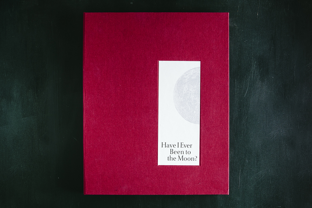
We enjoy giving back to the letterpress community and supporting amazing opportunities for printers around us to create, shine, enjoy, and share in the magic that is printing. In its eighth year, Boxcar Press has had the honor of contributing photopolymer plates to the 2018 Seattle Children’s Hospital Broadside project. The culmination of combining the talents of Ann Teplic and Sierra Nelson of the Writers in the Schools program (WITS), the School of Visual Concepts in Seattle, and young local poets at the Seattle Children’s Hospital was 20 cleverly crafted broadsides. Each print had a limited run of 110 editions. This first installment of a two-part blog highlights four printers who share their heartwarming experience bringing their young poets words to life.

Bonnie Thompson Norman
The process of working on the Children’s Hospital broadside project each year is a combination of dedication and commitment as well as skill and inspiration.
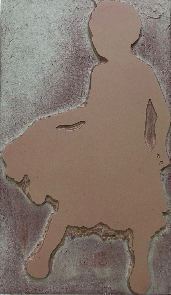
Each year, children present to us a selection of poems before we come together as a group of printer/designers for the first meeting. At that gathering, the wonderful poets-in-residence who bring such heart to the project, Sierra and Ann, read each poem written by their young proteges. We have our preferential choices and usually end up with the poem we most wanted to work on…although that process may occasionally require some good-natured negotiating. It never feels like enough time to work on our broadside. Sometimes we receive helpful hints or information from the poet and/or their family. Sierra was able to connect me to the family of the delightful young girl who wrote about her grandmother’s dog and the times she spent with them. Her parents sent me some photographs of them with their daughter and she was happy, gay and playful in the photos.

I wanted to convey that delight in the broadside so I carved a linoleum block of a young girl dancing and spinning and another block of a playful dog who (I hope) looked like the one her grandmother had.
The type for the poem, title and colophon was a combination of handset type and ornaments from my own cases and Linotype set according to my specifications by my good friend and Linotype master in Los Angeles, Bill Berkuta. Each color is ran individually on the press. The sheets of paper went through my Vandercook SP15 and my Chandler & Price 10 x 15 a total of eight times. This was in order to avoid over-inking the type and/or under-inking the images.
Because of the nature of this project, there is a great deal of poignancy with it. I learned that my young poet had already passed away by the time this year’s project had begun. While I was charmed by both the exuberance of her poem and her photographs, it was bittersweet to know that she couldn’t see herself in the final printed poem.
Justin Gonyea
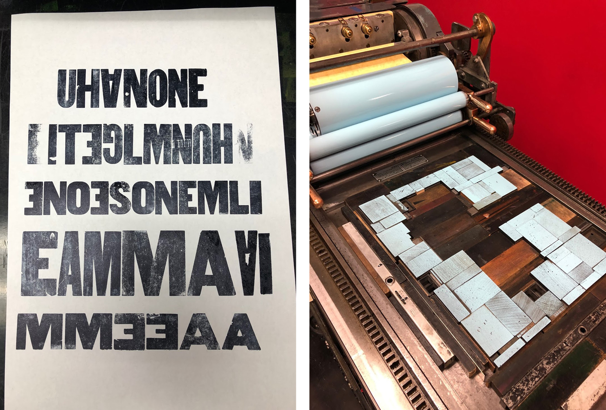
When I first read Jesse’s poem, his words really stood out to me, and I wanted to put them front and center. To achieve this, I used his poem to create a typographic portrait instead of calling out a specific image he evoked. I wanted to elevate his voice rather than creating my own interpretation of what he was saying.

My broadside had a total of five passes on press using wood type, metal type, and photopolymer plates. I first handset and printed four lines of the poem that I wanted to emphasize in wood type. Scanning this type allowed me to arrange the text on top of a silhouette. I set the rest of the poem digitally using HTF Knockout, HWT American, and HWT Catchwords. I resized and rearranged the scanned wood type and digital type until I was happy with the composition.
Back in SVC’s letterpress shop, I used a printout of my digital layout as a guide. I set it down on the composition table and set type on top of the paper. Using upside down wood type, I created a woodgrain texture around Jesse’s words to help create the form for the silhouette. I handset the type for colophon, byline, and title using metal and wood type.

The woodgrain texture was my first pass on the press. I scanned one of the final prints of this first layer, made sure all of my digital text lined up properly, and then put in an order for my photopolymer plates. On press, I printed the handset colophon, followed by photopolymer plates for the light and dark blue layers. For the green layer, I used a smaller Boxcar base, so I could also print the handset title and byline at the same time as the green photopolymer plate.

Unfortunately, I didn’t get a chance to talk with the young author for this project. I just hope that my broadside helped amplify Jesse’s voice. It was really fun to design a piece of artwork around his words, and it was an honor to be part of this year’s Seattle Children’s Hospital Broadside project.
Annabelle Larner
This year’s piece is all handset metal type and carved linoleum. In the past, I’d done elaborate pressure prints and layers. This year, I wanted to keep it simple and clear as I did not meet my poet.

The poem is called Brother & Sister Bear, by poet Jessyka Smith, age 16. It’s about her little brother, and what a great support and defender of her he’s been in her life. He calls her Big Sister Bear.

Jessyka’s poem made me think of a protective, strong, and fierce bear. Using linoleum, I carved a big slumbering bear to lay across and frame her poem.

It ended up looking like a polar bear. I thought it would be nice to have a cool, icy-blue area for the bear to rest on, which also added depth under the poem. This blue background was carved in linoleum as well.
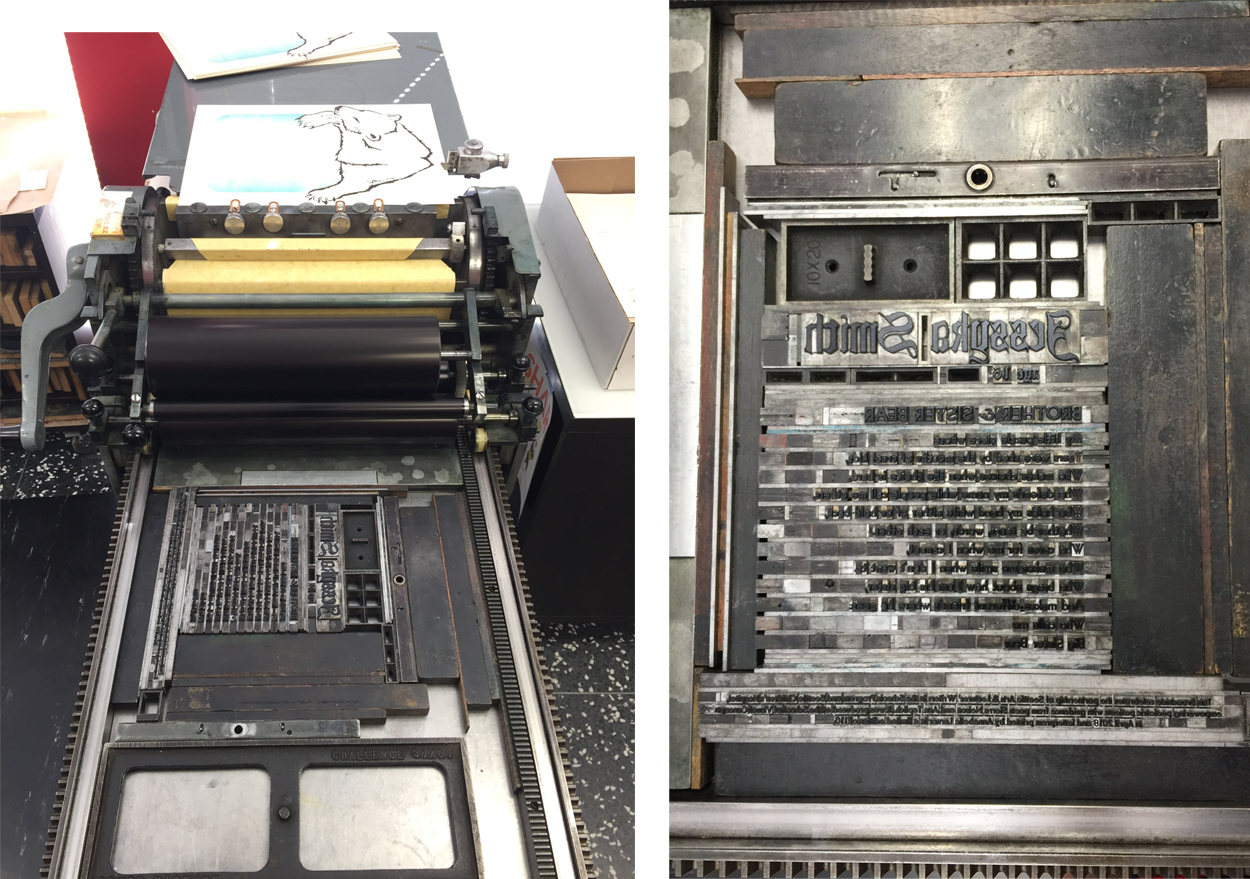
Regarding the type, I hand-set her name in big, 72 pt. Goudy Text to make it stand out. I also liked how the curves and lines of the typeface looked with the bear. I chose Bernhard Gothic for the poem itself, to contrast with the Goudy Text. Also, I loved the W’s in this typeface, since there were so many that started each stanza! And the Bernhard Gothic ampersand for the title was unique and pretty.
The first item that goes to print is the bear, which uses black ink. Second, is the blue background with a split fountain which contains blue on the outside bleeding to trans white on the inside. Finally, the poem and colophon go to print.
Laura Bentley
Sarah’s poem entitled “Roots” speaks to me because of the nature imagery. Specifically, the imagery of wildflowers and roots. I often print from handset type, but for this broadside, I decided to print from polymer plates. This allows for flexibility on choosing cohesive imagery for the wildflowers and the roots.

The layout of the text was designed on a computer with digital fonts, of course. In addition, the foliage and flower imagery are also from a font! Really! The font is called Makalu and is a series of illustrations created by Juraj Chrastina.
I felt like the playful feel of the illustrations. It fits Sarah’s imagination and her poem. The overlapping of colors to fill the top of the page was a natural fit. To evoke a mid-century modern feel, the roots are a tangle of geometric lines.

Each of the four colors was printed separately. For an edition of 120, I started with 130 pieces of paper. For all of you counting this means I am feeding paper through the press 520 times!
Stay tuned for Part 2 of our blog article series featuring more printers and their original and inspired prints.
Pingback: 2018 Seattle Children’s Hospital Broadsides: Part 2 - Boxcar Press