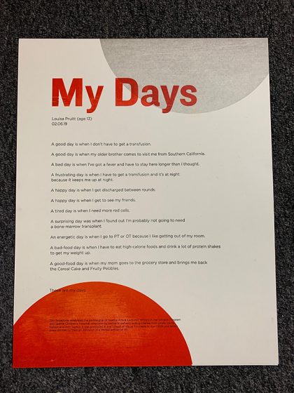
For our ninth year, we here at Boxcar Press have enjoyed the honor of supporting this year’s 2019 Seattle Children’s Hospital Broadside project. It is helmed by Sierra Nelson and Ann Teplick of the Writers in the Schools program (WITS) and the School of Visual Concepts in Seattle. This year’s creative young poets and printer/artists joined forces to build a magnificent collection of 20 broadsides in a limited run of 110 editions.

The works of arts are a collaboration of kindhearted printers bringing alive the thoughts of long-term patients from the Seattle Children’s Hospital. The result is nothing short of fun, colorful, whimsical, and inspiring. This first installment of a two-part blog highlights four printers who share their creative processes and showcase the magic of the children’s writing. Enjoy!

Amy Redmond
When we gathered at SVC to kick off this year’s series with the reading of the kid’s poems, I was convinced Gerald was a real llama. I wasn’t alone. After Ann Teplick (one of the lead poets for this project) finished reading Liam’s poem, she said she’d met Gerald. “He’s real?” another printer asked. “Oh no,” she replied. “He’s a stuffed toy, but he seems real.” Liam’s words had brought Gerald to life, a feeling that stuck with me through the creative process. We spent a lot of time together, me and Gerald. And he is quite a lovable little stinker.
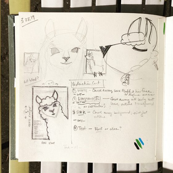
His larger-than-life personality demanded the same dominating presence on the page. Picturing a simple illustration with a large color background, I set about figuring out how to turn the sketch into a reduction cut.
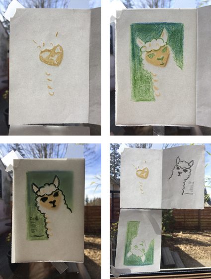
Not wanting to leave anything to chance, I tested my sketches on a small 2×3 inch linoleum block and printed a run of 200 so that I could play with color & the reduction cut process. Remember how I said Gerald was a stinker? Yep. He bit me. Twice. (Some may say my carving tool slipped, but they weren’t there. Gerald knows what he did.)

These tests were really informative. I quickly learned how opaque white ink would look on the cream-colored paper: in short, not as I expected. To make Gerald appear “white” I found it best to shift from my original plan of printing his entire body in white, to only printing the suggestion of his curly locks. I also played with the background color, and how to best define Gerald’s outline. These “Gerald trading cards,” as I came to view them, were later sent out to members of the Amalgamated Printers Association in the monthly letterpress bundle.
I like to create full size mock-ups to nail down the details before getting on press. The design of the broadside didn’t change much from these 2×3″ tests to the final 9×12 image; just a little rotation of the angle at which Gerald would be peeking out of the corner, in order to make room for the type.


The first pass through the press was Gerald’s curls and face. To prep my platen press (a 13×19 motorized Colt’s Armory), I let it run with opaque white ink for about 20 minutes to draw out any trace remains of other ink hiding in the rollers. I cleaned it with Putz Pomade and roller wash, and inked it up again with opaque white and began printing. The effect was subtle, but enough to make the non-printed parts of the page appear “whiter” than they actually were.

Carving the second part of the reduction cut was easy, even if Gerald wasn’t thrilled to receive the haircut. Removing his curls was deliciously satisfying.

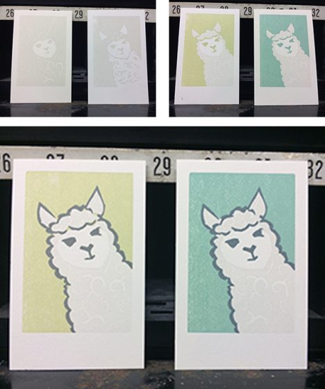
I decided — with the help of an informal Instagram poll comparing my test prints — to set Gerald on a blue background, rather than a green one. At one point it was going to be a split fountain of the 2, but that was just a symptom of indecision.

Passes 2 (blue) and 3 (gray) of the reduction cut aren’t well-documented, but I did snag a photo of my alignment tests on make-ready from previous year broadsides. In these 4 prints you can see evidence of Home Life (2017), Self-Portrait Poem (2016), How to Fix a Laptop (2015), and Favorite Things (2013).

The fourth and final pass through the press was the metal type, printed in the same gray as Gerald’s eyes, nose, mouth, and outline. The title was set in Boul Mich, a typeface designed by Chicago’s Ozwald Cooper in the spirit of the trendy Broadway typeface of the 1920s. The body and colophon are set in Spartan, my house sans-serif face.

Working with Liam’s poem was a treat, and things that are important to Liam are clear in his description of his beloved confidante: strength, tenderness, and a co-conspirator willing to weather the highs and lows of life. May we all be so lucky to have someone like Gerald, stinky as he may be, by our side.

Demian Johnston
Every year as I contemplate and work on this project, it has tremendous importance to me. Yet, I never feel like I do enough. Some artists meet their poets or the poet’s family if the poet had passed. I have never done that. I don’t know if my heart can handle it. I have done 5 or 6 of these. I have cried each time. Even the funny poems hit me and not for any specific reason, although I experience so many feelings. It’s simply just how human the poems are.

You get this unique, precious look into another person’s life—and sometimes death. It’s a rare thing, especially in this era of phony social media where our curated personalities pretend to connect with others. I really wish I had taken more photos, particularly of process photos of my last print but I did have some fun with this one. I used Boxcar plates for all of my printing.
I had played with clean lines and texture. I ended up printing everything clean and then carved away parts of the plates. I used sandpaper and wood cut knives to distress the plates and then I overprinted again. I also wiped away a little ink on each pass. I wanted there to be some “grit” below the surface.
The poem is clean and neat. It’s really tight but there is some real agony beneath it. Happiness, too… but I wanted to lean into the darkness without doing something traditionally dark. As always, I feel very lucky to be part of this project and to exercise my skills.
Annabelle Larner
My poem was an excerpt of a longer poem, written by Isaac Gardner, age 24. I was lucky and got to meet him a few weeks before I started the project. He was incredibly open and excited about seeing his poem in print.
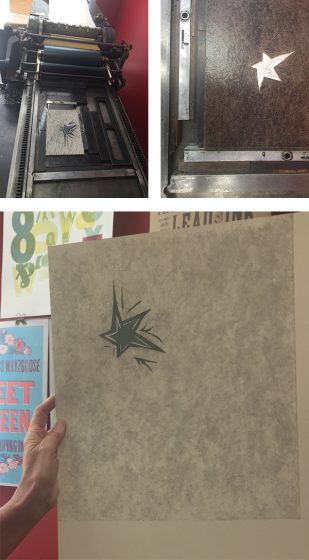
Isaac’s poem was very powerful, and the excerpt I had was in reference to darkness and light, and how he had a star in his pocket that grew brightly as he called upon it for help in the darkness.
I was immediately drawn to the star, and to creating a dark, stormy background with a path of light cutting through. I’m interested in textures and colors as opposed to using literal images, but did use a star as a sort of centerpiece. Boxcar made the poem excerpt in polymer, and the rest of the broadside was done by hand.

I began by making a linoleum cut of a star and printing it as my first pass. Next I created a collagraph–I mounted bookboard and painted it with acrylic medium with brush strokes for texture. This was my second pass.
For the third pass, I wanted to make a dark area to surround the star, and so hand-cut linoleum sheets mounted to a piece of shelving, and printed this background in a dark bluish color over the textured collagraph. I had to make sure the blue was transparent enough to show the texture while still being dark and moody. It was tricky!

Finally, I printed the polymer plate with the excerpt of the poem in a dark reddish color to contrast with the blue.
I was happy with the overall result! And was thrilled to meet Isaac and participate in this meaningful project. Thank you Boxcar!
Bonnie Thompson Norman
In the spring of 2019, myself and a lucky group of other letterpress printers gather to be part of the Children’s Hospital Broadside Project. This was the ninth year of the project. We listen as the poems are read and choose (and sometimes negotiate) which poem we will print.

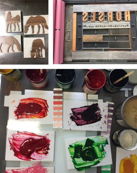
Sierra and Ann are able to share a little bit about each poet and I learned that my young one, Finnley Foster, was already an accomplished rider and had her own horse named Norman. Because she was so young, I wanted to keep the colors of the broadside gay and colorful, suggesting a carousel. And yet, I wanted to keep the horses lifelike because she described them so specifically and because she really knew what horses look like.
I enlisted the help of one of the other printers, Laura Walczak, because she is more savvy than I am with cleaning up images on a computer to get them ready for reproduction and because she has a laser cutter. I found several copyright free images on-line which I thought suited the lines that Finnley had written. Laura was able to work on the images and create the wooden laser cuts in a matter of hours.
I worked out and mixed all the colors in advance to create a harmonious palette for the run of seven colors. I did many mock-ups of hand cuts shapes of the horses before settling on the positions for each one. I printed the text on my Vandercook SP-15 but I printed each of the horses on my 1926 10 x 15 Chandler & Price. The horses required quite a bit of ink to get full coverage on each image and I was able to achieve this more easily on the C&P although it did require some careful paper handling as the sheet was over-sized relative to the press.
Throughout all the press runs, each broadside had a slipsheet laid between them so the ink would not offset from the front to the back of the next. Even so, I laid all the broadsides out on my work table to dry for several days before the final trimming.
At the completion of the project, we gather to read the broadsides to one another and talk about the process of working on them. Then we wrap up a complete set of the broadsides in a portfolio along with ten copies of the poet’s own piece which are later presented to the young poet and/or their family. Because of Finnley’s enthusiastic interest in horses, I gave them all of the laser cuts in case she would like to play with them.

It is both moving and inspiring to be part of this project for nine years. I am grateful I am invited to be even a small part of the young poet’s journey as they are so sweetly encouraged to write by Sierra and Ann. The generous support of businesses like Boxcar Press, Ecological Fibers, Neenah Paper, Puget Bindery and Evolution Press working with all involved makes this possible.