Part two in our blog feature of the 2016 Seattle Children’s Hospital Broadside project features six more artistic printers and young poets as part of the collaboration between Writers in the Schools program, long-term patients at Seattle Children’s Hospital, and the School of Visual Concepts in Seattle, Washington. These six printers share with us how they brought each writer’s words to vivid life in the 2016 edition.

Nicole Cronin 2016 marked my fourth year participating in the Children’s Broadside Project. Each time, I am excited to create art for a good cause alongside my fellow printers!
I was immediately drawn to Jasmine’s poem because of her detailed imagery and playfulness in her writing. It felt whimsical and fancy and hopeful… so I wanted my broadside to depict her words so the reader felt like they were right there, watching acrobats performing and climbing ribbons! One of my favorite things in designing for letterpress is linoleum carving, so I decided to carve a hand drawn wreath and the pink ribbon. The most time consuming and also enjoyable part of the process was carving and printing the wreath. It was challenging to line up the acrobat between the ribbon and the wreath (which in hindsight sounds crazy, but so true).

I printed the poem, acrobat and gold dots using Boxcar Plates which produced the most consistent passes on press.

This project is personally fulfilling, and I am honored to have had the opportunity to design and print Jasmine’s poem. With great leadership by Jenny Wilkson at SVC, we have a strong team that provides time, paper, plates, etc. and I am so grateful to have contributed a small part.
Carol Clifford This will be my 7th year of working on the Children’s Hospital Poetry Broadside Project. Each year we are presented with poems from the children to read over and consider. Then we all meet as a group and each chooses a final poem to interpret and print for the young poets. I usually sit down with a cup of coffee and take time to read each child’s poem. Then I reread.
Many of these kids are heartbreakingly wise beyond their years.

I will connect with some of the poems more than others. A few suggest ideas and images fairly quickly. I usually draw thumbnails right away in the margins, percolating on others until we meet to get our final assignment.
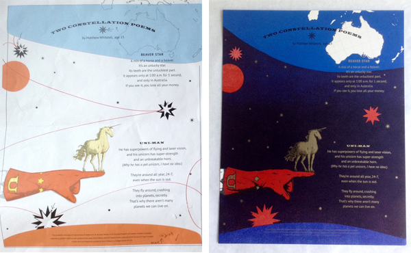
I chose Two Constellation Poems by Matthew Whitesel because I liked that this was one of his first attempts at a poem, and it turned out so visually rich and funny. I liked the challenge of creating a dark field of color with letterpress printing. As a bonus, I just happened to have a unicorn image I had recently used for another project.
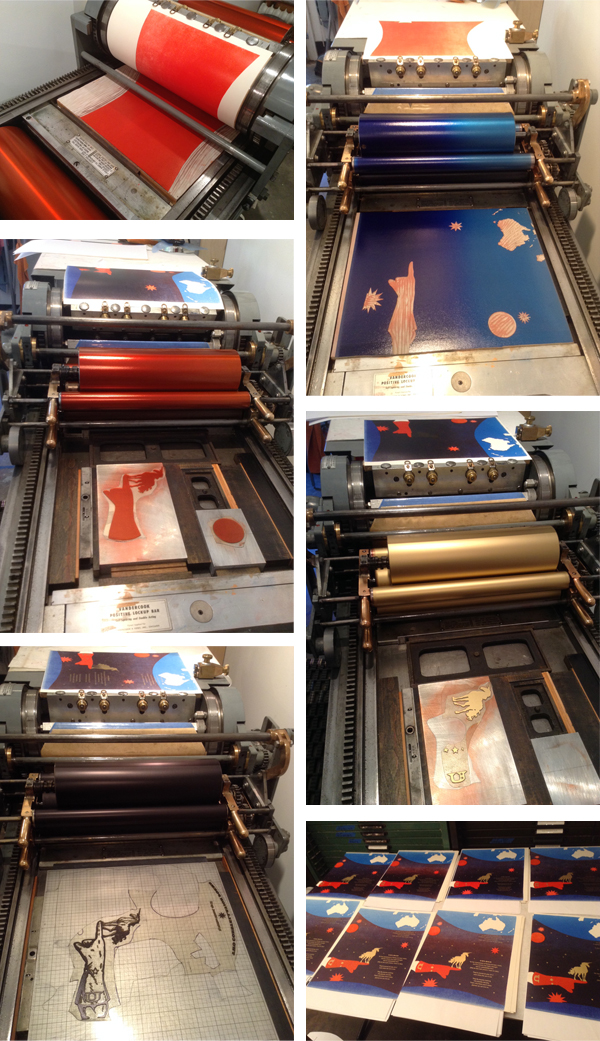
Because of the line “Why he has a pet unicorn, I have no idea,” I knew I wanted the unicorn to be front and center and gold (Right?! I used MS-1151 Rich Gold Paste from Hanco Ink Co) Printing gold as the featured color directed building up the background. With experimentation and suggestions from other printers, I learned that highlighting the shine quality of the gold ink is more successful when printed over another color, especially a darker color. To form the dark background, I was inspired to use two colors that overlap and create another color with a lot of depth.

I try to work out all the steps of a broadside before going on press, but inevitably, once I am in the studio, I tend to combine techniques to accomplish my ideas. This method of working can be maddening, but also allows for a lot spontaneity and, fingers crossed, happy surprises. The image was created with a combination of linoleum blocks and polymer plates.
I had planned for a four color run. It turned out to be nine! Two runs of red to get the saturation and color I wanted, 4 runs of gold to solve registration woes and for clarity on the colophon and then black and blue runs with linoleum blocks. I am really pleased with the final result.
When I come up with ideas for the broadsides I keep in mind the age of the poet. Ultimately though, my hope is that the piece will not be too “childish” and that the broadside will give both the poet and his family moments to enjoy for years to come. I haven’t met Matthew but I was told that his younger brother thought it was really cool to have something he wrote printed. This experience has inspired both of them to write more.
Leah Stevenson The Seattle Children’s Hospital Broadside project was a fantastic and challenging experience. I was equally excited and nervous to be a part of the collaboration. It was my first time and I wanted to ‘get it right’. These kids go through so much and being able to create a piece of art with them felt special and so important, even more so because we knew some of the kids wouldn’t and didn’t make it to the end of the project . I unfortunately never got the chance to interact directly with the kids but just hearing their stories through the poetry was extremely powerful. This was not just a piece of artwork that we were creating but also a piece that represented these kids in a way that a lot of people don’t get to see.

I selected poetry by a young student of 6 years who had four short poems together, each in English and Spanish for a total of 8 pieces of text to work with. Having grown up in South America, I felt an instant connection to the poet through her use of Spanish & English in her writing.
It was a challenge to figure out how to piece all these separate poems into one cohesive broadside. I had recently visited L’Opéra de Paris (the Paris Opera House) and was inspired by the mural on the ceiling for this piece as it depicted various scenes from different operas all together. I decided to take that concept and separate the poems into four sections surrounding the sun in the middle. This gave each poem it’s own stage, so to speak, while still tying them together.

I used a combination of pressure printing and photopolymer plates on this broadside. I used pressure printing for some of the background colors, as I wanted a little more fuzziness around the edges – not so clean and precise. To contrast, I used photopolymer for its clean lines for the more details work as well as the text. I actually hand wrote the poet’s name, age and title of the piece and digitized that to create a photopolymer plate. It felt like it gave a different emphasis on the poet that paired nicely with the illustrations around it.

I had a lot of registration going on in this piece, which proved challenging to control with the larger run. I had at least 8 passes and getting everything to line up was tough (and in some cases impossible) but it was definitely a learning and enriching experience and worth every minute I spent on it.
Jill Labieniec This year I worked on the group poem which combined words and ideas from different children. It was challenging to include all the imagery from the poem so I opted to add my own idea into the mix.

The overall theme was kissed by the rain so I figured a mermaid who lived in a puddle would be very appreciative of a little rain.
Amy Redmond I am a Seattle-based visual designer, a letterpress instructor at the School of Visual Concepts and letterpress printer since 1998.
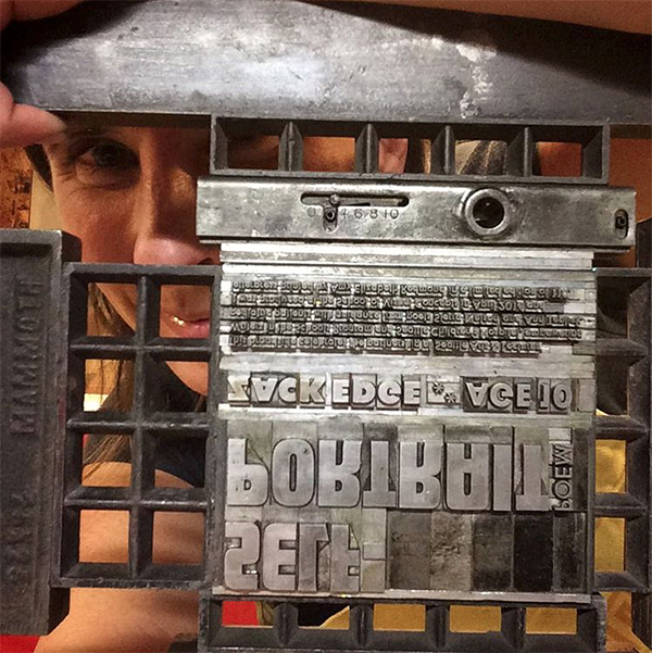
I work with photopolymer but absolutely fell in love with handset type. For personal work and special projects like the Seattle Children’s Hospital Broadside project I work only in handset type. The focus it requires, and the time, is my way of paying my respects to both the poet and the poem. I become fully immersed in the words and the process, and the extra time it takes is worth it. The poems the children write represent a huge amount of energy and heart on their part; it’s only fair that I attempt to meet them on equal ground.

This is my 6th time as a contributor. I do it for several reasons: to bring the poems into light, to be a part of a larger community project, to challenge myself, to learn from my mentors, to work side by side with the Seattle letterpress community. It is a very closely connected group and this Broadside project is one of the ways we maintain that association. The artistic work on this project gets better each year. We all work hard to out-do ourselves, and put to use new tricks we’ve learned throughout the year. We learn from each other to push the traditional boundaries of broadside design.

My poet, Zack Edge, incorporated a lot of imagery into his poem. I used large wood type (front and back) to help create a landscape in which his words would live. On the left the orange words form a wide tree trunk; on the right a sky and a field are formed. I used pressure printing techniques to create the white cloud when printing the blue sky, and it was serendipity that the wood type I chose happened to have a few stars carved out of from its backside.
For the smaller type, I handset everything in metal type – Spartan – on a 1903 Colt’s Armory Press. With all the various weights I was able to play with the cadence of the type, and pushed — as far as I felt comfortable — the composition of the poem itself. By placing the last line of the poem to the far right in the cloud and having it stand alone, I hope to give it emphasis so that others also take note of its gravity.
Laura Bentley I received a reflective and powerful poem by a 16-year old named Mackenzie who worked with poet Ann Teplick. I was struck by the earthquake imagery in the poem. It made me think I could do something with shifting plates of earth or seismographs. After weighing several options I was excited about the thought of using metal type ornaments that look a bit like layers of earth and thought I could put something together that imitated seismic faults, albeit in an abstract way. The bars of ornaments can also reflect just the abrupt ups and downs that life can take. Thank you Mackenzie, it was an honor to print your words.

For colors and typeface I was leaning towards both “earthy” and “mid-century modern, particularly, a typeface from the age of printing with metal, even if I would be printing it with photopolymer.

The metal type ornaments were set to the correct lengths, and arranged in position in the press bed. Each color is printed in a separate pass through the press. For an edition of 110, I started with 120 pieces of paper. For those of you counting that meant that 120 pieces of paper through the press four times meant feeding paper through the press 480 times!

Laure’s full blog article covering her printing adventure can be found here.
A huge round of applause and thanks out to all of the printers who donated their time and efforts to this amazing project!
Pingback: 2018 Seattle Children’s Hospital Broadsides: Part 2 - Boxcar Press