We are thrilled to share with you photographs of a beautiful collaboration between the Washington Poetic Routes project and a small group of Washington-based artisanal printers. The project itself is a digital poetry-mapping program that explores Washington state’s bountiful geographical terrain and that of the human relationships within.
The enterprise has joined together Seattle’s School of Visual Concepts, countless wonderful poets across the state, and eight letterpress artists to create the beautiful letterpress broadsides. At Boxcar Press, we are privileged to showcase and highlight this magnum opus of creativity. Below are photos of the process, as well as few shots of the incredibly crafted pieces. Enjoy!
Claudia Castro Luna, the creator of the Washington Poetic Routes website and SVC’s Designer in Residence from 2018–2019, has this to say:
I think of the poems on this map as heartbeats. Red beats full of candor and intimacy the way only a poem can transmit. My hope is that when reading them one after the other the dots shape in the reader’s mind a new set of travel routes, a complement and an alternative to the to the road routes drawn in on the map. The green routes take us physically from Point A to Point B. Depending on how the reader clicks on them, the dots will create a new constellation of routes: emotional, spiritual routes that tap into memory, into history, into joy, into our desires and frustrations, into land, trees, fish and bird song.
My hope is that together, through our own poems of place we will have a new, different way of engaging with each other as citizens. Together we create a living map of what is like to live in this wonderful place we share called Washington State.
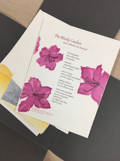
The portfolio includes a diverse representation of poems from across the state. I chose “The Rhody Garden” because not only is the rhododendron our state flower and I happen to have a whole forest of them in my backyard, but I loved the poet’s whimsical description of their bloom cycle.
This broadside was printed in 3 passes. The text and line art were printed in black with a Boxcar photopolymer plate. Then, I overprinted the black pass with a linocut, first in bright pink, then cutting away from the same linoleum block and printing it again in darker magenta—a very straightforward reduction cut!
Though I am usually so careful, somehow I managed to impale the palm of my hand with my carving tool while working on this. A quick trip to urgent care and some super glue fixed me right up, and now I have a scar to scare my students with.
This project involved teamwork at several levels. Arts agencies, our state’s poet laureate, Seattle’s fantastic School of Visual Concepts, and eight letterpress artists. I was one of them. And, oh—my wife and printing partner. She dove in as facilitator of the whole shebang (lots of emails, a little guidance). Everyone’s team spirit resulted in eight poetry broadsides, all collected into a stunning folio constructed by Windowpane Press.
My wife and I operate The North Press in Port Townsend, Washington. Poetry broadsides are about ninety percent of what we print. I selected Sandra Meade’s “Blackbird Sings at Night”; for its shape: tall and narrow—and because it’s a terrific Poem.
Our experience is that it’s best to start the design process with the body of the poem, to look at how it will occupy the page—what type, what size, what placement—and then the poem title and the author’s name, followed by subtitle, attributions, etc. I try to keep in mind that I’m working with someone else’s creative work, so there’s no messing with the poem’s alignment or indents. My job is to elevate the poem and not overshadow it with graphic whizbangs. That said, I’m comfortable with some sort of illustration secondary to the poem, and Ms. Meade gave me plenty to work with.
We teach a workshop called “Pixels to Print”. It’s about converting digital photographs to high-contrast art (what we used to call “camera ready”). The grass beneath the rural mailbox is an example of making a polymer plate from a continuous tone, full color photograph. With the right sequence of steps, many images—even blurry snapshots like the one we took on a road trip in South Dakota—can be converted to high-contrast and printed from polymer. For this composite illustration, I began with the grass. Then the mailbox. Then the cancellation and, finally, the bird. We had Pablo Neruda’s signature from a previous Project.
I ran black, gray, and red inks on the press. In that order. The red was the smallest plate I’ve ever printed, but there was no question that the blackbird’s wing would get its own impression. I love the poem’s reference to the mailman’s/blackbird’s “official shoulder patches”.
As I said, my broadside was only part of this project. Credit should go to Ellie Mathews for facilitating and to the other printers involved: Amy Redmond, Annabelle Larner, Heidi Hespelt, Chris Copley, Marie Kuch-Stanofsky, Jenny Wilkson, and Sukhie Patel. Midway through the process, we managed to gather for a critique session in which everyone shared their design considerations. Working in concert with these artists was both inspiring and humbling. I think I can speak for the group of us to say that we are grateful to Boxcar Press for sponsoring the project, and to Neenah Paper for contributing enough Neenah Cotton in Pearl White for the eight, 8×10 inch broadsides plus the cover sheet explaining the project. Teamwork!
I was honored to be part of the Washington Poetic Routes: Poems of Place project. I was immediately drawn to Luther Allen’s poem, dropping down the west side of the cascades. I love the way he transitions from the mountains of Steven’s Pass (about 80 miles east of Seattle) to the ocean, and how he depicts change in the environment. And he really captured the mossy green wetness of our area. Here’s the poem:
By Luther Allen, at Steven’s Pass this is it. the smell of green of damp rot, of slugs and ferns and staggering grand trees the smell of festering tidal flats the burst of orcas through a rain-matted sea. the smell of gulls and sea lions salmon and cedar longhouses of pulp mills and seattle traffic shrouded in mysterious islands and miles and miles and miles of raw ocean.
I always want to try new things when a project presents itself to me (sometimes frustrating myself for experimenting under a deadline!), so I thought of printing on wood because it felt right for the poem. I found a beautiful piece with whorls and knots, which looked both watery and woodsy.
For the background I mixed a mossy greenish color that had enough transparent in it to also feel layered like water. For the first pass on the wood I used a pressure print to create a mountain silhouette. This was a challenge, and took a lot of tests in order to not lose the whorls and details of the wood while pressure printing, so I ended double-inking each one.
The poem was hand-set set in the slab-serif, Stymie, which I felt befitted his words and I liked the way the type looked with the wood. I played with various layouts for the poem and was happy to stagger the title a bit, to reflect the dropping down words.
Debra Barclay of Ancora Press is a well-travelled printer who was inspired by the work of William Blake. She creates in her garage-turned-printshop and shares with us her lifelong printing mentors / friends she’s made along her print journey (as well as a favorite printing moment involving a Girl Scout Troop and a Vandercook).
WASHINGTON STATE PRINTER
My name is Debra Barclay, and I am a letterpress printer in Woodinville, WA. I live in Woodinville with my husband, 7-year-old daughter, 6-year-old son, 6-month-old Labradoodle, and two pretty lucky black cats, Uno and Tres. I’m a New Jersey transplant by way of Brooklyn, Virginia, Rhode Island, and Oregon. My favorite color at the moment is PMS 310 (light teal).
THE LURE OF LETTERPRESS
For my undergraduate degree, I attended Providence College in Rhode Island. My degree is in English Lit/Creative Writing and Printmaking. My senior year, I took a course on Romantic Literature and fell deeply in love with William Blake’s work. William Blake was a poet and printmaker who developed techniques to bring his poetry into a more visual realm. He combined text and image in a way that I had never seen up to that point. His poetry became visual as much as text-based, and he made it so the poem’s meaning was directly enhanced by the calligraphic lettering, colors he chose, and the overall design. In this way, he elevated the printing of information into a visual experience rather than just a transfer of data. At that point, I knew that I had to integrate my two passions: creative writing and printmaking.
After I graduated, I started looking into bookmaking classes. I found a school that had a very small but well equipped Book Arts Program. This was when I found the Oregon College of Art and Craft. I immediately enrolled in a few classes, packed my bags, and moved to Portland.
I really didn’t know what I was getting into, as far as letterpress printing goes. But there I was, learning to handset type and run a Vandercook under the tutelage of two women. Kathy Kuehn is a master printer at Pace Editions in NYC and Caryl Herfort, a letterpress printer from Texas who was there as the Artist in Residence. Many may know of Caryl from Roto Press (Rest in Peace, Caryl). Both of these women inspired me to experiment and play with the medium.
A CREATIVE ADVENTURE
As I continued to set the type for a short story I had written, my mind exploded. It was so crazy to be able to touch thoughts and ideas – letterforms as material objects with a history and life of their own just struck me on a very philosophical level. I then locked up my form in the school’s Vandercook Universal, and ended up a bit deflated. This was off course from my Blake path, as Blake didn’t use handset type in his work, possibly for this reason. Yes, typesetting is intimate, but once it gets on press and you print it with great craftsmanship, it does not show any of the depth or meaning that it had taken on when I handled it.
It was much more sterile and generic than I had envisioned my piece to be, given how emotionally and physically closer I had become to the words. This created some friction between me, the machine, and process. I moved my printing over to a hand rolled proof press, where I was determined to get the “hand of the maker” involved. Then, I hand-inked each pull, and ran the pages through one by one, skewing the registration so they would all be unique.
I actually still have a scar from this very first print run I did, as my thumb got caught in the cogs of the press as I was enthusiastically running pages through. The end result was a very artistic interpretation of letterpress! I created an art installation with the small edition of books I made with this experiment. I filled three walls of a gallery with the pages, and set up three of the spiral bound books on pedestals where viewers could flip-through the pages. The only requirement was that they wear white gloves, as is common practice when looking through fine press books.
However, the white gloves I provided were covered in black printers’ ink. So, the viewer/reader added and changed the book as they engaged with it – a visual representation of how we all change and alter language as we use it. It becomes a relationship where both parties – the ideas/text/ poetry and the reader/viewer – are changed through the interaction. We are all changed in sometimes undetectable ways by every interaction we have.
I then began to approach letterpress a bit differently, and started to think more about how words are laid out on the page, how the colors might interact with one another either through size, proximity, or overprint. I also started to notice the beautiful impression that letterpress machinery gives to the paper, making the text both a visual AND tactile experience for the viewer/reader.
A LETTERPRESS CONNECTION
Through this experience, I reconciled and truly fell in love with the exacting nature of letterpress machinery. It was through these experiments that I concluded that when I create, I am collaborating WITH the machine. With this finely engineered letterpress machinery, the ability to disseminate information in a way that allows for the content to be given the entire spotlight would now be possible. We are true partners. With that, my deep connection with letterpress continued to grow and develop into where it is today. I utilize the impeccable precision of the machinery to allow me to elevate letterforms, words, ideas, and everyday life moments into experiences with tactile beauty and time-tested craftsmanship.
HOME GROWN PRINTING
Ancora Letterpress is a custom letterpress print shop located about fifteen miles Northeast of downtown Seattle. We do custom designs working directly with clients as well as printing for graphic designers and other print shops who come to us with a pre-existing design of their own.
My shop feels like home. Mostly because it’s attached to it – in my garage! I have two 10×15 Heidelberg Windmills and an 8×12 Chandler and Price. I also have a photopolymer platemaker and a small guillotine paper cutter. My favorite thing about my shop is that I get to create there! Truly, it’s a dream come true. I also really like the commute.
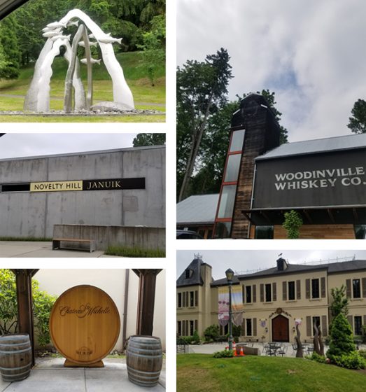
WOODINVILLE WONDERS
Woodinville is a tourist destination, as we have over 100 tasting rooms, wineries, distilleries, and breweries within a stone’s throw from my shop. This can be dangerous, but it’s really quite convenient mostly. Chateau St Michelle is probably the largest winery in the area. They have concerts on the lawn in the summers and beautiful grounds to walk around and picnic on. In the summer, we can hear the music from our backyard, which is usually a good thing. We also have a really cool theatre production company in town called Teatro Zinzanni, which recently moved to Woodinville from Lower Queen Anne in Seattle. From their website: “Teatro ZinZanni…is a three-hour whirlwind of international cirque, comedy, and cabaret artists…”
I really love living here because it’s quiet and we have lots of space. Our house is nestled into trees at the end of a cul-de-sac, yet we are incredibly close to the city. Woodinville is described as “subrural” as it is somewhere between suburban and farmland. One of our neighbors has a horse grazing in her front lawn pretty regularly, and the one across from her has over a dozen chickens on his property. We have a growing Arts community thanks to the Woodinville Arts Alliance in town.
PRINTING MENTORS
Oh gosh! This is a hard question! So many people have helped me get to where I am today. Esther Smith and Dikko Faust of Purgatory Pie Press were my first inspirations, as they were my first apprenticeship out of school. Dikko’s skills as a printer always inspire me, and Esther’s vision and ability to draw inspiration in the everyday is joyous.
My former boss Scott Hill of Workhorse Press is a great mentor as I continue to build my business. He’s readily available to help me with any questions I have about presses, printing, or the business side of things. I’ll be forever grateful to him for taking me on as an employee and teaching me so much about the production side of letterpress. Scott is a printer by trade, with a very keen eye for how to bring a design to life on paper.
Jami Heinricher of Sherwood Press is my most recent mentor and inspiration. She taught me how to run a Heidelberg platen, and for that I am forever grateful. She helped me troubleshoot one of my presses’ weird quirky problems, and even helped me back out my stuck Windmill, after my press pulled 6 sheets of 236# Flurry Cotton paper! I admire her business model, and her tips and tricks have saved me hours of time. My friend George Feakes of Impressive Inkreations has been an incredible mentor, giving me both sage printing and business advice, insights on efficiency, and an amazing amount of support.
All of my local letterpress trade guys are all absolutely my savior. After running letterpress for 40 years a piece, they collectively know everything, and there’s nothing they can’t make run correctly with just a little bit of tape and 18 point card stock. They’re also really down to earth and easy to talk to, and I love hanging out with them.
My husband, while not a printer, has been an amazing source of inspiration and strength. He single handedly moved my C&P and first Windmill up from Portland and got them situated on the garage floor. He also gave up a large portion of his workspace to allow me to have my studio. We are now looking into building him a lovely shed in the backyard for his woodworking tools for when I get a few more pieces of equipment this coming year.
GROWING THE DREAM
My business works out to be part time at the moment. I bought some equipment in early 2018, and spent about 6 months getting myself up to speed on the equipment and its particular quirks and what-have-you. Technically I’ve only been available to the public for about 7 months. I do plan to continue to solicit work and build relationships with designers, as well as develop a personal line of designs that I can offer to clients. Full time is my goal. I want to generate enough consistent job and print work so that I can take on an employee. There’s only one thing better than being a letterpress printer, and that’s sharing the workload!
THE CREATIVE FLOW
My process always begins by sitting down with the client and getting to know them a bit. I love getting to talk to people about their vision and translating that into a printed piece. I spend a fair amount of time gathering as much information as possible from the client. If it’s a wedding invitation, for example, I ask the bride to describe the ceremony and the type of event they’re going for. Is it modern, traditional, minimal, outdoor, etc? This narrows things down a bit. I get their wedding colors and match them to a PMS color that we all agree on pretty early on. I show them samples of my previous design work and see if anything stands out to them, either by way of technique (blind emboss, overprinting, etc) or if the tone of anything resonates with them.
At that point, I will begin a preliminary design. I find that this is really when the fun begins. It’s important to have a jumping off point, even if the design itself isn’t the final vision. It’s much easier for people to point out what they don’t like and for me to come up with alternatives to that, rather than envisioning something out of thin air. This has really worked well for me so far. I really enjoy the collaborative process during this stage of design.
PRINTING FEATS
I was the Arts Director of the Virginia Center for the Book from 2001-2003. While I was there, I helped run workshops and host events that built community involvement in the letterpress shop. I also created panel talks and art installations for Charlottesville’s annual Festival of the Book, which is a week-long event covering all aspects of books, from publishing, illustrating, designing, and reading. I also taught a class in the Art Department at the University of Virginia.
What I loved most about my time there was introducing the history and craft of letterpress to so many people in a variety of settings. One of my favorite moments was teaching an outreach program for a local Girl Scouts troop. I had the girls (who were all about 7 years old) run a pass through the Vandercook Universal. While I was in another room showing a group how to fold and slit the paper into a book, a girl came running out of the print shop in tears. Her mom asked her what was wrong, and she said through her sobs, “My print is over-inked!”
PRESS FAMILY
The very first presses I owned are my current ones – a 10×15 Heidelberg Windmill and an 8×12 Chandler and Price treadle that’s been converted with a motor. It’s funny that my first presses are both platens, since I learned to print on Cylinders. By the time I was ready to buy and had the space to have presses, Vandercooks were way out of my price range. Before this, I had always managed to access community print shops or presses belonging to friends.
BOXCAR’S ROLE
Boxcar has helped me in so many ways! Mainly, making resources readily available has been key. It’s a one-stop-shopping kind of place. They have given me the luxury of going slowly in building up my knowledge by offering a place to get it all done, and with such ease! The Boxcar Base has made life so much easier.
Before the Base, I was using magnesium plates. I found them to be much softer and more unpredictable, requiring more make ready due to being mounted to wood (not consistently flat on the bottom, and easily prone to warping). Being able to have predictable quality in my tools has allowed me to focus on perfecting my skills as a craftsman. The ability to buy paper, envelopes, order plates, and pick up a random thing I might need here or there (can of ink, roller gauge) has been fantastic. I can’t say enough good things about the Boxcar Press website flow. It is extremely user friendly, is quick and easy to navigate, and borders on foolproof!
I also love the How-To tutorials, which have increased my knowledge of my presses. Also, I cannot say enough great things about the staff. I have had random moments of panic where I’d forgotten to upload a small file for platemaking, only to call out an S.O.S. to Rebecca Miller, who swiftly and promptly put out the fire and saved the day! Working with Boxcar Press is like having a staff of knowledgeable and kind pre-press geniuses just an email away!
SHOP TIPS
Get the crop marks! This is something I don’t always do myself, and pretty much every time a two or three color cropless job goes to press, I spend twice as much time trying to get position. Even with one color jobs, I like crop marks once it gets to bindery. They seem like a luxury, but really they save you a bunch of time. And time is money, as well as a whole lotta frustration!
Spend the money! I’ve been there…I have tried to get away with a short cut, or making do without a particular tool or gadget (the Swing Away Lay Gauge comes to mind here). In the end, I end up spending way too much time having to figure out a “cheap” way to do something. Again, I’ve spent money, and potentially compromise the quality of the end result of the printed piece.
If you’re running a blind deboss on a stock that isn’t 100% cotton, or super plush, you can achieve a similar effect by adding a small amount of color that matches the paper stock with a ton of transparent white. Or, if you’re running a bright white sheet, opaque white right out of the can will do the trick.
I’ve also added a touch of yellow to gold ink in order to give it the punch it needs to stand out on an absorbent stock.
PRINTING ADVICE
Letterpress is a lot of troubleshooting and problem-solving. Isolate problems, ask for help from fellow printers that you know, or reach out online. One of the things I love about letterpress is how knowledgeable and helpful the community of printers is. Also, a motto I like – Stay modest, do good work, enjoy life outside the shop.
WHAT’S COMING NEXT
For the upcoming year, I will continue to grow my clientele. I also plan to add equipment so that I can add foil and emboss to my skill set. Currently, I am creating a design line, more of my own greeting cards, and some stock offerings that can be semi customized, like monogrammed note card sets and Holiday cards. I also hope to learn to paddle board!
Harumi Kobayashi of Mejiro Graphics is a letterpress printer whose pan-Pacific Ocean life travels have brought her zen on press, a wealth of creativity, and a patient approach to challenges on her beloved Chandler & Price. Her eye-catching, beautifully crafted letterpress work features whimsical Japanese-style artwork with bold, striking colors. Harumi fills us in on the trek so far and what lies ahead on her printing & creative horizons.
THE PRINTING ADVENTURES SO FAR I am originally from Japan and I’ve been interested in lettering and calligraphy since I was a child. I was able to use my calligraphy experience and take a position as an assistant to a freelance book cover designer in Tokyo. After this I worked for a printing company in their graphic design department. In 2003 my husband and I moved to the US. We lived in Kauai, Hawaii and Port Ludlow, WA.
When we lived in Port Ludlow, we found a two-week-old kitten in the forest and we bottle-fed and raised him. Since then Olele is a member of our family and the inspiration for my letterpress card designs.
In 2016, we moved to Sherman, TX, where I work at a small commercial printing shop.
FINDING CREATIVITY When we moved to the States, I established Mejiro Graphics** and I’ve been enjoying working as a graphic designer. Later I taught myself web design to broaden my services.
Creating the websites was interesting, but I felt I was always trying to keep up with current trends and technologies. It was about then that my sister told me about letterpress printing. I googled letterpress and learned about people who still put value in setting lead type and printing on fine paper [and] on old printing presses. I felt I had found something that I had been looking for and was hidden inside me for a very long time. I told my husband I wanted to buy an antique printing press. He enthusiastically supported me and helped me find a press and he built me a printing shop.
**A Mejiro [may-gee-row], or Japanese White-eye, is a small olive-green songbird with a conspicuous white eye-ring.
SEASIDE ENDEAVORS We moved to Port Ludlow, WA so my husband could attend a wooden-boat-building school, and we were very lucky to rent a house on Puget Sound. So my husband built his shop and my printing shop in the 2-car garage, and we each had an ocean view. It was very quiet and peaceful. We heated our shops with wood we harvested from the forest and felt quite self-sufficient.
PRINTING MENTORS I was delighted to get to know Ellie Mathews and Carl Youngmann at the North Press in Port Townsend, WA. Ellie taught me how to set type and Carl always gave us good advice and solutions when we had problems about printing. Through them we met many local letterpress printers and bookbinders.
Their work and their enthusiasm for printing inspired me a lot.
DESIGNED FOR PRINT I’m a designer and a printer. I enjoy exploring and sketching the ideas for our greeting cards. My husband and I evaluate the designs and re-sketch many times. When we’re satisfied with the design, I scan the sketch, create a digital file in Adobe Illustrator, and fine-tune the design.
I order the polymer plates at the Boxcar Press. When I receive the plates, I mount it on a Base, hand-mix the ink and print it. As all you know, the press doesn’t work the same way every time and we are sometimes frustrated. But usually one of us has patience and comes up with an idea to fix the problem.
We put our hearts into the process and we’re always happy and content when we see the finished card. It’s delightful to see the colors come alive when printing on fine paper and for the image to take on the depth that letterpress printing gives.
PRINTING FEATS I’m proud that my husband restored our press completely. In addition, when we realized how important it was for the rails to be flat and of even height after a lot of trial and error printing, he began to think of ways to build up the rails. He wasn’t satisfied with the multiple layers of tape to make up for the heavily worn uneven rails so he disassembled the press again and using a metal and epoxy mixture, renewed the rails to almost new condition. Then we moved on to inking and other challenging printing issues. I’m happy that we worked together and continued to enjoy the challenge of printing our original greeting cards.
PRESS HISTORY We found our first press in Portland, OR. We brought it home covered in tarps in a rainstorm, of course. It is an old-style 1890, 8×12 Chandler & Price. It is our first and only press for now. We think it is beautiful.
BOXCAR’S ROLE When we bought our press, we didn’t know anything about printing and polymer plates, and we didn’t know anybody to ask. When we called Boxcar Press, they were always happy to help us and gave us information and suggestions.
SHOP TIPS I have two Boxcar Bases of the same size. For two-color printing, I put each plate on a Base and test print without inking to adjust registration and packing. This way I can see where to add packing easily and it helps avoid the ink drying out on the plates because we use and prefer oil based ink.
WHAT’S NEXT When we moved to Texas, unfortunately we needed to put our press in storage. We don’t have a lot of extra money at the moment so we’re looking for a free or low-cost place to set up our shop. I have several new card designs and hope we’ll be able to print them in early 2018.
A huge round of thanks out to Harumi Kobayashi of Mejiro Graphics (Etsy store) as we’re eager to see what she comes up in the not-too-distant future.