L’Amour for Letterpress: L’Imprimerie Bâtard

 L’Imprimerie Bâtard is a Northeastern France-based letterpress printshop that enjoys working with handset type and learning as much as they can. Pauline and Gaëtan work and breathe letterpress in their printshop where they blend old-world craftsmanship with a daring for experimenting.

(A note for our readers: This article appears in both English and French for all lovers of letterpress to read! The French translation appears in italics. Huge round of applause out to Pauline and Gaëtan for the French translations!)

L'Imprimerie Bâtard is a France-based letterpress printshop that features a combination of handset type and new printing technology creations.

PRINTING IN FRANCE L’Imprimerie Bâtard -literally The Bastard Printer’s- is a new design and printing workshop in Nancy, France run by Pauline (24 yo) and Gaëtan (35 yo). We are hosted by a youth and cultural center called la MJC Lillebonne, which is super cool because it makes our everyday life at work very lively.

L’Imprimerie Bâtard -littéralement Bastard Printer’s- est un tout nouvel atelier de design et d’impression à Nancy en France géré par deux personnes : Pauline (24 ans) et Gaëtan (35 ans). Nous sommes hébergés dans une Maison de la Jeunesse et de la Culture, la MJC Lillebonne, un lieu super cool qui met plein de vie dans notre quotidien.

L'Imprimerie Bâtard is a France-based letterpress printshop that features a combination of handset type and new printing technology creations.

LETTERPRESS BEGINNINGS Pauline discovered letterpress during her fine arts studies, which she completed last year. Her school had a letterpress workshop led by a specialized teacher so she had the opportunity to learn the basics of the letterpress technique in different contexts such as personal editorial works or workshops that her teachers used to organize.

Gaëtan founded a nonprofit publishing house several years ago so he already knew a bit about graphic design and printing. He first practiced letterpress at his friends’ printshop. They had organized a week to produce a gazette combining text and illustration only printed by hand. They had invited other typographers so this first approach of letterpress revealed to be very enriching to him.

Pauline a découvert la typographie manuelle lors de ses études aux Beaux-Arts, qui se sont terminées l’année dernière. Dans son école, il y avait un atelier géré par un professeur spécialisé, elle a donc pu apprendre les bases de la technique dans différents contextes : des projets éditoriaux personnels ou encore des ateliers organisés par les professeurs.

Gaëtan, lui, a fondé une maison d’édition associative il y a plusieurs années, il avait donc déjà été au contact de l’univers du graphisme et de l’impression. Il a pratiqué la typographie pour la première fois dans l’imprimerie d’amis à lui. Ils avaient organisé une semaine pour créer une gazette mélant texte et illustration complètement imprimée à la main. Ils avaient invité d’autres typographes, cette première approche a donc été très riche en découvertes et en apprentissages.

L'Imprimerie Bâtard is a France-based letterpress printshop that features a combination of handset type and new printing technology creations.

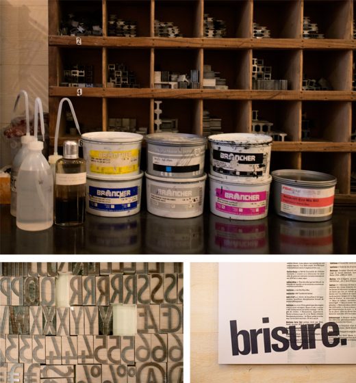
THE PRINTSHOP One of our favorite things about our workshop is also one of the things we hate the most: it is very small. When people visit us, we like to tell them that we have the smallest printing atelier in the world. On the one hand, it makes the atmosphere warm and cozy. The office part, with its old desk and granny carpet, definitely makes us feel at home. On the other hand, a so small working place requires loads of tricks to optimize the storage of our tools and equipment.

Une des choses que nous préférons à propos de notre imprimerie est également une des choses que nous détestons le plus : elle est très petite. Quand nous faisons des visites, nous nous amusons à dire que c’est la plus petite imprimerie du monde. D’un côté, ça donne une ambiance chaleureuse, cosy. On s’y sent à la maison, surtout dans la partie bureau où il y a une vieille table et un vieux tapis. D’un autre côté, une si petite surface de travail nous oblige à redoubler d’inventivité pour optimiser le rangement de notre matériel.

HISTORIC NEIGHBORHOOD Absolutely. The cultural center accommodating us is based in an old private hotel built during the Renaissance, so the place is very picturesque. Another cool thing about this center is that it is so huge that it has many different arts and crafts workshops, such as engraving, bookbinding, drawing, silkscreen printing, pottery, sculpture.

L'Imprimerie Bâtard is a France-based letterpress printshop that features a combination of handset type and new printing technology creations.

We are surrounded by many interesting practices and crafts. Also, the whole neighborhood is the oldest part of the city and certainly one of its most beautiful areas. It covers many wonderful Renaissance landmarks, like a Gothic church, a ducal palace turned into a museum and ancient city gates.

L'Imprimerie Bâtard is a France-based letterpress printshop that features a combination of handset type and new printing technology creations.

Tout à fait. La MJC qui nous loge est basée dans un ancien hôtel particulier construit à la Renaissance, le bâtiment est donc très pittoresque. Ce qui est aussi génial dans le fait d’être hébergés dans une MJC aussi grande, c’est la quantité et la diversité des ateliers d’artisanat qui y sont proposés : gravure, reliure, dessin, sérigraphie, poterie, sculpture… Nous sommes entourés de pratiques et de savoirs tous plus intéressants les uns que les autres. Au delà du bâtiment en lui-même, le quartier entier est une des plus anciennes parties de la ville et sans doute une des plus belles. Il comprend de nombreux monuments datant de la Renaissance, comme une église gothique, un palais ducal transformé en musée, ainsi que les anciennes portes de la ville.

PRINTING MENTORS Our inspirations are diverse and come from different movements: absurdism and Oulipo (a French movement about constrained writing) for the writing of the texts, and some graphic designers who played with letterpress such as Robert Massin and Jan Tschichold for the design part of our work. We wouldn’t say that we have specific “mentors” but we had the opportunity to meet some old printers and typographers who learned letterpress as a craft and they gave us some advice. We also usually save good printing ideas we find on the internet, mostly on Instagram, and try to reuse them in our work.

L'Imprimerie Bâtard is a France-based letterpress printshop that features a combination of handset type and new printing technology creations.

Nos inspirations sont variées et nous viennent de différents mouvements: l’absurde et l’Oulipo (un mouvement français d’écriture sous contrainte) en ce qui concerne l’écriture des textes, et plusieurs graphistes ayant joué avec la typographie comme Robert Massin et Jan Tschichold pour la partie création de notre travail. Nous ne pourrions pas nommer de réels “mentors” mais notre travail se base à la fois sur les bonnes idées que nous trouvons sur internet, notamment sur Instagram, et sur les précieux conseils des quelques imprimeurs typographes dont c’est le métier que nous avons eu la chance de rencontrer.

FULL TIME FUN Yes, we do [full time] ! It’s been 6 months since our atelier was set up. At the beginning, we wanted to do it as a pass-time in our garden shed, but when we had the opportunity to buy our press and our first cases, it became obvious for us that we would make it our new job.

Oui ! Ça fait 6 mois que notre atelier est installé. Au début, nous voulions faire de la typographie un passe-temps et occuper l’atelier au fond de notre jardin, mais quand nous avons eu l’occasion d’acheter notre presse et nos premières casses, ça nous est paru évident que nous en ferions notre nouveau métier.

DESIGNING A CUSTOM PIECE. The first step of our design process is the phase of creation, which includes the writing of the texts and the making of the illustrations (we mainly use linocut). Then, we compose the texts we wrote, testing different types: metal types for the body of the text and wood types for the titles. We’ll try (as much as possible) to avoid using plates and linotype to keep our work the more handmade. After choosing the most coherent characters in relation to the project, we print the texts and illustrations on transparent plastic paper on our proof press so that we can modulate the elements and decide on the final layout. We got this trick from our friend Guillaume Guilpart, who is a typographer at a workshop called Paris Print Club. We also take advantage of this step to do an orthotypographic correction of the texts. We make the color and paper choices and finally we can print on our bigger press.

L'Imprimerie Bâtard is a France-based letterpress printshop that features a combination of handset type and new printing technology creations.

La première étape de notre processus de design est la phase de création, c’est-à-dire l’écriture des textes et la réalisation des illustrations (nous utilisons avant tout la gravure sur lino). Ensuite, nous composons les textes en testant plusieurs typographies : les caractères plomb pour le labeur (autrement dit le corps de texte) et des caractères en bois pour les titres. Nous essayerons au maximum de nous passer de clichés et de linotypie afin de conserver l’idée d’artisanat. Après avoir choisi les typographies les plus cohérentes avec le projet, nous imprimons les textes et les illustrations sur du papier rhodoïd sur notre presse à épreuve afin de pouvoir agencer les éléments entre eux et décider de la mise en page finale. Cette astuce nous a été donnée par Guillaume Guilpart, un ami typographe à l’atelier Paris Print Club. Nous profitons également de cette étape pour faire la correction orthotypographique des textes. Nous faisons un choix de couleurs et de papier et nous pouvons finalement imprimer sur notre plus grosse presse.

PRINTING FEATS Above all, we are proud of our atelier. Just one year ago, we had no idea that it would be so thriving and fulfilling today, that we would have so many tools and materials to work with. It has been a lot of work and we’re still motivated to make this place more enjoyable and more practical. We also consider all the knowledge we got these past months just by practicing our passion and by meeting people with whom we share that passion as a big accomplishment. We can almost say that we are self-made typographers and that definitely rocks.

L'Imprimerie Bâtard is a France-based letterpress printshop that features a combination of handset type and new printing technology creations.

Moreover, this past year, we had the time to work on two big creations that we would like to point out. First, we designed a numerical font using the software Glyphs (and the precious help of a type designer friend) and we made a wood type of it using a laser printer. We called it “la typo bâtard” (“the bastard font”) in reference to our printer’s name. The second work we’d like to talk about is a poster we did for “la Fête de l’Estampe” (the National Print Day). It is composed by two prints of wood planks, a long text in two columns above these prints, which is the page of the dictionary that contains the word bâtard (bastard), and an extract of this page as a title covering a bit of the text and printed with wood types.

Nous sommes avant tout fièr·e·s de notre atelier. Il y a tout juste un an, on ne s’imaginait pas que tout s’y passerait aussi bien aujourd’hui, qu’on aurait autant d’outils, de matériel de travail et d’opportunités. Ça a été beaucoup de boulot mais nous sommes toujours aussi motivés à rendre cet endroit le plus agréable et le plus pratique possible. Nous considérons également comme un accomplissement tout le savoir que nous avons acquis ces derniers mois simplement en cultivant notre passion et en rencontrant des personnes avec qui partager cette passion. Nous pouvons presque dire que nous sommes des self-made typographes et c’est trop cool.

L'Imprimerie Bâtard is a France-based letterpress printshop that features a combination of handset type and new printing technology creations.

En plus de ça, cette année, nous avons passé beaucoup de temps sur deux créations en particulier dont nous aimerions parler. D’abord, nous avons dessiné une police de caractères numérique sur le logiciel Glyphs (et grâce à la précieuse aide d’un ami dessinateur de caractères) et nous en avons fait une série de caractères en bois avec une graveuse laser. Nous l’avons appelée « la typo bâtard » en référence au nom de notre imprimerie. Le second travail dont nous aimerions vous parler est une affiche que nous avons réalisée pour la Fête de l’Estampe. Elle est composée de deux empreintes de morceaux de bois, d’un long texte en deux colonnes sur ces empreintes, qui reprend la page du dictionnaire qui contient le mot « bâtard », et un extrait de cette page comme titre, qui couvre une partie du labeur et imprimé avec des caractères bois.

PRESS HISTORY Our first press is a big red flatbed cylinder press, a Korrex press manufactured by Simmel in 1969. This specific model is called “Berlin”. But we mostly call it by its pet name: Simone.

L'Imprimerie Bâtard is a France-based letterpress printshop that features a combination of handset type and new printing technology creations.

Notre toute première presse est une grosse presse rouge à cylindre, une Korrex fabriquée par Simmel en 1969. Ce modèle s’appelle « Berlin ». Mais nous l’appelons principalement par son petit surnom : Simone.

L'Imprimerie Bâtard is a France-based letterpress printshop that features a combination of handset type and new printing technology creations.

BOXCAR’S ROLE We’re grateful to Boxcar Press for their interest in our little printing house. We were glad to see that the passion for letterpress could cross the borders between different countries. It was a pleasure to read their blog and discover so many other printers and their techniques. They provide a really extensive and necessary work of investigation about letterpress. As far as we’re concerned, their questions enabled us to look back at the past year and to realize what we have achieved until now. So we can thank them for the dissemination of this article about us and for letting us translate it to share it with our French community.

Nous sommes reconnaissant pour l’intérêt qu’a porté Boxcar Press à notre petite imprimerie. Nous étions enchanté·e·s de voir que la passion pour l’impression typographique pouvait traverser les frontières. Ça a été un plaisir pour nous de lire leur blog et de découvrir autant d’autres imprimeurs ainsi que leurs techniques. Ils proposent un travail d’investigation du monde de la typographie vraiment complet et nécessaire. En ce qui nous concerne, nous avons pu, en répondant à leurs questions, faire le bilan de notre année passée et nous rendre compte que tout ce que nous avions accompli jusqu’à maintenant. Nous pouvons donc les remercier pour la diffusion de cet article et pour nous avoir permis de le traduire afin de le partager avec notre communauté en France.

PRINTING TIPS The most important advice that we could give is to try things. Letterpress is an open door to a world of creation with a lot of variables: characters, colors, shapes, layouts. They are some fundamental rules to respect such as the type height, but once you’re sure about these basics, you’re completely able to explore, imagine, make, invent new things. That was the case when we had the idea to print pallet planks to draw the shape of columns in the background of our poster… After all, why not?

L'Imprimerie Bâtard is a France-based letterpress printshop that features a combination of handset type and new printing technology creations.

Le conseil le plus important que nous pourrions donner est d’essayer des choses. La typographie est une porte ouverte à un monde de création avec des tas de variables : les caractères, les couleurs, les formes, les mises en page… Il y a certaines règles fondamentales à respecter, comme la hauteur typo, mais une fois les bases intégrées, on peut complètement se permettre d’explorer, d’imaginer, de fabriquer et d’inventer de nouvelles choses. Ça a été notre cas quand nous avons eu l’idée d’imprimer des planches de palettes pour dessiner la forme de colonnes en arrière plan de notre affiche. Après tout, pourquoi pas ?

WHAT’S COMING NEXT Our main plan for the upcoming year is to open our atelier to people and to give letterpress lessons. Starting from January 2020, we’ll give a three-hour lesson twice a week. In addition to that, we’ll try to organize workshops over one or several days in our atelier, sometimes soliciting the other arts and crafts workshops of our big house in order to provide an overview of the process for making a real printed object by hand. We would also like to offer classes outside our workshop, in other cultural or specialized structures such as schools, with our little proof press and some previously selected characters. We are absolutely willing to share our know-how, especially from the perspective of doing popular education.

L'Imprimerie Bâtard is a France-based letterpress printshop that features a combination of handset type and new printing technology creations.

Notre principal projet pour l’année qui arrive est d’ouvrir notre atelier aux gens et de donner des cours de typographie. À partir de janvier 2020, nous donnerons des cours de trois heures deux fois par semaine. En plus de ça, nous essayerons d’organiser des ateliers sur un ou plusieurs jours dans notre imprimerie, parfois en sollicitant les autres ateliers d’artisanat de notre grande maison afin de donner un aperçu du processus de fabrication d’un vrai objet imprimé à la main. Nous aimerions aussi proposer des ateliers en dehors de notre imprimerie, dans d’autres structures culturelles ou spécialisées comme des écoles, avec notre petite presse à épreuve et quelques caractères préalablement sélectionnés. Nous sommes complètement partant·e·s pour partager notre savoir-faire, notamment dans une optique d’éducation populaire.

International Printing Museum

Mark Barbour of the International Printing Museum highlights unique printing presses, fun printing trivia, and fantastic finds in the Carson, California museum. Come take a look!

The International Printing Museum in Carson, California, just south of downtown Los Angeles, is home to one of the largest collections of working antique printing presses in the part of this world that enjoys a type height of .918! Besides an extensive collection of metal and wood type, somewhere around 5,000 fonts, the Printing Museum is also home to some very unusual and rare printing presses. 

Of particular interest, while we focus this week on letterpress and type high, are the platen presses in the museum’s collections, presses that became the workhorse and the staple of every printing shop in America during the 19th and 20th centuries. Today’s book artists and letterpress enthusiasts are well familiar with the C & P Press, well described as the Ford 150 of printing presses. But have you heard of Gordon and his dream with Ben Franklin that birthed the modern platen press? Have your fingers ever been close to Gordon’s early press known as an Alligator (for good reason!)? What about Ruggles and his Jobber that made it to the California goldfields, and has a story to tell about Alcatraz and the Civil War? Or maybe the press that took you to the stars in 1875, known as the Asteroid?

In celebration of Type High Day and letterpress everywhere, this is an invitation to explore the stories of these very unique and rare platen presses of the 19th century with Curator Mark Barbour of the International Printing Museum… just click on the link to his video blog (his apologies for the quality and the sound…not enough makeready on the morning of .918!)

Printing Heritage at Hamilton Wood Type & Museum

(All photos courtesy of Knorth Studios)

Jim Moran of Hamilton Wood Type & Printing Museum recounts a day in his life at this stunning printing museum. Housing aisles upon aisles of history, craftsmanship, and deep printing roots, the Museum is a testament to the old (and new) ways printing remains such a treasured part of our culture.

I always get to the museum first thing in the morning. Maybe I need to slowly gather my thoughts but there’s something else. 

Turning on the lights, I take a long walk in this place. I’m trying to see everything and what needs to be done. The sander for half-rounds has a coil of wires that I’ve never liked and ought to be cut off. There is a display of patterns that seem to have been cut a hundred years ago and they seem more like sketches in wood. The pencil marks are precise as an architect’s. And why cedar? What an awful wood to cut cross-grain. Who did them? Could it have been a William Page employee that Hamilton brought here?

Among the type displays, I pause in front of Arabesque. The smoky strokes seem sixty-ish and I think of Janis Joplin posters. The row of platen presses are out of order. They should be chronological. Some need rollers, the treadle on the Challenge should be reconnected, there’s no tympan paper on a few and what could I lock up in their chases to explain the process better. 

In the “Central Room”, I dislike the name itself for being non-descript. I want to cover the walls behind the linotypes with newspaper pages from back in the day. Nearby, a Miehle is too gummed up with ink and grease and a Heidelberg serves mostly as a source to rob parts from. When will I get the ruling machine running again? 

Now in the staff pressroom, I’m tempted to put on an apron and run posters of horse races all day long. Maybe all week. The blocks are frozen in action of galloping hooves that will only come to life in printing. They may not have seen ink since the 50s. I wonder about registering their colors and the thrill of the first print that’s never left me since age 10 when I first set and printed my own name. Magic! Random type cases lean in small spaces, hoping to be filled again with Caslon or Engraver’s Text. I think there’s a cabinet in the back they’ll fit into but I resist the urge to check. 

The classroom lights snap on and I read each switches name; House left, House center, House right. The names mean nothing until Wayzgoose, which reminds me I need to create a backdrop for the presenter’s stand. Before I can do that there are boxes of blocks, mostly musician based, that have to be archived but not today. Better to prep for a workshop this weekend and replace those lights in the corner of the room.

Finally, in the gallery, everything is lit and I look over the exhibit again. It’s a good show that I’m lucky to consider for many days. I should look at new emails. Staff will arrive soon and there’s bound to be something I ought to be doing. Maybe printing horses.

For more information and fun about the wonderful Hamilton Wood Type & Printing Museum please visit their Facebook and Instagram pages!


The Mackenzie Printery and Newspaper Museum – Our Journey So Far

Louise Rowe of the Mackenzie Printery and Newspaper Museum in Queenston, Canada, shares how the Museum stands as a pillar of the printing community. Benefiting from a printing revival in the area, the Museum blends modern techniques with letterpress’ rich history.

I found letterpress in a very roundabout way. I have a vague fine art background; this precedes my twelve-year career in customer service and events. So the only printing I ever did focused on traditional etching techniques. When I was gifted a proofing press by my boyfriend, I quite literally had no clue what it was, let alone how to set it up and use it. However, it was, and is to this day, the best gift I have ever received.

The Mackenzie Printery and Newspaper Musuem img1

For starters, nobody has ever given me anything that romantic. Secondly, it was the motivation I needed to start my own business – Out of Sorts Studio. Finally, my Potter Proof Press is how we ended up becoming members of the Mackenzie Printery. I reached out to them in the hopes that they might be able to shed some light on the one-tonne-beast, which suddenly occupied a space in our basement.

The Mackenzie Printery and Newspaper Museum is a charity founded in 1993 and to this day is run completely by volunteers. They own a vast collection of printing equipment spanning 500 years of history. The collection is housed in the restored home of William Lyon Mackenzie, which is owned by the Niagara Parks Commission and during the summer they open the heritage site to the public as a working museum.

Whilst continuing to maintain a very impressive collection of printing equipment, the charity is now moving forward in efforts to preserve more than the just the physical pieces.

For the most part our members are older and have struggled with finding people in younger generations who are remotely interested in hearing about their experiences, let alone finding ones who actually wish to learn any of the processes. That’s not to say these people don’t exist, just that they are hard to find in our neck of the woods.

The Mackenzie Printery and Newspaper Musuem img1

In recent years, under the Chairmanship of Ron Schroder, the group has been focused on the organization of the entire collection; ensuring it is managed and preserved to the highest museum standards. With such a large collection, that includes a vast selection of type, it has been a long process. With this now well under way the group can turn some of its attention to the presses themselves. It isn’t just about keeping them all shiny and dust-free, we want to make sure that we always have someone who knows how to operate them.

Vice Chairman, Art Ellis, along with our Collections Executive, John Hunt, have been in charge of all things related to the restoration and working order of our printing presses for the majority of the last three decades. As new members, we found it a heartbreaking prospect that their knowledge could just be lost should they no longer be able to participate.

The Mackenzie Printery and Newspaper Musuem img1

Obviously the charity gaining me as a member is great because I’m awesome. However, in reality, Carl (my boyfriend) has proven to be a far more useful asset. He is a mechanic by trade, with a deep appreciation for antiques and a desire to know how things work. His passion for cars is deeply rooted in hot rods and this love took us to the Syracuse Nationals in July, which also provided us with the perfect opportunity to take a tour around Boxcar Press: a place dreams are made of!

Honestly, I don’t think we could have a better first candidate for learning how to set up, maintain and repair the printing presses.

The Mackenzie Printery and Newspaper Musuem img1

He started small, bringing home a rather rusty slug cutter, a mini paper cutter that didn’t cut and a brayer with broken handles. After some research, he took apart each item, carefully cleaned every piece, repaired what he could and fashioned new parts where necessary. Parts were then painted and reassembled, leaving us with three pieces that could either be added into the museum’s collection or sold.

The next logical step was for him to start learning the basics of some of the larger pieces of equipment. John began by showing him how to run our Heidelberg Windmill and has since moved on to showing Carl what he has to do to keep this press in good working order.

The Mackenzie Printery and Newspaper Musuem img1

The printery also has in its collection an 1894 Whitlock press. This press, weighing in around eight tonnes, is too large for Mackenzie House and is instead a permanent feature at the Marshville Heritage site in Wainfleet, Ontario. Every year, this press is used at The Marshville Heritage Festival to print a festival calendar and until this year, Art has been searching for someone to teach how to run it. Buoyed by Carl’s natural aptitude, Art taught Carl everything he needed to know about running and maintaining the Whitlock; she’s got a few quirks, which is understandable given she’s 125 years old.

The Mackenzie Printery and Newspaper Musuem img1

At the same event, after it stopped delivering us our slugs, Carl received a crash course from John on the insides of a Ludlow Type Caster and together they formulated a plan to repair it, which Carl then executed.

While the experts tinker with the big stuff, it falls on the rest of our core work group to continue with sorting through the storage bunker and the many, many, many cabinets of type. Members Marvyn, Dennis, Francis and Tim have the most patience I have ever seen and make type sorting look easy.

With letterpress now considered more of an art or craft, rather than a pillar of society, it is fascinating to see all the modern-day interpretations of an industrial process so rooted in history. As Executive Secretary for the group, I am now looking to the future and how we can continue to sustain our organisation. With much of our surplus stock now sold, it is time to get creative and I couldn’t be more excited to see what we can collectively do.

If you would like more information on the museum, any of the aforementioned members, and how to join or support The Mackenzie Printery and Newspaper Museum, please take a look at our website: https://mackenzieprintery.org/

Or follow our antics on Instagram: @themackenzieprintgroup

Printing Power! Crossword Puzzle


Time to roll up those sleeves and dust off those printing terminology books! We’ve got a wonderful printing-themed crossword puzzle for all you ink-in-the-blood aficionados!

Our online crossword puzzle can be found here. Come show us what you’ve got!

Answers and results will be revealed on Friday, September 20th, 2019 so stay tuned.

A paper-and-pen lover? Download it here: Printing-Power-crossword-puzzle-Boxcar-Press

Why I Love Letterpress with David Clifford: Letterpress Printing – A Life

David Clifford of the Canadian-based Black Stone Press recounts how he started working in printing and then falling in love with the beauty and the craft that is letterpress.

In the fifties, practically all printing was letterpress printing. In October 1951, I started my six year apprenticeship as a machine operator (machine minder), at the age of fifteen. It was at a small printer in London at the Borough near Elephant and Castle. There were three compositors setting type and in the basement, the machine room had two Wharfedales (cylinder presses), a Heidelberg Platen and a hand-fed Arab Platen. It was a little limited, fortunately, my apprenticeship agreement meant that I attended a technical school (Camberwell School of Arts) once a week to learn the trade.

( Indenture – The apprenticeship papers from 1951 )

After the six years had gone I worked in a few different printer shops. One of them was Ever-Ready Battery Print Works. There were about eighteen to twenty machines printing the big battery covers on card stock. Another printer specialized in cigarette cards. Roughly 1.25” x 2.5” cards, these were put in cigarette packages to make them stiffer. They were very collectible with fifty cards to a sheet printed in four-color process, one color at a time. Subjects included: butterflies, birds, flowers, sports, etc. etc. These were printed on small Dutch cylinder machines – Glockners (to get an idea of the trading cards visit this link).

( Me in 1961 on the Heidelberg Cylinder )

In 1962, I moved to Nice, France and worked at the biggest printer in Nice: Imprimerie Meyerbeer. There were fifty to sixty workers. Presses included two hand fed big Miehles, Albert cylinder presses and Heidelberg platens. After the student riots and worker strikes in 1968, I felt it was time to move. In 1970, Vancouver, Canada was chosen. Not much letterpress printing was to be found in Vancouver, so I had to run offset presses (ugh), which have never been my favorite – too many chemicals. I spent about twenty years as a Graphic Designer and in 1996 Black Stone Press was born with one Heidelberg and polymer plates made by hand. Now there are three Heidelbergs, a Golding Platen, a Vandercook 4 and an 1846 Albion, crown size hand press.

(Yasmine (Yaz) on the Golding)

I still work a few hours a week, but do not have the strength I had before. Sixty-eight years of printing, I am worn out. Fortunately, my daughter, Yasmine has taken over. She keeps everything running.

( Spring 2019 – me this last spring )

At the beginning, printing was just a job and I couldn’t wait to get off work. But the last thirty years I really appreciate the joy of letterpress printing.

Museum of Printing – Boston

Welcome to Part 1 in a series of blogs that celebrate the Print Museum. We are happy to introduce you to places that preserve, collect and offer hands-on opportunities to learn about printing in a way that enjoyably informs and educates. Read on for a quick “visit” to these places that hold our collective printing heritage.

The Museum of Printing is just north of Boston in the old mill city of Haverhill, on the Merrimack River. There are three Vandercooks, two show card presses, a Kelsey table-top, and a large-format Gordon. There are working machines, including Linotype, Ludlow, and Heidelberg Windmill. There is even a Keurig coffee maker and the fridge is always stocked with libations.

The cabinets are filled with paper. The type cabinets hold metal and wood fonts and the 40-drawer cut cabinet has almost one thousand wood and metal engravings The drawings for every font done by Linotype are here.

Craig Busteed is one of the many volunteers at the 41-year old Museum of Printing in Haverhill, Mass. He finds the Museum’s studio a mecca for himself and other members. 

He produced the poster for the Museum’s annual Printing Arts Fair with wood and metal type. Craig also assists at workshops that teach letterpress to novices, young and old. One workshop taught by veteran Ted Leigh covers printing with the hand press using the Museum’s 1888 Acorn press.

The Museum hosts school groups from all over New England. In most cases, the kids set their names and print them. One of them is now in their twenties and shared with us that they still have that print.

Craig also comes in on Wednesdays and helps his team restore vintage Kelseys and C & P’s, many of which are sold at two annual letterpress sales. The Museum Gift Shop sells type and other letterpress items. There are also two annual books sales that offer redundant books on graphic arts.

The Museum of Printing preserves the rich history and working tools of the graphic arts. It archives the largest collection of typographic art and ephemera in the world.

Letterpress City Tour: Charleston

On the next leg of our letterpress city tour series, Jamie and Allison Nadeau of Ink Meets Paper gives us a relaxing tour of their beloved Charleston, South Carolina community. From the colorful Rainbow Row Georgian houses to the great treats & eats, the historic city is a mecca for printers and artists alike. Jamie and Allison share with us their must-sees, gallery gems, and beyond.

ATLANTIC COAST COMFORT We moved to Charleston, South Carolina in 2006 after Jamie graduated from SCAD for a job opportunity (unrelated to letterpress). We fell in love with the low-country and southeastern coast during our time in Savannah that we couldn’t resist an opportunity to put down deeper roots in Charleston. We love it here.

(photography credit: amarisphoto.com)

FRESH AIR + INK Our studio is located in the Park Circle neighborhood of North Charleston, and we live less than two miles away. We’re lucky to be able to commute by bike and enjoy the fresh air and charm of our neighborhood during the ride in.

During a typical week, we’ll grab an iced latte and pastry at Orange Spot Coffeehouse in the morning (or when those afternoon blahs creep in). 

We’re all pretty heads down and focused during the day, so it’s always a treat to meet friends for happy hour at our neighborhood fave: Stems & Skins.

Lately, they’ve been hosting a burger pop-up with Pub Fare food truck on Mondays, so happy hour usually turns into dinner with friends. On Thursdays, we stop by the neighborhood farmer’s market for veggies and produce (and most recently duck eggs!). We’ve also really gotten into cycling, so we usually work in a longer ride on the weekends— we especially love heading out to Sullivan’s Island and Isle of Palms.

VIBRANT NEIGHBORHOOD Park Circle (and, really, the Charleston community as a whole) is especially wonderful about supporting local businesses, and we love sharing the letterpress process with them.

When we decided to move our letterpress studio out of our house in 2015, we knew we wanted to stay in Park Circle. We love the charm and quirk of the neighborhood— it’s not filled with big-box stores, and it’s community minded.

The studio is located off the main retail and dining area of Park Circle on a busier street that was pretty much surrounded by empty buildings (including a dilapidated auto repair shop that was later demolished). We were one of the first businesses along our stretch of the street, and we like to think it encouraged other vibrant and creative businesses to this area.

Our studio itself was a former convenience store and has big front windows for lots of natural light. The press room is behind a wall of windows, so customers are able to see the presses in action when they pop in for a greeting card. I think there’s really something wonderful about knowing the people and process behind the product (and people are naturally curious about these big old machines).

LOCAL PRINTING EVENTS We hosted Chris Fritton of the Itinerant Printer this past spring during his book tour. He filled our studio with prints from the road, and it was a blast to hear his stories. We also held a “For the Love of Print” event where we invited the public into the studio to learn more about letterpress printing (and to pull their own print, a “Greetings from Park Circle” postcard).

LETTERPRESS COMMUNITY ACTION Last fall, we designed and printed two limited-edition greeting cards to support the Women’s and Gender Studies program at the College of Charleston. Their “Yes! I’m a Feminist” party is a fundraiser for the WGS program and supports student/faculty activism and research, allowing them to work on issues like mothers of the Flint water crisis, women in politics, campus sexual assault, and municipal responses to the United Nations’ Convention on the Elimination of all forms of Discrimination Against Women. 

ONLY IN CHARLESTON Our “Greetings from Charleston” postcard is definitely a celebration of our city, and highlights perhaps one of the most iconic (and photographed) areas of Charleston: Rainbow Row. A series of thirteen Georgian row houses along East Bay Street, Rainbow Row gets its name from the houses’ bright and cheerful colors. We used the split fountain technique to create our Rainbow Row postcard version.

LOCAL SUPPORT  Since our primary focus is wholesale, we’re so thankful for the local shops in Charleston who stock our cards . It’s such a treat to connect with them in person and to see and support their shops as well.

ENJOYING THE NEIGHBORHOOD Of course, we’re partial to Park Circle because we live and work here; however, we love heading into downtown Charleston to meander through the cobblestone streets of the historic neighborhoods like South of Broad and the French Quarter.

Downtown can feel overwhelmingly touristy at times; however, there are plenty of streets to meander where you’re not always surrounded by so many people (and then you’ll just see the occasional local who’s out for a walk or enjoying tea on their porch). It’s in these quiet streets that Charleston really charms.

EATS + TREATS Charleston is known for its culinary scene, so it’s really hard to pick just one favorite restaurant. In Park Circle, we’re partial to EVO Pizza’s wood-fired pizzas and enormous salads, all featuring produce and meats from local farms.

(photography credit: evopizza.com)

As we mentioned previously, Stems & Skins is our go-to for happy hour. They have an incredible wine list and cocktail menu and also offer a selection of tinned seafood and other bites.

Brunch is a Charleston way of life, and our faves include High Thyme (Sullivan’s Island), Millers All Day (downtown Charleston; Jamie’s in the photo enjoying one of their amazing bloody marys), and Daps Breakfast and Imbibe (upper Charleston peninsula).

And, of course, part of the draw to living on the coast is the fresh seafood! Bowens Island has fresh off-the-dock seafood with some of the best marsh views in Charleston (and you’re definitely in luck if it’s oyster season!).

We also love The Darling Oyster Bar in downtown Charleston.

SHOP TILL YOU DROP When we moved to Park Circle in 2007, there were so many empty storefronts and buildings along the main business district; however, years later the neighborhood has really expanded in terms of independent retail shops, and we couldn’t be happier to have more local businesses to support.

Itinerant Literate is another women-owned independent business. It’s a bookstore that got its start by doing pop-up shops around town in an Airstream-like trailer. We’re friends with the owners, and their trailer used to have a regular spot in the INK MEETS PAPER parking lot before they opened their brick-and-mortar location.

Another good friend opened Iola Modern, a modern home goods and furniture store.

Just down the street from our studio is The Station, which features over 30 vendors and local artists. It’s a great shopping destination with everything from mid-century modern furniture and handmade candles to plants and original artwork, so it’s a great place to find a gift for someone (or yourself )

FESTIVAL FUN Each year in May, the City of North Charleston puts on its annual Arts Festival with exhibitions, workshops, and art installations all throughout the city (and they really work to make art accessible to everyone). I love seeing the large-scale outdoor sculptures that are installed throughout the neighborhood (one year, an artist did an installation in a neighborhood park of giant gummy bears— definitely fun and memorable). We also always head to the block party, where the city closes cars off the main street in Park Circle and fills it with vendors and performers. It’s a fun celebration of art.

(photo credit: North Charleston Arts Festival )

St. Patrick’s Day is another huge neighborhood celebration. The city closes down the streets for a parade and all sorts of merrymaking in the streets (and lots of Guinness drinking!).

(photo credit: North Charleston FB )

A GROWING CITY Charleston and its surrounding communities have seen lots of growth over the years (it’s hard to believe we’ve been here for 13 years now!). Since Charleston is a peninsula, it can only expand so much. We’ve seen big changes to the skyline. In addition, the ever-increasing commercial rental prices have pushed a lot of independent shops out of downtown. King Street used to be filled with independent shops and boutiques, and now national retailers are pretty much the only ones who can afford the rent. Service workers also feel the pain from this growth, as it’s expensive to work downtown (those parking meters and garages add up quickly). More people also mean more cars on the road, and, as a historic city, Charleston roadways aren’t necessarily made for all of the big modern cars (cobblestone was for horse and buggies!), and it can be dangerous to bike around the city as well.

In terms of the growth our neighborhood (Park Circle) has seen, I think it’s been primarily positive. The neighborhood is a bit of a “hidden gem,” and there aren’t a lot of big streets and thoroughfares to bring extra traffic. If anything, it’s been really wonderful to see so many independent businesses open up in the neighborhood. There’s also a recent movement called Park Circle Unchained, and their mission is to prevent chain retailers from taking over the character of the neighborhood.

NOT TO BE MISSED Cypress Gardens – Swamp boat rides, walking trails, native plants— Cypress Gardens is worth the drive to experience the beauty of the lowcountry (and you might recognize the scenery from movies like The Notebook and The Patriot).

Casual Crabbing with Tia – Experience the beauty of the lowcountry with Charleston native Tia Clark, whose family has been crabbing and casting for fun and food for generations.

(photo credit The Casual Crabber)

REDUX Studios – Contemporary art gallery and studio space on upper King Street.

Robert Lange Gallery – One of our favorite art galleries in Charleston. Lots of amazing local artists, and the entire gallery space is really inspiring and engaging.

Gibbes Museum of Art – Beautiful and well curated art gallery on Meeting Street with an emphasis on American art that incorporates the story of Charleston.

Candlefish – Located on King Street, this charming candle shop is filled with all sorts of beautifully fragranced candles (and their exclusive candle library guarantees you’ll find the perfect scent). Not to mention, they also host candle making classes.

J. Stark – High-quality bags, backpacks, and totes crafted by hand right in their Coming Street shop. (We carry one of their backpacks every day!)

Abide A While Garden Center – Our favorite destination for all things plants! This family-owned shop is truly a botanical experience, and their knowledgeable employees can help you pick the perfect plant.

Magnolia Plantation – It’s a little drive away from downtown, but they have amazing gardens and grounds (filled with all sorts of SC native plants). The train tour is a nice way to see everything.

Middleton Place Plantation – Along the same road as Magnolia Plantation, Middleton Place has an entirely different feel— their gardens are much more planned/structured.

Sullivan’s Island – Our favorite pick for a beach because it’s usually pretty chill (and there’s a lighthouse!). There are great food options out here as well if you decide to make a day of it (Poe’s Tavern, High Thyme, The Obstinate Daughter)

Meandering anywhere south of Broad Street will be lovely. There are all sorts of beautiful houses, and eventually you’ll get to the Battery at the tip of the peninsula surrounded by water.

Cooper River Bridge and Mount Pleasant Waterfront Park – The suspension bridge that connects Mount Pleasant to downtown Charleston is an awesome way to get a bit of exercise (walk/bike) along with an amazing view of the harbor and city.

LAST THOUGHTS Southern Charm (the reality tv show) is not us. lol. We are a ‘unique’ southern city that is culturally aware of its past, and actively working to build a better future.

We hope you enjoyed our featured installment of the letterpress city series guide! Interested in shining a spotlight on your hometown? Contact us today!

Inquisitive Printers Want To Know: Even More

This week’s Inquisitive Printer focuses on a new chapter for a letterpress printer, the cool printing history of Basel, Switzerland and a creative idea for sketch-booking in the summer.

REBECCA: 

It’s wonderful to see our letterpress friends grow and be on the move. Earlier this month, a cool Chicago-based letterpress printer, A Favorite Design, did just that. After a successful Kickstarter campaign, Amber Favorite & her husband have been able to move into their own brick-and-mortar store in the Albany park area. Way to go and congratulations!

A. Favorite Design letterpress print shop Chicago

(photography courtesy of blockclubchicago.com / afavoritedesign.com )

JAKE:

A significant other’s trip to Europe became an occasion for me to do a little poking into the history of Basel, Switzerland. I couldn’t — and really, still can’t — put my finger on any one reason why Basel feels significant to me, as prominent as it has been in the back of mind. Perhaps it’s some subconscious awareness that many of my cultural heroes are alumni of the old university, like Friedrich Nietzsche, Carl Gustav Jung, and Herman Hesse.

In the Renaissance, it was home to father of pharmacology, the astrologer and alchemist Paracelsus; in the modern era, it was the site of chemist Albert Hoffman’s famous bicycle ride over the course of which he became aware of the effects of the lysergic acid diethylamide he’d just invented. What a cute set of Basel historical bookends marking either end of the modern era of hard science, between magical herblore on one side and psychedelic cybernetics on the other.

At the University of Basel’s Museum of Pharmacy is yet another intriguing and world-changing artifact: the printing press owed by Amerbach & Froben. 

(Source: wikipedia.org and the BEIC digital library)

Amerbach is noted as the first printer to make the switch to Roman typefaces! If that ain’t notable, I couldn’t tell you what is.

MADDIE:

It is summer time, Ya’ll. 

This is the time when I just want to be active and outside. Taking in as much sunlight and warm weather as possible before the next season arrives. I relish these moments, yet have the feeling that I am not focused on my studio work. This little bit of guilt follows me around, but WAIT!!! I have dissolved this worry by combining my two favorite things: drawing and playing outdoors. 

Wherever I go on adventures, I make sure to always have space in my bag for a small notebook and a set for drawing tools. Pens, fine tipped markers and a handmade notebook. 

The sketchbooks are simple to make and can be constructed in a pinch. Yay bookbinding skills!!! Any found and recycled materials such as copy paper, string or staples are used to bind together this booklet. And there you are, ready for summer action and capturing your favorite moments. 

Above are images I have included are from a 2015 sketchbook. These were made while spending the weekend in a remote cabin in central New York. Below are this year’s (2019) sketches of some recent adventures. 

I can captures new experiences and practice my artistic skills all in this small item. I have even asked my friends to contribute to some pages. These become great collection pieces over time. I can look back at these works and enjoy my artistic practice through the summer months.  

Have something that you find intriguing? Let us know in the comments below!

Let’s See That Printed: Jenna Philpott Prints A Golden Wedding Beginning

Letterpress printer and artist Jenna Philpott adds a magical golden touch to a Jewish couple’s wedding celebration and Ketubah.

My husband’s coworker knew that I had a letterpress printing press. I had worked with him and his wife on other smaller projects, such as a custom stationery set for a house-warming gift and the like. Their son is in Rabbinical School at Hebrew University in Cincinnati. When their son got engaged, he asked for a special Ketubah.

A Ketubah is essentially a wedding contract used within the Jewish Tradition as a central part of the wedding ceremony.  As I also paint and draw, so the family thought the letterpress plus unique artwork would be a great way to celebrate their son’s marriage. 

My favorite part was the collaborative nature of the work. I am not Jewish and could not read the language either. I relied heavily on their community and mine to figure out the bits and bobs. It was also difficult to find just the right font for the couple so I made my own.  The text makes the shading of the full pomegranate in the background.

I had 3 fluent speakers review the text multiple times to make sure I got it right! I drew 613 pomegranate seeds to symbolize the 613 commandments in the Jewish faith. I then had my 4 kids and even my hairdresser help me count the seeds while I got a few highlights in! HA! My letterpress mentor helped me with my paper selection (Wild 220# white by Neenah).

Rebecca at Boxcar Press was a patient gem throughout and helped me piece the work so that I could print it just right on my C&P. After printing each section, I hand dusted the piece with gold dust to add shimmer and interest without high shine.

Ultimately, I became friends with the whole family and was invited to a wonderful wedding weekend. It was a fun, complex project that made my heart and talents sing (and my feet dance at the reception!).