Coffee with Don Black of Don Black Linecasting

[ Installment 2 ]

We are “pulling up a chair” with Don Black, a Northern neighbor from Scarborough, Ontario.

Don is winding down his business after 50 years and the dismay and sadness of that is still a jolt to our letterpress community.  

A warehouse of heavy metal and wood is not an exaggeration describing Don’s business.  He and his family, particularly his son, Craig, have helped and talked with thousands of printers and artisans over those decades.  Sadly, Craig passed away last year and Don is eyeing a quieter life.

Boxcar Press:  It’s a delight to hear your stories.  Let me first say, thank you for your kindness to me and all the others who were at one time new to letterpress printing.  It must be a screwy time right now with the business..

Don: We are super busy with the closing of our business.  Our General Manager Albert Kwon is invaluable in this endeavour. 

Boxcar Press:  Let’s go back to the beginning.  Is there one defining moment that you can recall or point to that was the start of your printing career?  

Don:  The defining moment that I knew I wanted to make Printing a career occurred when I went for a tour of the Globe & Mail (newspaper based in Toronto, Canada) with my uncle who worked there.  When I saw all the equipment in the Composing Room I decided this was for me.

I started to work at the Globe & Mail before I was 17 doing all the delivery jobs etc.  Then I served a 6 year apprenticeship as a Linotype Machinist.

Boxcar Press:  Tell us about mentors or printers that set you on a particular path?

Don: While working there was a machinist, Ed Hull, who helped me immensely by guiding me and tried to keep me on the right track.  I think about him often and am super thankful for all he did to help me.

While working as an apprentice at the Globe & Mail, the Credit Union ran a contest for the best designed Printing job.  This was open to seven Printer apprentices, but no mention about Machinist apprentices.  I questioned them and received permission to submit an entry.  Believe it or not, I won the prize of $25.00  I still tease my friend today,  who was a printer’s apprentice, that a machinist apprentice beat a Printer apprentice at the Printer’s trade.

Boxcar Press:  Where was the next stage in your career?

Don: I left the Globe & Mail in 1964 when the three Toronto newspapers went on strike.  I started to do freelance service on letterpress equipment.

Then I received the  Canadian dealership for Letterpress Equipment for Canada from Canadian Linotype Company.  This was a big help as it opened doors coast to coast and helped me to meet many great people.

After I started my business in the 1980’s I became acquainted with an equipment dealer in Cleveland, Jack Boggs.  He bought and sold all kinds of printing equipment.  Over the next 30-40 years, we did a super amount of business.  He liquidated printing shops that were closing or upgrading equipment.  I purchased many truckloads of equipment from him.  It was great as it gave me access to things I could not find in Canada.  We still do business today and without a doubt, he is a big reason we have been successful.

In the early 1970s, something strange happened when the Globe & Mail decided to update a lot of equipment.  I purchased most of the Composing Room which had some great equipment but also included were eleven machines which were now outdated.  They had originally cost approximately $25,000.00 each, less than 10 years before.  The value in scrap was less than $500.00.  We made a large copy of the cheque and mounted it with the eleven nameplates from the machines.  It has become quite a conversation piece that we still have at the office today.

Boxcar Press:  What does the legacy of Don Black Linecasting mean to you as you slowly wind it down.

Don:  I would say it’s the fact that we have been in business more than 50 years, conducted and did business with wonderful people all over the world and helped to keep Letterpress alive.

Boxcar Press:  You handled so many of pieces of equipment, they can’t even be counted.  Can you tell us about a press you remember fondly?

Don:  We have a Baby Reliance Iron Press which we purchased from a customer in Winnipeg.  It is a beautiful press and I could have sold it many times, but Craig, my son, always said don’t sell this press.  Now that he is gone and we are closing down, I am going to let it go to a collector that had talked to Craig.  I know Craig would be happy that it is going to someone who will treasure it.

Boxcar Press:  Thank you Don for those great memories.  We’ll talk more soon.  Can you leave us with your favorite printing saying?

Don:  Go with the Best!  Go Intertype.

Time is ticking down on getting equipment from Don, give him a call or email to ask what he has and chances are, you’ll get a nice deal. www.donblack.ca

Printing Heritage at Hamilton Wood Type & Museum

(All photos courtesy of Knorth Studios)

Jim Moran of Hamilton Wood Type & Printing Museum recounts a day in his life at this stunning printing museum. Housing aisles upon aisles of history, craftsmanship, and deep printing roots, the Museum is a testament to the old (and new) ways printing remains such a treasured part of our culture.

I always get to the museum first thing in the morning. Maybe I need to slowly gather my thoughts but there’s something else. 

Turning on the lights, I take a long walk in this place. I’m trying to see everything and what needs to be done. The sander for half-rounds has a coil of wires that I’ve never liked and ought to be cut off. There is a display of patterns that seem to have been cut a hundred years ago and they seem more like sketches in wood. The pencil marks are precise as an architect’s. And why cedar? What an awful wood to cut cross-grain. Who did them? Could it have been a William Page employee that Hamilton brought here?

Among the type displays, I pause in front of Arabesque. The smoky strokes seem sixty-ish and I think of Janis Joplin posters. The row of platen presses are out of order. They should be chronological. Some need rollers, the treadle on the Challenge should be reconnected, there’s no tympan paper on a few and what could I lock up in their chases to explain the process better. 

In the “Central Room”, I dislike the name itself for being non-descript. I want to cover the walls behind the linotypes with newspaper pages from back in the day. Nearby, a Miehle is too gummed up with ink and grease and a Heidelberg serves mostly as a source to rob parts from. When will I get the ruling machine running again? 

Now in the staff pressroom, I’m tempted to put on an apron and run posters of horse races all day long. Maybe all week. The blocks are frozen in action of galloping hooves that will only come to life in printing. They may not have seen ink since the 50s. I wonder about registering their colors and the thrill of the first print that’s never left me since age 10 when I first set and printed my own name. Magic! Random type cases lean in small spaces, hoping to be filled again with Caslon or Engraver’s Text. I think there’s a cabinet in the back they’ll fit into but I resist the urge to check. 

The classroom lights snap on and I read each switches name; House left, House center, House right. The names mean nothing until Wayzgoose, which reminds me I need to create a backdrop for the presenter’s stand. Before I can do that there are boxes of blocks, mostly musician based, that have to be archived but not today. Better to prep for a workshop this weekend and replace those lights in the corner of the room.

Finally, in the gallery, everything is lit and I look over the exhibit again. It’s a good show that I’m lucky to consider for many days. I should look at new emails. Staff will arrive soon and there’s bound to be something I ought to be doing. Maybe printing horses.

For more information and fun about the wonderful Hamilton Wood Type & Printing Museum please visit their Facebook and Instagram pages!


Of & Type and Men

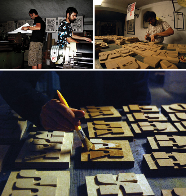
Trekking northwestward from the the sprawling Milan palazzos rests the quiet & serene city of Varese, Italy, surrounded by rolling fields of the awe-inspiring Italian countryside. Taking a closer look into the city, you’ll find the vibrant camaraderie that flows from the & Type print shop. Claudio, Gabriele, and Simone, the founders of & Type, opened their doors for us, letting in the passionate and experimental energy that engulfs their letterpress and printing abode. & Type is a letterpress print shop based in Varese, Italy

THE PRESSES We have four machines: 2 presses made by Saroglia (from Torino, Italy) 70×100 cm and 40×60 cm, 1 small manual press 23×32 cm, and 1 Nebiolo Ideale “a battuta” (as we say in Italian for “beat”), but this last one doesn’t work.

SIZE OF PRINT SHOP 70 square meters… almost 750 square feet.

TYPE OF SHOP We are just a laboratory, but often it is enjoyed with friends, interested people, or guests that join us for different purposes like projects, workshops, or just for type love sharing.

THE LOCATION Near the Liberty train station (in Varese, Italy).

FAVORITE THING ABOUT THE SHOP Our machines, wood type, typography, lettering books, and our friendship. We are surrounded by several posters, books, and music that are good sources of ideas. Last month, a beautiful puppy arrived, which is such great company!

NUMBER OF PRINTERS IN SPACE We have three printers. We don’t share the place with other people, but anyone is admitted to print with us or just to come enjoy with us. We prefer to be considered as only one mind because & Type is the mixing of the knowledge about letterforms of all of us.

MOST VALUABLE SHOP TOOL Pencil & hands.

FAVORITE INK Well, we always take time to figure out what color is most suitable for our purposes. We like to use typographic ink penetration, or rapid drying, that helps us to see details in our linocut matrix. Currently we enjoy finding and trying particular colors like metallic, fluorescent and glowing ones.  In our country, it is not easy to find all the colors we want; some of them are prohibited because of their chemical compositions.

SOLVENT OF CHOICE White spirit (turpentine), self-cleaning mechanisms, old towels and of course elbow grease. If you have some good cotton sheets, it’s not hard work.

PLATE AND BASE OF CHOICE We mostly use furniture linoleum used by gauges, but we also like to work with wood, MDF and different kinds of rubber. If it comes up that we find some interesting texture materials, we love to try it.

OIL OF CHOICE For gearboxes: synthetic oil; for the lubrication of open parts: UV-40 or oil for sewing machines.

WHAT TYPE OF RAG DO YOU CLEAN UP YOUR PRESSES WITH Towels, sheets, pants, T-shirts, shirts – everything that otherwise should be in rubbish.

FLOORING MATERIAL Industrial concrete flooring.

FLOOR PLAN TIPS Work in an illuminated space.

PIED TYPE None.

ORGANIZATION ADVICE Clean up after printing and have a relaxation area with some comfortable chairs.

PRINTING ADVICE To center the matrix, we used to draw the matrixes’ shapes on the print area with transparent paper, so we would know where to put every different color for posters. Custom engraving, friendly puppy mascot, and hand-crafted printed pieces of & Type of Italy.

Typography spotted in the Big Apple

While in New York City recently for the National Stationery Show, we found that not everything inspiring was happening just inside the Javits Center.  With a sharp eye, there was some appealing typography in signage that was spotted during our travels.  We all can appreciate a well turned font and a clever capital that gets the message across.  Shown here are just four images we snapped, but we also recommend checking out the artful NYC Type, a site that reveals some of the classic lettering hidden high and low along the streets of New Y0rk City.  Click on each picture on the NYC Type website for the location of each photo.

Clockwise from the top: Harrington’s Bar & Grill on 7th Avenue | Classic serifs on 42nd Street with Madame Tussauds | Houndstooth Pub on 8th Avenue | More serifs grace the Regal Theatre marquee.