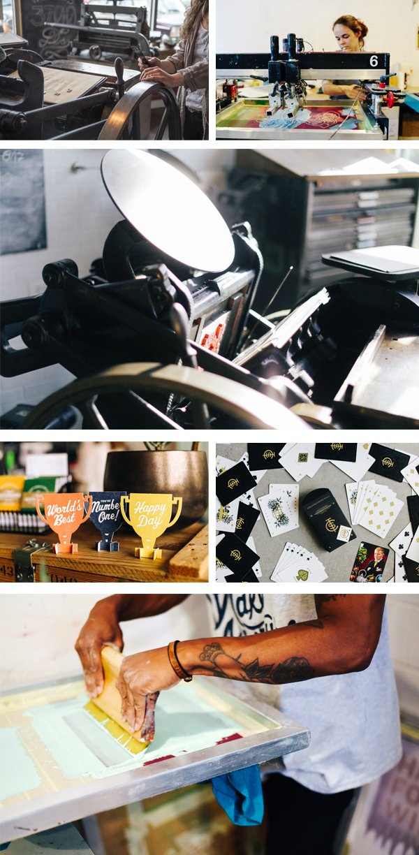
Bright pops of color, clean designs, and a hearty dose of whimsical humor can be seen in the letterpress works of Ryan Tempro (and team!) at M.C. Pressure. The Florida-based printer sat down with us to talk shop about Kelsey tabletop beginnings and expanding out with new presses & custom-printed works in tow. Read on to hear about the satisfying pride that goes into seeing the printed pieces being transformed into one-of-kind crafted pieces.
PRINTING IN THE SUNSHINE STATE M.C. Pressure is a print shop in St. Augustine, Florida specializing in letterpress, foil stamping, die-cutting and embossing. I started the company in 2014 after printing a couple years at a small stationery shop while I was in college. We have a lot of capabilities for a small shop. It’s been exciting to see the clients we’ve been able to work with and the creative things they come up with! We also design and create our own line of products that range from greeting cards to coasters to notepads and more.
INK IN THE BLOOD I first learned about letterpress and what it was while going through the graphic design department at Flagler College, here in St. Augustine, Florida. I was able to get a job at a local stationery shop operating their 8×12 Chandler and Price. I fell in love with the tactility of letterpress and being able to create something with my hands and away from the computer.
After I graduated from college I spent a summer in New York for an internship with an artist and was exposed to a lot of different print and production methods. When I returned I started a job at a screen printing shop that had an old Kluge for die-cutting decals. My boss saw my interest in the machine and introduced me to a friend of his who was an old timer in town who ran letterpresses for years.
He had a few small tabletop Kelsey presses that needed some work, but had all the parts! I bought them and cleaned them up and started a little shop on the side when I had time and clients. Over the next few years, I grew from a little tabletop press to several larger presses and a full time shop for myself and a couple of employees!
PRINTSHOP PARADISE Our shop is a modest 1300-ish sq/ft warehouse. We have a 30″ Challenge Paper cutter, an Orbital 8 Poly Plate Maker, 2 Heidelberg Windmills 10×15, 1 Heidelberg GTP 13×18, and 1 Heidelberg KSBA Cylinder Press. I love the capabilities we can accomplish with these machines. They are incredible workhorses. Some days they can be very temperamental, but overall they are wonderful and I’m very fortunate to have the machines I do. My favorite is probably the KSBA, it’s such an accurate press in all aspects of register and inking. I’d be lying to say as a printer that I didn’t love to print large, and that press allows us to really work on a larger format.
Our shop is located in St. Augustine, Florida which is the nation’s oldest city. It’s also a pretty small area so the community as a whole has been very accepting and welcoming of us and our small business. St. Augustine has a lot of rich history and a lot of great local makers and restaurants… a lot of which we’ve become friends with over the years. It’s truly a great community to be in support of and help others follow their passions.
CHILL NEIGHBORHOOD We have a city guide online for sale with a lot of our favorite places. The downtown area is where a lot of people visit when they come into town, though it’s also filled with the most touristy things in town. We are off of the West King Neighborhood and we love it! I’d say if you’re in town check out the Blue Hen Cafe for breakfast or SunDay. Dos and The Kookaburra for coffee. Juniper Market for a snack. Really there are so many great spots in town!
PRINTING MENTORS The print community as a whole has been very helpful. I’d say our biggest contacts are Dan over at Clove St. Press. He is probably one of the best I’ve seen, and I have to include Matt at Matte Gold in Australia. They also have GTP Foil Windmills and were a huge help in learning more about that machine specifically. I always love seeing the content and machines running from Studio on Fire and their capabilities are truly incredible. We have a shoutout to Letterpress Mechanic and Chris at FI Letterpress as well for troubleshooting. Really, there are folks all over we keep in touch with and love to see work from.
FULL TIME FUN I started M.C. Pressure in 2014 and worked on it part-time until the beginning of 2017 when I went full-time with it! I can say that I honestly love my job and love what I do.
THE CREATIVE ENERGIES I went to school for graphic design so some things are still designed by me. At the moment though most of my time is spent on press and business admin tasks. We have an employee, Lauren, who focuses the most on graphics for us. She graduated from Flagler College as well. We use a lot of digital processes in the work-flow. We use the Apple iPad and Pencil for a lot of the illustration work and typically finish up type in the computer through the Adobe suite.
We usually think up a funny idea and work on visualizing it. Or we have an image we want to create and work to create a use for it. Sometimes we get feedback from customers on looking for a type of product or more of a certain type of thing and can work to make them. For example, more birthday cards, or something to say I like you, but maybe don’t love you quite yet.
PRINTING FEATS Hmm, I’m always really proud of the packaging projects we work on here. Seeing the printed pieces being cut down and transformed into a three-dimensional object is always so satisfying. Most recently we printed a pretty complex and accurate carton for Hellcats USA for their Devilish Scent. A black outer sleeve with matte red foil and a red tonal letterpress printed on red for the inner carton. It had a cutout that needed to line-up perfectly with the print inside, and assemble to be snug enough to hold itself together. Clark Orr worked on the dieline and he truly nailed it with this project!
PRESS HISTORY Our very first press was a 5×8 Kelsey Table Top. It was a great start, but thank goodness we don’t have to work on such a manual press anymore!
BOXCAR’S ROLE In the early days of us starting out, we used Boxcar Press for all things! We got a set of inks, letterpress base, printing plates, and would use their resources to help figure out how to use the machines we acquired over the years. Though we don’t use Boxcar Press much these days, they were a huge help in getting us started on projects and understanding the things we use.
LETTERPRESS TIPS It isn’t always possible, but I almost always print with crop marks. I know it makes for a larger plate and paper size AND requires trimming. However, It really saves so much time, I think, on press to be able to utilize the grid on the Boxcar Base. It also allows for what I think is easier spotting if things start to bounce or get out of register.
WHAT’S COMING NEXT Over the last couple of years we’ve acquired various pieces of machines. This year we hope to not do that as much and really focus on the things we have to be as streamlined and efficient as possible! We don’t have a dedicated retail space, but we are working on some ideas to change that and hopefully get things out there more in our community!
A double round of applause & thanks out to Ryan Tempro at M.C. Pressure for letting us take a sneak peek at his wonderful plus fun printing realm!
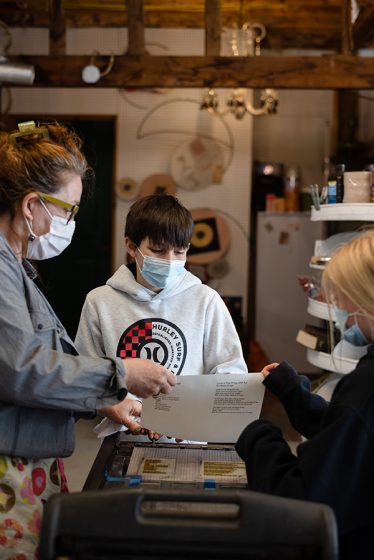
Nothing makes us more proud and excited when we learn about young printers and poets in the schools getting a chance to put their hand to a press. The sixth grade students of Mount Desert Elementary School (Mount Desert Island, Maine) experienced the joys and challenges while printing their own poetry this past year. The project was led by writing teachers Ms. Mariah Baker and Ms. Maria Simpson combined with artists/printers Nikki Moser and Katherine Emery. Read on to hear all about the group’s instruction in hand-set type, printing with photopolymer plates, bookbinding, and the fun that went into the Call of the Robin letterpress printed book project.
KATHERINE EMERY: I had met my daughter’s writing teacher, and she told me about a month-long poetry project the 6th graders were working on, and how it had transformed their attention and energy. It was a positive place to put their worries about the world. She was trying to do something special for them as an end-of-the-year project.
On impulse, I offered to help them print their poems. I got Nikki to agree to use her press and then persuaded the teachers to agree to bring the class for printing. I volunteered to help layout the poems for photopolymer plates, and then helped the students sew the books together.What a day when the kids walked to Nikki Moser’s artist studio and pulled prints on a tabletop press. After the students bound their final books, they signed their poems in the editions.
Teacher MS. MARIA SIMPSON: After the “Call of the Robin” poetry book was completed, we read the poems to the 2nd graders and it was so moving – each kid read their poem with feeling and passed a printed book hand to hand.
Then the kids gave the second graders advice about writing their own poems. One student, Kohl, had this advice,“Sometimes, when I got stuck, I would take a little walk. Then I would come back and write from my heart.”
It was an inspiring project that the students and I will remember for a long time. I look forward to doing it again!
STUDENTS’ REACTIONS AND REFLECTIONS
PIERCE HOLLEY:This experience was super fun and I loved that we got to be writing and doing art at the same time! It was really cool to be doing the printing instead of just using our computer like we always do. This would be an amazing activity for others.
LANAIA McDANIELS:I really enjoyed the printing project. It was super fun to do, and I got to learn new and interesting things. The best part about it was learning how to use the printingpress. It was fun to see and use it because I never knew about a printing press and the history behind it.
Kemy: I got to learn from Nikki and Katherine the basic skills behind printing and making my own book. It was very fun and I got to be with my friends trying new things.
HELAYNA SAVAGE:I loved writing poetry with Ms. Baker and Ms. Simpson. We did a lot of different types of poetry and close to the end we went to a place where we used a printing press. Best thanks to Katherine Emery and her work partner.
CORINNA JOHNSTON: I learned how printing is made and I really liked getting to print my own poem.
PHOENIX SWEET: With Katherine and Nikki, I had fun learning to bind a book, I also enjoyed putting ink on, learning to use, and printing my poem on the printing press.
We’re proud to share their story and hear how printing enriched these students and inspired fellow printers to reach out to their community. Huge round of applause out to Katherine, Nikki, and both teachers for getting their students invigorated about being on press and creating a lasting project. As Katherine beautifully stated about the project: “the 6th graders [were] over the moon to be out in the sunshine, celebrating words, and using beautiful old machinery to honor their inner voices.”
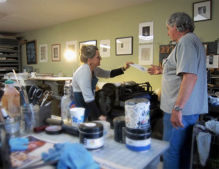
Michele Burgess of Brighton Press is a fine arts book artist, creative soundboard, and part-time university professor who loves to share printing with those around her. For three decades, Michele and her husband have been enjoying the fruits of their collaborative efforts one pulled print at a time.
AN ARTIST BY NATURE I am a visual artist obsessed with working in book form. My husband, Bill Kelly, founded our press in 1985 and it has morphed and grown before our eyes.
THE LURE OF LETTERPRESS I went to the Cranbrook Academy of Art for my MFA in the mid-’80s. There was a very funky letterpress there and small, crumbly piles of type. I enjoy the intentionality, the craft, the beauty of its collaboration with paper.
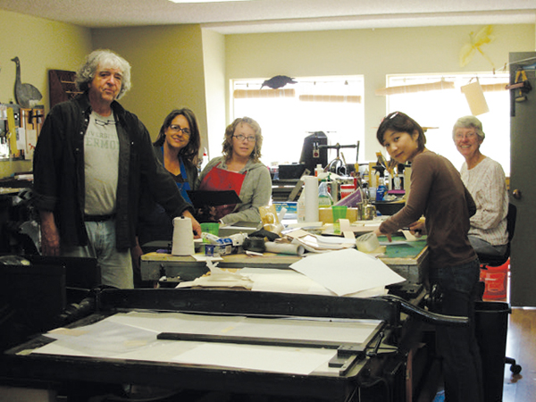
CREATIVE COLLECTIVE We are a small band of like-minded people using the studio as a creative laboratory. We create and publish collaborative artists’ books that braid the visions of both poets and visual artists. Everything is original and achieved by hand.
Bill Kelly, who founded the press, Nelle Martin, associate director/production designer/letterpress printer and I collaborate creatively with whoever the artist and poet might be. Most often, one of us is one or the other, or, in Bill’s case, both. We also often collaborate with papermakers such as those at Twinrocker, Cave paper, and the Morgan Conservatory to get a certain color or weight that we’re looking for.
Sonja Jones, in her 80’s and a previous librarian, has been a guardian angel and does our boxmaking. Kathi George, our crackerjack copy editor who makes sure we don’t have a plate made with a typo in it. Jenny Yoshida Park also works closely with us on typography and website and catalog design.
Recent poets include Bill Kelly, Chard deNiord, Bianca Stone, and Martha Serpas. Recent artists, besides myself and Bill include: Jinane Abbadi, Ian Tyson, Miya Hannan, Jenny Yoshida Park. A full list of artists and writers can be found on our website—34 years worth.
Sometimes we work with outside bookbinders Mark Tomlinson, Claudia Cohen, and Lisa Van Pelt, who have added creative ideas to the bindings. There’s a lot of back and forth regarding structure and content until it all melds together.
My favorite thing about it is that we never know what the final outcome will be until the B.A.T. (from the French phrase “bon a tirer” — good to pull. The subsequent prints should look like that one) is complete and that we can never remember whose idea certain things were. Synergy.
COAST-TO-COAST PRINTING We are bi-coastal now. We do most of the production in San Diego, which is getting a little less cool every year, and we do a lot of the creative work in Vermont in relative solitude. We also work in other artist’s studios sometimes or at the dinner tables of our writers.
PRINTING MENTORS Gerald Lange, Michael Bixler, Robin Price, Walter Hamady have been my letterpress mentors. William Blake, Sonja Delaunay, Ken Campbell, Anslem Kiefer, and Barbara Fahrner have been my book art mentors. The poets I work with inspire me. I get energy and fortitude from my collaborators at the press.
PART-TIME PRINTING, FULL-TIME FUN We decided years ago not to require the press to support us physically, so we teach at universities part-time.
THE ARTISTIC PROCESSES I start a book from a small kernel of inspiration which is always mysterious in its origin. Sometimes, the poet is my muse or his/her words. From there, I usually start working on visual images that expand on, rather than illustrate the text. The best scenario is when the poet and I are working together from a kernel and we’re spinning a web together.
PRINTING FEATS I’m proud of the meandering path we’ve taken, despite the hardships. With regards to a project: A Woman Hit by a Meteor. Our paper was MUCH too large for the press, so we folded it and through that limitation were able to imbue it with a sensibility of folded maps in ancient, celestial atlases.
PRESS HISTORY Vandercook 219, old style. I love the Vandercook, the sound, the weight, the intuitive simplicity of the machine.
BOXCAR’S ROLE Boxcar has helped us realize some visual formats that we couldn’t have done with lead type. Also, we were able to create Arabic calligraphy, Chinese and Japanese text that we couldn’t have done otherwise. Boxcar has been super-efficient, patiently helpful, both with my classroom needs and for Brighton Press.
PRINTING TIPS: Perhaps a useful letterpress printing technique? Slightly more punch, less ink.
WHAT’S COMING NEXT A book called WHERE AND HOW BLOOD WAS MADE with poet Chard deNiord. It will be my most complex book to date.
L’Imprimerie Bâtard is a Northeastern France-based letterpress printshop that enjoys working with handset type and learning as much as they can. Pauline and Gaëtan work and breathe letterpress in their printshop where they blend old-world craftsmanship with a daring for experimenting.
(A note for our readers: This article appears in both English and French for all lovers of letterpress to read! The French translation appears in italics. Huge round of applause out to Pauline and Gaëtan for the French translations!)
PRINTING IN FRANCE L’Imprimerie Bâtard -literally The Bastard Printer’s- is a new design and printing workshop in Nancy, France run by Pauline (24 yo) and Gaëtan (35 yo). We are hosted by a youth and cultural center called la MJC Lillebonne, which is super cool because it makes our everyday life at work very lively.
L’Imprimerie Bâtard -littéralement Bastard Printer’s- est un tout nouvel atelier de design et d’impression à Nancy en France géré par deux personnes : Pauline (24 ans) et Gaëtan (35 ans). Nous sommes hébergés dans une Maison de la Jeunesse et de la Culture, la MJC Lillebonne, un lieu super cool qui met plein de vie dans notre quotidien.
LETTERPRESS BEGINNINGS Pauline discovered letterpress during her fine arts studies, which she completed last year. Her school had a letterpress workshop led by a specialized teacher so she had the opportunity to learn the basics of the letterpress technique in different contexts such as personal editorial works or workshops that her teachers used to organize.
Gaëtan founded a nonprofit publishing house several years ago so he already knew a bit about graphic design and printing. He first practiced letterpress at his friends’ printshop. They had organized a week to produce a gazette combining text and illustration only printed by hand. They had invited other typographers so this first approach of letterpress revealed to be very enriching to him.
Pauline a découvert la typographie manuelle lors de ses études aux Beaux-Arts, qui se sont terminées l’année dernière. Dans son école, il y avait un atelier géré par un professeur spécialisé, elle a donc pu apprendre les bases de la technique dans différents contextes : des projets éditoriaux personnels ou encore des ateliers organisés par les professeurs.
Gaëtan, lui, a fondé une maison d’édition associative il y a plusieurs années, il avait donc déjà été au contact de l’univers du graphisme et de l’impression. Il a pratiqué la typographie pour la première fois dans l’imprimerie d’amis à lui. Ils avaient organisé une semaine pour créer une gazette mélant texte et illustration complètement imprimée à la main. Ils avaient invité d’autres typographes, cette première approche a donc été très riche en découvertes et en apprentissages.
THE PRINTSHOP One of our favorite things about our workshop is also one of the things we hate the most: it is very small. When people visit us, we like to tell them that we have the smallest printing atelier in the world. On the one hand, it makes the atmosphere warm and cozy. The office part, with its old desk and granny carpet, definitely makes us feel at home. On the other hand, a so small working place requires loads of tricks to optimize the storage of our tools and equipment.
Une des choses que nous préférons à propos de notre imprimerie est également une des choses que nous détestons le plus : elle est très petite. Quand nous faisons des visites, nous nous amusons à dire que c’est la plus petite imprimerie du monde. D’un côté, ça donne une ambiance chaleureuse, cosy. On s’y sent à la maison, surtout dans la partie bureau où il y a une vieille table et un vieux tapis. D’un autre côté, une si petite surface de travail nous oblige à redoubler d’inventivité pour optimiser le rangement de notre matériel.
HISTORIC NEIGHBORHOOD Absolutely. The cultural center accommodating us is based in an old private hotel built during the Renaissance, so the place is very picturesque. Another cool thing about this center is that it is so huge that it has many different arts and crafts workshops, such as engraving, bookbinding, drawing, silkscreen printing, pottery, sculpture.
We are surrounded by many interesting practices and crafts. Also, the whole neighborhood is the oldest part of the city and certainly one of its most beautiful areas. It covers many wonderful Renaissance landmarks, like a Gothic church, a ducal palace turned into a museum and ancient city gates.
Tout à fait. La MJC qui nous loge est basée dans un ancien hôtel particulier construit à la Renaissance, le bâtiment est donc très pittoresque. Ce qui est aussi génial dans le fait d’être hébergés dans une MJC aussi grande, c’est la quantité et la diversité des ateliers d’artisanat qui y sont proposés : gravure, reliure, dessin, sérigraphie, poterie, sculpture… Nous sommes entourés de pratiques et de savoirs tous plus intéressants les uns que les autres. Au delà du bâtiment en lui-même, le quartier entier est une des plus anciennes parties de la ville et sans doute une des plus belles. Il comprend de nombreux monuments datant de la Renaissance, comme une église gothique, un palais ducal transformé en musée, ainsi que les anciennes portes de la ville.
PRINTING MENTORS Our inspirations are diverse and come from different movements: absurdism and Oulipo (a French movement about constrained writing) for the writing of the texts, and some graphic designers who played with letterpress such as Robert Massin and Jan Tschichold for the design part of our work. We wouldn’t say that we have specific “mentors” but we had the opportunity to meet some old printers and typographers who learned letterpress as a craft and they gave us some advice. We also usually save good printing ideas we find on the internet, mostly on Instagram, and try to reuse them in our work.
Nos inspirations sont variées et nous viennent de différents mouvements: l’absurde et l’Oulipo (un mouvement français d’écriture sous contrainte) en ce qui concerne l’écriture des textes, et plusieurs graphistes ayant joué avec la typographie comme Robert Massin et Jan Tschichold pour la partie création de notre travail. Nous ne pourrions pas nommer de réels “mentors” mais notre travail se base à la fois sur les bonnes idées que nous trouvons sur internet, notamment sur Instagram, et sur les précieux conseils des quelques imprimeurs typographes dont c’est le métier que nous avons eu la chance de rencontrer.
FULL TIME FUN Yes, we do [full time] ! It’s been 6 months since our atelier was set up. At the beginning, we wanted to do it as a pass-time in our garden shed, but when we had the opportunity to buy our press and our first cases, it became obvious for us that we would make it our new job.
Oui ! Ça fait 6 mois que notre atelier est installé. Au début, nous voulions faire de la typographie un passe-temps et occuper l’atelier au fond de notre jardin, mais quand nous avons eu l’occasion d’acheter notre presse et nos premières casses, ça nous est paru évident que nous en ferions notre nouveau métier.
DESIGNING A CUSTOM PIECE. The first step of our design process is the phase of creation, which includes the writing of the texts and the making of the illustrations (we mainly use linocut). Then, we compose the texts we wrote, testing different types: metal types for the body of the text and wood types for the titles. We’ll try (as much as possible) to avoid using plates and linotype to keep our work the more handmade. After choosing the most coherent characters in relation to the project, we print the texts and illustrations on transparent plastic paper on our proof press so that we can modulate the elements and decide on the final layout. We got this trick from our friend Guillaume Guilpart, who is a typographer at a workshop called Paris Print Club. We also take advantage of this step to do an orthotypographic correction of the texts. We make the color and paper choices and finally we can print on our bigger press.
La première étape de notre processus de design est la phase de création, c’est-à-dire l’écriture des textes et la réalisation des illustrations (nous utilisons avant tout la gravure sur lino). Ensuite, nous composons les textes en testant plusieurs typographies : les caractères plomb pour le labeur (autrement dit le corps de texte) et des caractères en bois pour les titres. Nous essayerons au maximum de nous passer de clichés et de linotypie afin de conserver l’idée d’artisanat. Après avoir choisi les typographies les plus cohérentes avec le projet, nous imprimons les textes et les illustrations sur du papier rhodoïd sur notre presse à épreuve afin de pouvoir agencer les éléments entre eux et décider de la mise en page finale. Cette astuce nous a été donnée par Guillaume Guilpart, un ami typographe à l’atelier Paris Print Club. Nous profitons également de cette étape pour faire la correction orthotypographique des textes. Nous faisons un choix de couleurs et de papier et nous pouvons finalement imprimer sur notre plus grosse presse.
PRINTING FEATS Above all, we are proud of our atelier. Just one year ago, we had no idea that it would be so thriving and fulfilling today, that we would have so many tools and materials to work with. It has been a lot of work and we’re still motivated to make this place more enjoyable and more practical. We also consider all the knowledge we got these past months just by practicing our passion and by meeting people with whom we share that passion as a big accomplishment. We can almost say that we are self-made typographers and that definitely rocks.
Moreover, this past year, we had the time to work on two big creations that we would like to point out. First, we designed a numerical font using the software Glyphs (and the precious help of a type designer friend) and we made a wood type of it using a laser printer. We called it “la typo bâtard” (“the bastard font”) in reference to our printer’s name. The second work we’d like to talk about is a poster we did for “la Fête de l’Estampe” (the National Print Day). It is composed by two prints of wood planks, a long text in two columns above these prints, which is the page of the dictionary that contains the word bâtard (bastard), and an extract of this page as a title covering a bit of the text and printed with wood types.
Nous sommes avant tout fièr·e·s de notre atelier. Il y a tout juste un an, on ne s’imaginait pas que tout s’y passerait aussi bien aujourd’hui, qu’on aurait autant d’outils, de matériel de travail et d’opportunités. Ça a été beaucoup de boulot mais nous sommes toujours aussi motivés à rendre cet endroit le plus agréable et le plus pratique possible. Nous considérons également comme un accomplissement tout le savoir que nous avons acquis ces derniers mois simplement en cultivant notre passion et en rencontrant des personnes avec qui partager cette passion. Nous pouvons presque dire que nous sommes des self-made typographes et c’est trop cool.
En plus de ça, cette année, nous avons passé beaucoup de temps sur deux créations en particulier dont nous aimerions parler. D’abord, nous avons dessiné une police de caractères numérique sur le logiciel Glyphs (et grâce à la précieuse aide d’un ami dessinateur de caractères) et nous en avons fait une série de caractères en bois avec une graveuse laser. Nous l’avons appelée « la typo bâtard » en référence au nom de notre imprimerie. Le second travail dont nous aimerions vous parler est une affiche que nous avons réalisée pour la Fête de l’Estampe. Elle est composée de deux empreintes de morceaux de bois, d’un long texte en deux colonnes sur ces empreintes, qui reprend la page du dictionnaire qui contient le mot « bâtard », et un extrait de cette page comme titre, qui couvre une partie du labeur et imprimé avec des caractères bois.
PRESS HISTORY Our first press is a big red flatbed cylinder press, a Korrex press manufactured by Simmel in 1969. This specific model is called “Berlin”. But we mostly call it by its pet name: Simone.
Notre toute première presse est une grosse presse rouge à cylindre, une Korrex fabriquée par Simmel en 1969. Ce modèle s’appelle « Berlin ». Mais nous l’appelons principalement par son petit surnom : Simone.
BOXCAR’S ROLE We’re grateful to Boxcar Press for their interest in our little printing house. We were glad to see that the passion for letterpress could cross the borders between different countries. It was a pleasure to read their blog and discover so many other printers and their techniques. They provide a really extensive and necessary work of investigation about letterpress. As far as we’re concerned, their questions enabled us to look back at the past year and to realize what we have achieved until now. So we can thank them for the dissemination of this article about us and for letting us translate it to share it with our French community.
Nous sommes reconnaissant pour l’intérêt qu’a porté Boxcar Press à notre petite imprimerie. Nous étions enchanté·e·s de voir que la passion pour l’impression typographique pouvait traverser les frontières. Ça a été un plaisir pour nous de lire leur blog et de découvrir autant d’autres imprimeurs ainsi que leurs techniques. Ils proposent un travail d’investigation du monde de la typographie vraiment complet et nécessaire. En ce qui nous concerne, nous avons pu, en répondant à leurs questions, faire le bilan de notre année passée et nous rendre compte que tout ce que nous avions accompli jusqu’à maintenant. Nous pouvons donc les remercier pour la diffusion de cet article et pour nous avoir permis de le traduire afin de le partager avec notre communauté en France.
PRINTING TIPS The most important advice that we could give is to try things. Letterpress is an open door to a world of creation with a lot of variables: characters, colors, shapes, layouts. They are some fundamental rules to respect such as the type height, but once you’re sure about these basics, you’re completely able to explore, imagine, make, invent new things. That was the case when we had the idea to print pallet planks to draw the shape of columns in the background of our poster… After all, why not?
Le conseil le plus important que nous pourrions donner est d’essayer des choses. La typographie est une porte ouverte à un monde de création avec des tas de variables : les caractères, les couleurs, les formes, les mises en page… Il y a certaines règles fondamentales à respecter, comme la hauteur typo, mais une fois les bases intégrées, on peut complètement se permettre d’explorer, d’imaginer, de fabriquer et d’inventer de nouvelles choses. Ça a été notre cas quand nous avons eu l’idée d’imprimer des planches de palettes pour dessiner la forme de colonnes en arrière plan de notre affiche. Après tout, pourquoi pas ?
WHAT’S COMING NEXT Our main plan for the upcoming year is to open our atelier to people and to give letterpress lessons. Starting from January 2020, we’ll give a three-hour lesson twice a week. In addition to that, we’ll try to organize workshops over one or several days in our atelier, sometimes soliciting the other arts and crafts workshops of our big house in order to provide an overview of the process for making a real printed object by hand. We would also like to offer classes outside our workshop, in other cultural or specialized structures such as schools, with our little proof press and some previously selected characters. We are absolutely willing to share our know-how, especially from the perspective of doing popular education.
Notre principal projet pour l’année qui arrive est d’ouvrir notre atelier aux gens et de donner des cours de typographie. À partir de janvier 2020, nous donnerons des cours de trois heures deux fois par semaine. En plus de ça, nous essayerons d’organiser des ateliers sur un ou plusieurs jours dans notre imprimerie, parfois en sollicitant les autres ateliers d’artisanat de notre grande maison afin de donner un aperçu du processus de fabrication d’un vrai objet imprimé à la main. Nous aimerions aussi proposer des ateliers en dehors de notre imprimerie, dans d’autres structures culturelles ou spécialisées comme des écoles, avec notre petite presse à épreuve et quelques caractères préalablement sélectionnés. Nous sommes complètement partant·e·s pour partager notre savoir-faire, notamment dans une optique d’éducation populaire.
East Haven, Connecticut hugs the shoreline of Long Island Sound and is home to Lourdes Irizarry of Slackline Press. Lourdes’ self-proclaimed printing hideaway has cool tunes playing in the background, a loft nook above the main printing floor, and a treasure of letterpress tools collected over the years. Stepping back from her platen presses, Lourdes gives us a tour of where the printing magic happens, thanks in part to the support she has found in the New England letterpress community.
MINIMALIST PRINTSHOP Our shop is small so I like to keep it light and tidy. It has neutral, recessed lighting throughout and natural light from two windows and a sliding barn door that opens to the outside. The floor is a sturdy but affordable, wood textured linoleum over a leveled cement floor that I don’t have to worry about damaging. We built shelving from old wood we salvaged from the renovation, as well as a 7 ft. workbench with storage for large sheets of paper.
MOST PRIZED POSSESSION My favorite thing about our shop is a small crawl space in the rafters that was converted into a tiny loft for storage. I outfitted it with an old letterpress tray table I made. It’s a great space to hide with my laptop or sketchbook when I need quiet time to design. My prized possession is my first press – a Golding Jobber #6 named Brumhilda.
SHOP SIZE The entire space is approximately 300 sq ft.
CONNECTICUT SPLENDOR Our shop is a half of a detached garage that was drywalled and insulated to be functional throughout the seasons. It’s located behind our tiny cape on the Connecticut shoreline close to New Haven. It’s a short bike ride away from the town beach and town green where the library and farmer’s market is.
TYPE OF SHOP Our garage turned studio is in a residential neighborhood, on the border of a commercial part of town.
PRESS FAMILY I have 3 platen presses – a Golding Jobber #6 8×12, Golding Pearl #11 7×11 and a Sigwalt Nonpareil 6×9 tabletop press.
MOST VALUABLE SHOP TOOL It sounds silly, but I can’t live without my pocket ruler, to help center or square artwork while printing.
INK OF CHOICE I print with Van Son rubber-based inks. My favorite is rubine red. It never gets tacky, is easy to mix and looks lovely by itself.
SOLVENT OF CHOICE I find mineral spirits work best for me. Easy Street, which was recommended by someone at Boxcar, is a huge help when switching colors, cleaning up dark ink or if ink has been on the rollers for more than a few hours.
BASE SYSTEM I’ve had the Standard Boxcar Base for the 5 years I’ve been printing. I started with KF95 plates then switched to 94CHFB but I can’t decide if I like one more than the other.
OIL OF CHOICE I use 3-in-1 oil.
PREFERRED CLEAN-UP RAG just use old t-shirts that I collect from anyone getting rid of them!
PIED TYPE I don’t have a lot of metal type but what I do have came nicely sorted, so I don’t think I have any lying around.
KEEPING IT ORGANIZED Clean as you go! Everything in my studio has a home, and if I didn’t put things back in their place I either wouldn’t find them when I need them or I wouldn’t have enough space to work. I think my favorite organizational solution is plastic shoebox size bins to store printed cards. They’re stackable, easy to see what’s inside and keep dust out.
SHOP TIPS I feel like I will always be learning. I did notice very early on, how friendly and eager the letterpress community is to share advice. I think acquiring presses that needed some elbow grease and restoration helped to get to know the ins and outs of my presses. They all have their own unique quirks. It takes time and patience but I think it’s a really valuable way to learn.
West of the Sierra Nevada Mountain range and northeast of Sacramento is the beautiful city of Lincoln, California. It’s home to the Creative Beasties Workshop and printing abode of Danny Rhoades. The garage-turned-printing haven features the thrum of a Heidelberg Windmill on which Danny creates his latest colorful creations. Danny throws open the doors to give us a tour of his studio.
EVERCHANGING WORKSPACE The workshop is in the tandem portion of our garage. I had a bunch of fluorescent tube lights installed to give better lighting. Other than that it’s pretty sparse. We tried to finish it with some texture and paint but we didn’t know what we were doing and made a mess. Then we decided just to leave it half done because we ran out of time and had to stop for equipment delivery.
THE HEART OF THE SHOP My favorite thing in the shop is my Heidelberg Windmill. It’s the heart of our workshop and is what makes all of our letterpress projects happen.
SIZE OF PRINT SHOP It’s right around 288 square feet. 14’8″ x 19’8″
CALIFORNIA NEIGHBORHOOD Our house backs up to a highway, so our backyard view is a 20 foot sound wall. We’re in a recently developed suburban family neighborhood.
TYPE OF SHOP I’d actually really like to open my shop up to community printers and let them use my equipment to allow budding printers get started. However, I don’t know how to make that happen yet since I’m worried about the legality of it and if it creates any liabilities or risk which I’m sure it does.
THE PRESSES We rely on our Heidelberg Windmill 10×15 press from the late 70s to print all out letterpress projects. We also have some digital printers, a hobby laser cutter, vinyl cutter, and a heat press.
MOST VALUABLE SHOP TOOL There’s so many things I rely on heavily, but if I had to pick one, I’d go with my oil can. It really makes maintenance a breeze.
FAVORITE INK Van Son Rubber base inks are what we use. Current favorite ink color is probably Orange. I used it in a split fountain test run along with Purple and it really took me by surprise how nice of a color it is.
SOLVENT OF CHOICE We took Boxcar’s advice and use California wash. It seems to do the best job overall. We’ve also use odorless mineral spirits from time to time along with a roller wash we got from a local distributor, but usually come back to California wash again due to its reliability.
PLATE AND BASE OF CHOICE We use a Boxcar Base system, of course, along with KF95 and KF152 plates depending on the job. We’ve been using this system since inception in 2014.
OIL OF CHOICE We use Mobile DTE Oil Heavy.
WHAT TYPE OF RAG DO YOU CLEAN UP WITH We use Scott shop towels and white cotton rags that we cut from t-shirts.
PIED TYPE No type, we do everything on photopolymer.
ORGANIZATION ADVICE I keep all my packing materials in a drawer pre-sorted by weight for easy setup. I do the same with pretty much all my materials, but that’s the best example.
PRINTING ADVICE Spend the time to line up your plates on the Base. If you’re careful, you can save a ton of time on press.
In the beautiful rolling landscape of Greenville, South Carolina you’ll find the versatile Dapper Ink letterpress and silkscreen print shop. The down-south shop boasts expertly printed pieces, a great design staff, and a penchant for perfecting the right amount of ink (whether it’s on a tee shirt or cotton rag paper stock). The bright & light-hearted Virginia gave us a tour of her studio to talk shop, expanding to a new location, where to grab a great bite to eat, and of course… letterpress.
PRINTING BEGINNINGS We are a custom print and design shop, primarily focused on screen printed apparel. Matt Moreau and his wife Jen started screen printing t-shirts out of their house in 2007, and now employ a full team of printers and designers. Our first letterpress machine, a Chandler and Price, came from a local printshop that had closed its doors. Matt started building a letterpress client base, and would print whenever he had some time to spare. I started learning on the C&P when I interned for Dapper during college. They brought me on as the full time letterpress printer about a year and a half ago.
TYPE OF SHOP We are a full service print and design shop. We have two automatic screen presses, three manual screen presses, a wide format printer for fine art prints, a Chandler & Price, 2 table top clamshell letterpresses, and a hot foil machine. We also facilitate digital, offset, and anything else our customers can think up.
NUMBER OF PRINTERS IN THE SPACE We currently have two full time designers and two design interns, and Matt, the owner, now focuses on designing for our sister company The Landmark Project. We have between 15-20 full time and part time employees between the two companies. The designers here do everything from helping people refine their t-shirt or business card designs to full branding for new companies as well as creating designs for our own Dapper Ink retail line.
SIZE OF PRINT SHOP Our main shop is about 1500 square feet. We also have a secondary space that is about 6000 square feet and we originally planned to move the business there, but it filled up too quickly so now we have both spaces. The large space is in a new development called Hampton Station. It’s a warehouse facility that is being converted into shops and green space. There is currently a crossfit gym, a paddle board company, and a brewery operating in the other spaces.
THE LOCATION We are in the Stone’s Point shopping center that includes a dry cleaner, custom denim shop called Billiam, a home goods/gift shop called Urban Digs, and a craft beer and wine bar Community Tap. We have a rotation of five or six food trucks that setup for lunch and dinner outside of Community Tap.
MOST VALUABLE SHOP TOOL We went through a mile of double sided tape in the span of about a year. I use it for press setup, and we seem always need it for something.
PLATE AND BASE OF CHOICE We have a standard 6×9 Boxcar Base that we’ve used from the beginning, but I’m thinking it’s time to upgrade to the 9×12.
SOLVENT OF CHOICE I just started using Easy Street for cleanup this year, and it’s a real game changer.
ORGANIZATION TIPS I wish we had some organization secrets [laughs].
PRINTING ADVICE Mixing reflex blue into black gives much better coverage than straight black ink.
COMING SOON In 2017 we will be focusing on our new retail/wholesale line. We are currently in 8 shops around the country, and hope to expand. I am also excited to be training Alexander, one of our screen printers, on the C&P. We are hoping to add another press, and develop our poster printing capabilities.


 West of the Sierra Nevada Mountain range and northeast of Sacramento is the beautiful city of Lincoln, California. It’s home to the