Casting Off With Debra Barclay of Ancora Press

Debra Barclay of Ancora Press is a well-travelled printer who was inspired by the work of William Blake. She creates in her garage-turned-printshop and shares with us her lifelong printing mentors / friends she’s made along her print journey (as well as a favorite printing moment involving a Girl Scout Troop and a Vandercook).

Debra Barclay of Ancora Press (Washington state, USA) prints beautifully on a Heidelberg Windmill.

WASHINGTON STATE PRINTER

My name is Debra Barclay, and I am a letterpress printer in Woodinville, WA. I live in Woodinville with my husband, 7-year-old daughter, 6-year-old son, 6-month-old Labradoodle, and two pretty lucky black cats, Uno and Tres. I’m a New Jersey transplant by way of Brooklyn, Virginia, Rhode Island, and Oregon. My favorite color at the moment is PMS 310 (light teal).

THE LURE OF LETTERPRESS

For my undergraduate degree, I attended Providence College in Rhode Island. My degree is in English Lit/Creative Writing and Printmaking. My senior year, I took a course on Romantic Literature and fell deeply in love with William Blake’s work. William Blake was a poet and printmaker who developed techniques to bring his poetry into a more visual realm. He combined text and image in a way that I had never seen up to that point. His poetry became visual as much as text-based, and he made it so the poem’s meaning was directly enhanced by the calligraphic lettering, colors he chose, and the overall design. In this way, he elevated the printing of information into a visual experience rather than just a transfer of data. At that point, I knew that I had to integrate my two passions: creative writing and printmaking.

Debra Barclay of Ancora Press (Washington state, USA) prints beautifully on a Heidelberg Windmill.

After I graduated, I started looking into bookmaking classes. I found a school that had a very small but well equipped Book Arts Program. This was when I found the Oregon College of Art and Craft. I immediately enrolled in a few classes, packed my bags, and moved to Portland.

I really didn’t know what I was getting into, as far as letterpress printing goes.  But there I was, learning to handset type and run a Vandercook under the tutelage of two women. Kathy Kuehn is a master printer at Pace Editions in NYC and Caryl Herfort,  a letterpress printer from Texas who was there as the Artist in Residence. Many may know of Caryl from Roto Press (Rest in Peace, Caryl). Both of these women inspired me to experiment and play with the medium.

A CREATIVE ADVENTURE

As I continued to set the type for a short story I had written, my mind exploded. It was so crazy to be able to touch thoughts and ideas – letterforms as material objects with a history and life of their own just struck me on a very philosophical level. I then locked up my form in the school’s Vandercook Universal, and ended up a bit deflated. This was off course from my Blake path, as Blake didn’t use handset type in his work, possibly for this reason. Yes, typesetting is intimate, but once it gets on press and you print it with great craftsmanship, it does not show any of the depth or meaning that it had taken on when I handled it.

It was much more sterile and generic than I had envisioned my piece to be, given how emotionally and physically closer I had become to the words. This created some friction between me, the machine, and process. I moved my printing over to a hand rolled proof press, where I was determined to get the “hand of the maker” involved. Then, I hand-inked each pull, and ran the pages through one by one, skewing the registration so they would all be unique.

Debra Barclay of Ancora Press (Washington state, USA) prints beautifully on a Heidelberg Windmill.

I actually still have a scar from this very first print run I did, as my thumb got caught in the cogs of the press as I was enthusiastically running pages through. The end result was a very artistic interpretation of letterpress! I created an art installation with the small edition of books I made with this experiment. I filled three walls of a gallery with the pages, and set up three of the spiral bound books on pedestals where viewers could flip-through the pages. The only requirement was that they wear white gloves, as is common practice when looking through fine press books.

However, the white gloves I provided were covered in black printers’ ink. So, the viewer/reader added and changed the book as they engaged with it – a visual representation of how we all change and alter language as we use it. It becomes a relationship where both parties – the ideas/text/ poetry and the reader/viewer – are changed through the interaction. We are all changed in sometimes undetectable ways by every interaction we have.

I then began to approach letterpress a bit differently, and started to think more about how words are laid out on the page, how the colors might interact with one another either through size, proximity, or overprint. I also started to notice the beautiful impression that letterpress machinery gives to the paper, making the text both a visual AND tactile experience for the viewer/reader.

Debra Barclay of Ancora Press (Washington state, USA) prints beautifully on a Heidelberg Windmill.

A LETTERPRESS CONNECTION

Through this experience, I reconciled and truly fell in love with the exacting nature of letterpress machinery. It was through these experiments that I concluded that when I create, I am collaborating WITH the machine. With this finely engineered letterpress machinery, the ability to disseminate information in a way that allows for the content to be given the entire spotlight would now be possible. We are true partners. With that, my deep connection with letterpress continued to grow and develop into where it is today. I utilize the impeccable precision of the machinery to allow me to elevate letterforms, words, ideas, and everyday life moments into experiences with tactile beauty and time-tested craftsmanship.

Debra Barclay of Ancora Press (Washington state, USA) prints beautifully on a Heidelberg Windmill.

HOME GROWN PRINTING

Ancora Letterpress is a custom letterpress print shop located about fifteen miles Northeast of downtown Seattle. We do custom designs working directly with clients as well as printing for graphic designers and other print shops who come to us with a pre-existing design of their own.

Debra Barclay of Ancora Press (Washington state, USA) prints beautifully on a Heidelberg Windmill.

My shop feels like home. Mostly because it’s attached to it – in my garage! I have two 10×15 Heidelberg Windmills and an 8×12 Chandler and Price. I also have a photopolymer platemaker and a small guillotine paper cutter. My favorite thing about my shop is that I get to create there! Truly, it’s a dream come true. I also really like the commute.
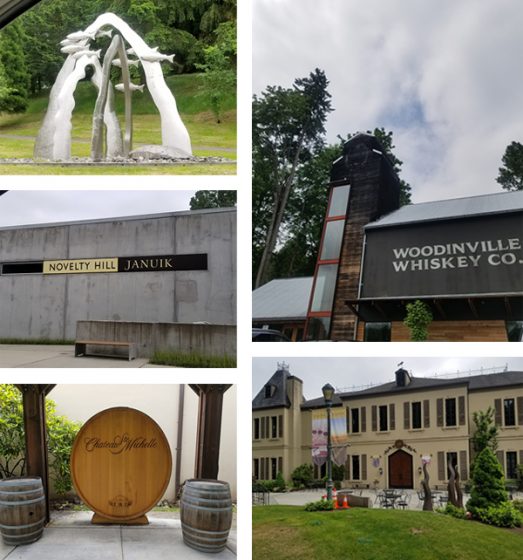
Debra Barclay of Ancora Press (Washington state, USA) prints beautifully on a Heidelberg Windmill.

WOODINVILLE WONDERS

Woodinville is a tourist destination, as we have over 100 tasting rooms, wineries, distilleries, and breweries within a stone’s throw from my shop. This can be dangerous, but it’s really quite convenient mostly. Chateau St Michelle is probably the largest winery in the area. They have concerts on the lawn in the summers and beautiful grounds to walk around and picnic on. In the summer, we can hear the music from our backyard, which is usually a good thing. We also have a really cool theatre production company in town called Teatro Zinzanni, which recently moved to Woodinville from Lower Queen Anne in Seattle. From their website: “Teatro ZinZanni…is a three-hour whirlwind of international cirque, comedy, and cabaret artists…”

Debra Barclay of Ancora Press (Washington state, USA) prints beautifully on a Heidelberg Windmill.

I really love living here because it’s quiet and we have lots of space. Our house is nestled into trees at the end of a cul-de-sac, yet we are incredibly close to the city. Woodinville is described as “subrural” as it is somewhere between suburban and farmland. One of our neighbors has a horse grazing in her front lawn pretty regularly, and the one across from her has over a dozen chickens on his property. We have a growing Arts community thanks to the Woodinville Arts Alliance in town.

PRINTING MENTORS

Oh gosh! This is a hard question! So many people have helped me get to where I am today. Esther Smith and Dikko Faust of Purgatory Pie Press were my first inspirations, as they were my first apprenticeship out of school. Dikko’s skills as a printer always inspire me, and Esther’s vision and ability to draw inspiration in the everyday is joyous.

My former boss Scott Hill of Workhorse Press is a great mentor as I continue to build my business. He’s readily available to help me with any questions I have about presses, printing, or the business side of things. I’ll be forever grateful to him for taking me on as an employee and teaching me so much about the production side of letterpress. Scott is a printer by trade, with a very keen eye for how to bring a design to life on paper.

Jami Heinricher of Sherwood Press is my most recent mentor and inspiration. She taught me how to run a Heidelberg platen, and for that I am forever grateful. She helped me troubleshoot one of my presses’ weird quirky problems, and even helped me back out my stuck Windmill, after my press pulled 6 sheets of 236# Flurry Cotton paper! I admire her business model, and her tips and tricks have saved me hours of time. My friend George Feakes of Impressive Inkreations has been an incredible mentor, giving me both sage printing and business advice, insights on efficiency, and an amazing amount of support.

Debra Barclay of Ancora Press (Washington state, USA) prints beautifully on a Heidelberg Windmill.

All of my local letterpress trade guys are all absolutely my savior. After running letterpress for 40 years a piece, they collectively know everything, and there’s nothing they can’t make run correctly with just a little bit of tape and 18 point card stock. They’re also really down to earth and easy to talk to, and I love hanging out with them.

My husband, while not a printer, has been an amazing source of inspiration and strength. He single handedly moved my C&P and first Windmill up from Portland and got them situated on the garage floor. He also gave up a large portion of his workspace to allow me to have my studio. We are now looking into building him a lovely shed in the backyard for his woodworking tools for when I get a few more pieces of equipment this coming year.

Debra Barclay of Ancora Press (Washington state, USA) prints beautifully on a Heidelberg Windmill.

GROWING THE DREAM

My business works out to be part time at the moment. I bought some equipment in early 2018, and spent about 6 months getting myself up to speed on the equipment and its particular quirks and what-have-you. Technically I’ve only been available to the public for about 7 months. I do plan to continue to solicit work and build relationships with designers, as well as develop a personal line of designs that I can offer to clients. Full time is my goal. I want to generate enough consistent job and print work so that I can take on an employee. There’s only one thing better than being a letterpress printer, and that’s sharing the workload!

THE CREATIVE FLOW

My process always begins by sitting down with the client and getting to know them a bit. I love getting to talk to people about their vision and translating that into a printed piece. I spend a fair amount of time gathering as much information as possible from the client. If it’s a wedding invitation, for example, I ask the bride to describe the ceremony and the type of event they’re going for. Is it modern, traditional, minimal, outdoor, etc? This narrows things down a bit. I get their wedding colors and match them to a PMS color that we all agree on pretty early on. I show them samples of my previous design work and see if anything stands out to them, either by way of technique (blind emboss, overprinting, etc) or if the tone of anything resonates with them.

At that point, I will begin a preliminary design. I find that this is really when the fun begins. It’s important to have a jumping off point, even if the design itself isn’t the final vision. It’s much easier for people to point out what they don’t like and for me to come up with alternatives to that, rather than envisioning something out of thin air. This has really worked well for me so far. I really enjoy the collaborative process during this stage of design.

PRINTING FEATS

I was the Arts Director of the Virginia Center for the Book from 2001-2003. While I was there, I helped run workshops and host events that built community involvement in the letterpress shop. I also created panel talks and art installations for Charlottesville’s annual Festival of the Book, which is a week-long event covering all aspects of books, from publishing, illustrating, designing, and reading. I also taught a class in the Art Department at the University of Virginia.

Debra Barclay of Ancora Press (Washington state, USA) prints beautifully on a Heidelberg Windmill.

What I loved most about my time there was introducing the history and craft of letterpress to so many people in a variety of settings. One of my favorite moments was teaching an outreach program for a local Girl Scouts troop. I had the girls (who were all about 7 years old) run a pass through the Vandercook Universal. While I was in another room showing a group how to fold and slit the paper into a book, a girl came running out of the print shop in tears. Her mom asked her what was wrong, and she said through her sobs, “My print is over-inked!”

Debra Barclay of Ancora Press (Washington state, USA) prints beautifully on a Heidelberg Windmill.

PRESS FAMILY

The very first presses I owned are my current ones – a 10×15 Heidelberg Windmill and an 8×12 Chandler and Price treadle that’s been converted with a motor. It’s funny that my first presses are both platens, since I learned to print on Cylinders. By the time I was ready to buy and had the space to have presses, Vandercooks were way out of my price range. Before this, I had always managed to access community print shops or presses belonging to friends.

BOXCAR’S ROLE

Boxcar has helped me in so many ways! Mainly, making resources readily available has been key. It’s a one-stop-shopping kind of place. They have given me the luxury of going slowly in building up my knowledge by offering a place to get it all done, and with such ease! The Boxcar Base has made life so much easier.

Before the Base, I was using magnesium plates.  I found them to be much softer and more unpredictable, requiring more make ready due to being mounted to wood (not consistently flat on the bottom, and easily prone to warping). Being able to have predictable quality in my tools has allowed me to focus on perfecting my skills as a craftsman. The ability to buy paper, envelopes, order plates, and pick up a random thing I might need here or there (can of ink, roller gauge) has been fantastic. I can’t say enough good things about the Boxcar Press website flow. It is extremely user friendly, is quick and easy to navigate, and borders on foolproof!

Debra Barclay of Ancora Press (Washington state, USA) prints beautifully on a Heidelberg Windmill.

I also love the How-To tutorials, which have increased my knowledge of my presses. Also, I cannot say enough great things about the staff. I have had random moments of panic where I’d forgotten to upload a small file for platemaking, only to call out an S.O.S. to Rebecca Miller, who swiftly and promptly put out the fire and saved the day! Working with Boxcar Press is like having a staff of knowledgeable and kind pre-press geniuses just an email away!

SHOP TIPS

Get the crop marks! This is something I don’t always do myself, and pretty much every time a two or three color cropless job goes to press, I spend twice as much time trying to get position. Even with one color jobs, I like crop marks once it gets to bindery. They seem like a luxury, but really they save you a bunch of time. And time is money, as well as a whole lotta frustration!

Spend the money! I’ve been there…I have tried to get away with a short cut, or making do without a particular tool or gadget (the Swing Away Lay Gauge comes to mind here). In the end, I end up spending way too much time having to figure out a “cheap” way to do something. Again, I’ve spent money, and potentially compromise the quality of the end result of the printed piece.

Debra Barclay of Ancora Press (Washington state, USA) prints beautifully on a Heidelberg Windmill.

If you’re running a blind deboss on a stock that isn’t 100% cotton, or super plush, you can achieve a similar effect by adding a small amount of color that matches the paper stock with a ton of transparent white. Or, if you’re running a bright white sheet, opaque white right out of the can will do the trick.

I’ve also added a touch of yellow to gold ink in order to give it the punch it needs to stand out on an absorbent stock.

PRINTING ADVICE

Letterpress is a lot of troubleshooting and problem-solving. Isolate problems, ask for help from fellow printers that you know, or reach out online. One of the things I love about letterpress is how knowledgeable and helpful the community of printers is.
Also, a motto I like – Stay modest, do good work, enjoy life outside the shop.

WHAT’S COMING NEXT

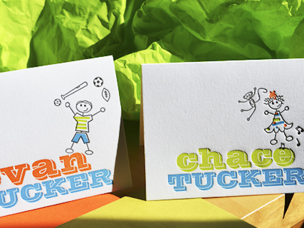
For the upcoming year, I will continue to grow my clientele. I also plan to add equipment so that I can add foil and emboss to my skill set. Currently, I am creating a design line, more of my own greeting cards, and some stock offerings that can be semi customized, like monogrammed note card sets and Holiday cards. I also hope to learn to paddle board!

Let’s See That Printed: Dana Kadison’s Exotic Flamingo Letterpress Prints

When the intricately-detailed illustrated flamingo graphic passed through our platemaking service, we were eager to learn more about what was to become of this plate and the resulting final pulled print. The printer behind the design, Dana Kadison, let us in on how the illustration project came to be and how she turned a long-mused-over concept into reality.

An illustration by Dana Kadison being made into a letterpress plate by Boxcar Press

Dana filled us in on beautiful (and long-term) project details: “As a photographer and collector, I have built a library of images and ephemera that is the foundation for an ongoing series based on the Mexican bingo game Loteria. Currently there are eight Loteria images. Each one exists in more than one “state”: my CMYK proofs, which will eventually have reverses and be printed as cards in a boxed set; monoprints, which I produce whenever I want to work out an idea or a reverse (like the Yeats Mariachis); soon, the editioned prints which include letterpress layers; and finally, Ofrendas, of which the Flamingo is the first. The Ofrendas, or offerings, are simpler statements of the ideas in the Loteria card series.”

Dana Kadison on press with a Vandercook printing press.

“The Flamingo Ofrenda is casual and references Jose Guadalupe Posada’s work. About two years ago, inspired by a set of Players cigarette cards, I was thinking about, and scratching, all kinds of birds, particularly finches, but also hornbills, crossbeaks, frogmouths, macaws, etc., and finally settled on a flamingo for card #2. The flamingo, for Americans at least, is undeniably iconic and the males and females look alike.”

“Now there is a suite of 8 images ready for editioning on 18×24 sheets of paper. Each one synthesized from a myriad of “stuff”: you know, the words, texts, images, objects, conversations that make up a life. And the first thing I wanted to add to each image is the text that will be on the reverse each of card when they become actual cards. For the viewer the text would be a clue to what I was thinking. Of course I wanted it in my own handwriting. And this is where letterpress comes into play. It all started with the idea of plates of text in my own handwriting.”

“So I took a class at Robert Blackburn on a Vandy 4. The flamingo, my first plate from Boxcar, was for that class. Using that Vandercook 4, I printed the flamingo two ways, straight and then over monotypes. All the prints have the same degree of impression. I like the straight prints, but am still deciding about paper. The monotype backgrounds please me the most, perhaps because I did not try to register them with the plate. Knowing that, once set, the Vandy would take care of itself, part of this exercise was to let go of the urge to register. While all of this is happening, I did press my first image with Pilar Nadal at Pickwick Independent Press in Portland ME.”

Dana Kaddison prints beautiful letterpress flamingo monoprints with Pilar Nadil.

“Letterpress is an aesthetically and physically freeing experience. We all know that paper is not really 2D, that it has depth. Letterpress layers add visible texture that can be seen with or without ink. And a letterpress registers. It is a little unsettling to use a press, completely unlike pulling the screens myself. Atmospheric conditions in the NYC studio are so variable and water-based inks misbehave in such interesting and frustrating ways that achieving consistency in CMYK prints takes great physical and mental stamina.

With letterpress I can imagine more and physically achieve more. For the editions of the first 8 images, I chose to set the 6.5×10.25 card faces on 18×24 sheets of paper and handwrite the text from each reverse below the screenprint of its card face. The handwritten texts are becoming letterpress plates. And there was more beautiful white space available. So parts of the reverse images are now finding their places as letterpress in that white space. For example, #2 will be embedded in the enlarged body of my scratchwork flamingo.”

A large heaping round of thanks out to Dana for letting us get a sneak peek at the brilliant flamingo designs!

Boxcar Talk With Katie Daniels of Concrete Lace

Armed with sharpies, inks, and a dazzling inspiration, Katie Daniels of Concrete Lace is a phenomenal front to shaping the way letterpress has been deftly handling those warm wishes and special greetings to friend and family alike, be it a an eye-popping invitation or a special run edition card. A Georgia native, Katie’s been imbibing the wonderfully sweet fruits of the creative process.

If you’re in the Asheville, North Carolina area between August 2nd-5th, you should pop in to the Ladies of Letterpress Conference and say a big hello to Katie, as she’ll be rousing up some fun at the printer’s fair!

IT’S ALL IN THE CARDS I am originally from Foley, Alabama, on the Gulf Coast of Alabama (a sleepy town that didn’t know what to do with a rebellious punk vegan in the early 90’s). My mother is very creative, always had art supplies around and is no doubt the reason why I am an artist today. As a four-year-old, she encouraged me to start selling my handmade cards annually at the Foley “Art In The Park”event. 30 years later, after moving to Atlanta, the card making tradition continues under the name my awesome sister, Carla Kaiser, came up with: Concrete Lace. I also love history, collecting, cooking, exploring, gardening, animals and being a nerd.

LETTERPRESS FOR LIFE I had dabbled in printmaking in the past, but when I got engaged in 2008, I really wanted to print my own invitations. A friend of mine told me about a local company, Praxium Press, who let you rent their press. The owner, Berwyn, was an awesome guy who introduced me to the Vandercook world. I loved it and immediately started designing & printing letterpress greeting cards and Atlanta neighborhood postcards, and was printing there so often that he convinced me it was time to get my own press. My awesome husband, Paul, then decided to set me up with a Vandercook studio in our home where Concrete Lace is thriving today.

GIFTED IN GEORGIA My studio is in my home, with the Vandercook & Kelsey upstairs in the small 7×10″ studio, and the Kluge, C&P and large format Challenge cutter down in the one-car garage. My upstairs studio is an inspirational eclectic mess, and the garage is more industrial feeling. I love to crank up local tunes super loud when I am printing, and I like to let the music set the tone for my productivity.

LIFE LESSONS + PRINTING MENTORS I had a fortunate job at one of the best health food stores, Brighter Day in Savannah, Georgia, while in college. I worked there for many years, and befriended a dear woman who also worked there, the late Joan Cobitz. Joan was among the first female MFA printmaking graduates of her time. She served as a major inspiration to me, as we traded house cleaning expeditions for printmaking classes in her home studio (printmaking was not offered at SCAD at the time). She was a great story teller and mentor for me and I think of her daily, not only in the press room, but also when I use her culinary advice or her prized Sabatier kitchen knife.

After graduating, I moved to Atlanta, and was fortunate enough to buy a house next door to a fourth generation letterpress printer, David Brough. He was a kind and generous man who loved his presses and loved to share information. Through David’s passing, I met another printer, Kevin O’Neil, who serves as my primary letterpress mentor today. Kevin very generously donated a beautiful C&P and Kluge to my pressroom, along with his invaluable information, which I will cherish forever.

DAILY GRIND For illustrations and hand lettering, I start out either with sharpies or pen and ink, then scan them in and convert them to vector graphics in Illustrator. Some illustrations are done directly on the computer in Illustrator (sometimes Photoshop then Illustrator), but I do all of my layouts, typesetting and separations in InDesign. My designing system is different for each line of cards as I like to switch things up so that I am always exploring new things. For example, I did a great deal of research on tapestries, pottery, wall paintings and other historic references when coming up with designs for my Greek and Hebrew lines, but did more hand lettering and illustration for my pet sitter cards, and illustration & typesetting for my French and German series.

THE DESIGNER IN THE PRINTER I am a professionally trained graphic designer, as well as a printer.

FULL TIME FUN I am a full time designer and a “part time” printer (but more like a 2nd full time job). I will never stop designing, so it is not my goal to give that up. I love it too much!

A LUCKY FIND I looked a year for a Vandercook SP15 or #4 (the only two sizes that would fit in my tiny upstairs studio), but no luck until I got Steve Robinson involved. He found me a #4 from an ink testing studio, and the press was in beautiful condition, with minimal miles logged and only one owner!

A VARIETY OF ACCOMPLISHMENTS I have won the Redbull Flugtag competition twice, thousands of dollars in numerous halloween costume contests, fostered and placed over 30 dogs, donated eggs twice, taught myself how to proficiently speak German in three years, forgot how to speak German in three months, taught myself how to play the accordion, started piano lessons at age 23, started tap lessons at age 31, won several design awards for work done for Emmy awards packaging and work created for television networks TNT, TBS and Turner Classic Movies, and most importantly, started Concrete Lace.

BOXCAR’S ROLE Boxcar sold me my base for my Vandercook and my Kelsey press, and I have been ordering my plates from Boxcar ever since. I really do find value in the relationships I have established with Boxcar, and feel that they have set a high industry standard, and high expectations, for customer service and plate making. They are fast and their site is user-friendly — key reasons for why I use them.

SHOP TIPS Don’t be discouraged. 1) This industry is all about exploring and learning, so I feel like even the biggest mistakes are the best teachers. 2) These machines were around WAY before any of us, and WAY before computers. We sometimes need to back off and not put pressure on ourselves to meet today’s standards of timing. These machines are much more powerful than we are, so it’s so important to think clearly and work at a pace that is comfortable for each of us individually.

WHAT’S NEXT I am working on an Italian line, and have two more lines in the works that will have to be a surprise… They probably won’t be ready until 2013, at this rate!

Big round of thanks out to Katie for letting us take a peek around the shop at Concrete Lace! Don’t forget to say “Hi!” to her at the Ladies of Letterpress Conference on August 2nd-5th, 2012!

Letterpress Art Sales to Benefit Baby’s Medical Procedures

Today we’ve got details about a worthy event that will help a young boy’s medical expenses and provide you with a chance to obtain some limited edition fine art prints for your walls! Prints for Platelets is helping raise funds for Nico Bond, the 17-month-old son of Arizona Master Printer Brent Bond of Santo Press and artist Veronica Villanueva.

Since November of 2011, Nico has undergone 2 bone marrow biopsies, over a dozen transfusions and is still undiagnosed with a blood disorder that leaves him with very low platelet counts.  Prints for Platelets will give you a 20% discount off all Santo Press Prints with 100% of the proceeds going to Nico’s medical expenses through the month of May.

Santo Press Prints offers high quality relief prints, monoprints and monotypes from 16 regionally and nationally recognized artists. Shown above is a photopolymer and reduction linocut from Veronica called Nicolas’ Odyssey.  Veronica tells us this about the creation of this print.

Getting pregnant wasn’t easy and the pregnancy was a high risk one.  I made this print when I was pregnant with Nicolás.  It seemed that even before birth Nico has gone through a whole odyssey.  And it seems that his odyssey continues… The key image was created digitally and relief printed from a Boxcar polymer plate, colors were developed via a reduction linocut.  The print was from an edition of 50 which was donated to Mesa Contemporary Arts at Mesa Arts Center for their annual fine art print calender fund raiser.

Click here to go to the Santo Press website and choose one or more signed, numbered, and titled prints from the artists and receive the 20% discount through the month of May.   The prices are very competitive and with an additional 20% off, it’s an easy but meaningful way to help this little boy and his parents while supporting fine art printmaking.

Boxcar Talk With Lenor Mirochna of Paprika Letterpress + Design

Take a large helping of letterpress love, add a smidgen of luck when finding the perfect press, pour in slowly more than a few cups of excellent design experience, add an enchanting creative streak, and you’ve got the divine recipe behind Paprika letterpress + design. Lenor Mirochna lets us in on the flavorful story behind the letterpress and design studio powerhouse. Read on to get the full scoop.

SPICING UP LETTERPRESS Paprika letterpress + design has been an adventure since day one with a serendipitous beginning. Short story about my background: I studied design at a number of different colleges and universities from Detroit to NYC. I began my design career in the mid 70’s; the beginning of computer typesetting where artwork was prepared using rapidograph pens, Xactos, photostats and hand done mechanicals.  There is a LOT to be said for the fabulous resources and possibilities of today’s graphic design. My experience has included ad agency design and art direction, owner of several graphic design firms, freelance design, commercial printing sales and print services buyer.

INK IN THE BLOOD I was interested in the process of letterpress and looking for a creative venture where I could use my design skills and love of color. I began to think about a local printer I met about 10 years ago who had a print shop in my town. On a whim, I stopped in one day and asked Dan Dewechter, the owner of Constitution Press, a 120 year old, continuously operating print shop, whether he had any letterpress equipment he was interested in selling. As luck would have it, he did. In fact he was consolidating and liquidating much of his shop having decided to explore other career options.

That is where I first met my circa 1916 Chandler and Price 8 x 12 press, all 1250 lbs of iron.  Along the way I also contacted Alan Runfeldt of Excelsior Press in Frenchtown, New Jersey. Interested in more hands-on-printing experience, I signed up for a day-long class with Alan and had a blast printing on a variety of presses.

FLOURISHING IN THE GARDEN STATE I am currently set up in a small garage studio. I hired some renovation help and we painted, insulated, refreshed and reorganized the space 6 months ago and now it is much more aesthetically pleasing as well as energy efficient. I am looking to expand my capabilities by purchasing another press by the end of the year.

PRINTING LEGACIES As a printer for over 30 years, Dan Dewechter has a wealth of knowledge and experience that you can’t find in a textbook. He not only worked with me, but also gave me pointers and patiently explained the idiosyncrasies of the process. He was generous with his time, talent and skills and is the person to credit or blame for what I ‘m doing now — right, Dan?

DESIGNED FOR PRINT I design and print. Currently, I am continuing to add to a line of greeting cards, notecards, and soon-to-come calendars. It’s been an adventure exploring the techniques and mechanics of letterpress printing. I have just scratched the surface of custom work and have collaborated with clients on custom pieces which has been extremely rewarding and a ton of fun.

PRINTING FEATS Letterpress printing is a beautifully complex yet simple process.  I love the colors, the feeling and the fun exploration of papers and technique. I’m not really sure I’d call it “my life’s work”.  I really like it and I’ll see where it takes me.

BOXCAR’S ROLE It was Alan who suggested I check out Boxcar Press to purchase plates as well as acquire more knowledge of the letterpress industry. Frequently posted videos and industry information on the Boxcar website has deepened my letterpress education. All of my plates are ordered through Boxcar Press and they have been an excellent, reliable resource for me.

GETTING STARTED When it was time to get my press, I contacted Dan, rented a trailer, asked my engineer husband to check out the situation and set the moving date.

When I arrived to pick up the press (haha- that’s a good story there) the fun began. (see the pictures) Dan was invaluable and incredibly generous in helping me get my shop set up.  Along with the press he gave me just about every possible piece of equipment needed to get started and in fact things I didn’t even know I needed.

Seriously. He included  quoins, 3 C &P chases, furniture, sets of guides, large roll of tympen paper, packing sheets, extra set of BRAND NEW rollers still in their box, cans of pre-mixed pantone ink colors, press wash, large “stone” on which to lock up the base, roller puller tool, sticky finger goo and stacks of  different types of paper to get me started. And more. And he helped move the press. Dan was amazingly helpful and I like to think he was happy to see the press go to someone who would work it and not sold as scrap.

WHAT’S NEXT My plans for 2012 include adding a new press to my shop, working with more custom clients and continuing to create new pieces for the Paprika letterpress + design line. My retail outlets include stores in Charleston, South Carolina, New Jersey, Philadelphia, and other areas of Pennsylvania. My cards have been featured in Culture Cheese Magazine and soon to be in USEF’s Equestrian magazine. In the future I’d like to grow the Paprika Letterpress brand specifically within the specialty retail and hand-made-art market nationwide.

Many thanks to Lenor for letting us take a look into the wonderful world of Paprika Letterpress + Design!

Boxcar Talk With Elizabeth Rittmeyer & Kelsie ZImmerman

Is there anything Elizabeth Rittmeyer and Kelsie Zimmerman can’t do? The energetic Elizabeth finally sat down with us to spill the details on just how ambrosial letterpress life at Sugarcube Press can be.

SUGAR, SPICE & EVERYTHING PRECISE I’m a 95%-self-taught letterpress printer, been doing it for 16 years. I’m a Portland, Maine transplant to SoCal via Seattle (I gloat profusely about living in the coolest places). The entire family is back in Maine so my husband and daughter go for 2 months and I get one before the printshop needs me back. I’m over 21, vegetarian 19 years, have a rational and hyper-creative husband who independently designs bags and i-gear for other companies like NAU and Apolis and he does production in Vietnam 4 months of the year (thus I become uber-super-mom). Our 11 year-old daughter is also so creative that she gets up at 6:30 a.m. to write stories before school. I love squirrels, pre-1900 books, tiny cut glass s&p shakers, ‘50’s odds-n-ends for my 1951 house with round livingroom, thrift stores and side-of-the-road finds, my proudest being a fire-orange Danish chair with swooped teak arms.

Sugarcube Press in action

INK IN THE BLOOD In 1995 I moved from Portland, Maine with my husband to a little rural island off of Seattle; he got a sweet job in K2 Snowboards. Well, after one trip on the ferry (after I missed the first two), through Seattle traffic, I decided there was just no way I could commute to Microsoft every day. What’s a girl to do on a wooded island with one blinking red light? Be the coffee-girl at a café. Lucky for me Jennifer and Ron Rich of Oblation remembered me from a book fair and asked if I wanted to be their paper-maker, which I did until I learned to print (enough) to be their printer for 2 years. With their success they left for Stumptown and I stayed on my island and did online weddings only. Looks like I was hooked.

CALIFORNIA DREAMING We recently moved to a new space in our sweet little Ojai downtown, a 6-minute walk from my house. We have 800 square feet with softly glowing buttercream walls, two all-windowed garage doors facing directly East with view of the mountains and with the doors fully-open we’re virtually “outside”.
An outside view of Sugarcube Press
Kelsie has a design-center, we have a processing + shipping area, and a near-half is the print shop. I am the second owner of my 1956 8×10 C&P named Dwight (she’s a girl), and 10X15 Heidelberg named The Butterfly that was bought from Frank Boross of Toxic Coyote Press (he had her for 25 years). Jack, my leggy Chihuahua mutt pound-dog, guards it all.

PRINTING LEGACIES I love Bonnie Thompson Norman of The Windowpane Press in Seattle. Her books are letterpress and lino-cuts; I adore Madeleine Zygarewicz of Panorama Press, she’s a doll; and I get really happy looking at 9SpotMonk, I gravitate to overlays and splash. Though I am amazed at people who achieve tight-registration and I totally bow to them, I prefer “movement” with overlays and juxtapositions that create new colors.

Sugarcube Press's print shop
DAILY GRIND “Design” happens every day; it’s inspiration and whimsy from a thrift-store goody or a conversation with a pal. My humor tends towards sarcasm and irony, so our cards are pretty funny. I like the one-offs and tongue-in-cheek play with words we English grads live for. These days I do quick pencil sketches and collaborate with my partner and designer-guru extraordinaire Kelsie Zimmerman; she uses our sketches and ideas and gets them plate-makin’ ready to send to Boxcar.

DESIGNED FOR PRINT I’ve always been a “designer” in the sense I draw, collage, carve, arrange and conceive. Up until I met Kelsie in 2007, I was the solo-business owner and designer. Our collaboration allows me to concentrate on Sugarcube’s printing; I print every single thing that comes out of the shop to supply over 400 stores.

Another look at the Sugarcube Press print shop
FULL TIME FUN I work full-time for Sugarcube Press and thankfully, finally, for no one else! Every-other year I’d panic and go get a desk job. But this past year was sweet to permanently be at my cast-iron “desk” all day; now I stand at the C&P for a solid 5 hours before it gets too tiring, then it’s off to other necessities: packaging, shipping, calling on invoices, and brainstorming.

PRINTER’S PARADISE In general, being a printer of good caliber; I print every single card and ephemera from Sugarcube Press on the C&P. Sugarcube has grown exponentially thanks to my go-getter-never-say-I-can’t partner, Kelsie. She rocks! We are both really proud of our growth over the years.

BOXCAR’S ROLE Our first NSS in 2008 found us paying thousands of dollars for wood-mounted metal that due to a changed formula (later discovered) was crumbling away as I printed. I was freaking out! We met with Boxcar at that show and decided to make the change to polymer plates: lightness in shipping, less cost in ganging–up images, less hazardous waste in it’s making, and polymer doesn’t smash (whoops) like magnesium.

Another look at the Sugarcube Press print shop
PRESS HISTORY I found my first press, named Big ol’ Pearl, a 10×15 1890’s C&P, in the Printer’s newspaper, in 1997-ish, in PDX. Drove down from the island in a huge Ford truck and extra-long Uhaul. Really spendy ferry ticket. My driver, backing it up in a rain-sodden field, became mired in the mud 500 feet from my studio door. One guy suggested we dump the press in the muck and drag it! The other guy (hello, Einstein) pointed out the press, being in a trailer, was already on wheels, we just needed a come-along, and a few hours of cranking got her inside with nary a drop of rain on her.

SHOP TIPS If you want to grow, get a partner! Kelsie and I both do different jobs and our expertise is necessary for our success. She designs and does all of the layout and haggling to get our catalogs done, online pop-up sales, keeps reps happy and trade shows looking sweet. I’ve mostly got the printing and stock under control; ya gotta make it to sell it!

WHAT’S NEXT Making more of everything and tripling growth.

Big thanks to Elizabeth and Kelsie for showing the sweeter side of letterpress with Sugarcube Press! Check out their nifty videos here!

Did You Know That … Checking Line and Dot Thicknesses Is a Cinch?

One of the most common issues we face here in the Platemaking Department at Boxcar Press is determining a sufficient line thickness. Making that ruling means explaining to customers two things – how do you go about checking to see if lines or text are thick enough to hold on your particular plate? What’s the thinnest line that can hold on the plate?

Surprisingly, there’s just one tool you need to utilize in either Adobe Illustrator or InDesign: The Line Tool. If you are using Adobe Photoshop, the Line Tool unfortunately reverts to a minimum line thickness of 1pt. If you are only using Adobe Photoshop to create your file, we highly recommend placing your final file in InDesign and using the Line Tool to check your work.

LINETHICKNESS_IMG1-1

What do we mean when we talk about our line thickness guarantee? Simply put, if your lines meet or exceed the line thickness as outlined below, we will guarantee they will hold on your plate. If they are under that thickness, it’s hit or miss. Some days you are lucky and other days, you might lose details.

The first thing you need to determine is your line thickness based on your plate type:

– If your plate type is the KF 95, Jet 94FL, or 94SB, you have a line thickness guarantee of 0.25pt or thicker.

– If your plate type is the KF152, 152SB, or 145SHSB, you have a line thickness guarantee of 0.35pt or thicker.

– For all plate types, your dots (like the ones above the letter “i”, periods, or dotted lines) must be 1pt to 1.25 pt or thicker.

THINK FAST! Quick quiz here – what is usually the most common culprit of too thin lines? Crop Marks! More on that later.

Here’s how to use the handy Line Tool to check to see if your lines are thick enough (and plate friendly, too):

You need to first open your file in either Adobe Illustrator or InDesign. We’ll be using a small type sample in Adobe Illustrator to check to see if our lines are plate-friendly for a KF152 plate type. The KF152 plate type has a line thickness minimum of 0.35pt for lines and 1pt to 1.25 pt for dots. We can see that it looks like there are some thin lines in the serif of the Didot typeface… but will they hold?

First, click the Line Tool icon in the tool palette on the lefthand side of the screen in Adobe Illustrator to activate it. If you cannot find it, hover your mouse over the icon that looks like a line to see “Line Segment Tool ()” pop up in a yellow box .

Next, in the control panel up at the top, we’ll select the words “1 pt.” in the dropdown area next to the word “STROKE” with our mouse. You’ll be substituting the “1 pt” and replace it with “0.35pt”.

letterpress file prep tips from Boxcar Press

We’ll select the Zoom tool (Z) and move in because we’ll be doing some close up viewing in the area you are inspecting. Select the line segment with your mouse and move it so it is right next to the bottom part of the “L” in “Letter”. Draw a short line so it is parallel with the thin line you are checking on your art board. It doesn’t have to be very long but this little line segment will be our “ruler” to compare thicknesses.

letterpress file prep tips from Boxcar Press

At this close magnification, we see that our line segment set at 0.35pt is much thicker in comparison to the thinnest line in of the serif on the letter “L”. We will need to add a hairline stroke to boost our text’s thickness to correct this.

letterpress file prep tips from Boxcar Press

To add a stroke, using the selection black arrow tool (V), select all the characters in the word “LETTER.” In our Control panel at the top our screen we should see that the letters only have a fill and that we’d like to add a hairline stroke (about 0.15pt). Click the white area next to “STROKE” to activate the area so we can type in “0.15pt”. Immediately single-click the white area anywhere on the board. This will deactivate your selected text and add the hairline (0.15pt) stroke.

letterpress file prep tips from Boxcar Press

Zoom in again using the Zoom Tool around the line segment we created with the Line Tool and the letter “L”. We can now visually see that the serif on the “L” is as thick as the 0.35pt line. Success!

Delete your line segment and zoom back out. Continue around your artboard to visually check to see if other areas look “safe” as well.

For dots, such as the ones around the heart shape, we’ll need to set our Line Tool weight to “1pt” just to be on the safe side. We’ll repeat the same steps mentioned above to create the line, to zoom in, and visually compare the dots’ diameter against the 1pt line segment we just drew on our art board. Like the thinner lines on the “L”, we’ll need to correct this by adding a much thicker stroke of 0.3 pt to boost our dots’ diameter up to 1pt.

Using the Line Tool to check your work should be a “Must Do” test before submitting your files to your platemaking ticket. If anything appears too thin, you will need to correct it.

A few final instructions to help you be aware of potential trouble spots:

-When creating crop marks in your files – the program default setting is often 0.2 pt or 0.25 pt. Keep this in mind so you can make the necessary changes to your crop mark thickness when you place them.

-Thin lines that curve, particularly in wispy script or calligraphic fonts, are always suspect for being too thin. Give them the support they need to hold on the plate with hairline stroke (if needed).

Stay tuned, letterpress lovers — next we’ll solve the mystery of how to create multiple color files!

Related Blog Posts

Learn to Love Color Separations – A Boxcar Press Checklist
Did You Know That … 100% CMYK Black Is a Breeze?

Field trip to Platemaking

Greg peels a plate off the washout unit on the platemaker. In the water are brushes that have taken off non-inking areas of the plate.

platemaking processplatemaking at the momentletterpress plates being made

Early letterpress block

Here is a piece of Harold’s metal cut ( or illustration ) collection: A bride in classic form.
metal cut letterpress plate

For Platemaking Needs

Inside this formidable cabinet lies a plethora of plate types that one can order from us. You can choose metal or plastic backed, and a variety of plate heights.