Vintage Cool: WE ARE 1976

The creative trio behind WE ARE 1976 effortlessly combines fun, eclectic, and world-wide inspirations to create hand-made letterpress paper goods in the heart of Dallas, Texas. From punches of color to fun & funky illustrations & prints, the shop is a happy culmination of the team’s love of learning, community printmaking workshops, and the ambition to keep the creative juices flowing. The crew caught us up on eight (and counting!) joyous years honing their craft, incorporating letterpress in their day-to-day lives, and enjoying the rich printing community that surrounds them.

FUNKY + FUN Hello! We’re Vynsie, Jully, and Derek and we own a small shop and letterpress design studio in Dallas, Texas called WE ARE 1976.  We opened our shop 8 years ago and we carry handmade and beautifully designed objects (ceramics, jewelry, and home goods) and paper goods (stationery, cards, and prints) from independent makers from all over the world. 

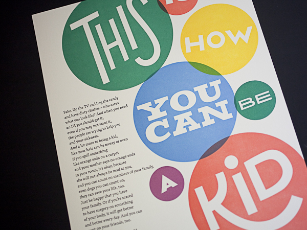
About four years ago, we started making our own line of stationery and art prints and have added custom branding, design, and letterpress printing to what we offer. We also teach printmaking workshops and host guest instructors that teach workshops such as calligraphy, water coloring, and jewelry stamping. We all grew up around the Dallas area and love being a part of the creative community here.

FIRST TASTE OF PRINTING Vynsie’s background is in graphic design. She got her first taste of letterpress and antique printmaking techniques at Graham Bignell’s Paper Conservation in London many years ago (cleaning old type cabinets in exchange for press time).

She also worked at Peter Harrington’s Rare Books (at their sister antiquarian print shop, formerly known as Old Church Galleries) which deals in rare books and antique prints made from wood, copper and steel engravings.

We carried the same vision and love of printmaking when we started our business. We have a diverse collection of art prints from illustrators, designers, printers (letterpress and screenprint) from the United States, Europe, Japan and Australia. Dallas also has a really tight letterpress community and we’ve been fortunate enough to get to work with them in various ways – the amazing people at Inky Lips PressMissing Q PressColor Box Studio, and Studio 204 were very generous with their time, expertise, and the work they shared in our shop. Five years ago we decided to make letterpress a permanent part of our shop. We started taking more letterpress workshops from places like Punch Press in Austin and San Francisco Center of the Book and with a bit of patience, we were able to locate two presses. We started printing immediately, teaching ourselves and each other.

BIG PRINTS IN TEXAS We moved to our current location because we needed a bigger space to fit our letterpress studio, which takes about half of our shop space. We’re in a charming historic district called The Bishop Arts District in Oak Cliff, Dallas. We’re across the street from a wonderful pie shop, Emporium Pies, and cute shops like Green PetNeighborhood, and Wild Detective. Most of the businesses are independently owned and we feel incredibly lucky to be here. There’s also amazing food and drinks on every corner in Oak Cliff –  Small Brewpub, Hattie’sEl Si Hay and Spiral Diner. Also, The Texas Theatre is a revitalized theatre with independent programming, fun events, and they host new art exhibitions monthly at their Safe Room gallery.

PRINTING MENTORS One of our presses is from the Art Larson’s Studio Hortan Tank Graphics. When the press was shipped to use, his colleague Joe Riedel came down to help us set up and was invaluable in teaching us the fundamentals of running and operating our presses. And, as mentioned above, we were really encouraged and motivated by many in the Dallas letterpress circle – Casey McGarr of Inky Lips Press, Jason McDaniels of Missing Q Press, Rhona Warren of Color Box Studio and Kim Neiman and Virgil Scott of Studio 204. Also, in our shop, we carry work from other illustrators/printmakers that really inspire us – Daria TesslerNate DuvallNaoshiDeth P Sun and Kelly Puissegur

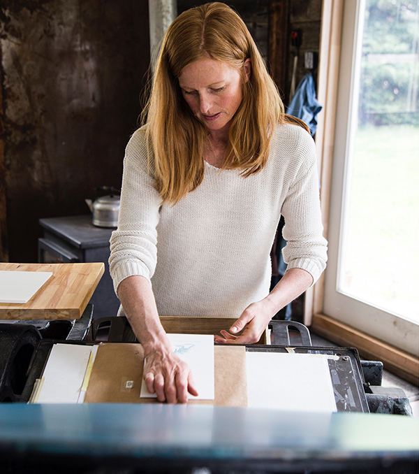
DESIGNERS + PRINTERS We’re both. We’re a family business and work on most projects together whether it’s just exchanging ideas initially or packaging finished projects. It’s so important for us to create unique and beautifully crafted pieces for us and for our clients so there’s lots of discussion and brainstorming before we even start designing or printing. We usually go through a few rounds of roughs and concepts before we get to a finished piece. We have a nice collection of antique type, so we work on many typeset posters, digitally design work, and use Boxcar plates.

FULL TIME FUN With our custom work, own line of stationery and our workshops we’ve been printing full-time for 4 years now. We’re lucky that we have really good team here so if we’re not printing that day, we’re designing something new, or trying to come up with new ideas. 

PRINTING FEATS As simple as this sounds, just operating these complex machines is something we’re proud of. Whether it’s just servicing the press, troubleshooting to get the perfect impression, or finding a solution for a squeaky part, learning to trust our instinct with the mechanics of these antique presses while producing beautiful high quality print work brings a new kind of confidence that we don’t get from our normal day-to-day life. We’ve been very proud to do more custom work – wedding invitations, branding projects, personal stationery. All of these moments and projects are important to our our clients and we’re so honored to be a part of it.


PRESS HISTORY Vandercook 325 and Challenge Proof Press. We have added a Vandercook 219 and tabletop Pilot.

BOXCAR’S ROLE Boxcar has made it so much easier for us to create custom work for our clients and for our own line of paper goods. Super helpful with file prep questions and any changes or adjustments. 

WHAT’S NEXT Designing and printing more! 

An amazingly large round of thanks out to Vynsie + team of WE ARE 1976. Keep up the phenomenal & beautiful letterpress work!

Big Beautiful Prints At Tiny Dog Press

While managing a Baltimore, Maryland stationery store, Kari Miller of Tiny Dog Press fell in love with letterpress printing while attending a weekend class in Austin, Texas. Fast forward a few years later, and the happy-go-lucky printing gal set-up shop in her cozy (but comfortable) 20’ x 20’ garage. Packed to the brim with printing sights, smells (ah! the smell of fresh ink), and studio canine pals, Kari has carved out a slice of printing heaven at home. We caught up with the Baltimore-based printer as she talks shop about an amazing love for letterpress, urban gardening, and the kicking off a new card line.

Kari Miller of Tiny Dog Press produces big, bold, and colorful prints in her cozy Baltimore-based garage printshop.(all photography courtesy of Side-A Photography)

PRINTING, PUPS, & PASSION I am a Baltimore-based, Texas native with a deep love of printing, color, and urban farming.

I am the owner of Tiny Dog Press in Baltimore, Maryland. I am married to my loving & supportive husband and we currently have 2 dogs and 2 cats who love driving me crazy by barking at every bird in our yard while I am printing.  I have a Bachelor of Fine Arts in Studio Art with an emphasis in Printmaking from Baylor University in Waco, Texas.

I love city life and love living in Baltimore, Maryland which has a rich history in culture and printing.

When not in the studio, I spend time planting and tending my urban farm, otherwise known as the jungle of my backyard. During summer months, I can be found leaving boxes of vegetables on neighbor’s porches.

FOR THE LOVE OF LETTERPRESS While at Baylor University and searching for a degree that would intrigue me, I landed on Studio Art in Printmaking. At the time, my most recent art class was from elementary school. The dean allowed me to take Drawing 1 and 4-1/2 years later I graduated awarded as one of the top students.

Unfortunately, Baylor did not have a letterpress. That was the only print form I did not study in college. Years later I was managing a stationery store in Baltimore and was introduced to the commercial side of printmaking. I immediately fell in love with several letterpress companies (all of who I still follow). I understood letterpress printing by concept at that point, but did not learn the actual process until a few years later when I attended a weekend class in Austin, Texas.

Kari Miller of Tiny Dog Press produces big, bold, and colorful prints in her cozy Baltimore-based garage printshop.

The love of paper, smell of ink and physical labor required drew me to printmaking. I loved being able to reproduce one image and share it with multiple people. I love the feel of the impression with letterpress printing. At markets, I ask each customer if they would like to feel a card. I believe the handling of the paper and experiencing the impression gives a greater joy to the receiver of the card than one that is printed digitally.

TINY SPACE, BIG HEART Tiny Dog Press’ print shop is in my 20’x 20’ garage. We purchased our home knowing I would need a studio workspace. Few houses in Baltimore have garages and ours happens to be a detached garage which makes it into its own separate building. I love my little garage. Shortly after moving in, we renovated the space which included rebuilding 2 termite damaged walls, adding windows, a sink, new walls, cement floor, lighting and doors. At the end I was told by our contractors that it would have probably been better to do a full demo and rebuild. Little did they know that printers love restoring old and broken things in order to make new and beautiful work.

The best part about the location of my studio is that I stay within my neighborhood/community. During most months, my windows display my garden. School days I hear, see and wave to the kiddos walking past after school. During the summer months, I open the studio up for neighborhood kids to produce work with artistic mentorship. I love receiving knocks on the door from kids who know they can come in to draw, paint or print for 15-20mins before running back out to play. One young lady has been my apprentice for the past 3 years. She started with helping fold & package cards. This past summer, I taught her how to print, mix ink and general up keep of the shop.  During August, she designed and printed her own cards and then sold them at a holiday market! All of which she loved doing while it helped her push herself to new levels within her creativity and abilities to sell her products. I love when I receive random knocks on the door with kids showing me their recent design ideas! If I was in a traditional location, I know this would not happen as organically.

PRINTING MENTORS Kyle VanHorn & Kim Bently have been great mentors as I have started my business. I started Tiny Dog Press while renting print time at The Baltimore Print Studios.

Kari Miller of Tiny Dog Press produces big, bold, and colorful prints in her cozy Baltimore-based garage printshop.

As for printers who inspire, I will always love the work of Kiki Smith for its artistic beauty. For commercial printers, I was first drawn to letterpress through Mr. Boddington’s Studio and Hello Lucky.

DESIGNED FOR PRINTING I am a printer at heart. From the touch of the paper to the smell of the ink, my happy place is being behind a press.  I have a love-hate relationship with the computer. I design due to its necessity to grow a design-print business. I love printing for graphic designers, which is an area that I hope to grow in my business.

Kari Miller of Tiny Dog Press produces big, bold, and colorful prints in her cozy Baltimore-based garage printshop.

FULL TIME FUN I have been running Tiny Dog Press as my full-time job since March 2013. At the time, I was also running another small creative business. Now I only focus on letterpress printing through Tiny Dog Press. I have focused my business to grow organically, building the business with profits it produces. This year I will start paying myself from the business! My husband and I wanted the business to be self-sufficient from the start, so we have focused all profit back into growing the business.

PRINTING FEATS 2016 was a year of many accomplished goals within the business. Each accomplished goal brings great joy. The two that I was most proud: first time a product published in the Baltimore Magazine local shopping guide {August 2016 edition} and bringing on 5 new retail stores, one of which I had been wanting to have product at for over 3 years! 2017 has started off great with a first time mention in the Mid-Atlantic edition of The Knot Magazine!

Kari Miller of Tiny Dog Press produces big, bold, and colorful prints in her cozy Baltimore-based garage printshop.

Besides those goals being accomplished, as a business I am most proud of being able to use my business for more than producing products but also to reach my community for something bigger than the stationery I produce. This past November, I was proud to organize and host the Benefit Baltimore Market that brought more than 500 people out on a cold & rainy “Giving” Tuesday evening to a local brewery in support of 5 Baltimore City non-profits. Through beer, food and vendor sales, collectively we raised $2,000 which were donated to the 5 non-profits. In August, I collaborated with a local retail store to create and sell cards that would benefit a popular area that experienced severe flooding. I love having a small business that gives back to the community where it is placed. I love having the financial ability within my business to be able to give back to the community. I hope this is something Tiny Dog Press is able to continue and grow further into.

PRESS HISTORY Besides working on presses as a college student, my “first” press is the L Letterpress. Embarrassing, but we all have to start somewhere. After taking a class in letterpress printing and not having access to a press or permanent location to house a press, I purchased the L Letterpress to print mine and a friend’s wedding invitations. I still have the press and use it for kid workshops.

After moving back to Baltimore, I was able to focus on letterpress printing by renting time at The Baltimore Print Studios printing on a Vandercock SP20. I purchased my 1949 Chandler & Price press in 2014 and finally finished restoring it in 2016!

Kari Miller of Tiny Dog Press produces big, bold, and colorful prints in her cozy Baltimore-based garage printshop.

BOXCAR’S ROLE I purchased my first printing plates from Boxcar Press back in 2010 when I was printing on the L Letterpress. Since then they have been a great resource for plates and materials. When setting up my studio, I purchased my base, ink and several small supply items through the Boxcar store.

SHOP TIPS Any advice I have, others gave to me. If you are looking to start your own print shop, don’t fret – a press will come on your radar at the right time! Don’t try to force that time to happen sooner than it should. I was working on having a C&P press shipped to me from Texas which I found in an antique store, when suddenly the press I now own came on the market and was located less than a mile from my house. Huge cost and logistics saving.

When switching to a new press, give yourself time and grace. Each press prints differently. Different is not worse or wrong, it is just different. Learn how to design towards those differences or learn how to use those differences as a positive in product development.

Also, remember to ALWAYS check your crop mark line thickness or Boxcar will call you when you are at the grocery store.

WHAT’S NEXT Spend more time in the studio designing new cards and getting my hands dirty with ink! I am also looking at hosting a kids maker camp this summer and several kid focused workshops.

Huge round of thanks out to Kari at Tiny Dog Press. Catch her amazing new work on Instagram, Facebook, Twitter! Printed goodies can be purchased here on Etsy.

Printer’s Wonderland at Ice Pond Press

Molly Douma Brewer of Ice Pond Press is a self-taught, Montana-based letterpress printer and life-loving extraordinaire. From imbibing in the lush, raw natural beauty of her home state, she translates that creative power to form airy, beautiful, and bright eye-popping colored prints.  Seven years and counting, Molly still lives up to her own inspiring words – “there are many creative ways to reach a beautiful result.” She sat down with us to talk about her new card line, creating beautiful printed goodies, and taking the time to enjoy the natural gems that surround her daily.

Molly Douma Brewer of Ice Pond Press is self-taught Montana-based letterpress printer and life-loving extraordinaire

(All photography courtesy of Susan Beth Breuner Elements of Light Photography, Emma Light Photography, and Ice Pond Press)

PRINTING MARVELS IN MONTANA I live in Bozeman, Montana by way of Utah, Colorado and Michigan. Past job titles include: dog photographer, public relations director, professional skier and cookie cart peddler. I ski, fly fish, mountain bike, trail run and pretty much eat up everything Montana has to offer, most often with my husband and big white dog. And then we drink some beer.

Blind deboss business card from Molly Douma Brewer of Ice Pond Press is self-taught Montana-based letterpress printer and life-loving extraordinaire

SELF-TAUGHT CREATIVE I don’t hold an MFA or graphic design degree, have never taken a printmaking class, and I hadn’t used a press until I purchased one so you might say I am a homespun case. I have embraced the concept that there are many creative ways to reach a beautiful result.

I’ve had my backyard letterpress studio, Ice Pond Press, for seven years. I parlayed a full-time career in public relations straight into full-time letterpress. I suddenly had a need to create something tangible by using words, images, art, ideas and gorgeous paper. The extra reward is that this work could all come together into a product that makes people happy.

Knowing I was on the search for a press, my father-in-law spotted a gigantic Chandler & Price Craftsman at his printer in Utah. After an epic journey involving several U-Hauls, massive machinery, a mountain pass and a road trip with my in-laws, we delivered my press to the studio my husband had just finished building in our back yard in Bozeman.

Molly Douma Brewer of Ice Pond Press is self-taught Montana-based letterpress printer and life-loving extraordinaire

PRINTING ABODE I feel so lucky to have my little studio. My husband BJ had his sights set on building a sauna with wood from an old family barn. Plans were under way and it really sounded nice but I jumped in with big plans for a letterpress studio. Luckily he was not only supportive but speed-built the studio (with the help of builder friends,) hanging the barn door just in time for the C&P to arrive. We rented a Spider Lift to deliver it from the driveway to the backyard. It was a tenuous trek and several tree branches haven’t been the same since. Still, the 2.5 ton press was gently placed on the studio floor on a diagonal, facing the window and allowing for a view of surrounding trees and wildlife. It is an absolute delight to be in my studio space; it offers me peace and a lovingly created space where I feel good working hard. 

Molly Douma Brewer of Ice Pond Press is self-taught Montana-based letterpress printer and life-loving extraordinaire

PRINTER AT HEART I do some of the design, particularly if it involves stick people, flowers or text-only. Mostly I work with designers; my #1 being Michael Johnson. It’s like he has a view into my brain…he can translate my heady explanations of concepts into works of brilliance.

Molly Douma Brewer of Ice Pond Press is self-taught Montana-based letterpress printer and life-loving extraordinaire

FAVORITE DESIGN SOFTWARE I love Adobe Illustrator Draw.

Red and blue traditional wedding invitation from Ice Pond Press.

FULL TIME PRINTING FUN Yes, for the past five years. (After two years of learning and printing small jobs.)

PRINTING TRIUMPHS In my early days of Ice Pond Press, I was contracted to print a poster for a private Keith Urban concert. The job forced me to purchase a large Boxcar Base which was a turning point because now I do a lot of larger format posters and art prints. I feel a personal triumph each time I collaborate with artists to create beautiful letterpress prints that allow them a different medium for their art.

Also, I’m happy & excited to be a part of the Boxcar Blog’s printer profile series!

BOXCAR’S ROLE Boxcar is like no other partner I know. Every single time I upload an order I have the feeling that everything will be expertly done and will arrive on time. In fact, just today Rebecca fixed a phantom crop mark I didn’t even know was in my file. It’s things like that that create 100% trust. I can call and ask their opinion on how a file will work for platemaking and that helps me know if I can help a client’s wishes come true. Boxcar helps me create my weekly printing schedule because I know exactly when plates will arrive. Their efficiency helps my efficiency.

Boxcar Base in action at Ice Pond Press.Molly Douma Brewer of Ice Pond Press is self-taught Montana-based letterpress printer and life-loving extraordinaire

PRESS HISTORY My current press is my one and only: Chandler & Price 14 1/2″ x 22″ Super Heavy Duty Craftsman Press

Blind deboss business card from Molly Douma Brewer of Ice Pond Press is self-taught Montana-based letterpress printer and life-loving extraordinaire

SHOP TIPS As a self taught printer, I think everything I do might be a trick or a hack. One that’s tangible is HENRY GAGE PINS! They can take a beating and their malleability makes them invaluable. Also, crop marks on plates for pre-cut paper. I typically register by printing a blind deboss on my tympan (which is actually butcher paper,) using the impression of the crop marks to register and finally trimming off the crops before inking. Or, if my press is already inked, I tape a piece of tracing paper my setup, make an impression and then follow the same steps. 

WHAT’S NEXT I’ll roll out a talking vegetable card line and keep up with the year-round wedding season. I’m generally forging on into the wilderness of this wonderful letterpress world.

Immense round of applause out to Molly of Ice Pond Press for taking the time to let us discover the hidden printing gem in Montana’s backyard!

File Preparation Tips: Deciphering Spot Colors and Your Swatch Palette

Here in the pre-press department at Boxcar Press, we unapologetically love 100% CMYK black. It’s the best way to send your files 95% of the time. However, on occasion, when you are printing in two (or more) colors, you may be interested in setting up your file in spot colors or using Pantone swatches.

CMYK

To first understand spot colors, let’s go back to CMYK process colors. We like your files to be 100% of the black only of the CMYK process.

  • C= Cyan
  • M= Magenta
  • Y=Yellow
  • K = Black

Spot-colors-IMG9

100% CMYK black means black is 100% and C,M, and Y are set to 0%.  There is only one color channel visible/used and the other 3 colors are missing and/or removed. If going this route, we are not looking for 100% of all of the color channels – just black.

If you want to print with spring green, in the process color system it might be made up of Cyan 63.5% and Yellow 100%. The mix of these two colors does not work for letterpress and for this, we turn to a spot color approach.

Spot-colors-IMG12

Spot Colors

In letterpress, for a good film and plate, you want just one color and not percentages of other colors. In this example, you want spring green in a spot color or Pantone Swatch.

In contrast to just using 100% CMYK black, a spot color is a special per-determined color, usually identified by a Pantone PMS number or name.  The PMS number will come from a color-matching library. Illustrator and InDesign both have color-matching libraries. For letterpress, you will want a solid spot color, usually from the color library of the Pantone + Solid Uncoated book. A spot color is a separate channel from your CMYK process colors.

Where do you access these libraries to choose your color?

With Adobe Illustrator:
Select your swatches from the color book library

File prep & How to Use Spot Colors for letterpress plates: Adobe Illustrator showing how to access Pantone Swatches (Pantone + Solid Uncoated swatch library book).

(1)  From the navigation bar at the top – Click Window > Swatches. A Swatch palette window will open. In the upper right hand part of that window, there is a set of 4 lines with a small drop down arrow (this icon indicates a fly-out menu). Click on this to open a list.

Spot-colors-IMG7

(2) Scroll to almost the bottom to Select > Open Swatch Library. Click on this for another list of options. Select > Color Books. Another click here to Select > Pantone + Solid Uncoated. A click on this will open this color-matching library with your spot colors.
(3) The top colors are the Pantone colors such as Warm Red and Purple. Next are the Fluorescent colors  followed by Metallics. After that are all the PMS colors by number found in this color library (and your formula guide, if you have one).

illustrator-pantone-color-library-book-1

Use the Find space to type in your PMS color number.  Click on the color to add it to your Swatch palette where you can now apply it to any text or image in your art board.

We now have spring green defined by Pantone 375 U in our swatch palette and our text is 100% of 375 U. Notice that the spot color will also show up on your Separations Preview window also, at the bottom below the CMYK colors.

Spot-colors-IMG13

With Adobe InDesign, load your color library swatches:

(1) From the navigation bar at the top – Click Window > Color > Swatches. A Swatch palette window will open.
(2) In the upper right hand part of that window – there is a set of 4 lines with a small drop down arrow (this icon indicates a fly-out menu). Click on this to open a list.

Spot-colors-IMG6

(3) Select at the top – New Color Swatch – and a window will open. Change the Color Type to Spot. Click on Color Mode for the list of color libraries and change CMYK to Pantone + Solid Uncoated. Choose your PMS color and it will be added to your swatch window so you can apply it to any text or image on your art board. Your spot color will also show up on your Separations Preview window, at the bottom below the CMYK colors.

File prep & How to Use Spot Colors for letterpress plates: Adobe InDesign showing how to access Adobe Pantone + Solid Uncoated swatch library.

When might you want to use spot colors on your files?

You may also be printing in two or more colors that touch each other. Sending a spot color file will help us output and trap correctly for you. If you are setting up a file to show color selections to a client, it is helpful to choose the actual ink colors for printing by their spot colors. (Please note that unless your monitor is calibrated correctly the on screen color may not match exactly the printed color).

Screen shot 2016-07-13 at 12.28.00 PM

When it’s time to submit your files to our pre-press department, we can output with those spot colors and provide a plate for each color. We encourage you to try your color libraries and some spot colors on your own so you can enjoy a little burst of Pantone in your files.

One Last Dance For Photopolymer Plates: Ink Stamp Pads

Here at Boxcar Press we’re always looking for new ways to give printing supplies “one last dance” before recycling or dismissing items into the wastebasket. One of our clever and resourceful platemaking customers, Meredith Pinson-Creasey of Purple Dog Press shares with us an experimental & last-time use for her custom-ordered photopolymer plates: using ink stamp pads to apply ink to the plates. Meredith weighs in on the pros and cons of using ink stamp pads for printing (and with some rather nice results).

Helpful note: please do remember that our custom-made photopolymer plates work best with letterpress printing inks (such as rubber-based or oil-based inks) which are rolled on to the surface of the plate.  Many other art inks are water-based and since our plates are water-wash out, using these products can degrade the quality of plates. Please use caution and good judgement if experimenting with water-based ink stamp products.

THE EXPERIMENTAL PROJECT I have been experimenting with some of my old polymer plates, trying to get my logo to print on the cotton twill fabric tape and boxes I use to wrap my letterpress cards for gifting. You guys may have already tried this and I may not be sharing new info, but I’ve had great luck.

My 82 year old mother continues to be the most fearless artist and crafter I know. And her father could repair or make just about anything. It is their “eat first, ask questions later” attitudes that inspire me. As a sports, landscape, and baby photographer, and an amateur letterpress printer with a 1940’s 10 x 15 Kluge, I wanted the packaging for my photo/letterpress cards to be personalized with both my logo and the recipient’s name, or a greeting. The most economical route was to purchase blank ribbon, boxes, and bags to customize as needed. I have printed my own packaging using silkscreen and linoleum blocks, but wanted something faster with less set up time. Having dozens of rubber stamps made was too expensive. So I decided to experiment with some of my retired polymer plates from Boxcar Press.

Using photopolymer plates experimentally with ink stamp pads for a final use.

INK PAD TIPS Working with dye or solvent ink pads produced the crispest image, due in large part to the firm surface of the pad. Pigment inks have a foam pad which can cause the ink to go down into the recessed portions of the polymer plate producing a blurred image. A brayer may also be used to transfer the ink from the pad to the polymer plate to provide even coverage and less mess.

Using polymer plates as a stamp works best when attached to a block of wood or a clear stamping block to ensure only the image or text comes in contact with the fabric. The wood block I used has a slick finish designed to release the temporary stamp easily. Three brands of ink pads worked well for me: Ranger Ink; Hero Arts; and StazOn. Ranger Ink’s “Dye Ink Pad” and “Archival Ink” in all colors I tried worked well. Hero Arts makes terrific “Neon Dye” Ink colors. StazOn’s “Solvent Ink Pad” worked equally well. These inks are waterproof, permanent, acid-free. and the pads are refillable. My guess is that most brands of dye or solvent ink would produce great results.

Using photopolymer plates experimentally with ink stamp pads for a final use.

MATERIALS TO TRY (AND ONES TO AVOID) A few of the materials I’ve stamped with polymer plates include: birch wood tags, twill ribbon tape, glassine food bags, kraft gift boxes, and paper. Although pleased with all the results, the glassine takes FOREVER to dry and the wood tends to bleed sometimes. The bleed may be the result of over inking or applying too much pressure to the stamp because some of the images did not bleed. Kraft paper enhanced the grunge look of one of the fonts. Ink wipes off easily easily with a cloth but will stain the recessed portion of the plate.

(Boxcar’s note: One important thing to note about polymer plates versus rubber stamps which can affect your results and determine which materials are best to stamp on. A polymer plate is a hard surface on a thin substrate. In contrast, a rubber stamp is soft, pliable and cushiony. These properties will work for or against you when you are stamping and experimenting will be key).

THE RESULTS Text of various sizes and weights, and line drawings as thin as .75pt printed well. Because the inks are translucent, this alternative use of polymer plates will not produce a silkscreen type effect.  My faux postage cancellation polymer plates worked great and the uneven application of ink makes it look even more authentic. Expect to see the fabric beneath graphics containing large areas of solid polymer. For best results, I recommend using plates no larger than about 4 x 6 inches, or about the size of your hand.

Using photopolymer plates experimentally with ink stamp pads for a final use.

I love it when my tools can do double duty and this is much more economical than having dozens of custom rubber stamps made. Now if I could get my Kluge to churn butter or something, maybe my husband wouldn’t grumble about the space it requires.

WHAT’S NEXT No longer limited to someone else’s rubber stamp designs, I am looking forward to putting some of my own quotes and graphics in polymer. When I gang up those plates for my Kluge, I’ll be squeezing in another stamp idea. While this alternative use of polymer plates may not appeal to a commercial print shop, I do recommend the idea to anyone looking to complete their branding with a personal handmade touch.

THE FINE PRINT So here’s the fine print: polymer plates degrade with water. Rubber stamp inks are water based. Polymer plates don’t really play well with rubber stamp ink and will degrade over time. I think I’ll go through quite a bit of ribbon before that happens, but I’ll keep my stamping plates separate from my printing plates.

A huge appreciative round of thanks goes out Meredith of Purple Dog Press for her excellent advice and tips!

Learning Letters with The Alphabet Press

Like letterpress, the city of Selengor in Malaysia sits on the crossroads of both traditional techniques and revolutionary technology. The country also is home to Zeejay Wong of The Alphabet Press, a custom letterpress print shop that offers unique letterpress stationery featuring bold colors and bright imagery in the form of endangered Malaysian animals and favorite food delicacies of the country. We caught up with Zeejay to see how the letterpress journey started with an across-the-globe trip to Melbourne, Australia and resulted in a thirst to make print come alive again in Malaysia.

We follow the beautifully crafted designs of The Alphabet Press, a Malaysia-based letterpress print company that features the type-loving Zeejay Wong and his team of letterpress aficionados.

HANDMADE CREATIONS I was trained as a web designer and it was my profession for eight years before I got into letterpress printing. Shifting from high speed digital works to something that seems to be technologically backward; it was truly a transition. I am now a full-time printmaker at The Alphabet Press and I enjoy creating products that are made by my own hands.

FIRST IMPRESSIONS Three years ago, we were a web design company who set out to look for something special for our business cards. We believe that the first impression is very important. I have been looking for printing technique such as letterpress in Malaysia, but we lacked the knowledge and resources. We decided to fly all the way to Melbourne to learn the craft itself from Carolyn from Idlewild Press. Since then, intrigued is an understatement to how I am at awe of the attention to detail that goes into letterpress printing.

We follow the beautifully crafted designs of The Alphabet Press, a Malaysia-based letterpress print company that features the type-loving Zeejay Wong and his team of letterpress aficionados.

MARVELOUS MALAYSIA I co-founded The Alphabet Press with 3 of my fellow partners. We rented a small shop in Selangor which is the second busiest town in Malaysia. Compared to Kuala Lumpur, the capital of Malaysia, Selangor is less busy a town with good neighborhood. Everything is easily accessible. Our shop is located in a small town in Selangor surrounded by suburban neighborhood, which fits the nature of our business and choice of lifestyle a lot.

We follow the beautifully crafted designs of The Alphabet Press, a Malaysia-based letterpress print company that features the type-loving Zeejay Wong and his team of letterpress aficionados.

DESIGNED FOR PRINT I am both a designer and a printer. I graduated from Multimedia courses in a local university, and I was trained to do everything that design entails from graphic to video to 3D modeling, web design, and more. But now, I have found my niche, which is letterpress printing.

THE CREATIVE PROCESS Malaysia is a big pot of culture. The vibrant nature of our nation that makes up from different races, cultural, food, and architecture really inspires me. I like to observe the little things that happen around me. Before I start doing any design, I will walk around in the town to get myself some fresh air and let the surrounding inspire me. And hopefully, I can find something that interests me and make it into a design subject. There are too many things to learn in Malaysia and the only thing that worries me is that I do not have enough time and resources to make it into something tangible. I usually don’t see this as just design but the documentation of our culture.

We follow the beautifully crafted designs of The Alphabet Press, a Malaysia-based letterpress print company that features the type-loving Zeejay Wong and his team of letterpress aficionados.

FULL TIME FUN Yes, I have been a full-time printmaker for two years, since we started The Alphabet Press.

PRINTING FEATS We finally released a series of social cards, notecards, and notebooks featuring the endangered animals in Malaysia and favourite foods of Malaysians. We launched the debut at Kinokuniya Book Store in Malaysia and to us, it’s more than just a product launch. We did a letterpress demonstration as well to educate people about the old craft of letterpress with the lead types we salvaged from the old printing shops around Malaysia.

We follow the beautifully crafted designs of The Alphabet Press, a Malaysia-based letterpress print company that features the type-loving Zeejay Wong and his team of letterpress aficionados.

BOXCAR PRESS We’re loyal supporters of Boxcar Press! There aren’t many resources for letterpress in Malaysia, and Boxcar Press has truly been our lifesaver. We started The Alphabet Press by purchasing most of the important tools from Boxcar Press. It’s not an exaggerated statement to say, without Boxcar Press, it would be pain in the arse to start a letterpress studio here. Oh, and the videos are particularly helpful for a beginner to start to learn how to use their Heidelberg platen press.

PRESS HISTORY A 1969 Heidelberg Platen Press (Windmill). We acquired this press from an old veteran printer. At first, he was quite reluctant to let it go. It took me 2 months to convince him to sell the press to me and promise that I will take care of it. Since then, we became good friends and he is also a good mentor of mine.

We follow the beautifully crafted designs of The Alphabet Press, a Malaysia-based letterpress print company that features the type-loving Zeejay Wong and his team of letterpress aficionados.

SHOP TIPS Paper is expensive for us, especially when we import most of our papers. We used to have a big margin on our printing. Now, we have reduced it to just 14mm (0.551 inches) for top and bottom and 10mm (0.393 inches) for left and right of the paper. We usually stick the plate to the very edge of our aluminum base and use a gauge for my print jobs most of the time as I require a perfect registration. Besides, I will always have rosin powder around me to fix the most irritating problem – the ghosting when I print a large blotch of colors. Apply a little bit on the roller track and it can solve most of the problems.

We follow the beautifully crafted designs of The Alphabet Press, a Malaysia-based letterpress print company that features the type-loving Zeejay Wong and his team of letterpress aficionados.

WHAT’S NEXT We will be focusing on our bespoke services. People love their wedding and business stationery printed with letterpress. Besides that, we will keep on participating in local art festivals to promote the craft of letterpress to the people in Malaysia. We want to make print alive again in our community and to upkeep the traditional printing skill that would otherwise become obsolete in the fast-moving world of technology.

Huge round of thanks out to Zeejay Wong of The Alphabet Press for letting us catch a glimpse into his vibrant printing world!

The Second Annual Letterpress Broadsides Project

For the second year in a row, we are thrilled to share with you photographs of an incredible collaboration between the folks at the Writers in the Schools program (WITS) and the School of Visual Concepts in Seattle, Washington. For the last two years, WITS has worked with terminally ill patients at Seattle Children’s Hospital to write poetry, out of which artists create beautiful letterpress broadsides. At Boxcar Press, we were privileged to be included yet again, and gladly offered up free photopolymer plates for the project. Below are photos of the process, as well as few shots of the incredibly inspiring poetry written by these kids and young adults.


The second annual portfolio includes 16 hand-set artist-made letterpress broadsides. WITS Writers-in-residence  Sierra Nelson and Ann Teplich worked with patients at the Seattle Children’s Hospital to write the poems, then 16 artists from the Seattle area took the poems and translated them into works of art. The poems were printed as letterpress broadsides and included in a striking red portfolio.

At the end of the project, each patient received a portfolio, as well as ten copies of their poem to give to their family and friends. Some patients were given the opportunity to read their poem in front of a live audience.

So many people worked to make this project a success, including letterpress printers volunteering their time, and Mohawk Papers donating paper. It is truly inspiring to see letterpress used in such a positive way!

Do you have any “Doing Good” projects you’ve worked on that you want to share? Let us know! We’d love to hear about them!

Important Numbers to Remember in Boxcar Platemaking 101

Everyday at Boxcar Press we throw around these numbers on the phone, in emails and to each other.  Some of us have even been known to mumble them in our sleep at night.  What makes them so special above all others?  See if you can guess what each one stands for.

94, 95, 145, 148, 152, 175: all of the plate types sold by Boxcar Press. The higher the number, the thicker the plate. 94 and 152 are available as both plastic backed and metal backed plates. If the number is followed by “SB”, it is a steel backed plate, not the number of stolen bases.

1:00: the time designated as the cut off or deadline for ordering same day rush service – 1:00pm EST to be exact.

6:00: the cut off time in the evening (again, Eastern standard time!) for creating a job ticket and submitting files for one day turnaround.

17 and 22: the largest plate size we can make in our platemakers that will fit on our Vandercook proofing press.  If your files measure greater than 17″ x 22″, break them up and submit 2 files.  You can always put them back together on your press to make letterpress love.

62 and 67: pricing per square inch for platemaking – $0.62/sq. inch for plates with the number 94 or 95 in their plate name; $0.67/sq. inch for plates with the number 145, 148, 152 and 175 in their plate name. And for some of you, ’67 may have meant the summer of love in San Francisco.

30: minimum charge for platemaking – $30 per job ticket.  Also the cost of overnight air shipping via UPS in the US.

.35 and .25: the minimum guaranteed line thickness for our plates measured in points (pt).  Lines should be .25pt for 94/95 plates and .35pt for anything larger.  Remember, dotted lines are considered dots and not lines.   Dots have their own special numbers and shouldn’t feel slighted at all.

1 and 1.25: preferred dot thickness for our plates, also measured in points.  Proper dot thickness helps those individual, stand-alone-by-themselves dots to stand firm and tall and press boldly into your paper.

0.5: the number in inches we add to your platemaking dimensions for the height and width.  This half inch is needed for the platemaking process.

.875 and .853: the thicknesses for the standard Boxcar base and the deep relief Boxcar base.  And some really good bowling scores after 3 games.

.918: this is an easy one. This refers to type high, or the standard height of type.  However, it also could refer to the Porsche 918 Spyder or the name of a letterpress club at the Lancaster Heritage Center Museum Print Shop in Lancaster, Pennsylvania (the 918 Club).

Now these numbers will have special significance for you too!

Boxcar Talk With Laura Bentley

After dipping her toes into the world of letterpress at the School of Visual Concepts in Seattle, all it took was a few choice experiences to get Laura Bentley of Pinwheel Press hooked on printing—a Vandercook here, a jaunt with typesetting there, plus one unforgettable brush with Gordon Franklin press that made her passion a full-frontal phenomenon. But as Boxcar Press sat down to discover, Laura is more than the sum of her letterpress loving parts.

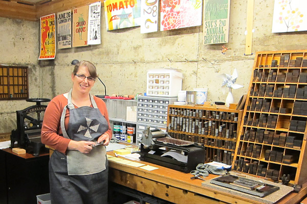
UP CLOSE WITH LAURA BENTLEY When I was young I enjoyed doing artsy things, but in college I went a different direction and got a Computer Science and Accounting degree.  By day I’m a computer consultant mostly for a dance studio that teaches social dance—ballroom, salsa, and swing.  I run their website, set up their sales system, and do their bookkeeping. So, I’m a hobby letterpress printer, and try to squeeze in time to print when I can.  I also volunteer as a teaching assistant for the letterpress classes at SVC (School of Visual Concepts) in Seattle.

INK IN THE BLOOD I first took a class at SVC in Seattle.  I was hooked right away.  Exploring the school shop felt like a treasure hunt.  With my first printing projects I tried to include as wide a variety of type and ornaments as possible, and enjoyed the challenge of typesetting them in crazy but-still-safe-to-print ways. I love typesetting and using the vintage equipment.  I was thrilled to find an art form where I could use my attention to detail and logistics to produce results.

EXCEPTIONAL IN THE EVERGREEN STATE My print shop is in the basement of my house.  The walls are unfinished, but colorful with printed work.  I have an 1863 Gordon platen press, a tabletop No. 0 Vandercook proofing press, and a very cute sign press that I use for proofing type.  I have two cabinets of type, and I’m always trying to be creative with how to fit in more.  I also have a 16” Challenge paper cutter that I fixed up real pretty.  My favorite thing about it is the old vintage equipment— I like to think about all the work they printed over their lifetimes.

PRINTING LEGACIES I feel blessed to be part of a printing community that is filled with talented printers who are very generous with their knowledge and time.  Two of my favorite mentors are Jenny Wilkson and David Black.  Jenny is the manager of the SVC shop and has a talent for developing students to do their best work no matter what style of printing—dainty and detailed invitations to raw and chunky posters with wood type.  She always has suggestions for projects that take them to the next level.

David Black is a fellow teaching assistant and a print artist.  I personally consider him a mechanical genius as he can fix almost anything, and has a real gift for explaining how things work.  But what inspires me most is that he makes time to print most every day.  He once printed a little card that had a tiny ornament of a car and the text said “Tiny car”; only black ink on white paper.  It was a great reminder to me that you don’t always have to be printing big extravagant projects, but can print quick fun things, and you’ll learn something with each new thing you print.

PRINTER’S PARADISE I design what I print. But that’s probably expected for a hobby printer; I don’t do job work.

PRINTING FEATS Our printing community just finished up a project where we partnered with a non-profit group of writers that works with patients in Children’s Hospital to help them write poetry.  Sixteen printers each printed a broadside of a poem, to create an edition of poems that are bound in a portfolio.

It’s always a challenge to design something to catch the spirit of someone else’s words and imagery. Also the edition size was 100, which with five print passes was a huge printing project for me.  I had never printed an edition of that size before.

BOXCAR’S ROLE Boxcar Press has helped me with the above broadside project, and others, by producing quality photopolymer plates.  I love handset type for hobby work, but for more flexibility and efficiency, it’s hard to beat photopolymer.

PRESS HISTORY A gentleman named Carl Montford, the self-nicknamed “press matchmaker,” matched me up with an 1863 Gordon Franklin press.  It was in the basement of a local artist that wasn’t using it anymore.  It’s a great match for me, because it’s a smaller platen press (chase about 7 x 11) and we needed to get it down into my basement.  The press would be a little wonky for production work, but it suits a hobby printer like me just fine.

SHOP TIPS Listen to your press.  Listen to it when it’s printing well—learn the pattern of sounds it makes.  Then someday when it makes a noise that’s new and unfamiliar you’ll notice it and be able to tend to it before things go awry.

WHAT’S NEXT Need to fix some inking issues with my platen press, and print more!

Big thanks out to Laura for letting us take a look at the wonderful whirl at Pinwheel Press!