How to Easily Outline Fonts into Vector Shapes

One of easiest ways to ensure smooth sailing from file to plate is to outline your fonts into vector shapes if you are using either Adobe Illustrator or InDesign. Outlining text into shapes frees you of the troublesome worry of whether you need to send along your fonts or embed them with your file. It also lets you add strokes to thinner fonts with ease – since the text becomes a vector shape, you’ll have more control over how each character looks.

Here’s the scoop in three simple steps:

•    Select the text with your black arrow tool in either Illustrator or InDesign. The black arrow tool is your default selection tool.
•    Select TYPE>Create Outlines.
•    Click anywhere that is blank on your art board and voila! Your text is now converted into fully editable vector shapes!

If the text looks a little thicker than usual, don’t panic! Simply deselect your text or click anywhere on your art board to deselect it and you’ll find that your text looks completely normal.

Did You Know That … Checking Line and Dot Thicknesses Is a Cinch?

One of the most common issues we face here in the Platemaking Department at Boxcar Press is determining a sufficient line thickness. Making that ruling means explaining to customers two things – how do you go about checking to see if lines or text are thick enough to hold on your particular plate? What’s the thinnest line that can hold on the plate?

Surprisingly, there’s just one tool you need to utilize in either Adobe Illustrator or InDesign: The Line Tool. If you are using Adobe Photoshop, the Line Tool unfortunately reverts to a minimum line thickness of 1pt. If you are only using Adobe Photoshop to create your file, we highly recommend placing your final file in InDesign and using the Line Tool to check your work.
LINETHICKNESS_IMG1-1

What do we mean when we talk about our line thickness guarantee? Simply put, if your lines meet or exceed the line thickness as outlined below, we will guarantee they will hold on your plate. If they are under that thickness, it’s hit or miss. Some days you are lucky and other days, you might lose details.

The first thing you need to determine is your line thickness based on your plate type:

– If your plate type is the KF 95, Jet 94FL, or 94SB, you have a line thickness guarantee of 0.25pt or thicker.

– If your plate type is the KF152, 152SB, or 145SHSB, you have a line thickness guarantee of 0.35pt or thicker.

– For all plate types, your dots (like the ones above the letter “i”, periods, or dotted lines) must be 1pt to 1.25 pt or thicker.

THINK FAST! Quick quiz here – what is usually the most common culprit of too thin lines? Crop Marks! More on that later.

Here’s how to use the handy Line Tool to check to see if your lines are thick enough (and plate friendly, too):

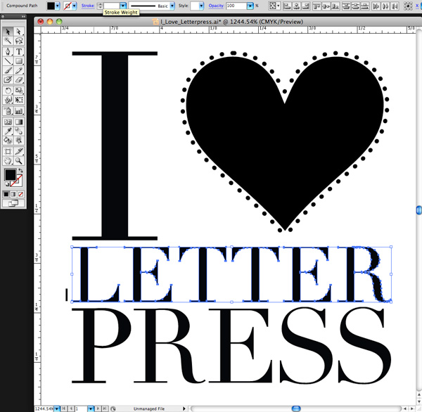
You need to first open your file in either Adobe Illustrator or InDesign. We’ll be using a small type sample in Adobe Illustrator to check to see if our lines are plate-friendly for a KF152 plate type. The KF152 plate type has a line thickness minimum of 0.35pt for lines and 1pt to 1.25 pt for dots. We can see that it looks like there are some thin lines in the serif of the Didot typeface… but will they hold?

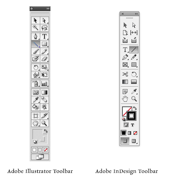
First, click the Line Tool icon in the tool palette on the lefthand side of the screen in Adobe Illustrator to activate it. If you cannot find it, hover your mouse over the icon that looks like a line to see “Line Segment Tool ()” pop up in a yellow box .

Next, in the control panel up at the top, we’ll select the words “1 pt.” in the dropdown area next to the word “STROKE” with our mouse. You’ll be substituting the “1 pt” and replace it with “0.35pt”.

letterpress file prep tips from Boxcar Press

We’ll select the Zoom tool (Z) and move in because we’ll be doing some close up viewing in the area you are inspecting. Select the line segment with your mouse and move it so it is right next to the bottom part of the “L” in “Letter”. Draw a short line so it is parallel with the thin line you are checking on your art board. It doesn’t have to be very long but this little line segment will be our “ruler” to compare thicknesses.

letterpress file prep tips from Boxcar Press

At this close magnification, we see that our line segment set at 0.35pt is much thicker in comparison to the thinnest line in of the serif on the letter “L”. We will need to add a hairline stroke to boost our text’s thickness to correct this.
letterpress file prep tips from Boxcar Press

To add a stroke, using the selection black arrow tool (V), select all the characters in the word “LETTER.” In our Control panel at the top our screen we should see that the letters only have a fill and that we’d like to add a hairline stroke (about 0.15pt). Click the white area next to “STROKE” to activate the area so we can type in “0.15pt”. Immediately single-click the white area anywhere on the board. This will deactivate your selected text and add the hairline (0.15pt) stroke.

letterpress file prep tips from Boxcar Press

Zoom in again using the Zoom Tool around the line segment we created with the Line Tool and the letter “L”. We can now visually see that the serif on the “L” is as thick as the 0.35pt line. Success!

Delete your line segment and zoom back out. Continue around your artboard to visually check to see if other areas look “safe” as well.

For dots, such as the ones around the heart shape, we’ll need to set our Line Tool weight to “1pt” just to be on the safe side. We’ll repeat the same steps mentioned above to create the line, to zoom in, and visually compare the dots’ diameter against the 1pt line segment we just drew on our art board. Like the thinner lines on the “L”, we’ll need to correct this by adding a much thicker stroke of 0.3 pt to boost our dots’ diameter up to 1pt.

Using the Line Tool to check your work should be a “Must Do” test before submitting your files to your platemaking ticket. If anything appears too thin, you will need to correct it.

A few final instructions to help you be aware of potential trouble spots:

-When creating crop marks in your files – the program default setting is often 0.2 pt or 0.25 pt. Keep this in mind so you can make the necessary changes to your crop mark thickness when you place them.

-Thin lines that curve, particularly in wispy script or calligraphic fonts, are always suspect for being too thin. Give them the support they need to hold on the plate with hairline stroke (if needed).

Stay tuned, letterpress lovers — next we’ll solve the mystery of how to create multiple color files!

Related Blog Posts

Learn to Love Color Separations – A Boxcar Press Checklist
Did You Know That … 100% CMYK Black Is a Breeze?

Microscopic View

Here is a part of a very common printer’s tool. Can you identify it? Here’s a hint: rhymes with coin fee.
letterpress print toolsletterpress print tool

Boxcar Talk With Ivan Gulkov

Printer and designer Ivan Gulkov first molded his passion for print in the colder climates of Siberia, Russia before turning out clean, modern collections at Pillowface Press that pay homage to the printing roots in the sunny state of California. Now, Gulkov balances the cool with the fun, with a nod to the old while creating the new. And he does it in spades.

Read on to get the full scoop.

Ivan Gulkov of Pillowface Press shares the full scoop on his background and printshop

SMOTHERED IN INK My name is Ivan Gulkov. I hail originally from the frozen wastes of Siberia, though currently reside in sunny California. PILLOWFACE PRESS is a small printmaking studio I set up to experiment with handset typography and photopolymer. Until recently, ours was one of the most traditional and conservative trades. For five hundred years, the tools and techniques of assembling type have not changed. Fonts were discreet, tangible things, you experienced on a physical level. In every letter, every space and ruler, there was a trace of the creators hand. Computers changed everything.

Continue reading

Getting ready to send out new Bella Figura albums

By the time you read this, stores will already be receiving their new 2012 albums that we have worked so hard on for the past several weeks and months. Within these pages, we have poured so much love & energy to present a DAZZLING selection of new envelope liners, new embellishments, new designs! Can’t wait to show you! To see it in person, go to the Bella Figura website & click on the link that says “Find a dealer“. Enjoy the feast for your senses!
bella figura 2012 albumsbella figura 2012 letterpress albumsbella figura swatches

A Facelift For Brittle Photopolymer Plates

Are your polymer plates starting to curl at the edges?

Like our skin, plates can be affected by the weather and age. When humidity levels are low, the plates can look and feel brittle. And with the passage of time, the thinner polymer on the edges of the plates are pulled towards the denser polymer text and images on the front which causes curling. There is a natural aging of the plates as they do have a limited life expectancy but we can offer a few simple steps that can hydrate and give extra life to your plates.

Printight, maker of Toyobo plates KF95 and KF152, offers these suggestions if you have a platemaking system. Boxcar also gives similar steps for the majority of you who are without such equipment.

1. Place your plate back in the washout system for one minute or immerse in water. We suggest room temperature for a quick dunking, a minute may only be necessary if your plates are severely curled.

2. Sponge off the water and place back in the drying oven of the platemaker for 5-10 minutes. We also suggest, alternatively, a hair dryer to warm the plate and make it more pliable (placing your plate in a box and blowing the hair dryer into the box will keep the warm air more contained).

3. After the plate warms and starts to uncurl, place the plate in its bag and set a heavy object on it to keep the shape.

This should help your plates relax so you can adhere them to your base for additional print runs. Some warnings for you – take care to avoid putting your hair dryer too close to the plates and be patient as warming the plates takes time. And watch that you don’t handle them too roughly after the wash and during drying so your relief images don’t chip.

Store your plates flat. One last tip, you may have to check your adhesive backing to determine if it needs to be re-applied to the back of your plate for a secure hold on your base.

If you have some storage and uncurling tips, tell us about them so we can share. It’s great when we can all learn from each other!

Lou is building his own igloo

He’s been working steadily printing Smock cards. Soon he will have his own private enclosed digs!
letterpress printers love papersmock everyday letterpress igloo

Running Windmill

The sleep machine is running, unaware it is being watched. Long out of production, this Heidelberg 10 x 15 windmill letterpress still runs smoothly & precisely with the loving care it has been given over the decades. If you listen closely, you can hear it breathing & purring as ink is pressed to downy white cotton paper.

Filomena Press visits Boxcar Press

We love when the people we get to work with come to our shop for a visit! Annie came all the way from Monterrey, Mexico to tour the Boxcar Press studio, and we were thrilled to have the opportunity to show her around the shop (and the city of Syracuse) a few weeks back.

Annie, a printer from Mexico who runs the shop "Filomena Press", came to Boxcar Press in November for a tour of the shop..

Annie works with us for photopolymer plates, and we’re amazed by the printing she’s been doing lately. Click here to visit Filomena Press on Facebook to check out some of Annie’s work!