Here in the pre-press department at Boxcar Press, we unapologetically love 100% CMYK black. It’s the best way to send your files 95% of the time. However, on occasion, when you are printing in two (or more) colors, you may be interested in setting up your file in spot colors or using Pantone swatches.
CMYK
To first understand spot colors, let’s go back to CMYK process colors. We like your files to be 100% of the black only of the CMYK process.
- C= Cyan
- M= Magenta
- Y=Yellow
- K = Black

100% CMYK black means black is 100% and C,M, and Y are set to 0%. There is only one color channel visible/used and the other 3 colors are missing and/or removed. If going this route, we are not looking for 100% of all of the color channels – just black.
If you want to print with spring green, in the process color system it might be made up of Cyan 63.5% and Yellow 100%. The mix of these two colors does not work for letterpress and for this, we turn to a spot color approach.

Spot Colors
In letterpress, for a good film and plate, you want just one color and not percentages of other colors. In this example, you want spring green in a spot color or Pantone Swatch.
In contrast to just using 100% CMYK black, a spot color is a special per-determined color, usually identified by a Pantone PMS number or name. The PMS number will come from a color-matching library. Illustrator and InDesign both have color-matching libraries. For letterpress, you will want a solid spot color, usually from the color library of the Pantone + Solid Uncoated book. A spot color is a separate channel from your CMYK process colors.
Where do you access these libraries to choose your color?
With Adobe Illustrator:
Select your swatches from the color book library

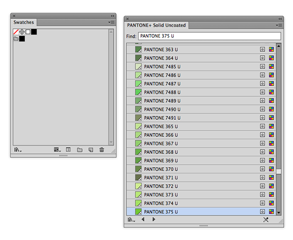
(1) From the navigation bar at the top – Click Window > Swatches. A Swatch palette window will open. In the upper right hand part of that window, there is a set of 4 lines with a small drop down arrow (this icon indicates a fly-out menu). Click on this to open a list.

(2) Scroll to almost the bottom to Select > Open Swatch Library. Click on this for another list of options. Select > Color Books. Another click here to Select > Pantone + Solid Uncoated. A click on this will open this color-matching library with your spot colors.
(3) The top colors are the Pantone colors such as Warm Red and Purple. Next are the Fluorescent colors followed by Metallics. After that are all the PMS colors by number found in this color library (and your formula guide, if you have one).

Use the Find space to type in your PMS color number. Click on the color to add it to your Swatch palette where you can now apply it to any text or image in your art board.
We now have spring green defined by Pantone 375 U in our swatch palette and our text is 100% of 375 U. Notice that the spot color will also show up on your Separations Preview window also, at the bottom below the CMYK colors.

With Adobe InDesign, load your color library swatches:
(1) From the navigation bar at the top – Click Window > Color > Swatches. A Swatch palette window will open.
(2) In the upper right hand part of that window – there is a set of 4 lines with a small drop down arrow (this icon indicates a fly-out menu). Click on this to open a list.

(3) Select at the top – New Color Swatch – and a window will open. Change the Color Type to Spot. Click on Color Mode for the list of color libraries and change CMYK to Pantone + Solid Uncoated. Choose your PMS color and it will be added to your swatch window so you can apply it to any text or image on your art board. Your spot color will also show up on your Separations Preview window, at the bottom below the CMYK colors.

When might you want to use spot colors on your files?
You may also be printing in two or more colors that touch each other. Sending a spot color file will help us output and trap correctly for you. If you are setting up a file to show color selections to a client, it is helpful to choose the actual ink colors for printing by their spot colors. (Please note that unless your monitor is calibrated correctly the on screen color may not match exactly the printed color).

When it’s time to submit your files to our pre-press department, we can output with those spot colors and provide a plate for each color. We encourage you to try your color libraries and some spot colors on your own so you can enjoy a little burst of Pantone in your files.


