File Preparation Tips: Deciphering Spot Colors and Your Swatch Palette

Here in the pre-press department at Boxcar Press, we unapologetically love 100% CMYK black. It’s the best way to send your files 95% of the time. However, on occasion, when you are printing in two (or more) colors, you may be interested in setting up your file in spot colors or using Pantone swatches.

CMYK

To first understand spot colors, let’s go back to CMYK process colors. We like your files to be 100% of the black only of the CMYK process.

  • C= Cyan
  • M= Magenta
  • Y=Yellow
  • K = Black

Spot-colors-IMG9

100% CMYK black means black is 100% and C,M, and Y are set to 0%.  There is only one color channel visible/used and the other 3 colors are missing and/or removed. If going this route, we are not looking for 100% of all of the color channels – just black.

If you want to print with spring green, in the process color system it might be made up of Cyan 63.5% and Yellow 100%. The mix of these two colors does not work for letterpress and for this, we turn to a spot color approach.

Spot-colors-IMG12

Spot Colors

In letterpress, for a good film and plate, you want just one color and not percentages of other colors. In this example, you want spring green in a spot color or Pantone Swatch.

In contrast to just using 100% CMYK black, a spot color is a special per-determined color, usually identified by a Pantone PMS number or name.  The PMS number will come from a color-matching library. Illustrator and InDesign both have color-matching libraries. For letterpress, you will want a solid spot color, usually from the color library of the Pantone + Solid Uncoated book. A spot color is a separate channel from your CMYK process colors.

Where do you access these libraries to choose your color?

With Adobe Illustrator:
Select your swatches from the color book library

File prep & How to Use Spot Colors for letterpress plates: Adobe Illustrator showing how to access Pantone Swatches (Pantone + Solid Uncoated swatch library book).

(1)  From the navigation bar at the top – Click Window > Swatches. A Swatch palette window will open. In the upper right hand part of that window, there is a set of 4 lines with a small drop down arrow (this icon indicates a fly-out menu). Click on this to open a list.

Spot-colors-IMG7

(2) Scroll to almost the bottom to Select > Open Swatch Library. Click on this for another list of options. Select > Color Books. Another click here to Select > Pantone + Solid Uncoated. A click on this will open this color-matching library with your spot colors.
(3) The top colors are the Pantone colors such as Warm Red and Purple. Next are the Fluorescent colors  followed by Metallics. After that are all the PMS colors by number found in this color library (and your formula guide, if you have one).

illustrator-pantone-color-library-book-1

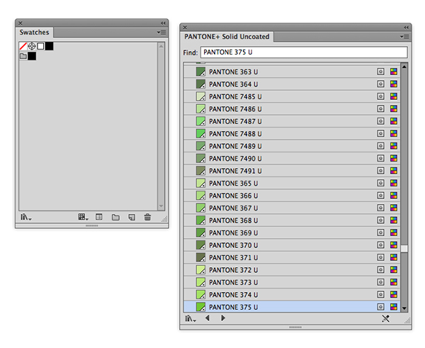
Use the Find space to type in your PMS color number.  Click on the color to add it to your Swatch palette where you can now apply it to any text or image in your art board.

We now have spring green defined by Pantone 375 U in our swatch palette and our text is 100% of 375 U. Notice that the spot color will also show up on your Separations Preview window also, at the bottom below the CMYK colors.

Spot-colors-IMG13

With Adobe InDesign, load your color library swatches:

(1) From the navigation bar at the top – Click Window > Color > Swatches. A Swatch palette window will open.
(2) In the upper right hand part of that window – there is a set of 4 lines with a small drop down arrow (this icon indicates a fly-out menu). Click on this to open a list.

Spot-colors-IMG6

(3) Select at the top – New Color Swatch – and a window will open. Change the Color Type to Spot. Click on Color Mode for the list of color libraries and change CMYK to Pantone + Solid Uncoated. Choose your PMS color and it will be added to your swatch window so you can apply it to any text or image on your art board. Your spot color will also show up on your Separations Preview window, at the bottom below the CMYK colors.

File prep & How to Use Spot Colors for letterpress plates: Adobe InDesign showing how to access Adobe Pantone + Solid Uncoated swatch library.

When might you want to use spot colors on your files?

You may also be printing in two or more colors that touch each other. Sending a spot color file will help us output and trap correctly for you. If you are setting up a file to show color selections to a client, it is helpful to choose the actual ink colors for printing by their spot colors. (Please note that unless your monitor is calibrated correctly the on screen color may not match exactly the printed color).

Screen shot 2016-07-13 at 12.28.00 PM

When it’s time to submit your files to our pre-press department, we can output with those spot colors and provide a plate for each color. We encourage you to try your color libraries and some spot colors on your own so you can enjoy a little burst of Pantone in your files.

Crop Marks and Registration Marks – A Printer’s Tool

When prepping a file for platemaking (or any printing job), you may find yourself deciding between crop marks and registration marks. Not sure which one to use? We’ve put together some scenarios where you might find these tools helpful — but first, we’ll start with some definitions and distinctions between the two.

Crop Marks Or Trim Marks:

Crop marks — also called trim marks — thin lines placed at the corners of your artwork that indicate where to trim your finished project. If your paper is larger than your final cutting size, it is helpful and sometimes crucial to include them. Crop marks help the person cutting to know precisely where to cut your piece.

When might it be important to have paper that is larger than your final size rather than a pre-cut size? For presses that grip the paper, using a larger sheet and making a finish cut allows you the paper edge or space to grip and guide the paper while printing, and provides space for you to use a guide pin (which may leave a mark on the paper).

An example of crop marks on a film negative and printed via letterpress.

Crop marks become crucial if you are printing a bleed (which is a design that runs to the edge of the finished piece). A design with a bleed is one where the artwork extends a minimum of 1/8″ past the edge of the finished design. Extending your artwork past that point prevents a blank or unprinted area from showing up along the edges of your design.

Crop marks are added during the design stage of a project, and are an option in most design software. We’ll share tips for adding them below.

Registration Marks:

Registration marks are used when you have a piece that will have multiple applications during production. This could mean two or more letterpress ink colors, die cutting, foil stamping, or embossing. Registration marks are important for precision and placement.

An example of mis-registered multiple color letterpress print.

A piece that is mis-registered (as shown above) will show elements that may be side by side when they should have been on top of each other. There are many different forms of registration marks, but the most common are the “crosshairs” or “target” style marks, color bars and even using the lines of crop marks.

An example of registration marks in the bulls eye or crosshair design on a two-color letterpress printed piece.

These marks will eventually be trimmed off the final piece, and registration marks should also have crop marks added, too. Registration marks will appear on each plate that you make, and they should be aligned to overlap perfectly.

Creating Crop Marks

When creating crop marks in Adobe Illustrator there are two ways to make them:

Option One

Create crop marks in Adobe Illustrator by drawing a box using the rectangle tool (M) with no stroke or fill color the same size and position as the final trim. Using the direct selection arrow (the white arrow tool), click on the box. In your color window, turn off the stroke by clicking the red diagonal line (none).

Step-by-step illustrator instructions from Boxcar Press on how to set up crop marks and registration marks

Now click EFFECT > CROP MARKS (for all versions of Adobe Illustrator). You may also use OBJECT > CREATE TRIM MARKS (this is only available for Adobe CS6 and above). Lines will appear on each corner of the box.

Step-by-step illustrator instructions from Boxcar Press on how to set up crop marks and registration marks

With the box still selected, click OBJECT > EXPAND APPEARANCE. You can now modify your crop marks, if needed.

Step-by-step illustrator instructions from Boxcar Press on how to set up crop marks and registration marks Step-by-step illustrator instructions from Boxcar Press on how to set up crop marks and registration marks

Option Two

Set your art board in Adobe Illustrator to the final piece size. You can set this when you click FILE > NEW and put your measurements in under length and width. If your art board is already open, select FILE > DOCUMENT SETUP > EDIT ARTBOARDS and resize if needed.

Once you are done creating the file, you can save it as a press quality PDF by going to FILE > SAVE AS > ADOBE PDF (file format).

A window will open – choose Press Quality PDF from the Adobe Presets dropdown at the top. On the left, select MARKS AND BLEEDS and click trim marks. You can also set your registration marks by clicking on the Registration Marks box. NOTE: The default trim mark thickness may be less the the required minimum line thickness for your plate type, so adjust this to be higher, if needed.

Step-by-step illustrator instructions from Boxcar Press on how to set up crop marks and registration marks

In most printing jobs, registration marks and crop marks should always be in Registration Black. That means they will show up on every color plate and will not affected by spot colors or other special markings added in design.

Feel free to contact our prepress team if you’re not sure if you need crop marks for your next plate order. They do add additional space and cost to your platemaking ticket, but may save you time and money in the long run.

Fresh Letterpress Fun: A Springtime Vector Set!

Spring seems to be coming a bit early here at Boxcar Press and we thought you’d enjoy a free spring themed vector set to kick the season off right! This vector set includes a festive pair o’lucky St. Patrick’s Day graphics, a typographic spring greeting, and to top it off… a trio of finely crafted Ukrainian Easter Eggs! All are free for use and in both EPS and PDF format. Enjoy!

A free springtime vector set from Boxcar Press

Local AIGA Branch Tours Boxcar Press

Boxcar Press started off February with a tour group from the local branch of the AIGA. These tours are a great opportunity for us to not only show what our company has to offer, but also helps us encourage and inspire people to pursue designing for letterpress projects. The group size consisted of about seven graphic designers. They showed great interest in the process from design to platemaking all the way to finishing.  Everyone enjoyed watching the printers at their windmills and rubbing their fingertips over the impression in the paper.  As letterpress continues to grow in popularity, we find graphic designers who visit are more knowledgeable about the craft than just a couple of years ago. A big thanks to these designers for stopping in!