Important Numbers to Remember in Boxcar Platemaking 101

Everyday at Boxcar Press we throw around these numbers on the phone, in emails and to each other.  Some of us have even been known to mumble them in our sleep at night.  What makes them so special above all others?  See if you can guess what each one stands for.

94, 95, 145, 148, 152, 175: all of the plate types sold by Boxcar Press. The higher the number, the thicker the plate. 94 and 152 are available as both plastic backed and metal backed plates. If the number is followed by “SB”, it is a steel backed plate, not the number of stolen bases.

1:00: the time designated as the cut off or deadline for ordering same day rush service – 1:00pm EST to be exact.

6:00: the cut off time in the evening (again, Eastern standard time!) for creating a job ticket and submitting files for one day turnaround.

17 and 22: the largest plate size we can make in our platemakers that will fit on our Vandercook proofing press.  If your files measure greater than 17″ x 22″, break them up and submit 2 files.  You can always put them back together on your press to make letterpress love.

62 and 67: pricing per square inch for platemaking – $0.62/sq. inch for plates with the number 94 or 95 in their plate name; $0.67/sq. inch for plates with the number 145, 148, 152 and 175 in their plate name. And for some of you, ’67 may have meant the summer of love in San Francisco.

30: minimum charge for platemaking – $30 per job ticket.  Also the cost of overnight air shipping via UPS in the US.

.35 and .25: the minimum guaranteed line thickness for our plates measured in points (pt).  Lines should be .25pt for 94/95 plates and .35pt for anything larger.  Remember, dotted lines are considered dots and not lines.   Dots have their own special numbers and shouldn’t feel slighted at all.

1 and 1.25: preferred dot thickness for our plates, also measured in points.  Proper dot thickness helps those individual, stand-alone-by-themselves dots to stand firm and tall and press boldly into your paper.

0.5: the number in inches we add to your platemaking dimensions for the height and width.  This half inch is needed for the platemaking process.

.875 and .853: the thicknesses for the standard Boxcar base and the deep relief Boxcar base.  And some really good bowling scores after 3 games.

.918: this is an easy one. This refers to type high, or the standard height of type.  However, it also could refer to the Porsche 918 Spyder or the name of a letterpress club at the Lancaster Heritage Center Museum Print Shop in Lancaster, Pennsylvania (the 918 Club).

Now these numbers will have special significance for you too!

Did You Know That … 100% CMYK Black Is a Breeze?

One of the more common questions we receive here in the Platemaking Department at Boxcar Press is: how do you check to see if your file is set up properly for color separations? Or in 100% CMYK Black (100%K where CMY are at 0%)?

One of the easiest ways is utilizing the Separations Preview palette that Adobe InDesign and Illustrator programs offer. To view the palette, simply select the following:

-In Illustrator (CS4 or above) WINDOW>SEPARATIONS PREVIEW
-In Indesign (all versions of CS) WINDOW>OUTPUT>SEPARATIONS PREVIEW

If you are using a version of CS3 or earlier, you will need to save your files, then place them into InDesign to check your color separations. In Adobe Illustrator CS3 or earlier, the separations preview window feature is not available.

separations-preview-palette-illustrator-indesign

Let’s examine how a file separates out using Adobe Illustrator.

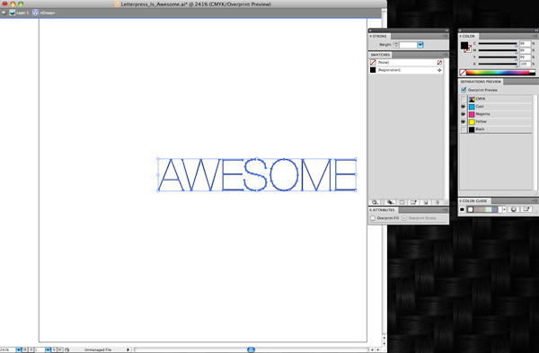
If you are in CMYK mode, then you should see in the Separations Preview palette CMYK, Cyan, Magenta, Yellow, and Black. If you do not see all these colors, you are most likely in RGB or a different color mode and need to switch to CMYK mode. You can easily do this by clicking on FILE>DOCUMENT COLOR MODE>CMYK. Once you are in CMYK mode, click the box next to “Overprint Preview”, which will allow you to see what objects in your file do or do not have a certain color applied to it.

Let’s start with this nifty type sample in Helvetica Neue Ultra Light of “Letterpress Is Awesome”. We can see that it looks like all of the text is in black. Let’s take a look using the Separations Preview to see what colors we truly have here.

CMYK Separation instructions from Boxcar Press

If we click the eye graphic next to “black”, all objects containing ONLY black will disappear, as we’ve turned off that particular color channel. What we have left is the word AWESOME but it’s now a funny shade of black. This indicates it is not in 100% black, but rather is made up of parts of cyan, yellow and magenta in addition to black. We don’t want this as it will cause errors in your film output. Easy fix, though. But first we need to access another window in our toolbox. If it isn’t already open, you will need your Color Window.
(WINDOW>COLOR)

Select the remaining text by clicking on it. In your Color window you will clearly see it is made up of parts of CMYK.

CMYK Separation instructions from Boxcar Press

Move your cursor to the bottom far right of the color window to where there is a white rectangle over a black rectangle. When you are over the black color, the cursor should change to an ink dropper. Select the black and it will change your text to 100% black. See, the sliders moved to 0 for CMY. This text should disappear. Don’t worry! It’s good. Go back to your Separations Preview and click on the eye next to black. Everything reappears. Click off the eye and all items in 100% black only will disappear. That should be your test before submitting your files. If anything is remaining, it needs to be corrected.

If you are printing in another color and need a second plate for that color, your file should be set up to have those objects assigned to a spot or Pantone swatch color for multiple color printing. Stay tuned for our next blog post where we demystify multiple color files!

Learn to Love Color Separations – A Boxcar Press Checklist

To guarantee a happy, press-ready Boxcar plate, follow our Top 10 checklist before finalizing and clicking UPLOAD to your job ticket. These handy steps will go a long way towards a smooth, quick platemaking turnaround. If you are having files created for you – pass these on to your graphic designer so they too can follow this Boxcar Checklist.

1 ) Are the file dimensions 17″ x 22″ or smaller? Is the file size less than 26 MB? (Our maximum plate size that we can proof at this time is 17″ x 22″ – if you need larger, please call.)

2 ) If my plate type is the KF95, Jet 94FL or 94SB, are my lines 0.25 pt or thicker? Are my dots 1 to 1.25pt thick? Dots (in a dotted line or by themselves) need a greater minimum thickness so they can hold on the plate by themselves.

3 ) If my plate type is KF152, 152SB, 145HSB, or 148SHSB, are my lines 0.35 pt or thicker? Are my dots 1.25pt thick?

4 ) If I created the art in Illustrator or InDesign, is the artwork in 100% CMYK Black (as in 0% Cyan, 0% Magenta, 0% Yellow, and 100% Black)?

5 ) If I’m doing color separations, are they assigned to a spot color or a Pantone Swatch Color?

6 ) Is my text outlined into vector shapes if I’m using InDesign or Illustrator for the text? (You can convert them to shapes by selecting the text and going to Type>Create Outlines in either Illustrator or InDesign.)

7 ) Have I indicated what linescreen (LPI) I’d like in the comments section of my ticket if my image is in greyscale or halftone and I want to keep the tonal qualities of the image? (We like 100 lpi for all plate types)

8 ) Is my image converted into bitmap mode of tif if I’m using only Photoshop (and not choosing a linescreen) ?

How to easily create an image in bitmap mode of tif:

    • Opening your image in Photoshop and selecting Image > Mode > Grayscale*.
    • Select Yes if a window asks about discarding color.
    • Then Select Image > Mode > Bitmap. A window will pop up looking for info – use a resolution of 600-1200 dpi and an output method of 50% threshold.
    • Save your file as a tif (with LZW Compression) and either send us the tif or place your tif into illustrator or indesign.
    *Images in higher resolution (600-1200 dpi) will give better, finer results than images in lower resolutions (72-300 dpi). If your images lose a lot of detail, you can either re-scan or adjust your levels of black (Image> Adjustments> Levels or Brightness Contrast). For info on this, please call 315-579-3366 for instructions.

9 ) If I have added crop marks to my file, do they meet the minimum line thicknesses? Are they in registration black if I have more than one color?

10 ) We don’t need a faxed hard copy of the file, simply a PDF and the original file. Are these both uploaded? (e.g, an .EPS and PDF of the same file.)

Stay tuned for more in-depth blogging on file prep when we amaze you with “Did You Know That…”!

Boxcar Talk With Jackie Robinson

Jackie Robinson is wonderful letterpress gal creating beautiful designs with 42 Pressed. Armed with typographical know-how and an acute attention to detail, Robinson’s work has been hit after hit with her letterpress customers. Read on to get the full scoop on this extraordinary lady of letterpress!

Can you tell us a little about yourself?
My name is Jackie Robinson and I am the owner/creative director of 42 Pressed. I live in St. Augustine, Florida with my husband, two dogs and brand new baby girl, Riley Magnolia Robinson. We also spend a lot of our time at our other house in Charleston, South Carolina, where my family lives and hope to get back to one day!

How did you first get involved in letterpress?
I went to grad school at a small portfolio school called the Creative Circus. I studied graphic design there and had a professor, Berwyn Hung, who was a big letterpress printer. It wasn’t until after I graduated that I really got into it, and he taught me everything that I know. After I started messing around with designing stationery and doing a few wedding suites for friends and for my own wedding, it just kind of clicked that this was what I wanted to do.

Tell us a little about your design process.
I really like to think out of the box and be different. My design style is heavily based on typography (I love type) so you will see a lot of that throughout my lines. When I am designing for a wedding, I really try and hit all different styles and imagine myself a bride again who wears Jcrew, one who is a hippie, one who is classic and chic, etc. and I pretty much establish a style that seems to fit every bride in their own right. My line appeals to pretty much everyone who likes to be a bit different and stray from the ordinary. I love using different materials and textures; I love to pair rough with delicate. I really just like to play with the unexpected.

When did you start printing?
42 Pressed has been operating since November of 2009.


What are some accomplishments you are proud of?
I am proud and fortunate to have gotten lots of great press: we’ve been featured on Martha Stewart, countless amazing blogs, and recently landed on the cover of Stationery Trends. We also attended our first National Stationery Show in May of 2010 and landed in 30 stores nationwide as a result.

How has Boxcar Press helped you with your business and printing?
Honestly, so so much! I was using Magnesium that was mounted on wood for my plates for a long time. I had issues with warping, with the magnesium pulling off the wood etc. Yes, it’s true that the mag mounted on wood is what real letterpress is all about, but the photopolymer plates have given me so much less of a headache. I know what to expect from them every time, and it’s a great product that I can rely on to get the job done well without the added stress that letterpress sometimes brings. If you are a letterpress printer, you know so many things can go wrong, so it is nice to eliminate a problem all together, and Boxcar plates help me do that.

What was your very first press? Was it love at first sight?
My first press was a Vandercook 15-21 and is still my only press. It has an adjustable bed which I love, it would be hard to bring on another press since I am just so in love with the one I have currently.


Describe your print shop. Any cool or nifty things about it?
It is fun, lots of color, lots of sunshine pouring in, dogs lounging around, music is always blasting. It’s definitely an inspiring space to be in.

Any neat tricks or advice you can share?
Never let a letterpress defeat you or frustrate you, always try and solve the puzzle and win.

What plans do you have for 2012 that you’d like to share?
Well, we just had our first baby!! So things have been insane around here, but I am starting to get back into gear again and think about the 2012 stationery show that we plan on attending. There will be a lot more ready made things, and I am also planning on designing and releasing new products once a month (ready made items) to keep us fresh and new with limited quantities. Stuff will go fast and remain relevant and in the now!

Many thanks to Jackie for letting us take a sneak peek into her shop and hard work! Check out out her cool designs at 42 Pressed!

Boxcar Base spotted: Brendan Monroe letterpress art print

Some nice pics of the Boxcar Base + plates in letterpress action at OMG Posters in a post about Brendan Monroe’s really cool new letterpress art print. You can see Brendan’s other letterpress prints here. (This spotting was sent in by Boxcar’s original employee Ben Whitla.) (Photo is from OMG Poster’s blog post)