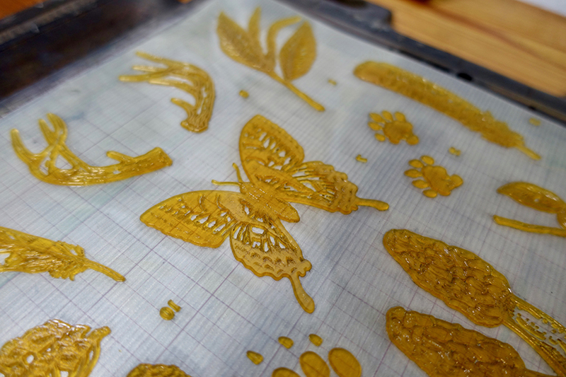
We delighted in the delicate linework in the field guide prints that came across our desks. Illustration artist Clara Cline & letterpress printer Colby Beck of Post Rider Press bring these gorgeous (and highly informative) American field guides to life via letterpress.
ILLUSTRATING FOR LETTERPRESS
CLARA CLINE: I’ve always loved nature, but when I first created the guide for my home state of Virginia I didn’t intend for it to become a series. The print seemed to resonate with folks and I started getting requests for more states, and as I did more I became absorbed in learning about each state’s local ecosystems. It wasn’t until I listened to a podcast about John Audubon’s quest to draw every bird in North America that I decided I wanted to commit to a larger project exploring native species and biogeography.
I’m a big proponent of tailoring your work to the production medium, but I feel like letterpress has influenced my illustration style even more than I expected. As I see the detail Colby’s capable of putting into each print, I find myself pushing more fine lines in my own work. I really value having a print partner who can provide feedback and guidance to ensure that what I deliver is going to translate the best way possible.
THE FINE DETAILS WHILE ON PRESS
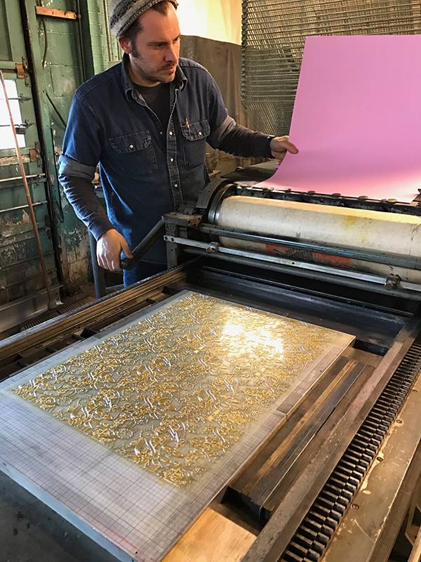
COLBY BECK: My press is a 10×15 Chandler & Price made in 1952 and equipped with a variable speed motor. I named it Carl after it’s previous owner who printed commercially in Northern Virginia and even printed some work for the US government. Carl, the man, passed away and his press was left in the back of a friend’s machine repair shop. We dug it out and moved it down to Richmond, Virginia where I began Post Rider Press.
The Field Guide prints are 11×17 and since I run a 10 x 15 platen press, I have to print them in two sections. The illustrations get printed first because they take more finessing and then the type is printed second. When printing one design in two sections, the key is to keep the ink coverage as consistent as possible. You really have to keep a close eye on them to make sure the type is matching the illustrations so that it appears it was printed all at once.
It really depends on the amount we are printing but the print runs can take at least a full day in the studio. Due to their size, the Field Guides require a good amount of ink, which means stopping to re-ink between every 15-20 prints.
FAVORITE PART OF THE PROJECT
CLARA: That’s such a tough question! There’s so many different phases of this project that I appreciate in their own way. I do quite a bit of research to get a balanced group of species for each state, and it’s been really rewarding learning more about biogeography and our environmental balances.
That being said, as an illustrator it’s such a treat to see your work in letterpress. It’s wildly different going from a flat ink drawing to the richness of texture that letterpress allows, so every time a new guide arrives I feel like a kid at Christmas.
COLBY: I so admire Clara as an illustrator and to watch the detailed lines of her pen work come to life through letterpress printing is magical. I get so excited every time we print another state. It never gets old to watch the ridges of a shell or hair of an animal create a beautiful texture in the paper.
At Boxcar we enjoy the tales and trials shared by printers as they tackle a new project or skill. We feel like we are right along with them (cheering) as they figure out each step, particularly when we can be a small part of the process. And we love when someone sends us the final fruits of their labors. You are our heroes and we’d like to introduce to you one pressman who explored Book Printing. In his own words, meet Dale Raby.
A little bit about me – Ampersand Storybooks produces primarily small single-signature books, written by myself, though we may soon be branching out to begin printing stuff written by others. Our usual fare is serialized runs of just over a hundred impressions.
I have been writing for a few years now. My first novel, The Wives of Jacob, Book I, In the Beginning, was and is only available as an ebook. Now, while most of the customers at my day job were impressed that I had written even one book, let alone three, they were decidedly non-plussed when they found out that my books were only collections of pixels, not “real” books.
I investigated the possibility of getting my work printed into “real” books, but like most beginning writers, I lacked the capital.
Having had a brief introduction to letterpress printing some fifty-odd years ago, I did think about the possibility of a hand-operated tabletop platen press, if I could find one somewhere. I did a little checking and discovered that most presses suitable for this kind of project were also beyond my means.
One day I met a man who was a printer and happened to have an old Craftsmen Superior for sale. A price was named and the deal was done. Three weeks later we moved the press from his pickup truck to mine. Now, like most semi-discarded platen presses, it needed some work, but eventually I was able to start making impressions.
At first I used standard copy paper to print things like receipt templates. Then I went to a local office supply store and ordered a quantity of business cards with nothing printed on them. By the next week, I had some usable business cards, though they were not as flashy as “professional” cards.
I started to frequent Briar Press and Ladies of Letterpress among other locales on the web. I exchanged countless emails with the folks at Boxcar Press, picking the brains of many people there. I’m pretty sure that somebody there must’ve drawn the short straw there every time I got a response to an email! I discovered the magic of photopolymer plates and the Boxcar Base. I gradually acquired more movable type fonts, a couple of line gauges and assorted other items of printer’s paraphernalia. I took a rare day off from work and visited the Hamilton Wood Type Museum in Two Rivers, Wisconsin, which was a very educational trip. Eventually, the dining room became the print shop. I still had much to learn, but by gosh, I was a printer of sorts!
I thought that for my first “real” book project, I would do a single-signature book. The Sasquatch’s Dilemma has only seven pages. The first page is my title page and is not numbered. I decided right away that I wanted my books printed on some good stuff, not copy paper. I did some investigating, got a few swatch books and eventually discovered Flurry paper – a 100% cotton paper.
As Flurry was associated with Boxcar Press, who would be making my plates, I decided that this was a good choice. I did have some concerns at first. I was afraid that the text-weight paper would be too thin and the ink would bleed through it. My initial fears proved unfounded.
The pages are printed upon Flurry cotton text-weight paper and the book covers are made from Flurry 118# pre-scored blank cards. I use a three-hole pamphlet stitch with tails on the outside of the cover for binding. Each book comes in its own envelope, which was designed to fit the card that forms the cover. I plan to continue using the envelope as long as the book is thin enough to fit.
Did I mention I had a lot to learn? There was the question of format. I hit upon the idea of using a pre-scored greeting card as a book cover quite early on. The only thing then was to determine the optimal size. I gave myself headaches learning about paper grain and the proper use of a bone folder. I developed a jig for binding my books. The stitching jig did not look like much, but it worked. After much consideration I decided upon the Flurry 10.5” x 7.25” greeting card. The pages could be cut to 7” x 10” for a folded size of 5” x 7” out of the Flurry text-weight paper. This would give a nice cover overlap such as a hard-cover book might have.
I resurrected an old photo trimmer from my film photography days and learned to trim my pages a few at a time, keeping the scraps to be used eventually for business cards for myself and a couple of other local businesses. The text-weight paper is not really optimal for business cards, but it gets the job done.
Kim and Diane, known as “the Copy Editors” badgered me about various things that were decidedly outside the traditional purview of copy editors. Kim was relentless, and not above using a hammer to get things into my head, so I learned a few more things. I did mention I had a lot to learn, didn’t I? Under Kim’s tutelage, I became familiar with terms like “small caps”, “drop caps”, “orphans” & “widows”. At the time Kim was busy with college but continued to educate me. Kim has since graduated and now works in a print shop… which I think is pretty groovy!
I found many free type fonts out there on the web along with images for my cover image. As most of them were intended primarily for either HTML documents on the web or inkjet printers, not all of them were suitable. Naked Chicks didn’t make the cut as Diane hated it. Kim nixed Comic Sans as “The Devil’s Font”. Crimson Text (now Crimson Pro), Alice, Black Chancery and Typographer Woodcut were all incorporated into The Sasquatch’s Dilemma.
When it came time to order plates, Kim showed me some of her poetry. Shortly thereafter, Ocean Creature was hastily assembled into a second single-signature book manuscript. Both were submitted to Boxcar Press as PDF’s and converted into plates.
Upon receipt of my polymer plates, I started learning about how to correctly assemble the leaves into pages for my book. For those of you who have never assembled a book before, well, suffice to say that it is not quite like one of those books you might have made in first grade bound with an office stapler. I used the proofs provided to assemble a dummy book so I could be sure of printing my books correctly.
When it came time to print, I had to learn how to properly set up and ink the press. Proper inking and roller clearance was fairly important when printing those Typographer Woodcut drop caps at the beginning of each chapter. Too much ink and the fine spiderweb inside the box of the letter would block up. Too little and it would not look right either. The paper seemed very forgiving of my errors in printing the pages.
Printing the cover introduced me to another difficulty. The cover image for The Sasquatch’s Dilemma is not a half-tone. All printed areas are solid ink. Large areas of solid ink are difficult to print in letterpress. I found that I had to add more ink to the disc after about every third impression. Pressure had to be high. There was no finesse involved here; I just piled on packing until I was almost afraid of breaking my press.
Flurry took the ink well, despite the heavy pressure I was using. I did experiment with wetting the paper and then printing, but while it worked, it did not work well enough to justify the extra headaches.
I chose the soft white paper hue for both the cover and the pages for The Sasquatch’s Dilemma. This is a sort of “off white” or cream-colored hue. They do supply a very nicely done swatch book for those who want one.
I used silver ink to print the title and my name on the cover over the top of the black sasquatch image. Now I found that the Flurry paper did take a nice “bite” from the polymer text and the silver ink showed up well enough to read, though it was really more gray than silver. I had wanted to print the sasquatch’s eyes in red ink, but with my relative inexperience, I reasoned that registration would be somewhat of a nightmare, so I just left them white.
Public response to The Sasquatch’s Dilemma has mostly been positive, and at $7.99 each, I have sold enough copies to just about break even. One positive comment I got was in response to the “tactile” nature of the cover, which is primarily the “bite” from the title and my name as well as the wood type ampersand I am using as a trademark on the rear cover.
Kim’s book, Ocean Creature, was, in many ways, very different from The Sasquatch’s Dilemma. The cover was formed from a sandy beach image printed with gold ink. The effect was very delicate and the image itself quite understated. I used the soft white card for the cover of Ocean Creature as for The Sasquatch’s Dilemma, but printed the pages on bright white text paper.
As I printed Ocean Creature in a second run, I had learned quite a bit about setting up the press and keeping my grubby paws off the work. Ocean Creature exhibits much better pressmanship, in my opinion.
Some details about paper and ink in printing these two projects: Flurry paper handled it well by taking the ink without bleeding through. It cuts and folds and there were no issues with piercing the holes and binding it with thread. The 80 lb text-weight paper is opaque enough to handle printing on both sides. I use oil-based ink in my printing as rubber based ink frightens me just a little bit. Kinda like polymer plates did when I first learned about them.
Now, there are many printers who have printed a book or two. There are many writers who have had their books printed. Many people have designed books, set type for them, made up cover art and internal illustrations, selected the ink, selected the paper, cut the paper, bound each book, pulled the operating lever of a platen press to print each page of the book, marketed the book, and sold copies of the book. I am proud enough to say I have joined the ranks of those who have written their own book and went through all the processes listed above to eventually take the money and sell their own book to the actual person who will read it.
My book may not be a literary masterpiece. It isn’t especially well executed and you will find smudges and more typos than I would care to admit. I did it all myself though, and I take a certain amount of pride in that. All in all, this was an interesting journey and as I have another dozen or so manuscripts in various stages of completion, the journey is not yet finished.
We were pleased to lend support to Carmela Heinztelman when she was approached with a special print request. After seeing the results, we think more professional design projects like this should come to life in letterpress.
When architect Edward Deegan contacted me about making some letterpress prints of his architectural drawings, I jumped at the chance. I admire Ed’s work and have seen many of his designs realized in our Illinois community and his work is absolutely impeccable. Below is one of the beautiful houses he designed, and one of the prints I made from his sketch of this house.
I love printing personalized artwork, and this was no different. To take a talented architect’s sketches and translate it into letterpress printed art that could be framed and hung was such an honor.
Edward had five sketches that he wanted printed. The challenge was to take these sketches and adjust them in a way that worked best for letterpress and kept the details.
We needed to apply a screen, which I had never done before. Enter Prepress from Boxcar Press! I called Cathy and explained this project, and she was excited to help. She looked at each of the pieces and told me the best way to prep the artwork. I converted the scans to grayscale, adjusted the contrast, brightness and threshold, then saved it as a TIFF. It came out perfect – the client was extremely happy!
In addition to the house renderings, I also printed for Edward a tall ships scene and two historical facades. He framed and hung them all in his office.
Thanks Carmela for sharing the printing of these drawings. In addition to being a learning experience for you on the file preparation side, it was a nice treat to see something a little out of the norm come to life in letterpress. This is a very limited edition art that will be viewed and enjoyed.
Sometimes the words on a person’s platemaking order just leap off the page and catch our attention. That was true with Eleonore Lee’s curving and falling text layout. Add in that they were lyrics by Queen’s Freddie Mercury and we just “had to see that printed”. We hope this strikes a chord with you too.
In spring 2017, the Fine Press Book Association sent out a call for entries for their annual fundraising portfolio. Since I already had a huge project to complete before heading off on a trip, it seemed fitting to add another project to my docket.
This project was especially enticing as it would support their fine press journal, Parenthesis, and the portfolio would be shared among other printers. Last year was a year in which I was re-discovering myself after a good decade of hardcore parenting. An exchange portfolio would allow others to discover me too.
Like a lot of printmakers, I am a sucker for exchange portfolios. Something I particularly appreciate about letterpress and handmade paper exchanges is that they are a lot more lenient about format. The parameters for this portfolio were generous … produce 125 prints. Within these parameters, it was definitely possible to consider a less likely subject matter.
If you do not know, most often Fine Press work has a tendency to publish known and lauded dead poets. Always the contrarian, I felt like shaking it up a little with less-predictable words. My work aims to ask questions or bring attention to something you might not usually notice.
Because music means so much to me, I have been considering making art about the music that pervades my life. Whilst at work I am known as “that person who wears their headphones and sings out loud”. One epic late night, two BFA students and I had a lot of paper to make. We loudly sang through 2 CDs of Queen’s Greatest hits. That was my inspiration.
I was not a huge Queen fan in my youth, finding Freddie overwhelmingly exuberant. However, I grew into Queen. I learned the lyrics intimately in the same way that I spend a lot of time with the poems I work with. Singing along both joyfully and studiously, so that I could be as accurate as possible with the pacing and the sounds. By including the breaths, the uh’s and drawn out syllables, the project was most enjoyable.
I also revelled in the details: The paper is Neenah’s Flash Pearl Starwhite. Not only is it shiny pearlescent like some of Freddie’s leggings, but it also covers Flash, for Flash Gordon’s theme song, by Queen.
The font is Montserrat. Freddie had a dream to perform with and finally collaborated with Montserrat Caballé on the album Barcelona. And of course, I did my research: Freddie loved red and yellow, bold loud colors. The rhythm of the song is included in the yellow and red dots. They are foam dots, with 2” dots representing a full beat, 1” dots a half beat and ½” dots a ¼ beat.
I wanted a mix of more iconic images of Freddie as well as images from his videos. I chose the song because the lyrics combined with the video spoke volumes about Freddie.
He lived flamboyantly and boldly in public, at a time when being gay was a crime in most countries. In ‘I want to Break Free’ the band appears dressed as working class women. We first see Brian May wake up, with curlers in his hair, very rapidly followed by a hairy arm wearing bangles brandishing a vacuum. After a few swipes, all of Freddie scurries out boldly, staring right at the camera and gives us a brief, contented smirk before proceeding with some very sexy vacuuming (to the music). He dances and sings and winks appearing to enjoy himself a lot. It may seem run-of-the-mill today. It was bold back then, especially for a shy, cat-loving man wrestling with his sexuality. All of these words and images worked well on the tri-fold design I had in mind.
Although the images have enough small details and fine lines, I would never have attempted type with such fine details so I thank Boxcar Press for the plates. They also provided a fine press discount on the plates for this project.
I hope others in this exchange enjoyed this project as much as I did envisioning and printing it. You can learn more about Eleonore’s project with Parentheses at FPBA.com.
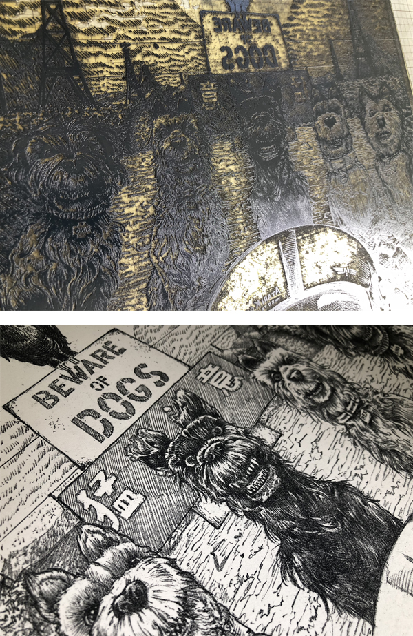
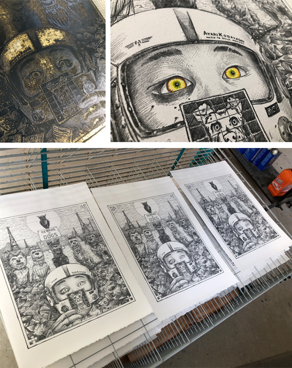
As soon as AJ Masthay’s “Isle of Dogs” print passed through our platemaking department, we had to know more. Discover as we catch up with AJ of Masthay Studio, and this sneak peek. Find out what is the inspiration for this ultra-detailed piece… and where can you enjoy this piece.
The piece was created for an upcoming Isle of Dogs group exhibition hosted by SpokeArt NYC at the Parasol Project, 213 Bowery, NYC. From their Facebook event page:
“Spoke Art is pleased to present the Isle of Dogs Art Show. This is an officially licensed art exhibition tribute to Wes Anderson’s most recent film. The dynamic group show features over one hundred artists, painters, sculptors and print makers, debuting one weekend only in New York City’s Lower East Side.
Isle of Dogs
Isle of Dogs, Wes Anderson’s most recent project, is a stop-motion animated film set in a Japanese dystopian future. The story follows a boy’s journey to find his dog after the species is banished to an island following the outbreak of canine flu. Inspired by the adventurous tale that Anderson brought forth, a select group of artists have created character portraits and highly detailed environments and scenes inspired by Isle of Dogs. Featuring a diverse array of painting, sculpture and limited edition prints, each artist offers their own unique perspective and interpretation of the Wes Anderson film. This whimsical and canine filled pop-up exhibition is an absolute must see.”
About the Piece
I personally love the quirky works of Wes Anderson and am a huge dog lover. I have two very spoiled Labrador Retrievers Dexter & Halley. When asked to participate in this exhibition I immediately said YES!
My piece features the main characters from the film, both human and canine. As well as, the scene in which they debate whether to attack. Spoiler alert – they realize he has come searching for his own dog “Spots” and decide to help him in his quest.
The print is a reproduction of a detailed graphite drawing utilizing a Boxcar Press’ photopolymer plate with a 133 LPI halftone screen applied. We’ve found that once dialed in on our Vandercook Universal III, these halftone plates reproduce tonal drawings beautifully. They come very close to the detail typically found in lithographs.
To mimic the graphite work we do the following steps. First, we mix a fairly stiff, dark gray ink with a touch of brown to warm it up a bit. Next, we use a paper that is soft and supple, such as Arches 88. Finally, we finish the piece with a hint of hand-applied color in the pilot’s eyes. As a result, this slight variation adds a personal touch of individuality. The hand coloring piece complements the printing perfectly.
The Final Edition size is 100 signed, numbered and titled, 15”x20” on Arches 88. Prints are available to purchase at the event. Remaining prints will be made available online following the event, through SpokeArt.
We keep tabs on the many wonderful and intriguing designs that come through doors here for our custom-made photopolymer platemaking services. One that we’ve been following for quite some time is Mindy Belloff (of Intima Press)’s highly detailed illustration and creative typesetting designs in her latest fine edition book project.
As a book artist, letterpress printer, and educator, I have been a loyal fan of Boxcar Press, having ordered plates since the beginning of Harold’s enterprises. The staff have always been helpful, especially when polymer platemaking and digital spec instructions were still in their infancy.
During this time, I have sent to Boxcar a wide variety of digital designs of artwork, student work, and job work. A few years ago, as a new livre d’artiste was in the works, they took notice of the beginning of the work. As I firmed up designs and sent a flurry of large plate orders, I was asked about the scope of this project as it had piqued their interest. I was happy to share the text, but could not stop production and take time to send images of the various pages, as I was working so intensely, designing by night and printing all day. I had close to 2,000 sheets in my studio in various stages of printing for over a year and a half.
Recently, I was asked by Boxcar to reveal more about the fine edition book I have just released, after two intense years of work, which follows.
The book is titled, “A Golden Thread.” It is 92-pages, in a format of folios, featuring the text of “The Minotaur,” a short story by Nathaniel Hawthorne (1853). It is composed of 100 original drawings, some with hand painting, and 200 press runs, in an edition of 40, printed on cotton rag papers with a sheet size of approximately 15 x 21 inches. It is a contemporary twist on the medieval illumination, letterpress printed on a Vandercook Uni III automatic press.
The story begins in blue and gold ink, with our hero Theseus, as a young boy. As the story unfolds, Theseus grows to be a young man and journeys to Athens to find his father, King Aegus.
Theseus has an unpleasant encounter with the wicked Medea before he finds and is embraced by his father. He soon learns of the fate of seven young men and seven maidens, to be chosen as a sacrifice to the Minotaur, a beast housed in the labyrinth of Crete. Theseus volunteers to sail to Crete with the youths. (By now, you may recall the details of this tragic myth.)
When the ship arrives in Crete, the evil King Minos throws them in the dungeon, to await their fate. Enter the heroine, Ariadne, who secretly releases Theseus and leads him to the entrance of a maze.
The middle section of the book, as Theseus makes his way through the labyrinth to find the Minotaur, is designed with typography that blankets the page. The plates for this section were, of course, quite large, and many pages were printed on one side of the sheet, and then turned (plates and paper), to accommodate the sheet size. Most pages have 5 to 6 press runs each.
In the third and final section of the book, Theseus emerges victorious, having slain the bull-headed Minotaur monster. Our heroine awaits, still holding the golden thread at the entrance to the maze. Theseus and the other 13 youths sail back to Athens, where they encounter more obstacles and tragedy, as expected in a classic Greek myth.
On the final page of the story, our hero becomes King. Below is an image of the page showing two of the four-color press runs, which includes ornamented initials, and border drawings.
The book is hand sewn and beautifully bound with a blue leather spine and gold gilding.
Mindy received a fine press book discount for her entire project for the plates Boxcar Press created. We appreciate her giving us a sense of her book “A Golden Thread” with words and photos. Mindy Belloff produces fine letterpress printed book and broadside editions at her Union Square studio under the imprint Intima Press. Her artist’s books have been included in many publications and she received an award for Excellence in Book Design.
You can visit Mindy’s website for more on the Minotaur edition at Intimapress.com.
A myriad of eye-catching and pop-culture surreal characters snagged our attention when printer Bryan Baker and artist Jasper Wong’s fun order passed through our custom-made photopolymer platemaking service department. So much that we couldn’t resist the urge to reach out and get the scoop on such a brilliant and wild project!
The ever-wonderful Bryan helped illuminate how such an bright, hypnotic printing project came to be.
This project was printed at Striped Light in Knoxville Tennessee, by Bryan Baker. The artist who did the design is Jasper Wong. It is the second time that Striped Light made an edition of his work through an ongoing collaboration with a Detroit publishing company called 1xRun.
This particular piece was printed to coincide with a rather large street art event call “Pow Pow” in Hawaii. The print was run in four color ways: Trans on Pink, Trans on Teal, Black on Black, and Green and Black on Teal. All finished with hand torn edges.
Striped Light is often commissioned by 1xRun to do limited edition letterpress prints for the artists that they represent. It it a pretty exciting relationship, because they work with artists from all over the world, and are now in their fourth year of working together. It first began while Bryan was up in Detroit running a shop called Stukenborg Press, and has continued with his new community letterpress shop that he opened with his partners Sarah Shebaro, and Jason Boardman.
When the intricately-detailed illustrated flamingo graphic passed through our platemaking service, we were eager to learn more about what was to become of this plate and the resulting final pulled print. The printer behind the design, Dana Kadison, let us in on how the illustration project came to be and how she turned a long-mused-over concept into reality.
Dana filled us in on beautiful (and long-term) project details: “As a photographer and collector, I have built a library of images and ephemera that is the foundation for an ongoing series based on the Mexican bingo game Loteria. Currently there are eight Loteria images. Each one exists in more than one “state”: my CMYK proofs, which will eventually have reverses and be printed as cards in a boxed set; monoprints, which I produce whenever I want to work out an idea or a reverse (like the Yeats Mariachis); soon, the editioned prints which include letterpress layers; and finally, Ofrendas, of which the Flamingo is the first. The Ofrendas, or offerings, are simpler statements of the ideas in the Loteria card series.”
“The Flamingo Ofrenda is casual and references Jose Guadalupe Posada’s work. About two years ago, inspired by a set of Players cigarette cards, I was thinking about, and scratching, all kinds of birds, particularly finches, but also hornbills, crossbeaks, frogmouths, macaws, etc., and finally settled on a flamingo for card #2. The flamingo, for Americans at least, is undeniably iconic and the males and females look alike.”
“Now there is a suite of 8 images ready for editioning on 18×24 sheets of paper. Each one synthesized from a myriad of “stuff”: you know, the words, texts, images, objects, conversations that make up a life. And the first thing I wanted to add to each image is the text that will be on the reverse each of card when they become actual cards. For the viewer the text would be a clue to what I was thinking. Of course I wanted it in my own handwriting. And this is where letterpress comes into play. It all started with the idea of plates of text in my own handwriting.”
“So I took a class at Robert Blackburn on a Vandy 4. The flamingo, my first plate from Boxcar, was for that class. Using that Vandercook 4, I printed the flamingo two ways, straight and then over monotypes. All the prints have the same degree of impression. I like the straight prints, but am still deciding about paper. The monotype backgrounds please me the most, perhaps because I did not try to register them with the plate. Knowing that, once set, the Vandy would take care of itself, part of this exercise was to let go of the urge to register. While all of this is happening, I did press my first image with Pilar Nadal at Pickwick Independent Press in Portland ME.”
“Letterpress is an aesthetically and physically freeing experience. We all know that paper is not really 2D, that it has depth. Letterpress layers add visible texture that can be seen with or without ink. And a letterpress registers. It is a little unsettling to use a press, completely unlike pulling the screens myself. Atmospheric conditions in the NYC studio are so variable and water-based inks misbehave in such interesting and frustrating ways that achieving consistency in CMYK prints takes great physical and mental stamina.
With letterpress I can imagine more and physically achieve more. For the editions of the first 8 images, I chose to set the 6.5×10.25 card faces on 18×24 sheets of paper and handwrite the text from each reverse below the screenprint of its card face. The handwritten texts are becoming letterpress plates. And there was more beautiful white space available. So parts of the reverse images are now finding their places as letterpress in that white space. For example, #2 will be embedded in the enlarged body of my scratchwork flamingo.”
A large heaping round of thanks out to Dana for letting us get a sneak peek at the brilliant flamingo designs!