Letterpress Art Prints for Obvious State’s Kickstarter Campaign

Obvious State is a New York City-based creative studio and literary brand meant to inspire through their art prints, tote bags, and other items for bibliophiles, word lovers, and art lovers alike. We recently partnered with Evan at Obvious State to create these large, 11″ x 14″ letterpress prints featuring their “Martini” artwork, in black ink on our Heidelberg Cylinder Press. The prints are available for sale (along with 11 other styles that we’ll be letterpress printing, too!) now through June 8th as part of their current Kickstarter campaign. Learn more and get yours today!

Letterpress art prints from Boxcar Press

Letterpress art prints from Boxcar Press

Letterpress art prints from Boxcar Press

2016 Seattle Children’s Hospital Broadsides: Part 2

Part two in our blog feature of the 2016 Seattle Children’s Hospital Broadside project features six more artistic printers and young poets as part of the collaboration between Writers in the Schools program, long-term patients at Seattle Children’s Hospital, and the School of Visual Concepts in Seattle, Washington. These six printers share with us how they brought each writer’s words to vivid life in the 2016 edition.

Nicole Cronin 2016 marked my fourth year participating in the Children’s Broadside Project. Each time, I am excited to create art for a good cause alongside my fellow printers!

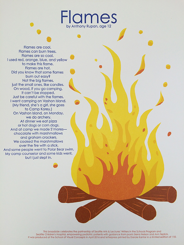
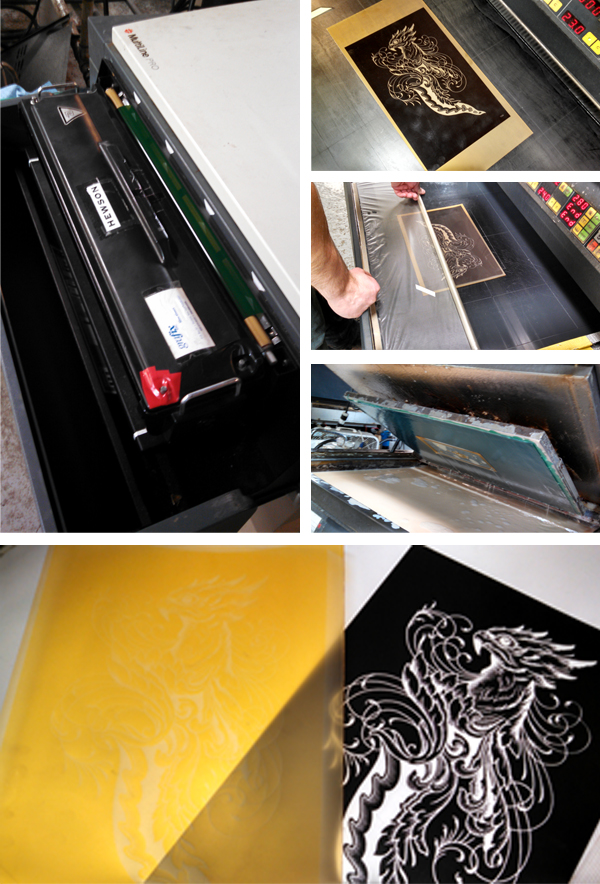
I was immediately drawn to Jasmine’s poem because of her detailed imagery and playfulness in her writing. It felt whimsical and fancy and hopeful… so I wanted my broadside to depict her words so the reader felt like they were right there, watching acrobats performing and climbing ribbons! One of my favorite things in designing for letterpress is linoleum carving, so I decided to carve a hand drawn wreath and the pink ribbon. The most time consuming and also enjoyable part of the process was carving and printing the wreath. It was challenging to line up the acrobat between the ribbon and the wreath (which in hindsight sounds crazy, but so true).

Nicole Cronin creates beautiful broadsides for the 2016 SVC Children's Broadsides project.

I printed the poem, acrobat and gold dots using Boxcar Plates which produced the most consistent passes on press.

Nicole Cronin creates beautiful broadsides for the 2016 SVC Children's Broadsides project.

This project is personally fulfilling, and I am honored to have had the opportunity to design and print Jasmine’s poem. With great leadership by Jenny Wilkson at SVC, we have a strong team that provides time, paper, plates, etc. and I am so grateful to have contributed a small part.

Carol Clifford This will be my 7th year of working on the Children’s Hospital Poetry Broadside Project. Each year we are presented with poems from the children to read over and consider. Then we all meet as a group and each chooses a final poem to interpret and print for the young poets. I usually sit down with a cup of coffee and take time to read each child’s poem. Then I reread.

Many of these kids are heartbreakingly wise beyond their years.

Carol Clifford creates beautiful broadsides for the 2016 SVC Children's Broadsides project.

I will connect with some of the poems more than others. A few suggest ideas and images fairly quickly. I usually draw thumbnails right away in the margins, percolating on others until we meet to get our final assignment.

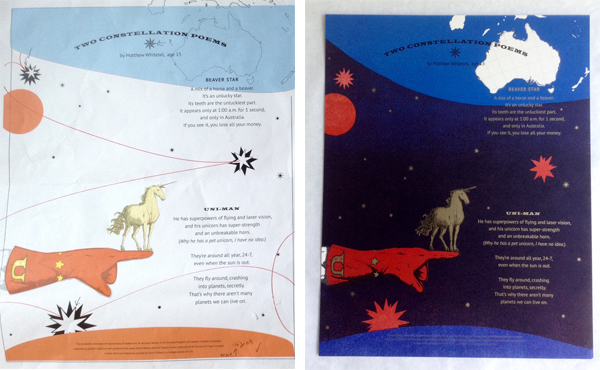
I chose Two Constellation Poems by Matthew Whitesel because I liked that this was one of his first attempts at a poem, and it turned out so visually rich and funny. I liked the challenge of creating a dark field of color with letterpress printing. As a bonus, I just happened to have a unicorn image I had recently used for another project.

Because of the line “Why he has a pet unicorn, I have no idea,” I knew I wanted the unicorn to be front and center and gold (Right?! I used MS-1151 Rich Gold Paste from Hanco Ink Co) Printing gold as the featured color directed building up the background. With experimentation and suggestions from other printers, I learned that highlighting the shine quality of the gold ink is more successful when printed over another color, especially a darker color.  To form the dark background, I was inspired to use two colors that overlap and create another color with a lot of depth.

Carol Clifford creates beautiful broadsides for the 2016 SVC Children's Broadsides project.

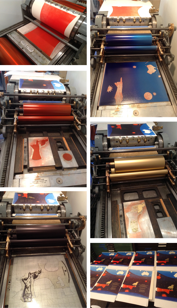
I try to work out all the steps of a broadside before going on press, but inevitably, once I am in the studio, I tend to combine techniques to accomplish my ideas. This method of working can be maddening, but also allows for a lot spontaneity and, fingers crossed, happy surprises. The image was created with a combination of linoleum blocks and polymer plates.

I had planned for a four color run. It turned out to be nine!  Two runs of red to get the saturation and color I wanted, 4 runs of gold to solve registration woes and for clarity on the colophon and then black and blue runs with linoleum blocks.  I am really pleased with the final result.

When I come up with ideas for the broadsides I keep in mind the age of the poet. Ultimately though, my hope is that the piece will not be too “childish” and that the broadside will give both the poet and his family moments to enjoy for years to come. I haven’t met Matthew but I was told that his younger brother thought it was really cool to have something he wrote printed. This experience has inspired both of them to write more.

Leah Stevenson The Seattle Children’s Hospital Broadside project was a fantastic and challenging experience. I was equally excited and nervous to be a part of the collaboration. It was my first time and I wanted to ‘get it right’. These kids go through so much and being able to create a piece of art with them felt special and so important, even more so because we knew some of the kids wouldn’t and didn’t make it to the end of the project . I unfortunately never got the chance to interact directly with the kids but just hearing their stories through the poetry was extremely powerful. This was not just a piece of artwork that we were creating but also a piece that represented these kids in a way that a lot of people don’t get to see.

Leah Stevenson creates beautiful broadsides for the 2016 SVC Children's Broadsides project.

I selected poetry by a young student of 6 years who had four short poems together, each in English and Spanish for a total of 8 pieces of text to work with. Having grown up in South America, I felt an instant connection to the poet through her use of Spanish & English in her writing.

It was a challenge to figure out how to piece all these separate poems into one cohesive broadside. I had recently visited L’Opéra de Paris (the Paris Opera House) and was inspired by the mural on the ceiling for this piece as it depicted various scenes from different operas all together. I decided to take that concept and separate the poems into four sections surrounding the sun in the middle. This gave each poem it’s own stage, so to speak, while still tying them together.

Leah Stevenson creates beautiful broadsides for the 2016 SVC Children's Broadsides project.

I used a combination of pressure printing and photopolymer plates on this broadside. I used pressure printing for some of the background colors, as I wanted a little more fuzziness around the edges – not so clean and precise. To contrast, I used photopolymer for its clean lines for the more details work as well as the text. I actually hand wrote the poet’s name, age and title of the piece and digitized that to create a photopolymer plate. It felt like it gave a different emphasis on the poet that paired nicely with the illustrations around it.

Leah Stevenson creates beautiful broadsides for the 2016 SVC Children's Broadsides project.

I had a lot of registration going on in this piece, which proved challenging to control with the larger run. I had at least 8 passes and getting everything to line up was tough (and in some cases impossible) but it was definitely a learning and enriching experience and worth every minute I spent on it.

Jill Labieniec  This year I worked on the group poem which combined words and ideas from different children. It was challenging to include all the imagery from the poem so I opted to add my own idea into the mix.

Jill Labieniec creates beautiful broadsides for the 2016 SVC Children's Broadsides project.

The overall theme was kissed by the rain so I figured a mermaid who lived in a puddle would be very appreciative of a little rain.

Amy Redmond I am a Seattle-based visual designer, a letterpress instructor at the School of Visual Concepts and letterpress printer since 1998.  

I work with photopolymer but absolutely fell in love with handset type.  For personal work and special projects like the Seattle Children’s Hospital Broadside project I work only in handset type. The focus it requires, and the time, is my way of paying my respects to both the poet and the poem. I become fully immersed in the words and the process, and the extra time it takes is worth it. The poems the children write represent a huge amount of energy and heart on their part; it’s only fair that I attempt to meet them on equal ground.

This is my 6th time as a contributor. I do it for several reasons: to bring the poems into light, to be a part of a larger community project, to challenge myself, to learn from my mentors, to work side by side with the Seattle letterpress community. It is a very closely connected group and this Broadside project is one of the ways we maintain that association. The artistic work on this project gets better each year. We all work hard to out-do ourselves, and put to use new tricks we’ve learned throughout the year. We learn from each other to push the traditional boundaries of broadside design.

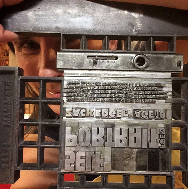
My poet, Zack Edge, incorporated a lot of imagery into his poem. I used large wood type (front and back) to help create a landscape in which his words would live. On the left the orange words form a wide tree trunk; on the right a sky and a field are formed. I used pressure printing techniques to create the white cloud when printing the blue sky, and it was serendipity that the wood type I chose happened to have a few stars carved out of from its backside.

For the smaller type, I handset everything in metal type – Spartan – on a 1903 Colt’s Armory Press. With all the various weights I was able to play with the cadence of the type, and pushed — as far as I felt comfortable — the composition of the poem itself. By placing the last line of the poem to the far right in the cloud and having it stand alone, I hope to give it emphasis so that others also take note of its gravity.

Laura Bentley I received a reflective and powerful poem by a 16-year old named Mackenzie who worked with poet Ann Teplick. I was struck by the earthquake imagery in the poem. It made me think I could do something with shifting plates of earth or seismographs. After weighing several options I was excited about the thought of using metal type ornaments that look a bit like layers of earth and thought I could put something together that imitated seismic faults, albeit in an abstract way.  The bars of ornaments can also reflect just the abrupt ups and downs that life can take.  Thank you Mackenzie, it was an honor to print your words.

For colors and typeface I was leaning towards both “earthy” and “mid-century modern, particularly, a typeface from the age of printing with metal, even if I would be printing it with photopolymer.  

The metal type ornaments were set to the correct lengths, and arranged in position in the press bed. Each color is printed in a separate pass through the press. For an edition of 110, I started with 120 pieces of paper. For those of you counting that meant that 120 pieces of paper through the press four times meant feeding paper through the press 480 times!

Laure’s full blog article covering her printing adventure can be found here.

A huge round of applause and thanks out to all of the printers who donated their time and efforts to this amazing project!

2016 Seattle Children’s Hospital Broadsides: Part 1

In its sixth year of running, we’ve teamed up with amazing young poets, and inspired printers to share with you 2016’s Seattle Children’s Hospital Broadside project in a two-part blog feature. The collaboration of 22 artists and pediatric patients is helmed by poets Sierra Nelson and Ann Teplick of the Writers in the Schools program and the School of Visual Concepts in Seattle. WITS works with long term patients at Seattle Children’s Hospital to write poetry, out of which printers & artists create beautiful letterpress broadside prints. Boxcar Press supports this project with photopolymer plates for the limited run of broadsides. Participating printers share their experiences bringing each poet’s words to life in this year’s edition.

This first installment features six printers who share their printing process and experiences with the youth writers of the program.

2016 Seattle Children's Hospital letterpress broadsides project
Letterpress broadside posters from the 2016 Seattle Children's Hospital letterpress broadsides project

Bonnie Thompson Norman Every year, I feel a strong connection to the young person whose poem I print. I know each person who works on these broadsides feels the same way. We don’t always have (or choose to have) the opportunity and/or privilege of meeting our poets, but the bond is a strong one. As the project comes to an end, we all gather for a potluck dinner. All of the completed broadsides for that year’s project are displayed. Each of us reads “our” poem and talks about the process of creating the image, designing the text, printing, etc. The sharing that takes place as we read and talk about our connection to the young person who wrote the poem and our experience in interpreting it for others to see, is a meaningful bond for all of us and each of us…to the writers, the poets who work with them, and one another. It is what keeps us looking forward to coming back year after year. It isn’t just a legacy for the poets and their families. It is our legacy, too.

Here is a video of the creative process for a few of us:

(video courtesy of www.seattlechannel.org

One last comment on the bond between printer and poet… last year, I wrote a blog post about my young poet who I was able to meet on his 17th birthday. He teared up when he saw how I had interpreted his writing. We met at the Children’s Hospital where he was (again) a patient when I gave him his copy of his poem that I designed and printed. We were both emotional when he saw how I had interpreted his writing. It was so gratifying to see how he appreciated what I felt was our collaboration though we had not met before.

Chris Copley 2016 was my second experience with the Seattle Children’s Hospital poetry broadside project. My 2015 project was both artistically challenging (still a rookie to letterpress, I carved three 10-inch-by-13-inch linoleum blocks to illustrate the poem’s text and images) and emotionally poignant (the poet I worked with, 13-year-old Ahmie Njie, died about a month after I printed her poem). Exchanging a few Facebook IMs with her before she passed away remains one of the highlights of my life.

I liked the idea of incorporating the text of the poem itself in the illustration of the poem, so I planned to do that again in 2016. I worked with a poem by 12-year-old Kayli Jones, a Chinese-born adoptee living with her American parents and three brothers in Idaho. I exchanged a few email questions with the poet’s mom to learn a little more about the poet.

Chris Copley creates beautiful broadsides for the 2016 SVC Children's Broadsides project.

The primary design concept for me revolved around Kayli’s Chinese origins. So I decided to use the poem’s text to represent branches of a Chinese-style cherry tree in bloom. Cherry blossoms are considered a symbol of good luck in Asia, and Kayli’s poem ends on a note of hope and determination to beat her cancer.

I hand-drew the letters of the poem, then ordered a polymer plate from Boxcar. This was my first polymer plate print run, and it worked SO WELL. I couldn’t have been happier. All of my text was printed in black. I then hand-set a tall, thin column of text for the colophon; the form was intended to evoke the look of a column of characters on a Chinese-style painting.

I decided to print the second color, red, using a different technique — pressure printing. I used a print from the first color run to cut out the cherry blossoms, and then glued them onto another print to create the pressure-print “plate.” I used the print with the blossom “holes” as a frisket to mask the speckling you get with pressure printing. Printing the blossoms also went pretty smoothly, although I had to recut the frisket twice to try to get the blossoms the way I wanted.

(An added disaster-turned-blessing: I forgot to bring a linoleum block as required for pressure printing, so I used the backside of a Boxcar base, and the swirly pattern on the base’s bottom side left an absolutely beautiful effect on the cherry blossoms.)

Finally, I added another element, at least to some of the prints: several hand-drawn Chinese-style chops, also in red ink. Two of the chops spelled Kayli’s name in characters reminiscent of ancient Chinese text. I printed them freehand on only a few prints, using an ink-stamp pad because I worried they would distract from Kayli’s poem.

I was really happy with the broadside design and printing, and I felt it represented Kayli well. As much as I enjoy the artistic and technical challenges of portraying a poem, it’s important to me to represent the person whose work I’m illustrating.

Darcie Kantor It was an honor to be part of the Children’s Hospital Broadside project. This was my second year participating.

Darcie Kantor creates beautiful broadsides for the 2016 SVC Children's Broadsides project.

For my process I combined Boxcar plates for the poem and did a linoleum block reduction for the fire/flames. It was a fun project to work on.

Darcie Kantor creates beautiful broadsides for the 2016 SVC Children's Broadsides project.

Juliet Shen The boy who wrote this poem was a registered member of the Swinomish tribe whose lands are north of Seattle on Puget Sound. I had designed a font for the Lushootseed language (indigenous to this area) and asked my contacts in the Tulalip Lushootseed Department to have his poem translated so it could be typeset in both languages.

Juliet Chen's beautiful broadside as featured in the 2016 Seattle Children's Broadsides.

When it comes to making art work, I am against the appropriation of traditional Native American art styles by outsiders because my research for making the Lushootseed font revealed that the iconic imagery used by Northwest tribes has deep cultural significance. I decided to design to my particular strengths, which are typographic, not illustrative, so I typeset the poem in a shape that I hope looks like an elk to readers. I rely on polymer plates because my primary focus is on typographic design and I need the control that using polymer affords me.

Heidi Hespelt I do want to say that our printing community is amazing!  I had a terrible back injury at the end of last year and was pretty much out of printing commission. Amy Redmond offered to do the actual printing for me if I wanted to be involved in the design. She made it possible for me to participate by giving of her time and printing expertise.

Heidi Hespelt creates beautiful broadsides for the 2016 SVC Children's Broadsides project.

Project supervisor, Jenny Wilkson, selected a younger poet for me, not knowing that she chose what was secretly the one I wanted. Serendipity.  My poet was Alex Enderle, and the poem was “I Am Me”.  Alex was 7 when he wrote the poem.

Heidi Hespelt creates beautiful broadsides for the 2016 SVC Children's Broadsides project.

I think of it as the cupcake poem.  I wanted a younger poet because I have a now 5 year old grandson that is a big part of my life and felt like I could probably tune in to what a little guy might find interesting. Bright colors and yumminess that you can see seemed important and I loved what I was able to accomplish with Boxcar plates.

Annabelle Larner I’ve participated as a printer in the Seattle Children’s Hospital Broadside project since its inception about 6 years ago.

Most of my work is all hand done. This year’s project, from April 2016, was printed using a hand-cut wood block as the printing base, with a lightning bolt used as a pressure print. It was printed with a split fountain ink in dark blue, then the final polymer type was printed in red.

Annabelle Larner creates beautiful broadsides for the 2016 SVC Children's Broadsides project.

Working on this project is extremely rewarding, and also hard. I want to really get into the words of the printer and try to convey their feelings in a way that is not too literal or childish, as I know kids can appreciate darkness, and what they are going through is pretty dark. Sometimes I get to meet the kids and it’s always special. Their parents are often very grateful, and seeing the kids talk about their poems is amazing.

Stay tuned & read on about this amazing Broadside project in the upcoming Part 2. The creativity and intensity of both poets and printers and the dazzling results are why Boxcar is proud to have a part in this project every year.

Let’s See That Printed: Dead On Paper’s Extraordinary Tarot Card Prints

As soon as Chris Ovdiyenko’s masterfully intricate and eerily beautifully illustrated Arcana tarot card designs passed through our platemaking department, we were eager to learn more about the project and how it was to be printed. Chris from Dead on Paper filled us in on the gorgeous work (and let us know where we could snag a print or two)!

Photopolymer plates being made for Chris Ovidiyenko of Dead on Paper. This letterpress Arcana tarot card poster series features eerily beautiful detailing.

All prints are 11×14” on Stonehenge Natural White, printed with Van Son Universal Black. I’m printing them on a 1907 Peerless platen press. As you can see from the images, I’m using a Boxcar Base (love it!!), and gauge pins from Boxcar Press also.

Chris Ovidiyenko of Dead on Paper brilliantly prints eerily beautiful detail in his letterpress Arcana tarot card poster series.

In order to get good coverage, I’ve cranked up the pressure a fair amount and hand turn the fly wheel. Although my press is motorized, with the increased pressure the motor and belt assembly isn’t able to make it through a full cycle as it takes a fair amount of effort to get it through to the point where the platen touches paper.

Chris Ovidiyenko of Dead on Paper brilliantly prints eerily beautiful detail in his letterpress Arcana tarot card poster series.

There are 45 different designs with a total run of 3000 prints. At this point, I’ve completed about 1800 of them. The most difficult part, as you would imagine, are the ones with large areas of flat black. Luckily I have the technique down to where there’s only a minimum of “salting” which actually adds some nice character to the prints. 

Chris Ovidiyenko of Dead on Paper brilliantly prints eerily beautiful detail in his letterpress Arcana tarot card poster series.

Just a quick word about the plates – they are amazing! I started out relief printing with laser etched wooden plates, and what a world of difference photopolymer plates have made for me! I outfitted my press from Boxcar and love the high-quality plates, excellent service, and speedy turnaround!

Huge round of thanks out to Chris at Dead on Paper for letting us get a closer look at these brilliant poster designs! And be sure to snag a print here!

Letterpress art prints by George Davis on display in the Adirondacks

Earlier this summer, we teamed up with George Davis to create letterpress art prints for his latest exhibit, “The Doodle Show,” which is currently on display at the Depot Theatre in Westport, New York. We letterpress printed the trio of art prints on our Heidelberg SBB cylinder press to ensure even ink coverage of the designs, which all make great use of negative space and feature heavy floods of classic black ink. Today we’re sharing George’s inspiration behind the designs, which will be on display until October 15th.

Black and white letterpress art prints from Boxcar Press

Let’s start with Soar, a dizzying bird flying skyward. The seed for this image was a ceramic tile I spotted in Taos, New Mexico. Rusty red glaze painted onto a white tile, yellowing with age. Simple image, sparse brush strokes. It struck me that this carefree creature was trapped in the grid of tiles. Cubicled. But it yearned to escape, longed to fly high into the turquoise dome. Freedom. So I liberated it. I simplified the silhouette and added the concentric silhouette. Echoes. Slightly vertiginous.

Soar, a letterpress art print designed by George Davis and printed by Boxcar Press

Design Shoal began with a 2-3 foot tall, hand painted ceramic vase, one of a pair that stood in opposite corners of a room in Anguilla. As I recall, the pattern on the vase was blue-green, maybe aquamarine. The background was white. The walls were white. And the vases — exotic artifacts from afar — were balancing the upholstery. Or the immense chandelier. Or the panoramic view of the Mediterranean. Designed. Decorated. Carefully choreographed, perhaps a little too carefully. The vases, though intricately detailed, seemed less self-conscious, more alluring. I loved their texture, was distracted by the possibility of the same vase underwater, sunken treasure, tropical fish schooling and shoaling around it. The fish is actually a single image duplicated, tweaked, and rescaled, and it was sketched quickly after snorkeling.

Design Shoal, a letterpress art print designed by George Davis and printed by Boxcar Press

Soar and Design Shoal are included in 40×41: Midlife Crisis Postponed, a collection of meditations on middle age. They are visual poems, an experiment that I’m revisiting in a second edition due out by year’s end. 

Letterpress art prints designed by George Davis on display

Soar and Design Shoal interspersed with drawings by artists Kevin Raines and Judy Guglielmo.

St. Joseph’s Steeple is a standing-on-the-ground view looking almost directly up at the tall pointy part of a church located a five minute walk from my home. I’m attracted to unusual perspectives. I’m attracted to texture (tactile and visual). Combining both provides a fresh look at this handsome but restrained country church. Or at least that’s what I was hoping to achieve. The illustration is included in Essex, New York Architecture: A Doodler’s Field Guide, an unconventional handbook intended to inspire architectural curiosity and creativity.

Letterpress art prints designed by George Davis on display

St. Joseph’s Steeple (and Noble Clemons House, leftmost image) interspersed with drawings by architect Bryan Burke.

 St. Joseph's Steeple letterpress art print designed by George Davis and printed by Boxcar Press

All three of these images are what I refer to as digital doodles. A few years ago I vowed to transform my mobile devices from productivity tools into creativity tools. From albatross to adventure, ball and chain to hot air balloon. Less data overload; more whimsy. Less anxiety; more joy. Today we’re so inundated with digital demands, deadlines, commitments, communications that we sometimes overlook the magnificent world around us. We trudge around with our necks doubled and our fingers swiping and typing. When we glance up it’s too often just to document our sexy appetizer or our dog’s antics for our friends and family on social media. We too rarely distill anything enduring from the digital detritus, rarely harness our devices’ remarkable capacity for invention and caprice and wonder. So I decided to try. My digital doodles combine illustrations, photographs, and collage. They inevitably endure multiple iterations in Photoshop purgatory as I play and explore and experiment and remix and strip away and occasionally — if I get really fortunate — a few of these digital first image evolve to a stage when ink and paper and fingerprints are indicated. This is the evasive but glorious goal. Boxcar Press helped me achieve this goal with Soar, Design Shoal, and St. Joseph’s Steeple. And I am profoundly grateful. Thank you. Thank you. Thank you.

 St. Joseph's Steeple letterpress art print designed by George Davis and printed by Boxcar Press

Many thanks to George for sharing his inspiration behind his impressive art prints! If you’re planning a visit to the Adirondacks, be sure to visit the Depot Theatre to check out the exhibit.

Gallery photographs provided by George Davis. 

Let’s See That Printed: Dana Kadison’s Exotic Flamingo Letterpress Prints

When the intricately-detailed illustrated flamingo graphic passed through our platemaking service, we were eager to learn more about what was to become of this plate and the resulting final pulled print. The printer behind the design, Dana Kadison, let us in on how the illustration project came to be and how she turned a long-mused-over concept into reality.

An illustration by Dana Kadison being made into a letterpress plate by Boxcar Press

Dana filled us in on beautiful (and long-term) project details: “As a photographer and collector, I have built a library of images and ephemera that is the foundation for an ongoing series based on the Mexican bingo game Loteria. Currently there are eight Loteria images. Each one exists in more than one “state”: my CMYK proofs, which will eventually have reverses and be printed as cards in a boxed set; monoprints, which I produce whenever I want to work out an idea or a reverse (like the Yeats Mariachis); soon, the editioned prints which include letterpress layers; and finally, Ofrendas, of which the Flamingo is the first. The Ofrendas, or offerings, are simpler statements of the ideas in the Loteria card series.”

Dana Kadison on press with a Vandercook printing press.

“The Flamingo Ofrenda is casual and references Jose Guadalupe Posada’s work. About two years ago, inspired by a set of Players cigarette cards, I was thinking about, and scratching, all kinds of birds, particularly finches, but also hornbills, crossbeaks, frogmouths, macaws, etc., and finally settled on a flamingo for card #2. The flamingo, for Americans at least, is undeniably iconic and the males and females look alike.”

“Now there is a suite of 8 images ready for editioning on 18×24 sheets of paper. Each one synthesized from a myriad of “stuff”: you know, the words, texts, images, objects, conversations that make up a life. And the first thing I wanted to add to each image is the text that will be on the reverse each of card when they become actual cards. For the viewer the text would be a clue to what I was thinking. Of course I wanted it in my own handwriting. And this is where letterpress comes into play. It all started with the idea of plates of text in my own handwriting.”

“So I took a class at Robert Blackburn on a Vandy 4. The flamingo, my first plate from Boxcar, was for that class. Using that Vandercook 4, I printed the flamingo two ways, straight and then over monotypes. All the prints have the same degree of impression. I like the straight prints, but am still deciding about paper. The monotype backgrounds please me the most, perhaps because I did not try to register them with the plate. Knowing that, once set, the Vandy would take care of itself, part of this exercise was to let go of the urge to register. While all of this is happening, I did press my first image with Pilar Nadal at Pickwick Independent Press in Portland ME.”

Dana Kaddison prints beautiful letterpress flamingo monoprints with Pilar Nadil.

“Letterpress is an aesthetically and physically freeing experience. We all know that paper is not really 2D, that it has depth. Letterpress layers add visible texture that can be seen with or without ink. And a letterpress registers. It is a little unsettling to use a press, completely unlike pulling the screens myself. Atmospheric conditions in the NYC studio are so variable and water-based inks misbehave in such interesting and frustrating ways that achieving consistency in CMYK prints takes great physical and mental stamina.

With letterpress I can imagine more and physically achieve more. For the editions of the first 8 images, I chose to set the 6.5×10.25 card faces on 18×24 sheets of paper and handwrite the text from each reverse below the screenprint of its card face. The handwritten texts are becoming letterpress plates. And there was more beautiful white space available. So parts of the reverse images are now finding their places as letterpress in that white space. For example, #2 will be embedded in the enlarged body of my scratchwork flamingo.”

A large heaping round of thanks out to Dana for letting us get a sneak peek at the brilliant flamingo designs!

Letterpress coasters for The Lab Creative

We recently worked with The Lab Creative — new neighbors of ours here in the Delavan Center — to create custom letterpress coasters for a recent building-wide open studio event. The team at The Lab created a cool video showing their entire process, including the coasters being printed on one of our Heidelberg Windmills. Take a look!

Let’s See That Printed: Primer Scares Up Fun

As soon as we found out the electric and spooky illustration designs of Primer were passing through our platemaking service department, we had to learn more about eye-catching letterpress poster designs. The printer behind Primer, Brian Isserman, and his wonderful wife gave us a sneak peek at the chilling yet beautiful tale behind these letterpress pieces.

Brian Isserman's halloween and spooky illustratrations going through the letterpress plateaking process from film to plate.

Brian helped fill in the blanks on how such captivating project came to be:

“Primer is a brand development agency located just north of Philadelphia in the historic town of Hatboro, Pennsylvania. We specialize in brand strategy development, graphic design, web development and video production, but what we really love, is print.”

Our "Let's See That Printed" article features the spooky letterpress posters by Brian Isserman (and wife) of Primer.

“Several years ago we purchased and restored a GEO. P. GORDON platen press circa late 1870’s. It was a 6 month labor of love to get it back up and printing (and see here for the journey!). Especially considering we knew nothing about letterpress printing when we started. Now we use it every few months for personal projects and small promotional runs for our clients.”

A beautiful Chandler & Price letterpress press stands ready for printing fun at Primer.

“Every year we put together a Halloween promotion as a thank you to our clients, friends and family for their continued support. It allows us to step away from coding and web development so we can get back to our roots, ink and paper. We usually create a short run limited edition series of prints. Two years ago the theme was Day of the Dead, last year it was the Universal Studio Monsters, this year we decided to go with vintage Halloween.”

Primer-IMG3

“Once we had the concept in place, we collaborated with the super talented Michele Melcher to illustrate a series of three iconic Halloween images. The flat graphic, off-registration look of those vintage Halloween decorations gave us a safe zone margin of error that helped us tremendously. This was our first multi-color print run and we wanted to create a design that was forgiving. It really worked out well. The prints that were in perfect registration looked awesome, the ones that were really off looked even better.

The print run itself ran over 15 hours and for the most part went pretty smooth. We learned a lot from the experience and I am totally looking forward to tackling another multi-color job. Everyone really loved the prints. We received numerous calls and emails and got lots of social media love.

PRO TIP – Our press is old. I mean really old – and although it still prints amazingly well, we knew it would be extremely difficult to keep the plates and prints registered. We do not have a paper cutter so we opted to not include crop marks of any kind on our plates and ordered pre-cut paper instead.”

Brian Isserman of Primer sets up manual color registration mock ups for his letterpress broadside poster.

“So, how do you keep everything in register without crop marks? Boxcar sent us a large press proof. We cut out the individual images and spray mounted those proofs onto our paper. We placed a small piece of tape on the front of the plate and aligned it face down onto the paper. Once in position we removed the sticky back of the plate and ran it through the press. The plate would then attach itself to our base. We then carefully peeled off the paper and tape, and we repeated the process with each of the 3 plates per illustration. Using the master proof helped keep all of the plates aligned.

I think one of the most interesting parts of printing is figuring out the little tricks and treats to make your vision come to life. We could not have done it without the guidance, plates and custom ink colors from Boxcar Press. Thanks Boxcar!”

Huge round of thanks out to Brian and his lovely wife at Primer for letting us get a closer look at these brilliantly colored poster designs!

Let’s see that printed: Dueling Dictionaries

Here at Boxcar Press, we may be centered in the photopolymer world, but we love the look of print blocks and old time illustrations as much as anyone. So we were instantly intrigued and excited to see the artwork from John Carrera of Quercus Press come through for platemaking.  His art makes us feel nostalgic and paired with the one word text, we definitely wanted John to know we were eager to see what he was printing.

John Quercas' letterpress files are going through the platemaking process at Boxcar Press very quickly!

John not only told about his project but sent us a final copy of his fascinating book – Dueling Dictionaries. The artwork came from two dictionary companies, G. & C. Merriam and Worcester, who were rivals in the nineteenth century and tried to outdo each other with their illustrations. What’s fascinating is that the two companies shared the same engraver.

The Dueling Dictionaries letterpress printed book looks beautiful!

This saloon-door styled book also has another feature to it: by flipping open each page, the words that read across on the top and bottom change meaning with each pairing. The book also includes a great use of silver ink on the front cover, and intricate illustrations on the backs of the pages.

John also shared some of the experiences of his process on this print job.

“You can see that after I printed the first run of pages that I had laid out for the initial plates, I then cut up the plates to get the proper overlap and look. This is one of the benefits of polymer – you just can’t re-arrange and cut magnesium or copper blocks as easily. (I remember cutting many a block on the band-saw). I enjoyed working with the Vandercook on this project because it allowed me to look at each of the images as I printed them and tweak them before I got too far along. Printing these backsides has been one of the most exciting parts of the project so far.”

John Carrera of Quercus Press adds black and cool grey ink to his "Dueling Dictionaries" letterpress print project.

Using polymer plates also added some interesting aspects to the job that John describes:

“I have given a lot of thought to the difference of using polymer vs. using magnesium plates. One of the things that has been a challenge for me is that somehow knowing the plates are plastic has made me more prone to sending in copy that is not quite ready for prime time. This has happened twice to me and I don’t think I’m alone in this sloppy attitude. Although I have cut and pasted copy it’s better to remake the whole page and I have to take a little more time with my files.”

Inset details of the Dueling Dictionaries by John Quercas look beautiful!

“I also think I have pushed the envelope of how long these polymer plates can hang around, too – as I printed on some of these after they had been sitting for almost two years – the trick was keeping the edges from peeling up. In some instances I went ahead and folded them down so hard that they cracked – and in some of the plates I believe you can make out the hairline cracks in some of the images – the flunk fish had lots of little cracks. Most people won’t even notice nor will they realize that some of the lip actually broke off the image.  However, I kind of thought they looked cool and fit the book style.”

We thank John for revealing the story behind this gem of a book and for the enjoyment of his illustrations.

Let’s See That Printed: Translating Ink with John Reardon

One of the most enjoyable aspects of working with so many talented printers and designers who make their photopolymer plates with us is coming across some truly inspiring design work. Designs that make you stop and wonder just what color ink they’ll be running or what the print is for. It’s even better when you get a chance to catch up with the printer behind the design. We chatted with the outrageously gifted tattoo artist, John Reardon of Greenpoint Tattoo Co. in Brooklyn, New York, when his plate came through our doors. We’ll let John take it from here.

Photopolymer letterpress printing plate being made at Boxcar Press.

The project came about by running into Dan Morris (of The Arm in Brooklyn) on the streets. This was the second time I printed at The Arm (the first was back in 2010). I also have a tattoo shop down the street from Earl Kallemeyn (Kallemeyn Press). I’ve drawn stuff for him. He comes by the shop to hang out occasionally.

Photopolymer printing plates on a Vandercook.

John Reardon printing on a Vandercook.

Dan told me I needed to make another print and I agreed. I’ve been drawing and tattooing daggers like this for about 7 years now. The first one I drew I tattooed on Othello Garcia when we both worked for Scott Campbell at Saved Tattoo. When I find the time I have four more to finish drawing and print. The difference between my drawing for printing vs tattooing is that I can put in more detail in a print. Also I have to make tones by stippling or cross hatching. It’s fun. I printed with my buddy Jordan Haley and two bottles of red.. Been on a Spanish Rioja kick this winter…(it’s how I survived).

John Reardon printing on a Vandercook and pulling the paper through the press.

Final pulled prints of the ever talented  John Reardon.

Huge round of thanks out to John for letting us take a peek at his cool printing project!