Let’s See That Printed: All A-boot Kamikin

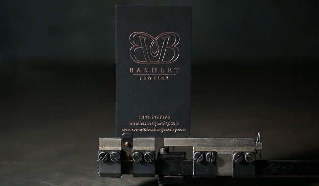
When we received Kamikin’s first order for plates, we had to get the back story – we loved their dynamic artwork and had to learn more. This family owned operation has quickly transformed from a pet project to a full fledged printmaking business. Marvel at their artwork while we tell you the rest of their tale.

Photopolymer letterpress printing plates being made at Boxcar Press in upstate New York.

A quick history: Kamikin is the dream child of three sisters, Karen, Betsy and Susan, of Sedalia, Colorado.  Betsy and her husband acquired a 12×18 1920 C&P platen in 2012 with a goal of entering the fine art market with unique and affordable prints. The business plan revolves around the beautiful pen and ink drawings of both Betsy and Susan, and is driven forward by the go-getter business savvy of their older sister Karen.

Hand-drawing & illustrating designs for letterpress photopolymer plates and letterpress printing with Kamiken.

The artwork came together during the fall of 2014 with a western theme. This particular “Zen Doodle” series is western/folk art with a modern twist. Zen doodling consists of decorative lines that can have beautiful results when printed on a letterpress. Kamikin didn’t hesitate to shoot for a very competitive show for their first foray into selling, the 2015 National Western Stock Show, in their backyard of Denver. Betsy readily admits they were not actually prepared for a 16-day show. “Because of this, when we got accepted, our studio burst into a flurry of activity! We had to finalize our art, order plates for the letterpress, purchase loads of paper and packaging, and build a booth! It was a quick learning curve for all three of us as we cranked up the press for mass production.”

Letterpress printing with photopolymer plates with Kamiken on a C&P press.

“During this whole process, one of the most exciting steps was when our first order of polymer plates from Boxcar arrived,” says Betsy. “At that moment, it seemed that everything we had planned was now possible. With the artwork for this series done, the paper cut, and a printing schedule on the calendar, it was time to buckle down and get our hands dirty. With 8-10 hour printing sessions, we learned so much so fast! Like it’s a good idea to tag team the chase to save on your shoulder muscles.”

Beautiful letterpress printed western - themed cards from Kamiken.

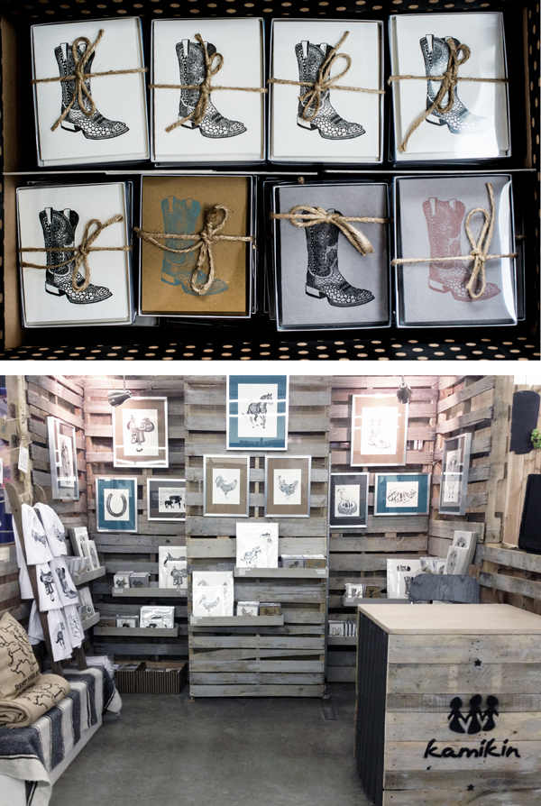
In the 6 week timeline, they fell in love with the process. In one month, they went from having zero inventory to 2,700 packaged pieces of beautiful art to sell.  Over the 16 days at the show, they loved talking with people about letterpress and screen-printing. The prints and stationery were very well received. They even had a little movie playing in the booth to show the customers what a letterpress looks like and how it works. Overall, their debut at the National Western Stock show was a success.

Since January, the trio has put together a website and an Etsy shop. They have enjoyed donating several prints for various auctions to help support their community. And with more plates on the way, the team will be busy building up their inventory for the summer art shows and festivals.

Letterpress Art Prints by Rabbit Wife Pen and Ink

Recently we worked with husband & wife team Mary Ann and Jesse Watkins from Rabbit Wife Pen and Ink on a Sufjan Stevens inspired letterpress art print. Letterpress printed in crisp black ink on 60 pt chipboard, the art prints are 6″ squares with playful hand lettering. Mary Ann shared the backstory on the prints – take a look.

Letterpress art print from Rabbit Wife Studio - letterpress printed by Boxcar Press

I love words. This is one of those phrases that becomes anthemic for a season. The song, “The Dress Looks Nice on You,” will forever take me back to my college boyfriend’s car almost ten years ago. Now he’s my husband, Jesse, and our lives are messy and ragged and achingly beautiful, strewn with life and light. There are days when I am emptied and tattered. But I see my boys with their Papa, riding their bikes down hills in a graveyard near our house in the amber of the day, bathed in sunlight, marching through mountains of leaves. These images are stitched together in my mind like a home-spun slide show. I can see a lot of life in them; a lot of bright in them.

This design is the first thing I sent to print. It was invigorating and life-giving to work on. I would close my eyes at night and see the letters fitting together, like Tetris pieces. I sent it off to Boxcar and shortly after, one hundred letterpress prints sat on my doorstep. I’m thrilled with how they turned out. The thickness of the chipboard is perfect and exactly what I had in mind. And the tactile experience of the letterpress indentions is dreamy.

Letterpress art print from Rabbit Wife Studio - letterpress printed by Boxcar Press Letterpress art print from Rabbit Wife Studio - letterpress printed by Boxcar Press

The art prints are available for purchase on Rabbit Wife’s Etsy shop! Many thanks to Mary Ann and Jesse for collaborating with us on this new venture.

The Bucket Series: Limited Edition Letterpress Maps & Prints by Reva and Tommy Nafso

We were excited to work with Reva and Tommy Nafso on a few letterpress prints for their new Bucket Series, a unique project that connects Experts and Artists to create a series of limited edition, curated letterpress art pieces. The experts provide a bucket list, the artists interpret each list into a map, and then they are letterpress printed. A new volume is issued every month, with a limited run of 100 prints created for each volume.

Bucket List Poster Series, Vol. A: The College Football Volume.

The experts can submit a Bucket List with any theme – from arts to travel to gastronomy. For example, a European travel expert can create a “When in Rome” list, while an art expert can provide a list of must-see art museums, and so on. After the list has been crafted, the Bucket Series Art team — which consists of Marilia Beltrame from Brazil, and Mike Swallow from England — works with a new featured artist each month to interpret the list into an 11×17 map. In addition to the map, two 8×10 minimalist letterpress prints showcasing individual design elements from the map are created with each volume. Gold foil is used to accentuate one of the two art prints.

For their Kickstarter project, the Bucket Series has created 2 exclusive volumes: A – The College Football Volume and B – The European Volume. We had the pleasure of printing the College Football volume, which includes approximately 50 illustrated college football traditions, along with a gold foil emblem. The two corresponding 8×10 art prints from this volume show off Yale’s Handsome Dan and Notre Dame’s Golden Dome, in gold foil. These are backer rewards and ship once the campaign is fully funded and complete, and before the holidays. Volume B, the European Union bucket list, will be printed in early December and will hopefully ship before the holidays.

Bucket Series Vol. A: The College Football SeriesBucket Series Vol. A: The College Football Series

Visit the Nafso’s Kickstarter page to support the project and check out their schedule for 2015!

Photos provided by Reva Nafso. 

Let’s see that printed: Dia de los Muertos letterpress cards from Pablo Delgado

From start to finish, watching the production of a custom photopolymer plate is fascinating. From the genesis of a digital design file to hand-inspection of a pulled proof, the transformation of light-sensitive photopolymer to a vehicle for endless hours of printing fun is curiously intriguing. We followed one of Pablo Delgado’s recent plate orders as he had fun using the plate on the at-home Fiskars Fuse system to create letterpress cards.

Delgado-img5-1 Delgado-img6-1

Starting out, I went with the Fiskars Fuse because of the maximum size for the platform. At 12 inches it is double the max width on the Quickutz Epic Six. The first problem was that there wasn’t a platform available at the 12 inches that would allow me the registration necessary to print on the precut A-6 size cards. So I ordered two 12″x12″ clear cast acrylic sheets from Tap Plastics. The bottom piece was .472″ thick and would work as my base for the cardstock, and the top piece was .236″ thick and would act as the chase for the photopolymer plate. I cut a heavy white plastic in two strips to work as hinges and put it all together. It looked a bit crude, but it worked great and I am able to take advantage of the wider roller length. I adhered a sheet of hard heavy white plastic to help achieve the thickness necessary, and a couple of thinner sheets with grids on them to help with placement. The ink I am using for the particular card I am showing are both Great Western Ink oil based Pantone 185 and Reflex Blue.

Delgado-img1

I began with a one color card to figure out the process, and this went fairly smooth. I played around with packing to get the depth I wanted and when I accomplished this I took the leap into a two color card. This was a challenge. Keeping an even consistency of the two inks on the brayer was difficult to figure out at first. I had to try different ways of getting enough but not too much ink on the rubber roller without causing ghosting or plugging up the detail. In the end a couple of thin coats seemed to work best as the perfect balance. One trick I learned to keep the messiness down was to put some transparent tape on the plate strips so when I rolled out the ink on the plate, I could lift off the inked  tape and the strip remained clean. I had a lot of fun figuring out this process. It definitely requires a good bit of patience, the ability to look at things analytically, and organization to keep the ink only where it belongs. The rewards of seeing your art reproduced in vibrant colors and beautiful stock outweighs any of the downsides you experience.

Delgado-img2

The art I am using is original. It is inspired directly by the traditional “Dia de los Muertos” style of images that depict “calacas” (skeletons) and “diablitos” (little devils) in humorous and satirical poses. “Amor Eterno Artesanias” is the name that I am creating under.

Delgado-img3-1

It has been a journey that has taken several years to come together, and the work is only just beginning. I had not been able to find the right medium to share this art through before, so I am very thankful to Boxcar Press for not only putting out information on how to create these letterpress images, but also the personal assistance they offer. Whatever this venture may turn in to, it’s reassuring to know that Boxcar Press is there to help out in any way they can.

Huge round of thanks out to Pablo for letting us get a closer look at his beautifully printed pieces!

Let’s see that printed: letterpress posters for Hobofest

Here at Boxcar Press, we look at many, many files every week that are submitted for platemaking. Wedding invitations, greeting cards, text for fine press books and even the occasional unidentifiable piece (translation: large blobs and sketchy lines). More than a few of these files make us wonder what they will look like in their final printed form. So, we decided not to wonder anymore and will be periodically following up with customers to satisfy our inquiring minds and to get the full story on neat projects. For added interest, we will be following the process of the plate through our shop and pick up with the printer on press.

platemaking-img1-2

We saw this letterpress poster file and admired the boldness of the design. It also appealed to us because it was for a musical festival put on by Adirondack Sustainable Communities Inc, an organization whose vision statement is empowering communities to care for the people, the land and the future of the Adirondacks.  The Adirondack Region is a six million acre region of endless lakes and wild mountains in Northern New York. With the assistance of Peter Seward, one of the organizers of this weekend’s event, we were able to get the rest of the story on this letterpress poster

Todd Smith and I, Peter Seward, organize and host a free all-day music festival called Hobofest – now in its sixth year – in the small mountain village of Saranac Lake. Part of our collaboration is designing a new graphic each year, which serves to brand the event, featured as posters, flyers and on T-shirts. From the beginning our primary means of funding the event was through T-shirt sales, and we often marvel at how many of these shirts are out there.

poster-img2

In addition to printing on shirts, the graphic is also printed as a fine art print edition. This year was the first time that we printed the design using a polymer plate. We wanted the precision that this process offered and to take advantage of Bluseed Studios’ Vandercook press. In years past, I actually used the Vandercook as a solid base to silkscreen on!

poster-img3

Bluseed Studios is an inclusive community art center offering studio space for printing, paper making, and ceramics, and a gallery and performance space upstairs. We printed with burlap paper made at Bluseed Studios, donated by Drew Mattot and Maraget Mahan, who travel the world with a portable pulp beater as the Peace Paper Project. Drew and Margaret were the ones who recommended that we use Boxcar Press to create a polymer plate!

poster-img4

We’ve always limited the design as one color and strive for impact and clarity, and an aesthetic informed by earlier printing technologies. We’re very happy with the prints which we’ll vend alongside our other merchandise on event day.

poster-img1

Our thanks to ADKSC.org and Blueseed Studios for letting us see their project!

Rose Gold Foil Stamped Business Cards

We worked with Sarah at the Windmill Paper Boutique in Boca Raton, Florida to create these foil stamped business cards for Bashert Jewelry. We used our Kluge press to foil stamp the cards with rose gold foil on thick, 2-ply black museum board. The end result? Simple, elegant and luxurious.

BC_11A1706BC_11A1705

Client: Bashert Jewelry | Designer: Sarah Gluchacki from the Windmill Paper Boutique | paper: 2-ply Rising Museum Board, black | foil: rose gold shine | press: Kluge | Job #22568

Gold Shine Foil Stamped Gala Invitations

We worked with the talented and gracious Katie Barr of Tucked to create invitations and place cards for Reach for the Stars, a fund-raising gala to benefit St. Anne’s – Belfield School, a private school for Kindergarten through 12th grade in Charlottesville, Virginia. The double-sided invitations feature gold shine foil stamping and an exquisite constellation map on sapphire paper. The place cards included an inspirational poem and Katie personalized them by using metallic gold ink and a calligraphy pen to write each guest’s name. The combination of the design elements, gold foil and rich paper color made for quite the dramatic look!
Foil stamped place cards printed by Boxcar Press Gold foil stamped gala invitations printed by Boxcar Press, designed by Katie Barr of Tucked BC_MG_8668Gold foil stamped gala invitations printed by Boxcar Press, designed by Katie Barr of Tucked

foil stamping: gold shine | paper: Colorplan 100# cover in sapphire | size: invitations 5 x 7 when folded; menus 4.12 x 9.12  | job numbers: 22003 + 22392

Place cards photographed by KMS Photography 

At-Home L Letterpress Adventure Printing Tips

The infamously wise Sun Tzu once said “Victorious warriors win first and then go to war, while defeated warriors go to war first and then seek to win.” Old Mr. Sun is spot on and one our wonderful Boxcar Press customers, Pat Farley of Farley Designs, thinks so too as he rolled up his sleeves and put the advice to use. While tackling an invitation suite on the DIY style L Letterpress, Pat had such a excellent time working with the machine that he shared with us some of his at-home printing advice.

L Letterpress at-home printing tips and advice via Pat Farley of farleydesigns.com.

This was my first project using my NEW L Letterpress and I suggest that everyone reads the following tricks from my friends at Boxcar Press before ever attempting anything. It saved me a lot of headaches and money. Check them out. You won’t be disappointed.

L Letterpress Printing Techniques from Boxcar Press
The L Letterpress Revisited
What You Need to Print Well On Your L Letterpress Machine 

Helpful Items To Have On Hand Before You Start

  • 6″ soft brayer( A MUST )
  • A second plate to roll the ink on (I used a cheap glass plate off a picture frame from a  dollar store)
  • Custom KF152 plates from Boxcar Press (ask for extra strips, you will need them)
  • Vanson ink – I used oil based, it dries faster. Use rubber based ink if you are planning on leaving it overnight.
  • Ink knife/spackling knife (dollar store)
  • Paper… I used a thick, 100% Cotton, 220lbs stock (gives amazing depth and great texture)
  • Henry Gage Pins (2 packs of 12)
  • An old t-shirt or soft rage to wipe off the plates, press, and everything in between

And the Printing Adventure Begins

When I created the files for the plates I made sure to leave a 1/8 bleed on all sides. This is a must if you are using thick paper. It will prevent any indents from the plate when you pass it through the machine.

I also used the strips to make sure I rolled the ink on evenly. However, I was told to remove the strips before passing it throughout the machine, but with this project I did not. The reason for this is because I was making 30 invites and it would have taken me ages to remove and replace the strips after every pass. What I did instead was leaving a side free from any Henry Gage pins.

L Letterpress at-home printing tips using Henry Gage Pins.

After a pass I wiped the extra ink that was by the strip on the surface of the bed, I then slid the invite off and replaced it with a new blank invite… easy.

L Letterpress at-home printing tips using inking roller bearer strips from Boxcar Press.

I loved the whole process. Make sure you give yourself enough time so that you don’t feel rushed. It was very relaxing for me, even though I repeated the process 30 times. Every time I popped open the Letterpress to reveal the new invite I felt like it was my first time. There is a learning curve but that’s also the fun part. If you are planning on doing this just once I would stay away, but I’m planning on doing business cards and any other projects I can get my hands on, which makes the money spent well worth it.

L Letterpress at-home printing tips using a blind deboss as a "second" ink color.

Also, laying down a plastic sheet on your workspace is a great idea as the process can be messy and the sheet will help protect your work surface. Even a semi-durable plastic tablecloth will do the trick.

And always remember, less is more when it comes to ink.  It only took 1-2 teaspoons for 30 invites.

Boxcar Press Bonus Round Tips

We suggest, if you are using both inking roller bearer strips, to extend the plate strips about 1″ past each end of your plate so your brayer won’t stop on your design and possibly leave an ink blob.

If you’re looking to save a little bit on ink and time, try printing part of the design in a blind deboss (as Pat has used) and it can add a lot to your design without investing in a second ink.

Using 110 lb and thinner paper?  We have something around our shop that can add a little more packing behind your paper and get you a little bit deeper bite into your paper.  It is the plastic protective overlays that cover our plates before processing.  They are sturdy and resist impression.  While using the L Letterpress in our office, we have cut one sheet of this plastic the same size as our paper and placed it behind our paper in the Henry Gage pins.  It gave us that little extra thickness (.004″ to .005″)  to get the impression we all love.  It held up for a long time, too.  We got the idea because some of the printers in our print shop use it for packing.  Ask for a sheet or two on your next platemaking order if you are printing on the L Letterpress and experimenting.

L Letterpress at-home printing tips using acetate as packing and makes plates last longer.

And lastly, to extend your plates’ shelf life, make sure to keep your plates stored in a sealed ziploc bag after printing in a flat drawer.

Have a tip or two that you want to share? Leave your best advice below in our comments section. We’d love to hear from you about what works and what doesn’t!

Malcolm’s Letterpress Dinosaur Cards

Today we’ve got a special treat to share — and if this story doesn’t make you saw “aw!”, we’re not sure what will. We recently had the pleasure of letterpress printing these amazing dinosaur cards for Malcolm by way of his amazing Aunt Whitney, who shared the story behind his cards with us.
Malcolm's letterpress dinosaur cards
Malcolm is 5 1/2 years old. He is a prolific dinosaur artist filling many sketch books with dino drawings, in addition to a few trucks, helicopters and airplanes. We wanted to share some of Malc’s drawings, so we decided to have some letterpress cards made at Boxcar Press. We used a collage of his favorite drawings to make the postcard. Because he’s left handed, Malcolm signed his work with his backwards signature. Malcolm LOVES his first letterpress printed piece. The first card goes to Grandma Dorothy!  
malc-painting
The photos above show Malcolm with his artist’s easel, his bedroom wall (which is naturally filled with dinosaur drawings) and his newly printed dino cards. Big thanks to Malcolm’s Aunt Whitney for letting us share this fun story!

Advice for letterpress printers: a letter from the machinist’s daughter.

Yesterday Harold talked about his letterpress printing mentor, Paulette Myers-Rich of Traffic Street Press. Here’s an email from Paulette that captures her generous spirit. Harold explains: “Paulette wrote this to me in 2001 and I thought it read like poetry. I turned it into a broadside for the APA, printed in Boxcar Press’s basement digs when I was working out of my house, using Zapfino back when Zapfino used to be cool.”
Harold Kyle turned this letter from his mentor, Paulette Myers-Rich, into abroadside for the APA

Harold Kyle turned this letter from his mentor, Paulette Myers-Rich, into abroadside for the APA

“Harold, Sounds like your adventures with machinery are going along right about how they should. Machines and equipment were never designed to cooperate. They are the boss. We are subservient to them and they are temperamental, destructive, dangerous, and cranky. They need lots of understanding, TLC, and grease. John Henry and his exploded heart found this out. Just finding a place to put the stuff is only the beginning. Then there are the adjustments, the cleaning, the replacement parts, the exotic, expensive obsolete tools to go with the machine, the bolts no longer manufactured, the gremlins that live inside that won’t let you do your work properly. It’s the fourth of four nuts that is rusted on or frozen and refuses to come loose as easily as its three predecessors. It is also the mastery of metal, the ability to use machines to an amazing end, to crank out stuff that few others can, to become one with gears and cylinders, to go places you couldn’t otherwise go. What a life! Take care and wear your steel toes, (I mean it!)”
Paulette Myers-Rich