Letterpress Art Prints for Obvious State’s Kickstarter Campaign

Obvious State is a New York City-based creative studio and literary brand meant to inspire through their art prints, tote bags, and other items for bibliophiles, word lovers, and art lovers alike. We recently partnered with Evan at Obvious State to create these large, 11″ x 14″ letterpress prints featuring their “Martini” artwork, in black ink on our Heidelberg Cylinder Press. The prints are available for sale (along with 11 other styles that we’ll be letterpress printing, too!) now through June 8th as part of their current Kickstarter campaign. Learn more and get yours today!

Letterpress art prints from Boxcar Press

Letterpress art prints from Boxcar Press

Letterpress art prints from Boxcar Press

Letterpress art prints by George Davis on display in the Adirondacks

Earlier this summer, we teamed up with George Davis to create letterpress art prints for his latest exhibit, “The Doodle Show,” which is currently on display at the Depot Theatre in Westport, New York. We letterpress printed the trio of art prints on our Heidelberg SBB cylinder press to ensure even ink coverage of the designs, which all make great use of negative space and feature heavy floods of classic black ink. Today we’re sharing George’s inspiration behind the designs, which will be on display until October 15th.

Black and white letterpress art prints from Boxcar Press

Let’s start with Soar, a dizzying bird flying skyward. The seed for this image was a ceramic tile I spotted in Taos, New Mexico. Rusty red glaze painted onto a white tile, yellowing with age. Simple image, sparse brush strokes. It struck me that this carefree creature was trapped in the grid of tiles. Cubicled. But it yearned to escape, longed to fly high into the turquoise dome. Freedom. So I liberated it. I simplified the silhouette and added the concentric silhouette. Echoes. Slightly vertiginous.

Soar, a letterpress art print designed by George Davis and printed by Boxcar Press

Design Shoal began with a 2-3 foot tall, hand painted ceramic vase, one of a pair that stood in opposite corners of a room in Anguilla. As I recall, the pattern on the vase was blue-green, maybe aquamarine. The background was white. The walls were white. And the vases — exotic artifacts from afar — were balancing the upholstery. Or the immense chandelier. Or the panoramic view of the Mediterranean. Designed. Decorated. Carefully choreographed, perhaps a little too carefully. The vases, though intricately detailed, seemed less self-conscious, more alluring. I loved their texture, was distracted by the possibility of the same vase underwater, sunken treasure, tropical fish schooling and shoaling around it. The fish is actually a single image duplicated, tweaked, and rescaled, and it was sketched quickly after snorkeling.

Design Shoal, a letterpress art print designed by George Davis and printed by Boxcar Press

Soar and Design Shoal are included in 40×41: Midlife Crisis Postponed, a collection of meditations on middle age. They are visual poems, an experiment that I’m revisiting in a second edition due out by year’s end. 

Letterpress art prints designed by George Davis on display

Soar and Design Shoal interspersed with drawings by artists Kevin Raines and Judy Guglielmo.

St. Joseph’s Steeple is a standing-on-the-ground view looking almost directly up at the tall pointy part of a church located a five minute walk from my home. I’m attracted to unusual perspectives. I’m attracted to texture (tactile and visual). Combining both provides a fresh look at this handsome but restrained country church. Or at least that’s what I was hoping to achieve. The illustration is included in Essex, New York Architecture: A Doodler’s Field Guide, an unconventional handbook intended to inspire architectural curiosity and creativity.

Letterpress art prints designed by George Davis on display

St. Joseph’s Steeple (and Noble Clemons House, leftmost image) interspersed with drawings by architect Bryan Burke.

 St. Joseph's Steeple letterpress art print designed by George Davis and printed by Boxcar Press

All three of these images are what I refer to as digital doodles. A few years ago I vowed to transform my mobile devices from productivity tools into creativity tools. From albatross to adventure, ball and chain to hot air balloon. Less data overload; more whimsy. Less anxiety; more joy. Today we’re so inundated with digital demands, deadlines, commitments, communications that we sometimes overlook the magnificent world around us. We trudge around with our necks doubled and our fingers swiping and typing. When we glance up it’s too often just to document our sexy appetizer or our dog’s antics for our friends and family on social media. We too rarely distill anything enduring from the digital detritus, rarely harness our devices’ remarkable capacity for invention and caprice and wonder. So I decided to try. My digital doodles combine illustrations, photographs, and collage. They inevitably endure multiple iterations in Photoshop purgatory as I play and explore and experiment and remix and strip away and occasionally — if I get really fortunate — a few of these digital first image evolve to a stage when ink and paper and fingerprints are indicated. This is the evasive but glorious goal. Boxcar Press helped me achieve this goal with Soar, Design Shoal, and St. Joseph’s Steeple. And I am profoundly grateful. Thank you. Thank you. Thank you.

 St. Joseph's Steeple letterpress art print designed by George Davis and printed by Boxcar Press

Many thanks to George for sharing his inspiration behind his impressive art prints! If you’re planning a visit to the Adirondacks, be sure to visit the Depot Theatre to check out the exhibit.

Gallery photographs provided by George Davis. 

Letterpress coasters for The Lab Creative

We recently worked with The Lab Creative — new neighbors of ours here in the Delavan Center — to create custom letterpress coasters for a recent building-wide open studio event. The team at The Lab created a cool video showing their entire process, including the coasters being printed on one of our Heidelberg Windmills. Take a look!

Letterpress Art Prints by Rabbit Wife Pen and Ink

Recently we worked with husband & wife team Mary Ann and Jesse Watkins from Rabbit Wife Pen and Ink on a Sufjan Stevens inspired letterpress art print. Letterpress printed in crisp black ink on 60 pt chipboard, the art prints are 6″ squares with playful hand lettering. Mary Ann shared the backstory on the prints – take a look.

Letterpress art print from Rabbit Wife Studio - letterpress printed by Boxcar Press

I love words. This is one of those phrases that becomes anthemic for a season. The song, “The Dress Looks Nice on You,” will forever take me back to my college boyfriend’s car almost ten years ago. Now he’s my husband, Jesse, and our lives are messy and ragged and achingly beautiful, strewn with life and light. There are days when I am emptied and tattered. But I see my boys with their Papa, riding their bikes down hills in a graveyard near our house in the amber of the day, bathed in sunlight, marching through mountains of leaves. These images are stitched together in my mind like a home-spun slide show. I can see a lot of life in them; a lot of bright in them.

This design is the first thing I sent to print. It was invigorating and life-giving to work on. I would close my eyes at night and see the letters fitting together, like Tetris pieces. I sent it off to Boxcar and shortly after, one hundred letterpress prints sat on my doorstep. I’m thrilled with how they turned out. The thickness of the chipboard is perfect and exactly what I had in mind. And the tactile experience of the letterpress indentions is dreamy.

Letterpress art print from Rabbit Wife Studio - letterpress printed by Boxcar Press Letterpress art print from Rabbit Wife Studio - letterpress printed by Boxcar Press

The art prints are available for purchase on Rabbit Wife’s Etsy shop! Many thanks to Mary Ann and Jesse for collaborating with us on this new venture.

The Bucket Series: Limited Edition Letterpress Maps & Prints by Reva and Tommy Nafso

We were excited to work with Reva and Tommy Nafso on a few letterpress prints for their new Bucket Series, a unique project that connects Experts and Artists to create a series of limited edition, curated letterpress art pieces. The experts provide a bucket list, the artists interpret each list into a map, and then they are letterpress printed. A new volume is issued every month, with a limited run of 100 prints created for each volume.

Bucket List Poster Series, Vol. A: The College Football Volume.

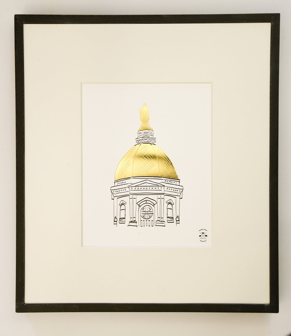
The experts can submit a Bucket List with any theme – from arts to travel to gastronomy. For example, a European travel expert can create a “When in Rome” list, while an art expert can provide a list of must-see art museums, and so on. After the list has been crafted, the Bucket Series Art team — which consists of Marilia Beltrame from Brazil, and Mike Swallow from England — works with a new featured artist each month to interpret the list into an 11×17 map. In addition to the map, two 8×10 minimalist letterpress prints showcasing individual design elements from the map are created with each volume. Gold foil is used to accentuate one of the two art prints.

For their Kickstarter project, the Bucket Series has created 2 exclusive volumes: A – The College Football Volume and B – The European Volume. We had the pleasure of printing the College Football volume, which includes approximately 50 illustrated college football traditions, along with a gold foil emblem. The two corresponding 8×10 art prints from this volume show off Yale’s Handsome Dan and Notre Dame’s Golden Dome, in gold foil. These are backer rewards and ship once the campaign is fully funded and complete, and before the holidays. Volume B, the European Union bucket list, will be printed in early December and will hopefully ship before the holidays.

Bucket Series Vol. A: The College Football SeriesBucket Series Vol. A: The College Football Series

Visit the Nafso’s Kickstarter page to support the project and check out their schedule for 2015!

Photos provided by Reva Nafso. 

Rose Gold Foil Stamped Business Cards

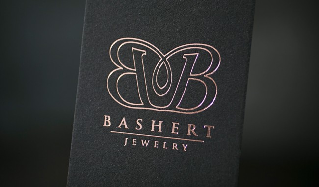
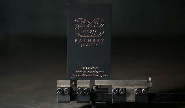
We worked with Sarah at the Windmill Paper Boutique in Boca Raton, Florida to create these foil stamped business cards for Bashert Jewelry. We used our Kluge press to foil stamp the cards with rose gold foil on thick, 2-ply black museum board. The end result? Simple, elegant and luxurious.

BC_11A1706BC_11A1705

Client: Bashert Jewelry | Designer: Sarah Gluchacki from the Windmill Paper Boutique | paper: 2-ply Rising Museum Board, black | foil: rose gold shine | press: Kluge | Job #22568

Gold Shine Foil Stamped Gala Invitations

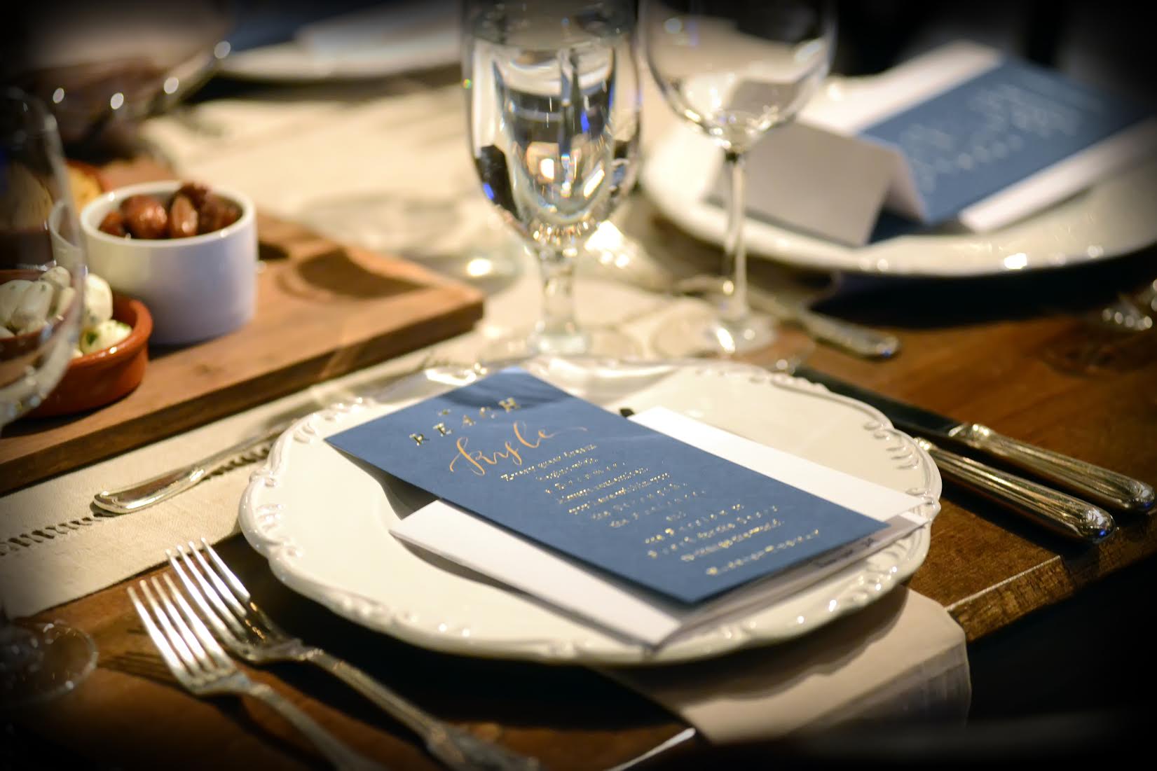
We worked with the talented and gracious Katie Barr of Tucked to create invitations and place cards for Reach for the Stars, a fund-raising gala to benefit St. Anne’s – Belfield School, a private school for Kindergarten through 12th grade in Charlottesville, Virginia. The double-sided invitations feature gold shine foil stamping and an exquisite constellation map on sapphire paper. The place cards included an inspirational poem and Katie personalized them by using metallic gold ink and a calligraphy pen to write each guest’s name. The combination of the design elements, gold foil and rich paper color made for quite the dramatic look!
Foil stamped place cards printed by Boxcar Press Gold foil stamped gala invitations printed by Boxcar Press, designed by Katie Barr of Tucked BC_MG_8668Gold foil stamped gala invitations printed by Boxcar Press, designed by Katie Barr of Tucked

foil stamping: gold shine | paper: Colorplan 100# cover in sapphire | size: invitations 5 x 7 when folded; menus 4.12 x 9.12  | job numbers: 22003 + 22392

Place cards photographed by KMS Photography 

Malcolm’s Letterpress Dinosaur Cards

Today we’ve got a special treat to share — and if this story doesn’t make you saw “aw!”, we’re not sure what will. We recently had the pleasure of letterpress printing these amazing dinosaur cards for Malcolm by way of his amazing Aunt Whitney, who shared the story behind his cards with us.
Malcolm's letterpress dinosaur cards
Malcolm is 5 1/2 years old. He is a prolific dinosaur artist filling many sketch books with dino drawings, in addition to a few trucks, helicopters and airplanes. We wanted to share some of Malc’s drawings, so we decided to have some letterpress cards made at Boxcar Press. We used a collage of his favorite drawings to make the postcard. Because he’s left handed, Malcolm signed his work with his backwards signature. Malcolm LOVES his first letterpress printed piece. The first card goes to Grandma Dorothy!  
malc-painting
The photos above show Malcolm with his artist’s easel, his bedroom wall (which is naturally filled with dinosaur drawings) and his newly printed dino cards. Big thanks to Malcolm’s Aunt Whitney for letting us share this fun story!

Advice for letterpress printers: a letter from the machinist’s daughter.

Yesterday Harold talked about his letterpress printing mentor, Paulette Myers-Rich of Traffic Street Press. Here’s an email from Paulette that captures her generous spirit. Harold explains: “Paulette wrote this to me in 2001 and I thought it read like poetry. I turned it into a broadside for the APA, printed in Boxcar Press’s basement digs when I was working out of my house, using Zapfino back when Zapfino used to be cool.”
Harold Kyle turned this letter from his mentor, Paulette Myers-Rich, into abroadside for the APA

Harold Kyle turned this letter from his mentor, Paulette Myers-Rich, into abroadside for the APA

“Harold, Sounds like your adventures with machinery are going along right about how they should. Machines and equipment were never designed to cooperate. They are the boss. We are subservient to them and they are temperamental, destructive, dangerous, and cranky. They need lots of understanding, TLC, and grease. John Henry and his exploded heart found this out. Just finding a place to put the stuff is only the beginning. Then there are the adjustments, the cleaning, the replacement parts, the exotic, expensive obsolete tools to go with the machine, the bolts no longer manufactured, the gremlins that live inside that won’t let you do your work properly. It’s the fourth of four nuts that is rusted on or frozen and refuses to come loose as easily as its three predecessors. It is also the mastery of metal, the ability to use machines to an amazing end, to crank out stuff that few others can, to become one with gears and cylinders, to go places you couldn’t otherwise go. What a life! Take care and wear your steel toes, (I mean it!)”
Paulette Myers-Rich