On My Own Time Art Gallery Exhibition at Boxcar Press

By day, the majority of our staff here at Boxcar Press is surrounded by creativity during their workdays— whether it’s designing and illustrating invitations and stationery, or putting ink to paper and printing heirloom pieces. When it comes to their downtime, though, many of our employees have artistic skills beyond the world of letterpress. We had the pleasure of getting to see some of the art from our employees through an exhibition as part of the On My Own Time program through CNY Arts — in total, we had 21 pieces on display from six artists on our staff. Three of the pieces were selected to go on to the larger On My Own Time exhibit that will take place at the Everson Museum in Syracuse this fall. Here’s a peek at our gallery!

The 2017 On My Own Time Boxcar Press art gallery exhibit

The 2017 Boxcar Press On My Own Time Exhibit

The 2017 On My Own Time Boxcar Press art gallery exhibit

Artist: Jennifer DeRoberts

The 2017 On My Own Time Boxcar Press art gallery exhibit

Artist: Jennifer DeRoberts

The 2017 On My Own Time Boxcar Press art gallery exhibit

Artist: Madeline Bartley

The 2017 On My Own Time Boxcar Press art gallery exhibit

Artist: Madeline Bartley

The 2017 On My Own Time Boxcar Press art gallery exhibit

Artist: Clayton Estey

The 2017 On My Own Time Boxcar Press art gallery exhibit

Artist: Rebecca Miller

The 2017 On My Own Time Boxcar Press art gallery exhibit

Artist: Carrie Valenzuela

The 2017 On My Own Time Boxcar Press art gallery exhibit

Artist: Carrie Valenzuela

The 2017 On My Own Time Boxcar Press art gallery exhibit

Artist: Carrie Valenzuela

The 2017 On My Own Time Boxcar Press art gallery exhibit

Artist: Thomas Abbamont

Letterpress Art Prints for Obvious State’s Kickstarter Campaign

Obvious State is a New York City-based creative studio and literary brand meant to inspire through their art prints, tote bags, and other items for bibliophiles, word lovers, and art lovers alike. We recently partnered with Evan at Obvious State to create these large, 11″ x 14″ letterpress prints featuring their “Martini” artwork, in black ink on our Heidelberg Cylinder Press. The prints are available for sale (along with 11 other styles that we’ll be letterpress printing, too!) now through June 8th as part of their current Kickstarter campaign. Learn more and get yours today!

Letterpress art prints from Boxcar Press

Letterpress art prints from Boxcar Press

Letterpress art prints from Boxcar Press

Free same-day rush service on letterpress plates

Need letterpress plates fast? Like, really fast? We are excited to announce that same-day rush plate orders are free. If you submit the order before 1pm Eastern, Monday through Friday, we can ship the plates the same day for no additional charge. Just select Rush Service on the “Choose Your Shipping Method” step:

Orders over 120 square inches can also receive free 2-day shipping within the US.

Free same-day rush service now available from Boxcar Press. letterpress plates.

And one other improvement for 2017: we’ve added PayPal as a payment option for supply orders.

Letterpress art prints by George Davis on display in the Adirondacks

Earlier this summer, we teamed up with George Davis to create letterpress art prints for his latest exhibit, “The Doodle Show,” which is currently on display at the Depot Theatre in Westport, New York. We letterpress printed the trio of art prints on our Heidelberg SBB cylinder press to ensure even ink coverage of the designs, which all make great use of negative space and feature heavy floods of classic black ink. Today we’re sharing George’s inspiration behind the designs, which will be on display until October 15th.

Black and white letterpress art prints from Boxcar Press

Let’s start with Soar, a dizzying bird flying skyward. The seed for this image was a ceramic tile I spotted in Taos, New Mexico. Rusty red glaze painted onto a white tile, yellowing with age. Simple image, sparse brush strokes. It struck me that this carefree creature was trapped in the grid of tiles. Cubicled. But it yearned to escape, longed to fly high into the turquoise dome. Freedom. So I liberated it. I simplified the silhouette and added the concentric silhouette. Echoes. Slightly vertiginous.

Soar, a letterpress art print designed by George Davis and printed by Boxcar Press

Design Shoal began with a 2-3 foot tall, hand painted ceramic vase, one of a pair that stood in opposite corners of a room in Anguilla. As I recall, the pattern on the vase was blue-green, maybe aquamarine. The background was white. The walls were white. And the vases — exotic artifacts from afar — were balancing the upholstery. Or the immense chandelier. Or the panoramic view of the Mediterranean. Designed. Decorated. Carefully choreographed, perhaps a little too carefully. The vases, though intricately detailed, seemed less self-conscious, more alluring. I loved their texture, was distracted by the possibility of the same vase underwater, sunken treasure, tropical fish schooling and shoaling around it. The fish is actually a single image duplicated, tweaked, and rescaled, and it was sketched quickly after snorkeling.

Design Shoal, a letterpress art print designed by George Davis and printed by Boxcar Press

Soar and Design Shoal are included in 40×41: Midlife Crisis Postponed, a collection of meditations on middle age. They are visual poems, an experiment that I’m revisiting in a second edition due out by year’s end. 

Letterpress art prints designed by George Davis on display

Soar and Design Shoal interspersed with drawings by artists Kevin Raines and Judy Guglielmo.

St. Joseph’s Steeple is a standing-on-the-ground view looking almost directly up at the tall pointy part of a church located a five minute walk from my home. I’m attracted to unusual perspectives. I’m attracted to texture (tactile and visual). Combining both provides a fresh look at this handsome but restrained country church. Or at least that’s what I was hoping to achieve. The illustration is included in Essex, New York Architecture: A Doodler’s Field Guide, an unconventional handbook intended to inspire architectural curiosity and creativity.

Letterpress art prints designed by George Davis on display

St. Joseph’s Steeple (and Noble Clemons House, leftmost image) interspersed with drawings by architect Bryan Burke.

 St. Joseph's Steeple letterpress art print designed by George Davis and printed by Boxcar Press

All three of these images are what I refer to as digital doodles. A few years ago I vowed to transform my mobile devices from productivity tools into creativity tools. From albatross to adventure, ball and chain to hot air balloon. Less data overload; more whimsy. Less anxiety; more joy. Today we’re so inundated with digital demands, deadlines, commitments, communications that we sometimes overlook the magnificent world around us. We trudge around with our necks doubled and our fingers swiping and typing. When we glance up it’s too often just to document our sexy appetizer or our dog’s antics for our friends and family on social media. We too rarely distill anything enduring from the digital detritus, rarely harness our devices’ remarkable capacity for invention and caprice and wonder. So I decided to try. My digital doodles combine illustrations, photographs, and collage. They inevitably endure multiple iterations in Photoshop purgatory as I play and explore and experiment and remix and strip away and occasionally — if I get really fortunate — a few of these digital first image evolve to a stage when ink and paper and fingerprints are indicated. This is the evasive but glorious goal. Boxcar Press helped me achieve this goal with Soar, Design Shoal, and St. Joseph’s Steeple. And I am profoundly grateful. Thank you. Thank you. Thank you.

 St. Joseph's Steeple letterpress art print designed by George Davis and printed by Boxcar Press

Many thanks to George for sharing his inspiration behind his impressive art prints! If you’re planning a visit to the Adirondacks, be sure to visit the Depot Theatre to check out the exhibit.

Gallery photographs provided by George Davis. 

Letterpress coasters for The Lab Creative

We recently worked with The Lab Creative — new neighbors of ours here in the Delavan Center — to create custom letterpress coasters for a recent building-wide open studio event. The team at The Lab created a cool video showing their entire process, including the coasters being printed on one of our Heidelberg Windmills. Take a look!

Looking for printers to join the new Etsy Manufacturing Marketplace

Today we’re sharing some big news from Etsy, who recently introduced an exciting new opportunity for letterpress printers. For those of you who don’t know Etsy, it’s a marketplace where people people make, buy, and sell unique goods. Etsy has grown over the last ten years to support over 1.5 million designers selling their products online. As these designers grow, they need production help to scale.

Etsy manufacturing is an exciting new opportunity for letterpress printers

As part of this next step, Etsy has announced Etsy Manufacturing, a new marketplace connecting manufacturers to Etsy designers. Printing is one of the largest categories in need of manufacturing help on Etsy. The great thing about working with Etsy designers is that they appreciate the quality and the craft of the letterpress as much as anyone. 

The goal of Etsy Manufacturing is not to inundate businesses with irrelevant inquiries, but to provide quality leads that will result in long term partnerships. When someone contacts you through Etsy Manufacturing, you can browse their shop and products to make sure it’s a fit on both sides. You can also make a beautiful online profile for your business – accessible to anyone – in just a few minutes. Here’s an example featuring Orlando-based letterpress print shop Mama’s Sauce

Etsy manufacturing is an exciting new opportunity for letterpress printers

Interested? It only takes a few minutes to apply and (in case you were curious) there’s absolutely no cost. You can learn more and apply at www.etsy.com/manufacturing/apply.

Design tips for letterpress printing on chipboard

Available in several paper weights, our 100% post-consumer recycled chipboard is a popular paper choice for letterpress printing. Thick and textured, chipboard is kraft brown and completely utilitarian: we’ve printed wedding invitations, business cards, letterpress broadsides, and more on this versatile stock. Today we’re sharing a few tips from designer Angelena Bruesewitz on how to design for chipboard, along with some of our favorite examples of letterpress printing on this popular paper.

Design tips for letterpress printing on chipboard from Boxcar Press

Dark colors + bold lines are a great starting point.

Darker colors tend to be the easiest to work with when it comes to printing on chipboard – you’re sure to have contrast and legibility as long as your line weights are thick enough to be readable.

Kneeling Drunkards letterpress poster | Designed by Jarrod Taylor Design, Letterpress printed by Boxcar Press

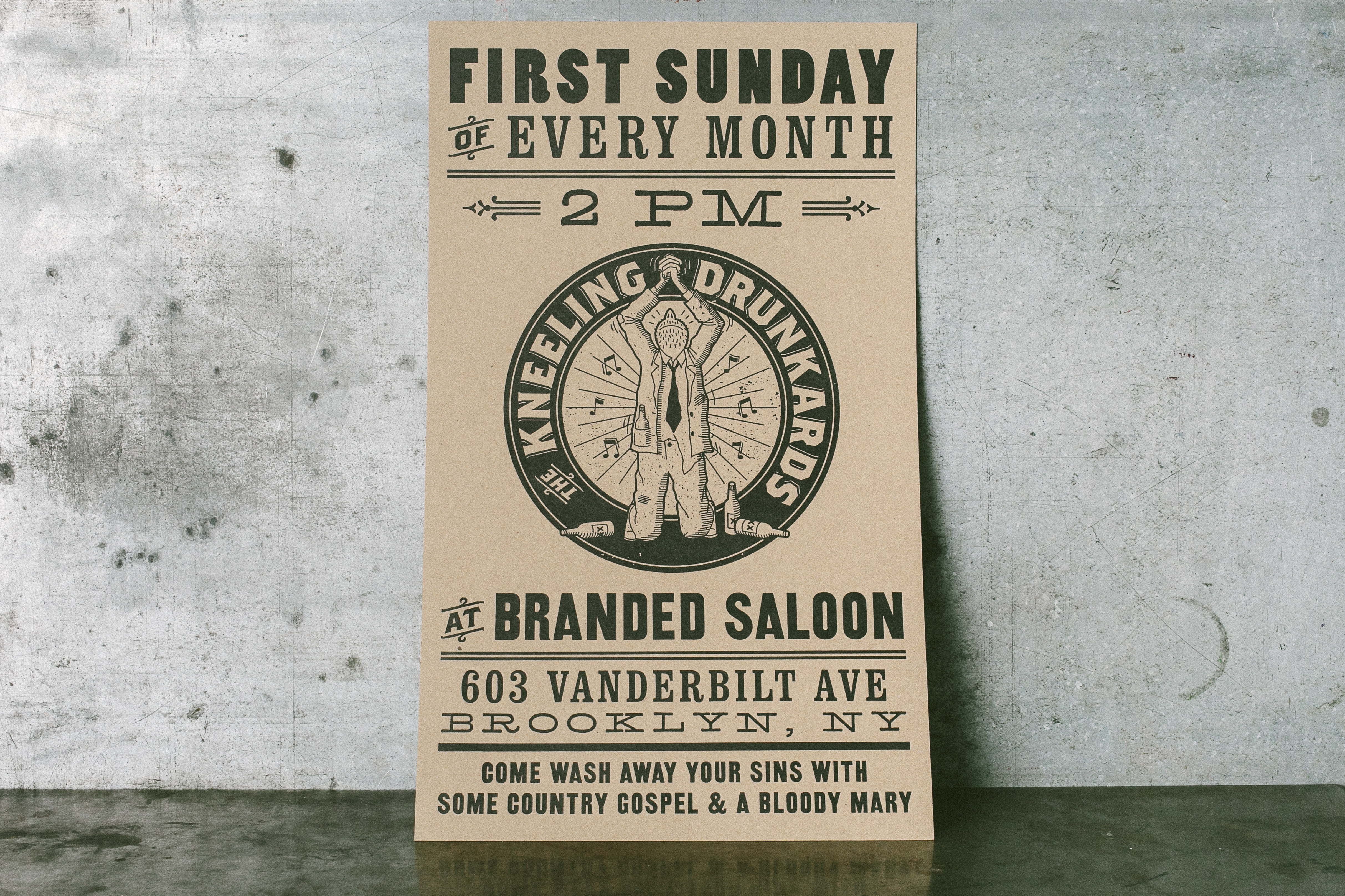
Kneeling Drunkards 12″ x 20″ poster, job #25934. Designed by Jarrod Taylor, printed in black ink on 28 pt chipboard on our Cylinder Press

Bold letterpress business cards for UXA Lab - letterpress printed by Boxcar PressBold letterpress business cards for UXA Lab - letterpress printed by Boxcar Press

UXA Lab 3.5” x 2″ business cards, job #26428 for UXA Lab. Printed in Pantone 185U on 60pt chipboard on our Heidelberg Windmill Press

Tips for designing a low contrast piece.

If you’re looking to create a low-contrast piece, make sure your line weights are thick enough to be legible. We recently worked with Angelena to create the identity suite below, which included a double-sided gift card with metallic gold ink on the back. The piece required a second run on press to achieve the desired look, but the end result was a subtle bamboo forest with lots of intricate details.

Letterpress identity suite for The Wellness Tree - printed by Boxcar Press, designed by Angelena BruesewitzLetterpress identity suite for The Wellness Tree - printed by Boxcar Press, designed by Angelena Bruesewitz

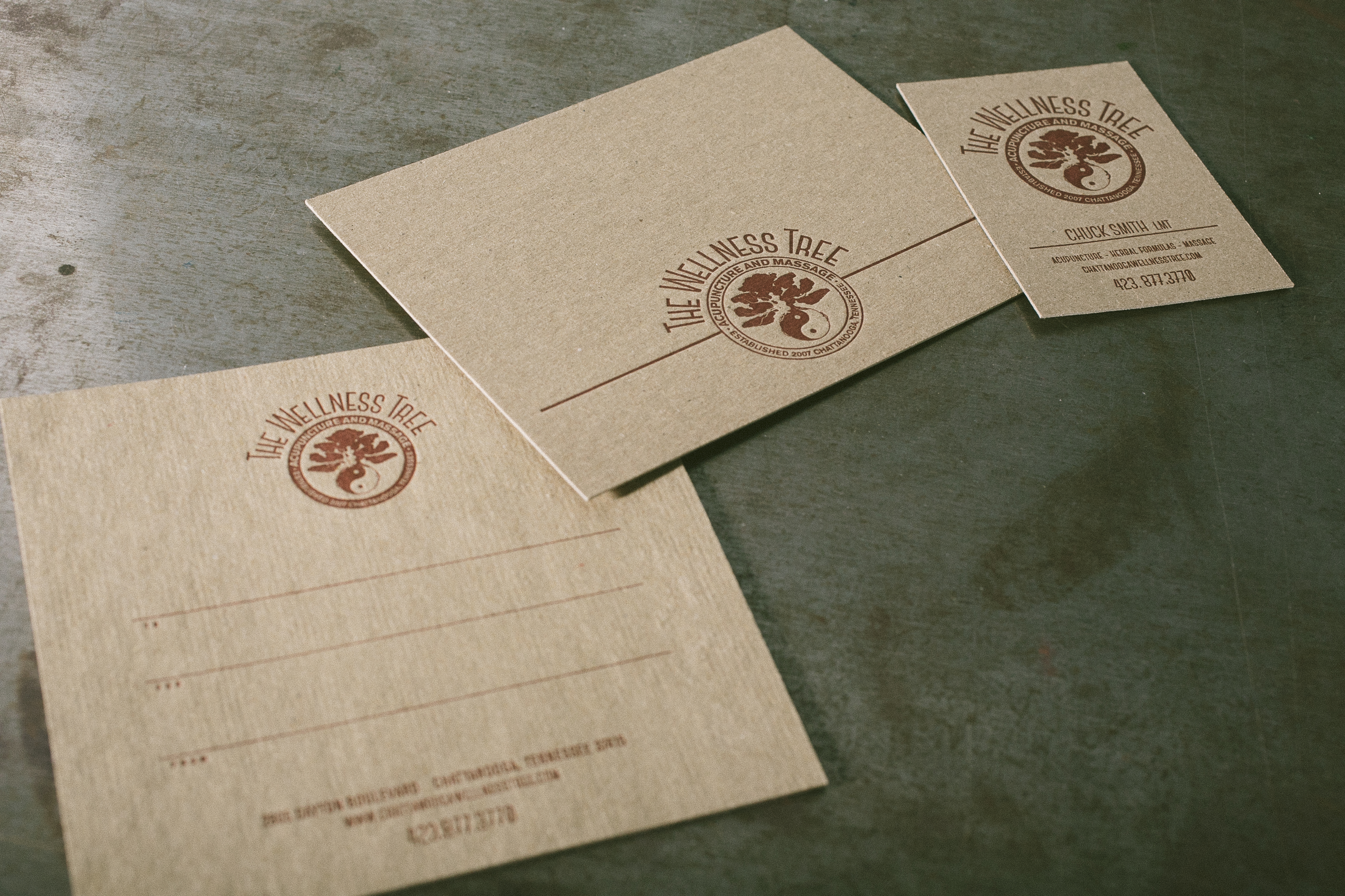
Identity suite for The Wellness Tree, jobs #26310 + 24962, designed by Angelena Bruesewitz at the Dandelion Shoppe. 2.5″ x 3.5″ business cards and 5.5″ x 4.25″ note cards, printed in Pantone 1805U on 28pt chipboard. 5″ x 5″ double-sided gift certificates, printed on 60pt chipboard in Pantone 1805U on the front, with a double hit of 874U on the back.

Keep the end use in mind.

When it comes to designing for chipboard and selecting colors and fonts to work with, keep your customer and the end result in mind. If you’re going for something rustic, Angelena recommends tone-on-tone. More fun and playful? Opt for lighter shades with more vibrancy to achieve the look. The earth tones used on the Bedford 234 business cards below matched the restaurant’s rustic, farm to table vibe perfectly.

Letterpress business cards for Bedford 234 | Designed by Sol Shim, printed by Boxcar PressLetterpress business cards for Bedford 234 | Designed by Sol Shim, printed by Boxcar Press

Bedford 234 3.5” x 2″ business cards, job #26802. Designed by Sol Shim, printed in Pantone 161U + 021U on 28 pt chipboard. 

If color accuracy is a priority, consider drawdowns or foil.

Just like printing on any other colored paper, color does shift on chipboard. If color accuracy is of the utmost importance for your clients, foil stamping may be a better choice than letterpress.  Alternatively, we offer a drawdown service for $50 per color if you’d like a test run to see how your color would look on our chipboard.

C_A11A2945Letterpress identity suite for The Wellness Tree - printed by Boxcar Press, designed by Angelena Bruesewitz

Faith Neidig 3.5” x 2″ business cards, job #24666. Designed by Kelly Moses Design, printed in black ink + gold shine foil on 28pt chipboard on our Heidelberg Windmill + Kluge presses. 

Red foil stamped holiday cards - design by Jenny C Design, printing by Boxcar Press

Custom 4.25″  x 5.5″ holiday cards, job #25576. Designed by Jenny C Design, printed in red shine foil on 28pt chipboard on our Kluge.

Go a shade brighter to achieve richer colors.

Because ink colors may appear more dull or muted on chipboard, we recommend going a shade brighter in order to compensate for the difference.

Die-cut product tags - letterpress printed on chipboard by Boxcar Press Die-cut product tags - letterpress printed on chipboard by Boxcar Press Die-cut product tags - letterpress printed on chipboard by Boxcar Press Die-cut product tags - letterpress printed on chipboard by Boxcar Press

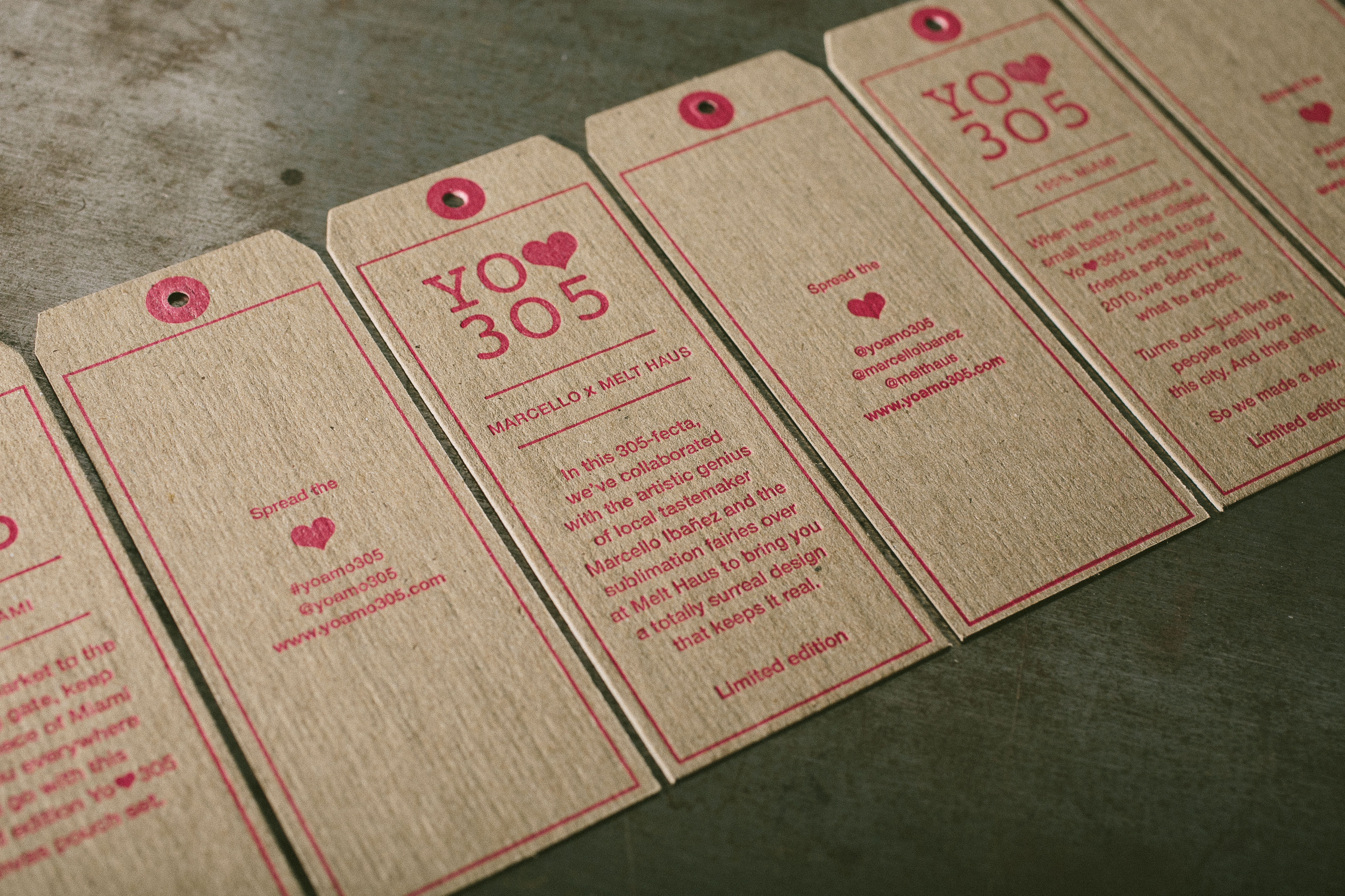
Yo Amo 305 1.69″ x 4.25″ product tags, job #25740. Designed by Wynwood Letterpress, printed in Pantone 806U on 28pt chipboard on our Heidelberg Windmill.

Keep size and paper weight in mind.

When it comes to working with chipboard (or any thicker papers), be sure to check your margins when you’re designing – you’ll want to make sure your cards fit in your envelopes! Additionally, postage weights may increase when it comes to heavier paper stocks, so make sure your client is comfortable with any added costs. Lastly, when it comes to sizes and shapes: we’ve found that 60pt chipboard is too thick for die cutting (though we have had success with 40pt chipboard). If creating a unique shape is important, consider straight cuts – the save the date pictured below was trimmed on a regular cutter, but has the look of a die-cut shape.

Letterpress + die-cut save the date tag with gold grommets - designed by Kristin at Reverie Made, printed by Boxcar Press Letterpress + die-cut save the date tag with gold grommets - designed by Kristin at Reverie Made, printed by Boxcar Press Letterpress + die-cut save the date tag with gold grommets - designed by Kristin at Reverie Made, printed by Boxcar Press

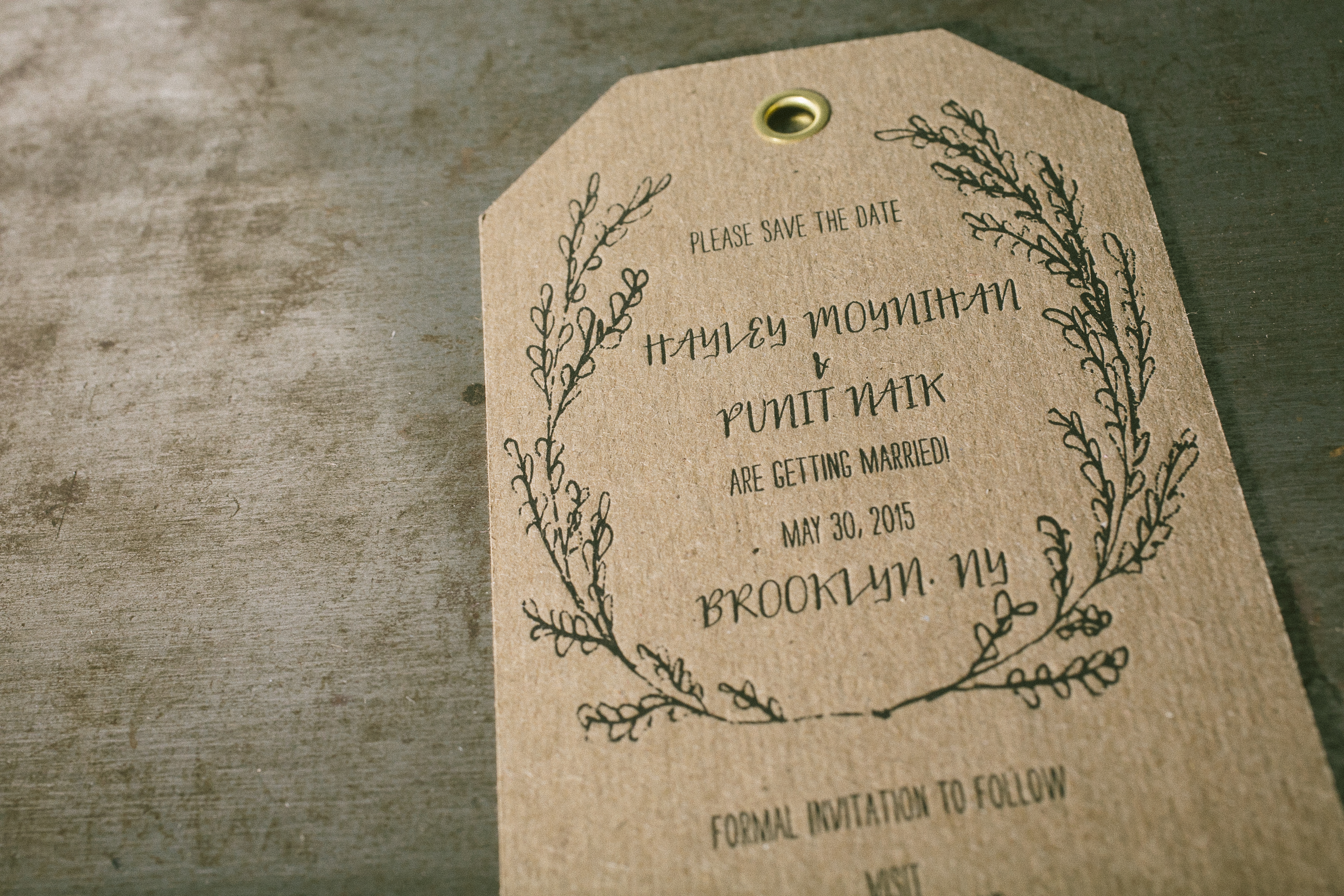
Custom save the dates 3.25″ x 5.5″ luggage tag style, job #241166. Designed by Kristin at Reverie Made, printed in black ink on 28pt chipboard. 


Our final piece of advice? Don’t be afraid! Experiment and have fun.

Letterpress Art Prints by Rabbit Wife Pen and Ink

Recently we worked with husband & wife team Mary Ann and Jesse Watkins from Rabbit Wife Pen and Ink on a Sufjan Stevens inspired letterpress art print. Letterpress printed in crisp black ink on 60 pt chipboard, the art prints are 6″ squares with playful hand lettering. Mary Ann shared the backstory on the prints – take a look.

Letterpress art print from Rabbit Wife Studio - letterpress printed by Boxcar Press

I love words. This is one of those phrases that becomes anthemic for a season. The song, “The Dress Looks Nice on You,” will forever take me back to my college boyfriend’s car almost ten years ago. Now he’s my husband, Jesse, and our lives are messy and ragged and achingly beautiful, strewn with life and light. There are days when I am emptied and tattered. But I see my boys with their Papa, riding their bikes down hills in a graveyard near our house in the amber of the day, bathed in sunlight, marching through mountains of leaves. These images are stitched together in my mind like a home-spun slide show. I can see a lot of life in them; a lot of bright in them.

This design is the first thing I sent to print. It was invigorating and life-giving to work on. I would close my eyes at night and see the letters fitting together, like Tetris pieces. I sent it off to Boxcar and shortly after, one hundred letterpress prints sat on my doorstep. I’m thrilled with how they turned out. The thickness of the chipboard is perfect and exactly what I had in mind. And the tactile experience of the letterpress indentions is dreamy.

Letterpress art print from Rabbit Wife Studio - letterpress printed by Boxcar Press Letterpress art print from Rabbit Wife Studio - letterpress printed by Boxcar Press

The art prints are available for purchase on Rabbit Wife’s Etsy shop! Many thanks to Mary Ann and Jesse for collaborating with us on this new venture.

The Bucket Series: Limited Edition Letterpress Maps & Prints by Reva and Tommy Nafso

We were excited to work with Reva and Tommy Nafso on a few letterpress prints for their new Bucket Series, a unique project that connects Experts and Artists to create a series of limited edition, curated letterpress art pieces. The experts provide a bucket list, the artists interpret each list into a map, and then they are letterpress printed. A new volume is issued every month, with a limited run of 100 prints created for each volume.

Bucket List Poster Series, Vol. A: The College Football Volume.

The experts can submit a Bucket List with any theme – from arts to travel to gastronomy. For example, a European travel expert can create a “When in Rome” list, while an art expert can provide a list of must-see art museums, and so on. After the list has been crafted, the Bucket Series Art team — which consists of Marilia Beltrame from Brazil, and Mike Swallow from England — works with a new featured artist each month to interpret the list into an 11×17 map. In addition to the map, two 8×10 minimalist letterpress prints showcasing individual design elements from the map are created with each volume. Gold foil is used to accentuate one of the two art prints.

For their Kickstarter project, the Bucket Series has created 2 exclusive volumes: A – The College Football Volume and B – The European Volume. We had the pleasure of printing the College Football volume, which includes approximately 50 illustrated college football traditions, along with a gold foil emblem. The two corresponding 8×10 art prints from this volume show off Yale’s Handsome Dan and Notre Dame’s Golden Dome, in gold foil. These are backer rewards and ship once the campaign is fully funded and complete, and before the holidays. Volume B, the European Union bucket list, will be printed in early December and will hopefully ship before the holidays.

Bucket Series Vol. A: The College Football SeriesBucket Series Vol. A: The College Football Series

Visit the Nafso’s Kickstarter page to support the project and check out their schedule for 2015!

Photos provided by Reva Nafso.