Let’s See That Printed: Translating Ink with John Reardon

One of the most enjoyable aspects of working with so many talented printers and designers who make their photopolymer plates with us is coming across some truly inspiring design work. Designs that make you stop and wonder just what color ink they’ll be running or what the print is for. It’s even better when you get a chance to catch up with the printer behind the design. We chatted with the outrageously gifted tattoo artist, John Reardon of Greenpoint Tattoo Co. in Brooklyn, New York, when his plate came through our doors. We’ll let John take it from here.

Photopolymer letterpress printing plate being made at Boxcar Press.

The project came about by running into Dan Morris (of The Arm in Brooklyn) on the streets. This was the second time I printed at The Arm (the first was back in 2010). I also have a tattoo shop down the street from Earl Kallemeyn (Kallemeyn Press). I’ve drawn stuff for him. He comes by the shop to hang out occasionally.

Photopolymer printing plates on a Vandercook.

John Reardon printing on a Vandercook.

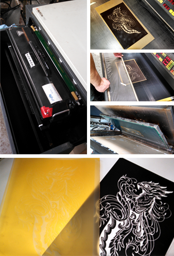
Dan told me I needed to make another print and I agreed. I’ve been drawing and tattooing daggers like this for about 7 years now. The first one I drew I tattooed on Othello Garcia when we both worked for Scott Campbell at Saved Tattoo. When I find the time I have four more to finish drawing and print. The difference between my drawing for printing vs tattooing is that I can put in more detail in a print. Also I have to make tones by stippling or cross hatching. It’s fun. I printed with my buddy Jordan Haley and two bottles of red.. Been on a Spanish Rioja kick this winter…(it’s how I survived).

John Reardon printing on a Vandercook and pulling the paper through the press.

Final pulled prints of the ever talented  John Reardon.

Huge round of thanks out to John for letting us take a peek at his cool printing project!

Let’s See That Printed: All A-boot Kamikin

When we received Kamikin’s first order for plates, we had to get the back story – we loved their dynamic artwork and had to learn more. This family owned operation has quickly transformed from a pet project to a full fledged printmaking business. Marvel at their artwork while we tell you the rest of their tale.

Photopolymer letterpress printing plates being made at Boxcar Press in upstate New York.

A quick history: Kamikin is the dream child of three sisters, Karen, Betsy and Susan, of Sedalia, Colorado.  Betsy and her husband acquired a 12×18 1920 C&P platen in 2012 with a goal of entering the fine art market with unique and affordable prints. The business plan revolves around the beautiful pen and ink drawings of both Betsy and Susan, and is driven forward by the go-getter business savvy of their older sister Karen.

Hand-drawing & illustrating designs for letterpress photopolymer plates and letterpress printing with Kamiken.

The artwork came together during the fall of 2014 with a western theme. This particular “Zen Doodle” series is western/folk art with a modern twist. Zen doodling consists of decorative lines that can have beautiful results when printed on a letterpress. Kamikin didn’t hesitate to shoot for a very competitive show for their first foray into selling, the 2015 National Western Stock Show, in their backyard of Denver. Betsy readily admits they were not actually prepared for a 16-day show. “Because of this, when we got accepted, our studio burst into a flurry of activity! We had to finalize our art, order plates for the letterpress, purchase loads of paper and packaging, and build a booth! It was a quick learning curve for all three of us as we cranked up the press for mass production.”

Letterpress printing with photopolymer plates with Kamiken on a C&P press.

“During this whole process, one of the most exciting steps was when our first order of polymer plates from Boxcar arrived,” says Betsy. “At that moment, it seemed that everything we had planned was now possible. With the artwork for this series done, the paper cut, and a printing schedule on the calendar, it was time to buckle down and get our hands dirty. With 8-10 hour printing sessions, we learned so much so fast! Like it’s a good idea to tag team the chase to save on your shoulder muscles.”

Beautiful letterpress printed western - themed cards from Kamiken.

In the 6 week timeline, they fell in love with the process. In one month, they went from having zero inventory to 2,700 packaged pieces of beautiful art to sell.  Over the 16 days at the show, they loved talking with people about letterpress and screen-printing. The prints and stationery were very well received. They even had a little movie playing in the booth to show the customers what a letterpress looks like and how it works. Overall, their debut at the National Western Stock show was a success.

Since January, the trio has put together a website and an Etsy shop. They have enjoyed donating several prints for various auctions to help support their community. And with more plates on the way, the team will be busy building up their inventory for the summer art shows and festivals.

Let’s see that printed: Dia de los Muertos letterpress cards from Pablo Delgado

From start to finish, watching the production of a custom photopolymer plate is fascinating. From the genesis of a digital design file to hand-inspection of a pulled proof, the transformation of light-sensitive photopolymer to a vehicle for endless hours of printing fun is curiously intriguing. We followed one of Pablo Delgado’s recent plate orders as he had fun using the plate on the at-home Fiskars Fuse system to create letterpress cards.

Delgado-img5-1 Delgado-img6-1

Starting out, I went with the Fiskars Fuse because of the maximum size for the platform. At 12 inches it is double the max width on the Quickutz Epic Six. The first problem was that there wasn’t a platform available at the 12 inches that would allow me the registration necessary to print on the precut A-6 size cards. So I ordered two 12″x12″ clear cast acrylic sheets from Tap Plastics. The bottom piece was .472″ thick and would work as my base for the cardstock, and the top piece was .236″ thick and would act as the chase for the photopolymer plate. I cut a heavy white plastic in two strips to work as hinges and put it all together. It looked a bit crude, but it worked great and I am able to take advantage of the wider roller length. I adhered a sheet of hard heavy white plastic to help achieve the thickness necessary, and a couple of thinner sheets with grids on them to help with placement. The ink I am using for the particular card I am showing are both Great Western Ink oil based Pantone 185 and Reflex Blue.

Delgado-img1

I began with a one color card to figure out the process, and this went fairly smooth. I played around with packing to get the depth I wanted and when I accomplished this I took the leap into a two color card. This was a challenge. Keeping an even consistency of the two inks on the brayer was difficult to figure out at first. I had to try different ways of getting enough but not too much ink on the rubber roller without causing ghosting or plugging up the detail. In the end a couple of thin coats seemed to work best as the perfect balance. One trick I learned to keep the messiness down was to put some transparent tape on the plate strips so when I rolled out the ink on the plate, I could lift off the inked  tape and the strip remained clean. I had a lot of fun figuring out this process. It definitely requires a good bit of patience, the ability to look at things analytically, and organization to keep the ink only where it belongs. The rewards of seeing your art reproduced in vibrant colors and beautiful stock outweighs any of the downsides you experience.

Delgado-img2

The art I am using is original. It is inspired directly by the traditional “Dia de los Muertos” style of images that depict “calacas” (skeletons) and “diablitos” (little devils) in humorous and satirical poses. “Amor Eterno Artesanias” is the name that I am creating under.

Delgado-img3-1

It has been a journey that has taken several years to come together, and the work is only just beginning. I had not been able to find the right medium to share this art through before, so I am very thankful to Boxcar Press for not only putting out information on how to create these letterpress images, but also the personal assistance they offer. Whatever this venture may turn in to, it’s reassuring to know that Boxcar Press is there to help out in any way they can.

Huge round of thanks out to Pablo for letting us get a closer look at his beautifully printed pieces!

Let’s see that printed: letterpress posters for Hobofest

Here at Boxcar Press, we look at many, many files every week that are submitted for platemaking. Wedding invitations, greeting cards, text for fine press books and even the occasional unidentifiable piece (translation: large blobs and sketchy lines). More than a few of these files make us wonder what they will look like in their final printed form. So, we decided not to wonder anymore and will be periodically following up with customers to satisfy our inquiring minds and to get the full story on neat projects. For added interest, we will be following the process of the plate through our shop and pick up with the printer on press.

platemaking-img1-2

We saw this letterpress poster file and admired the boldness of the design. It also appealed to us because it was for a musical festival put on by Adirondack Sustainable Communities Inc, an organization whose vision statement is empowering communities to care for the people, the land and the future of the Adirondacks.  The Adirondack Region is a six million acre region of endless lakes and wild mountains in Northern New York. With the assistance of Peter Seward, one of the organizers of this weekend’s event, we were able to get the rest of the story on this letterpress poster

Todd Smith and I, Peter Seward, organize and host a free all-day music festival called Hobofest – now in its sixth year – in the small mountain village of Saranac Lake. Part of our collaboration is designing a new graphic each year, which serves to brand the event, featured as posters, flyers and on T-shirts. From the beginning our primary means of funding the event was through T-shirt sales, and we often marvel at how many of these shirts are out there.

poster-img2

In addition to printing on shirts, the graphic is also printed as a fine art print edition. This year was the first time that we printed the design using a polymer plate. We wanted the precision that this process offered and to take advantage of Bluseed Studios’ Vandercook press. In years past, I actually used the Vandercook as a solid base to silkscreen on!

poster-img3

Bluseed Studios is an inclusive community art center offering studio space for printing, paper making, and ceramics, and a gallery and performance space upstairs. We printed with burlap paper made at Bluseed Studios, donated by Drew Mattot and Maraget Mahan, who travel the world with a portable pulp beater as the Peace Paper Project. Drew and Margaret were the ones who recommended that we use Boxcar Press to create a polymer plate!

poster-img4

We’ve always limited the design as one color and strive for impact and clarity, and an aesthetic informed by earlier printing technologies. We’re very happy with the prints which we’ll vend alongside our other merchandise on event day.

poster-img1

Our thanks to ADKSC.org and Blueseed Studios for letting us see their project!