Let’s See That Printed: Carmela Heintzelman of Fiore Press : Architectural Artwork

We were pleased to lend support to Carmela Heinztelman when she was approached with a special print request. After seeing the results, we think more professional design projects like this should come to life in letterpress.

When architect Edward Deegan contacted me about making some letterpress prints of his architectural drawings, I jumped at the chance.  I admire Ed’s work and have seen many of his designs realized in our Illinois community and his work is absolutely impeccable. Below is one of the beautiful houses he designed, and one of the prints I made from his sketch of this house.

Carmela Heintzelman of Fiore Press

(Above: photography credit: Karen Loffing)

Carmela Heintzelman of Fiore Press

I love printing personalized artwork, and this was no different.  To take a talented architect’s sketches and translate it into letterpress printed art that could be framed and hung was such an honor. 

Carmela Heintzelman of Fiore Press

Edward had five sketches that he wanted printed. The challenge was to take these sketches and adjust them in a way that worked best for letterpress and kept the details. 

Carmela Heintzelman of Fiore Press

We needed to apply a screen, which I had never done before. Enter Prepress from Boxcar Press! I called Cathy and explained this project, and she was excited to help. She looked at each of the pieces and told me the best way to prep the artwork. I converted the scans to grayscale, adjusted the contrast, brightness and threshold, then saved it as a TIFF.  It came out perfect – the client was extremely happy!


Carmela Heintzelman of Fiore Press

In addition to the house renderings, I also printed for Edward a tall ships scene and two historical facades.  He framed and hung them all in his office.

Thanks Carmela for sharing the printing of these drawings.  In addition to being a learning experience for you on the file preparation side, it was a nice treat to see something a little out of the norm come to life in letterpress. This is a very limited edition art that will be viewed and enjoyed.

Let’s See That Printed: Dan Narva’s National Parks Letterpress Poster

Dan Narva of Nine Day Weekend teams up with Ted Ollier to have his minimalistic US National Parks poster come to life.

Mark Gibson of Syracuse, New York works on a platemaker at Boxcar Press.

Dan Narva:

I opened my Etsy shop, Nine Day Weekend, a few years ago. My initial focus was on custom illustrations of family photographs. Early projects were all laser cut into wood, as either hangable portraits or magnets. One thing led to another and soon my love of the outdoors inspired me to create illustrations of National Parks.

Dan Narva of Nine Day Weekend

I know it sounds trite, but I woke up early one morning with the random idea that I could draw the Grand Canyon simply by splitting the words in half and spreading them to the far corners of the frame. As I lay in the dark  brainstorming how I could rearrange the letters of my favorite parks into similar designs. I brought my sketchbook and laptop to bed and worked until well after noon, but I had laid the foundation for my new project.

I realized early on that I wanted all of the designs to share a uniform visual language, so it was important to keep the line weights equal, no matter how big or small the letters became. Then, I quickly shifted gears and the parks became the focus of my Etsy shop (conveniently, I had already named my shop Nine Day Weekend, after the length of vacation that you create by taking Monday through Friday off work – I think this name lines up well with my new celebration of America’s natural lands and the joys of visiting them).

Over the course of the following days and weeks (and months), I kept working on the remaining parks, trying to turn each name into a distinct feature of the landscape or wildlife of each park. I allowed myself to rotate, flip, stretch, chop, and generally manipulate each letter, but my one rule was that every letter needed to be recognizably present.

Some of the images came to me very easily (like Arches, Hawaii Volcanoes, and Redwood), and I think their simplicity helps to balance out the more complicated illustrations (like Gates of the Arctic, Guadalupe Mountains, and Petrified Forest), where the letters are truly jumbled and it’s more difficult to “read” the name of the park. It’s fun to present my work at craft fairs and watch customers hover at my table while they try to “solve” all of these puzzles.

Dan Narva of Nine Day Weekend

I first sold these parks as individual laser cut coaster and magnets, so people could create their own combinations of parks to resemble their favorite adventures. But I always imagined the full roster being presented together, so when I finally finished the 59th park (it took over a week to rearrange Theodore Roosevelt into a representation of his North Dakota log cabin and a bison), I needed to find the right medium for the poster.

Dan Narva of Nine Day Weekend

I had met some letterpress printers on the craft fair circuit, and it seemed like my crisp lines would be a good fit for letterpress. One of them was kind enough to point me to Ted Ollier, who advised me on how to translate my digital artwork into letterpress. He also recommended I contact Boxcar Press for the plate. Having many questions, I was very happy with the patience displayed by Boxcar as I was educated on the process of platemaking. Both times that I have ordered plates (I recently created a second edition that includes the 2 new entries to the National Park roster) I was in a self-imposed rush. Why does it seem like all art projects end at the last minute?

Dan Narva of Nine Day Weekend

The quick turnaround by Boxcar allowed me to get my posters printed as soon as possible. And even when their quality control found errors on my end (like using RGB instead of CMYK), I was able to correct the problem immediately without delaying production. I’ll let Ted speak to the printing qualities of these photopolymer plates, but I certainly have no complaints. As a letterpress newbie, Boxcar has been a pleasure to work with.

In addition to the plate I ordered for my new 18″ x 24″ print of all 61 National Parks, I also created a smaller plate that features the 5 National Parks of Utah (with the designs themselves arranged into the shape of Utah).

Dan Narva of Nine Day Weekend

I’m excited to see how outdoor enthusiasts respond to this print. These parks are all very well regarded and highly visited – I’ll actually be visiting them with my family later this month to coincide with National Park Week. I’m incredibly proud of these posters – I love running my fingers along the deboss and I love seeing all of my illustrations lined up in a perfect grid. I looked up the specific Pantone shades of green and brown used by the National Park Service, in order to get as close as possible to the real thing. My hope is that these prints inspire folks to visit, treasure, and protect these amazing lands.

Ted Ollier:

So Dan found me when I was still in a now-defunct letterpress co-op. I ran the original posters on the SP-20 there, but for this run I needed to borrow the SP-20 at the letterpress at Harvard where I teach, the Bow & Arrow Press. I started Reflex Letterpress about this time last year to salvage something out of the demise of the co-op.

The smaller pieces I ran at Reflex on the Vandercook No 4. The presses were feeling good that day, there were no oddities in either run.

Dan Narva of Nine Day Weekend

The smaller pieces I ran at Reflex on the Vandercook No 4. The presses were feeling good that day, there were no oddities in either run.

Want to snag a print of this beautiful poster? Shop here!


Let’s See That Printed: Eleonore Lee’s Printing Tribute to Freddie Mercury

Sometimes the words on a person’s platemaking order just leap off the page and catch our attention. That was true with Eleonore Lee’s curving and falling text layout. Add in that they were lyrics by Queen’s Freddie Mercury and we just “had to see that printed”.  We hope this strikes a chord with you too.

Eleonore Lee's "Lover Of Life, Singer of Songs" fine art print tribute to Freddie Mercury of Queen strikes a chord with the heart.

In spring 2017, the Fine Press Book Association sent out a call for entries for their annual fundraising portfolio.  Since I already had a huge project to complete before heading off on a trip, it seemed fitting to add another project to my docket.  

Eleonore Lee's "Lover Of Life, Singer of Songs" fine art print tribute to Freddie Mercury of Queen strikes a chord with the heart.

This project was especially enticing as it would support their fine press journal, Parenthesis, and the portfolio would be shared among other printers. Last year was a year in which I was re-discovering myself after a good decade of hardcore parenting. An exchange portfolio would allow others to discover me too.

Eleonore Lee's "Lover Of Life, Singer of Songs" fine art print tribute to Freddie Mercury of Queen strikes a chord with the heart.

Like a lot of printmakers, I am a sucker for exchange portfolios. Something I particularly appreciate about letterpress and handmade paper exchanges is that they are a lot more lenient about format. The parameters for this portfolio were generous … produce 125 prints. Within these parameters, it was definitely possible to consider a less likely subject matter.

If you do not know, most often Fine Press work has a tendency to publish known and lauded dead poets. Always the contrarian, I felt like shaking it up a little with less-predictable words. My work aims to ask questions or bring attention to something you might not usually notice.  

Because music means so much to me, I have been considering making art about the music that pervades my life. Whilst at work I am known as “that person who wears their headphones and sings out loud”.  One epic late night, two BFA students and I had a lot of paper to make. We loudly sang through 2 CDs of Queen’s Greatest hits. That was my inspiration.

Eleonore Lee's "Lover Of Life, Singer of Songs" fine art print tribute to Freddie Mercury of Queen strikes a chord with the heart.

I was not a huge Queen fan in my youth, finding Freddie overwhelmingly exuberant. However, I grew into Queen. I learned the lyrics intimately in the same way that I spend a lot of time with the poems I work with. Singing along both joyfully and studiously, so that I could be as accurate as possible with the pacing and the sounds. By including the breaths, the uh’s and drawn out syllables, the project was most enjoyable.

I also revelled in the details: The paper is Neenah’s Flash Pearl Starwhite. Not only is it shiny pearlescent like some of Freddie’s leggings, but it also covers Flash, for Flash Gordon’s theme song, by Queen.

The font is Montserrat. Freddie had a dream to perform with and finally collaborated with Montserrat Caballé on the album Barcelona. And of course, I did my research: Freddie loved red and yellow, bold loud colors. The rhythm of the song is included in the yellow and red dots. They are foam dots, with 2” dots representing a full beat, 1” dots a half beat and ½” dots a ¼ beat.

I wanted a mix of more iconic images of Freddie as well as images from his videos. I chose the song because the lyrics combined with the video spoke volumes about Freddie.

He lived flamboyantly and boldly in public, at a time when being gay was a crime in most countries. In ‘I want to Break Free’ the band appears dressed as working class women. We first see Brian May wake up, with curlers in his hair, very rapidly followed by a hairy arm wearing bangles brandishing a vacuum. After a few swipes, all of Freddie scurries out boldly, staring right at the camera and gives us a brief, contented smirk before proceeding with some very sexy vacuuming (to the music). He dances and sings and winks appearing to enjoy himself a lot. It may seem run-of-the-mill today. It was bold back then, especially for a shy, cat-loving man wrestling with his sexuality. All of these words and images worked well on the tri-fold design I had in mind.

Eleonore Lee's "Lover Of Life, Singer of Songs" fine art print tribute to Freddie Mercury of Queen strikes a chord with the heart.

Although the images have enough small details and fine lines, I would never have attempted type with such fine details so I thank Boxcar Press for the plates. They also provided a fine press discount on the plates for this project.  

I hope others in this exchange enjoyed this project as much as I did envisioning and printing it.
You can learn more about Eleonore’s project with Parentheses at  FPBA.com.


Let’s See That Printed: Isle of Dogs by AJ Masthay

As soon as AJ Masthay’s “Isle of Dogs” print passed through our platemaking department, we had to know more. Discover as we catch up with AJ of Masthay Studio, and this sneak peek. Find out what is the inspiration for this ultra-detailed piece… and where can you enjoy this piece.

The piece was created for an upcoming Isle of Dogs group exhibition hosted by SpokeArt NYC at the Parasol Project, 213 Bowery, NYC. From their Facebook event page:

“Spoke Art is pleased to present the Isle of Dogs Art Show. This is an officially licensed art exhibition tribute to Wes Anderson’s most recent film. The dynamic group show features over one hundred artists, painters, sculptors and print makers, debuting one weekend only in New York City’s Lower East Side.

Isle of Dogs Wes Anderson AJ Masthay letterpress print

Isle of Dogs

Isle of Dogs, Wes Anderson’s most recent project, is a stop-motion animated film set in a Japanese dystopian future. The story follows a boy’s journey to find his dog after the species is banished to an island following the outbreak of canine flu. Inspired by the adventurous tale that Anderson brought forth, a select group of artists have created character portraits and highly detailed environments and scenes inspired by Isle of Dogs. Featuring a diverse array of painting, sculpture and limited edition prints, each artist offers their own unique perspective and interpretation of the Wes Anderson film. This whimsical and canine filled pop-up exhibition is an absolute must see.

About the Piece

I personally love the quirky works of Wes Anderson and am a huge dog lover. I have two very spoiled Labrador Retrievers Dexter & Halley. When asked to participate in this exhibition I immediately said YES!

My piece features the main characters from the film, both human and canine. As well as, the scene in which they debate whether to attack. Spoiler alert – they realize he has come searching for his own dog “Spots” and decide to help him in his quest. 

Isle of Dogs Wes Anderson AJ Masthay letterpress print

The print is a reproduction of a detailed graphite drawing utilizing a Boxcar Press’ photopolymer plate with a 133 LPI halftone screen applied. We’ve found that once dialed in on our Vandercook Universal III, these halftone plates reproduce tonal drawings beautifully. They come very close to the detail typically found in lithographs.

To mimic the graphite work we do the following steps. First, we mix a fairly stiff, dark gray ink with a touch of brown to warm it up a bit. Next, we use a paper that is soft and supple, such as Arches 88. Finally, we finish the piece with a hint of hand-applied color in the pilot’s eyes. As a result, this slight variation adds a personal touch of individuality. The hand coloring piece complements the printing perfectly.

Isle of Dogs Wes Anderson AJ Masthay letterpress print

The Final Edition size is 100 signed, numbered and titled, 15”x20” on Arches 88. Prints are available to purchase at the event. Remaining prints will be made available online following the event, through SpokeArt.

The Isle of Dogs Art Show group art exhibit is running from November 9th, 2018 – November 11th, 2018. For more details, check out their Facebook page here.

2018 Seattle Children’s Hospital Broadsides: Part 2

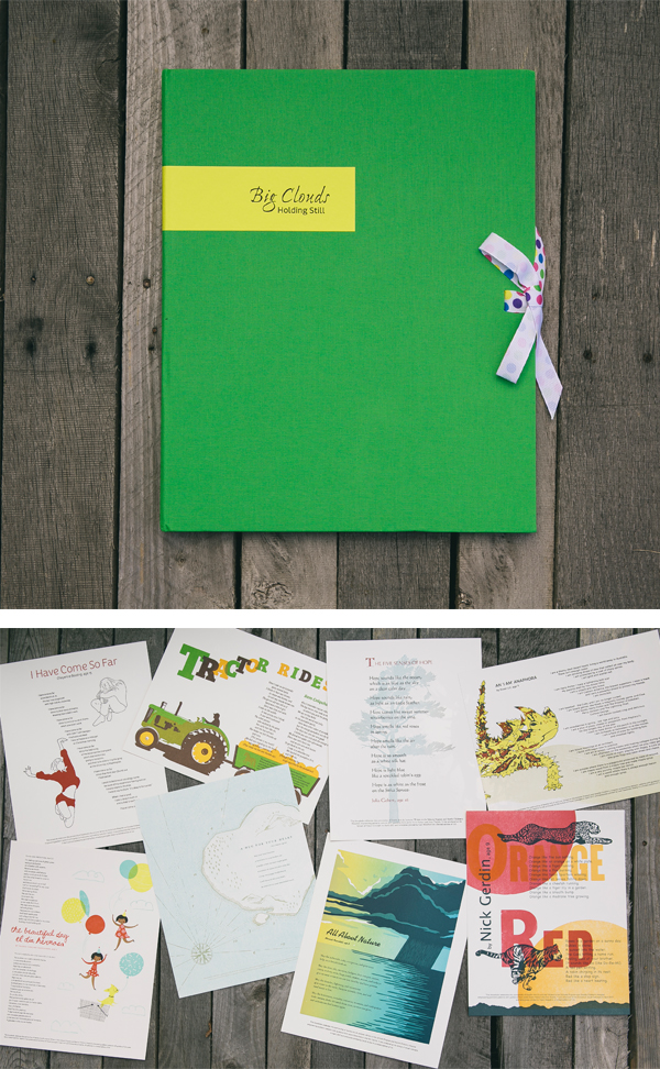
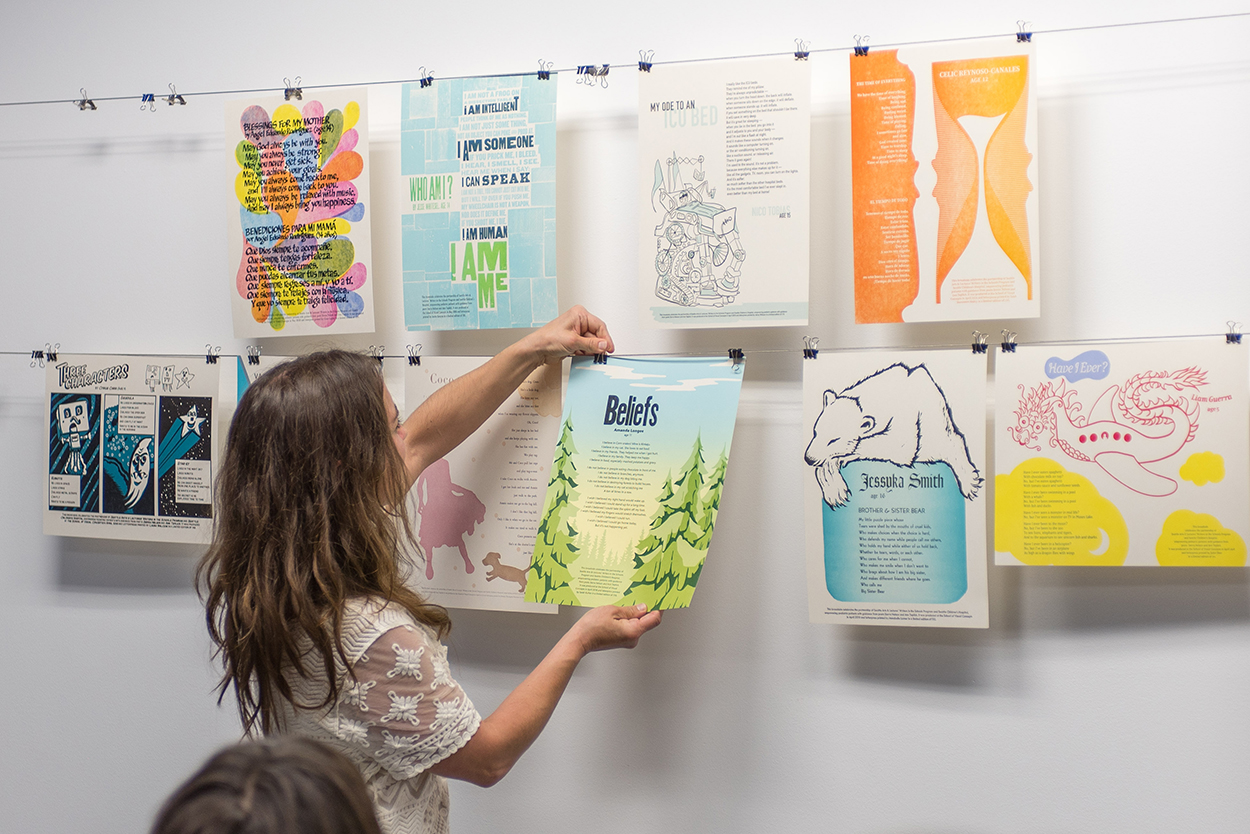
Part two in this year’s Broadside blog series highlights more of the beautiful art prints from the printers and writers who came together in the 2018 Seattle Children’s Hospital Broadsides project. The Writers in the Schools program (WITS – a poetry program created by Sierra Nelson and Ann Teplick), the School of Visual Concepts, and long-term patients at Seattle Children’s Hospital all joined creative forces to produce original stories that come to life in beautifully crafts printed works. Sarah Kulfan reflects on this year’s printing experience of adding in fun & color to their special young writer’s words.

“I am always blown away by the talent and commitment of our young poets and this group of printers. Many have been involved with this project every year. Its an honor to be a part of this amazing collaboration. I am grateful for the support of business partners like Boxcar Press who help fuel this creative endeavor from the beginning.”

2018 Childrens Broadsides -IMG12018 Childrens Broadsides

Sarah Kulfan

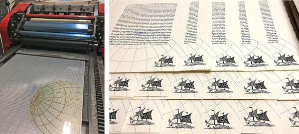
There are a couple of lines from the poem by Amanda Longees, Age 11, titled Beliefs, that inspire the forest and tree theme illustrations. My goal was to create a broadside that was bright and optimistic. In the first print pass, I created a split fountain gradient that represents the rising morning sun. With a design perspective of looking out across the treetops, there is a sense of spiritual uplifting. Which also reflects the title of the poem. 

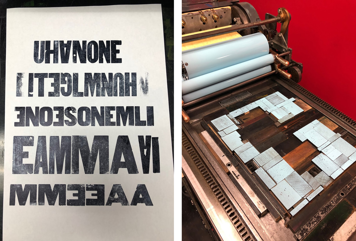
With the tree element design, it was only natural to include a wood type for the title. I worked with Boxcar Press to create plates for the poem and colophon.

Sarah Kulfan Boxcar Press 2018 Seattle Children's Broadsides

The reduction cut process includes a total of 4 colors. Each color is a successive layer that is carved from the same block.

Sarah Kulfan Boxcar Press 2018 Seattle Children's Broadsides

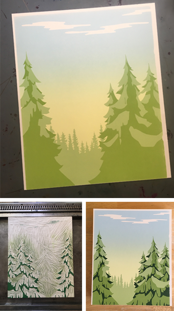
The colors typically go from light to dark. This year’s challenge for myself was to print a full bleed and a gradient on a portrait style broadside. Which includes several rounds of careful trimming, and maxing out my press’ sheet size in order to make that directional gradient work.

Sarah Kulfan Boxcar Press 2018 Seattle Children's Broadsides

The talent and commitment of our young poets and group of printers are impressive. It is an honor to be a part of this amazing collaboration effort. I am grateful for the support of business partners like Boxcar Press – who help fuel this creative endeavor from the beginning.

Heidi Hespelt

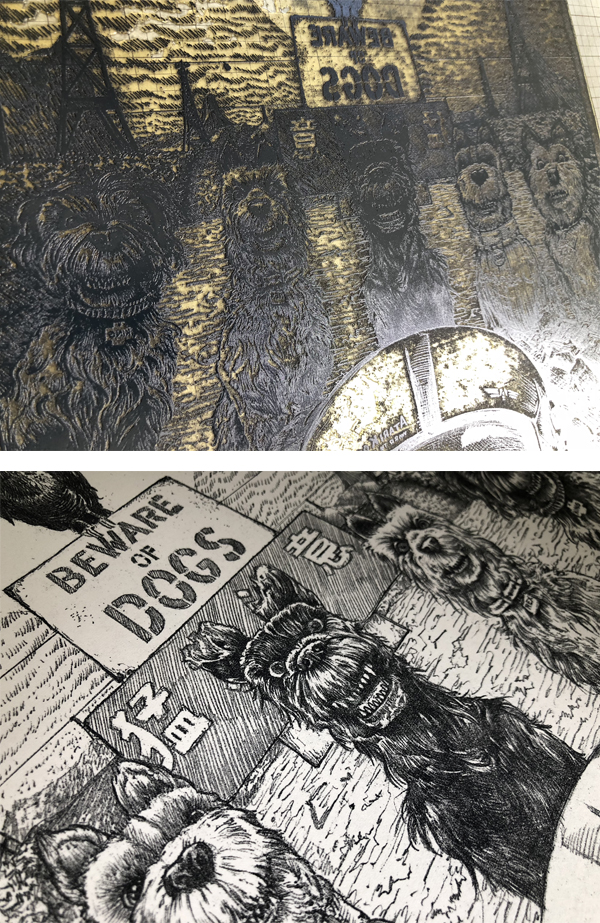
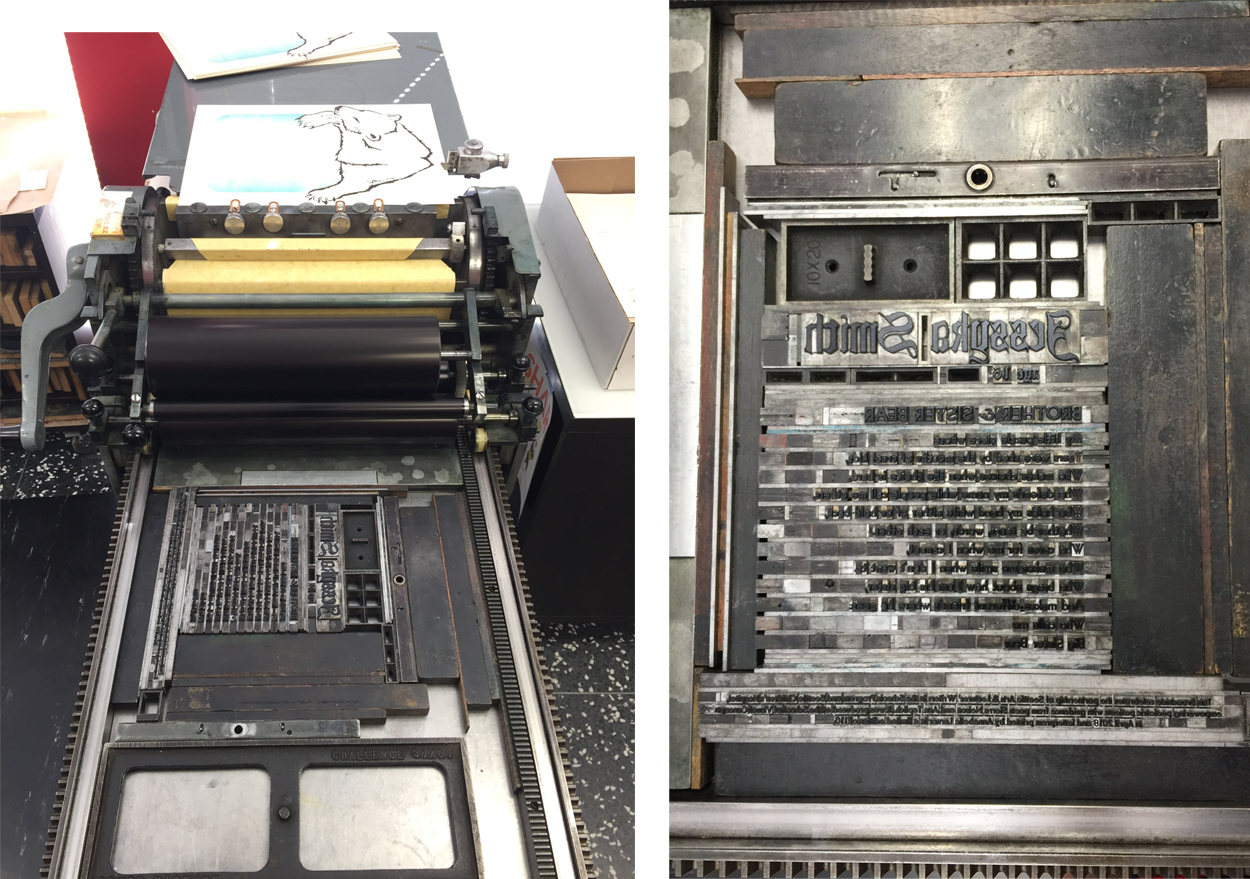
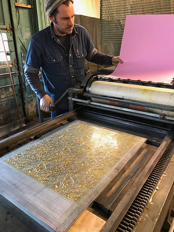
This year’s broadside design illustrates a poem written by Ella Joy Won, Age 7, titled The Secret Place. Ella is a “sparkly girl,” and the design reflects this through the incorporation of bright colors and metallic inks. The printing of the poem starts with text which uses polymer plates from Boxcar Press. Next, is the artwork. This piece, in particular, there were 7 passes through the press. The press used a large reduction linoleum block that carves away sections of the block between each color pass.

Heidi Hespelt 2018 Seattle Children's Broadsides Boxcar Press

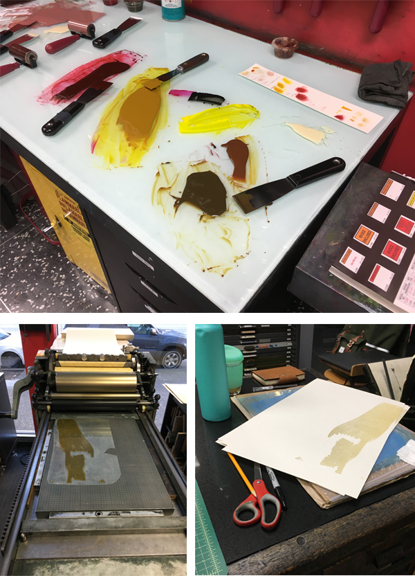
Printing silver over a blue background for the first cut on reduction block. Carving away the things that I want to stay medium blue and then next is the teal layer…

Heidi Hespelt 2018 Seattle Children's Broadsides Boxcar Press

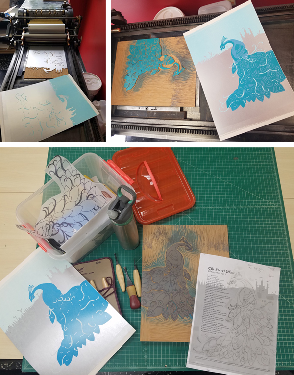
Next, printing the gold pass. Followed by mixing ink for the purple coloring for its pass. Finally, I will print the text and trim the paper.

Heidi Hespelt 2018 Seattle Children's Broadsides Boxcar Press

Amy Redmond

As a letterpress instructor at the School of Visual Concepts, it’s a real joy to see students evolve from fledgling ink slingers into skilled printers, and this Broadside project represents a milestone in that journey. There are many new names on this project’s list of printers this year, but by no means are they new to the press. This year the stars finally aligned for them to join this kind-hearted & generous group, raising the bar of talent even higher than before.

Amy Redmond letterpress Seattle Children's Broadsides project.(Above: Photo courtesy of “Carrie Radford / Radford Creative”)

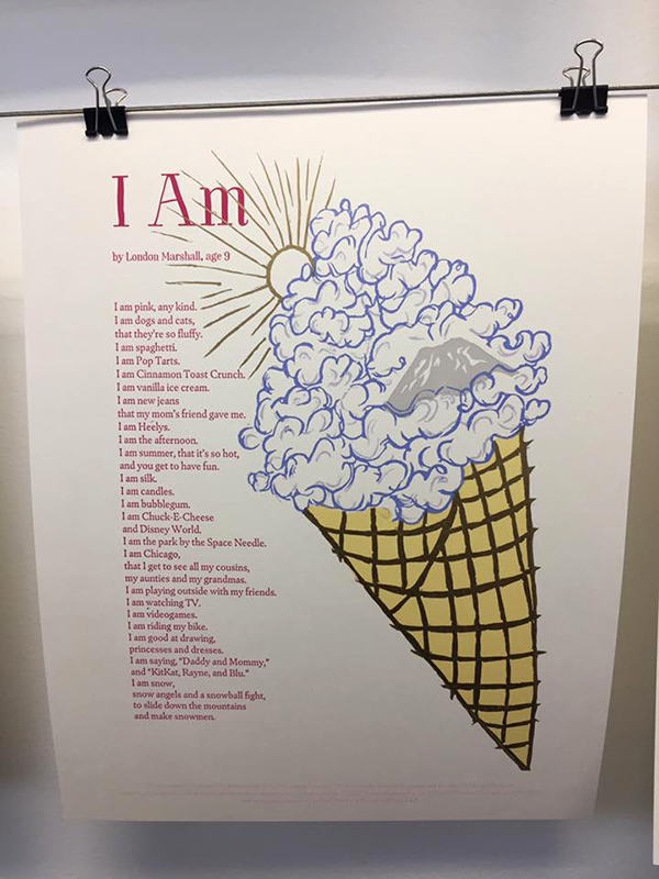
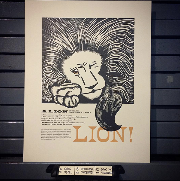
When first reading, A Lion by Rowan Delloway, Age 6, I was struck by how much power just a few words carry. Looking beyond the face value of his admiration of a lion, I interpret the lines “so you don’t run from anything / because no one can hurt you” as representing Rowan’s own fierce determination and strength. This concept was my guide through the design process to include bold elements and a careful use of color.

Amy Redmond letterpress Seattle Children's Broadsides project.(All other photography courtesy of Amy Redmond.)

It would be easy to show the lion’s power through a literal translation of Rowan’s words. However, after making some quick thumbnail sketches, I chose to illustrate it through a display of calm confidence.

The lion may be at rest — claws in, tail curled around its body — but its one watchful eye says, “Think twice before you make your move.” I imagine it protecting Rowan, watching over him… ready to pounce and unleash that power upon any threat to his well-being. The first rough layout sketch was effortless. In contrast to how my process usually goes. When looking back at my choice to sketch on top of make-ready tells me I really didn’t expect that to happen.

Amy Redmond letterpress Seattle Children's Broadsides project.

I wasn’t sure if I would be able to capture that energy if I redrew it again. Instead, I used a thick charcoal pencil to rework the sketch on top of the original. When I removed the tape that was masking my margins and lifted the page from the table, I got a kick out of seeing my make-ready for Zack Edge’s poem (from the 2016 portfolio).

Amy Redmond letterpress Seattle Children's Broadsides project.

Moving on to typesetting, first I started with the easiest part: LION! Big and bold, the size alone limited my choices. Next, I selected a Latin wood type that when aligned to the right margin of my sketch. This left just enough room for the body text and colophon. Also, it also gave me the excuse to use the Latin Wide metal type in my collection. Typically, this is not a face I would normally choose for body text. Due to the short nature of the poem made it feels safe enough to try. I’m delighted that it worked!

Amy Redmond letterpress Seattle Children's Broadsides project.

By this point, my typesetting was complete for the day even though the colophon wasn’t done. This is my 8th year contributing to the broadside project. And my first year contributing by carving an image from linoleum. For those who are familiar with linoleum, it cuts the smoothest when warmed by the sun. Lucky for me, Seattle was having an unusually warm sunny spell in May. Time to move outside.

I usually shy away from carving. However, I had a strong vision of a bold and graphic piece, that I went for it. For the first time in over 20 years, I invested in a new set of carving tools. I also made sure to purchase extra blocks, just in case of a few errors. Careful viewers can see, right out of the gate, I forgot to reverse my image before carving.

Amy Redmond letterpress Seattle Children's Broadsides project.

On the second carving attempt, I decided to slow down and take a proof before moving forward with the paws and tail. The placement needed to be just right in order for the type to work. Refreshed by a new day, I also finished typesetting the colophon and proofed that as well. Out came the scissors and tape and Sharpies.

Amy Redmond letterpress Seattle Children's Broadsides project.

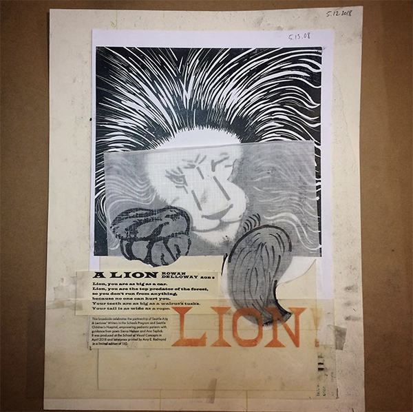
Paw and tail position decided, the remainder of the lion carving went well with only a few minor slip-ups. The sun was having a positive effect on my outlook, and I decided I could live with a few wayward marks. I moved back into the studio, locked it up, and printed the first run on my Colt’s Armory platen press.

Amy Redmond letterpress Seattle Children's Broadsides project.

With the lion in place, I now had a map from which I could now measure all future passes. I locked up the first form, gave the type a good scrub, and ran the second pass. (Shiny clean type is so satisfying.)

Amy Redmond letterpress Seattle Children's Broadsides project.

In a fit of stubborn efficiency, I decided to print the lion’s eye color with the last line of the poem (“LION!”), in one final pass of orange ink. To guarantee perfect alignment, I mounted a small rectangle of uncarved linoleum to a piece of furniture, made it type high, and composed it with the wood type.

Amy Redmond letterpress Seattle Children's Broadsides project.

Taking measurements of the lockup from the text printed in black, I was able to lock up this new form in the exact location in needed to be. Without changing my page guides on the tympan, I then pulled a blind proof on a still-wet print from the second pass to confirm that the text aligned as I wanted. The black eye of the lion offset onto the uncarved linoleum, revealing exactly where I needed to carve. I added a little trapping as a safety measure, in case some of my earlier prints had shifted alignment in the run.

Amy Redmond letterpress Seattle Children's Broadsides project.

This small series of careful acrobatics worked well, and I’m pleased with the final print. I hope others see in its design what I see in Rowan’s words. “That underneath his joyful and seemingly wild exuberance lies a trained force of powerful inner strength.”

Amy Redmond letterpress Seattle Children's Broadsides project.


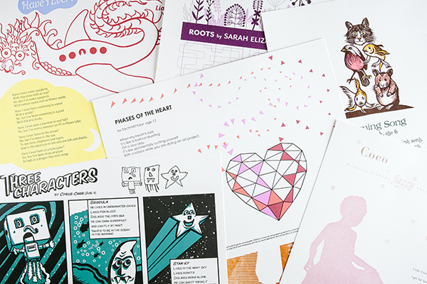
Come check out Part 1 of this year’s Children’s Broadsides project!  We would like to thank all of our young writers, organizers, printers, and families who help make the 2018 Broadsides project memorable and powerful.

2018 Seattle Children’s Hospital Broadsides: Part 1

We enjoy giving back to the letterpress community and supporting amazing opportunities for printers around us to create, shine, enjoy, and share in the magic that is printing. In its eighth year, Boxcar Press has had the honor of contributing photopolymer plates to the 2018 Seattle Children’s Hospital Broadside project. The culmination of combining the talents of Ann Teplic and Sierra Nelson of the Writers in the Schools program (WITS), the School of Visual Concepts in Seattle, and young local poets at the Seattle Children’s Hospital was 20 cleverly crafted broadsides. Each print had a limited run of 110 editions. This first installment of a two-part blog highlights four printers who share their heartwarming experience bringing their young poets words to life.

2018 Children's Broadsides -IMG12018 Childrens Broadsides -IMG1

Bonnie Thompson Norman

The process of working on the Children’s Hospital broadside project each year is a combination of dedication and commitment as well as skill and inspiration.

Each year, children present to us a selection of poems before we come together as a group of printer/designers for the first meeting. At that gathering, the wonderful poets-in-residence who bring such heart to the project, Sierra and Ann, read each poem written by their young proteges. We have our preferential choices and usually end up with the poem we most wanted to work on…although that process may occasionally require some good-natured negotiating. It never feels like enough time to work on our broadside. Sometimes we receive helpful hints or information from the poet and/or their family. Sierra was able to connect me to the family of the delightful young girl who wrote about her grandmother’s dog and the times she spent with them. Her parents sent me some photographs of them with their daughter and she was happy, gay and playful in the photos.

Bonnie Thompson Norman 2018 Seattle Children's Broadsides

I wanted to convey that delight in the broadside so I carved a linoleum block of a young girl dancing and spinning and another block of a playful dog who (I hope) looked like the one her grandmother had.

Bonnie Thompson Norman 2018 Seattle Children's Broadsides

The type for the poem, title and colophon was a combination of handset type and ornaments from my own cases and Linotype set according to my specifications by my good friend and Linotype master in Los Angeles, Bill Berkuta. Each color is ran individually on the press. The sheets of paper went through my Vandercook SP15 and my Chandler & Price 10 x 15 a total of eight times. This was in order to avoid over-inking the type and/or under-inking the images.

Because of the nature of this project, there is a great deal of poignancy with it. I learned that my young poet had already passed away by the time this year’s project had begun. While I was charmed by both the exuberance of her poem and her photographs, it was bittersweet to know that she couldn’t see herself in the final printed poem.

Justin Gonyea

When I first read Jesse’s poem, his words really stood out to me, and I wanted to put them front and center. To achieve this, I used his poem to create a typographic portrait instead of calling out a specific image he evoked. I wanted to elevate his voice rather than creating my own interpretation of what he was saying.

Justin Gonyea Seattle Childrens Broadsides project - IMG1

My broadside had a total of five passes on press using wood type, metal type, and photopolymer plates. I first handset and printed four lines of the poem that I wanted to emphasize in wood type. Scanning this type allowed me to arrange the text on top of a silhouette. I set the rest of the poem digitally using HTF Knockout, HWT American, and HWT Catchwords. I resized and rearranged the scanned wood type and digital type until I was happy with the composition.

Justin Gonyea Seattle Childrens Broadsides project - IMG1

Back in SVC’s letterpress shop, I used a printout of my digital layout as a guide. I set it down on the composition table and set type on top of the paper. Using upside down wood type, I created a woodgrain texture around Jesse’s words to help create the form for the silhouette. I handset the type for colophon, byline, and title using metal and wood type.

Justin Gonyea Seattle Childrens Broadsides project - IMG1

The woodgrain texture was my first pass on the press. I scanned one of the final prints of this first layer, made sure all of my digital text lined up properly, and then put in an order for my photopolymer plates. On press, I printed the handset colophon, followed by photopolymer plates for the light and dark blue layers. For the green layer, I used a smaller Boxcar base, so I could also print the handset title and byline at the same time as the green photopolymer plate.

Justin Gonyea Seattle Childrens Broadsides project - IMG1

Unfortunately, I didn’t get a chance to talk with the young author for this project. I just hope that my broadside helped amplify Jesse’s voice. It was really fun to design a piece of artwork around his words, and it was an honor to be part of this year’s Seattle Children’s Hospital Broadside project.

Annabelle Larner

This year’s piece is all handset metal type and carved linoleum. In the past, I’d done elaborate pressure prints and layers. This year, I wanted to keep it simple and clear as I did not meet my poet.

Annabelle Larner Seattle Children's Hospital Broadsides.

The poem is called Brother & Sister Bear, by poet Jessyka Smith, age 16. It’s about her little brother, and what a great support and defender of her he’s been in her life. He calls her Big Sister Bear.

Annabelle Larner Seattle Children's Hospital Broadsides.

Jessyka’s poem made me think of a protective, strong, and fierce bear. Using linoleum, I carved a big slumbering bear to lay across and frame her poem.

Annabelle Larner Seattle Children's Hospital Broadsides.

It ended up looking like a polar bear. I thought it would be nice to have a cool, icy-blue area for the bear to rest on, which also added depth under the poem. This blue background was carved in linoleum as well.

Annabelle Larner Seattle Children's Hospital Broadsides.

Regarding the type, I hand-set her name in big, 72 pt. Goudy Text to make it stand out. I also liked how the curves and lines of the typeface looked with the bear. I chose Bernhard Gothic for the poem itself, to contrast with the Goudy Text. Also, I loved the W’s in this typeface, since there were so many that started each stanza! And the Bernhard Gothic ampersand for the title was unique and pretty.

The first item that goes to print is the bear, which uses black ink. Second, is the blue background with a split fountain which contains blue on the outside bleeding to trans white on the inside. Finally, the poem and colophon go to print.

Laura Bentley

Sarah’s poem entitled “Roots” speaks to me because of the nature imagery. Specifically, the imagery of wildflowers and roots. I often print from handset type, but for this broadside, I decided to print from polymer plates. This allows for flexibility on choosing cohesive imagery for the wildflowers and the roots.

Laura Bentley 2018 Childrens Broadsides -IMG1

The layout of the text was designed on a computer with digital fonts, of course. In addition, the foliage and flower imagery are also from a font! Really! The font is called Makalu and is a series of illustrations created by Juraj Chrastina. 

I felt like the playful feel of the illustrations. It fits Sarah’s imagination and her poem. The overlapping of colors to fill the top of the page was a natural fit. To evoke a mid-century modern feel, the roots are a tangle of geometric lines.

Laura Bentley 2018 Childrens Broadsides -IMG1

Each of the four colors was printed separately. For an edition of 120, I started with 130 pieces of paper. For all of you counting this means I am feeding paper through the press 520 times!


Stay tuned for Part 2 of our blog article series featuring more printers and their original and inspired prints.

Let’s See That Printed: Mindy Belloff of Intima Press’s ‘Minotaur’

We keep tabs on the many wonderful and intriguing designs that come through doors here for our custom-made photopolymer platemaking services. One that we’ve been following for quite some time is Mindy Belloff (of Intima Press)’s highly detailed illustration and creative typesetting designs in her latest fine edition book project.

As a book artist, letterpress printer, and educator, I have been a loyal fan of Boxcar Press, having ordered plates since the beginning of Harold’s enterprises. The staff have always been helpful, especially when polymer platemaking and digital spec instructions were still in their infancy.

During this time, I have sent to Boxcar a wide variety of digital designs of artwork, student work, and job work. A few years ago, as a new livre d’artiste was in the works, they took notice of the beginning of the work. As I firmed up designs and sent a flurry of large plate orders, I was asked about the scope of this project as it had piqued their interest. I was happy to share the text, but could not stop production and take time to send images of the various pages, as I was working so intensely, designing by night and printing all day. I had close to 2,000 sheets in my studio in various stages of printing for over a year and a half.

Recently, I was asked by Boxcar to reveal more about the fine edition book I have just released, after two intense years of work, which follows.

The book is titled, “A Golden Thread.” It is 92-pages, in a format of folios, featuring the text of “The Minotaur,” a short story by Nathaniel Hawthorne (1853). It is composed of 100 original drawings, some with hand painting, and 200 press runs, in an edition of 40, printed on cotton rag papers with a sheet size of approximately 15 x 21 inches. It is a contemporary twist on the medieval illumination, letterpress printed on a Vandercook Uni III automatic press.

The story begins in blue and gold ink, with our hero Theseus, as a young boy. As the story unfolds, Theseus grows to be a young man and journeys to Athens to find his father, King Aegus.

Theseus has an unpleasant encounter with the wicked Medea before he finds and is embraced by his father. He soon learns of the fate of seven young men and seven maidens, to be chosen as a sacrifice to the Minotaur, a beast housed in the labyrinth of Crete.  Theseus volunteers to sail to Crete with the youths. (By now, you may recall the details of this tragic myth.)

When the ship arrives in Crete, the evil King Minos throws them in the dungeon, to await their fate. Enter the heroine, Ariadne, who secretly releases Theseus and leads him to the entrance of a maze.

The middle section of the book, as Theseus makes his way through the labyrinth to find the Minotaur, is designed with typography that blankets the page. The plates for this section were, of course, quite large, and many pages were printed on one side of the sheet, and then turned (plates and paper), to accommodate the sheet size. Most pages have 5 to 6 press runs each.

In the third and final section of the book, Theseus emerges victorious, having slain the bull-headed Minotaur monster. Our heroine awaits, still holding the golden thread at the entrance to the maze. Theseus and the other 13 youths sail back to Athens, where they encounter more obstacles and tragedy, as expected in a classic Greek myth.

On the final page of the story, our hero becomes King. Below is an image of the page showing two of the four-color press runs, which includes ornamented initials, and border drawings.

The book is hand sewn and beautifully bound with a blue leather spine and gold gilding.

Mindy received a fine press book discount for her entire project for the plates Boxcar Press created.  We appreciate her giving us a sense of her book “A Golden Thread” with words and photos.  Mindy Belloff produces fine letterpress printed book and broadside editions at her Union Square studio under the imprint Intima Press. Her artist’s books have been included in many publications and she received an award for Excellence in Book Design.

You can visit Mindy’s website for more on the Minotaur edition at Intimapress.com.

2017 Seattle Children’s Hospital Broadsides: Part 2

Part two in this year’s inspiring blog feature of the Seattle Children’s Hospital Broadsides project explores the work of five more clever printers and their young poets as part of the collaborative effort between the Writers in the Schools program (WITS – a poetry program spearheaded by Sierra Nelson and Ann Teplick), long term patients at Seattle Children’s Hospital, and the School of Visual Concepts. These five printers share with us how they brought to life the young poets’ colorful imagination in a cornucopia of color, text, texture, and fun imagery.

Jane Suchan While at Seattle Children’s Hospital, 14 year old Mary McCann learned to knit and wrote the two poems used for her broadside.  I was drawn to Mary’s poems because of their emotion and imagery.  I work at Seattle Children’s, so I had the good fortune to visit and get to know Mary a bit.

Jane Suchran letterpress prints for 2017 SVC Children's Broadsides.

As Mary and I were chatting she gave me some great design input: her favorite colors, the fun to be had with a ball of yarn, the sense of coziness and comfort she feels from sitting quietly and knitting.  Mary is creative, energetic and playful, so I sought to reflect those characteristics in my design.  Since we both have orange cats, and cats and knitting just naturally go together, I knew I wanted to include a cat somehow as our shared secret.  

Jane Suchran letterpress prints for 2017 SVC Children's Broadsides- knitting imagery.

The big, cushy arm chair and a playful cat ready to pounce on a ball of yarn tells a little story to go along with Mary’s poems.  This line in Mary’s poem “Fabric coming off the end of the needle” made me think of knitted sweaters with intarsia motifs, so that’s where I got the idea to create a stockinette pattern with Mary’s name.  I printed in yellow behind the stockinette to create a fifth, blended color as a nod to Mary’s love of color.  Mary’s vision is impaired, so I kept images simple, used easy to read fonts in a larger size and high contrast colors.  My goal was to honor Mary and her poetry, to produce a keepsake that she would love and her family and friends would cherish.

Jane Suchran prints on a Vandercook for SVC Children's Broadsides.

These broadsides were printed on a Vandercook SP15 press at the School of Visual Concepts over three days.  In my first pass I used a large Boxcar base to print a block of soft yellow that would become the background for Mary’s name across the top of the broadside.  Printing the yellow behind the teal was an easy way to get a fifth color out of four passes on press.

Jane Suchran prints on a Vandercook for SVC Children's Broadsides.

 I had photopolymer plates made for the rest of the design elements, and pass number two was a run of teal for the chair, Mary’s name and the colophon.  Pass three was the orange cat and ball of yarn, followed by a fourth pass in dark charcoal for the poems.

Jane Suchran prints on a Vandercook for SVC Children's Broadsides.

The only tricky thing about my design was the tight registration of the orange cat and the back of the teal chair.  I had the photopolymer plate made with the cat and chair positioned together as they would be when printed even though I knew they would be in two different colors.  Before printing the chair I used an Exacto knife to carefully cut away the photopolymer plate for the cat and set it aside, along with the plate for the ball of yarn.  After printing the chair, I left the photopolymer plate adhered to the Boxcar base in the press bed.  I cleaned the teal ink off and added the photopolymer plate for the cat and yarn onto the base.  I pulled away the photopolymer plate used for the chair and other teal elements, re-inked the press with bright orange and was ready to roll in no time.   

2017 SVC Children's Broadsides meet-up.

Jenny Wilkson This year, Jules Remedios Faye and I collaborated on one poetry broadside. There were three letterpress processes we were excited to use: photopolymer for the text, because our chosen poem was the longest of the bunch; laser cut imagery, just because lasers are great, and collographs for detail in the illustration, which is Jules’ specialty.

Jenny Wilkson prints on a Vandercook for SVC Children's Broadsides.

First, we double-hit a solid with straight rubine red, to achieve a saturated dark pink background. After it dried, we overprinted purple laser cut butterflies, being careful to add cobalt drier to the ink so that it would dry on top of the pink pass.

Jenny Wilkson prints on a Vandercook for SVC Children's Broadsides.

Jules created a collograph for the light purple detail in the butterfly wings by gluing lace and sealing it with acrylic gel medium on an identical laser cut block, making registration a cinch. Finally, the gold text was printed using Boxcar plates.

Laura Bentley The broadside is a three color design printed with handset metal type ornaments, metal type, and photopolymer plates.   Type was set and printed on a Vandercook SP-15 printing press from the 1960s. The ornaments were arranged dripping down the page with the spacing growing such that the ornaments were breaking apart in a nod to the poem’s title.

Laura Bentley printing on a Vandercook letterpress press.

Simple shapes in dramatic colors echo the everyday and extraordinary experiences mentioned in the poem. The poem text and colophon was printed in a fourth pass on the same press with photopolymer plates and a metal base from Boxcar Press. Laura Bentley prints on a Vandercook for SVC Children's Broadsides.

I didn’t get a chance to talk with either of the young authors this time. Sometimes with all that’s going on it isn’t possible. But I enjoyed learning about their experiences through their words. Poet Ann Teplick works with patients in this classroom and helps the students express their experiences through poetry.

Laura Bentley prints on a Vandercook for SVC Children's Broadsides.

While I have a good variety of metal type ornaments to print with, and found a great font to use for the author’s names, my metal type collection came up short when it came to typesetting the poem text and colophon. Using a photopolymer plate opened up the possibility to print any typeface available on the computer, but for this design I chose a digital version of a typeface (Venus) from the age of printing with metal. While I have a couple of metal fonts of Venus, none were appropriate sizes. I like that Boxcar can fill in gaps in my metal type collection!

(Laura’s full blog article goes in-depth here on this year’s printing journey)

Leah Stevenson As I was thinking about my poem for this year’s Broadside project, I was instantly inspired by the recurring presence of red and yellow/gold. I was also struck by how much more space was devoted to the thorny devil desert lizard compared to anything else Ewan wrote about in his poem. Because of that, I really wanted to have that be a focal point of this piece.

Leah-Stevenson letterpress prints for the 2017 SVC Children's Broadsides.

Toward the beginning of my process I received an email with some scans of drawings Ewan had done. They represented what he saw in his mind as he wrote and read his poem so I really wanted to find a way to incorporate them. While beautiful, I was a little stuck on how to use the drawings I had received from Ewan while remaining true to my own style. I ended up just starting to draw a desert lizard to see where it would take me. Eventually, I realized I could use Ewan’s drawings as little ‘tattoos’ on the lizard.

Leah-Stevenson uses a Vandercook to print.

One of my favorite things about doing letterpress printing is combining my experience in digital design with the analog system of printing by hand. I was able to design the broadside digitally and used those designs to get photopolymer plates made. I printed the whole piece on a Vandercook SP15 press in SVC’s letterpress studio.

Leah-Stevenson uses a Vandercook to print.

I ended up with four passes through the press. I had actually planned a fifth pass (a blue for the baseball cap to bring in the Cubs in stanza three), but was on the fence about how much it really added. Once I pulled a proof of it, I decided it wasn’t necessary and left it out, giving me some extra time for paper cutting and sorting.

Leah-Stevenson letterpress prints for the 2017 SVC Children's Broadsides.

Unfortunately, I was not able to meet with my author this year but I did get a little insight into his mind when I received the drawings he had made for the poem. I really loved having that extra bit of my poet’s creativity and imagination that I could incorporate into the broadside. It was fun to get a glimpse into his mind and see what he had envisioned when he was writing the poem and use that as another place to take my design.

Carol Clifford For this annual project I usually work with the assumption that the young poet will see the finished piece I created for them, and in the past my hope has been to create an image for them to grow up with. This year’s piece was different though because I learned during the poem pick meeting that sadly Julissa had passed away. Knowing this influenced the feeling I wanted to convey. I didn’t want to make something too frivolous or silly. I usually don’t, but felt particularly aware of that this time. Plus, Julissa’s poem was serious and reflective, so I wanted to honor that as well as create a piece that felt more reverent.

Carol Clifford letterpress prints for SVC Children's Broadsides.

Initially, I had planned to combine several techniques: pressure printing, hand-set type, collagraphs, and linoleum cuts. However, I decided I didn’t want the “chatter” from pressure printing which is often a result. Nor did I want the heavier lines from linoleum cuts. I chose instead to use all polymer plates. In part for simplicity, but moreover for the clearer lines and shapes that I felt suited this poem.  

My hope for Julissa’s family is that I created a piece that is quiet yet witnesses her questions. I, too, would like to believe that birds walk on the clouds.

Carol Clifford letterpress prints for SVC Children's Broadsides.

Immense round of applause and thanks to all of the wonderful printers who donated their time and efforts to this truly beautiful project!

2017 Seattle Children’s Hospital Broadsides: Part 1

For its seventh year running, Boxcar Press has the immense pleasure of supporting the magical outcome created by this year’s 2017 Seattle Children’s Hospital Broadside project. Guided by Sierra Nelson and Ann Teplick of the Writers in the Schools program (WITS) and the School of Visual Concepts in Seattle, an inspiring group of young poets and artist/printers collaborated together to produce 21 broadsides in a limited run of 110 broadsides. WITS worked with big-hearted printers as well as long term patients at the Seattle Children’s Hospital in this exceptional opportunity for fun, creativity, and stirring works of art. This first installment of a two part blog showcases four printers who share their creative printing process and capture the wonder of the children’s writing.

Boxcar Press donated photopolymer plates for the 2017 Seattle Children's Hospital Letterpress Broadsides, a project by WITS + the School of Visual Concepts.

Sarah Kulfan I was very excited to print Merrick’s poem for this year’s Seattle Children’s Hospital Broadside project. As someone who spends a lot of time outdoors, his colorful descriptions of the natural world resonated with me and provided a rich trove of inspiring imagery that would pair well with his words. I printed a total of 6 passes on a Universal I, combining a linoleum block, metal type, and a Boxcar plate.

Sarah-Kulfan-letterpress prints for the 2017 SVC Children's Broadsides.  Multicolor letterpress printing from Sarah Kulfan.

This was my fifth year printing for this lovely project which brings together so many talented and generous folk. I was immediately drawn to Merrick’s poem. His words remind me of all the many blessings that nature provides, discoveries that I have found in my own wanderings outside. I haven’t met Merrick yet, but I hope to get a chance so that we can compare our adventures in nature.

Sarah-Kulfan-letterpress prints for the 2017 SVC Children's Broadsides.

This year, I wanted to try my hand at a reduction cut that would combine split fountain layers. Using high-drama imagery of a hurricane worked really well for this process as it provided a big-sky, full frame backdrop. The poem speaks to the cycles of nature and the process of destruction and darkness followed by light and new life. The gradients capture the weather transition from light to dark and the reduction cut allowed me to build up the dark layers of the passing storm clouds. There were four total passes on the reduction cut and these included two split fountains. I printed a fifth layer of metal type for the poem. The final pass was the colophon text, printed from a Boxcar photopolymer plate, which saved a lot of time hand setting and proofing tiny type.

Chris Copley Each year, I find myself wanting to push my artistic envelope in the Children’s Hospital Poetry Broadside Project — exploring a technique or concept while still making a piece of art that might appeal to people who know nothing of me or the poet or the project. I also try to reflect the feeling or personality of my poet.

Chris Copley letterpress prints for SVC Children's Broadsides.

Nandi, my poet this year, was not quite 5 when she wrote her piece about a huge stuffed animal that fell on her while she was in her hospital bed. The poem features strong emotions, and moves from upset and angry (at the big bunny) to loving and heartfelt (toward her mom). I tried to bring that out in the frame around the poem.

Chris Copley letterpress prints for SVC Children's Broadsides. Chris Copley letterpress prints for SVC Children's Broadsides.

I also embedded folk-art-style drawings of animals and a few “easter eggs” in the frame, just for fun. I drew the original art on black paper, then cut it out with an Xacto knife. I scanned the cut-paper art and ordered a polymer plate from Boxcar; this was my third (and fourth) pass. The first two passes involved the technique I wanted to explore — perpendicular split fountain printing. I printed a red-to-mustard-yellow pass (the color blocks behind the text blocks), and then turned the paper 90 degrees to print a blue-to-olive-green pass (the highlight colors in the frame).

Unfortunately, in trimming the paper to permit it to fit on the press, I unthinkingly cut off my gripper edge. So when I went to print the polymer frame, I couldn’t. I quickly went through a list or three or four options for solving my disaster, and decided the least bad solution was to cut the polymer plate in half. The problem was compounded when printing the second half of the plate, when my favorite press inexplicably fish-tailed my paper a different direction on every pass, making close registration virtually impossible. I cried almost the entire run, convinced the broadside was ruined. But I finished the project, hand-setting the poem and colophon in Bodoni and printing it without a hiccup. And it didn’t look too bad, in the final analysis. Five passes through the press.

I never met Nandi, but I met her mom, Adele. Nandi was camping with Dad the week we met. We chatted for nearly an hour about Nandi’s poems and how her health crisis brought out Nandi’s strong spirit. I saw the connection between Adele and Nandi, and saw photos of the little girl and the big bunny. I wanted to bring out in my design Nandi’s playful, vibrant personality, and her love for her mother.

I used two other techniques: hand-set metal type; and pressure printing. I wanted soft edges to the color blocks behind the stanzas of Nandi’s poem, so I used the back side of a Boxcar Press base (with the swirly pattern of the grinder as a design element) and a paper pressure “plate.” I did the same thing with the color highlights in the frame. I like the contrast between the crisp polymer printing and the softer pressure-printed colors. And I like the way the metal type echoes the sharp edges of the polymer plate. This is another of those projects that turns out better than expected, with different parts contributing to a unified whole.

Heidi Hespelt As always, it was a privilege to illustrate one of these wonderful poems by these talented children. My poet was Nick Gerdin, age 9 and he wrote 2 poems, titled Orange and Red. His plan is to continue the series by writing poems about other colors of the rainbow. I love the word pictures that Nick painted. He is obviously an insightful guy.

Heidi Hespelt letterpress prints for SVC Children's Broadsides.

I used several different methods to bring my illustration to life.  The titles, Red and Orange, are done in large antique wood type, the rest of the type is polymer from Boxcar Press (thanks, Boxcar, for your support!), and I carved the tiger, the cheetah on lino blocks using photographs as inspiration.

Heidi Hespelt prints on a Vandercook for SVC Children's Broadsides.

The setting suns and the bottom border are also carved from lino blocks. All of the printing was done on a Vandercook press at the School of Visual Concepts in Seattle.

Heidi Hespelt prints on a Vandercook for SVC Children's Broadsides.Heidi Hespelt letterpress prints for SVC Children's Broadsides.

Much of the joy of participating in the Children’s Hospital Broadside project each year (this is my fourth year!) is the camaraderie between the printers and the creative way each printer (artist) interprets the poem that they are given. I like to think that our efforts will live long lives on the walls and in the portfolios of the poets and their families, and that our artistic visions will add a dimension to the poems that brings out a deeper meaning.

Sukhie Patel I love carving linoleum and engraving wood, so I knew I wanted to draw and then hand-carve the poem’s illustrations. Carving is, for me, a form of meditation, and it was a beautiful way to contemplate this young poet’s life and honor her through that process. It was hard to narrow down what to illustrate, as the poem had so many vibrant images to choose from. I wanted the broadside to capture as much of the visual levity and sweetness of the poem as possible, so I chose to carve this metallic gold ice cream cone of whimsical pastel cotton-candy-esque clouds, with Mount Rainier popping out amidst them. It ended up being 6 separate blocks, and including text, 8 passes.

Sukhie Patel letterpress prints for the 2017 SVC Children's Broadsides.

I found out two days after receiving the poem that the lovely young poet, London Marshall, had passed away at age 9. My approach thus shifted from designing a broadside to delight a 9-year-old audience, to designing a commemorative broadside for her family. I wanted to create something the family would want to return to at different stages in their grieving, that did not preclude a path of healing, and could bring them a smile. I hoped the illustrations would capture the levity of being nine years old, the vivacity of being a young girl, the earnestness of feeling in love with the world around her. It was an honor to print London’s poem, and spend time with her words.

Sukhie Patel letterpress prints for the 2017 SVC Children's Broadsides.

My print consisted of 6 hand carved linoleum blocks and two photopolymer plates. I don’t know how I would have pulled this off without the help of Boxcar. I had never printed with photopolymer before, but with the structure of this poem (each line began with “I am”), I didn’t have any cases of metal type with enough capital I’s! Incorporating photopolymer also allowed me to select a more contemporary and youthful typeface. It was such a pleasure working with Boxcar on this project, and (despite being a sucker for handset type) I can’t wait to incorporate photopolymer in more of my designs. It really did open up my eyes to a whole new set of techniques and approaches.

Stay tuned & read on about this amazing Broadside project in the upcoming Part 2. The ever-inspiring work of both poets and printers and the brilliant results are why Boxcar has a big soft spot for such an amazing tradition year after year.

Let’s See That Printed: Bryan Baker’s Hypnotic Print

A myriad of eye-catching and pop-culture surreal characters snagged our attention when printer Bryan Baker and artist Jasper Wong’s fun order passed through our custom-made photopolymer platemaking service department. So much that we couldn’t resist the urge to reach out and get the scoop on such a brilliant and wild project!

The ever-wonderful Bryan helped illuminate how such an bright, hypnotic printing project came to be.

This project was printed at Striped Light in Knoxville Tennessee, by Bryan Baker. The artist who did the design is Jasper Wong. It is the second time that Striped Light made an edition of his work through an ongoing collaboration with a Detroit publishing company called 1xRun.  

This particular piece was printed to coincide with a rather large street art event call “Pow Pow” in Hawaii. The print was run in four color ways: Trans on Pink, Trans on Teal, Black on Black, and Green and Black on Teal.  All finished with hand torn edges.

Striped Light is often commissioned by 1xRun to do limited edition letterpress prints for the artists that they represent. It it a pretty exciting relationship, because they work with artists from all over the world, and are now in their fourth year of working together. It first began while Bryan was up in Detroit running a shop called Stukenborg Press, and has continued with his new community letterpress shop that he opened with his partners Sarah Shebaro, and Jason Boardman.