Printing Reality with Lauren Emeritz of Abstract Orange

Graphic designer & printer Lauren Emeritz creates brilliantly colored fine artists books & punchy prints. Lauren talks about teaching printing at an area Community Art Center, creating artists books, and introducing many to letterpress at events in the Capitol area.

FOR THE LOVE OF LETTERPRESS  

I am a graphic designer, letterpress printer, and book artist in Washington, DC and have always loved type and printing. While attending the University of Delaware, they were beginning to set up a print shop. I was fortunate enough to have the opportunity to print. Now Pyramid Atlantic Art Center is my go-to print place.

Emeritz Lauren ( Washington, D.C. ) letterpress prints beautiful hand-crafted fine editions artists books.

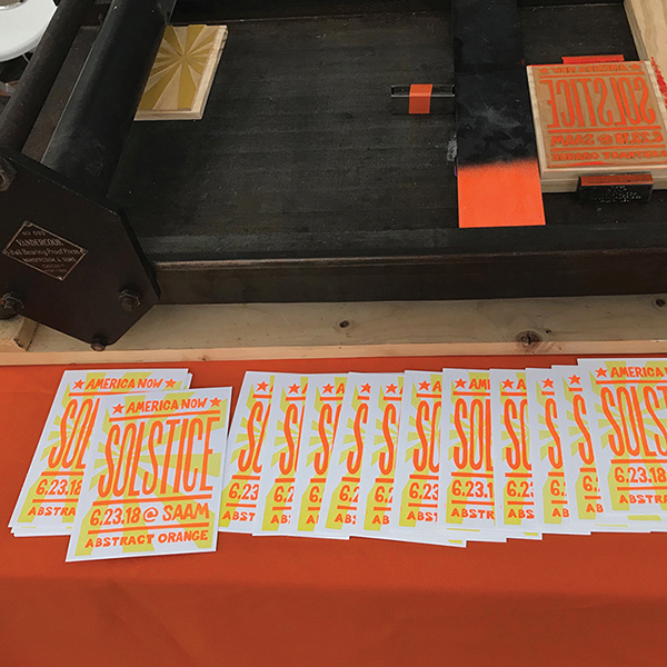
(Letterpress Demo at the Smithsonian Solstice Saturday Event)

PRINT FOR THE COMMUNITY

I print at the amazing community art center – Pyramid Atlantic Art Center (PAAC). Unique to the DC-area, PAAC offers workshops on how to learn to print, and the rental of presses to print on your own. I discovered PAAC at their Biennial Book Arts Fair. This fair is home to beautiful art made by hand. But ultimately, this created a spark in me to reconnect with making art by hand. 

Emeritz Lauren ( Washington, D.C. ) letterpress prints beautiful hand-crafted fine editions artists books.

ART ON THE HILL

I live in DC, so there is lots of cool artsy stuff. I love the Smithsonian Art Museums, the National Gallery of Art, the Library of Congress — they have so much amazing art and printed pieces! The Library of Congress was on my bucket list for a number of years. I finally made it there for an American Printing History Association (APHA) event. It was awesome and now I try to go back every couple of months. 

PRINTING MENTORS

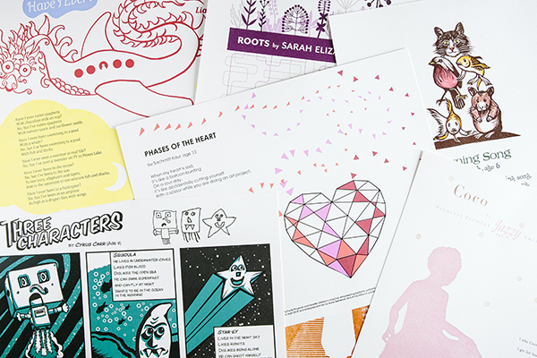
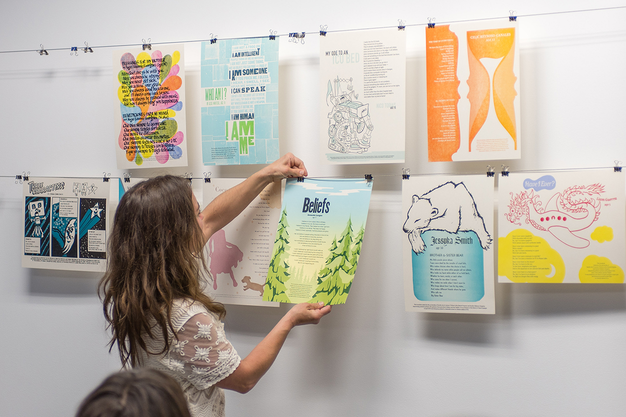
Ray and Jill at Lead Graffiti do cool work and love to share their knowledge. Vince Frost is a graphic designer who used a lot of wood type in his designs. When I teach at Pyramid I get inspired by the people in class. I get to share my passion for letterpress: type, ink, paper, and printing with people who may love it too or may not have done it before. It is always fun to see new ideas and the directions people explore.

I did an internship at Hatch Show Print in December 2017 and it was wonderful to have access to so much wood type — one of the first things that I loved about letterpress. The people were so creative and friendly and the shop was AMAZING – I highly recommend a journey there! I would love to go back for an artist residency sometime. 

Emeritz Lauren ( Washington, D.C. ) letterpress prints beautiful hand-crafted fine editions artists books.

PART TIME PRINTER, FULL TIME FUN

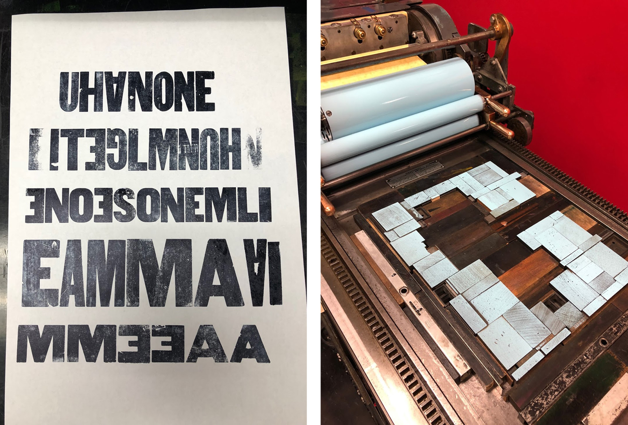
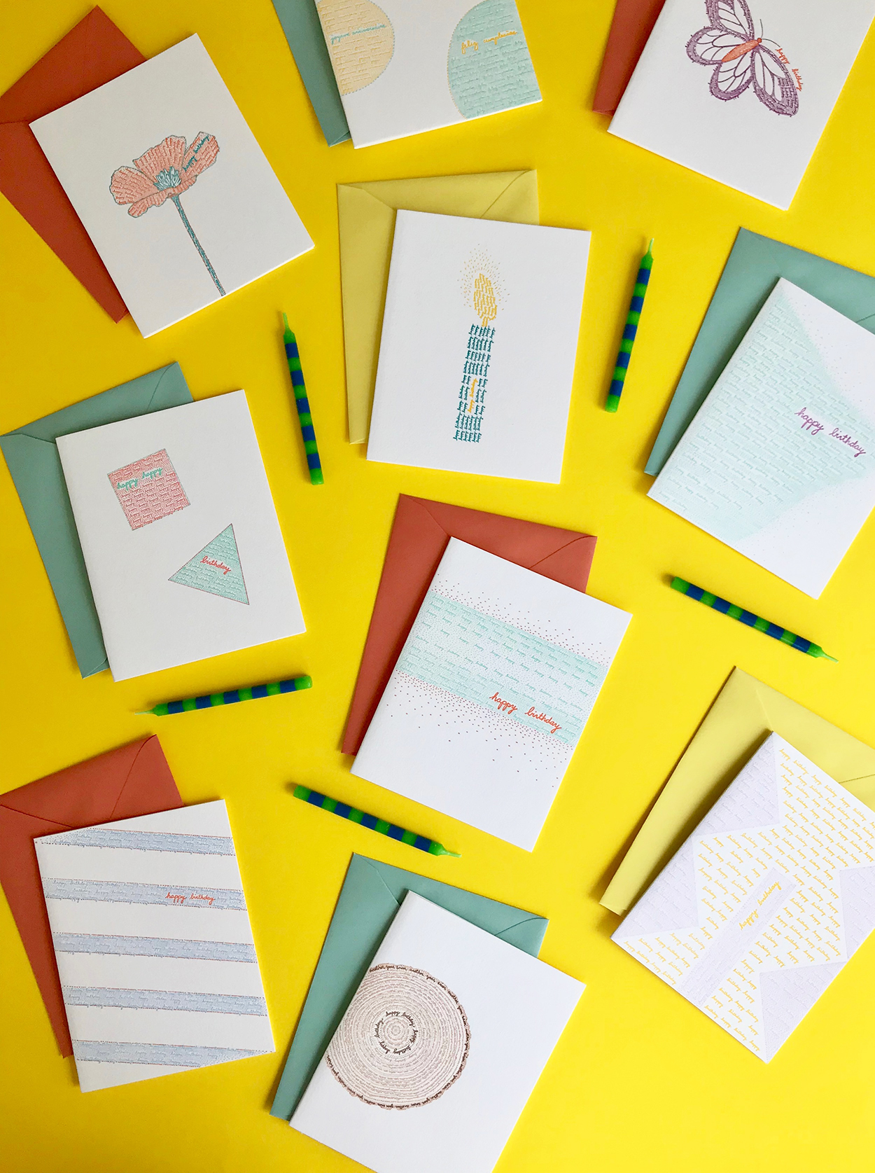
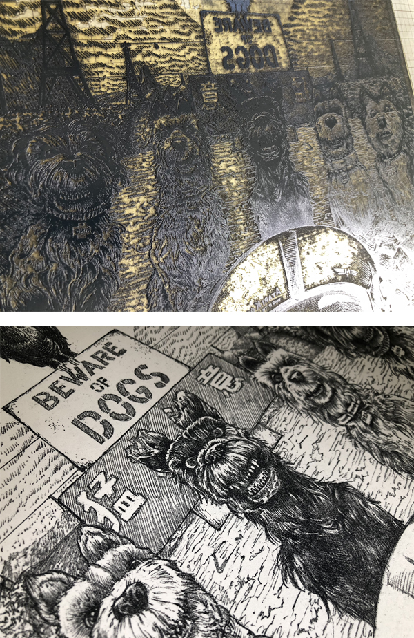
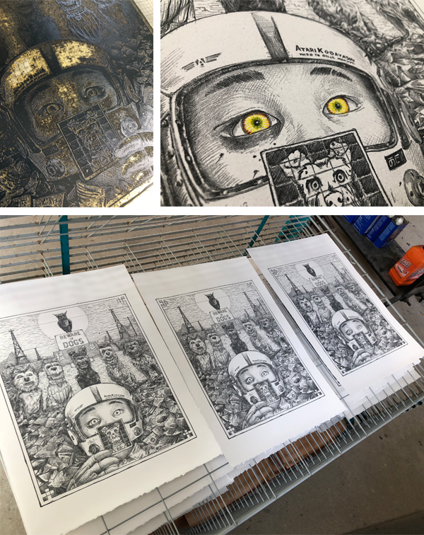
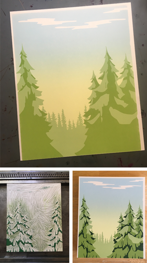
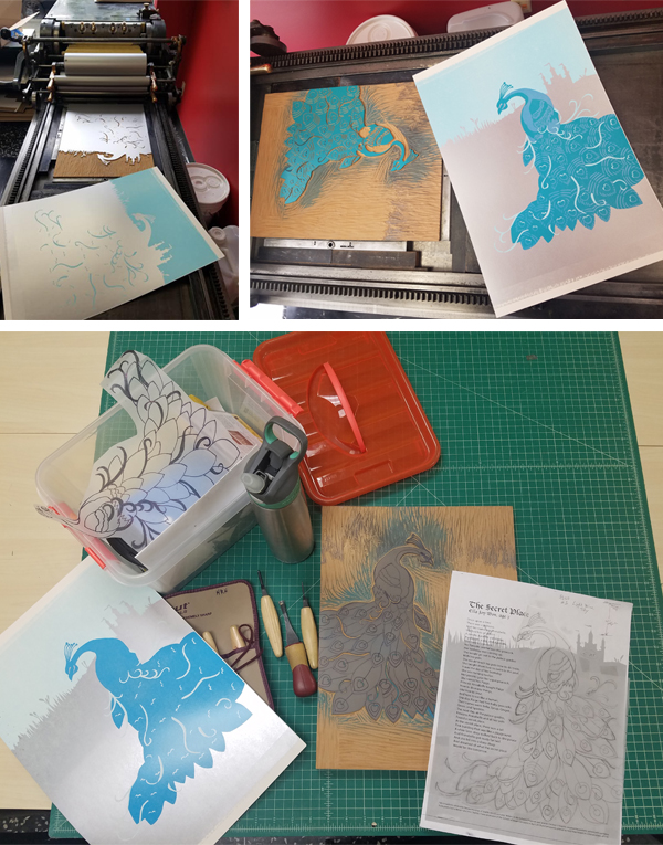
My primary job is as a graphic designer for my company Abstract Orange. I enjoy printing and I do it mostly for fun. While I would love to do it full-time, I am concerned that if I printed commercially it might lose the satisfaction. Teaching at Pyramid keeps me fresh and experimenting. When I letterpress now, I use a combination of techniques. For small text and logos I usually use polymer. For hand-drawn type I usually carve linoleum or wood blocks. Each process has it advantages and I try to be intentional in my process, using the one that will best suit my goals for the project.

PRINTING FEATS

I made a Hand-Carved Alphabet book that I sold to the Library of Congress. At one of the APHA events, I sold my book to their special collections. It was one of the most exciting and validating events in my life. I started the project several years earlier without any particular goals or directions. Through a series of events, the book ended up in a show on a table next to works by Edward Gorey and Frederic Goudy! As a type nerd, Goudy has a special place in my heart!

I picked-up my bookmaking skills from a number of places along the way.  I started with different portfolio books at University of Delaware; workshops at Hamilton Wayzgoose; Ladies of Letterpress conferences, New York Center for the Book, GW Corcoran, and AIGA DC. The bookbinding associates at PAAC are always amazing and helpful.

Emeritz Lauren ( Washington, D.C. ) letterpress prints beautiful hand-crafted fine editions artists books.

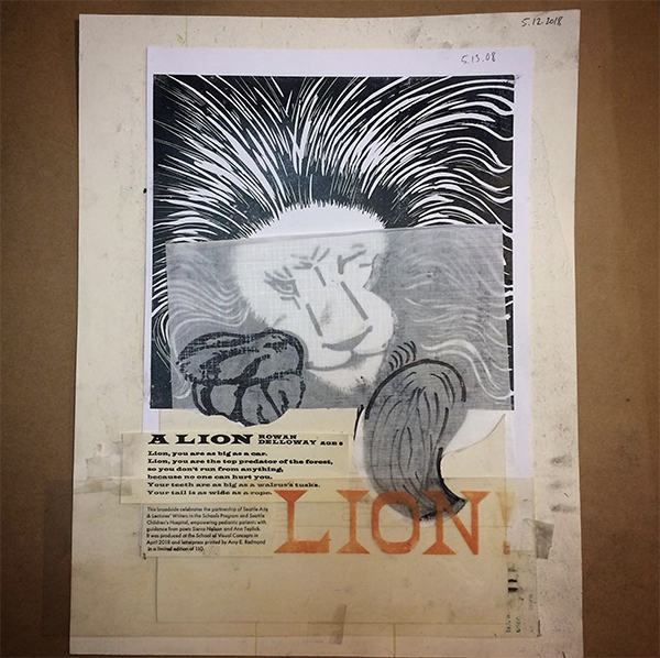
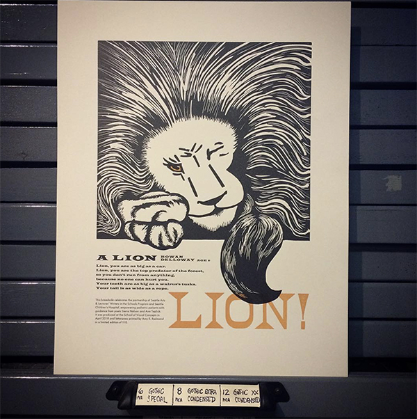
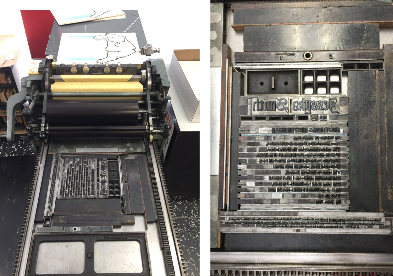
(This is the artist book I carved, printed, bound and sold to the Library of Congress. (uses polymer for the colophon page)

PRESS HISTORY

My first press was probably my hands. I loved making rubbings. I own a Vandercook 99 (that is one without an inking system). My Vandercook 99 lives in my basement. I print on it sometimes, usually small runs or irregular things you couldn’t print on a larger Vandercook, such as round coasters. I have also used it for printing demos/workshops at the Smithsonian American Art Museum, Renwick Gallery, and Shop Made in DC. Because it is smaller and only 110 lbs, it is fairly portable for demos.

Emeritz Lauren ( Washington, D.C. ) letterpress prints beautiful hand-crafted fine editions artists books.

BOXCAR PRESS’ ROLE

Boxcar Press really revolutionized letterpress printing. I realized at some point that things were being letterpress printed using fonts that were more modern than lead type. Next, I figured there had to be a way to print modern computer designs on the letterpress — and I found Boxcar Press! I love the merging of old and new technology and combining my computer design skills with hands-on printing techniques. I tell my students who are interested in polymer to check out Boxcar Press because they “invented the system” we use to print polymer.

FAVORITE INK COLOR

At the moment, I have been printing some neon orange lately. It is lots of fun!

Emeritz Lauren ( Washington, D.C. ) letterpress prints beautiful hand-crafted fine editions artists books.

WHAT’S NEXT

Very recently, I did a letterpress printing demo with the Smithsonian American Art Museum to celebrate the Solstice. I’ve also taught a Hand-Carved Type Workshop at the Ladies of Letterpress Conference in October 2018.

I am not sure where 2019 will take me, but I am excited about the possibilities! 

2018 Holiday Letterpress Gift Guide

We count down the top 18 gift ideas in our 2018 Holiday Letterpress Gift Guide for that special printer on your list. Featuring calendars, prints, and type-themed goodies that are sure to please!  Let us know what’s on your wishlist in the comments section below!

Holiday Gift Guide 2018

1.  Flurry Paper from Boxcar Press.  | 2. The Vandercook 100 book by JustVandy   | 3.  PANTONE holiday ornament by PANTONE.   | 4. RGB & CMYK & PANTONE sticker by gschroeds.  | 5. Letterpress Metal Type 110 piece puzzle by alicing.  | 6. Hamilton Wood Type Water Bottle from Hamilton Wood Type.

Holiday Gift Guide 2018

7.  Letterpress type Serving Tray by forrest.   8. Live Love Letterpress mug by OddMatter .  | 9. Letterpress Metal Type Composing Stick Enamel Pin  by ThePaperCarnival.  | 10.  2019 Fundraising Calendar from Green Pea Press. 11. 2019 Letterpress Calendar by HighwayPress.  | 12. Heidelberg Windmill Press t-shirt by Boxcar Press.

Holiday Gift Guide 2018

13. Hamilton Wood Type Blue Pullover Hoodie from Hamilton Wood Type. | 14. Daredevil furniture from Springtide Press.  |  15. Gallery Magnets from Springtide Press.  |  16. Printing Digital Type on the hand-operated flatbed cylinder by Gerard Lang |   17. Letterpress Paper Turtle Sculpture Kit by Questionable Press.

20th Anniversary Boxcar Press printing apron - Boxcar Press - Holiday Gift Guide 2018

18.  Boxcar Press Printing Apron by Boxcar Press.

All In The Printing Family With Two Tone Press

Thirteen years ago, printer and illustrator Michelle Dreher began the roots of Two Tone Press in Kansas City, Missouri. Joining forces with her sister, Angie, who helms the business side, brought exciting changes. It catapulted the growing letterpress print shop into a well-run machine full of creativity, fun & eye-catching prints and cards. They branched out with their blossoming printmaking community workshop. Michelle recounts the adventures of buying a building, expanding her studio for her sky-high printing visions, and what’s just around the bend.

EAST OR WEST, LETTERPRESS IS BEST

I grew up in a military family, so we moved around a lot. We lived in Germany and South Korea for several years before ending up back in the US. I later came to Kansas City to attend the Kansas City Art Institute and loved the city so much I never left.

Michelle Dreher of Two Tone Press (Kansas City, Missouri) creates beautifully printed letterpress cards, invitation suites, and more.

FALLING FOR THE PRECISION OF LETTERPRESS

At the Kansas City Art Institute, my degree was in illustration, but I spent a couple semesters in printmaking. While there, an interim instructor introduced me to the Vandercook. I immediately fell in love with its hairline precision and registration which made multi-color relief printing so easy.

ALL IN THE FAMILY

I started Two Tone Press in 2005 in a super-drafty warehouse loft on the top floor of an industrial brick building. I was later joined by my sister Angie in 2011 after buying a building in a soon-to-be up & coming neighborhood. She has a business background paired with a love for art and helped whip this place into shape. Together we built our own studio with a modest storefront and lots of open space and high ceilings. It’s been a long eight-year renovation journey but the studio is finally taking the shape of our initial vision.

KANSAS CITY COOL

When I purchased our building, there really wasn’t much going on around us. It has since started to flourish with other creative-minded folks who have banded together to build our own unique neighborhood.

Michelle Dreher of Two Tone Press (Kansas City, Missouri) creates beautifully printed letterpress cards, invitation suites, and more.

We even named our new area TowerEast District based on the very orange and prominent tv tower right next to us. It’s been interesting being a part of something new.

Michelle Dreher of Two Tone Press (Kansas City, Missouri) creates beautifully printed letterpress cards, invitation suites, and more.

PRINTING MENTORS

My passion lies in creating colorful relief block prints so I draw inspiration from my peers in the field. Our favorite shops are The Firecracker Press in St. Louis, MO and Tugboat Printshop in Pittsburgh, PA.

FULL TIME FUN

Two Tone Press is where I spend most of my time, but I do love to teach. I have been a part-time studio art instructor at the Nelson-Atkins Museum of Art for over 10 years. And just last year in 2017, my sister and I along with another colleague, Ani Volkan, started our own community printshop called Print League KC. It shares the same studio space as Two Tone Press. In addition to letterpress, Print League KC offers workshops of other print processes such as etching, lithography, and silkscreen.

Michelle Dreher of Two Tone Press (Kansas City, Missouri) creates beautifully printed letterpress cards, invitation suites, and more.

THE CREATIVE FLOW

At our studio, we create everything from custom wedding invitations to business cards. When there’s “free” time, we create our own line of colorful poster prints and cards. Due to my illustration background, I tend to incorporate hand-carved block images where I can.

Michelle Dreher of Two Tone Press (Kansas City, Missouri) creates beautifully printed letterpress cards, invitation suites, and more.

PRINTING FEATS

With the immense support of my family, buying my own building to create our unique studio was a huge accomplishment. And later, being able to give back by starting a community printshop felt really good. I enjoy sharing my passion for printmaking with others.

Michelle Dreher of Two Tone Press (Kansas City, Missouri) creates beautifully printed letterpress cards, invitation suites, and more.

PRESS HISTORY

I gained a lot of experience working at another local print shop, Hammerpress, for several years after I graduated college. Then in 2004, Brady Vest, the owner of Hammerpress, offered to sell me a Vandercook No. 3 for $400. I jumped at the opportunity.

Michelle Dreher of Two Tone Press (Kansas City, Missouri) creates beautifully printed letterpress cards, invitation suites, and more.

It was a clunky machine that had no motor and a funny little hand crank to distribute the ink. Once I started my own studio, I later traded it for an SP15 from Indianapolis which is still my favorite press to this day.

Michelle Dreher of Two Tone Press (Kansas City, Missouri) creates beautifully printed letterpress cards, invitation suites, and more.

BOXCAR PRESS’ ROLE

We started by using metal-backed polymer plates that we spray-mounted to MDF boards. This made precision printing challenging because the boards were never perfectly flat. Then in 2013, my sister recommended we finally invest in a Boxcar Base so we bought the biggest one that would fit on our Vandercook, a 19×13.

Michelle Dreher of Two Tone Press (Kansas City, Missouri) creates beautifully printed letterpress cards, invitation suites, and more.

I can’t even express how much it changed our whole world by making setup so much faster and easier. The grid marks were totally worth it. I’ve never regretted the purchase for even a second and can’t believe I didn’t invest in one sooner.

PRINTING TIPS

Here is one of our useful letterpress printing techniques. We like using a sheet of mylar on top of the tympan sheets around the cylinder to keep a clean surface and then we also like to use removable sticker paper on it to bump up certain areas of the print.

WHAT’S NEXT

We look forward to expanding our store to offer print work from all over the world. We also recently bought the building next door which now has a gallery space on the second floor. We’re excited to put together interesting exhibits that will include letterpress and other print work.

Inquisitive Printers Want to Know: Extra Things That Caught Our Eye

This month’s installment of the Inquisitive Printers Want to Know showcases an enjoyable animated video short “Typesetter Blues” and today’s Mars-bound InSight probe. Read on to learn more!

From Cathy: How can you not love a title like Typesetter Blues?  Enjoy this short animated video about the fickleness of love in a print shop (Fun Fact: the printer in the video is named “Harold”).

Typesetter-blues-letterpress-printing - inquisitive(photography courtesy of TOGETHER/Pahzit Cahlon)

From Rebecca:  Seven months ago, NASA sent up the Mars-bound InSight probe. Today, the probe is schedule to land on the surface of Mars. The cool little probe has the job of collecting data of Mars’ surface and drilling a hole 5 meters (16.4 feet) down.

Mars_insight_probe-NASA(photography credit: NASA/JPL-Caltech)

The data will be able to help scientists understand the creation of Mars and its geological landscape evolution.

Making the Leap Into Letterpress: Lauren Rolph


Newly fledged full-time architect-turned printer, Lauren Ralph of Helen Edna letterpress shares with us her printing journey so far. From being inspired by the vivid color palettes of Van Gogh and Kandinsky to taking up printing lessons at the International Printing Museum in Carson, CA, Lauren’s bright and clean designs reflect her dedication to the printing tradition.

TACTILE ARTIST

I began my career as an architect. Shortly thereafter, I came to the realization I missed working with my hands. The summer of 2018, I embarked on a new journey and opened my letterpress stationery studio, Helen Edna.

Lauren Rolph letterpress

I took printing lessons at the International Printing Museum in Carson. My favorite part was learning the printing process and being able to print my hand-drawn designs and turning them into cards. As a result of the printing lessons, I bought a Golding Pearl. Next, I made the leap to start Helen Edna!

LOVE AT FIRST PRINT

Letterpress cards in boutiques are something that I have admired. Being able to design and print my own cards for people to enjoy is something that brings me great joy. 

Lauren Rolph letterpress

CALIFORNIA COOL

I live a really neat area in California that is close to just about everything. My house is near the Headlands Conservation Area, Dana Point Harbor … and next to Strands Beach in Dana Point.

All the design work and order fulfillment takes place at my home in Dana Point. While all the printing happens at my husband’s grandmother’s home (which is nearby).

PRINTING MENTORS

One of my printing mentors would be Mark Barbor, the International Printing Museum Director. Not only did he give my husband and I a printing lesson at the museum. Even more, he has been helpful in getting me started. In addition to Mark as a printing mentor, artists such as Van Gogh and Kandinsky are inspirational.

Lauren Rolph letterpress

FULL TIME FUN

Over the last several months, I have been printing full-time. It is a true pleasure in seeing my designs come to life!

CREATIVE PROCESS

How does the creative process begin? First, I begin drawing thumbnail sketches in pen and ink. Next, I take a photo of the design is uploaded in Adobe Draw. From here, I use the Apple Pencil to create the illustration. After this, I export the drawing into Adobe Illustrator and adjust the Pantone colors. Finally, I prepare the design file to send to Boxcar Press. The design file includes adding registration for the designs that are full-bleed.

Lauren Rolph letterpress

PRINTING FEATS

One of my biggest printing feats is opening Helen Edna. Opening this store is something I have dreamed about for years. 

FIRST PRESS

A Golding Improved Pearl No. 11, which I bought from the International Printing Museum in Carson, CA.

BOXCAR PRESS’ ROLE

Boxcar Press’ customer service is impressive. They have a really fast turnaround, are always very polite, and willing to help with any questions you may have.

Lauren Rolph letterpress

PRINTING TIPS

I have three pieces of printing tips. My first, If you are looking to save time … for card designs that are not a full bleed (and have a good margin around the design) I order precut and folded A2 Crane Lettra, from Astro.

My second tip, to achieve the perfect registration try overlaying your design with the printed design on vellum.

The final printing tip, if you are looking for Pantone ink colors to be spot on, and able to apply directly from the tube onto the disk, check out Southern Ink.

WHAT’S NEXT

I’m hoping to exhibit at the National Stationery Show for the first time! I also plan on doing more craft fairs and continue to play with designs for my line.

Immensely large round of thanks + appreciation out to Lauren of Helen Edna!

Let’s See That Printed: Isle of Dogs by AJ Masthay

As soon as AJ Masthay’s “Isle of Dogs” print passed through our platemaking department, we had to know more. Discover as we catch up with AJ of Masthay Studio, and this sneak peek. Find out what is the inspiration for this ultra-detailed piece… and where can you enjoy this piece.

The piece was created for an upcoming Isle of Dogs group exhibition hosted by SpokeArt NYC at the Parasol Project, 213 Bowery, NYC. From their Facebook event page:

“Spoke Art is pleased to present the Isle of Dogs Art Show. This is an officially licensed art exhibition tribute to Wes Anderson’s most recent film. The dynamic group show features over one hundred artists, painters, sculptors and print makers, debuting one weekend only in New York City’s Lower East Side.

Isle of Dogs Wes Anderson AJ Masthay letterpress print

Isle of Dogs

Isle of Dogs, Wes Anderson’s most recent project, is a stop-motion animated film set in a Japanese dystopian future. The story follows a boy’s journey to find his dog after the species is banished to an island following the outbreak of canine flu. Inspired by the adventurous tale that Anderson brought forth, a select group of artists have created character portraits and highly detailed environments and scenes inspired by Isle of Dogs. Featuring a diverse array of painting, sculpture and limited edition prints, each artist offers their own unique perspective and interpretation of the Wes Anderson film. This whimsical and canine filled pop-up exhibition is an absolute must see.

About the Piece

I personally love the quirky works of Wes Anderson and am a huge dog lover. I have two very spoiled Labrador Retrievers Dexter & Halley. When asked to participate in this exhibition I immediately said YES!

My piece features the main characters from the film, both human and canine. As well as, the scene in which they debate whether to attack. Spoiler alert – they realize he has come searching for his own dog “Spots” and decide to help him in his quest. 

Isle of Dogs Wes Anderson AJ Masthay letterpress print

The print is a reproduction of a detailed graphite drawing utilizing a Boxcar Press’ photopolymer plate with a 133 LPI halftone screen applied. We’ve found that once dialed in on our Vandercook Universal III, these halftone plates reproduce tonal drawings beautifully. They come very close to the detail typically found in lithographs.

To mimic the graphite work we do the following steps. First, we mix a fairly stiff, dark gray ink with a touch of brown to warm it up a bit. Next, we use a paper that is soft and supple, such as Arches 88. Finally, we finish the piece with a hint of hand-applied color in the pilot’s eyes. As a result, this slight variation adds a personal touch of individuality. The hand coloring piece complements the printing perfectly.

Isle of Dogs Wes Anderson AJ Masthay letterpress print

The Final Edition size is 100 signed, numbered and titled, 15”x20” on Arches 88. Prints are available to purchase at the event. Remaining prints will be made available online following the event, through SpokeArt.

The Isle of Dogs Art Show group art exhibit is running from November 9th, 2018 – November 11th, 2018. For more details, check out their Facebook page here.

2018 Seattle Children’s Hospital Broadsides: Part 2

Part two in this year’s Broadside blog series highlights more of the beautiful art prints from the printers and writers who came together in the 2018 Seattle Children’s Hospital Broadsides project. The Writers in the Schools program (WITS – a poetry program created by Sierra Nelson and Ann Teplick), the School of Visual Concepts, and long-term patients at Seattle Children’s Hospital all joined creative forces to produce original stories that come to life in beautifully crafts printed works. Sarah Kulfan reflects on this year’s printing experience of adding in fun & color to their special young writer’s words.

“I am always blown away by the talent and commitment of our young poets and this group of printers. Many have been involved with this project every year. Its an honor to be a part of this amazing collaboration. I am grateful for the support of business partners like Boxcar Press who help fuel this creative endeavor from the beginning.”

2018 Childrens Broadsides -IMG12018 Childrens Broadsides

Sarah Kulfan

There are a couple of lines from the poem by Amanda Longees, Age 11, titled Beliefs, that inspire the forest and tree theme illustrations. My goal was to create a broadside that was bright and optimistic. In the first print pass, I created a split fountain gradient that represents the rising morning sun. With a design perspective of looking out across the treetops, there is a sense of spiritual uplifting. Which also reflects the title of the poem. 

With the tree element design, it was only natural to include a wood type for the title. I worked with Boxcar Press to create plates for the poem and colophon.

Sarah Kulfan Boxcar Press 2018 Seattle Children's Broadsides

The reduction cut process includes a total of 4 colors. Each color is a successive layer that is carved from the same block.

Sarah Kulfan Boxcar Press 2018 Seattle Children's Broadsides

The colors typically go from light to dark. This year’s challenge for myself was to print a full bleed and a gradient on a portrait style broadside. Which includes several rounds of careful trimming, and maxing out my press’ sheet size in order to make that directional gradient work.

Sarah Kulfan Boxcar Press 2018 Seattle Children's Broadsides

The talent and commitment of our young poets and group of printers are impressive. It is an honor to be a part of this amazing collaboration effort. I am grateful for the support of business partners like Boxcar Press – who help fuel this creative endeavor from the beginning.

Heidi Hespelt

This year’s broadside design illustrates a poem written by Ella Joy Won, Age 7, titled The Secret Place. Ella is a “sparkly girl,” and the design reflects this through the incorporation of bright colors and metallic inks. The printing of the poem starts with text which uses polymer plates from Boxcar Press. Next, is the artwork. This piece, in particular, there were 7 passes through the press. The press used a large reduction linoleum block that carves away sections of the block between each color pass.

Heidi Hespelt 2018 Seattle Children's Broadsides Boxcar Press

Printing silver over a blue background for the first cut on reduction block. Carving away the things that I want to stay medium blue and then next is the teal layer…

Heidi Hespelt 2018 Seattle Children's Broadsides Boxcar Press

Next, printing the gold pass. Followed by mixing ink for the purple coloring for its pass. Finally, I will print the text and trim the paper.

Heidi Hespelt 2018 Seattle Children's Broadsides Boxcar Press

Amy Redmond

As a letterpress instructor at the School of Visual Concepts, it’s a real joy to see students evolve from fledgling ink slingers into skilled printers, and this Broadside project represents a milestone in that journey. There are many new names on this project’s list of printers this year, but by no means are they new to the press. This year the stars finally aligned for them to join this kind-hearted & generous group, raising the bar of talent even higher than before.

Amy Redmond letterpress Seattle Children's Broadsides project.(Above: Photo courtesy of “Carrie Radford / Radford Creative”)

When first reading, A Lion by Rowan Delloway, Age 6, I was struck by how much power just a few words carry. Looking beyond the face value of his admiration of a lion, I interpret the lines “so you don’t run from anything / because no one can hurt you” as representing Rowan’s own fierce determination and strength. This concept was my guide through the design process to include bold elements and a careful use of color.

Amy Redmond letterpress Seattle Children's Broadsides project.(All other photography courtesy of Amy Redmond.)

It would be easy to show the lion’s power through a literal translation of Rowan’s words. However, after making some quick thumbnail sketches, I chose to illustrate it through a display of calm confidence.

The lion may be at rest — claws in, tail curled around its body — but its one watchful eye says, “Think twice before you make your move.” I imagine it protecting Rowan, watching over him… ready to pounce and unleash that power upon any threat to his well-being. The first rough layout sketch was effortless. In contrast to how my process usually goes. When looking back at my choice to sketch on top of make-ready tells me I really didn’t expect that to happen.

Amy Redmond letterpress Seattle Children's Broadsides project.

I wasn’t sure if I would be able to capture that energy if I redrew it again. Instead, I used a thick charcoal pencil to rework the sketch on top of the original. When I removed the tape that was masking my margins and lifted the page from the table, I got a kick out of seeing my make-ready for Zack Edge’s poem (from the 2016 portfolio).

Amy Redmond letterpress Seattle Children's Broadsides project.

Moving on to typesetting, first I started with the easiest part: LION! Big and bold, the size alone limited my choices. Next, I selected a Latin wood type that when aligned to the right margin of my sketch. This left just enough room for the body text and colophon. Also, it also gave me the excuse to use the Latin Wide metal type in my collection. Typically, this is not a face I would normally choose for body text. Due to the short nature of the poem made it feels safe enough to try. I’m delighted that it worked!

Amy Redmond letterpress Seattle Children's Broadsides project.

By this point, my typesetting was complete for the day even though the colophon wasn’t done. This is my 8th year contributing to the broadside project. And my first year contributing by carving an image from linoleum. For those who are familiar with linoleum, it cuts the smoothest when warmed by the sun. Lucky for me, Seattle was having an unusually warm sunny spell in May. Time to move outside.

I usually shy away from carving. However, I had a strong vision of a bold and graphic piece, that I went for it. For the first time in over 20 years, I invested in a new set of carving tools. I also made sure to purchase extra blocks, just in case of a few errors. Careful viewers can see, right out of the gate, I forgot to reverse my image before carving.

Amy Redmond letterpress Seattle Children's Broadsides project.

On the second carving attempt, I decided to slow down and take a proof before moving forward with the paws and tail. The placement needed to be just right in order for the type to work. Refreshed by a new day, I also finished typesetting the colophon and proofed that as well. Out came the scissors and tape and Sharpies.

Amy Redmond letterpress Seattle Children's Broadsides project.

Paw and tail position decided, the remainder of the lion carving went well with only a few minor slip-ups. The sun was having a positive effect on my outlook, and I decided I could live with a few wayward marks. I moved back into the studio, locked it up, and printed the first run on my Colt’s Armory platen press.

Amy Redmond letterpress Seattle Children's Broadsides project.

With the lion in place, I now had a map from which I could now measure all future passes. I locked up the first form, gave the type a good scrub, and ran the second pass. (Shiny clean type is so satisfying.)

Amy Redmond letterpress Seattle Children's Broadsides project.

In a fit of stubborn efficiency, I decided to print the lion’s eye color with the last line of the poem (“LION!”), in one final pass of orange ink. To guarantee perfect alignment, I mounted a small rectangle of uncarved linoleum to a piece of furniture, made it type high, and composed it with the wood type.

Amy Redmond letterpress Seattle Children's Broadsides project.

Taking measurements of the lockup from the text printed in black, I was able to lock up this new form in the exact location in needed to be. Without changing my page guides on the tympan, I then pulled a blind proof on a still-wet print from the second pass to confirm that the text aligned as I wanted. The black eye of the lion offset onto the uncarved linoleum, revealing exactly where I needed to carve. I added a little trapping as a safety measure, in case some of my earlier prints had shifted alignment in the run.

Amy Redmond letterpress Seattle Children's Broadsides project.

This small series of careful acrobatics worked well, and I’m pleased with the final print. I hope others see in its design what I see in Rowan’s words. “That underneath his joyful and seemingly wild exuberance lies a trained force of powerful inner strength.”

Amy Redmond letterpress Seattle Children's Broadsides project.


Come check out Part 1 of this year’s Children’s Broadsides project!  We would like to thank all of our young writers, organizers, printers, and families who help make the 2018 Broadsides project memorable and powerful.

File Prep Tip: Pricing Previews for TIF files

Today’s tip is for designers and printers who set up and create their files in Photoshop for platemaking orders.

Our online ordering system can calculate your square inches and pricing for files that are .pdf, .ai, and .eps.  This is so helpful for seeing your costs while creating your ticket.  However, the online system doesn’t do that for .tif files.

We love .tif files from Photoshop, but saving to a PDF in Photoshop can change your black and white file to a rasterized RGB (oh, the horror!).   With the .tif, you see a big fat $0 for cost and that can make some nervous.

Here is a quick suggestion to handle that situation.  Save your .tif with one of the below methods with the words – for pricing only – in the file name and upload it to your job ticket with your tif.  We’ll get a working tif file and you’ll get your price.

Pricing TIFF file letterpress plates for Boxcar Press.

Best ways to do this:

From Photoshop:

Select FILE > SAVE AS > PHOTOSHOP EPS (under Format drop down).

Using Adobe Acrobat Pro:

Select FILE > OPEN. When the window opens, at the bottom the default is Show > Adobe PDF Files. Change to All Files to find your tif.  Choose Open.  Now select FILE > SAVE AS > the Save as PDF window will open > save with pricing only file name.

If you have other programs for saving as a PDF that you’d like to use, contact us and we can help you, if needed.

2018 Seattle Children’s Hospital Broadsides: Part 1

We enjoy giving back to the letterpress community and supporting amazing opportunities for printers around us to create, shine, enjoy, and share in the magic that is printing. In its eighth year, Boxcar Press has had the honor of contributing photopolymer plates to the 2018 Seattle Children’s Hospital Broadside project. The culmination of combining the talents of Ann Teplic and Sierra Nelson of the Writers in the Schools program (WITS), the School of Visual Concepts in Seattle, and young local poets at the Seattle Children’s Hospital was 20 cleverly crafted broadsides. Each print had a limited run of 110 editions. This first installment of a two-part blog highlights four printers who share their heartwarming experience bringing their young poets words to life.

2018 Children's Broadsides -IMG12018 Childrens Broadsides -IMG1

Bonnie Thompson Norman

The process of working on the Children’s Hospital broadside project each year is a combination of dedication and commitment as well as skill and inspiration.

Each year, children present to us a selection of poems before we come together as a group of printer/designers for the first meeting. At that gathering, the wonderful poets-in-residence who bring such heart to the project, Sierra and Ann, read each poem written by their young proteges. We have our preferential choices and usually end up with the poem we most wanted to work on…although that process may occasionally require some good-natured negotiating. It never feels like enough time to work on our broadside. Sometimes we receive helpful hints or information from the poet and/or their family. Sierra was able to connect me to the family of the delightful young girl who wrote about her grandmother’s dog and the times she spent with them. Her parents sent me some photographs of them with their daughter and she was happy, gay and playful in the photos.

Bonnie Thompson Norman 2018 Seattle Children's Broadsides

I wanted to convey that delight in the broadside so I carved a linoleum block of a young girl dancing and spinning and another block of a playful dog who (I hope) looked like the one her grandmother had.

Bonnie Thompson Norman 2018 Seattle Children's Broadsides

The type for the poem, title and colophon was a combination of handset type and ornaments from my own cases and Linotype set according to my specifications by my good friend and Linotype master in Los Angeles, Bill Berkuta. Each color is ran individually on the press. The sheets of paper went through my Vandercook SP15 and my Chandler & Price 10 x 15 a total of eight times. This was in order to avoid over-inking the type and/or under-inking the images.

Because of the nature of this project, there is a great deal of poignancy with it. I learned that my young poet had already passed away by the time this year’s project had begun. While I was charmed by both the exuberance of her poem and her photographs, it was bittersweet to know that she couldn’t see herself in the final printed poem.

Justin Gonyea

When I first read Jesse’s poem, his words really stood out to me, and I wanted to put them front and center. To achieve this, I used his poem to create a typographic portrait instead of calling out a specific image he evoked. I wanted to elevate his voice rather than creating my own interpretation of what he was saying.

Justin Gonyea Seattle Childrens Broadsides project - IMG1

My broadside had a total of five passes on press using wood type, metal type, and photopolymer plates. I first handset and printed four lines of the poem that I wanted to emphasize in wood type. Scanning this type allowed me to arrange the text on top of a silhouette. I set the rest of the poem digitally using HTF Knockout, HWT American, and HWT Catchwords. I resized and rearranged the scanned wood type and digital type until I was happy with the composition.

Justin Gonyea Seattle Childrens Broadsides project - IMG1

Back in SVC’s letterpress shop, I used a printout of my digital layout as a guide. I set it down on the composition table and set type on top of the paper. Using upside down wood type, I created a woodgrain texture around Jesse’s words to help create the form for the silhouette. I handset the type for colophon, byline, and title using metal and wood type.

Justin Gonyea Seattle Childrens Broadsides project - IMG1

The woodgrain texture was my first pass on the press. I scanned one of the final prints of this first layer, made sure all of my digital text lined up properly, and then put in an order for my photopolymer plates. On press, I printed the handset colophon, followed by photopolymer plates for the light and dark blue layers. For the green layer, I used a smaller Boxcar base, so I could also print the handset title and byline at the same time as the green photopolymer plate.

Justin Gonyea Seattle Childrens Broadsides project - IMG1

Unfortunately, I didn’t get a chance to talk with the young author for this project. I just hope that my broadside helped amplify Jesse’s voice. It was really fun to design a piece of artwork around his words, and it was an honor to be part of this year’s Seattle Children’s Hospital Broadside project.

Annabelle Larner

This year’s piece is all handset metal type and carved linoleum. In the past, I’d done elaborate pressure prints and layers. This year, I wanted to keep it simple and clear as I did not meet my poet.

Annabelle Larner Seattle Children's Hospital Broadsides.

The poem is called Brother & Sister Bear, by poet Jessyka Smith, age 16. It’s about her little brother, and what a great support and defender of her he’s been in her life. He calls her Big Sister Bear.

Annabelle Larner Seattle Children's Hospital Broadsides.

Jessyka’s poem made me think of a protective, strong, and fierce bear. Using linoleum, I carved a big slumbering bear to lay across and frame her poem.

Annabelle Larner Seattle Children's Hospital Broadsides.

It ended up looking like a polar bear. I thought it would be nice to have a cool, icy-blue area for the bear to rest on, which also added depth under the poem. This blue background was carved in linoleum as well.

Annabelle Larner Seattle Children's Hospital Broadsides.

Regarding the type, I hand-set her name in big, 72 pt. Goudy Text to make it stand out. I also liked how the curves and lines of the typeface looked with the bear. I chose Bernhard Gothic for the poem itself, to contrast with the Goudy Text. Also, I loved the W’s in this typeface, since there were so many that started each stanza! And the Bernhard Gothic ampersand for the title was unique and pretty.

The first item that goes to print is the bear, which uses black ink. Second, is the blue background with a split fountain which contains blue on the outside bleeding to trans white on the inside. Finally, the poem and colophon go to print.

Laura Bentley

Sarah’s poem entitled “Roots” speaks to me because of the nature imagery. Specifically, the imagery of wildflowers and roots. I often print from handset type, but for this broadside, I decided to print from polymer plates. This allows for flexibility on choosing cohesive imagery for the wildflowers and the roots.

Laura Bentley 2018 Childrens Broadsides -IMG1

The layout of the text was designed on a computer with digital fonts, of course. In addition, the foliage and flower imagery are also from a font! Really! The font is called Makalu and is a series of illustrations created by Juraj Chrastina. 

I felt like the playful feel of the illustrations. It fits Sarah’s imagination and her poem. The overlapping of colors to fill the top of the page was a natural fit. To evoke a mid-century modern feel, the roots are a tangle of geometric lines.

Laura Bentley 2018 Childrens Broadsides -IMG1

Each of the four colors was printed separately. For an edition of 120, I started with 130 pieces of paper. For all of you counting this means I am feeding paper through the press 520 times!


Stay tuned for Part 2 of our blog article series featuring more printers and their original and inspired prints.

Boxcar Press Open Studio 2018

If the action and rhythmic noise of heavy metal does it for you, the Boxcar Press Open Studio is a great place to be.  Cast iron letterpress machines that thump, clang and ker-chunk will be on display for free tours on Saturday, November 10th from 10 AM – 4 PM.  This family-friendly event has printing demonstrations, crafts, a giveaway, workshop, and paper sales of Smock Paper products.

Boxcar Press celebrates their 20th anniversary this year and welcomes all to step up close to view our presses that weigh over 2,000 plus pounds.  We print on all cotton paper to make beautiful invitations.  Print shop tours on this day will let you see this in action.

In honor of Veterans day, we will be offering free thank you cards to send to veterans.  For Veterans attending, they will receive a complimentary coaster.  If you are shopping our Smock paper products sale of beautiful boxes, wrapping paper and notebooks, bring a re-usable shopping bag to receive 10% off.

Letterpress is alive and well and happens daily at Boxcar Press, with big spinning wheels and rotating windmill arms.  Visit to enjoy the sights and sounds of our print shop.

Open Studio Boxcar Press 2018 - IMG1

Open Studio Boxcar Press 2018 - IMG2