Let’s See That Printed: Translating Ink with John Reardon

One of the most enjoyable aspects of working with so many talented printers and designers who make their photopolymer plates with us is coming across some truly inspiring design work. Designs that make you stop and wonder just what color ink they’ll be running or what the print is for. It’s even better when you get a chance to catch up with the printer behind the design. We chatted with the outrageously gifted tattoo artist, John Reardon of Greenpoint Tattoo Co. in Brooklyn, New York, when his plate came through our doors. We’ll let John take it from here.

Photopolymer letterpress printing plate being made at Boxcar Press.

The project came about by running into Dan Morris (of The Arm in Brooklyn) on the streets. This was the second time I printed at The Arm (the first was back in 2010). I also have a tattoo shop down the street from Earl Kallemeyn (Kallemeyn Press). I’ve drawn stuff for him. He comes by the shop to hang out occasionally.

Photopolymer printing plates on a Vandercook.

John Reardon printing on a Vandercook.

Dan told me I needed to make another print and I agreed. I’ve been drawing and tattooing daggers like this for about 7 years now. The first one I drew I tattooed on Othello Garcia when we both worked for Scott Campbell at Saved Tattoo. When I find the time I have four more to finish drawing and print. The difference between my drawing for printing vs tattooing is that I can put in more detail in a print. Also I have to make tones by stippling or cross hatching. It’s fun. I printed with my buddy Jordan Haley and two bottles of red.. Been on a Spanish Rioja kick this winter…(it’s how I survived).

John Reardon printing on a Vandercook and pulling the paper through the press.

Final pulled prints of the ever talented  John Reardon.

Huge round of thanks out to John for letting us take a peek at his cool printing project!

Let’s See That Printed: All A-boot Kamikin

When we received Kamikin’s first order for plates, we had to get the back story – we loved their dynamic artwork and had to learn more. This family owned operation has quickly transformed from a pet project to a full fledged printmaking business. Marvel at their artwork while we tell you the rest of their tale.

Photopolymer letterpress printing plates being made at Boxcar Press in upstate New York.

A quick history: Kamikin is the dream child of three sisters, Karen, Betsy and Susan, of Sedalia, Colorado.  Betsy and her husband acquired a 12×18 1920 C&P platen in 2012 with a goal of entering the fine art market with unique and affordable prints. The business plan revolves around the beautiful pen and ink drawings of both Betsy and Susan, and is driven forward by the go-getter business savvy of their older sister Karen.

Hand-drawing & illustrating designs for letterpress photopolymer plates and letterpress printing with Kamiken.

The artwork came together during the fall of 2014 with a western theme. This particular “Zen Doodle” series is western/folk art with a modern twist. Zen doodling consists of decorative lines that can have beautiful results when printed on a letterpress. Kamikin didn’t hesitate to shoot for a very competitive show for their first foray into selling, the 2015 National Western Stock Show, in their backyard of Denver. Betsy readily admits they were not actually prepared for a 16-day show. “Because of this, when we got accepted, our studio burst into a flurry of activity! We had to finalize our art, order plates for the letterpress, purchase loads of paper and packaging, and build a booth! It was a quick learning curve for all three of us as we cranked up the press for mass production.”

Letterpress printing with photopolymer plates with Kamiken on a C&P press.

“During this whole process, one of the most exciting steps was when our first order of polymer plates from Boxcar arrived,” says Betsy. “At that moment, it seemed that everything we had planned was now possible. With the artwork for this series done, the paper cut, and a printing schedule on the calendar, it was time to buckle down and get our hands dirty. With 8-10 hour printing sessions, we learned so much so fast! Like it’s a good idea to tag team the chase to save on your shoulder muscles.”

Beautiful letterpress printed western - themed cards from Kamiken.

In the 6 week timeline, they fell in love with the process. In one month, they went from having zero inventory to 2,700 packaged pieces of beautiful art to sell.  Over the 16 days at the show, they loved talking with people about letterpress and screen-printing. The prints and stationery were very well received. They even had a little movie playing in the booth to show the customers what a letterpress looks like and how it works. Overall, their debut at the National Western Stock show was a success.

Since January, the trio has put together a website and an Etsy shop. They have enjoyed donating several prints for various auctions to help support their community. And with more plates on the way, the team will be busy building up their inventory for the summer art shows and festivals.

In Type-Top Shape With Archivio Tipografico

Nestled in the northwestern corner of Italy is the vibrant city of Torino — city that boasts beautiful plazas, gorgeous views, and of course the hidden gem that is Archivio Tipografico. Davide Tomatis, a cheerful member of the type-based shop, was able to take a minute between press runs to talk shop, the overflowing array of rare type and the joy of coming home to his letterpress “family” on the weekends.

Emanuele Mensa, Davide Tomatis, Davide Eucalipto, Anna Follo, and Nello Russo - Gabriele Fumero of Archivio Tipografico
(from left to right: Emanuele Mensa (our mentor!), Davide Tomatis, Davide Eucalipto, Anna Follo, Nello Russo, and Gabriele Fumero)

LETTERPRESS ADDICT I am not a conventional printer… I’m primarily a graphic designer addicted to good type, and I’ve always been fascinated by type in all of their shapes and typologies. About three years ago, I found a letterpress workshop online in my hometown. My brain stopped for a second watching the screen, and I remember thinking something along the lines of “what the hell are those wooden letters? Did there really exist a printing technology before the inkjet printer?”

Vibrant green hand-set letterpress poster from Archivio Typographico

Hand-set wooden type at Archivio Typographico.

LOVE AT FIRST SIGHT When I entered a printshop for the first time, I was 20 years old and knew nothing about typography, but it was clear to me that I needed to learn everything about that world. Back then, Archivio Tipografico was “just” a huge collection, not a real printshop as it is right now. I started working there in my spare time, cleaning old type and ordering them in their drawers. During the following two years the team got bigger, and now it is comprised of six people (Anna, Davide, Emanuele, Gabriele, Nello, and me).

INKING UP IN ITALY Archivio Tipografico is a really big printshop: housing more than 1,600 type drawers, one flatbed press, five platen-presses and two proof-presses. As I said before, it’s not mine but I’m a part of it. We don’t like to think that there exists an owner of the printshop — we see it as the home of our typographic family. Our shop is located in Torino, Italy, and the “letterpress revival” phenomenon is still in its early days here. There are some old little printshops that still use platen and flatbed presses, but we are the only printshop in our area to integrate graphic design, digital tools and traditional printing techniques.

Speaking of exceptional printers, just out of town there’s Enrico Tallone, a great friend of ours and the last Italian publisher that is still composing and printing his books by hand only using movable type. We often visit each other to see the latest printed matter!

Drawers of metal type and a press close-up at Archivio TypographicoLetterpress printing press at Archivio Typographico.

THE BEAUTIFUL TYPE Our collection comes from the dismissal of other printshops in Piemonte (our region) and Liguria. So most of the specimens and typefaces are obviously from Italian Foundries like “Nebiolo” (that was located in Torino) or “Reggiani” (in Milano). We own specimens of nearly all the typefaces designed by Aldo Novarese, one of the most prolific type designers ever and our national “type hero”.

We generally like to use Italian type to revive that “geolocation” effect that got lost with the possibility of having an endless choice of digital typefaces. I think the rarest typefaces we have are “Inkunabula”, a typeface designed by Raffaello Bertieri in 1921 for “Società Augusta” (the previous name of Nebiolo) and “Fontanesi”, a really elaborate ornate typeface designed by Aldo Novarese in 1954 for the Nebiolo foundry.

Drawers of metal type and a letterpress sample of the Inkunabula typeface at Archivio Typographico.

PRESS HISTORY I first learned to print on an Asbern proof press and later on a platen-press called Hohner Rapid II, with the help of Emanuele, the skilled printer who founded Archivio Tipografico. He is my mentor. He actually knows how to solve any problem about letterpress printing. I’ve never felt like I couldn’t ask him a question as there isn’t one that he can’t answer.

A wide array of printing inks and beautiful printing samples at Archivio Tipografico. On press at Archivio Typographico.

LATE NIGHT PRINTING Printing is primarily a passion. It’s not our first job so we print after our main work and on every Saturday, but we’re trying to fix this situation.

THE CREATIVE FLOW Every one of us was born as a designer and is now learning to print, except for Emanuele, who was mainly a printer. Thanks to our different backgrounds we’re always searching for the perfection in both printing and graphic composition. We don’t have a defined style as we like being inspired from everything that we stumble across — from old books, to modern graphic design, passing through Italian specimen-books designed in the seventies.

A flatbed Voirin press and Linotype a tArchivio Typographico

PRINTSHOP FEATS Our main accomplishment is actually moving the whole printshop last year. It took us more than two months and a lot of sweat. The moving of the whole collection was very hard. All the platen and flatbed presses were moved by a professional carrier because it’s really impossible to move tons and tons of cast iron perfectly without knowing what you’re doing.

We also decided to donate to a museum two of the machine we owned: a flatbed press from the late 1800’s called Voirin, and a Linotype, as we weren’t really using them. We rented a big van for two weekends to move everything else (type drawers, cabinets, tools, ink cans, etc…) and that was the first time we counted how many drawers we own: it was a bit of a shock!

In the process of emptying the old space we found many typefaces we forgot about, and we managed not to lose anything! We divided in two teams, one in the old space removing all the drawers from the cabinets, numbering them, loading them on pallets and then loading pallets on the van. The other team was in the new place, unloading the van and reassembling the cabinets. I made a map of the new layout of presses and drawers that was ignored during the moving, but everything magically fit in anyway! Special equipment that was needed: gloves, pallets, transpallet, latino music, elbow grease and patience. It never seemed to end.

SHOP TIPS If you’re printing on a platen press always remove the gauge pins when setting up a new job. Emanuele always told me that in order to correctly learn… one has to make every mistake at least once, but that one is the kind of mistake that I sadly keep making.

Gorgeous Eat Drink Print hand-set letterpress poster from Archivio Tipografico.

WHAT’S NEXT Our main inspiration has always been “Tipografia Marchisio” of Torino. It was a legendary printshop in Torino, the best place to have one’s business cards printed regarding printing quality and elegance of typographic composition. Our aim is to become 50% like them and 50% like an American letterpress & graphic design studio. Our new printshop gave us the possibility to be more productive and organized so we can print more and work on multiple projects at the same time.

Another big plan for 2015 is to sort and catalogue our whole type collection (so to use it more and better) and digitalize the coolest and rarest fonts/type we own.

Extremely huge round of thanks to Davide for letting us getting a peek at the beautiful & amazing Archivio Tipografico! Molto bello!

Design tips for letterpress printing on chipboard

Available in several paper weights, our 100% post-consumer recycled chipboard is a popular paper choice for letterpress printing. Thick and textured, chipboard is kraft brown and completely utilitarian: we’ve printed wedding invitations, business cards, letterpress broadsides, and more on this versatile stock. Today we’re sharing a few tips from designer Angelena Bruesewitz on how to design for chipboard, along with some of our favorite examples of letterpress printing on this popular paper.

Design tips for letterpress printing on chipboard from Boxcar Press

Dark colors + bold lines are a great starting point.

Darker colors tend to be the easiest to work with when it comes to printing on chipboard – you’re sure to have contrast and legibility as long as your line weights are thick enough to be readable.

Kneeling Drunkards letterpress poster | Designed by Jarrod Taylor Design, Letterpress printed by Boxcar Press

Kneeling Drunkards 12″ x 20″ poster, job #25934. Designed by Jarrod Taylor, printed in black ink on 28 pt chipboard on our Cylinder Press

Bold letterpress business cards for UXA Lab - letterpress printed by Boxcar PressBold letterpress business cards for UXA Lab - letterpress printed by Boxcar Press

UXA Lab 3.5” x 2″ business cards, job #26428 for UXA Lab. Printed in Pantone 185U on 60pt chipboard on our Heidelberg Windmill Press

Tips for designing a low contrast piece.

If you’re looking to create a low-contrast piece, make sure your line weights are thick enough to be legible. We recently worked with Angelena to create the identity suite below, which included a double-sided gift card with metallic gold ink on the back. The piece required a second run on press to achieve the desired look, but the end result was a subtle bamboo forest with lots of intricate details.

Letterpress identity suite for The Wellness Tree - printed by Boxcar Press, designed by Angelena BruesewitzLetterpress identity suite for The Wellness Tree - printed by Boxcar Press, designed by Angelena Bruesewitz

Identity suite for The Wellness Tree, jobs #26310 + 24962, designed by Angelena Bruesewitz at the Dandelion Shoppe. 2.5″ x 3.5″ business cards and 5.5″ x 4.25″ note cards, printed in Pantone 1805U on 28pt chipboard. 5″ x 5″ double-sided gift certificates, printed on 60pt chipboard in Pantone 1805U on the front, with a double hit of 874U on the back.

Keep the end use in mind.

When it comes to designing for chipboard and selecting colors and fonts to work with, keep your customer and the end result in mind. If you’re going for something rustic, Angelena recommends tone-on-tone. More fun and playful? Opt for lighter shades with more vibrancy to achieve the look. The earth tones used on the Bedford 234 business cards below matched the restaurant’s rustic, farm to table vibe perfectly.

Letterpress business cards for Bedford 234 | Designed by Sol Shim, printed by Boxcar PressLetterpress business cards for Bedford 234 | Designed by Sol Shim, printed by Boxcar Press

Bedford 234 3.5” x 2″ business cards, job #26802. Designed by Sol Shim, printed in Pantone 161U + 021U on 28 pt chipboard. 

If color accuracy is a priority, consider drawdowns or foil.

Just like printing on any other colored paper, color does shift on chipboard. If color accuracy is of the utmost importance for your clients, foil stamping may be a better choice than letterpress.  Alternatively, we offer a drawdown service for $50 per color if you’d like a test run to see how your color would look on our chipboard.

C_A11A2945Letterpress identity suite for The Wellness Tree - printed by Boxcar Press, designed by Angelena Bruesewitz

Faith Neidig 3.5” x 2″ business cards, job #24666. Designed by Kelly Moses Design, printed in black ink + gold shine foil on 28pt chipboard on our Heidelberg Windmill + Kluge presses. 

Red foil stamped holiday cards - design by Jenny C Design, printing by Boxcar Press

Custom 4.25″  x 5.5″ holiday cards, job #25576. Designed by Jenny C Design, printed in red shine foil on 28pt chipboard on our Kluge.

Go a shade brighter to achieve richer colors.

Because ink colors may appear more dull or muted on chipboard, we recommend going a shade brighter in order to compensate for the difference.

Die-cut product tags - letterpress printed on chipboard by Boxcar Press Die-cut product tags - letterpress printed on chipboard by Boxcar Press Die-cut product tags - letterpress printed on chipboard by Boxcar Press Die-cut product tags - letterpress printed on chipboard by Boxcar Press

Yo Amo 305 1.69″ x 4.25″ product tags, job #25740. Designed by Wynwood Letterpress, printed in Pantone 806U on 28pt chipboard on our Heidelberg Windmill.

Keep size and paper weight in mind.

When it comes to working with chipboard (or any thicker papers), be sure to check your margins when you’re designing – you’ll want to make sure your cards fit in your envelopes! Additionally, postage weights may increase when it comes to heavier paper stocks, so make sure your client is comfortable with any added costs. Lastly, when it comes to sizes and shapes: we’ve found that 60pt chipboard is too thick for die cutting (though we have had success with 40pt chipboard). If creating a unique shape is important, consider straight cuts – the save the date pictured below was trimmed on a regular cutter, but has the look of a die-cut shape.

Letterpress + die-cut save the date tag with gold grommets - designed by Kristin at Reverie Made, printed by Boxcar Press Letterpress + die-cut save the date tag with gold grommets - designed by Kristin at Reverie Made, printed by Boxcar Press Letterpress + die-cut save the date tag with gold grommets - designed by Kristin at Reverie Made, printed by Boxcar Press

Custom save the dates 3.25″ x 5.5″ luggage tag style, job #241166. Designed by Kristin at Reverie Made, printed in black ink on 28pt chipboard. 


Our final piece of advice? Don’t be afraid! Experiment and have fun.

The Creative Buzz of Wasp Print

Through nearly a decade of printing adventures (from printing with Hello!Lucky to opening up shop in his current printing abode in the creative neighborhood hub of East Williamsburg, Brooklyn), Nicholas Hurd of Wasp Print continues to deliver whether it’s serving up a fresh batch of letterpress printed goodies or being inspired by the non-stop creative forces that swirl in New York City. We were able to catch Nicholas for a hot minute to talk shop, where to get the best delivery for those late night print runs, and of course… the mesmerizing awe of watching a Heidelberg Windmill & his beloved Vandercook in action.

Nicholas Hurd of Wasp Print shop in Brooklyn

CREATIVE MAVEN  I am a printer, artist, tattoo collector, maple syrup snob, whiskey drinker, paper fanatic, amateur gardener, drummer, and lover of ink. I live in Brooklyn with my wife Erin, who is an excellent printer on the Vandercook and a poet & writer. We have a 9 lb chihuahua named Reno, who is an extremely accomplished and obsessive fetcher.

Nicholas Hurd of Wasp Print shop in Brooklyn

LETTERPRESS OBSESSED I was first introduced to letterpress while studying printmaking at the San Francisco Art Institute. After spending three years learning etching and lithography I was excited to print something where the machine was doing most of the work and large editions were made with ease. After school I worked for 4 years mostly printing greeting cards for Hello!Lucky. They were a wonderful company to work for and it gave me a lot of experience in production printing. The deeper I waded into letterpress printing the more obsessed I became. It’s pretty much the only thing in the world that makes any sense to me.

Letterpress samples from Wasp Print shop in Brooklyn

EAST WILLIAMSBURG WONDER I share the space with another awesome designer/printer, Dan from Sheffield Product. We both love collecting old equipment but operate in a tiny space. Together we have a 10×15 Windmill, 219 Old style Vandercook, 305MC Challenge Paper Cutter, a ton of type and other little bits of equipment. We’re located in a big warehouse building in East Williamsburg in Brooklyn. I print a lot of business cards and some personal stationery as well. I love the hustle and bustle of the city and feature quick turnaround times for those New Yorkers who are moving at lightning speed. We also love collaborations with artists and making political posters with hand set type.

Nicholas Hurd of Wasp Print shop in Brooklyn

DESIGNED FOR PRINT I’m both a designer and a printer. I enjoy designing but really love collaborating with other artists and printers. It is fun to work with people who don’t understand the process because they always bring something new & challenging to the table.

CREATIVE INFLUENCES I really enjoy looking for old printed design elements. I love bright colors and patterns. New York City has a wealth of inspiration for me. Hand painted signs, architecture, and mosaics all influence my design work. A meandering walk through the city always leads to exciting inspiration. I once made a design based on chewing gum on subway platform. I was designing something that looked spacey and noticed that the gum on the platform looked like planets in a solar system.

Letterpress samples from Wasp Print shop in Brooklyn

Behind the scenes at Wasp Print shop in Brooklyn

FULL TIME FUN Yes, this is a full time operation. After working for other printers and stationers for 10 years I finally set up my own shop a year ago. I work some seriously long hours. Fortunately there are tons of awesome food delivery places nearby and Fleetwood Mac albums to keep me sustained. I see a lot of old printers going out of business who are not keeping up with the design aesthetic and print needs of people in this city. It’s sad to see them go but they are operating on an outdated model of what printing is presently used for. I have found that there is actually a huge market for printing and letterpress. There’s a real longing in this digital age for a well made and tangible object.

PRINTING FEATS I love making wood type posters and every time I make one I am proud of it whether it’s a political poster that I can distribute at a demonstration or a poster for a local whiskey distiller.

Letterpress Posters by Wasp Print

BOXCAR’S ROLE The Boxcar Base and plate system has been great to letterpress printers everywhere. Plate switchover on a Boxcar Base is the easiest and fastest system.

PRESS HISTORY I learned how to print on Vandercooks but the first real press I ever bought was a Windmill. It really is the most beautiful machine. Once you start using one of these it’s hard to go back to any other machine. The feeding, registration, inking and impression are all top notch with this press. It looks like a perfectly choreographed ballet every time I turn it on.

Heidelberg Windmill at Wasp Print in Brooklyn, NY

SHOP TIPS I keep my best tricks a secret, but the best advice I can give anyone who is interested in letterpress is to have patience and enjoy the problem solving aspects of the work. We do this not because it is easy but because the finished product looks great. Expect every job to be a struggle – you might have to fight the paper, ink, press or design- but hopefully not all four.

Letterpress samples from Wasp Print in Brooklyn

WHAT’S NEXT I plan to keep on printing, expanding our equipment and making more posters with members of NYC’s passionate and amazing activist community. I would like to get into making ‘zines and books too!

Huge round of thanks out to Nicholas Hurd of Wasp Print for letting us take a peek into his inspiring world of letterpress!

Printing Traditions at The Tympanum Press

When you step over the threshold of the warm & cheery Goshen, Indiana apartment that houses The Tympanum Press, you find yourself surrounded by the delicate smell of ink, the intoxicating jingling laughter of Amy & Richard Worsham’s daughters, and a Kelsey set-up lovingly in the living room (next to the accoutrements of a shop that’s steeped deep in family printing traditions). We sat down with the husband-and-wife duo to talk shop, printing at home, and the joys of leaving the house with relatively clean fingernails.

Amy Worsham of The Tympanum  Press

HOME-STYLE PRINTING I’m Amy Worsham from the The Tympanum Press. My background is in graphic design, with experience in bookbinding and paper making. I homeschool our two youngest girls and operate our press out of our home in downtown Goshen, Indiana.

THE INK RUNS DEEP My husband has printing ink in his blood. His great-grandfather took to printing early in life and as a boy earned enough to pay for his small press and buy a bicycle before leaving school. He went to work for Joseph Bryan, a prominent Virginia newspaperman, who shortly after acquired the Richmond Times. He was sent to New York by Bryan to learn the operation of the linotype machine and met its inventor, Ottmar Merganthaler, in Baltimore on his return trip. In 1892 he set up the first linotype machine in Virginia, and eventually went on to found the Richmond Press, which he ran into the 1940’s. We still use the Kelsey Excelsior that he bought for his son, Richard’s grandfather, who in turn ran it as a job press for many years. In 1998, Richard trained under Walter Clements at the Rugby Print Works and had been running the press since then on small jobs for friends and family.

We started working together shortly after we were married to bring in a little extra money while we were still in college. We didn’t advertise and considered ourselves mostly a hobby press, but were amazed at the interest in our work. Graduate school drew us to South Bend, Indiana in 2009 where we decided to open as a job press. Since then, we have gradually expanded our portfolio from business cards and invitations to everything from broadsides to even small books.

Letterpress printing from The Tympanum Press

CLOSE TO HOME Our print shop has always been run out of our apartment. We have our old reliable Kelsey 5×8, so we’ve always managed to set aside a corner of our living space dedicated to our press. Recently the area needed for our press space has increased as we’ve expanded our line by taking in more jobs from online sales sources like Square Marketplace and Etsy.

Our current workspace is what some might call a living room. The press, tables, shelving, and equipment take up most of the space, but since both Richard and I are self-employed, we don’t have much time for lounging around anyway. It is truly amazing how much can be accomplished with the right attitude and well-made equipment, no matter what size.

Amy Worsham + letterpress printing from The Tympanum Press

DESIGNED TO PRINT My background is in graphic design. Richard takes the side of the cranky printer, and enjoys setting in cold type with a light impression, while I have brought the adaptability of digital design and graphic arts training to our letterpress process. Our goal is to pair the tradition of printing with modern techniques and create things that remind us of the power of the printed word.

THE CREATIVE PROCESS Depending on the project I’ll either grab a pencil and start sketching or go straight to the computer. For many of our cards and graphics I use Adobe Illustrator, but I also do a good number of linoleum block cuts on or off the press. For custom projects, I like to start with a number of precedents, honing it in with a pencil and paper, and finally moving to the computer for a final pre-proof design.

FULL TIME FUN Since starting the Tympanum Press, we have transitioned from small jobs, mostly for fun, to part-time job printing, to regular work, but in the last year it has become a full-time operation for me. As orders continue to come in, we are looking for a larger press and additional equipment, as well as space outside our home. It is amazing how far we have come operating the press just like those old advertisements promised in the 20’s.

Letterpress printing at The Tympanum Press

PRINTING FEATS Gosh, this question is tough. Sometimes in our hectic schedules mixing the perfect color is an accomplishment… Sometimes leaving the house with relatively clean fingernails is an accomplishment!

PRESS HISTORY We’re still printing on our very first press, the reliable 5×8 Kelsey Excelsior. Richard was trained on a Pearl and we are definitely looking for a larger floor press. We never had the space since we’ve always printed out of our home, but since we’ve gone full time I am very excited at the hugely expanded potential of a larger press.

The Tympanum Press prints with a 5x8 Kelsey Excelsior

BOXCAR’S ROLE Photopolymer plates, especially with the Boxcar Base, have allowed me to tailor our printing to our community and combine my love for design with the versatility of letterpress. Boxcar has allowed me to create a cohesive line of products within my budget.

SHOP TIPS Never rush a print job. Take your time. When nothing is working, clean it all up and start again.

Letterpress printing from The Tympanum Press

WHAT’S NEXT 2015 is going to be a great year for us. We’re not only investing in a larger press and plenty more lead type, but we also have big plans for much more platemaking through Boxcar as way to get many of our customers the types of stationery styles they are looking for.

Huge heaps of thanks out to Amy and Richard for letting us take a sneak peak into the wonderful world of The Tympanum Press!

(photography courtesy of Grant Beachy)

2015 Valentine’s Day Letterpress Gift Guide

With Valentine’s Day right around the corner, why not indulge your letterpress lovin’ sweetie with one of our hand-picked gifts sure to inspire l’amour this cozy Valentine’s Day weekend! Let us know what you’re getting your sweetheart this year in the comments below!

2015 Valentine's Day gift guide from Boxcar Press

1. Handbound Leather Journal from That Grace Restored | 2. Paper Swatch Sample Kit by Twinrocker  (to introduce your printer to fab handmade paper options) | 3. For the Love of Letterpress book by Cathie Saunders | 4. C.S. Lewis Letterpress Print by 9th Letter Press| 5. Printing Press Letterpress Coasters by Boxcar Press | 6. Famous Person Printers Blocks from Damosels Printers Blocks (a great gift to inspire your favorite printer)  | 7. And Furthermore Valentine’s Day Letterpress Card by Paprika Letterpress

2015 Valentine's Day gift guide from Boxcar Press

8. Swing Away Lay Gauge by Boxcar Press | 9. Lettepress type throw pillow by Marieken | 10. Letterpress Type Shower Curtain by Headcase Press | 11. Letterpress Postage Stamps by alicing | 12.MoMA Cubes Perpetual Calendar in CMYK from the MoMA store | 13. Chocolate Type by Typolade | 14. Pantone Storage Container from Pantone

Have Press, Will Travel

Meet Erin Fae, a self-proclaimed dreamer and printer. Last year, she dreamed of putting a new spin on letterpress. With visions of a traveling tabletop press and a new set of wheels, the Press Cycle project began. Erin explains how her idea took off with the help of others who shared her slightly unique vision.

Erin Fae of the Press Cycle

In 2013, I bought an 8×5 Adana on Trade Me from a woman in Christchurch, New Zealand. She was so excited that the press would help teach people printing at Alphabet City (the community art space I used to run) that she offered me a bonus press for free: an Adana 5×3. As soon as the small press came into our lives, I knew this gift presented an opportunity to be able to share letterpress printing with even more people than those who wandered into our studio.

I was returning to my beloved home of New York City for the summer of 2014. I knew I wanted to run a portable print project that would take letterpress printing outdoors and into various communities. I wanted to expose as many people to letterpress printing as possible and find a way for people who had never heard about letterpress to try it out.

The dream came to fruition with the help of Press Cycle Kickstarter and over a hundred backers.

I called the project The Press Cycle: Letterpress on Three Wheels. Running the Kickstarter meant I was able to purchase a vintage Schwinn Tri-Wheeler adult tricycle and outfit it with a custom box (built by the super talented folks over at Nightwood in Brooklyn that converted the tricycle into the mini studio). I had originally thought that the project would use magnesium dies for printing…and had started an order when I got a pretty magic phone message.

Letterpress printing by The Press Cycle The Press Cycle in NYC

When Boxcar told me that they wanted to donate a base and a page of plates, I was beyond thrilled. By nature, I am every shade of enthusiastic: I had a solo dance party in my borrowed Brooklyn apartment. This wasn’t just because the donation helped the project immensely, but because the Press Cycle is all about collaboration. I wanted every stage of the project to be about collaboration and community, and teaming up with Boxcar meant this was evermore true.

The Press Cycle on tour

The project wrapped up in September. How did The Press Cycle go on the slightly more inky streets of New York? I think it went marvelously. I said from the beginning that even if one person learned about letterpress, all the work would be worth it. By the end of the Summer, not one person, but hundreds of people in different Brooklyn and Manhattan neighbourhoods got to try out letterpress printing. We even took the press to the Greenpoint branch of the Brooklyn Public Library for their Greenpoint Handskills workshop.

I love teaching printing and one of my favorite things in the world is watching people pull their first print. Even if they’ve watched someone else do it, even when they know what is going to happen, doing it themselves is always a wonder. One woman told me that she needed something to make her day and that the Press Cycle did it. An older man in Brooklyn told me about how he printed on a hobby press in high school. Young children were especially amazed at the instant nature of printing, that they could pull one lever and make an image—no waiting for something to come out of a machine; they had the power to do the work.

Erin Fae of the Press Cycle

I handed out pamphlets to anyone who printed since most people didn’t have time to hang out and chat. I wanted everyone who encountered the Press Cycle to know that they were helping keep letterpress printing alive and are part of a long lineage of printers, even with just that short encounter. All printers matter. I hope that some of the folks who tried letterpress for the first time went on to learn more about printing. Who knows?

Letterpress printing samples from The Press Cycle

Maybe someone will take a class, maybe someone will one day have their own press.

It wasn’t all roses. Before I put up a giant laminated sign that said “FREE (Yes, really)” it was sometimes hard to lure people into printing since New Yorkers were suspicious that I was selling something. Also, I was somewhat limited by being a human. I didn’t have the power to wheel the 100+ pounds of Press Cycle as often as I would have liked, and needed to give my body time to rest and recharge.

Letterpress printing with The Press Cycle

What was always amazing was the community that came together around this project. I collaborated with various artists to make the images for the plates; Boxcar’s amazing donation; the enthusiasm of letterpress printers online and off; and the amazing backers on Kickstarter. People coming together around learning and creativity is always humbling and wonderful. I feel grateful that I was able to lead a project that gave so many people a peek into the world of printing and how letterpress works.

Hitting the Mark With Ted Ollier

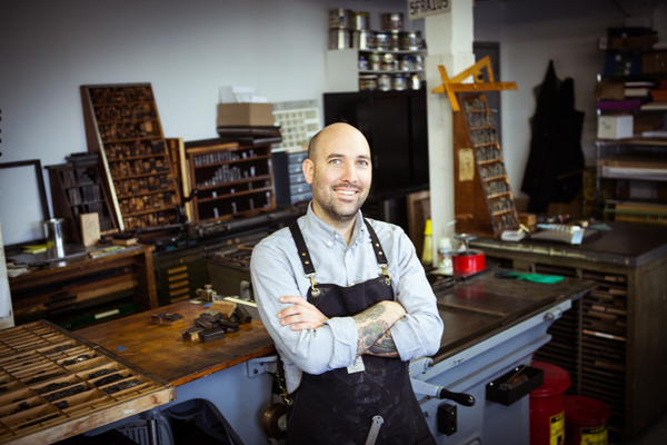
A whirlwind of creative energy, Ted Ollier of the Bow & Arrow Press & Mindhue Studio is a creative tour-de-force who loves blending art & education via letterpress (and with gusto we might add). When he’s not getting students and the letterpress-curious up to speed at the Crash Courses and Open Press Nights found at the Bow & Arrow Press at Harvard University, Ted moves deftly from part-time teaching to pursuing his own fascination with typesetting, designing conceptual artwork, playing bass, and the enjoying the thrill of finding type still wrapped in foundry sealed wax paper. We caught up with Ted amidst the fun to see why the fascination with printing still reigns supreme.

Ted Ollier at Bow & Arrow Studio on the Harvard Campus

PRINTING DEXTERITY I was born in Toledo, moved to Austin during the 80’s Rust Bowl, and moved to Boston in 2008. I have a BA in Liberal Arts from the University of Texas at Austin, a BFA in Studio Art and Communication Design from Texas State University, and an MFA from Massachusetts College of Art. I’ve been a designer, prepress technician, type designer, printmaker, photographer, bass player and artist at various times in my life, sometimes all at once. My BFA concentration was in metalwork and fine art printmaking, and I worked prepress and design in a small offset litho shop in Austin while I was getting that degree. That dual experience — seeing printing both as an art and as a business — definitely has come in handy dealing with letterpress.

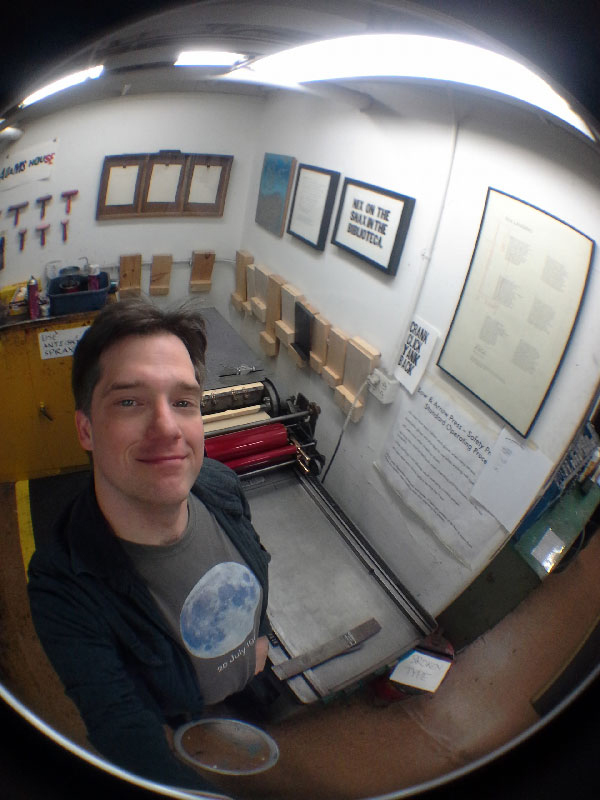
LOVE AT FIRST SIGHT A friend of mine was running the Bow & Arrow Press, a letterpress shoehorned into the basement of Adams House, a residence hall at Harvard University. When I moved to Boston, he asked me if I’d like to take it over, as he had other projects coming up. I did, and the rest is history.

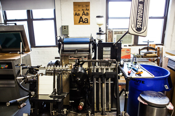
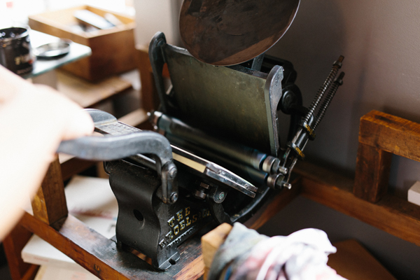
THE PRINTING BEAT IN BOSTON We’re shoehorned into three-and-a-half connected rooms in the basement of the Adams House Residence Hall. Odd corners, protuberances, closets and shelving are just part and parcel of the Bow & Arrow experience. We have a Vandercook No. 4, a Vandercook SP-20, an old Vandercook roller press, a C&P Pilot tabletop press, a Charles Brand intaglio press, and two museum pieces: a C&P windmill press and a Pearl treadle press. The Pearl is, alas, too fragile to run and I don’t really trust the C&P around so many inexperienced people, so they stay quiet. The Charles Brand intaglio press is our most recent addition, donated by a printmaking colleague of mine, and it’s nice to be able to demonstrate forms of printing even more obsolete than letterpress.

Ted Ollier at Bow & Arrow Studio on the Harvard Campus

Our type is old and has not always been handled properly, but that doesn’t stop people from setting amazing things with it. Some of my favorite faces in our collection are a nice selection of Futura Light, a nice selection of Stymie, a case of New Century Schoolbook, and a case of Kennerly Italic. We also have more than 500 printing plates and linoleum blocks in our library.

Packages of type at Bow & Arrow Studio on the Harvard Campus

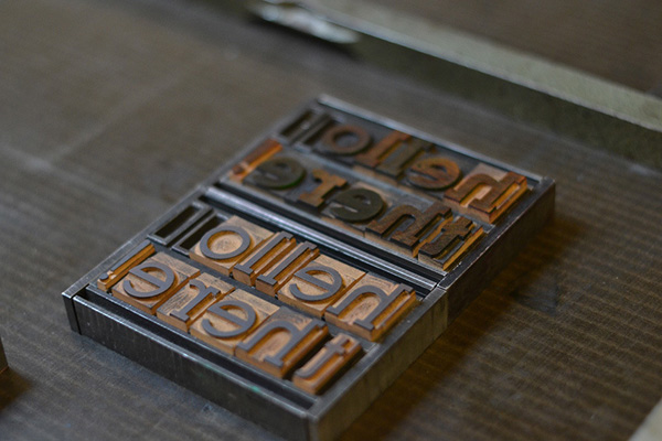
We have the full complement of rubber-based PANTONE inks, and have an uncoated guidebook for mixing custom colors. We use California Wash, NTT type wash, and Super Rubber Rejuvenator. I’ve heard there is some controversy about SRR in letterpress circles, but judicious use over the last five years has kept my rollers looking as smooth and matte as the day we installed them. We have a small manual Challenge guillotine cutter, and the usual complement of composing sticks, pica sticks, leads, spaces, coppers, chases, quoins, keys and other ancillaries.

THE CREATIVE PROCESS I’m both a designer and printer. It depends on if it’s for a commercial job or for my own artwork. The commercial jobs tend to be relatively straightforward: legible type, minimum of ornamentation, some judicious color if that’s what the client wants. These days it’s an uphill run explaining the concept of spot color or the limitations of the letterpress to people who are used to immediate CMYKOG inkjet printing, but it usually works out to everyone’s satisfaction. I definitely subscribe to the idea that design is there to facilitate the transfer of information, rather than a chance for an art director to demonstrate some faddish stylization or pointless gingerbread.

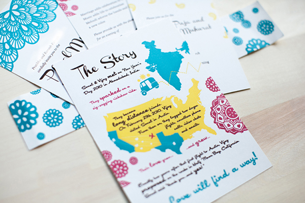
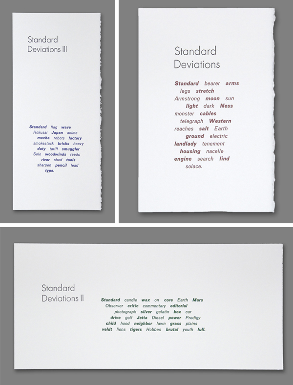
My own artwork, on the other hand, is heavily conceptual and very intellectual. I spend quite some time tweaking and mulling the concepts that I find intriguing and compelling, and then thinking about what’s going to end up on the paper. That said, I try as best as I can to distill things down so that someone seeing the images for the first time will find them interesting enough to explore the concept further, rather than be put off by a hermetic sterility or ivory-tower isolation. My main intention is to get people to see these ideas in the same fascinating light that I do. This desire to show and share interesting information about the world keeps me from getting too far into outer space — at least that’s what I hope.

Ted Ollier's letterpress printing samples

Ted Ollier's letterpress printing samples, plus lead type at the Bow & Arrow Studio

FULL TIME FUN I also teach part-time, and have a day job doing scanning and Photoshop work, along with some intermittent design. I’ve taught printmaking and intro graphic design, and recently I’ve been able to use the Bow & Arrow Press to teach letterpress and intaglio. That’s wonderful because I’m able to keep the Press busy and engage students in a more formal teaching environment than our informal classes and open press hours. Plus, the heightened visibility of the Press has allowed us to work with people from all over campus, including the Harvard Summer School, the Harvard Extension School, the Graduate School of Design, and the Department of Visual and Environmental Studies. Printing is only one of the several hats I wear, but I’d love to do more of it.

Bow & Arrow Studio on the Harvard Campus

PRINTING FEATS When I got to the Bow & Arrow Press, it was somewhat underutilized and chaotic, and although I had printmaking experience, I didn’t have much printing experience. In the last six years, with the help of many of the people who run Adams House, I’ve been able to grow the Press into a bright, busy, organized place. Since we reside in a undergraduate dormitory, we are required to have Open Press Nights where students (and others) can come to see what this obsolete printing process is all about. Through weekend Crash Courses supplementing these Open Press Nights, we’ve enabled the Press to accrete a growing population of people who keep coming to explore not only typesetting, but also bookmaking, relief printing, engraving and drypoint, page layout and imposition, and many other things. Through all of this, and probably because of it, I’ve also been able to find my way toward gaining experience as a letterpress printer. Nowadays, I’m very pleased that I can run multi-color tight-registration jobs with a reasonable throughput on both our Vandercook No. 4 and Vandercook SP-20.

Classes at the Bow & Arrow Studio on the Harvard Campus

PRESS HISTORY The first press I ran was the Vandercook No. 4 that has pride of place at the Bow & Arrow Press. It’s still my favorite. It’s small, but it’s bulletproof, and I’ve been very pleased with the registration I’ve been able to get on what is supposed to be a proofing press.

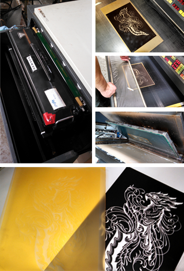
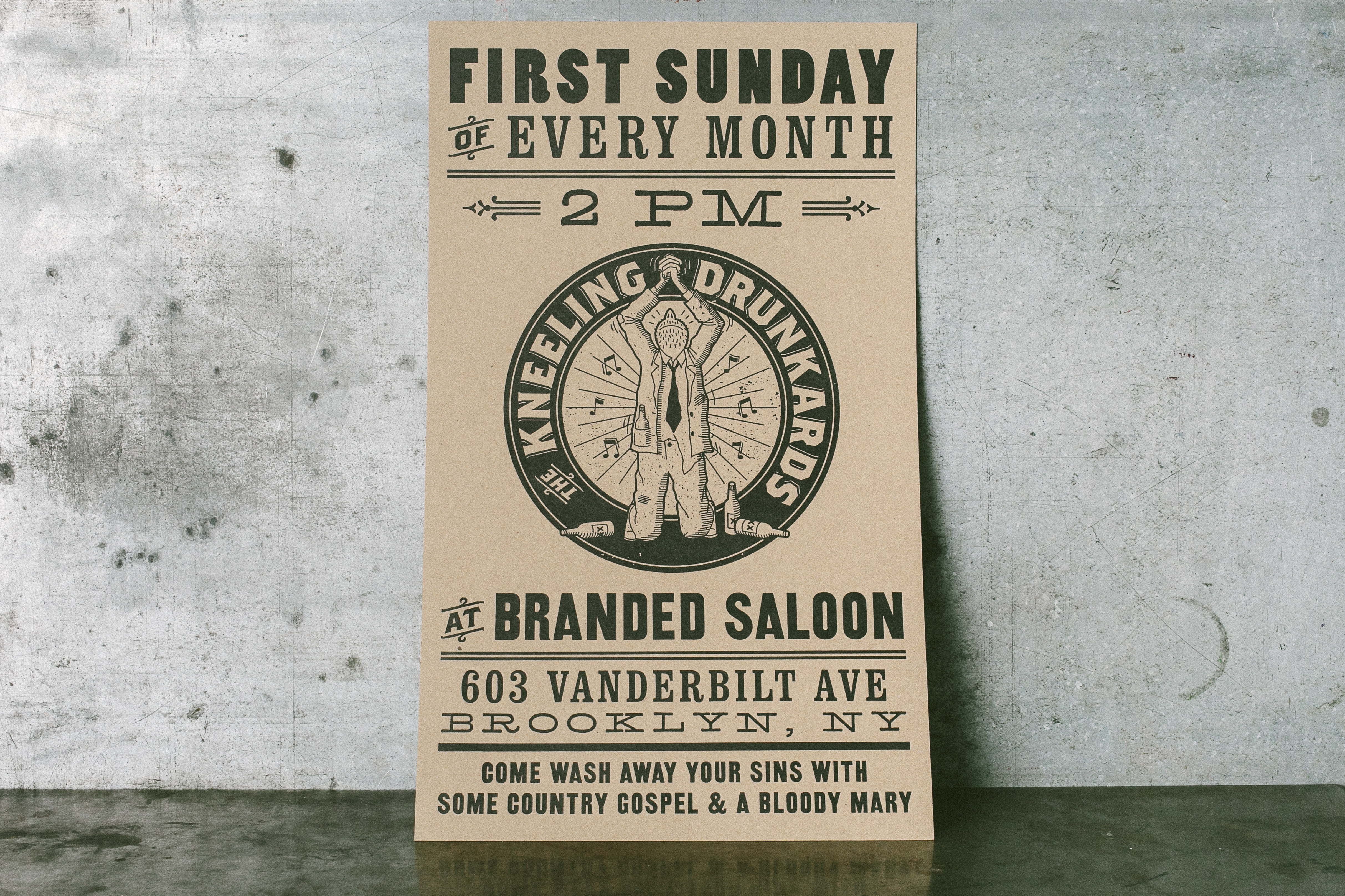
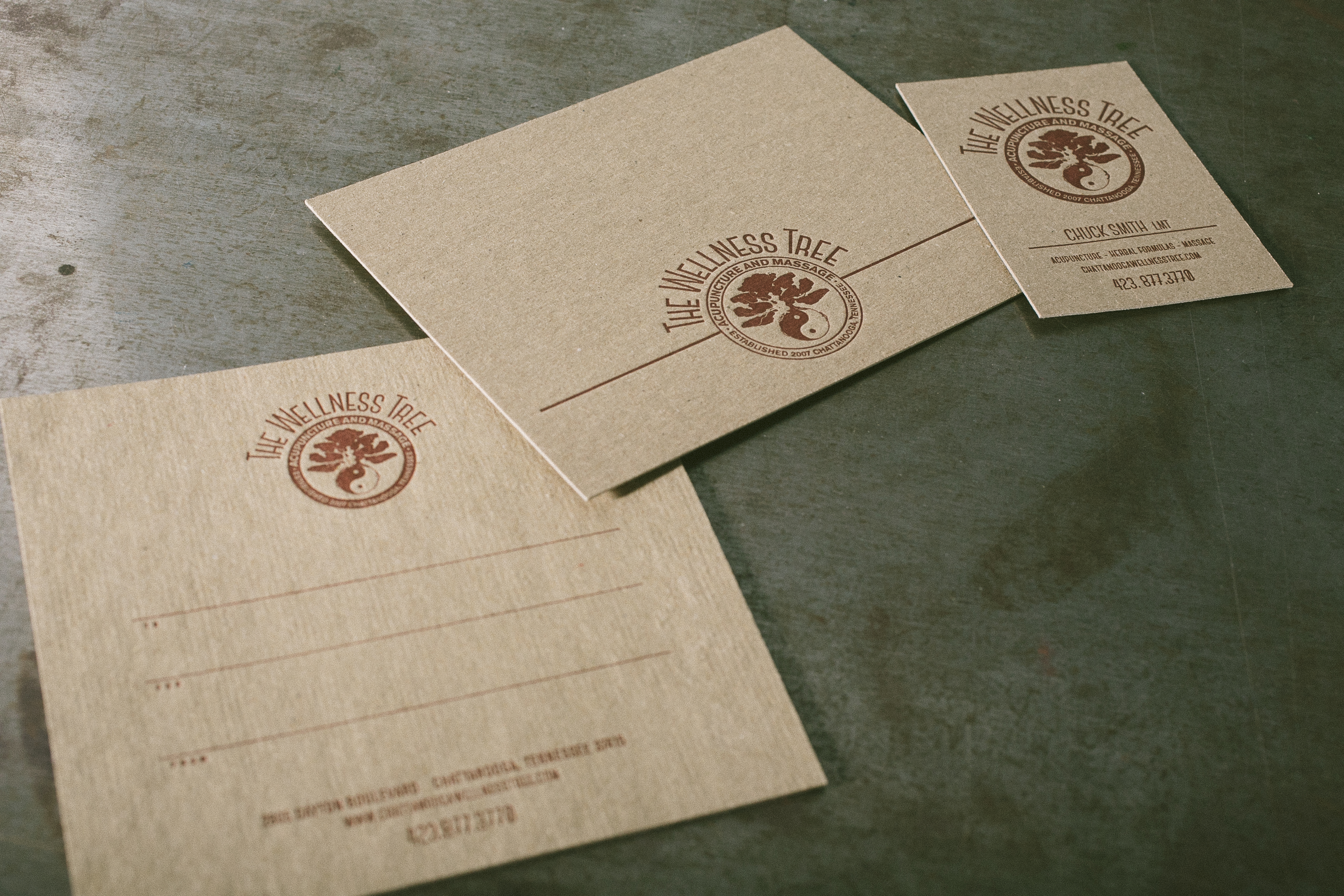
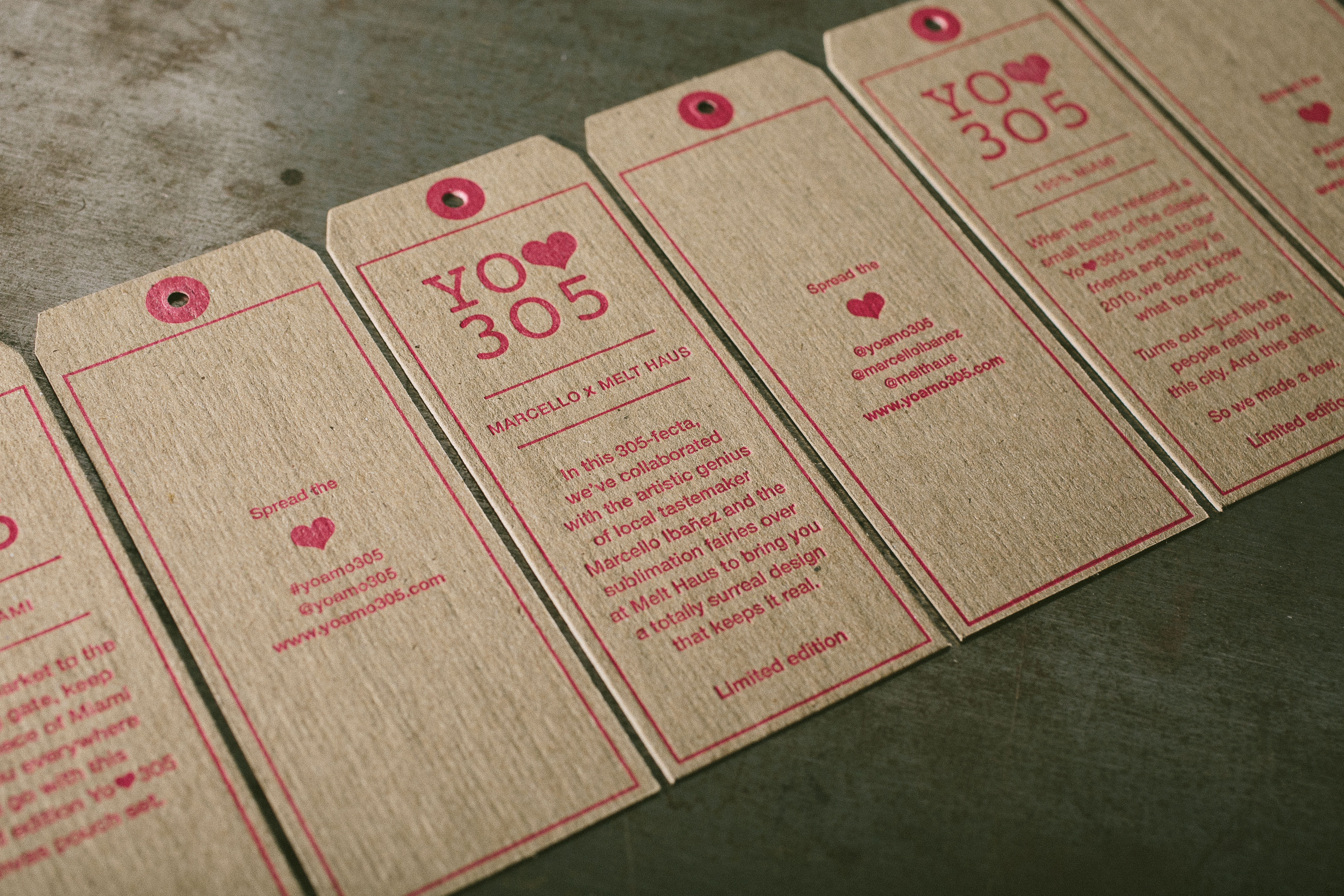
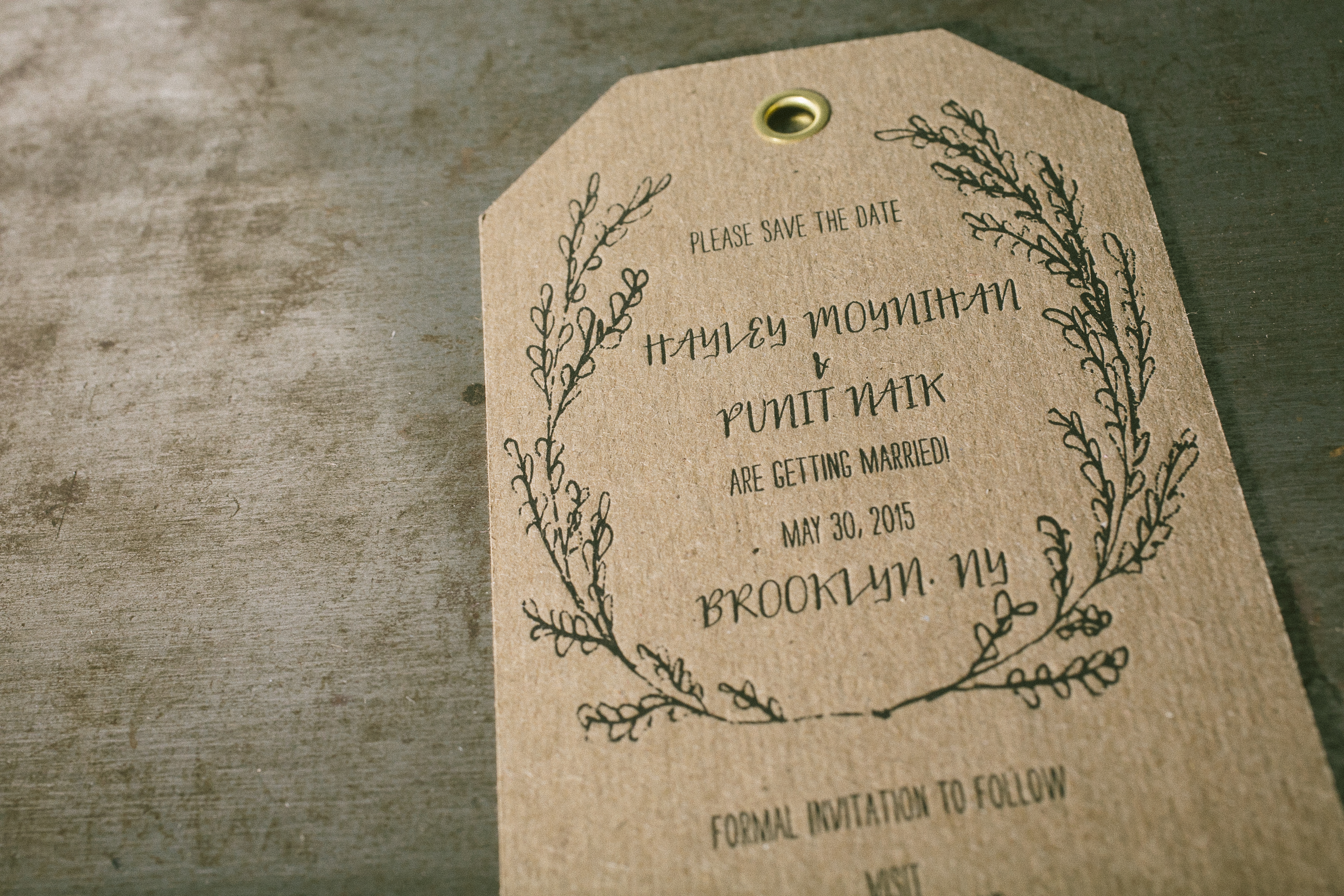
BOXCAR’S ROLE Boxcar Press has been an integral part of this whole thing from the very beginning. I know that letterpress people are supposed to extoll the romance of cold lead type and disown anything digital, but when you’re running a four-color design with modern typefaces, complex line art, and a final emboss, it’s time to examine one’s base assumptions. It’s the final product that really matters. Designers can be just as obsessive with thousandth-em kerning in Illustrator or InDesign as they can be with coppers or brasses, and with OpenType glyph sets, you have more ligatures, swashes and ornaments than you really know what to do with. That’s not to say I don’t bliss out when sitting down to typeset with the font of Standard Italic 18-pt that I found at Letterpress Things in Chicopee still wrapped in foundry-sealed wax paper and binding string, but one has to recognize that there are things that formalized lead typesetting cannot do.

Lead type

Since I have an extensive technical background in prepress, I haven’t needed the help of Boxcar Press in solving problems, tweaking designs, and fixing trainwrecks as other people might, but I think that’s a bonus for both of us. I think of Boxcar just as I did about the service bureau where I used to get film positives and offset printing plates made back in the day: I send you my files, you process my files, you send me my plates, and I run them. No fuss, no muss. In the five years I’ve been using your services, I’ve only ever had one hiccup in the process, and that was dealt with swiftly. I can’t think of higher praise to give.

SHOP TIPS Running a Press with a substantial public component takes patience and care. At any given time there are probably three or four people in the shop who have never touched a piece of lead type in their lives. Although I have Student Pressmasters and kindly regulars to help smooth over the bumps, the Crash Courses that I started teaching in 2009 have really kept the worst kinds of newbie mistakes to a minimum.

WHAT’S NEXT Recently, some of my regular Open Press attendees and I were able to purchase a Vandercook SP-20 for a joint-use project. We’re still looking around at lease options and way of organizing the business, but our intent is to take some of the lessons learned at the Bow & Arrow and pursue them in an independent venue. Will it become a full-time printing gig? We shall see, as I still love the Bow & Arrow and everything that surrounds it.

Huge round of thanks to Ted for letting us get a sneek peek at both the Bow & Arrow Press and Mindhue Studio!

A Printing Tradition: Sargent Brothers Press

Since our last visit with ever-charming Ben Sargent of Sargent Brothers Printers & Typographers, we toured his wonderful Texas-based printing abode. A few printing treasures and tools may have been moved around & added to, but Ben’s cheerful demeanor while printing on his C&P 10×15 Old Series has never missed a beat yet. We caught up again with Ben between ink runs to see how the printing tradition still runs strong in his family (like father, like son), why the down-home feel of a good letterpress print shop can’t be beat, and scored some nifty inking tricks to use on an older platen press.

Ben Sargent smiles wide in his Austin, Texas-based letterpress print shop (Sargent Brothers).

INK IN THE BLOOD I was born and grew up on the windy plains of the Texas Panhandle, where I learned the printing trade from my father. After getting a journalism degree from the University of Texas and putting in a few years as a reporter, I spent the next 35 years drawing political cartoons for the Austin American-Statesman. Retirement from that job gave me ample time to pursue my original trade, and I am enjoying it hugely.

Beautifully letterpressed blue and white wedding invitation featuring hand illustrated flowers is printed by Sargent Brothers out of Austin, Texas.

TEXAN TREASURE I’m fortunate enough to have a big enough property in South Austin to have built a nice little house (my one architectural accomplishment) as a home for the printing shop, and it is very satisfying to have a space built just for printing, not in the way of anything else. (Okay, it does also include a model-railroad layout along the walls above the type cabinets.)

Beautiful signage hangs on the door for the Sargent Brothers press shop in Austin, Texas.

FOR THE LOVE OF LETTERPRESS My father and his brother (the original “Sargent Brothers”) took up the trade as teenagers in Fort Worth in the ‘20s, and while newspaper careers took them both away from printing for many years, my dad got back into the trade when I was 12 years old. He purchased a Kelsey outfit with which he taught the craft to me and to my brother. Three years later, he brought the C&P 10×15 Old Series job press of his boyhood back home, and that is still the press I use today.

DESIGNED TO PRINT I enjoy designing printing, especially if it’s with metal type, but for almost all my commercial jobs I defer to the excellent creative efforts of the several graphic designers with whom I work.

Eye-popping color comes to life via Ben Sargent's lettepress wedding invitation pieces.

FULL TIME Since my schedule is my own these days, I guess one could say that printing is not only full-time, but 24-7, since I can take care of a client’s needs whenever fits their schedule. It’s been thus since I left regular syndicated cartooning a year or so ago, freeing me up to devote more time to the trade.

PRINTING FEATS I see that as the goal, however imperfectly achieved, of every job we do, to give the customer something we’re proud to stand behind. Still, there are certainly some pieces we’ve done over the years that do stand out, and I have a particularly fond regard for the various little handset books we’ve published (including two editions of our specimen book, and a brief history of the platen job press, published to commemorate the centennial of my press back in 2005).

Ben Sargent of Sarget Brothers sets up his Kort Guage Pins for his next printing run in Austin, Texas.

BOXCAR’S ROLE Oh, goodness, since almost all my commercial jobs are printed with Boxcar plates, it’s fair to say Boxcar is the sine qua non of our business. The plates themselves are always flawless, of course, and the service always timely, but by far the best part is the personal touch by which the staff, particularly Rebecca Miller, are always available and cheerfully willing to help us through the occasional digital-file nightmare, etc. I know you must have other customers, but I am always made to feel like Boxcar is there just waiting to meet Sargent Brothers’ needs. Thanks!

FIRST PRESS I learned the fundamentals on a Kelsey 5×8 Excelsior.

SHOP TIPS I think every printer, particularly one such as I who mostly works by himself, probably comes up over the years with dozens of tricks and techniques as he puzzles his way out of particular problems and situations, until they become just part of the craft, and he forgets they were once experimental innovations.

I can think of a few we’ve come up with, and they are probably worth some separate blog entries, so I’ll just cite one we’ve been having some luck with lately. Everybody who uses one of the older platen jobbers such as ours knows that the relatively unsophisticated inking system sometimes requires a little ingenuity in the case of relatively broad inked images. (Not big, huge color floods….with those I have learned the wise adage of one of my colleagues that “in letterpress, sometimes it’s okay just to say no.”). But for reasonable-sized bold areas, I’ve found they can be conquered with a couple of drops of something like Smooth Lith in the ink mix, and with providing a soft place for the impression to land, either by putting a couple of sheets of newsprint between tympan and pressboard, or even pasting some newsprint directly on the tympan (particularly if one is just trying to cover some limited areas). Also helps to “skip-feed” the pieces, so the ink has a little extra time to recover between impressions, and in some cases to go to the trouble of making the design into two press runs, one for the bold areas and one for the finer images. And I’m always receptive to anyone else’s ideas for this conundrum!

WHAT’S NEXT Job work has reached a fairly steady and comfortable level over here, and we look forward to getting the word about our offerings further out by word-of-mouth and our website. I’ve also had the privilege of working with a few young newcomers to the trade, and hope to continue in that way to keep letterpress thriving and growing.

A mighty round of thanks go out to Ben of Sargent Brothers Printers & Typographers for letting us take another peek into his sublime printing paradise.