Nestled in the northwestern corner of Italy is the vibrant city of Torino — city that boasts beautiful plazas, gorgeous views, and of course the hidden gem that is Archivio Tipografico. Davide Tomatis, a cheerful member of the type-based shop, was able to take a minute between press runs to talk shop, the overflowing array of rare type and the joy of coming home to his letterpress “family” on the weekends.

(from left to right: Emanuele Mensa (our mentor!), Davide Tomatis, Davide Eucalipto, Anna Follo, Nello Russo, and Gabriele Fumero)
LETTERPRESS ADDICT I am not a conventional printer… I’m primarily a graphic designer addicted to good type, and I’ve always been fascinated by type in all of their shapes and typologies. About three years ago, I found a letterpress workshop online in my hometown. My brain stopped for a second watching the screen, and I remember thinking something along the lines of “what the hell are those wooden letters? Did there really exist a printing technology before the inkjet printer?”

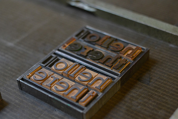
LOVE AT FIRST SIGHT When I entered a printshop for the first time, I was 20 years old and knew nothing about typography, but it was clear to me that I needed to learn everything about that world. Back then, Archivio Tipografico was “just” a huge collection, not a real printshop as it is right now. I started working there in my spare time, cleaning old type and ordering them in their drawers. During the following two years the team got bigger, and now it is comprised of six people (Anna, Davide, Emanuele, Gabriele, Nello, and me).
INKING UP IN ITALY Archivio Tipografico is a really big printshop: housing more than 1,600 type drawers, one flatbed press, five platen-presses and two proof-presses. As I said before, it’s not mine but I’m a part of it. We don’t like to think that there exists an owner of the printshop — we see it as the home of our typographic family. Our shop is located in Torino, Italy, and the “letterpress revival” phenomenon is still in its early days here. There are some old little printshops that still use platen and flatbed presses, but we are the only printshop in our area to integrate graphic design, digital tools and traditional printing techniques.
Speaking of exceptional printers, just out of town there’s Enrico Tallone, a great friend of ours and the last Italian publisher that is still composing and printing his books by hand only using movable type. We often visit each other to see the latest printed matter!


THE BEAUTIFUL TYPE Our collection comes from the dismissal of other printshops in Piemonte (our region) and Liguria. So most of the specimens and typefaces are obviously from Italian Foundries like “Nebiolo” (that was located in Torino) or “Reggiani” (in Milano). We own specimens of nearly all the typefaces designed by Aldo Novarese, one of the most prolific type designers ever and our national “type hero”.
We generally like to use Italian type to revive that “geolocation” effect that got lost with the possibility of having an endless choice of digital typefaces. I think the rarest typefaces we have are “Inkunabula”, a typeface designed by Raffaello Bertieri in 1921 for “Società Augusta” (the previous name of Nebiolo) and “Fontanesi”, a really elaborate ornate typeface designed by Aldo Novarese in 1954 for the Nebiolo foundry.

PRESS HISTORY I first learned to print on an Asbern proof press and later on a platen-press called Hohner Rapid II, with the help of Emanuele, the skilled printer who founded Archivio Tipografico. He is my mentor. He actually knows how to solve any problem about letterpress printing. I’ve never felt like I couldn’t ask him a question as there isn’t one that he can’t answer.


LATE NIGHT PRINTING Printing is primarily a passion. It’s not our first job so we print after our main work and on every Saturday, but we’re trying to fix this situation.
THE CREATIVE FLOW Every one of us was born as a designer and is now learning to print, except for Emanuele, who was mainly a printer. Thanks to our different backgrounds we’re always searching for the perfection in both printing and graphic composition. We don’t have a defined style as we like being inspired from everything that we stumble across — from old books, to modern graphic design, passing through Italian specimen-books designed in the seventies.

PRINTSHOP FEATS Our main accomplishment is actually moving the whole printshop last year. It took us more than two months and a lot of sweat. The moving of the whole collection was very hard. All the platen and flatbed presses were moved by a professional carrier because it’s really impossible to move tons and tons of cast iron perfectly without knowing what you’re doing.
We also decided to donate to a museum two of the machine we owned: a flatbed press from the late 1800’s called Voirin, and a Linotype, as we weren’t really using them. We rented a big van for two weekends to move everything else (type drawers, cabinets, tools, ink cans, etc…) and that was the first time we counted how many drawers we own: it was a bit of a shock!
In the process of emptying the old space we found many typefaces we forgot about, and we managed not to lose anything! We divided in two teams, one in the old space removing all the drawers from the cabinets, numbering them, loading them on pallets and then loading pallets on the van. The other team was in the new place, unloading the van and reassembling the cabinets. I made a map of the new layout of presses and drawers that was ignored during the moving, but everything magically fit in anyway! Special equipment that was needed: gloves, pallets, transpallet, latino music, elbow grease and patience. It never seemed to end.
SHOP TIPS If you’re printing on a platen press always remove the gauge pins when setting up a new job. Emanuele always told me that in order to correctly learn… one has to make every mistake at least once, but that one is the kind of mistake that I sadly keep making.

WHAT’S NEXT Our main inspiration has always been “Tipografia Marchisio” of Torino. It was a legendary printshop in Torino, the best place to have one’s business cards printed regarding printing quality and elegance of typographic composition. Our aim is to become 50% like them and 50% like an American letterpress & graphic design studio. Our new printshop gave us the possibility to be more productive and organized so we can print more and work on multiple projects at the same time.
Another big plan for 2015 is to sort and catalogue our whole type collection (so to use it more and better) and digitalize the coolest and rarest fonts/type we own.
Extremely huge round of thanks to Davide for letting us getting a peek at the beautiful & amazing Archivio Tipografico! Molto bello!
I think I own an early letter cabinet. I can send pictures.