Crop Marks and Registration Marks – A Printer’s Tool

When prepping a file for platemaking (or any printing job), you may find yourself deciding between crop marks and registration marks. Not sure which one to use? We’ve put together some scenarios where you might find these tools helpful — but first, we’ll start with some definitions and distinctions between the two.

Crop Marks Or Trim Marks:

Crop marks — also called trim marks — thin lines placed at the corners of your artwork that indicate where to trim your finished project. If your paper is larger than your final cutting size, it is helpful and sometimes crucial to include them. Crop marks help the person cutting to know precisely where to cut your piece.

When might it be important to have paper that is larger than your final size rather than a pre-cut size? For presses that grip the paper, using a larger sheet and making a finish cut allows you the paper edge or space to grip and guide the paper while printing, and provides space for you to use a guide pin (which may leave a mark on the paper).

An example of crop marks on a film negative and printed via letterpress.

Crop marks become crucial if you are printing a bleed (which is a design that runs to the edge of the finished piece). A design with a bleed is one where the artwork extends a minimum of 1/8″ past the edge of the finished design. Extending your artwork past that point prevents a blank or unprinted area from showing up along the edges of your design.

Crop marks are added during the design stage of a project, and are an option in most design software. We’ll share tips for adding them below.

Registration Marks:

Registration marks are used when you have a piece that will have multiple applications during production. This could mean two or more letterpress ink colors, die cutting, foil stamping, or embossing. Registration marks are important for precision and placement.

An example of mis-registered multiple color letterpress print.

A piece that is mis-registered (as shown above) will show elements that may be side by side when they should have been on top of each other. There are many different forms of registration marks, but the most common are the “crosshairs” or “target” style marks, color bars and even using the lines of crop marks.

An example of registration marks in the bulls eye or crosshair design on a two-color letterpress printed piece.

These marks will eventually be trimmed off the final piece, and registration marks should also have crop marks added, too. Registration marks will appear on each plate that you make, and they should be aligned to overlap perfectly.

Creating Crop Marks

When creating crop marks in Adobe Illustrator there are two ways to make them:

Option One

Create crop marks in Adobe Illustrator by drawing a box using the rectangle tool (M) with no stroke or fill color the same size and position as the final trim. Using the direct selection arrow (the white arrow tool), click on the box. In your color window, turn off the stroke by clicking the red diagonal line (none).

Step-by-step illustrator instructions from Boxcar Press on how to set up crop marks and registration marks

Now click EFFECT > CROP MARKS (for all versions of Adobe Illustrator). You may also use OBJECT > CREATE TRIM MARKS (this is only available for Adobe CS6 and above). Lines will appear on each corner of the box.

Step-by-step illustrator instructions from Boxcar Press on how to set up crop marks and registration marks

With the box still selected, click OBJECT > EXPAND APPEARANCE. You can now modify your crop marks, if needed.

Step-by-step illustrator instructions from Boxcar Press on how to set up crop marks and registration marks Step-by-step illustrator instructions from Boxcar Press on how to set up crop marks and registration marks

Option Two

Set your art board in Adobe Illustrator to the final piece size. You can set this when you click FILE > NEW and put your measurements in under length and width. If your art board is already open, select FILE > DOCUMENT SETUP > EDIT ARTBOARDS and resize if needed.

Once you are done creating the file, you can save it as a press quality PDF by going to FILE > SAVE AS > ADOBE PDF (file format).

A window will open – choose Press Quality PDF from the Adobe Presets dropdown at the top. On the left, select MARKS AND BLEEDS and click trim marks. You can also set your registration marks by clicking on the Registration Marks box. NOTE: The default trim mark thickness may be less the the required minimum line thickness for your plate type, so adjust this to be higher, if needed.

Step-by-step illustrator instructions from Boxcar Press on how to set up crop marks and registration marks

In most printing jobs, registration marks and crop marks should always be in Registration Black. That means they will show up on every color plate and will not affected by spot colors or other special markings added in design.

Feel free to contact our prepress team if you’re not sure if you need crop marks for your next plate order. They do add additional space and cost to your platemaking ticket, but may save you time and money in the long run.

LZW Compression File Prep for Letterpress Plates

For Adobe enthusiasts who use Photoshop to create their platemaking files, we’d like to introduce you to Lempel-Ziv-Welch, which is a simple algorithm known as LZW compression. LZW compression makes your file size smaller without losing any image quality. Have a 1200 dpi, 22 megabyte file? No problem with LZW compression. It can compress that file down to mere megabytes and sometimes even kilobytes. Why do you want higher resolution? So you can have text and images that are higher quality and pleasing to the eye when printed.

Here is how you use the gem that is LZW. If you have a Photoshop image or text that you need to bitmap for a platemaking line art file, follow these steps.

1. Open your file in Adobe Photoshop. Convert to grayscale via IMAGE > MODE > GRAYSCALE. Select Yes if a window asks about discarding color.

2. Check your image size via IMAGE > IMAGE SIZE. When this window opens up, make note of the Pixel Dimensions at the top. Look halfway down the page at the Resolution of Pixels/Inch. Is the number 300 or less? We can do better! Increasing your resolution can shave and smooth out the pixelation of your bitmapped image. Change your resolution to between 600 – 1200.

Adobe Photoshop file showing how to check image size resolution.

LZW-img2-a

LZW-img5-a

Did you see your Pixel Dimension make a big jump up? Don’t worry, LZW will take care of that later. Click OK to save this new setting.

3. Select LAYER > check to see if Flatten Image is showing. If yes, Click on this.

4. Click on IMAGE > MODE > BITMAP. A window will open to complete this step. Your input should match the resolution you just chose a few steps earlier. The Output should be equal to or greater than your Input (up to 1200 Pixels/Inch). Your Method should be 50% Threshold. If you are seeing Diffusion Dither (the default), click on the box to see other Method choices to find 50% Threshold. Choose OK. Your file is now in black and white in Bitmap mode.

LZW-img4-a

Saving to Bitmap made my file size smaller, you say? Yes, it did, but it is still probably many MB large. Imagine having 4 or 5 of these files and organizing all this artwork into one large document. Your new art board can quickly get unwieldy and oversized.

Time to save your file as a TIFF (.tif file extension) and tap into the power of LZW! TIFF is the format of choice for commercial and professional image standards. TIFF is the most universal and most widely supported format across all platforms, Mac, Windows

5. To finish up, Select FILE > SAVE AS . The pop up window is looking for your file name and a format. Choose TIFF. Another window called TIFF Options will open. At the top (for Image Compression) select LZW and click OK.

LZW-img6-a

Check your folder where you saved your TIFF The size is now probably under 1 MB. Your TIFF document was able to be compressed with all the quality you desire but now in a nicely managed little file.

Comparison of two files and their data size: one is a Photoshop (PSD) file at 3.6 MB and one is a TIFF file at 160KB because of LZW compression.

Design tips for letterpress printing on chipboard

Available in several paper weights, our 100% post-consumer recycled chipboard is a popular paper choice for letterpress printing. Thick and textured, chipboard is kraft brown and completely utilitarian: we’ve printed wedding invitations, business cards, letterpress broadsides, and more on this versatile stock. Today we’re sharing a few tips from designer Angelena Bruesewitz on how to design for chipboard, along with some of our favorite examples of letterpress printing on this popular paper.

Design tips for letterpress printing on chipboard from Boxcar Press

Dark colors + bold lines are a great starting point.

Darker colors tend to be the easiest to work with when it comes to printing on chipboard – you’re sure to have contrast and legibility as long as your line weights are thick enough to be readable.

Kneeling Drunkards letterpress poster | Designed by Jarrod Taylor Design, Letterpress printed by Boxcar Press

Kneeling Drunkards 12″ x 20″ poster, job #25934. Designed by Jarrod Taylor, printed in black ink on 28 pt chipboard on our Cylinder Press

Bold letterpress business cards for UXA Lab - letterpress printed by Boxcar PressBold letterpress business cards for UXA Lab - letterpress printed by Boxcar Press

UXA Lab 3.5” x 2″ business cards, job #26428 for UXA Lab. Printed in Pantone 185U on 60pt chipboard on our Heidelberg Windmill Press

Tips for designing a low contrast piece.

If you’re looking to create a low-contrast piece, make sure your line weights are thick enough to be legible. We recently worked with Angelena to create the identity suite below, which included a double-sided gift card with metallic gold ink on the back. The piece required a second run on press to achieve the desired look, but the end result was a subtle bamboo forest with lots of intricate details.

Letterpress identity suite for The Wellness Tree - printed by Boxcar Press, designed by Angelena BruesewitzLetterpress identity suite for The Wellness Tree - printed by Boxcar Press, designed by Angelena Bruesewitz

Identity suite for The Wellness Tree, jobs #26310 + 24962, designed by Angelena Bruesewitz at the Dandelion Shoppe. 2.5″ x 3.5″ business cards and 5.5″ x 4.25″ note cards, printed in Pantone 1805U on 28pt chipboard. 5″ x 5″ double-sided gift certificates, printed on 60pt chipboard in Pantone 1805U on the front, with a double hit of 874U on the back.

Keep the end use in mind.

When it comes to designing for chipboard and selecting colors and fonts to work with, keep your customer and the end result in mind. If you’re going for something rustic, Angelena recommends tone-on-tone. More fun and playful? Opt for lighter shades with more vibrancy to achieve the look. The earth tones used on the Bedford 234 business cards below matched the restaurant’s rustic, farm to table vibe perfectly.

Letterpress business cards for Bedford 234 | Designed by Sol Shim, printed by Boxcar PressLetterpress business cards for Bedford 234 | Designed by Sol Shim, printed by Boxcar Press

Bedford 234 3.5” x 2″ business cards, job #26802. Designed by Sol Shim, printed in Pantone 161U + 021U on 28 pt chipboard. 

If color accuracy is a priority, consider drawdowns or foil.

Just like printing on any other colored paper, color does shift on chipboard. If color accuracy is of the utmost importance for your clients, foil stamping may be a better choice than letterpress.  Alternatively, we offer a drawdown service for $50 per color if you’d like a test run to see how your color would look on our chipboard.

C_A11A2945Letterpress identity suite for The Wellness Tree - printed by Boxcar Press, designed by Angelena Bruesewitz

Faith Neidig 3.5” x 2″ business cards, job #24666. Designed by Kelly Moses Design, printed in black ink + gold shine foil on 28pt chipboard on our Heidelberg Windmill + Kluge presses. 

Red foil stamped holiday cards - design by Jenny C Design, printing by Boxcar Press

Custom 4.25″  x 5.5″ holiday cards, job #25576. Designed by Jenny C Design, printed in red shine foil on 28pt chipboard on our Kluge.

Go a shade brighter to achieve richer colors.

Because ink colors may appear more dull or muted on chipboard, we recommend going a shade brighter in order to compensate for the difference.

Die-cut product tags - letterpress printed on chipboard by Boxcar Press Die-cut product tags - letterpress printed on chipboard by Boxcar Press Die-cut product tags - letterpress printed on chipboard by Boxcar Press Die-cut product tags - letterpress printed on chipboard by Boxcar Press

Yo Amo 305 1.69″ x 4.25″ product tags, job #25740. Designed by Wynwood Letterpress, printed in Pantone 806U on 28pt chipboard on our Heidelberg Windmill.

Keep size and paper weight in mind.

When it comes to working with chipboard (or any thicker papers), be sure to check your margins when you’re designing – you’ll want to make sure your cards fit in your envelopes! Additionally, postage weights may increase when it comes to heavier paper stocks, so make sure your client is comfortable with any added costs. Lastly, when it comes to sizes and shapes: we’ve found that 60pt chipboard is too thick for die cutting (though we have had success with 40pt chipboard). If creating a unique shape is important, consider straight cuts – the save the date pictured below was trimmed on a regular cutter, but has the look of a die-cut shape.

Letterpress + die-cut save the date tag with gold grommets - designed by Kristin at Reverie Made, printed by Boxcar Press Letterpress + die-cut save the date tag with gold grommets - designed by Kristin at Reverie Made, printed by Boxcar Press Letterpress + die-cut save the date tag with gold grommets - designed by Kristin at Reverie Made, printed by Boxcar Press

Custom save the dates 3.25″ x 5.5″ luggage tag style, job #241166. Designed by Kristin at Reverie Made, printed in black ink on 28pt chipboard. 


Our final piece of advice? Don’t be afraid! Experiment and have fun.

How to Create a Cutting Diagram for Steel-Backed Plates

While steel-backed plates are fun to print with, cutting them down is not so wonderful. If you do not have access to either a heavy guillotine paper cutter or tin snips,  we can (and would be happy to) cut down your steel-backed custom-made plates for you. Simply include a simple, separate cutting diagram file when uploading your file.

We ask that you create a separate file showing your cut mark lines in magenta (Cyan=0, Yellow=0, Magenta=100, and Black=0). The smallest plate size we can trim is 1.5″ x 1.5″ as we use a heavy board shear (heavy guillotine cutter) to make the straight cuts. Please add spacing on either side of each magenta line equal to at least 0.75″ (keep in mind the safety of the tips of our fingers). Only use straight lines and no diagonals, please. Save your cutting diagram file with the words “cutting-diagram” in the file name to alert us that the file is for cutting purposes.

workspace-cuttingdiagram-2

(Notice that the correctly set-up sample has straight lines with enough spacing on either side of the magenta cut lines)

When you have your cutting diagram file and original file ready, upload both to your ticket during the ordering process. Make sure to “decline” all previews for the cutting diagram file as this will ensure accurate plate cost calculations.

How to Prepare Calligraphy & Hand-drawn Text for Letterpress Printing Plates

One of the more popular questions we get asked here in the Platemaking Department at Boxcar Press is the curious query: “What’s the best way to prep calligraphy and hand-drawn text or artwork for letterpress printing plates?” Understanding how to prepare scanned-in calligraphy and artwork starts first with knowing what file type/format works best for the type of artwork you are scanning in and utilizing the software programs that are accessible to you or your designer.

The most basic formatted file from scanned-in artwork or calligraphy is a TIFF (file extension) in Bitmap color mode. This pixel-based file type is good for keeping tiny details & linework and also produces crisp, solid shapes on the plate. This also means that if you zoom in very closely and examine the edges of shapes, they are slightly jagged, pixelated, and not 100% smooth. If the artwork is scanned in at high-quality resolution (600-1200 DPI), this pixelation is not as visible to the naked eye when you print with the plates.

A great software program that excels in this arena is the pixel-based editing program, Adobe Photoshop. Adobe Photoshop is a powerful editing program that offers a wide range of editing & manipulating options and tools. When scanning in your artwork, hand-drawn text, or calligraphy, make sure that you are using the highest resolution possible (at least 600 DPI) and in a grayscale color mode. This high resolution will ensure that the maximum amount of data will be scanned in and result in a better quality file that you can edit later on. A low-resolution scan (72 DPI-150 DPI) is not recommended as it will not produce the best results. Lower qualities scans and files will show extreme pixelation, illegibility, and “fuzziness” when zoomed in closely on the artwork.

inset-workspace

Above is a example of scanned-in calligraphy file set in grayscale and at 600 DPI. Notice the grayscale and slight pixelation of the edges of the letterforms.

Before converting to TIFF in Bitmap Mode, make sure to edit & fine-tune the artwork by removing blemishes & extra noise as well as fixing breaks in the linework and forms. Once you have your finalized high-resolution grayscale digital file, we recommend the following steps to create a TIFF in Bitmap Mode using Adobe Photoshop:

  • Open your grayscale image in Photoshop.
  • Select Image> Image Size. Change your resolution so that is high (300-600 or more). Make sure all of your artwork is 100% the size you need.
  • Select Image > Mode > Grayscale.
  • Select Yes if a window asks about discarding color.
  • Select Image > Adjustments > Threshold.
  • Move the slider to “preview” what 50% Threshold Bitmap will look like.
  • Move the slider as far to the right to thicken up your objects as much as you can bear. The thicker the object, the better chance it has to hold to your plate type.
  • Click OK (if it prompts you).
  • Then Select Image > Mode > Bitmap. A window will pop up looking for info – use the same output resolution number as the input (e.g. Input: 1200 and Output:1200) and an output method of 50% threshold.
  • Save your file as a TIF (with LZW Compression). Your program may be set to the default of NONE.  LZW compression is the next choice down.

Calligraphy-Bitmap-file-sample

Above is our sample of scanned-in calligraphy that has been treated so that it is a TIFF in Bitmap Mode. Notice the smoothness of the shapes and the minimal pixelation on the letterforms.

When you have your scanned-in artwork file saved as a TIFF in Bitmap mode and want to take the file to the next level, we recommend turning the rasterized artwork into vector-based artwork via a software program such as Adobe Illustrator. Depending on how detailed your artwork or calligraphy is, converting to vector may not be the best option as some of the finer details and smaller objects may be lost. Simple calligraphy or hand-drawn text that has strong forms & shapes may be suitable for vector conversion whereas extremely frail strokes and tiny details may not.

In Adobe Illustrator, you will need to open your TIFF in Bitmap mode file. Then select the artwork using the black arrow (default arrow) tool and select Object>Live Trace. If you have Adobe Illustrator CS5.5 or higher, it will be Object>Image Trace. You can edit and tweak the setting of the Live Trace (or Image Trace in newer versions of Illustrator) to display different vectorized results. Try first the default setting and then experimenting with the “Lettering” setting.

Remember, you can always Edit>Undo if the results are not want you like. Vector conversion with Live Trace / Image Trace may not suit every occasion. We’ll be covering tips and tricks on how to get the best Live Trace results in an upcoming blog post so stay tuned! Additionally, for more amazing information on file formatting, Letterpress Commons has a brilliant section on Raster Vs. Vector: When to Use and Why.

We’d love to hear your thoughts and any tips you’d like share in the comments section below!

Mohawk launches new Strathmore paper for letterpress printers

Mohawk has a new paper for letterpress printers: Strathmore Pure Cotton Letterpress papers. These papers have been designed to emulate the look and feel of handmade papers, with a luxurious surface that allows for a beautiful contrast between the sheet and the printed impression.

New Strathmore Pure Cotton Letterpress paper & envelopes

New Strathmore Pure Cotton Letterpress paper & envelopes

New Strathmore Pure Cotton Letterpress paper & envelopes

Strathmore Pure Cotton Letterpress Paper is available in two shades of white, Ultimate White and Soft White and two rich colors, Smoke Gray and Chino. The paper is available in two calipers: 18 pt for digital printing and 20 pt for letterpress printing. Matching 80 text envelopes are available with square or Euro flaps. Visit Mohawk to learn more.

At-Home L Letterpress Adventure Printing Tips

The infamously wise Sun Tzu once said “Victorious warriors win first and then go to war, while defeated warriors go to war first and then seek to win.” Old Mr. Sun is spot on and one our wonderful Boxcar Press customers, Pat Farley of Farley Designs, thinks so too as he rolled up his sleeves and put the advice to use. While tackling an invitation suite on the DIY style L Letterpress, Pat had such a excellent time working with the machine that he shared with us some of his at-home printing advice.

L Letterpress at-home printing tips and advice via Pat Farley of farleydesigns.com.

This was my first project using my NEW L Letterpress and I suggest that everyone reads the following tricks from my friends at Boxcar Press before ever attempting anything. It saved me a lot of headaches and money. Check them out. You won’t be disappointed.

L Letterpress Printing Techniques from Boxcar Press
The L Letterpress Revisited
What You Need to Print Well On Your L Letterpress Machine 

Helpful Items To Have On Hand Before You Start

  • 6″ soft brayer( A MUST )
  • A second plate to roll the ink on (I used a cheap glass plate off a picture frame from a  dollar store)
  • Custom KF152 plates from Boxcar Press (ask for extra strips, you will need them)
  • Vanson ink – I used oil based, it dries faster. Use rubber based ink if you are planning on leaving it overnight.
  • Ink knife/spackling knife (dollar store)
  • Paper… I used a thick, 100% Cotton, 220lbs stock (gives amazing depth and great texture)
  • Henry Gage Pins (2 packs of 12)
  • An old t-shirt or soft rage to wipe off the plates, press, and everything in between

And the Printing Adventure Begins

When I created the files for the plates I made sure to leave a 1/8 bleed on all sides. This is a must if you are using thick paper. It will prevent any indents from the plate when you pass it through the machine.

I also used the strips to make sure I rolled the ink on evenly. However, I was told to remove the strips before passing it throughout the machine, but with this project I did not. The reason for this is because I was making 30 invites and it would have taken me ages to remove and replace the strips after every pass. What I did instead was leaving a side free from any Henry Gage pins.

L Letterpress at-home printing tips using Henry Gage Pins.

After a pass I wiped the extra ink that was by the strip on the surface of the bed, I then slid the invite off and replaced it with a new blank invite… easy.

L Letterpress at-home printing tips using inking roller bearer strips from Boxcar Press.

I loved the whole process. Make sure you give yourself enough time so that you don’t feel rushed. It was very relaxing for me, even though I repeated the process 30 times. Every time I popped open the Letterpress to reveal the new invite I felt like it was my first time. There is a learning curve but that’s also the fun part. If you are planning on doing this just once I would stay away, but I’m planning on doing business cards and any other projects I can get my hands on, which makes the money spent well worth it.

L Letterpress at-home printing tips using a blind deboss as a "second" ink color.

Also, laying down a plastic sheet on your workspace is a great idea as the process can be messy and the sheet will help protect your work surface. Even a semi-durable plastic tablecloth will do the trick.

And always remember, less is more when it comes to ink.  It only took 1-2 teaspoons for 30 invites.

Boxcar Press Bonus Round Tips

We suggest, if you are using both inking roller bearer strips, to extend the plate strips about 1″ past each end of your plate so your brayer won’t stop on your design and possibly leave an ink blob.

If you’re looking to save a little bit on ink and time, try printing part of the design in a blind deboss (as Pat has used) and it can add a lot to your design without investing in a second ink.

Using 110 lb and thinner paper?  We have something around our shop that can add a little more packing behind your paper and get you a little bit deeper bite into your paper.  It is the plastic protective overlays that cover our plates before processing.  They are sturdy and resist impression.  While using the L Letterpress in our office, we have cut one sheet of this plastic the same size as our paper and placed it behind our paper in the Henry Gage pins.  It gave us that little extra thickness (.004″ to .005″)  to get the impression we all love.  It held up for a long time, too.  We got the idea because some of the printers in our print shop use it for packing.  Ask for a sheet or two on your next platemaking order if you are printing on the L Letterpress and experimenting.

L Letterpress at-home printing tips using acetate as packing and makes plates last longer.

And lastly, to extend your plates’ shelf life, make sure to keep your plates stored in a sealed ziploc bag after printing in a flat drawer.

Have a tip or two that you want to share? Leave your best advice below in our comments section. We’d love to hear from you about what works and what doesn’t!

Reverse Type File Prep Techniques

An increasingly common question we are asked, here in the Platemaking Department at Boxcar Press, is “will my reverse type/text/design be readable or look good when I letterpress print it?” Reaching the desired results means exploring what exactly “reverse type/design” is and what to check for to guarantee a great printed piece.

When it comes to printing, reverse type or design refers to white or light text or objects positioned against a solid colored (usually dark) background. This is sometimes also referred to as “knocked out” text.

This is an example of reverse type: white text on black background.

There are some important aspects to remember when designing for reverse type, especially with regards to using photopolymer plates:

  • Always take the time to check that your designs meet or exceed the minimum guaranteed line or dot thicknesses. Check out these recommended line and dot thicknesses for your preferred plate type. (We also have a nifty tutorial that offers step-by-step instructions on how to check your dots and line thicknesses – go check it out!). 
  • Next, it’s critical to know the eye will observe your white text as “smaller or thinner” on your printed piece as your eyes are tricked by the optical illusion created by the juxtaposition of a large dark area next to a smaller thinner white area. So, we cheerfully recommend that you add AT LEAST a 0.75pt extra stroke around designs to balance out this optical illusion. This extra stroke is added on top your minimum line/dot thickness.  It’s misleading to judge an onscreen or laser printout against what a final printed piece will look like so we usually suggest erring on the side of slightly larger reverse type.
  • If you are printing in a light ink background, your white text or objects may need to be even larger and thicker because the the contrast between the white text against a light colored background on a white paper can be easily lost. Small text may not have a place in this color situation and needs to be avoided.

Illustration of reversed type on lighter background.

  • Lastly, make note of the dark areas in between your white object. (The highlighted area in cyan shown in the image below illustrates the “dark areas” in between the white objects that should also be checked for line and dot minimums). Are they narrow and thin? Will they meet the line and dot minimums so the plate polymer can support and hold between your white space?

Illustration of the negative space around text and objects that also need to be checked for minimums.

Designs with reverse type can be pretty dramatic, and we hope you’ll consider printing a project like this.  With a little planning and forethought about how the design will translate with a larger solid inked area and  the detail you want, you can have some very satisfying results.  So keep those rollers inked, letterpress lovers, and go reverse!

The L Letterpress Revisited

It’s been a few years since the popular L Letterpress Machine by Lifestyle Crafts hit the market, and since then other diecutting machine manufacturers have followed up with their own versions. Our original November 2009 blog post about printing on the L Letterpress has been read and positively received, so now it’s time for some updates that we hope will help you get the best results you can. If you are new to this machine – don’t read ahead until you have gone back to our original L Letterpress tutorial and gotten caught up to speed.

 (1) Using the right brayer.
We recommended that you toss the ink roller that came with the machine and suggested some new, soft options. Here are a few more sources for soft brayers – particularly the Speedball brand: McClain’sDaniel Smith, and Amazon.

(2) Using the roller bearers from your KF152 plate order.
So, of course, you are ordering your custom letterpress plates from Boxcar Press.  If you are a do-it-yourself person who loves letterpress than you will want to put your own personal stamp on what you are printing with your own designs and text.  Here is what we recommend when you place your order so all is clear on your end and ours:

  • In the comments section of your platemaking order, write in capital letters – SEND STRIPS.  We will be trimming your plates down but let us know that you want strips, lots of them.  Keep them and use them on future printing jobs.

Roller bearers are really important, and if you’ve ever tried to ink without them, you likely wanted to tear your hair out.

(3) Tips to control how much ink you apply to your plates.
The manufacturer sent you a small plastic square slab – approximately 6″ square.  We’ll call this Slab 1. This was for squeezing your ink onto and rolling your brayer through.

STOP! Our suggestion is that you get another plastic or glass slab of greater size. A piece of glass from a picture frame works well. We will call this Slab 2. Two slabs will improve your inking tremendously.

Squeeze your ink onto the smaller plastic Slab 1. Or scoop out your ink from your 1 lb can – about 1 tablespoon.

L Letterpress printing tips from Boxcar Press

Use your Boxcar Press ink knife and work your ink so it’s a smooth and easy consistency.  Imagine making scrambled eggs and use that motion – turn over, pull through the ink, over and over.

L Letterpress printing tips from Boxcar Press

Now, take the ink knife and pull the end through your mixed ink so you have just an 1/8″ inch round roll of ink on the end of the ink knife. Spread this on your larger second Slab 2 by dabbing it in a line at least equal to the length of your brayer.  Now roll your brayer through this.

Really work the brayer back and forth until it’s consistently and evenly covered. Now roll the brayer over your polymer plates and run a sheet of paper through the machine. Look at your results up close. There shouldn’t be any feathery bleeds outside your impression on your paper.  If there is, you have too much ink.

(4) Removing excess ink
Go back to Slab 2 where you used your brayer.  Use your ink knife and scrap away some of the ink and return it to the first Slab 1 where you mixed.  Now lightly wipe some of the ink off your brayer with a cloth rag (old t-shirts are great for this).

L Letterpress printing tips from Boxcar Press

Wipe off your polymer plate gently, also with a soft cloth. Run your brayer through your ink on the second Slab 2 again and try another impression. You should be seeing less ink.

Use Slab 2 for your brayer only.  As needed, add more ink as in tiny amounts from the ink on Slab 1.  This will help you control your inking and prevent over-inking.  You will be amazed how little ink is needed on your polymer plates for a good inking.

(5) So many ink choices
L Letterpress sends an oil based tube of black ink with the machine.  They also have more colors available in craft stores. These inks are fine, although you really can’t re-use any leftover ink so don’t over squeeze too much ink out of the tube.  Also, they are a little more challenging if you want to try mixing your inks for more colors.

Other suggestions include Van Son Rubber Based inks in 1 lb cans from Boxcar. They come in Pantone colors and you can feel more confident about mixing some colors together if you have a Pantone Uncoated Formula Guide. However, they are only in 1 lb cans and the cost can go quickly from $13 a can to $30 a can for each color. If you are planning for long term, this is a good choice as you can mix your colors and save them for printing another time.

One other suggested ink is available in tubes and colors – it’s an oil based ink called Caligo Safe Wash Ink. They are easily washed up with soap and water. One note of caution though – which takes us to the next step – CLEAN UP.

(6) After Printing, Clean UP.
Don’t ever use water for cleaning up your plates! Do not use water based inks and don’t use water to clean up the inks from the plates. You can use a soft cloth rag to wipe off the ink off your plates.  If you inked correctly, it’s just on the surface of your plates and should wipe off easily.

L Letterpress printing tips from Boxcar Press

L Letterpress has developed some wipes that you can buy – use them only to clean up the L Letterpress equipment and the slabs you used to mix and spread your ink.  Keep your plates from water and moisture or they will soften and deteriorate.

If you want a professional press wash – we suggest VARN California Wash. The smallest size available is 1 gallon; however, it’s a good investment if you expect many years with your L Letterpress.

(7) When you like thicker paper
Your L Letterpress comes with a 1 ply or 100 lb paper.  But if you’ve fallen in love with a thicker stock like museum board or something that is 220 lb or greater thickness, you’ll need a little bit more of prep to get great results.  You can use this paper in your machine and with our polymer plates, but there will need to be some planning when you prepare your files for platemaking.

First, let me explain some of the wonderful things about photopolymer plates. They are easy to cut with
scissors and translucent which makes it nice to see your press bed grid through them. So you can take a bunch of images and text and gang them all up onto one plate leaving just 1/2″ between them to safely cut them apart. Then, you can place your pieces on your L Letterpress press bed exactly where you want them and they will stick with their adhesive back. This all works fine with 100 lb paper, but if you try this with thicker paper, the edges of your plates may also impress into your paper — not what you’re looking for.  So here is where the planning takes place. You will have to design your polymer plate to be slightly larger than your final finished paper size, which means paying a little bit more in platemaking costs for that extra space, but it’s worth it when you see your impression on the double thick paper.

So, when you send in your design, include crop marks on your outer edges so we give you all the plate material border you will need.  If you use precut paper, plan your plate size to be just larger than your paper.  If you are using paper that you will print and cut later, your plate only needs to be larger than your “live area”, that is, the impression from the edge of the plate can push into the area that will be cut off later.

(8) Odds and ends for better printing.
Remember that your paper always has two sides, so while you are working on press setup (makeready) getting everything lined up and perfecting your inking, etc. just hold on to your paper goofs.  Either turn them over and use the back side or just use it for the next time you are setting up in a different color.  Here at Boxcar Press, we use some of our paper sheets multiple times while we get everything just the way we want it.

L Letterpress printing tips from Boxcar Press

  • Invest in Henry Gage Pins – these small, repositionable “tabs” are handy and will do a great job holding your paper in place.
  • Or try this other suggestion for holding your paper in position: take a sheet of the paper you are printing on and trim one sheet down into an “L” shape. Put removable double-sided tape on the back of it and set it aside for one minute. Place the paper you are printing on in position on your press bed.  Take your L shape and with the edges forming the inside of the “L”, move it up against your paper so it is tight against two corners of your paper. Adhere it to your press bed. Now you can always slide your paper against your “L” and have it in position before you close the cover of the machine. This works best with one color printing and smaller printed pieces.

L Letterpress printing tips from Boxcar Press

  • The plastic grid on your L Letterpress machine base has a white paper backing behind it.   If you are getting a little movement and sponginess in your grid base, a little hard packing could help. Your grid can lift out of the bed and you can either replace that white sheet with a thicker sheet or put more sheets on top of it.  Whenever you lift this clear gridded piece, make sure it locks back into place.  And as mentioned in our last post, you may have to tape this press bed at the corners to keep it immobile. Try experimenting by adding more or fewer sheets.

L Letterpress printing tips from Boxcar Press

  • Last but not least, don’t get discouraged.  There is a learning curve here.

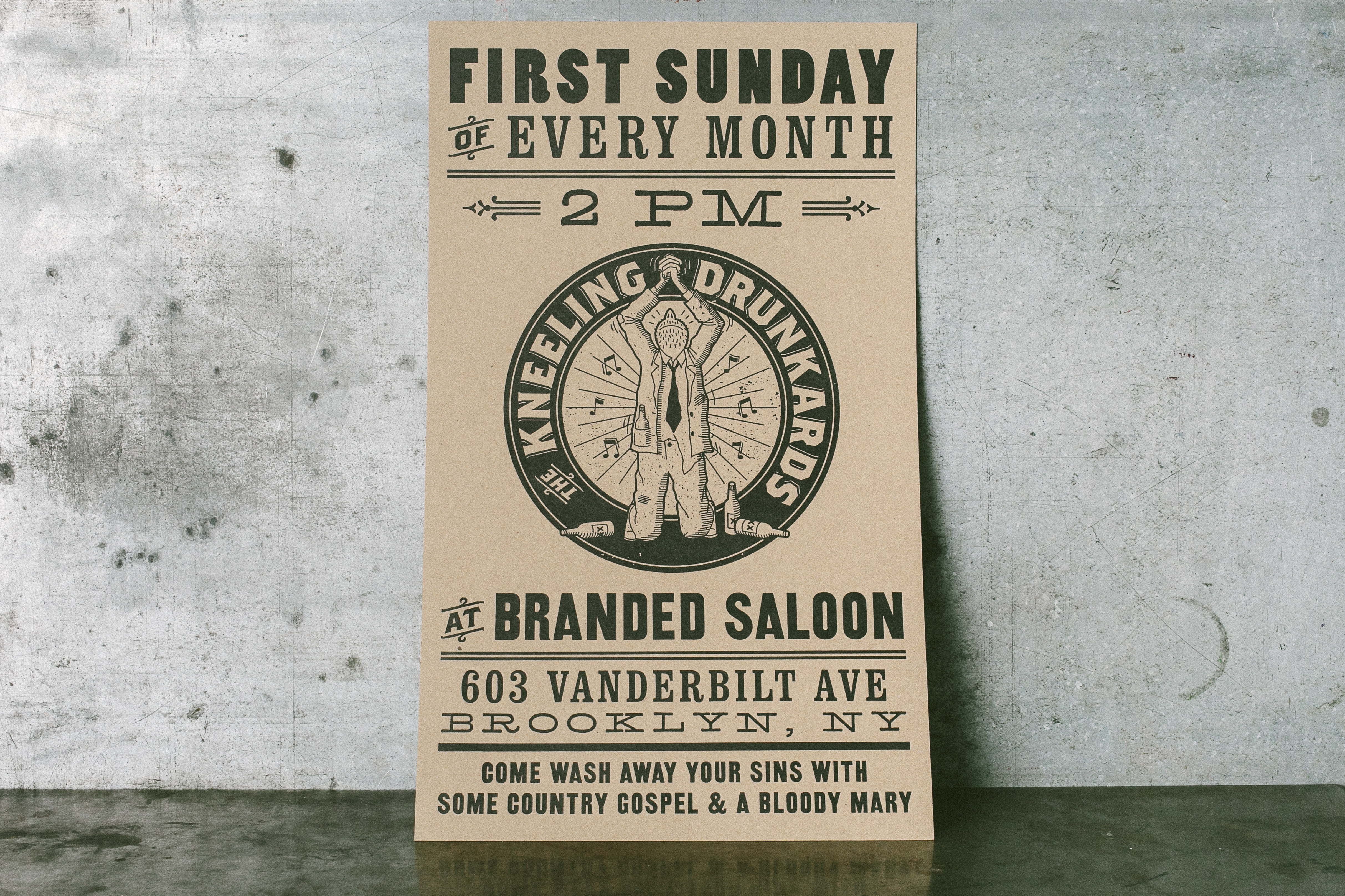
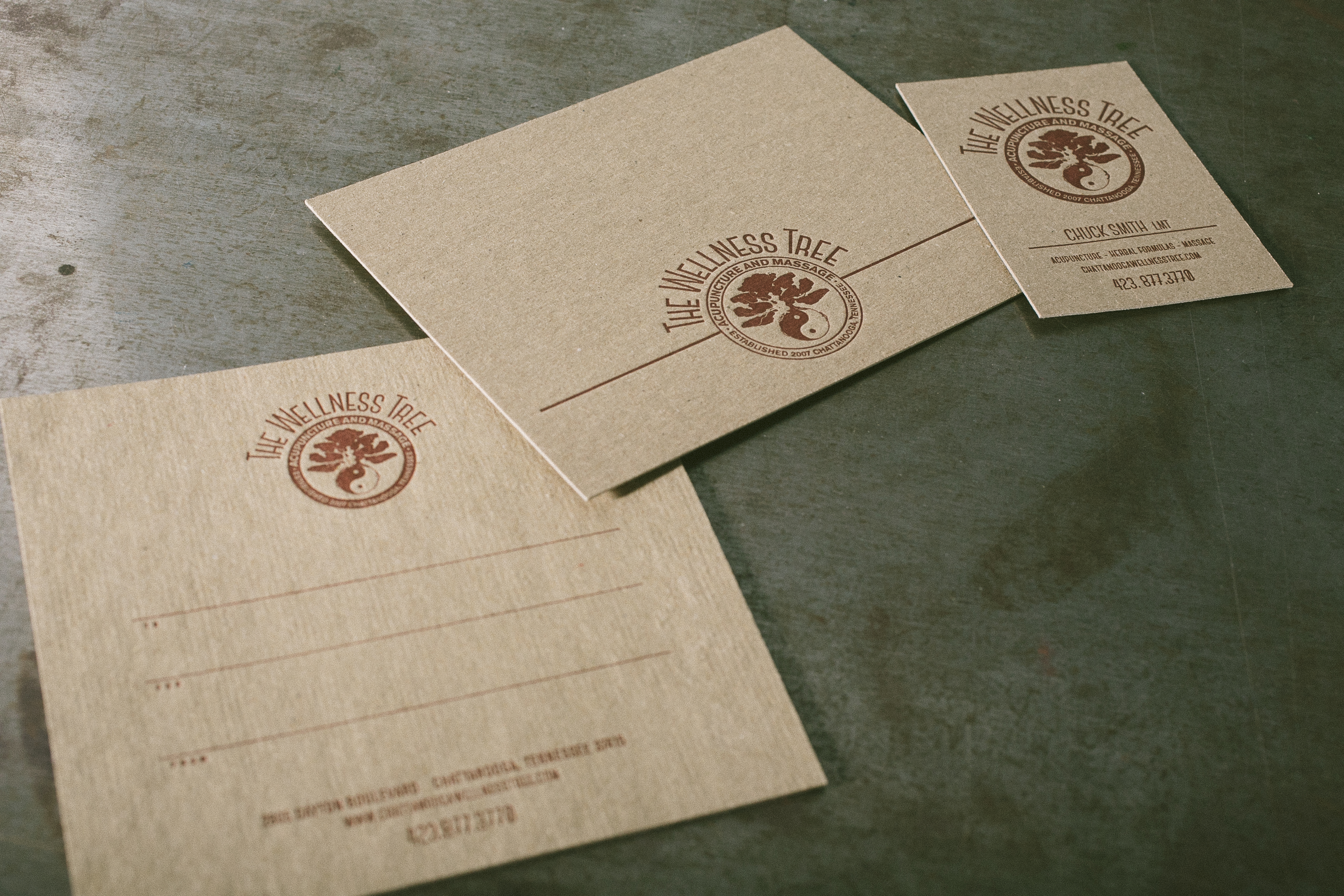
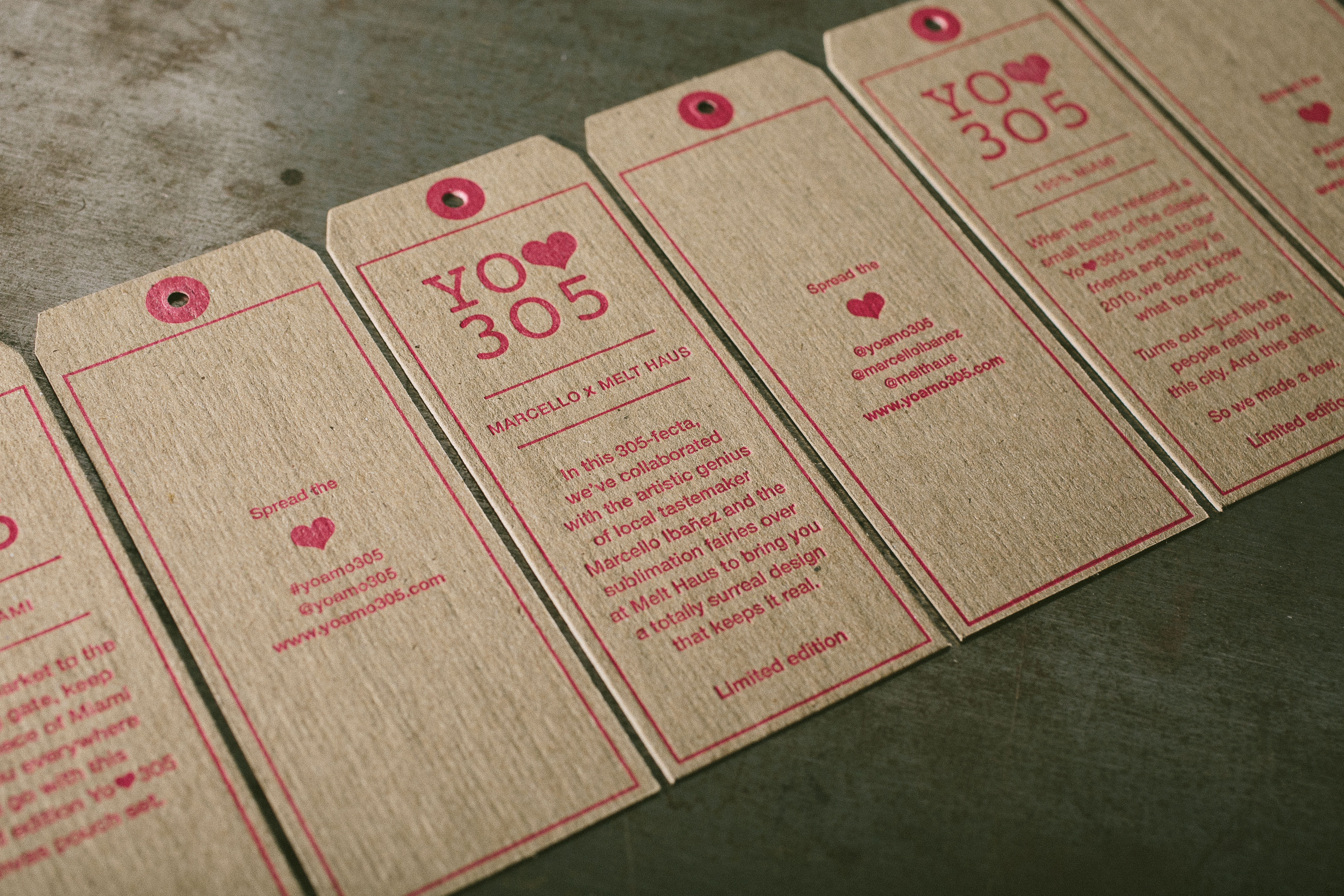
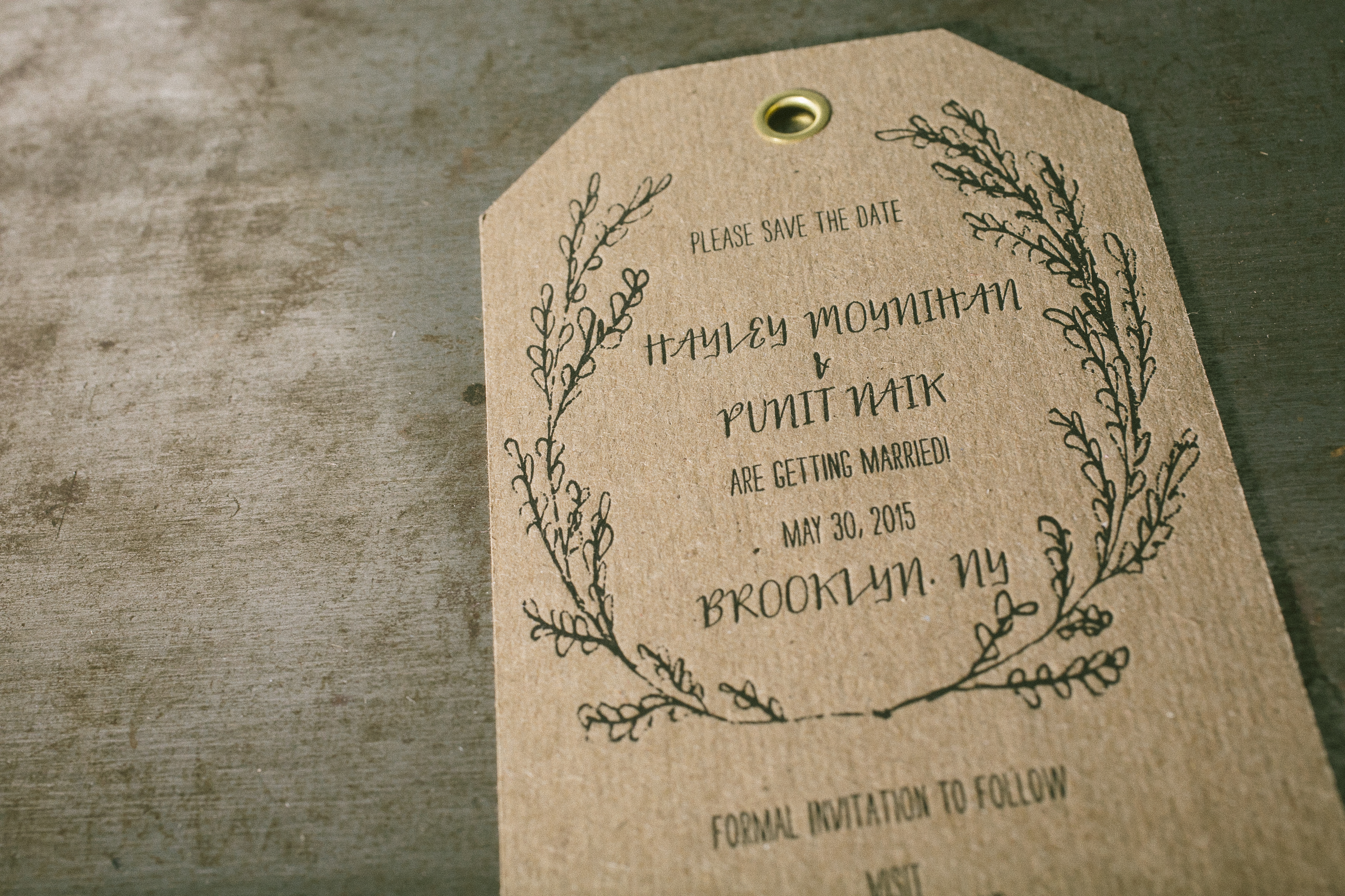
And before you decide you want to print your wedding invites on the L Letterpress, start with a smaller project first for practicing.  Try holiday cards, thank you notes, or something that you don’t have all your emotions invested in while you are learning to use this machine.  It will make it much easier to keep up with the experimenting if you don’t have a deadline and a huge investment in paper for your first time printing.

Ready to get started with some L Letterpress projects? Be sure to check out our offerings and visit Papercrave next week to enter for even more project ideas and a chance to win your own set of L Letterpress plates!

17 must-see lettepress videos

There are few things more fascinating than watching letterpress printing in person, but videos can be a close second. We picked out some of our favorite letterpress printing videos, so feast your eyes on the presses, the ink, the paper and the people. There are stories to be heard and techniques to be learned. We bet you’ll be itching to get to your own press to make a little letterpress magic after watching just a few of these! Tell us which ones you liked best in the comments below, and by all means, share some of the jewels you’ve discovered.

Boxcar Institute Training Series (BITS)

We admit, we think these instructional letterpress videos on makeready, mixing ink, and locking up your base are packed with good information for all types of printers. Harold and the Boxcar Presses can help improve your printing, so be sure to check out the rest of our training videos.  Here are some unique tips for the Heidelberg Windmill.

Boxcar Press – A day in the Life

Can’t make it to Syracuse for a tour? This video will give you a little taste of Boxcar Press.

Linotype, The Film

This is a great film that pays homage to a machine that transformed printing. It’s a wonderful blend of new and old footage, and the stories are fascinating. Here’s an introduction.

Letterpress Coasters printed at Repeat Press

In this fun video, Mike Dacey of Repeat Press creates coasters from beginning to end. He combines polymer plates (on a Boxcar Base) with a little metal type and throws in corner rounding, cutting, packaging, and even tests the coasters out.

Letterpress Printing Vocational Film from 1947

This black and white video is fun to watch and makes you feel nostalgic about the glory days of letterpress printing — there’s great footage of pressman, hand typesetting, linotypes and more.

Letterpress video at Studio on fire

A video about Studio on Fire that also includes information on designing for letterpress and a simplified version of the polymer platemaking process. Highlights include the printing (and reading) of Studio on Fire’s “Pressman’s Creed”.
http://www.beastpieces.com/2010/11/letterpress-video-at-studio-on-fire/

American Letterpress – The art of Hatch show

A look into the workings of Hatch Show Print Shop. The visuals of all the posters, the people working, and their long history blends into a nice video experience.

Upside Down, Left to Right: A Letterpress Film

A short film about letterpress and one of the few remaining, movable-type printing workshops in the United Kingdom, which is situated at Plymouth University. The credits are a fun surprise, too.

Letterpress documentary at Firefly Press

This video eloquently explains the craftsmanship involved with the hands-on process of letterpress, including creating and using metal type.

Brian Donaghey on Letterpress Printing

This is a short film on UK printer Brian Donaghey. It covers his background and it’s like a spending a pleasant afternoon with a master. Brian pulls prints on a Hopkinson, Finsbury & Cope Iron handpress.

Chase Lock Tutorial from Tim Butler 

Good information and a demonstration on locking up type from Tim Butler at Quality Letterpress.

Steel Petal Press video on letterpress

Shayna Norwood from Steel Petal Press does a masterful job explaining letterpress for a new customer. You can watch each part of her studio process, from inking all the way through to cleanup.

Heidelberg windmill video from Invitations by Ajalon

A very good explanation and demonstration of the Heidelberg Windmill from Invitations by Ajalon. A great example of German engineering and yes, that is a Boxcar Base (it’s one of the original bases with the older design).

Short & Sweet letterpress video by Naomie Ross

A brief but well done video of printing with wood type. There are no words, but the videographer added some great descriptions and artsy touches.

Steamroller Printing with the University of Montana Printmaking Division

Many have tried this supersized printing method. This video combines a fun, musical look at the artistic efforts of the University of Montana students in their annual event. All of the artwork had a “Day of the Dead” theme, so it’s very bold, and at the end of the day they held a parade to show off the art. Check out the sketching, carving, inking and yes, the unveiling.

Jack Daniels does Letterpress – with Yee-Haw Industries

From the toe-tapping banjo music to the long shots of the Yee-Haw studio, this video is very appealing on so many levels. Yee-Haw worked on 10 letterpress posters for Jack Daniels, and this video shows the creation of just one of them (and it’s a beauty). It’s also nice to see because Yee-Haw closed their doors in April 2012 and they did masterful work.

Typeface Movie trailer

This trailer gives a peek at Typeface, an hour long immersion into the history of the Hamilton Type factory (now known as the Hamilton Wood Type Museum). The film has inspired many visits to Two Rivers Wisconsin for the real thing, but is also available for purchase on DVD.