2017 Seattle Children’s Hospital Broadsides: Part 1

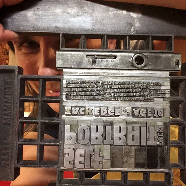
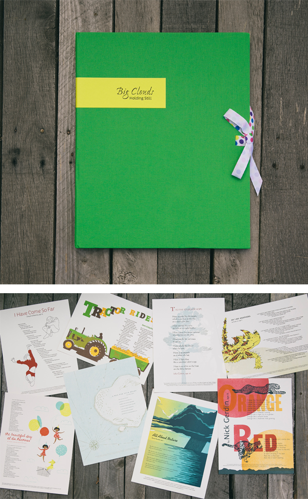
For its seventh year running, Boxcar Press has the immense pleasure of supporting the magical outcome created by this year’s 2017 Seattle Children’s Hospital Broadside project. Guided by Sierra Nelson and Ann Teplick of the Writers in the Schools program (WITS) and the School of Visual Concepts in Seattle, an inspiring group of young poets and artist/printers collaborated together to produce 21 broadsides in a limited run of 110 broadsides. WITS worked with big-hearted printers as well as long term patients at the Seattle Children’s Hospital in this exceptional opportunity for fun, creativity, and stirring works of art. This first installment of a two part blog showcases four printers who share their creative printing process and capture the wonder of the children’s writing.

Boxcar Press donated photopolymer plates for the 2017 Seattle Children's Hospital Letterpress Broadsides, a project by WITS + the School of Visual Concepts.

Sarah Kulfan I was very excited to print Merrick’s poem for this year’s Seattle Children’s Hospital Broadside project. As someone who spends a lot of time outdoors, his colorful descriptions of the natural world resonated with me and provided a rich trove of inspiring imagery that would pair well with his words. I printed a total of 6 passes on a Universal I, combining a linoleum block, metal type, and a Boxcar plate.

Sarah-Kulfan-letterpress prints for the 2017 SVC Children's Broadsides.  Multicolor letterpress printing from Sarah Kulfan.

This was my fifth year printing for this lovely project which brings together so many talented and generous folk. I was immediately drawn to Merrick’s poem. His words remind me of all the many blessings that nature provides, discoveries that I have found in my own wanderings outside. I haven’t met Merrick yet, but I hope to get a chance so that we can compare our adventures in nature.

Sarah-Kulfan-letterpress prints for the 2017 SVC Children's Broadsides.

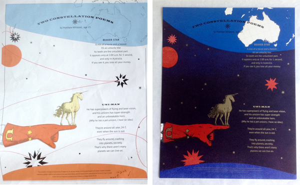
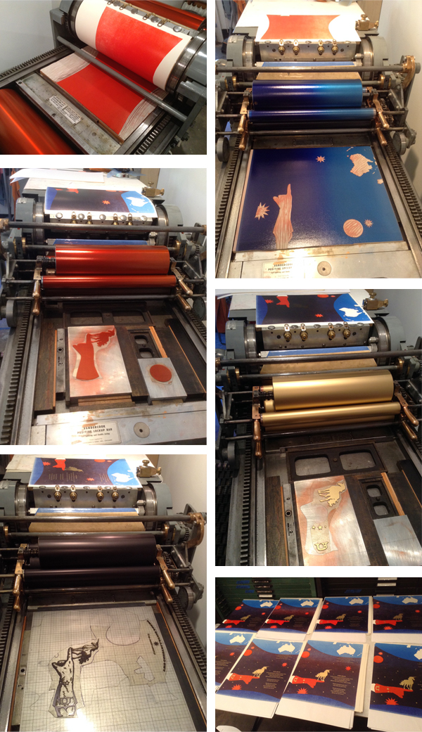
This year, I wanted to try my hand at a reduction cut that would combine split fountain layers. Using high-drama imagery of a hurricane worked really well for this process as it provided a big-sky, full frame backdrop. The poem speaks to the cycles of nature and the process of destruction and darkness followed by light and new life. The gradients capture the weather transition from light to dark and the reduction cut allowed me to build up the dark layers of the passing storm clouds. There were four total passes on the reduction cut and these included two split fountains. I printed a fifth layer of metal type for the poem. The final pass was the colophon text, printed from a Boxcar photopolymer plate, which saved a lot of time hand setting and proofing tiny type.

Chris Copley Each year, I find myself wanting to push my artistic envelope in the Children’s Hospital Poetry Broadside Project — exploring a technique or concept while still making a piece of art that might appeal to people who know nothing of me or the poet or the project. I also try to reflect the feeling or personality of my poet.

Chris Copley letterpress prints for SVC Children's Broadsides.

Nandi, my poet this year, was not quite 5 when she wrote her piece about a huge stuffed animal that fell on her while she was in her hospital bed. The poem features strong emotions, and moves from upset and angry (at the big bunny) to loving and heartfelt (toward her mom). I tried to bring that out in the frame around the poem.

Chris Copley letterpress prints for SVC Children's Broadsides. Chris Copley letterpress prints for SVC Children's Broadsides.

I also embedded folk-art-style drawings of animals and a few “easter eggs” in the frame, just for fun. I drew the original art on black paper, then cut it out with an Xacto knife. I scanned the cut-paper art and ordered a polymer plate from Boxcar; this was my third (and fourth) pass. The first two passes involved the technique I wanted to explore — perpendicular split fountain printing. I printed a red-to-mustard-yellow pass (the color blocks behind the text blocks), and then turned the paper 90 degrees to print a blue-to-olive-green pass (the highlight colors in the frame).

Unfortunately, in trimming the paper to permit it to fit on the press, I unthinkingly cut off my gripper edge. So when I went to print the polymer frame, I couldn’t. I quickly went through a list or three or four options for solving my disaster, and decided the least bad solution was to cut the polymer plate in half. The problem was compounded when printing the second half of the plate, when my favorite press inexplicably fish-tailed my paper a different direction on every pass, making close registration virtually impossible. I cried almost the entire run, convinced the broadside was ruined. But I finished the project, hand-setting the poem and colophon in Bodoni and printing it without a hiccup. And it didn’t look too bad, in the final analysis. Five passes through the press.

I never met Nandi, but I met her mom, Adele. Nandi was camping with Dad the week we met. We chatted for nearly an hour about Nandi’s poems and how her health crisis brought out Nandi’s strong spirit. I saw the connection between Adele and Nandi, and saw photos of the little girl and the big bunny. I wanted to bring out in my design Nandi’s playful, vibrant personality, and her love for her mother.

I used two other techniques: hand-set metal type; and pressure printing. I wanted soft edges to the color blocks behind the stanzas of Nandi’s poem, so I used the back side of a Boxcar Press base (with the swirly pattern of the grinder as a design element) and a paper pressure “plate.” I did the same thing with the color highlights in the frame. I like the contrast between the crisp polymer printing and the softer pressure-printed colors. And I like the way the metal type echoes the sharp edges of the polymer plate. This is another of those projects that turns out better than expected, with different parts contributing to a unified whole.

Heidi Hespelt As always, it was a privilege to illustrate one of these wonderful poems by these talented children. My poet was Nick Gerdin, age 9 and he wrote 2 poems, titled Orange and Red. His plan is to continue the series by writing poems about other colors of the rainbow. I love the word pictures that Nick painted. He is obviously an insightful guy.

Heidi Hespelt letterpress prints for SVC Children's Broadsides.

I used several different methods to bring my illustration to life.  The titles, Red and Orange, are done in large antique wood type, the rest of the type is polymer from Boxcar Press (thanks, Boxcar, for your support!), and I carved the tiger, the cheetah on lino blocks using photographs as inspiration.

Heidi Hespelt prints on a Vandercook for SVC Children's Broadsides.

The setting suns and the bottom border are also carved from lino blocks. All of the printing was done on a Vandercook press at the School of Visual Concepts in Seattle.

Heidi Hespelt prints on a Vandercook for SVC Children's Broadsides.Heidi Hespelt letterpress prints for SVC Children's Broadsides.

Much of the joy of participating in the Children’s Hospital Broadside project each year (this is my fourth year!) is the camaraderie between the printers and the creative way each printer (artist) interprets the poem that they are given. I like to think that our efforts will live long lives on the walls and in the portfolios of the poets and their families, and that our artistic visions will add a dimension to the poems that brings out a deeper meaning.

Sukhie Patel I love carving linoleum and engraving wood, so I knew I wanted to draw and then hand-carve the poem’s illustrations. Carving is, for me, a form of meditation, and it was a beautiful way to contemplate this young poet’s life and honor her through that process. It was hard to narrow down what to illustrate, as the poem had so many vibrant images to choose from. I wanted the broadside to capture as much of the visual levity and sweetness of the poem as possible, so I chose to carve this metallic gold ice cream cone of whimsical pastel cotton-candy-esque clouds, with Mount Rainier popping out amidst them. It ended up being 6 separate blocks, and including text, 8 passes.

Sukhie Patel letterpress prints for the 2017 SVC Children's Broadsides.

I found out two days after receiving the poem that the lovely young poet, London Marshall, had passed away at age 9. My approach thus shifted from designing a broadside to delight a 9-year-old audience, to designing a commemorative broadside for her family. I wanted to create something the family would want to return to at different stages in their grieving, that did not preclude a path of healing, and could bring them a smile. I hoped the illustrations would capture the levity of being nine years old, the vivacity of being a young girl, the earnestness of feeling in love with the world around her. It was an honor to print London’s poem, and spend time with her words.

Sukhie Patel letterpress prints for the 2017 SVC Children's Broadsides.

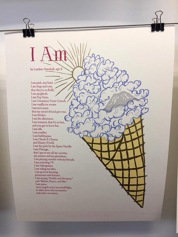
My print consisted of 6 hand carved linoleum blocks and two photopolymer plates. I don’t know how I would have pulled this off without the help of Boxcar. I had never printed with photopolymer before, but with the structure of this poem (each line began with “I am”), I didn’t have any cases of metal type with enough capital I’s! Incorporating photopolymer also allowed me to select a more contemporary and youthful typeface. It was such a pleasure working with Boxcar on this project, and (despite being a sucker for handset type) I can’t wait to incorporate photopolymer in more of my designs. It really did open up my eyes to a whole new set of techniques and approaches.

Stay tuned & read on about this amazing Broadside project in the upcoming Part 2. The ever-inspiring work of both poets and printers and the brilliant results are why Boxcar has a big soft spot for such an amazing tradition year after year.

The Art of Printing: Prose, Song, and Poetry to Entertain Those in the Trade

Who doesn’t love a rousing, good ditty, or a clever, snappy poem with a wicked twist of words?  And what better than an ode about your favorite topic – printing – written by and for printers?

We recently found a digital copy of a poetry book about printing from 1833.  Turning the pages makes you feel like you are at a comfortable British pub house a couple of hundred years ago, raising a glass with inky nails, saying, “Have ye heard this one?”

The title of the book is Songs of the Press and Other Poems Relative to the Art of Printing, gathered by T. Kirk, Printer of Nottingham, 1833.  It is available for download at www.openlibrary.org.

One of the gems we found included a curse or censure by a printer who called down mayhem on his colleague.

Printing Prose Song and Poetry: Vintage pressman illustration(illustration courtesy of Briarpress.org)

The Poet’s Anathema by R.S. Coffin

On a printer who had displeased him.
May all your columns fall in pie,
Each chase be gnawed by rust;
Weak, weak as water be your lye,
Your cases filled with dust.
May all your sticks untrue be made,
Your frames too high or low;
No page upon the stone be laid
Where it should rightly go.

Printing Prose Song and Poetry: Book an Job Printers Illustration(illustration courtesy of Briarpress.org)

How about a song on the Origin of Printing by Dodd, in particular, one that praises good printing and the demise of hand-copying.

Aided by thee, the printed page
Conveys instruction to each age;
When in one hour more sheets appear,

Than Scribes could copy in a year.

An anonymous poet captured that moment when a printer gets what he is looking for…

Printing Prose Song and Poetry: Printer's Kiss poem

Print on my lip another kiss.
The picture of thy glowing passion;
Nay, this won’t do— nor this — nor this —
But now — Ay, that’s a proof impression!

One more thought to give some perspective on what it meant when you held a book in the 1800’s and the nice thought that countless of our fellow fine press printers still handle many of these tasks themselves.

The following twenty-two occupations are engaged to produce a single book (circa 1873):-The author, the designer, the rag merchant, the paper maker, the stationer, the type founder, the press maker, the ink maker, the roller maker, the chase maker, the reader, the compositor, the press­man, the gatherer, the folder, the stitcher, the leather seller, the binder, the coppersmith, the engraver, the copper-plate printer, and the bookseller.

Are you inspired to pen your own sonnet or lyric to printing?  Send us your verse in the comments section below!

In search of the perfect printing ink – why not do it yourself?

Letterpress printers have many tools at their disposal, such as presswash, line gauges and quoins. Not the least of these is their favored printing ink. Broach this subject with a group of printers in person or an online forum and most can hotly debate the one they can’t live without.

(photograph courtesy of coloranthistory.org. Those interested in purchasing a 13″x19″ archival poster print can reach out to Andy here. )

Yes, we are going to step into that debate and ask specifically which black printing ink do you hold in high esteem but before we do that, we want to entertain you with an article from a book that gives the recipe for making your own.  Looks pretty simple to us but you decide.

The sage instructions of experience come from this book found on openlibrary.org

Six Hundred Receipts, Worth Their Weight in Gold by John Marquardt of Lebanon, PA.

Turn to page 75 – Receipt No. 138  How to make Black Printer’s Ink.

“Printers’ ink is a real black paint, composed of lampblack and linseed-oil, which has undergone a degree of heat superior to that of common drying oils. The manner of preparing it is extremely simple. Boil the linseed-oil in a large iron pot for 8 hours, adding to it bits of toasted bread the purpose of absorbing the water contained in the oil; let it rest till the following morning, and then expose it to the same degree of heat for 8 hours more, or till it has acquired the consistence required; then add lamp-black worked up with a mixture of oil of turpentine and turpentine.

The consistence depends on the degree of heat given to the oil, and the quantity of lampblack mixed up with it; and this consistence is regulated by the strength of the paper for which the ink is intended.

The preparations of printers’ ink should take place in the open air, to prevent the bad effects arising from the vapor of the burnt oil, and, in particular, to guard against accident by fire.”

If one receipt isn’t enough, another is available on page 264 , No. 597  An Excellent Printing-Ink.

Balsam of copaiva, (or Canada balsam,) 9 ounces; lampblack, 3 ounces; indigo and Prussian blue, each 5 drachms; Indian red, 3/4 ounce; yellow soap, (dry,) 3 ounce. Grind it to an impalpable smoothness. Mix with old linseed oil. “

In case you are wondering – the drachms is a unit of weight formerly used by apothecaries, equivalent to 60 grains or one eighth of an ounce.

Letterpress printers, as a group, seem to be interested in trying new things for their art, so we hope that these two recipes might get a try-out or two from someone.  However, it is also fun to note that within the 598 other receipts in this book, you can also find a recipe for peppermint cordial, a cure for the bite of a mad dog, and treatment for scabby heads on children and toothaches.  

Back to our original question, we truly are interested in hearing about your favorite black printing ink, either ones you have used in the past and can’t find anymore or one you use everyday.

Tell us in the comments below!

Letterpress City Tour: San Francisco

In our third excursion of our letterpress city tour series, the cheery Kim Austin of Austin Press shows us the brilliant printing world that weaves its way through the vibrant San Francisco, California community. Beyond the year-round fog, iconic Golden Gate Bridge, and rows of colorful Victorian Houses, San Fran offers a haven for printers and artisans alike. Kim shows us around her historic Pier 70 neighborhood and beyond. Similar to her beautiful letterpress prints, the city is “where elegance meets function.”

Kim Austin of Austin Press (San Francisco) tours us through her creative and brilliant community.(All photography courtesy of Kim Austin unless otherwise noted.)

CALIFORNIA DREAMING I moved to San Francisco in 1988, just after graduating from college. I came here out of my life long desire to move to the city from the suburbs and also to go to graduate school to study photography.

DAILY LIFE Well, mostly my studio. I work a lot. But it is such an amazing place. Pier 70 is one of the oldest shipyards in the country. Lots of history and texture. My quarter of the town is also quite great. Bayview, the Mission, Dogpatch, Soma … all great neighborhoods with lots of functional and fun outlets.

The Noonan Building in the Pier 70 disctrict of San Francisco houses Kim Austin of Austin Press.Kim Austin of Austin Press (San Francisco) tours us through her creative and brilliant community.

MUCH LOVE FOR SAN FRAN I love SF. Always have since I was a kid. It is a beautiful city and it has always had a funky edge, which is such an important quality for artists. I made art here for years before I ventured into letterpress. It was a seamless transition for me. And yes, letterpress is much loved in our city.

The Mission of San Francisco has beautiful murals and creative energy.(Photography courtesy of The Bayview Performing Arts Workshop.org)

RICH IN LETTERPRESS RESOURCES There are some great resources here: Center for the Book being one of them. We also have Dependable Letterpress that has recently opened its doors for public events. The American Bookbinders Museum and Arion Press/ M and H Type are also great.

Center for the Book Arts in San Francisco. Center for the Book Arts in San Francisco.(Photography courtesy of Center for the Book Arts)

FAVORITE LOCAL COLLABORATION The open studio organized by Artspan is a fun event that artists participate in city-wide. We open our studios to the public for a whole weekend to share our work and process with the community. It is fun to welcome everyone from kids to grandparents and share the curious world of letterpress with them. Everyone is always fascinated. Letterpress seems to have a universal appeal.

Kim Austin of Austin Press (San Francisco) tours us through her creative and brilliant community.

SAN FRAN STYLE Well, of course, there is Hatch and Hamilton. We all bow to them and their brilliance. But I think anyone who takes the time to learn letterpress and struggle through the physical and emotional process is deserving of admiration. It is something you really have to work out on your own and when you do that, it speaks for itself.

COMMUNITY SUPPORT Lots of printers find their way to Kelly Paper for the basics: ink, paper, solvents, etc. Logo Graphics is another print shop that lends a helping hand to those starting out or in need of assistance.

FAVORITE NEIGHBORHOODS Pier 70 has long been a favorite spot for me: abandoned brick buildings, the bay, stray kitties… it is such a unique place – unpolished, with lots of texture. The Mission has also been such a fun part of my life here in SF. Ever-changing, lots to see, and do, and eat. again unpolished and lively! Artists work in Pier 70, every slice of life lives in The Mission. Pier 70 was the port where ships were built and rope was made. Workers flooded here during the day. The Mission has historically been the Latino neighborhood full of small shops and eateries to meet the locals needs.

 Pier 70 in San Francisco offers thriving creative and production scenes.Pier 70 in San Francisco offers thriving creative and production scenes.Pier 70 district.
(photograph courtesy of www.pier70sf.com)

FOOD + EATS El Toro for a great taco. Zuni for roasted chicken and oysters, Serpentine for great local SF vibe, Out the Door for the best Vietnamese, Mitchell’s for ice cream, All Good Pizza for sitting outside on a picnic bench in the center of the city.

SHOP ’TIL YOU DROP  The Mission is full of great interesting small shops. Dog Patch has lots of local makers, and of course, you have to go downtown to Union Square, right?

FESTIVAL + FAIRS We have lots of open street fairs, food fairs, holiday markets, and makers markets. You can also find music venues, lectures, and performances. Check out Yerba Buena for ongoing events. Bottom of the Hill has a great calendar of contemporary music. City lectures for the arts are also quite fun.

A LIVING, BREATHING CITY So many changes! Bayview is a neighborhood in transition but still holds tight to its history and locals. Dog Patch is now on the world scene. Pier 70 will be one of the most visited ports in the near future – think the Highline in NYC.

Center for the Book Arts in San Francisco.The Dogpatch in San Francisco.(top: The Bayview photography courtesy of Bayviewperformingartsworkshop.com | bottom: Dogpatch photography courtesy of Peter DaSilva)

FUN + DOWNTIME SPOTS Love Kabuki Spa for total chill. Also driving a bit down the coast to Sam’s Chowder House is such a treat and nothing is better than a healthy walk in Lands End.

CITY SPIRIT Well, we are good people. SF/CA is a place for those who think a little bit differently. We come here to find a path that is unique, not cookie cutter. We strive to look out for others and do the right thing. The weather helps and so does being close to water- on both sides!

Friend of the Urban Forest helps clean up neighborhoods in San Francisco.

HIDDEN GEM Kelly’s Mission Rock. It has been here forever and sits right on the water. Funky, lots of old wood including recycled bleacher seats to create the facade. Seagulls, views, and the best fish and chips and seafood salad anywhere. You can eat outside on the wooden deck and look across the bay to Oakland. Often there are huge container ships from far-off lands in the dock of Pier 70. The vibe is local and mellow. Dogs are welcome!

LETTERPRESS STUDIOS IN SAN FRANCISCO
San Francisco Center for the Book – San Francisco, CA
The Aesthetic Union – San Francisco, CA
Dependable Letterpress – San Francisco, CA
Noble Impressions – San Francisco, CA
M and H Type / Arion Press – San Francisco, CA
In Haus Press – San Francisco, CA
Paperflirt – San Francisco, CA
Ladybones Print Shop – San Francisco, CA
Thrysus Press – Berkeley, CA
Set In Motion Press – Berkeley, CA
Peter Koch Printers – Berkeley, CA 

MUST-SEE STOPS
American Bookbinders Museum – North America’s only museum dedicated to preserving and sharing the beautiful artistry and craftwork that is bookbinding.
Golden Gate Bridge – No trip to the San Fransisco area would be complete without stopping in at this iconic bridge with breathtaking views.
Chinese New Year Festival and Parade  Internationally-renowned Chinese New Year parade featuring a 270-foot Golden Dragon and thousands of parade-goers each year.
Seward Street Slide – Let your inner kid out and slide down these public concrete slides.
John’s Grill – The infamous diner where Sam Spade of 1941 noir film classic The Maltese Falcon orders his “chops, baked potatoes, sliced tomatoes”.
Lombard Street – Like the Golden Gate bridge, this landmark is worth the 27-degree incline uphill walk.
POPOS – 68 privately owned public open spaces scattered throughout the city.

We hope you enjoyed our third installment of our letterpress city guide! Interested in showing your city some love? Contact us today! And if you’re planning a letterpress-centric trip, be sure to check out the print trip map on Letterpress Commons!

Letterpress Party at Bay View Printing Co

Ashley Town of Bay View Printing Co. in Milwaukee, WI cultivates printing camaraderie amongst its 75+ members while artfully conducting the printing festivities of the by-day commercial and by-night whirl of workshops, co-ops and print parties. Ashley sat down with us to talk shop about how two and half beautiful years that have flown by since buying the shop (and taking the full-on plunge as full-time letterpress owner) to how teaching, supporting her family, and sharing the joys of letterpress have more in common than meets the eye.

Ashley Town is the creative tour-de-force behind Milwaukee, WI’s Bay View Printing Co.

A PRINTING COMMUNITY TREASURE A little about me…I’m a mother, a teacher, a wife and a super curious and anxious body that prefers to be in constant motion. At the shop, I love crossing items off of a to-do list, thinking of new ways to flex my creative muscles and try really hard to stay engaged in my community. At home, I love wrestling and reading books with my son, cooking together as a family and drinking local beers with my husband. Prior to owning the shop I worked as a designer and faculty at the Milwaukee Institute of Art & Design.

Ashley Town is the creative tour-de-force behind Milwaukee, WI’s Bay View Printing Co.

A little about my shop…it’s amazing! Bay View Printing Co. is 100 years old this year and I’m incredibly lucky to have fallen into it 2.5 years ago. In 100 years of existence I’m only the third owner (first female – huzzah!). We have 8 letterpresses, 3 offset presses, a small foil press, an Intertype, and upwards of 350+ wood and lead typefaces all crammed into the basement of a once Protestant Church in the Bay View neighborhood of Milwaukee. Historically, the shop has always been very involved in the Bay View community and supportive of other local small businesses and organizations, but somehow relatively hidden and unknown to a large percentage of the public community. I lived in Milwaukee for 12 years as an active member of the art community before I had ever even heard of its existence. So, when I bought it 2.5 years ago my goal was to take that treasure chest and share it with the community, to make letterpress design and printing accessible to anyone and everyone in the community who has an interest. It’s been about two years in the making, but it’s happening! We teach one to three print-related classes a week, have a print co-op of currently about 75 members and people are making beautiful stuff within our walls on the daily. I like to say that during the day we’re a commercial design+print shop and at night we’re a print party.

Ashley Town is the creative tour-de-force behind Milwaukee, WI’s Bay View Printing Co.

THE LURE OF LETTERPRESS The tactility and the physical labor are what initially drew me to letterpress and what continue to do so today. I went to grad school at the School of the Art Institute of Chicago and spent most of my time in the writing department. I began investigating my personal memories and the lines, or blur rather, between truths, lies, memory and the construction of each. I was documenting really personal, gritty, hard memories on a daily basis and creating drawings/illustrations to accompany them. I ended up writing a book, but every time I printed proofs I knew something was off. The feeling of holding these stories, touching the letters and really feeling the experience or reliving those memories was completely gone. So I knew I had to print in a way that would allow for that. I needed the tactile quality that only letterpress printing can offer. And the physical labor and real work that went into typesetting and printing each and every page of the book just felt right. A cathartic experience that couldn’t have happened any other way.

Ashley Town is the creative tour-de-force behind Milwaukee, WI’s Bay View Printing Co. Ashley Town is the creative tour-de-force behind Milwaukee, WI’s Bay View Printing Co.

WISCONSIN’S OWN My little shop is located in Bay View, in my opinion the best neighborhood in Milwaukee. Historically, Bay View is the most diverse neighborhood in the city and there is a ton of community pride here. Neighbors still shovel for one another, have morning chats in the alley, and genuinely support one another.

Ashley Town is the creative tour-de-force behind Milwaukee, WI’s Bay View Printing Co.

Milwaukee in its entirety is also the perfect place to have a community print shop – the arts culture here is vast and growing and currently in love with craft and handmade goods.

MENTORS + INSPIRATION In terms of the letterpress community, I’m a baby so I’m constantly looking at and learning from other printers. Sometimes that means creeping on Michael Hepher’s (Claw Hammer Press) process videos or drooling over Kathryn Hunter’s (Blackbird Letterpress) linocuts on Instagram. Sometimes that means sitting down in the studio and pouring over all the boss babes and their work in my Ladies of Letterpress book. And sometimes that means calling Jim Baker (the previous owner of Bay View Printing Co) and begging him to come show me that little trick on the Kluge just one more time. Although, as I grow as a printer and a curious student the latter is being replaced by hours of tinkering on my own accord.

Ashley Town is the creative tour-de-force behind Milwaukee, WI’s Bay View Printing Co.

DESIGNED TO PRINT I’m a designer + printer + artist. Although in my opinion, anyone who prints is an artist. The decisions that go into creating perfect prints are most definitely artistic ones and the process itself is an art form. In terms of my process…I’m lucky enough to work with a lot of clients that have seen our portfolio of work or known someone we’ve worked with and they offer up complete creative freedom with their business, packaging, branding, wedding invitations, etc. etc. That means I get to make design decisions that embrace ideas that can only be realized through letterpress printing so the client truly gets unique work.

Ashley Town is the creative tour-de-force behind Milwaukee, WI’s Bay View Printing Co.Ashley Town is the creative tour-de-force behind Milwaukee, WI’s Bay View Printing Co.

I just finished a wedding suite for a bride that saw one of our “Nasty Woman” posters in the shop during our consult and said, “Can I have that for my invites?!” She was talking about the inking technique which was me going nuts with 5 ink colors and a brayer. I thought, “for an entire wedding suite? That’s insane. But oh so beautiful. YAAAS. Let’s do it!”

FULL TIME FUN Yes. Most days the hustle is real. Trying to balance designing, printing, hosting print parties, teaching classes, keeping co-op members engaged, running the business and remembering that I have and love my family is a disaster of a balance but I’m also 100% living the dream. I hear my dad in my head on most days saying, “You can sleep when you’re dead”.

Ashley Town is the creative tour-de-force behind Milwaukee, WI’s Bay View Printing Co.

PRINTING FEATS The accomplishment I’m most proud of is raising my son, Oliver. And doing so while running a business. Neither one is an easy task and every day that he continues to grow into an awesome human is a notch on our belts. I’m also proud of the change and growth that Bay View Printing Co. has gone through in the past 2.5 years. When I made the decision to buy the shop someone said to me, “Don’t buy that old man’s shop – you’ll be wearing his clothes for the rest of your life.” That was really scary. Jim is an amazing person and a super talented printer, but had zero interest in design or teaching classes or anything of the things that I wanted to do. The bulk of his work was offset printing for local small businesses and crash imprinting banking forms. The idea of taking over a business whose current focus was completely opposite of what I saw myself doing was a bit terrifying. But here we are. Doing all the things. I maintain if you do awesome stuff, you attract awesome people.

I couldn’t be more proud to work with all of the incredible Milwaukee folks that we work with in all the different capacities that we do.

PRESS HISTORY I guess my story is a little weird and atypical. Most folks that I’ve met or read about dreamt of acquiring a press for years before they found one or they spent a decade piecing together a type collection, whereas I was lucky enough (or crazy enough) to acquire the whole shebang all at once. But, the first press I fell in love with at the shop is our 8×12 C&P platen press. The model was manufactured in 1894, it’s the oldest press in the shop and still my reliable little babe. But I’m currently in a love affair with our Vandercook No 4. There’s something about hand cranking every print through the press that’s really satisfying right now. Feels like work. Really beautiful work.

BOXCAR’S ROLE Ah man, thank god for Boxcar Press!! When I first started designing and printing wedding suites it was all handset type all the time. But we just grew so dang fast and the wedding work was out of control. Designing with all handset type wasn’t sustainable if I wanted to continue to grow that part of our business. And then I found Boxcar and holy smokes did the doors fly right open. The idea that I can design digitally and send proofs back and forth to clients and then have polymer plates at my door days later and STILL get that sexy impression on paper that everyone is looking for…well, that’s mind blowing. I remember the first time I printed with a polymer plate from Boxcar I felt like I was cheating. Ha! I still do sometimes, and there is still a part of me that needs to slow down and design with our type collection as much as humanly possible, but having other options is incredible.

SHOP TIPS Focus on continuing to listen to all the advice and filter what works for BVP Co. and what doesn’t. I suppose that might be good advice for anyone, huh?

WHAT’S NEXT Keep on keepin’ on. We’re babies and we’re growing our commercial print client base and our portfolio of wedding work and our assortment of classes and our print co-op community. We’ve worked really hard to get here and I think it’s time to settle in for a bit.

Immensely huge round of thanks and appreciation out to the ever-brilliant Ashley of Bay View Printing Co. Keep up the awesome & inspiring work!

2016 Seattle Children’s Hospital Broadsides: Part 2

Part two in our blog feature of the 2016 Seattle Children’s Hospital Broadside project features six more artistic printers and young poets as part of the collaboration between Writers in the Schools program, long-term patients at Seattle Children’s Hospital, and the School of Visual Concepts in Seattle, Washington. These six printers share with us how they brought each writer’s words to vivid life in the 2016 edition.

Nicole Cronin 2016 marked my fourth year participating in the Children’s Broadside Project. Each time, I am excited to create art for a good cause alongside my fellow printers!

I was immediately drawn to Jasmine’s poem because of her detailed imagery and playfulness in her writing. It felt whimsical and fancy and hopeful… so I wanted my broadside to depict her words so the reader felt like they were right there, watching acrobats performing and climbing ribbons! One of my favorite things in designing for letterpress is linoleum carving, so I decided to carve a hand drawn wreath and the pink ribbon. The most time consuming and also enjoyable part of the process was carving and printing the wreath. It was challenging to line up the acrobat between the ribbon and the wreath (which in hindsight sounds crazy, but so true).

Nicole Cronin creates beautiful broadsides for the 2016 SVC Children's Broadsides project.

I printed the poem, acrobat and gold dots using Boxcar Plates which produced the most consistent passes on press.

Nicole Cronin creates beautiful broadsides for the 2016 SVC Children's Broadsides project.

This project is personally fulfilling, and I am honored to have had the opportunity to design and print Jasmine’s poem. With great leadership by Jenny Wilkson at SVC, we have a strong team that provides time, paper, plates, etc. and I am so grateful to have contributed a small part.

Carol Clifford This will be my 7th year of working on the Children’s Hospital Poetry Broadside Project. Each year we are presented with poems from the children to read over and consider. Then we all meet as a group and each chooses a final poem to interpret and print for the young poets. I usually sit down with a cup of coffee and take time to read each child’s poem. Then I reread.

Many of these kids are heartbreakingly wise beyond their years.

Carol Clifford creates beautiful broadsides for the 2016 SVC Children's Broadsides project.

I will connect with some of the poems more than others. A few suggest ideas and images fairly quickly. I usually draw thumbnails right away in the margins, percolating on others until we meet to get our final assignment.

I chose Two Constellation Poems by Matthew Whitesel because I liked that this was one of his first attempts at a poem, and it turned out so visually rich and funny. I liked the challenge of creating a dark field of color with letterpress printing. As a bonus, I just happened to have a unicorn image I had recently used for another project.

Because of the line “Why he has a pet unicorn, I have no idea,” I knew I wanted the unicorn to be front and center and gold (Right?! I used MS-1151 Rich Gold Paste from Hanco Ink Co) Printing gold as the featured color directed building up the background. With experimentation and suggestions from other printers, I learned that highlighting the shine quality of the gold ink is more successful when printed over another color, especially a darker color.  To form the dark background, I was inspired to use two colors that overlap and create another color with a lot of depth.

Carol Clifford creates beautiful broadsides for the 2016 SVC Children's Broadsides project.

I try to work out all the steps of a broadside before going on press, but inevitably, once I am in the studio, I tend to combine techniques to accomplish my ideas. This method of working can be maddening, but also allows for a lot spontaneity and, fingers crossed, happy surprises. The image was created with a combination of linoleum blocks and polymer plates.

I had planned for a four color run. It turned out to be nine!  Two runs of red to get the saturation and color I wanted, 4 runs of gold to solve registration woes and for clarity on the colophon and then black and blue runs with linoleum blocks.  I am really pleased with the final result.

When I come up with ideas for the broadsides I keep in mind the age of the poet. Ultimately though, my hope is that the piece will not be too “childish” and that the broadside will give both the poet and his family moments to enjoy for years to come. I haven’t met Matthew but I was told that his younger brother thought it was really cool to have something he wrote printed. This experience has inspired both of them to write more.

Leah Stevenson The Seattle Children’s Hospital Broadside project was a fantastic and challenging experience. I was equally excited and nervous to be a part of the collaboration. It was my first time and I wanted to ‘get it right’. These kids go through so much and being able to create a piece of art with them felt special and so important, even more so because we knew some of the kids wouldn’t and didn’t make it to the end of the project . I unfortunately never got the chance to interact directly with the kids but just hearing their stories through the poetry was extremely powerful. This was not just a piece of artwork that we were creating but also a piece that represented these kids in a way that a lot of people don’t get to see.

Leah Stevenson creates beautiful broadsides for the 2016 SVC Children's Broadsides project.

I selected poetry by a young student of 6 years who had four short poems together, each in English and Spanish for a total of 8 pieces of text to work with. Having grown up in South America, I felt an instant connection to the poet through her use of Spanish & English in her writing.

It was a challenge to figure out how to piece all these separate poems into one cohesive broadside. I had recently visited L’Opéra de Paris (the Paris Opera House) and was inspired by the mural on the ceiling for this piece as it depicted various scenes from different operas all together. I decided to take that concept and separate the poems into four sections surrounding the sun in the middle. This gave each poem it’s own stage, so to speak, while still tying them together.

Leah Stevenson creates beautiful broadsides for the 2016 SVC Children's Broadsides project.

I used a combination of pressure printing and photopolymer plates on this broadside. I used pressure printing for some of the background colors, as I wanted a little more fuzziness around the edges – not so clean and precise. To contrast, I used photopolymer for its clean lines for the more details work as well as the text. I actually hand wrote the poet’s name, age and title of the piece and digitized that to create a photopolymer plate. It felt like it gave a different emphasis on the poet that paired nicely with the illustrations around it.

Leah Stevenson creates beautiful broadsides for the 2016 SVC Children's Broadsides project.

I had a lot of registration going on in this piece, which proved challenging to control with the larger run. I had at least 8 passes and getting everything to line up was tough (and in some cases impossible) but it was definitely a learning and enriching experience and worth every minute I spent on it.

Jill Labieniec  This year I worked on the group poem which combined words and ideas from different children. It was challenging to include all the imagery from the poem so I opted to add my own idea into the mix.

Jill Labieniec creates beautiful broadsides for the 2016 SVC Children's Broadsides project.

The overall theme was kissed by the rain so I figured a mermaid who lived in a puddle would be very appreciative of a little rain.

Amy Redmond I am a Seattle-based visual designer, a letterpress instructor at the School of Visual Concepts and letterpress printer since 1998.  

I work with photopolymer but absolutely fell in love with handset type.  For personal work and special projects like the Seattle Children’s Hospital Broadside project I work only in handset type. The focus it requires, and the time, is my way of paying my respects to both the poet and the poem. I become fully immersed in the words and the process, and the extra time it takes is worth it. The poems the children write represent a huge amount of energy and heart on their part; it’s only fair that I attempt to meet them on equal ground.

This is my 6th time as a contributor. I do it for several reasons: to bring the poems into light, to be a part of a larger community project, to challenge myself, to learn from my mentors, to work side by side with the Seattle letterpress community. It is a very closely connected group and this Broadside project is one of the ways we maintain that association. The artistic work on this project gets better each year. We all work hard to out-do ourselves, and put to use new tricks we’ve learned throughout the year. We learn from each other to push the traditional boundaries of broadside design.

My poet, Zack Edge, incorporated a lot of imagery into his poem. I used large wood type (front and back) to help create a landscape in which his words would live. On the left the orange words form a wide tree trunk; on the right a sky and a field are formed. I used pressure printing techniques to create the white cloud when printing the blue sky, and it was serendipity that the wood type I chose happened to have a few stars carved out of from its backside.

For the smaller type, I handset everything in metal type – Spartan – on a 1903 Colt’s Armory Press. With all the various weights I was able to play with the cadence of the type, and pushed — as far as I felt comfortable — the composition of the poem itself. By placing the last line of the poem to the far right in the cloud and having it stand alone, I hope to give it emphasis so that others also take note of its gravity.

Laura Bentley I received a reflective and powerful poem by a 16-year old named Mackenzie who worked with poet Ann Teplick. I was struck by the earthquake imagery in the poem. It made me think I could do something with shifting plates of earth or seismographs. After weighing several options I was excited about the thought of using metal type ornaments that look a bit like layers of earth and thought I could put something together that imitated seismic faults, albeit in an abstract way.  The bars of ornaments can also reflect just the abrupt ups and downs that life can take.  Thank you Mackenzie, it was an honor to print your words.

For colors and typeface I was leaning towards both “earthy” and “mid-century modern, particularly, a typeface from the age of printing with metal, even if I would be printing it with photopolymer.  

The metal type ornaments were set to the correct lengths, and arranged in position in the press bed. Each color is printed in a separate pass through the press. For an edition of 110, I started with 120 pieces of paper. For those of you counting that meant that 120 pieces of paper through the press four times meant feeding paper through the press 480 times!

Laure’s full blog article covering her printing adventure can be found here.

A huge round of applause and thanks out to all of the printers who donated their time and efforts to this amazing project!

Vintage Cool: WE ARE 1976

The creative trio behind WE ARE 1976 effortlessly combines fun, eclectic, and world-wide inspirations to create hand-made letterpress paper goods in the heart of Dallas, Texas. From punches of color to fun & funky illustrations & prints, the shop is a happy culmination of the team’s love of learning, community printmaking workshops, and the ambition to keep the creative juices flowing. The crew caught us up on eight (and counting!) joyous years honing their craft, incorporating letterpress in their day-to-day lives, and enjoying the rich printing community that surrounds them.

FUNKY + FUN Hello! We’re Vynsie, Jully, and Derek and we own a small shop and letterpress design studio in Dallas, Texas called WE ARE 1976.  We opened our shop 8 years ago and we carry handmade and beautifully designed objects (ceramics, jewelry, and home goods) and paper goods (stationery, cards, and prints) from independent makers from all over the world. 

About four years ago, we started making our own line of stationery and art prints and have added custom branding, design, and letterpress printing to what we offer. We also teach printmaking workshops and host guest instructors that teach workshops such as calligraphy, water coloring, and jewelry stamping. We all grew up around the Dallas area and love being a part of the creative community here.

FIRST TASTE OF PRINTING Vynsie’s background is in graphic design. She got her first taste of letterpress and antique printmaking techniques at Graham Bignell’s Paper Conservation in London many years ago (cleaning old type cabinets in exchange for press time).

She also worked at Peter Harrington’s Rare Books (at their sister antiquarian print shop, formerly known as Old Church Galleries) which deals in rare books and antique prints made from wood, copper and steel engravings.

We carried the same vision and love of printmaking when we started our business. We have a diverse collection of art prints from illustrators, designers, printers (letterpress and screenprint) from the United States, Europe, Japan and Australia. Dallas also has a really tight letterpress community and we’ve been fortunate enough to get to work with them in various ways – the amazing people at Inky Lips PressMissing Q PressColor Box Studio, and Studio 204 were very generous with their time, expertise, and the work they shared in our shop. Five years ago we decided to make letterpress a permanent part of our shop. We started taking more letterpress workshops from places like Punch Press in Austin and San Francisco Center of the Book and with a bit of patience, we were able to locate two presses. We started printing immediately, teaching ourselves and each other.

BIG PRINTS IN TEXAS We moved to our current location because we needed a bigger space to fit our letterpress studio, which takes about half of our shop space. We’re in a charming historic district called The Bishop Arts District in Oak Cliff, Dallas. We’re across the street from a wonderful pie shop, Emporium Pies, and cute shops like Green PetNeighborhood, and Wild Detective. Most of the businesses are independently owned and we feel incredibly lucky to be here. There’s also amazing food and drinks on every corner in Oak Cliff –  Small Brewpub, Hattie’sEl Si Hay and Spiral Diner. Also, The Texas Theatre is a revitalized theatre with independent programming, fun events, and they host new art exhibitions monthly at their Safe Room gallery.

PRINTING MENTORS One of our presses is from the Art Larson’s Studio Hortan Tank Graphics. When the press was shipped to use, his colleague Joe Riedel came down to help us set up and was invaluable in teaching us the fundamentals of running and operating our presses. And, as mentioned above, we were really encouraged and motivated by many in the Dallas letterpress circle – Casey McGarr of Inky Lips Press, Jason McDaniels of Missing Q Press, Rhona Warren of Color Box Studio and Kim Neiman and Virgil Scott of Studio 204. Also, in our shop, we carry work from other illustrators/printmakers that really inspire us – Daria TesslerNate DuvallNaoshiDeth P Sun and Kelly Puissegur

DESIGNERS + PRINTERS We’re both. We’re a family business and work on most projects together whether it’s just exchanging ideas initially or packaging finished projects. It’s so important for us to create unique and beautifully crafted pieces for us and for our clients so there’s lots of discussion and brainstorming before we even start designing or printing. We usually go through a few rounds of roughs and concepts before we get to a finished piece. We have a nice collection of antique type, so we work on many typeset posters, digitally design work, and use Boxcar plates.

FULL TIME FUN With our custom work, own line of stationery and our workshops we’ve been printing full-time for 4 years now. We’re lucky that we have really good team here so if we’re not printing that day, we’re designing something new, or trying to come up with new ideas. 

PRINTING FEATS As simple as this sounds, just operating these complex machines is something we’re proud of. Whether it’s just servicing the press, troubleshooting to get the perfect impression, or finding a solution for a squeaky part, learning to trust our instinct with the mechanics of these antique presses while producing beautiful high quality print work brings a new kind of confidence that we don’t get from our normal day-to-day life. We’ve been very proud to do more custom work – wedding invitations, branding projects, personal stationery. All of these moments and projects are important to our our clients and we’re so honored to be a part of it.


PRESS HISTORY Vandercook 325 and Challenge Proof Press. We have added a Vandercook 219 and tabletop Pilot.

BOXCAR’S ROLE Boxcar has made it so much easier for us to create custom work for our clients and for our own line of paper goods. Super helpful with file prep questions and any changes or adjustments. 

WHAT’S NEXT Designing and printing more! 

An amazingly large round of thanks out to Vynsie + team of WE ARE 1976. Keep up the phenomenal & beautiful letterpress work!

Top 14 Valentine’s Day Letterpress Cards for 2017

Hand-picked with love, today we’re counting down 14 beautiful, silly & sweet, and brilliant 2017 Valentine’s Day letterpress cards sure to impress your sweetie and printing paramour.  Let us know what you are getting your special someone this year in the comments below!

Valentine's Day letterpress cards of 2017 feature romance, funny love, and sweet messages.

1. We Go Together PB&J by Ramona & Ruth  |  2. You’re Good At Husband Things by Sapling Press   |  3. Love Letter Cat card by Mejiro Graphics  |  4. Big Squeeze by Alee & Press | 5. Let’s Make Each Other Mixtapes by Little Goat Paper Co  |  6. I’d Still Say I Do by Benchpressed

Valentine's Day letterpress cards of 2017 feature romance, funny love, and sweet messages.

7. Happily Ever After by rbprintery  |  8. Hand-Drawn Tree Trunk With Heart by FAsInFrankPapergoods

Valentine's Day letterpress cards of 2017 feature romance, funny love, and sweet messages.

9. You’re Souper by Wild Ink Press | 10. Of All the Fish In The Sea… by McBitterson’s | 11. Love With You Rocks by Waterknot | 12. Love & Wedding by Wolf & Wren Press | 13. Hello My Love by Smock |  14. Letterpress Conversation Heart coasters by Haute Papier

2016 Letterpress Holiday Gift Guide

We’ve making a list and checking it twice for must-have gifts for the printer & letterpress aficionado in your life in our 2016 Letterpress Holiday Gift Guide. From type-inspired goodies to printing press-themed gifts, we’ve got you covered. Let us know what is on your wishlist in the comments section below!

layout-1

1. Roller Setting Gauge by Boxcar Press  |  2. Mint Chocolate bar by LetterPress | 3. Gutenberg Wooden Model kit from Oakridge Hobbies | 4. Ampersand Necklace by GwenDelicious | 5. Anatomy of Type Letterpress poster by Typography Desconstructed | 6. The Little Book of Typographic Ornament by David Jury | 7. Ink Knife from Boxcar Press | 8. Pantone Pastel Mug Set by Pantone | 9. Sigwalt holiday ornament from Briar Press |  10.  Bon a Tirer tee shirt from Studio On Fire

layout-2

11. Lorem Ipsum Throw Pillow from typehype  |  12. Type Case drawstring bag by Hollingsworth

layout-3

13. California Job Case letterpress poster by PioneerHouse  | 14. Drop Caps : 100 Postcards book by Jessica Hische  |   15. Garamond lead type smartphone case by CARO Berlin  |   16. “Every time you make a typo, the errorists win” mug by DesignsbyLindaNeeToo  |   17. Ladies of Letterpress patch by Ladies of Letterpress  |   18. Helvetica hoodie by medium control  |   19. 12″ or 18″ Line Gauge from Boxcar Press  |   20. Letterpress clock by CAPow!

L Letterpress Startup Costs

We’re in love with the fact that at-home do-it-yourself letterpress machines are giving access to the beautiful world of letterpress to those who are hands-on and are looking to stay budget-friendly for printing projects (hand-made wedding invites or business cards, anyone?). But what about the initial setup costs and the essential items needed to make the printing journey a fun and fruitful one?

L Letterpress startup materials including L Letterpress machine, paper, ink knife, ink strips, ink plates, speedball rubber brayer, ink can, and pantone formula guide.

Below is a list of the essentials (as well as general pricing) to help get you started. We’ve included options for a few select items where you can curb spending or splurge for luxe goods. (Note that these prices do not include shipping costs and are general estimates for the items themselves at the time of this blog post).

Keep in mind how big (or small) your budget will be for your printing projects as this will be a great way to reduce wallet woes and will help make sure you aren’t making multiple trips out to the store or online for more paper (or worse…. finding out you don’t have all your supplies at-the-ready. Eek!).

L Letterpress Machine with hinged platform.

The letterpress kit:

L Letterpress ($75 – $100) – highly recommended.

Die Cutting / Embossing Machine that is the platform used for the L Letterpress kit.

The Evolution Machine (from We Are Memory Keepers). Prices range from $70 – $150.

Other at-home machines that can be substituted – Fiskars Fuse KitSizzix Big Shot, and Cuttlebug. Prices range from $50 – $120. 

L Letterpress DIY letterpress printing photopolymer printing plate with inking roller bearer strips.L Letterpress DIY letterpress printing photopolymer printing plate with inking roller bearer strips.

Photopolymer printing plates Boxcar Press platemaking costs: up to 50 square inches of printed-area-only custom made printing plates (KF152 plate type): $35.50.

Inking roller bearer plate strips Inking roller bearer strips (from Boxcar Press): Free! Just request inking roller bearer strips in your custom-made plate-making order.

L Letterpress DIY invitations letterpress papers.

Paper:

Practice paper: uncoated papers, preferably in 80# cover or thicker. This is the paper you will experiment on as you learn to use your brayer and ink correctly. Suggestions are sketchbook paper, uncoated card stock, and bristol stock. Don’t use your more expensive project paper until you are confident in your inking.

Project paper: fine quality letterpress paper pricing will vary on what brand or type you purchase and the sheet size / quantity you need. Letterpress papers are uncoated and mostly or all tree-free (cotton, bamboo, and combinations).

We recommend the following paper mill brands: Crane’s Lettra, Mohawk Strathmore, Holyoke Cotton, Rives BFK Cotton, Reich Savoy Cotton, Legion Bamboo, Revere Cotton and Somerset Cotton. Find a paper that will fit within your paper budget allotment to satiate your printing project’s needs and always remember that ordering a little extra paper is a good suggestion for the inevitable “I goofed” moments.

Additional paper suggestions:  don’t overlook chipboard, kraft board or home-made paper options for a different look. 

Examples of pricing:

  • Cotton paper (example: Crane’s Lettra or Strathmore Pure Cotton):
  • Bamboo Paper (example: Legion Bamboo):
    • 8.5” x 11” 110lb paper
    • Prices range from $0.36 per sheet *+
    • (*letterpresspapers.com sells Legion Bamboo at $3.24 per sheet in packs of 25 sheets. You can cut down (9) nine 8.5” x 11” sheets from their 27.5 x 39.3 big sheet size)

Speedball Soft 6" Rubber Brayer.

Soft rubber inking brayer 6” Speedball Soft Rubber Brayer: $15.95

Ink:

Save: Caligo Safe Wash Oil-based ink tubes: 150ml tube ($14.30 – $23.99)

Save:  5 oz or 8 oz ink from Southern Inks:  $10 – $20

Splurge: Van Son Rubber-based inks via Boxcar Press ($34.65-$78.10)

Twp ink plates for L Letterpress DIY printing.

Ink knife Boxcar Press Ink Knife: $14.00

Inking plates use the glass from two Dollar Store picture frames for your inking plates: $2.00

Henry Gage Pins in use on L Letterpress machine.

Gage pins Henry Gage Pins: $12.00

Soft shop rags (for cleaning up your printing plates) Cut-up old soft t-shirts: Free!

Press wash or cleaning solvent:

Super Save:  Vegetable oil followed by baby wipes followed by a very thorough drying with a clean shop rag – $5 (not for your plates)

For cleaning everything:

Save: Odorless Mineral Spirits: $8 (1 quart container) (okay for cleaning everything including plates)

Splurge: California Press Wash: $38.75 (1 gallon container) (okay for cleaning everything including plates)

pantone-1

Pantone Formula Guide:

Save:  Coated Formula Guide – $65 (limited quantities from Boxcar Press)

Splurge: Pantone Solid Coated and Uncoated Formula Guide: $155.00

Backing/Packing board: use cereal boxes, which are made from a soft chipboard. Placing this behind your paper can increase your impression or bite into the paper. Free after breakfast.

Scissors Utility-style scissors: $1.00 – $3.00

Printing apron Boxcar Press Apron: $19.50

Budget-Friendly: ~$266.25

Splurge: ~$758.125

We hope that this essentials list has you energized for your next project and if you are looking for the handy tips and tricks to use your DIY letterpress machine, we heartily recommend checking out these “tell-all” blog posts from our archives:

As always, let us know in the comments section below how you fared and any suggestions to our list that helped you out. We’d love to hear from you!