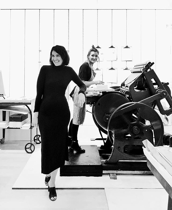
When best friends Britt Madden and Ava Goldberg of Banshee Press set-up shop in the creative & booming city of Denver, Colorado, they sought to foster the true tradition of letterpress by raising the bar for elegance, quality and beautiful craftsmanship. Fast forward a few years later and the magnificent duo still prints perfection, adds to printing ephemera collection, and heckles one one another in good fun. The brilliantly cheery pair sat down with us to catch us up on the next moves for the shop, properly cut paper (the foundation for success!) and why you shouldn’t print & mix colors alone at night.


BUILDING FROM THE GROUND UP We are a duo (Ava & Britt) born and bred in Colorado. We met in high school and have been best friends ever since. After college, many travels and odd jobs we decided to unite our creative talents and work a job we loved and built from the ground up. We both majored in print, and decided letterpress was a perfect channel for our perfectionism and design dreams, so creating Banshee was an obvious move. Out of the studio we take advantage of all the adventure Colorado has to offer and spend our free time outside with our friends and family.
THE FIRST TASTE OF LETTERPRESS Britt didn’t have letterpresses in her school, and once she graduated decided that she needed to learn. She bought a C&P 10×15 New Style on Briar Press and taught herself in her garage. Ava’s school did have letterpresses and she learned to use them while in college. We maintained our practice the best we could until we began Banshee with the purchase of our second press, the Vandercook Uni I.
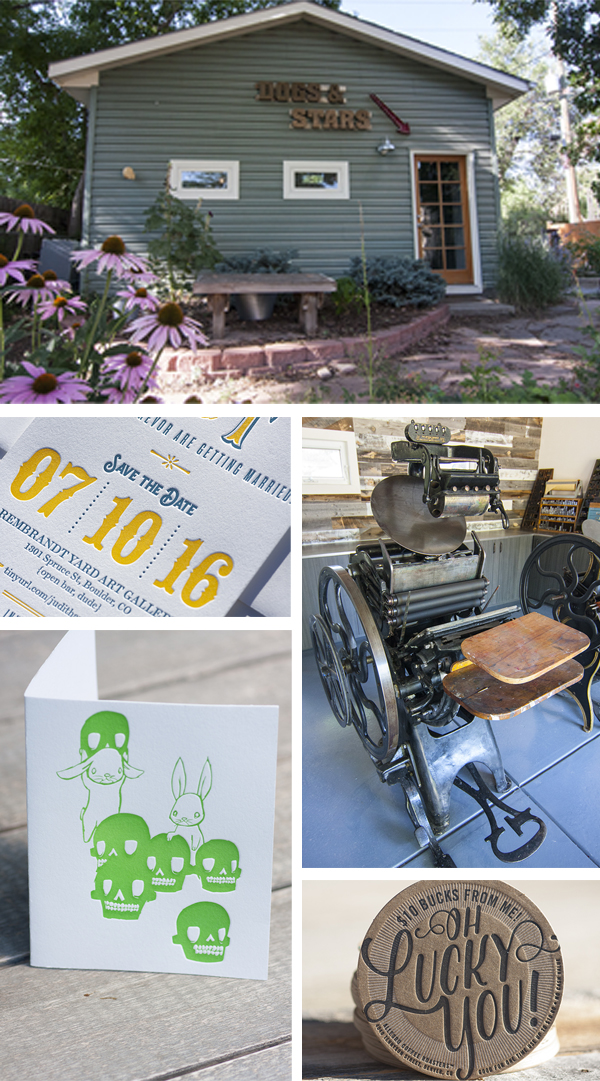
CREATIVITY IN THE CENTENNIAL STATE Our shop is located in the RiNo (River North Arts District) of Denver. It’s a concentration of creative businesses, including architects, art galleries, designers, furniture makers, illustrators, wineries, breweries, sculptors, photographers, and an array of studio spaces. The buildings are covered in murals and color and the streets bustle with evening nightlife. Our space is full of natural light, plants, and presses, and we enjoy having people come and go as they walk by. Our favorite thing about it is that we can use the space for all of our creative endeavors, not just letterpress, and encourage our friends to visit us to do so as well.

MEET THE PRESS FAMILY Our first press was a Chandler and Price 10×15 New Style. We now additionally have a Vandercook Universal I and a Heidelberg Windmill 10×13.
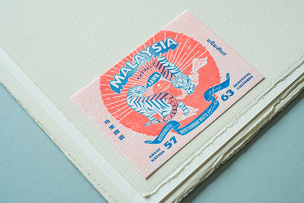
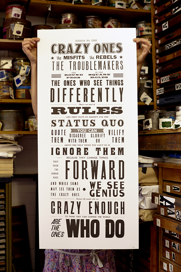
DESIGNED FOR PRINT We are both designers and printers and we print designs provided by our clients as well. We have a quirky aesthetic, and enjoy designs that utilize the unique capabilities that letterpress offers.

THE CREATIVE FLOW Normally we begin any design job with close conversations with our clients. The more information we can gather, the faster and more efficiently we can design to their needs. It saves us energy and them money. We then move into our brainstorming sketch phase where we put whatever our brains come up with down on paper.
After a “would you want that to be your logo?” elimination, we come back to clients with a variety of ideas that we narrow from there. Sometimes we know that either Ava or Britt will be more of a fit for a particular job and will work solo in those situations, but never without feedback from the other.

PART-TIME PARADISE We do not print full time. Britt has two young kiddos that capture much of her attention and Ava owns and runs her own business as well. Printing full time is something we wouldn’t mind, but at this point in our lives is not something we can make the time for.
PRINTING FEATS Making it onto Boxcar’s blog! For the past two years we have published an artist series of letterpress editions that we are very proud of and enjoy doing immensely. We recently purchased a Windmill and have taught ourselves how to use it. And finally, we are best friends in business and we still love each other with all our hearts.

BOXCAR’S ROLE Boxcar is our patient, kind, and understanding babysitter. We know the rules, and yet, we sometimes break them. They always call us with a smile to remind us of our errors before we make them. They have kept us from adding additional stress to our jobs, and consistently make this huge piece of our process easy. Thank You!
SHOP TIPS Bow down to King Reggie and make him your friend. Properly cut paper is the foundation to success. And don’t mix and print color alone at night.
WHAT’S NEXT In 2017 we are going to focus more on our own designs and begin creating a line of products all our own. It’s easy to lose yourself in printing other people’s jobs, and we want to keep our aesthetic a priority. It makes everything more fun.
Immensely huge round of thanks out to Britt & Ave of Banshee Press for letting us take a peek at their printing paradise!


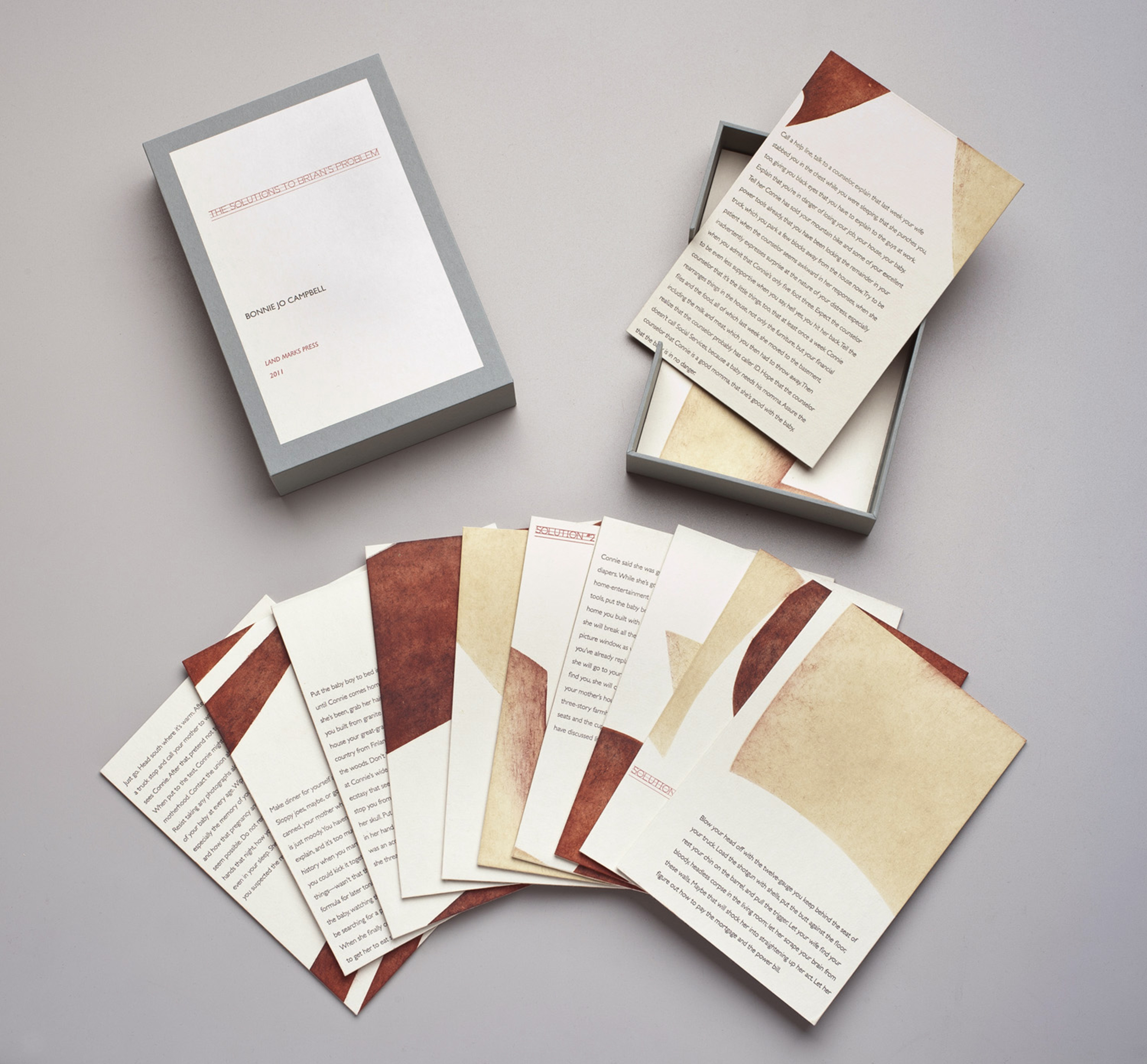 The Solutions to Brian’s Problem, 2011 (written by Bonnie Jo Campbell), pochoir, letterpress from photopolymer, wood veneer


 top: Lamentations 2009, (Chapter 5), woodcut, pochoir, letterpress from photopolymer