Benjamin Eakin: New Beginnings with Quite Simply Cards

Letterpress finds us all and captivates us in one way or another. Benjamin Eakin of E. W. Card Crafts is no exception. From a rich printing history with his father in the newspaper business in Quanah, Texas, to navigating the transition from the old-school style of hands-on typesetting to the digital and modern age of letterpress printing, Benjamin has taken up the gauntlet of the challenges of starting a new part-time letterpress business. Armed with a small but mighty Craftsman Superior (that rode shotgun in his car on the return journey home after acquiring it), he is testing out the waters and is finding himself discovering new projects, a new greeting card line and championing the zealous ambition all letterpress printers share: the dream of getting back on press for just a little bit longer.

Benjamin Eakin of E.W. Card Crafts (Texas, USA), letterpress prints hand-made text-focus cards with brilliance and panache.

A RETURN TO LETTERPRESS To my utter dismay, I find I will soon turn 64. No idea at all how that happened but, well, here I am. I’ve worked at many things over the years, including a 16-year stint with my father and our book publishing company, software support for a book publishing software company, some time with a CPA, and my current position is the cash office of an international kidney dialysis company, among other things. Eakin Press originally published mainly Texas history and began as an extension of Nortex Press which had been printing county histories for a number of years. In turn, Nortex Press started as an extension of the Quanah Tribune Chief newspaper for the express purpose of printing county histories.

PRINTING TRADITIONS I grew up in the newspaper business in the 50s and 60s in north Texas. My father was the editor of the Quanah Tribune Chief in Quanah, Texas. At the time, the population was about 5,000. When we moved there when I was five, the newspaper had letterpress presses only. Even after a new building was built, the presses were moved the block down the town square to start a new life there.

Quanah Tribune (Texas, USA) early printing days in the 1950s-1960s.

Our pressmen and Linotype operators were all a little rough around the edges but that only served to make them more interesting. I worked at the newspaper collating papers and doing cleanup for many years. Not everyone in town knew my name but most everyone knew me as “Little Ed” – that editor’s kid. That made it rather difficult to get away with much. Eventually, the newspaper switched to offset presses but kept the Linotype and one or two of the letterpresses for job work. I used to deliver funeral notices to the stores on the square since this was a weekly paper and Wednesday might be too late to get the word out about a recent death in town.

Benjamin Eakin of E.W. Card Crafts (Texas, USA) posing for photos for the Quanah Tribune newspaper.

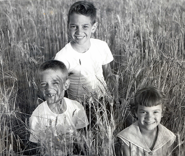
My brother, sister, and I did a lot of posing for photos to accompany news stories – for instance, posing in a wheat field for a story about that year’s crop. My father’s gone now and I’m afraid I don’t remember all the presses that were originally in the shop. There are some great memories, though, about the noise and smell of the press room.

Benjamin Eakin of E.W. Card Crafts (Texas, USA) as a book production manager before starting on his journey into letterpress printing.

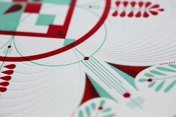
I used to do the design and book layout for the book publishing company after years as the production manager. I was the one to first bring in a PC to test out typesetting on a personal computer instead of our dedicated Penta typesetting system. We gradually transitioned to PCs only. The designing I do now for the greeting card line, in addition to writing the text, has mostly to do with choosing a typeface for each card. My intent with the cards is to focus solely on the words to paint a visual picture for the recipient. We are so bombarded with images today that I cherish the chance to use my imagination to come up with its own visual. I’d like to think there’s a niche audience for the words I write and the look and feel of handcrafted cards.

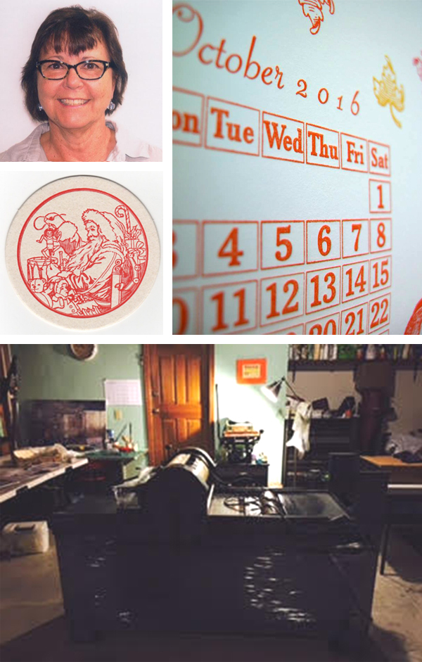
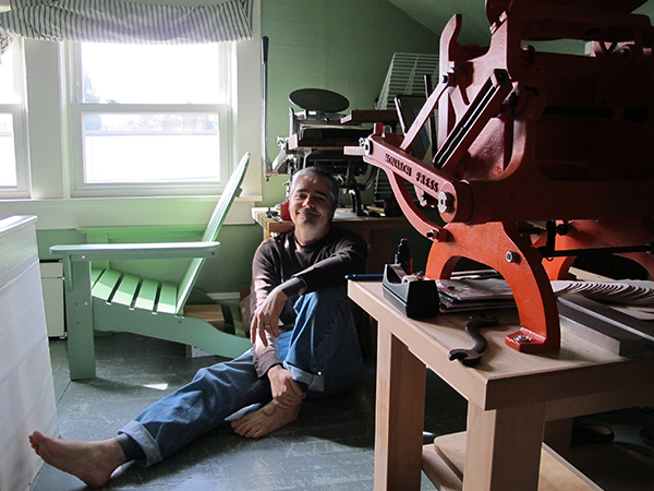
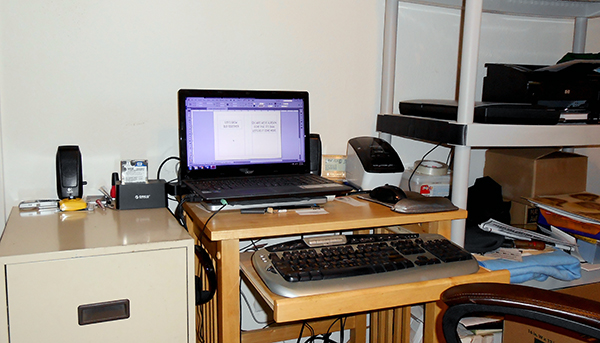
PRINTING IN THE LONE STAR STATE My current shop is a small bedroom at home that operates as my home office and now home to my Craftsmen Superior press. I purchased the press last year from a couple who’d purchased it a couple of years earlier in New York. They ended up moving to Houston, Texas and life apparently got in the way – babies and such. I found it on Briar Press  and met the sellers just north of Houston to pick it up. The press rode in the passenger seat of my car for the trip back to Richardson – a part of the Dallas metroplex.

Benjamin Eakin of E.W. Card Crafts (Texas, USA) and his Craftsmen Superior tabletop letterpress on the ride home.

PART TIME PRINTER, FULL TIME FUN Sadly, I don’t print full time. In fact, the new online store was pushed back several months after I agreed to be a cousin’s executor. Sooner than expected, she died in late March of pancreatic cancer and several things were placed on hold as I tried to figure out how to handle that new job. My goal with the new online store, Quite Simply Cards, is to try to put myself in a position to give up my “day job” and concentrate on printing my greeting cards. I’m hopeful I can transition to printing full-time sometime in 2017. E.W. Card Crafts is named after my partner Tom Hayes and I. Edward is my middle name, William is Tom’s. Hence, E.W. – or Edward-William. We both worked for Eakin Press for many years in the past.The 1980s photo supplied of the two of us shows me on the left and Tom on the right. We’re a tad older now.

PRINTING FEATS I tend not to see my own accomplishments and rely on other people to point out that I’ve done something worthwhile. Yeah, I’m working on that rather poor self-image thing. Recently, however, I printed Shakespeare’s Sonnet 154 for the Oxford Bodleian Library’s call for entries to print all 154 of Shakespeare’s sonnets to commemorate the 400th anniversary of his death. While I pushed it to almost the deadline, I managed to get my entry there on time. I printed the sonnet under my private press name Little Boy Blue Press. I was a fun challenge taken on for the pure enjoyment of it.

Benjamin Eakin of E.W. Card Crafts (Texas, USA) and his Craftsmen Superior tabletop letterpress press.

BOXCAR’S ROLE Boxcar Press has been there from the beginning with help in determining how I was going to set up my press. That included walking me through why I really needed to work with InDesign to produce print-ready images for ordering the polymer plates. I also now have two of Boxcar’s Deep Relief bases to help in a faster setup and press change for printing. Answers to questions have always been readily available from Boxcar.

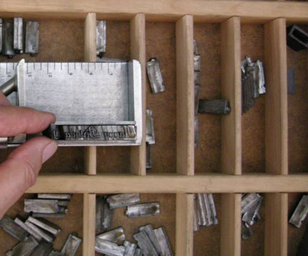
PRINTING TIPS Neat tricks? Well, I’m a little too new to have much in the way of tricks except for one thing. Since my greeting cards all have the same basic layout, I’ve set up Excel files with a representation of the grid on my Boxcar base. I export the type for a card to a PNG file with transparency. Once I position the polymer plate exactly where I need it, I place the type transparency in the Excel file for that card. Now I know exactly how to position the plate for subsequent runs of that card.

Benjamin Eakin of E.W. Card Crafts (Texas, USA) simple but efficient production and design set-up headquarters.

benjamin-eakin-texas-letterpress-printing-img8

Also, setting up one card aids in quickly positioning a new card since I can position based on the previous card – if the saying is wider than the previous card, I can center the type for the new card over the previous and so on. I save a file for each greeting card for quick reference.

WHAT’S NEXT Plans for 2017? Hopefully, I’ll be able to print full-time. No plans right now to expand beyond the greeting card line but would like to think we’ll be successful enough to perhaps purchase something like a C&P 10×15. That would be too large for my home shop, so would mean finding a small commercial office. That’s the goal in the long term. I don’t see myself officially retiring. I have no reason to believe I’d be happy without some new project in my life. And it seems I never tire of finding new projects.

We’re cheering on Benjamin as he starts his new greeting card line and a huge round of thanks to him for letting us get the scoop on his wonderful printing heritage. Catch him here on Facebook!

Mirka Hokkanen: Linocuts and Letterpress

As a full-time mom and part-time printer, naturalist Mirka Hokkanen exemplifies the can-do printing spirit. The fine arts printer has enjoyed the challenges and joys that also come with relocation as her wonderful husband is active in the Army. The results are astounding and show the love she has for the printing tradition as seen in her beautifully detailed nature-themed linocuts and letterpress print work. We sat down with Mirka to talk shop, what it’s like to catch up with letterpress after all these years, and of course her upcoming wood engraving teaching position in Finland next summer.

 Mirka Hokkanen of Texas prints beautiful letterpress and linocut fine art prints.

THE TRAVELED PRINTER I’m a printmaker, mom, army wife, Finn, and an animal and nature lover. I was born and raised in Finland and came to the US after high school to go to college as an international student. I took a printmaking class my first semester and have been printing ever since. After my MFA, I got married to an Army guy, and we have been traveling the US (and Europe) since. Our family now consists of my husband and I, two kids, a doggie and fish.

The kids are finally old enough to be at a part time day care, and I am starting to work in the studio more efficiently. I feel like there is so much work to catch up with after being a full(er) time mom for several years. We love spending time outside (as much as the Texas heat will let us). The kids are just as interested in exploring nature as I am.   

Mirka Hokkanen of Texas prints beautiful letterpress and linocut fine art prints.

FOR THE LOVE OF LETTERPRESS There were some awesome letterpresses at the University of Dallas, where I got my MFA from. No one knew how to use them, so for my graduate work, I set some type on my own, and did embossing for a book project I had. The experiment was fun, and as a printmaker, I love all presses, no matter how they print. The seeds of letterpress were sown and I went on my way with etchings. Fast forward about six years, and several state-to-state moves. I was trying to look for a medium that was easier to move than etching equipment, but something I could get high detail in. I exposed polymer plates at home for intaglio, and was getting into color reduction linocuts. Letterpress drew me in, because of the ease of registering multiple plates. I proceeded to drive an hour and a half to take letterpress classes at SVC in Seattle and met Carl Montford who then taught and got me involved with wood engraving.   

Mirka Hokkanen prints beautifully detailed linocut prints.

PRESS HISTORY My very first press was a blue Dick Blick etching press. I used it quite a lot, but when I started getting into letterpress, I first got a tiny Sigwalt from eBay for almost nothing (because it was in horrible shape). Obviously that did not take me too far after fixing it up (I don’t think I ever printed anything with it) and within a couple years, my studio had an assortment of about 5 letterpresses in all shapes and sizes. 

Mirka Hokkanen prints on a Vandercook beautiful nature-themed linocut prints.

PRINTER ON THE MOVE Wherever we move, we do our best to get a house with enough room to have a studio in it. That way I can be at home and pop to work in the studio as much as possible. Compared to most other printers, my shop needs to pick up and move every three years, which limits the amount of things I can accumulate. I barely have any type for that reason or huge presses, and use polymer plates or carve linoleum if I need text in my work. My current studio is tiny, I can’t teach classes in it, but the best part about it is that it is right here, and I can go in there whenever I have a spare moment.

If I had to pick one thing to save in case of a fire, I’d grab my Morgan Lin-o-scribe press. I think everything else I could bare to part with or could replace. It’s like a loyal old dog: he follows me around everywhere we move, is a little shaggy and rough around the edges, waits for me patiently when I can’t get to printing for months, and makes a great impression whenever I need to get work done quickly.      

Mirka Hokkanen prints on a Vandercook beautiful nature-themed linocut prints.

THE PRINTER AND DESIGNER I’ve always considered myself a printmaker, but recently I’ve been becoming more of a proper business owner too. I come from a fine art background, so I’ve always done everything from designing the images, and carving the plates, to hands-on printing and then photographing and marketing to sell the finished product and sending them off to their new homes. 

THE CREATIVE PROCESS I usually have a mix of ideas in my head for new prints. I think it kind of looks like alphabet soup in there. Over time, I might sketch things on paper and let them marinate some more. Sometimes things will mull for over a year before the time is right to start working on them. When I finally have the finished idea of what I want to do, the execution goes pretty fast.

I often don’t sketch things too much. Many times it’s just one drawing that I might work over and over, which gets transferred onto a block and then carved. It’s fairly mechanical after the idea is complete. For multiple plate blocks, with several colors, I might do thumbnail sketches with watercolors, or scan my drawing and play with color options in Photoshop.

Cutting and printing with linocuts by fine arts printmaker Mirka Hokkannen.


PART TIME PRINTING, FULLTIME FUN
I’d say I work as an art business as close to full time as I get from the kids. I’ve done my fair share of odd jobs over the years, from adjunct teaching, to volunteering and then staying at home with kids. With the moving, my studio is the only thing that travels with me and that I can work on consistently. My dream one day is to make prints full time and have an assistant who would do some of the business end of things. It won’t be until after we settle down one day, though. It’s fun to dream in the meantime, though.

Mirka Hokkanen prints beautifully detailed linocut prints. "Mr. Carpey".

PRINTING FEATS I’m proud that I’m still printing with passion after all these years. I have more confidence than ever in my work, and have figured out how to challenge myself and grow without the consistent support of a local artist/printer/gallery community that many others have. My friends live far and wide, and the peer community who I rely on offers support through emails, phone calls, and social media groups.

On the flip-side; picking up every three years, has forced me (a sworn introvert) to become super fast at networking every time we land in a new town.  

BOXCAR’S ROLE I’ve been ordering unexposed plates from Boxcar for about 5 years now, and the service has always been flawless. I’ve even ordered a couple ready made plates, when I wanted something to turn out perfect or needed lots of detail that I didn’t want to risk exposing myself. I have some ideas for prints with larger plates, that I care not to carve as engravings, and Boxcar will be my go-to plate source at that point.

PRINTING TIPS I usually print linocuts and engravings, which in some ways is different than type. I’ve got a lot of tricks up my sleeve to get things to print right. First, I almost always prefer to ink by hand, which gives me more leverage on ink coverage, and how the paper lays on the plate while printing.

In this video, you can see I use pieces of foam on big prints to keep paper off the plate until the press rolls over it. It keeps the ink from making stretch marks in solid areas. If you use a different system, like a Vandercook or an iron hand press where the paper meets the plate differently, this wouldn’t make a difference.

Really, the biggest advice I can share is: have lots of patience and have a group of people who you can call on for advice. The best way to learn is just to do lots of it. You will have a different problem with each edition to solve, so you become really smart by the time you’re a seasoned printer. LOL! I try to keep up with a blog of tips and tricks. It’s a record for myself to remember the things I’ve done with editions and hope it’s something for students to reference also. You can find it here!

  Mirka Hokkanen prints on a Vandercook beautiful nature-themed linocut prints.

WHAT’S NEXT At this point it looks like we will be moving overseas in the middle of 2017. Packing and unpacking will take up most of the year, so I am working really hard to build up a mailing list now, and release a collection of prints in March-April before we pack up. Join the mailing list here!

Secondly, I am also really excited to be teaching a wood engraving beginners class in Finland next summer. The technique is all but died out there, so I hope to invigorate and inject some enthusiasm about engraving into graphic artists there.  

A big round of thanks out to Mirka for letting us get a sneak peak at her beautiful printing world!

Let’s See That Printed: Dana Kadison’s Exotic Flamingo Letterpress Prints

When the intricately-detailed illustrated flamingo graphic passed through our platemaking service, we were eager to learn more about what was to become of this plate and the resulting final pulled print. The printer behind the design, Dana Kadison, let us in on how the illustration project came to be and how she turned a long-mused-over concept into reality.

An illustration by Dana Kadison being made into a letterpress plate by Boxcar Press

Dana filled us in on beautiful (and long-term) project details: “As a photographer and collector, I have built a library of images and ephemera that is the foundation for an ongoing series based on the Mexican bingo game Loteria. Currently there are eight Loteria images. Each one exists in more than one “state”: my CMYK proofs, which will eventually have reverses and be printed as cards in a boxed set; monoprints, which I produce whenever I want to work out an idea or a reverse (like the Yeats Mariachis); soon, the editioned prints which include letterpress layers; and finally, Ofrendas, of which the Flamingo is the first. The Ofrendas, or offerings, are simpler statements of the ideas in the Loteria card series.”

Dana Kadison on press with a Vandercook printing press.

“The Flamingo Ofrenda is casual and references Jose Guadalupe Posada’s work. About two years ago, inspired by a set of Players cigarette cards, I was thinking about, and scratching, all kinds of birds, particularly finches, but also hornbills, crossbeaks, frogmouths, macaws, etc., and finally settled on a flamingo for card #2. The flamingo, for Americans at least, is undeniably iconic and the males and females look alike.”

“Now there is a suite of 8 images ready for editioning on 18×24 sheets of paper. Each one synthesized from a myriad of “stuff”: you know, the words, texts, images, objects, conversations that make up a life. And the first thing I wanted to add to each image is the text that will be on the reverse each of card when they become actual cards. For the viewer the text would be a clue to what I was thinking. Of course I wanted it in my own handwriting. And this is where letterpress comes into play. It all started with the idea of plates of text in my own handwriting.”

“So I took a class at Robert Blackburn on a Vandy 4. The flamingo, my first plate from Boxcar, was for that class. Using that Vandercook 4, I printed the flamingo two ways, straight and then over monotypes. All the prints have the same degree of impression. I like the straight prints, but am still deciding about paper. The monotype backgrounds please me the most, perhaps because I did not try to register them with the plate. Knowing that, once set, the Vandy would take care of itself, part of this exercise was to let go of the urge to register. While all of this is happening, I did press my first image with Pilar Nadal at Pickwick Independent Press in Portland ME.”

Dana Kaddison prints beautiful letterpress flamingo monoprints with Pilar Nadil.

“Letterpress is an aesthetically and physically freeing experience. We all know that paper is not really 2D, that it has depth. Letterpress layers add visible texture that can be seen with or without ink. And a letterpress registers. It is a little unsettling to use a press, completely unlike pulling the screens myself. Atmospheric conditions in the NYC studio are so variable and water-based inks misbehave in such interesting and frustrating ways that achieving consistency in CMYK prints takes great physical and mental stamina.

With letterpress I can imagine more and physically achieve more. For the editions of the first 8 images, I chose to set the 6.5×10.25 card faces on 18×24 sheets of paper and handwrite the text from each reverse below the screenprint of its card face. The handwritten texts are becoming letterpress plates. And there was more beautiful white space available. So parts of the reverse images are now finding their places as letterpress in that white space. For example, #2 will be embedded in the enlarged body of my scratchwork flamingo.”

A large heaping round of thanks out to Dana for letting us get a sneak peek at the brilliant flamingo designs!

One Last Dance For Photopolymer Plates: Ink Stamp Pads

Here at Boxcar Press we’re always looking for new ways to give printing supplies “one last dance” before recycling or dismissing items into the wastebasket. One of our clever and resourceful platemaking customers, Meredith Pinson-Creasey of Purple Dog Press shares with us an experimental & last-time use for her custom-ordered photopolymer plates: using ink stamp pads to apply ink to the plates. Meredith weighs in on the pros and cons of using ink stamp pads for printing (and with some rather nice results).

Helpful note: please do remember that our custom-made photopolymer plates work best with letterpress printing inks (such as rubber-based or oil-based inks) which are rolled on to the surface of the plate.  Many other art inks are water-based and since our plates are water-wash out, using these products can degrade the quality of plates. Please use caution and good judgement if experimenting with water-based ink stamp products.

THE EXPERIMENTAL PROJECT I have been experimenting with some of my old polymer plates, trying to get my logo to print on the cotton twill fabric tape and boxes I use to wrap my letterpress cards for gifting. You guys may have already tried this and I may not be sharing new info, but I’ve had great luck.

My 82 year old mother continues to be the most fearless artist and crafter I know. And her father could repair or make just about anything. It is their “eat first, ask questions later” attitudes that inspire me. As a sports, landscape, and baby photographer, and an amateur letterpress printer with a 1940’s 10 x 15 Kluge, I wanted the packaging for my photo/letterpress cards to be personalized with both my logo and the recipient’s name, or a greeting. The most economical route was to purchase blank ribbon, boxes, and bags to customize as needed. I have printed my own packaging using silkscreen and linoleum blocks, but wanted something faster with less set up time. Having dozens of rubber stamps made was too expensive. So I decided to experiment with some of my retired polymer plates from Boxcar Press.

Using photopolymer plates experimentally with ink stamp pads for a final use.

INK PAD TIPS Working with dye or solvent ink pads produced the crispest image, due in large part to the firm surface of the pad. Pigment inks have a foam pad which can cause the ink to go down into the recessed portions of the polymer plate producing a blurred image. A brayer may also be used to transfer the ink from the pad to the polymer plate to provide even coverage and less mess.

Using polymer plates as a stamp works best when attached to a block of wood or a clear stamping block to ensure only the image or text comes in contact with the fabric. The wood block I used has a slick finish designed to release the temporary stamp easily. Three brands of ink pads worked well for me: Ranger Ink; Hero Arts; and StazOn. Ranger Ink’s “Dye Ink Pad” and “Archival Ink” in all colors I tried worked well. Hero Arts makes terrific “Neon Dye” Ink colors. StazOn’s “Solvent Ink Pad” worked equally well. These inks are waterproof, permanent, acid-free. and the pads are refillable. My guess is that most brands of dye or solvent ink would produce great results.

Using photopolymer plates experimentally with ink stamp pads for a final use.

MATERIALS TO TRY (AND ONES TO AVOID) A few of the materials I’ve stamped with polymer plates include: birch wood tags, twill ribbon tape, glassine food bags, kraft gift boxes, and paper. Although pleased with all the results, the glassine takes FOREVER to dry and the wood tends to bleed sometimes. The bleed may be the result of over inking or applying too much pressure to the stamp because some of the images did not bleed. Kraft paper enhanced the grunge look of one of the fonts. Ink wipes off easily easily with a cloth but will stain the recessed portion of the plate.

(Boxcar’s note: One important thing to note about polymer plates versus rubber stamps which can affect your results and determine which materials are best to stamp on. A polymer plate is a hard surface on a thin substrate. In contrast, a rubber stamp is soft, pliable and cushiony. These properties will work for or against you when you are stamping and experimenting will be key).

THE RESULTS Text of various sizes and weights, and line drawings as thin as .75pt printed well. Because the inks are translucent, this alternative use of polymer plates will not produce a silkscreen type effect.  My faux postage cancellation polymer plates worked great and the uneven application of ink makes it look even more authentic. Expect to see the fabric beneath graphics containing large areas of solid polymer. For best results, I recommend using plates no larger than about 4 x 6 inches, or about the size of your hand.

Using photopolymer plates experimentally with ink stamp pads for a final use.

I love it when my tools can do double duty and this is much more economical than having dozens of custom rubber stamps made. Now if I could get my Kluge to churn butter or something, maybe my husband wouldn’t grumble about the space it requires.

WHAT’S NEXT No longer limited to someone else’s rubber stamp designs, I am looking forward to putting some of my own quotes and graphics in polymer. When I gang up those plates for my Kluge, I’ll be squeezing in another stamp idea. While this alternative use of polymer plates may not appeal to a commercial print shop, I do recommend the idea to anyone looking to complete their branding with a personal handmade touch.

THE FINE PRINT So here’s the fine print: polymer plates degrade with water. Rubber stamp inks are water based. Polymer plates don’t really play well with rubber stamp ink and will degrade over time. I think I’ll go through quite a bit of ribbon before that happens, but I’ll keep my stamping plates separate from my printing plates.

A huge appreciative round of thanks goes out Meredith of Purple Dog Press for her excellent advice and tips!

The Printing Realm of Genghis Kern

A decade has passed and the creative gleam in Jason Wedekind’s eye still outshines even the brightest of metallic ink accent in his impressive printing portfolio. The Colorado-based printing realm of Genghis Kern has grown from two dozen cases of lead type & a single press to setting-up camp (and shop) in his dream workspace (not to mention acquiring a drool-worthy collection of hand-set and metal type). With one foot rooted in both the design & job world, Jason and his exceptionally gifted team have repeatedly pushed letterpress printing boundaries and amped up the creative oomph to their printed work. We stopped in to chat with Jason about the joys of printing, working with his mentor Tom Parsons, balancing life with two wonderful kids, and keeping up with the flow of community workshops.

Jason Wedekind (left) of Genghis Kern in his Colorado-based letterpress printshop.
(from left to right: Jason Wedekind and Jeff Shepherd of Genghis Kern)

DECADE OF PRINTING INGENUITY I founded Genghis Kern 10 years ago this May when I started printing for friends while working as an art director for a small design firm in Denver. I still remember the day when I bought my first press, leaving with 24 cases of lead type banging around in the back of my SUV and saying “what the hell did I just do? I don’t even know if I like this?!?!” I had been introduced into this wonderful world by Tom Parson, Denver’s poet/printer grandfather of letterpress, and founder of the Englewood Depot Letterpress Museum. The letterpress bug bit hard and hasn’t stopped biting yet. I spent many a night printing all sorts of fun stuff while learning the trade.

Silver metallic letterpress printed invitation piece amps up the wow-factor at Genghis Kern.

The firm I worked for got hit hard during 2009 and I was thrust into the world of self employment. With an 18month old daughter, it was stressful, but the payoff was rewarding. From day one it’s been a nice mix of design work and job work, with the goal being producing tactile work that makes both us and our clients proud. “One foot rooted in each world” is how a recent shop visitor described what we’ve built.

CREATIVE IN COLORADO Our current shop is my dream space. I drove by it in 1999 and said “That’d be a cool place to work” and now we do. It was a Hispanic Furniture and Record shop 2 blocks from my house. We have 2,000 square feet up front which we turned into a co-working space for creative types, and our 1,000 square foot print shop is in the back.

Pressman and presses alike convene beautifully at the commercial letterpress printshop that is Genghis Kern.

When I brought my current pressman/designer Jeff Shepherd on over a year ago, he mentioned he had a windmill in his folks’ garage. My garage shop was full to the gills at that time, but I knew growth was in our future. You see, I had moved my design arm of Genghis Kern out of my bedroom 2 years prior into a shared work space with 4 other creative firms. When I brought a pressman on, they worked in my garage and I ran back and forth the 5 blocks from the new “office” to the print shop. It worked, but grew tiresome. Let alone having to keep my house clean in case they needed to pee. I started looking for a new space that would allow us to combine a print shop and office space, and reached out to the owner of the furniture store blocks from my house. It had been vacant since 2005.

He agreed to my crazy plan and we broke ground in January of 2015, gutting the space and crossing our fingers that our floorplan for the pressroom would work out. Then the dominoes began to fall. We started with my original 10×15 C&P, an Asbern ADR-1 (German SP-15 Clone), a 10×15 Windmill, and a 30″ Challenge cutter. While doing the buildout Jeff saw a Heidlberg KSBA at auction that had inkers on it. My “dream” press. So we added that to the mix, quickly shuffling our floor plan to be to make room. Then one of the printers from our bimonthly printer’s lunch in Denver walked into our garage and said “Did you guys see that Vandercook for sale on the western slope?” Jeff ran inside and put an offer down on it. HIS dream press, a Vandercook 4.

Pressman and presses alike convene beautifully at the commercial letterpress printshop that is Genghis Kern.

We figured we’d deal with the floorplan when we had a floor to plan. SOON. So that became our current shop. We set the two proof presses up in our “type alley” where we host an occasional workshop. It’s fun having different presses to turn to when something goes south.

TL;DR: Our shop started out in my garage 10 years ago. 1 C&P and a cutter. I then moved 3 blocks and built my second “garage” shop, large enough to fit a C&P, Proof press (not yet owned), and a windmill (not yet owned), a stone and a cutter. What I neglected to tell my wife when we were designing the floor plan, was that if the presses were to move out one day, my dad’s vintage BMW motorcycle collection could slide right in where the presses once stood.

Colorado-based Jason Wedekind of Genghis Kern prints letterpress with creativity and panache.

INTRIGUED BY LETTERPRESS While working as an art director back in 2003, someone brought in a beautiful custom duplexed letterpress/foil stamped card and said they wanted to add 3 initials to their name in 6pt. I looked at my print broker and asked “How the hell are we going to do that?” She told me letterpress. Hand-fed letterpress. I was intrigued. I knew of letterpress from the design annuals but had never been up close. That was about to change in a big way. I walked into the printshop of Tom Parson, our local “godfather” of letterpress and was transported to a different time. Tom printed that job and I said “I want a press (like every designer in the mid 2000s)” and he put me on the list. I asked him to teach me the process and he showed me how to do everything from hand washing plates to treadling. When it came time to print, he started kicking and I asked if I could try. He let me. The rest is history. I ended up kicking 600 cards in 40 minutes to which Tom asked “where did you learn how to do that?”. I told him my childhood was spent working in a decorating tool factory in Chicago, our family business which was started in 1908. Slave labor at its finest. But that slave labor instilled some hand eye coordination that I surely don’t complain about now.

The beautiful printing presses gleam in the sunshine of Genghis Kern (Colorado).

FIRST PRESS 1922 10×15 C&P

PRINTING MENTORS Tom Parson will always be my first mentor, but my inspirations are the people out there pushing the boundaries and keeping the art of letterpress alive like Jen Farrell of Starshaped Press in Chicago. A day rarely goes by when I’m not wiping drool of my phone thanks to her instagram feed.

DESIGNED FOR PRINT I’m a designer and a printer. I’ve been hiring designers and printers. And we’re on a quest to turn some designers into printers. Feet in both worlds.

THE CREATIVE PROCESS My design process has been greatly influenced by the door that letterpress opened to the typographic world. Being faced with a design challenge and combining passions when applicable is the best feeling. Whether it be typographically or texturally, or both.

Jaw-dropping tight registration and beautiful letterpress printing are regulars at Genghis Kern (Colorado).

FULL TIME FUN, ALL YEAR ROUND Lately I’ve been printing a little more, but as the workload grows, I find myself printing less and less but enjoying the time in front of the presses even more. I’m also a member of the Amalgamated Printers Association, which is an incredible group of 150 printers from around the world who print 4x or more times a year. Each member gets a monthly envelope with everyone’s work in it. So creating for that keeps me on my toes and up to my elbows in type.

PRINTING FEATS I’m proud that I’ve been able to grow a business from a passion, and employ people with similar passions. I’m also proud to keep these ancient machines and type from the scrap heap. Those two kids I’m trying to instill a work ethic in before it’s too late? They make me proud on a daily basis. I think I complained more about “helping Dad” when I was their age. Eva and Jasper? Thanks for putting up with me!

BOXCAR’S ROLE The quality of Boxcar plates are unparalleled in my opinion. We have local photopolymer plate makers but letterpress isn’t their main focus. I know that if I get my artwork in on time, I’m going to get plates back quickly. And when there’s an issue with my plates, the help that the staff provides is top notch.

Eye-popping color and beautiful blind deboss letterpress pieces are hand-crafted with care at Genghis Kern (Colorado).

SHOP TIPS Embrace your local community. The amount of knowledge gained by the “olds” out there who aren’t getting younger, by the way, is invaluable. And most of them love sharing. If there’s no active community that you know of, start one by inviting over some old printers for coffee and donuts.

WHAT’S NEXT Just keep on organizing our new space. Offer a few more workshops. Streamline work flow. And continue to produce work we’re all proud of.

A huge round of applause (and thanks!) out to Jason of Genghis Kern for letting us get a sneak peek at his wonderfully creative printing world.

Perfect Aim With The Hunter Press

For those curious enough to venture into the beautiful and gentle rolling hills of the Scottish countryside, a thirty minute serene drive southwest from Edinburgh will find you in the company of friendly smiles, a easy-going pace of lifestyle, and the private farm workshop that is The Hunter Press. Lyndsey Hunter is the energetic entrepreneur manning the presses there and she let us in for a tour of her printing paradise — a true gem found in the heart of Scotland. She sat down with us between ink runs to talk shop, about her passions as a printer, and bringing more letterpress to the Scottish community.

Take a virtual tour of The Hunter Press, a private farm workshop that is home to Scottish printer Lyndsey Hunter.Take a virtual tour of The Hunter Press, a private farm workshop that is home to Scottish printer Lyndsey Hunter.

THE LOCATION The print studio is located on an arable farm just 12 miles outside of Edinburgh. It’s a nice peaceful spot, not too far from the nearest town but quiet enough to feel as though we’re in the countryside. The print space is adjoined to my husband’s blacksmiths workshop so things can get a little noisy at times. We’re currently restoring a 300 year old property further north in Highland Perthshire which we plan to relocate to within the next year. The print studio will then be located in one of the adjoining cottages.

I like to have a central hub which I can access from every point within the studio. Ours is a large prep/finishing table which often doubles as a set up area, computer station and photography surface.

SHOP SIZE 500 square feet.

FAVORITE THING ABOUT THE SHOP It’s quiet on the farm, away from traffic and city hustle and bustle, which really fuels my creativity. Within the studio, my favourite thing would have to be the old type cabinets which are used to hold surplus paper stock and our cutting dies. The drawers have taken a bit of a beating over the years, but add so much warmth to the space.

FLOORING MATERIAL Sturdy painted concrete below the printing presses. We added some comfy hard wearing carpet across the rest of the space. The studio can get really cold so it’s nice to have a little bit of comfort during those cold months.

TYPE OF SHOP Commercial but closed to visitors.

THE PRESSES 3 Heidelberg Windmills 10×15, one of which has been converted for Foil Printing, 1 Harrild and Sons Proofing Press in need of full restoration, and we are hoping to replace one of the Windmills with a Korrex Berlin Proofing Press very soon.

MOST VALUABLE SHOP TOOL Not a tool exactly but I definitely couldn’t run things without my wood burner on those chillier days! I’m not too sure how I managed without it at the beginning now.

FAVORITE INK + COLOR Ink of choice would be VanSon Rubber Based Inks. I often use oil based for specials. Current favourite colour to mix would be mint green.

CLEAN-UP ROUTINE Clean up is my least favorite part of the day!  Luckily the Windmills are fairly straightforward to clean.  I use a water-miscible roller and blanket solution with cotton rags and blue roll.

OIL OF CHOICE Castrol Magna 150 Mineral Circulating Oil.

CLEAN UP RAG OF CHOICE Old tshirts and sheets donated from the family.

PIED TYPE A very small amount of odds which we picked up with the presses.

BOXCAR BASE + PLATE SYSTEM I always work with Polymer Plates KF95. I had a couple of aluminum bases made locally when I started printing in 2012, they’re still going strong.

WORKSPACE ORGANIZATION TIPS Keeping things clean, especially the ink station.  I don’t like to leave the studio without carrying out a full ink clean up ready for the next day.  I also like to file and label all polymer plates from past projects.

PRINTING TIPS I’m completely self taught so I feel as though I’ve ticked my way through every mistake in the book and I still feel like I learn something new every day. It’s been said before but ink application was a big lesson! I started out using way too much ink, which in turn led to me wasting a lot and also spending too much time adjusting the roller heights. It’s best to start with a minimal amount of ink and build up to the desired effect. It’s much easier to add to than to run out and have to remix an entire custom colour. And always mix slightly more than needed (custom colour) in case of reprint. Oh, and oil those machines regularly!

Take a virtual tour of The Hunter Press, a private farm workshop that is home to Scottish printer Lyndsey Hunter.

A huge  round of thanks out to Lyndsey for this wonderful look inside The Hunter Press! Check out Lyndsey’s Pinterest page to see more of her work and inspiration!

Banshee Press: Best Friends in Letterpress

When best friends Britt Madden and Ava Goldberg of Banshee Press set-up shop in the creative & booming city of Denver, Colorado, they sought to foster the true tradition of letterpress by raising the bar for elegance, quality and beautiful craftsmanship. Fast forward a few years later and the magnificent duo still prints perfection, adds to printing ephemera collection, and heckles one one another in good fun. The brilliantly cheery pair sat down with us to catch us up on the next moves for the shop, properly cut paper (the foundation for success!) and why you shouldn’t print & mix colors alone at night.

Britt Madden & Ava Goldberg of Banshee Press are the best friend duo behind the beautiful letterpress pieces that are hand printed in ColoradoBritt Madden & Ava Goldberg of Banshee Press are the best friend duo behind the beautiful letterpress pieces that are hand printed in Colorado

BUILDING FROM THE GROUND UP We are a duo (Ava & Britt) born and bred in Colorado. We met in high school and have been best friends ever since. After college, many travels and odd jobs we decided to unite our creative talents and work a job we loved and built from the ground up. We both majored in print, and decided letterpress was a perfect channel for our perfectionism and design dreams, so creating Banshee was an obvious move. Out of the studio we take advantage of all the adventure Colorado has to offer and spend our free time outside with our friends and family.

THE FIRST TASTE OF LETTERPRESS Britt didn’t have letterpresses in her school, and once she graduated decided that she needed to learn. She bought a C&P 10×15 New Style on Briar Press and taught herself in her garage. Ava’s school did have letterpresses and she learned to use them while in college. We maintained our practice the best we could until we began Banshee with the purchase of our second press, the Vandercook Uni I.

Britt Madden & Ava Goldberg of Banshee Press are the best friend duo behind the beautiful letterpress pieces that are hand printed in Colorado

CREATIVITY IN THE CENTENNIAL STATE Our shop is located in the RiNo (River North Arts District) of Denver. It’s a concentration of creative businesses, including architects, art galleries, designers, furniture makers, illustrators, wineries, breweries, sculptors, photographers, and an array of studio spaces. The buildings are covered in murals and color and the streets bustle with evening nightlife. Our space is full of natural light, plants, and presses, and we enjoy having people come and go as they walk by. Our favorite thing about it is that we can use the space for all of our creative endeavors, not just letterpress, and encourage our friends to visit us to do so as well.

Britt Madden & Ava Goldberg of Banshee Press are the best friend duo behind the beautiful letterpress pieces that are hand printed in Colorado

MEET THE PRESS FAMILY Our first press was a Chandler and Price 10×15 New Style. We now additionally have a Vandercook Universal I and a Heidelberg Windmill 10×13.

DESIGNED FOR PRINT We are both designers and printers and we print designs provided by our clients as well. We have a quirky aesthetic, and enjoy designs that utilize the unique capabilities that letterpress offers.

Britt Madden & Ava Goldberg of Banshee Press are the best friend duo behind the beautiful letterpress pieces that are hand printed in Colorado

THE CREATIVE FLOW Normally we begin any design job with close conversations with our clients. The more information we can gather, the faster and more efficiently we can design to their needs. It saves us energy and them money. We then move into our brainstorming sketch phase where we put whatever our brains come up with down on paper.

After a “would you want that to be your logo?” elimination, we come back to clients with a variety of ideas that we narrow from there.  Sometimes we know that either Ava or Britt will be more of a fit for a particular job and will work solo in those situations, but never without feedback from the other.

Britt Madden & Ava Goldberg of Banshee Press are the best friend duo behind the beautiful letterpress pieces that are hand printed in Colorado

PART-TIME PARADISE We do not print full time. Britt has two young kiddos that capture much of her attention and Ava owns and runs her own business as well. Printing full time is something we wouldn’t mind, but at this point in our lives is not something we can make the time for.

Britt Madden & Ava Goldberg of Banshee Press are the best friend duo behind the beautiful letterpress pieces that are hand printed in Colorado

PRINTING FEATS Making it onto Boxcar’s blog!  For the past two years we have published an artist series of letterpress editions that we are very proud of and enjoy doing immensely. We recently purchased a Windmill and have taught ourselves how to use it. And finally, we are best friends in business and we still love each other with all our hearts.

Britt Madden & Ava Goldberg of Banshee Press are the best friend duo behind the beautiful letterpress pieces that are hand printed in Colorado

BOXCAR’S ROLE Boxcar is our patient, kind, and understanding babysitter. We know the rules, and yet, we sometimes break them. They always call us with a smile to remind us of our errors before we make them. They have kept us from adding additional stress to our jobs, and consistently make this huge piece of our process easy. Thank You!

SHOP TIPS Bow down to King Reggie and make him your friend. Properly cut paper is the foundation to success. And don’t mix and print color alone at night.

Britt Madden & Ava Goldberg of Banshee Press are the best friend duo behind the beautiful letterpress pieces that are hand printed in Colorado

WHAT’S NEXT In 2017 we are going to focus more on our own designs and begin creating a line of products all our own. It’s easy to lose yourself in printing other people’s jobs, and we want to keep our aesthetic a priority. It makes everything more fun.

Immensely huge round of thanks out to Britt & Ave of Banshee Press for letting us take a peek at their printing paradise!

The Printing Rhythm at One At a Time Press

Patricia Barron of One At a Time Press lives life to the fullest daily in her garage-turned-studio in the picturesque Sierra Madre mountain range of sunny California. Her ambitions to pursue her passions in letterpress have been fostered by exceptional printing mentors and the thrill of the creative challenge. We caught up with Patricia to see how her part-time printing adventure is treating her.

Patricia Barron of One At a Time Press lives life to the fullest daily in her garage-turned studio in the picturesque Sierra Madre mountain range in sunny CaliforniaPatricia Barron of One At a Time Press lives life to the fullest daily in her garage-turned studio in the picturesque Sierra Madre mountain range in sunny California

THE JOY OF CREATING I am a born and raised, Southern California lady through and through. I live in Sierra Madre with my husband, Jeff. I went to college at UC Santa Barbara in 1969 and then transferred as a junior to UC Berkeley, where I graduated with a B.A. in psychology.

I began my business on my 60th birthday in 2011, after having raised two boys to men as a stay at home mom. I was lucky to be able to take art classes at Pasadena City College, the local junior college. These included drawing, life drawing, painting, ceramics, sculpture and photography. I love the challenge and joy of creating, and am inspired by nature, people, places, music, books and life. Sierra Madre has beautiful views, mountains, and green spaces so there is much to inspire.

Patricia Barron of One At a Time Press lives life to the fullest daily in her garage-turned studio in the picturesque Sierra Madre mountain range in sunny California

LETTERPRESS LOVE AT FIRST SIGHT My first exposure to letterpress began at the Armory Center for the Arts in Pasadena. I immediately became enthralled with the process, from imagining what to print to making it a finished product. At first, I though I’d have trouble thinking of enough ideas of what to do, but I’m way over that!

MEET THE FAMILY My first press was a 1950’s Chandler & Price Pilot Tabletop Press that I bought in 2011. In 2015, I was very lucky to buy a Vandercook SP-20 press that I had shipped out from Chicago.

SERENDIPITY IN SIERRA MADRE My studio is in our garage. We have two garage doors, a double and a single. The one car garage is my studio. My favorite thing about my studio is that I can open the garage door and get lots of fresh air, light and a view of the mountains. 
While it’s cold in winter, I can use a space heater. In the summer, I am up very early or very late, printing in the cooler part of the day.  I am very proud of having my own business and the quality of my work.

Patricia Barron of One At a Time Press lives life to the fullest daily in her garage-turned studio in the picturesque Sierra Madre mountain range in sunny California

PRINTING MENTORS Denise El-Hoss is my teacher and mentor, and I have been taking classes from her at the Armory for almost five years. Through her encouragement, I began my business. She is totally awesome as a teacher and friend. In fact, I bought my first press from her.

THE CREATIVE PROCESS I design my work using old blocks, my linoleum carvings, designs I create on Adobe Illustrator and have made into blocks, as well as images I find that are copyright free. I also use wood type and metal type that I either have or can use at the Armory. Lastly, I use Illustrator to create words or sentences that I need to be made into a block.

Patricia Barron of One At a Time Press lives life to the fullest daily in her garage-turned studio in the picturesque Sierra Madre mountain range in sunny California

PART TIME PRINTER, FULL TIME FUN I do not print full time, but do print as much as I can. My goal is to do more custom work and larger scale prints. I love to experiment to create original work. My process is often a combination of planning and serendipity. I often begin without knowing exactly what will come next. I love the challenge of solving for the answer! I sometimes begin with an image I like and then bring it to life with words. Or I’ll find a poem or saying that I like and come up with a background.

PRINTING FEATS My art prints, Fauve Look I & II, make me proud, having hand-carved three different linoleum blocks (one for each color) and succeeding in printing them to my satisfaction. I love the way they turned out. The image is based on a textile design from France, 1925. 

I also printed a 2016 letterpress calendar which turned out to be worth all the work involved! I was very happy with the result.

Patricia Barron of One At a Time Press lives life to the fullest daily in her garage-turned studio in the picturesque Sierra Madre mountain range in sunny California

SHOP TIPS Use AlignMate! Their product helps in making sure your text is straight and centered.

WHAT’S NEXT I have been accepted into various shows, including the Patchwork show in Long Beach in June and a show in Claremont. I also have my work in Lulu Mae’s in Pasadena and at Creative Arts Group in Sierra Madre.

Patricia Barron of One At a Time Press lives life to the fullest daily in her garage-turned studio in the picturesque Sierra Madre mountain range in sunny California

A huge round of thanks to Patricia for letting us take a sneak peek at her creative world at One At a Time Press!

Greenboathouse Press Navigates a Smooth Course In Fine Press Printing

Jason Dewinitz of Greenboathouse Press, is a fine press printer who hails from Western Canada. He is also an award winning book designer who has thrown open his studio doors to give us this friendly and laid back tour. His current studio isn’t on a waterway anymore, so for the interesting background story on the name, read more here.

Take a virtual tour of Greenboathouse Press, the laid-back Canadian letterpress printing workspace and abode of Jason Dewinitz.

THE LOCATION Greenboathouse Press is located in Vernon, British Columbia, a year round tourist destination in the lower southern region of BC. The workshop is attached to the house and is 20 by 24 feet (480 square feet), otherwise known as not big enough. While I certainly appreciate the community that a shared space offers, I prefer to work alone (or with an apprentice), so I cherish my private space.

EFFICIENTLY PRODUCED SHOP I was going to say my space is simply a glorified two-car garage, but “glorified” is a bit of an overstatement. The upside of a garage is, of course, the garage doors, but in my case it’s also helpful that both the electrical panel and furnace room are off the garage, as I needed to run a 220V line and running water to my Monotype Super Caster. The ground-level entry and concrete floor are also great, considering that the casting machine likes to spill molten metal all over the place. As for a floor plan, as can be seen in the photos, I’ve set up a number of workstations, for cutting paper, setting type, printing, casting, and working on machine bits & pieces. Although every square inch of space is taken up, it’s an efficient and reasonably comfortable area conducive to getting things done.

FAVORITE THING ABOUT THE SHOP I’m pretty fond of every single thing in the shop, likely due to the fact that only about 30% of my equipment is currently set up there. The bulk of my stuff is at the print shop I’ve set up for my students at Okanagan College, so what’s in my shop at home is the best of it. Aside from the machines and tools, likely the two features I appreciate the most are the long work bench at the back of the shop (for setting type) and the shelving unit behind the press, which holds all of the stuff one needs while printing (ink, reglets, leads/slugs, furniture, tools, etc.) at arm’s reach while printing.

PRESSES I work almost exclusively on a Vandercook 15-21, the adjustable bed of which is crucial in my shop given that I have quite a bit of European type that’s not .918”. At the college shop I also have an SP-25 Power and a giant 14.5” x 22” C&P. I’ve had a couple of SP-15s pass through as well, which I sold to get the SP-25, although I’m currently looking to sell the 25 in order to get my hands on a 219 or Uni III (I need another press with an adjustable bed, and the 25 is simply more than I need in terms of size).

MOST VALUABLE SHOP TOOL Where to start…value, of course, being relative, I have a handful of tools that are worth a fair penny, and a few of those are also extremely valuable to me in terms of utility. At the top of the list would probably be my point-micrometer, which is one of only a handful in existence that measure in (North American) typographer’s points, with increments of 1/16th of a point. This is extremely handy for casting type, but also great for simply measuring type & spacing while setting & finalizing forms. Next to this would be a good alignment gauge and lining gauge, both used for casting. In terms of printing I’d have to say my favourite tool would be a pair of stamp-collecting tweezers that are ideal for pulling out sorts & spacing when correcting forms. And, by the way, I can’t seem to find these things anywhere, so if anyone has a source please let me know!

FAVORITE INK & COLOR When I inherited my first press & etc. from Caryl Peters (of Frog Hollow Press in Victoria, BC) with whom I very informally apprenticed, she also passed along two partial cans of a black ink that has, in my experience, no equal. It was a formula developed by Stephen Heaver and produced by Hostmann-Steinberg. The stock is long gone, but even after 14 years in the can, the stuff prints like nothing else I’ve worked with: perfect viscosity, deep, rich but matte black, and holds up for hours on the rollers. My two cans are almost gone now, so I contacted Hostmann-Steinberg in Canada who pulled the formula up from their US division and they were kind enough to make a big tub of the stuff for me, but I have to say it’s just not the same. I’m pretty sure they scrimped and used synthetics, and the new formulation is far too thin and soft. I’ve found, though, that if I work some out on the glass and (gulp) leave it exposed for about 3 days, then skim off the top skin, it works pretty well. Wish that I could find a stash of the old stuff though!

CLEAN-UP ROUTINE I have a very simple wooden cradle that holds both my oscillating and rider roller carriage, as well as my two rubber rollers, and this makes clean-up pretty easy. I use California Wash, mixed 50/50 with water, and paper towels to get most of the ink off, and then do the final cleaning with straight Wash and clean rags. I’ve got clean-up down to about 15 minutes. I use a lot of heavyweight Bounty paper towels, and chopped up old cotton sheets for rags.

OIL OF CHOICE I use pretty much any non-detergent oil, I’m not fussy as I use very thin coats on the rails and just a few drops in the oil holes.

BOXCAR BASE + PLATE SYSTEM I use the standard Boxcar base with standard plates. As I’m not doing job work and thus don’t feel the need to pound deep into chipboard, this simple configuration has worked very well for me. My most challenging job with polymer thus far was the Feliciano book, which was an alphabet book with each letter having two fill plates and a stroke plate with VERY fine lines. The registration was near impossible, but the plates did their job and the results were darn solid (see images).

PIED TYPE It all goes in the casting machine. Last summer I melted down over 2,000 lbs of old type and cooked them into fresh ingots for the Super Caster. Now there’s a fun job.

ORGANIZATION ADVICE Mostly I just follow  “A place for everything, and everything (usually) in its place…”

PRINTING TIPS Roller bearers. Sure, the Vandercook allows for careful height adjustment to the rollers, but that does nothing for maintaining inking with uneven or gapped lines of text. Bearers actually control the height of the rollers, and can be taped here and there to address the text arrangement. And, change your packing/tympan with every new form. And, keep your press clean. I’ve seen presses that look as though they haven’t been cleaned in decades, and the result is always crappy printing. And one last secret: keep the ink light on the press, just a kiss of contact between roller & type, and then double-ink every pass.

Take a virtual tour of Greenboathouse Press, the laid-back Canadian letterpress printing workspace and abode of Jason Dewinitz.

Many thanks to Jason for this look inside the Greenboathouse Press! Visit Jason’s Pinterest page to see more of his presswork.

Keeping Creative With London Bellman

Diving into the letterpress printing realm sometimes starts like an archaeology adventure: layers of beautiful history and technology are uncovered, past projects are found as remnants on the tympan paper of newly discovered (and obtained presses), and and entire chasm of knowledge is revealed when the printing press starts to clink, buzz, and whirl to life. London Bellman knows this thrilling adventure all too well. The creative virtuoso has been been discovering new ways to apply his innovative passions from past endeavors such as a toy sculptor, painter, and tattoo artist into letterpress printing. His command over line and layout in his tattoo work has translated breathlessly and beautifully into letterpress printing (and it’s quite easy to be enraptured by it all as well). We caught London in both of his ink shops to see how the printing journey started and where the creative momentum has taken him.

London Bellman (of Atomic Press in Oregon) prints beautifully intricate letterpress designs that pull from his background professions as a tattoo artist, sculptor and painter.

INKING UP PAPER AND SKIN I’m a guy who married an awesome lady who puts up with all my scattered visions. We walk a lot, garden, cook, live simple and enjoy the hell out of each other. I’m very thankful and fortunate to have Steph in my life. Career-wise, I have been in the tattoo world since 1991 and that is my primary income stream. This last year I shifted my focus on what it is that I want to convey in my work tattoo wise and personal art. I was a toy sculptor for about five years before I entered the realm of tattoo. The company I worked for did prototypes for the toy industry such as Teenage Mutant Ninja Turtles, McDonalds give-aways, Garfield, Felix the cat, etc. I learned a lot there but also realized sitting in a factory type environment was not for me. Tattooing gave me the life I have now and I owe so much to it. Almost every person I am acquainted with has been through artistic or tattoo endeavors. I also started painting and now sculpting again is in the works.

LOVE AT FIRST SIGHT Letterpress seemed like the simplest way to reproduce my art with the least amount of equipment and is the least toxic. That’s what I thought. 😉 Compared to screen printing (with lots of solvent fumes) which a close friend of mine does. I like that you can use soy solvents and not lose a liver over it.

London Bellman creates beautiful letterpress prints inspired by his own work as a tattoo artist.

I started reading Briar Press’s blog and was going crazy with all the information. Learning the difference in presses, how they worked and performed different tasks. Searching, searching, searching for the right press. In the beginning I would buy a press, dismantle it, clean it and test print primarily. It was a slow process. At one point I drove to San Francisco from here in Portland, Oregon straight through, loaded up a Pearl No.1 and drove home. My wife thought I was press crazy. I’ve had them shipped, get broken, repaired them, all to just find the right fit for my needs. When I would realize a press was not for me I would look for another one and start all over. The movement and mechanical beauty of the machines themselves is a big part of the magic of letterpress. The history of these machines is a big part as well, and where they have been & what they have done. A few times a press has come with boxes of type, quoins, all the extra printer’s goodies and there would be remnants of past projects. Sometimes layers of past projects still on the tympan paper. That part was a fun kind of archaeology. I have not printed a ton of projects, it took me most of the time gathering my equipment and momentum.

London Bellman (of Atomic Press in Oregon) prints beautifully intricate letterpress designs that pull from his background professions as a tattoo artist, sculptor and painter.

OREGON’S VERY OWN My home and studio are one and the same. I like to call it Atomic House. The actual business is Atomic Art Tattoo Studio and that’s the basement of my home. The main floor is where Steph and I live and the attic space is where my presses and paper cutter reside. I am a hobby printer at this point and really enjoy it when I do print. The best thing about my home, shop, and studio is that it’s all right here and at my fingertips whenever I want to make something — I don’t have to leave the premises to make it happen.

THE CREATIVE FLOW I would say I design for tattoos and my personal art whims but I don’t design for peoples’ personal projects. I am very low tech as far as designing goes. I play around with some small sketches, decide whether I like the composition, and let it rest in my stack of images. If I like it enough to proceed to making a print, I’ll redraw the design, ink it, and have a plate (or plates) made. I keep a sketchbook going daily and have lately been going back to my past imagery and borrowing from there.

FUTURE PRINTING As I mentioned before, I am a hobby printer but would love to make more images and find a market for my art. I have been pushing towards that lately. I haven’t fully figured it out but I have some ideas in the works.

PRINTING FEATS I am proud of what and where I am at this point in my life. I’m rich in love, imagery, where I live, whom I am surrounded by and the country I was born in (I mean this in a not crazy patriotic kinda way). I feel lucky in general when considering the state of the planet as a whole.

BOXCAR’S ROLE Boxcar Press is awesome! I have not used you for a ton of services but you did make me a couple really cool base plates for my presses and your online video tutorials are indispensable.

London Bellman (of Atomic Press in Oregon) prints beautifully intricate letterpress designs that pull from his background professions as a tattoo artist, sculptor and painter.

PRESS HISTORY I’m not sure which was my first press? I’ll try and go down the list, which are mostly tabletops. I’m sure I’ve had a couple Kelseys 5×7’s; a Sigwalt or two have arrived broken; Three Pearl No.1’s: basically a tabletop with cute cabinetry below; my largest was a 10×15 Craftsman (unfortunately I let it go but it was a beautiful beast); and one Pilot 6×10 old style which I sold. Currently I am printing on a Craftsman 6×10 and I have a Craftsman Monarch 9×12 made out of aluminum.

SHOP TIPS I’m still learning and always will be. My advice would be: don’t rush, take your time, walk away and come back to it later. If you screw it up… re-run it and print it again. I did this just the other day.

WHAT’S NEXT This time last year I started a letterpress project based on Bio-Mechanical inspired art. The artists in the first set of five prints provided me with a design of their choice in the aforementioned genre. I printed 120 of each image mailed them to the artists to sign and number.

Once they send them back to me I collate them into sets and each person gets 20 sets of prints to sell, gift, or whatever they want to do with them. I am onto a second and third set currently. I recently printed a few images in the same vein (Bio-Organic) as an off shoot of Bio-Mech, but it leans more towards nature-inspired forms. I would like to increase my inventory of prints, nature-inspired stuff primarily, sticks and stones, mushrooms, bones, landscapes etc. I have been offered a couple opportunities to show so hopefully more of that will happen in the near future.

London Bellman (of Atomic Press in Oregon) prints beautifully intricate letterpress designs that pull from his background professions as a tattoo artist, sculptor and painter.

An exceptionally large round of thanks and applause out to London for letting us get a larger glimpse of his creative world!