Boxcar Talk With Elizabeth Rittmeyer & Kelsie ZImmerman

Is there anything Elizabeth Rittmeyer and Kelsie Zimmerman can’t do? The energetic Elizabeth finally sat down with us to spill the details on just how ambrosial letterpress life at Sugarcube Press can be.

SUGAR, SPICE & EVERYTHING PRECISE I’m a 95%-self-taught letterpress printer, been doing it for 16 years. I’m a Portland, Maine transplant to SoCal via Seattle (I gloat profusely about living in the coolest places). The entire family is back in Maine so my husband and daughter go for 2 months and I get one before the printshop needs me back. I’m over 21, vegetarian 19 years, have a rational and hyper-creative husband who independently designs bags and i-gear for other companies like NAU and Apolis and he does production in Vietnam 4 months of the year (thus I become uber-super-mom). Our 11 year-old daughter is also so creative that she gets up at 6:30 a.m. to write stories before school. I love squirrels, pre-1900 books, tiny cut glass s&p shakers, ‘50’s odds-n-ends for my 1951 house with round livingroom, thrift stores and side-of-the-road finds, my proudest being a fire-orange Danish chair with swooped teak arms.

Sugarcube Press in action

INK IN THE BLOOD In 1995 I moved from Portland, Maine with my husband to a little rural island off of Seattle; he got a sweet job in K2 Snowboards. Well, after one trip on the ferry (after I missed the first two), through Seattle traffic, I decided there was just no way I could commute to Microsoft every day. What’s a girl to do on a wooded island with one blinking red light? Be the coffee-girl at a café. Lucky for me Jennifer and Ron Rich of Oblation remembered me from a book fair and asked if I wanted to be their paper-maker, which I did until I learned to print (enough) to be their printer for 2 years. With their success they left for Stumptown and I stayed on my island and did online weddings only. Looks like I was hooked.

CALIFORNIA DREAMING We recently moved to a new space in our sweet little Ojai downtown, a 6-minute walk from my house. We have 800 square feet with softly glowing buttercream walls, two all-windowed garage doors facing directly East with view of the mountains and with the doors fully-open we’re virtually “outside”.
An outside view of Sugarcube Press
Kelsie has a design-center, we have a processing + shipping area, and a near-half is the print shop. I am the second owner of my 1956 8×10 C&P named Dwight (she’s a girl), and 10X15 Heidelberg named The Butterfly that was bought from Frank Boross of Toxic Coyote Press (he had her for 25 years). Jack, my leggy Chihuahua mutt pound-dog, guards it all.

PRINTING LEGACIES I love Bonnie Thompson Norman of The Windowpane Press in Seattle. Her books are letterpress and lino-cuts; I adore Madeleine Zygarewicz of Panorama Press, she’s a doll; and I get really happy looking at 9SpotMonk, I gravitate to overlays and splash. Though I am amazed at people who achieve tight-registration and I totally bow to them, I prefer “movement” with overlays and juxtapositions that create new colors.

Sugarcube Press's print shop
DAILY GRIND “Design” happens every day; it’s inspiration and whimsy from a thrift-store goody or a conversation with a pal. My humor tends towards sarcasm and irony, so our cards are pretty funny. I like the one-offs and tongue-in-cheek play with words we English grads live for. These days I do quick pencil sketches and collaborate with my partner and designer-guru extraordinaire Kelsie Zimmerman; she uses our sketches and ideas and gets them plate-makin’ ready to send to Boxcar.

DESIGNED FOR PRINT I’ve always been a “designer” in the sense I draw, collage, carve, arrange and conceive. Up until I met Kelsie in 2007, I was the solo-business owner and designer. Our collaboration allows me to concentrate on Sugarcube’s printing; I print every single thing that comes out of the shop to supply over 400 stores.

Another look at the Sugarcube Press print shop
FULL TIME FUN I work full-time for Sugarcube Press and thankfully, finally, for no one else! Every-other year I’d panic and go get a desk job. But this past year was sweet to permanently be at my cast-iron “desk” all day; now I stand at the C&P for a solid 5 hours before it gets too tiring, then it’s off to other necessities: packaging, shipping, calling on invoices, and brainstorming.

PRINTER’S PARADISE In general, being a printer of good caliber; I print every single card and ephemera from Sugarcube Press on the C&P. Sugarcube has grown exponentially thanks to my go-getter-never-say-I-can’t partner, Kelsie. She rocks! We are both really proud of our growth over the years.

BOXCAR’S ROLE Our first NSS in 2008 found us paying thousands of dollars for wood-mounted metal that due to a changed formula (later discovered) was crumbling away as I printed. I was freaking out! We met with Boxcar at that show and decided to make the change to polymer plates: lightness in shipping, less cost in ganging–up images, less hazardous waste in it’s making, and polymer doesn’t smash (whoops) like magnesium.

Another look at the Sugarcube Press print shop
PRESS HISTORY I found my first press, named Big ol’ Pearl, a 10×15 1890’s C&P, in the Printer’s newspaper, in 1997-ish, in PDX. Drove down from the island in a huge Ford truck and extra-long Uhaul. Really spendy ferry ticket. My driver, backing it up in a rain-sodden field, became mired in the mud 500 feet from my studio door. One guy suggested we dump the press in the muck and drag it! The other guy (hello, Einstein) pointed out the press, being in a trailer, was already on wheels, we just needed a come-along, and a few hours of cranking got her inside with nary a drop of rain on her.

SHOP TIPS If you want to grow, get a partner! Kelsie and I both do different jobs and our expertise is necessary for our success. She designs and does all of the layout and haggling to get our catalogs done, online pop-up sales, keeps reps happy and trade shows looking sweet. I’ve mostly got the printing and stock under control; ya gotta make it to sell it!

WHAT’S NEXT Making more of everything and tripling growth.

Big thanks to Elizabeth and Kelsie for showing the sweeter side of letterpress with Sugarcube Press! Check out their nifty videos here!

Boxcar Ventures Out

It’s always a happy experience when we meet our customers at shows and conferences. However, we get particularly excited when we can come to your place and meet you in your creative space!

Recently during winter travels, I was able to visit two customers in the Boston area. It meant navigating the Boston subway and bus system but it was such a kick to visit and get a tour from women printers and entrepreneurs, Smudge Ink and Albertine Press.

Shelley Barandes of Albertine Press is in Somerville, Massachusetts in a warehouse that also houses not one, but two chocolate companies.   That is the aroma you smell when you follow the signs that direct you to her space.  
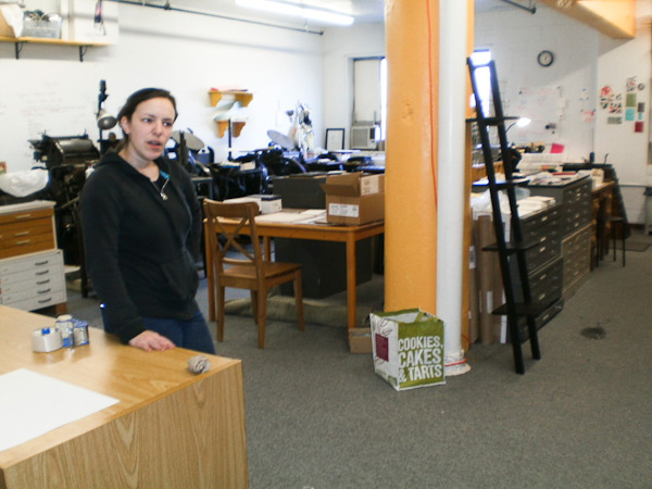
She has a large, open studio with plenty of natural light for printing and finishing.

I admired her Vandercook where her printer Matt was working and her Heidelberg windmill, not to mention seeing a pilot, a cutter and some tabletops.  On occasion, Shelley will teach a class to spread the love of letterpress, but not as often now that she has a pre-school daughter.  Shelley is busy!

A bus and another warehouse later, I was able to a have nice visit and tour with Deb Bastien and Kate Saliba of Smudge Ink.   They are in Charlestown, Massachusetts along the waterfront.  What amazed me was the quantity and variety of presses our customers have.  I lost count of presses at Smudge after five. Smudge Ink actually has a long history tied with Boxcar Press and we feel like we’ve grown in this business with them. 

They have a nice blend of letterpress with offset and everything was printed in gorgeous, vibrant colors (you should see their shelves!).  Everyone was hard at work while I was there and yes, I took note of their polymer plate recycling box.

While my visits were brief, it was special to see these talented ladies and where they find their creative energy. I was impressed above all at how they have built their businesses and thrive. And I especially appreciated their warm welcomes on short notice.  Our Boxcar doors are always open should you ever want to reciprocate and drop in here!

Boxcar Talk With Travis Friedrich

The man behind the up and coming Parklife Press, Travis Friedrich, lets us in on the things he can’t do without, his insatiable love for letterpress, the curious journey of his beloved C & P, and his vintage paper cutter.

Friedrich carved out a few minutes to tell us about the things that keep his rollers inked.

Travis Friedrich

(photo credit: Annemie Tonken)

EAST OR WEST, LETTERPRESS IS BEST I grew up in Oregon but have lived in North Carolina for most of my post high school life. I’m 31 now. Although my college degree is in engineering, I’ve always loved print and design. I enjoy making grilled cheese sandwiches, watching tennis, playing ping pong, drinking fancy cocktails, and printing with headphones on.

Travis Friedrich

(photo credit: Annemie Tonken)

INK IN THE BLOOD I’ve enjoyed printmaking since I was about 13 years old — although it was mostly linoleum cuts and a little bit of lithography early on. It wasn’t until about 2005 that I learned about letterpress. At the time, I was living in Portland, Oregon and working at my first post-college job as a mechanical engineer, but I wasn’t wild about what I was doing. I came across a letterpress shop not too far from my apartment, and I thought how cool it would be to be doing something like that rather than sitting in front of a computer all day. By the end of that year, I was very seriously considering trying to find a way to make printing my career.

Vintage Challenger CutterSTUDIO WITH SOUTHERN CHARM  Parklife Press exists in a cozy studio at my home. It houses a C&P 10×15, a C&P 12×18, and a 123 year old Challenge paper cutter. My favorite thing about the studio is probably the lax dress code.

PRINTING LEGACIES
Aside from two days of a community college letterpress class (I couldn’t stick with the 2 hour commute required to stay in the class), all of my letterpress education has been “virtual.”  The Briar Press discussion boards, the Letpress list-serve, and Boxcar training videos have been invaluable.

DAILY GRIND  Most of the design work I do is for wedding clients. I start by asking for as much info about design preferences and inspiration as the client can give, then I put a few initial first drafts together for the client to look at. At that point, the client inevitably loves my least favorite draft, and we go from there, tweaking and refining. It’s amazing though how often I end up loving the final design and am glad that I was pushed away from my initial preferences.

FULL TIME FUN I’m definitely both a designer and a printer. I split my time pretty evenly between the two. I’ve been doing it full time since shortly after I started in 2005, and I’m certainly amazed that I’m able to do this full time. The cubicle job that I had after college was not that awesome. During that time I remember mentioning that I’d love to have a print studio at some point in my life. But I definitely didn’t think it would happen so soon, and I didn’t think it would be a career.

BOXCAR’S ROLE The speed and ease with which I can order and receive a plate is huge. As for the plates themselves, my tiny studio appreciates that Boxcar’s plates take up so little physical space and I love how easy it is to trim, alter, and reposition them. It’s much more flexible than other plate systems.

PRESS HISTORY My first press was a Kelsey 5×8 tabletop, which quickly frustrated me. After just a few months I upgraded to the press I still use — a C&P 10×15 Old Style. I was in the bay area at the time, and came across a guy who had been storing an old press in his warehouse for years, and I bought it from him—despite the fact that I knew I would be moving across the country three months later. Transporting the press to NC from California was not easy, but it was totally worth it—I love that press.

SHOP TIPS Occasionally, take on a job that you’re not sure you can pull off.

WHAT’S NEXT The new Parklife Press website just went online in early February and folks really seem to be liking it. I designed and printed a bunch of brand new invitation designs and re-photographed everything. I also added a bunch of new business content.

Big thanks to Travis Friedrich for letting us shine a spotlight on his creative letterpress talents at Parklife Press!

Did You Know That … Checking Line and Dot Thicknesses Is a Cinch?

One of the most common issues we face here in the Platemaking Department at Boxcar Press is determining a sufficient line thickness. Making that ruling means explaining to customers two things – how do you go about checking to see if lines or text are thick enough to hold on your particular plate? What’s the thinnest line that can hold on the plate?

Surprisingly, there’s just one tool you need to utilize in either Adobe Illustrator or InDesign: The Line Tool. If you are using Adobe Photoshop, the Line Tool unfortunately reverts to a minimum line thickness of 1pt. If you are only using Adobe Photoshop to create your file, we highly recommend placing your final file in InDesign and using the Line Tool to check your work.

LINETHICKNESS_IMG1-1

What do we mean when we talk about our line thickness guarantee? Simply put, if your lines meet or exceed the line thickness as outlined below, we will guarantee they will hold on your plate. If they are under that thickness, it’s hit or miss. Some days you are lucky and other days, you might lose details.

The first thing you need to determine is your line thickness based on your plate type:

– If your plate type is the KF 95, Jet 94FL, or 94SB, you have a line thickness guarantee of 0.25pt or thicker.

– If your plate type is the KF152, 152SB, or 145SHSB, you have a line thickness guarantee of 0.35pt or thicker.

– For all plate types, your dots (like the ones above the letter “i”, periods, or dotted lines) must be 1pt to 1.25 pt or thicker.

THINK FAST! Quick quiz here – what is usually the most common culprit of too thin lines? Crop Marks! More on that later.

Here’s how to use the handy Line Tool to check to see if your lines are thick enough (and plate friendly, too):

You need to first open your file in either Adobe Illustrator or InDesign. We’ll be using a small type sample in Adobe Illustrator to check to see if our lines are plate-friendly for a KF152 plate type. The KF152 plate type has a line thickness minimum of 0.35pt for lines and 1pt to 1.25 pt for dots. We can see that it looks like there are some thin lines in the serif of the Didot typeface… but will they hold?

First, click the Line Tool icon in the tool palette on the lefthand side of the screen in Adobe Illustrator to activate it. If you cannot find it, hover your mouse over the icon that looks like a line to see “Line Segment Tool ()” pop up in a yellow box .

Next, in the control panel up at the top, we’ll select the words “1 pt.” in the dropdown area next to the word “STROKE” with our mouse. You’ll be substituting the “1 pt” and replace it with “0.35pt”.

letterpress file prep tips from Boxcar Press

We’ll select the Zoom tool (Z) and move in because we’ll be doing some close up viewing in the area you are inspecting. Select the line segment with your mouse and move it so it is right next to the bottom part of the “L” in “Letter”. Draw a short line so it is parallel with the thin line you are checking on your art board. It doesn’t have to be very long but this little line segment will be our “ruler” to compare thicknesses.

letterpress file prep tips from Boxcar Press

At this close magnification, we see that our line segment set at 0.35pt is much thicker in comparison to the thinnest line in of the serif on the letter “L”. We will need to add a hairline stroke to boost our text’s thickness to correct this.

letterpress file prep tips from Boxcar Press

To add a stroke, using the selection black arrow tool (V), select all the characters in the word “LETTER.” In our Control panel at the top our screen we should see that the letters only have a fill and that we’d like to add a hairline stroke (about 0.15pt). Click the white area next to “STROKE” to activate the area so we can type in “0.15pt”. Immediately single-click the white area anywhere on the board. This will deactivate your selected text and add the hairline (0.15pt) stroke.

letterpress file prep tips from Boxcar Press

Zoom in again using the Zoom Tool around the line segment we created with the Line Tool and the letter “L”. We can now visually see that the serif on the “L” is as thick as the 0.35pt line. Success!

Delete your line segment and zoom back out. Continue around your artboard to visually check to see if other areas look “safe” as well.

For dots, such as the ones around the heart shape, we’ll need to set our Line Tool weight to “1pt” just to be on the safe side. We’ll repeat the same steps mentioned above to create the line, to zoom in, and visually compare the dots’ diameter against the 1pt line segment we just drew on our art board. Like the thinner lines on the “L”, we’ll need to correct this by adding a much thicker stroke of 0.3 pt to boost our dots’ diameter up to 1pt.

Using the Line Tool to check your work should be a “Must Do” test before submitting your files to your platemaking ticket. If anything appears too thin, you will need to correct it.

A few final instructions to help you be aware of potential trouble spots:

-When creating crop marks in your files – the program default setting is often 0.2 pt or 0.25 pt. Keep this in mind so you can make the necessary changes to your crop mark thickness when you place them.

-Thin lines that curve, particularly in wispy script or calligraphic fonts, are always suspect for being too thin. Give them the support they need to hold on the plate with hairline stroke (if needed).

Stay tuned, letterpress lovers — next we’ll solve the mystery of how to create multiple color files!

Related Blog Posts

Learn to Love Color Separations – A Boxcar Press Checklist
Did You Know That … 100% CMYK Black Is a Breeze?

Boxcar Talk With Ivan Gulkov

Printer and designer Ivan Gulkov first molded his passion for print in the colder climates of Siberia, Russia before turning out clean, modern collections at Pillowface Press that pay homage to the printing roots in the sunny state of California. Now, Gulkov balances the cool with the fun, with a nod to the old while creating the new. And he does it in spades.

Read on to get the full scoop.

Ivan Gulkov of Pillowface Press shares the full scoop on his background and printshop

SMOTHERED IN INK My name is Ivan Gulkov. I hail originally from the frozen wastes of Siberia, though currently reside in sunny California. PILLOWFACE PRESS is a small printmaking studio I set up to experiment with handset typography and photopolymer. Until recently, ours was one of the most traditional and conservative trades. For five hundred years, the tools and techniques of assembling type have not changed. Fonts were discreet, tangible things, you experienced on a physical level. In every letter, every space and ruler, there was a trace of the creators hand. Computers changed everything.

Continue reading

A Facelift For Brittle Photopolymer Plates

Are your polymer plates starting to curl at the edges?

Like our skin, plates can be affected by the weather and age. When humidity levels are low, the plates can look and feel brittle. And with the passage of time, the thinner polymer on the edges of the plates are pulled towards the denser polymer text and images on the front which causes curling. There is a natural aging of the plates as they do have a limited life expectancy but we can offer a few simple steps that can hydrate and give extra life to your plates.

Printight, maker of Toyobo plates KF95 and KF152, offers these suggestions if you have a platemaking system. Boxcar also gives similar steps for the majority of you who are without such equipment.

1. Place your plate back in the washout system for one minute or immerse in water. We suggest room temperature for a quick dunking, a minute may only be necessary if your plates are severely curled.

2. Sponge off the water and place back in the drying oven of the platemaker for 5-10 minutes. We also suggest, alternatively, a hair dryer to warm the plate and make it more pliable (placing your plate in a box and blowing the hair dryer into the box will keep the warm air more contained).

3. After the plate warms and starts to uncurl, place the plate in its bag and set a heavy object on it to keep the shape.

This should help your plates relax so you can adhere them to your base for additional print runs. Some warnings for you – take care to avoid putting your hair dryer too close to the plates and be patient as warming the plates takes time. And watch that you don’t handle them too roughly after the wash and during drying so your relief images don’t chip.

Store your plates flat. One last tip, you may have to check your adhesive backing to determine if it needs to be re-applied to the back of your plate for a secure hold on your base.

If you have some storage and uncurling tips, tell us about them so we can share. It’s great when we can all learn from each other!

Learn to Love Color Separations – A Boxcar Press Checklist

To guarantee a happy, press-ready Boxcar plate, follow our Top 10 checklist before finalizing and clicking UPLOAD to your job ticket. These handy steps will go a long way towards a smooth, quick platemaking turnaround. If you are having files created for you – pass these on to your graphic designer so they too can follow this Boxcar Checklist.

1 ) Are the file dimensions 17″ x 22″ or smaller? Is the file size less than 26 MB? (Our maximum plate size that we can proof at this time is 17″ x 22″ – if you need larger, please call.)

2 ) If my plate type is the KF95, Jet 94FL or 94SB, are my lines 0.25 pt or thicker? Are my dots 1 to 1.25pt thick? Dots (in a dotted line or by themselves) need a greater minimum thickness so they can hold on the plate by themselves.

3 ) If my plate type is KF152, 152SB, 145HSB, or 148SHSB, are my lines 0.35 pt or thicker? Are my dots 1.25pt thick?

4 ) If I created the art in Illustrator or InDesign, is the artwork in 100% CMYK Black (as in 0% Cyan, 0% Magenta, 0% Yellow, and 100% Black)?

5 ) If I’m doing color separations, are they assigned to a spot color or a Pantone Swatch Color?

6 ) Is my text outlined into vector shapes if I’m using InDesign or Illustrator for the text? (You can convert them to shapes by selecting the text and going to Type>Create Outlines in either Illustrator or InDesign.)

7 ) Have I indicated what linescreen (LPI) I’d like in the comments section of my ticket if my image is in greyscale or halftone and I want to keep the tonal qualities of the image? (We like 100 lpi for all plate types)

8 ) Is my image converted into bitmap mode of tif if I’m using only Photoshop (and not choosing a linescreen) ?

How to easily create an image in bitmap mode of tif:

    • Opening your image in Photoshop and selecting Image > Mode > Grayscale*.
    • Select Yes if a window asks about discarding color.
    • Then Select Image > Mode > Bitmap. A window will pop up looking for info – use a resolution of 600-1200 dpi and an output method of 50% threshold.
    • Save your file as a tif (with LZW Compression) and either send us the tif or place your tif into illustrator or indesign.
    *Images in higher resolution (600-1200 dpi) will give better, finer results than images in lower resolutions (72-300 dpi). If your images lose a lot of detail, you can either re-scan or adjust your levels of black (Image> Adjustments> Levels or Brightness Contrast). For info on this, please call 315-579-3366 for instructions.

9 ) If I have added crop marks to my file, do they meet the minimum line thicknesses? Are they in registration black if I have more than one color?

10 ) We don’t need a faxed hard copy of the file, simply a PDF and the original file. Are these both uploaded? (e.g, an .EPS and PDF of the same file.)

Stay tuned for more in-depth blogging on file prep when we amaze you with “Did You Know That…”!

Lou is mixing ink

See the fists of fury fly as he speedily mixes red, yellow & black inks into a smooth, delicious burgundy for a thank you card.
mixing custom ink for letterpress printing