Inquisitive Printers Want to Know: Extra Things That Caught Our Eye

This month’s installment of the Inquisitive Printers Want to Know showcases an enjoyable animated video short “Typesetter Blues” and today’s Mars-bound InSight probe. Read on to learn more!

From Cathy: How can you not love a title like Typesetter Blues?  Enjoy this short animated video about the fickleness of love in a print shop (Fun Fact: the printer in the video is named “Harold”).

Typesetter-blues-letterpress-printing - inquisitive(photography courtesy of TOGETHER/Pahzit Cahlon)

From Rebecca:  Seven months ago, NASA sent up the Mars-bound InSight probe. Today, the probe is schedule to land on the surface of Mars. The cool little probe has the job of collecting data of Mars’ surface and drilling a hole 5 meters (16.4 feet) down.

Mars_insight_probe-NASA(photography credit: NASA/JPL-Caltech)

The data will be able to help scientists understand the creation of Mars and its geological landscape evolution.

2018 Seattle Children’s Hospital Broadsides: Part 2

Part two in this year’s Broadside blog series highlights more of the beautiful art prints from the printers and writers who came together in the 2018 Seattle Children’s Hospital Broadsides project. The Writers in the Schools program (WITS – a poetry program created by Sierra Nelson and Ann Teplick), the School of Visual Concepts, and long-term patients at Seattle Children’s Hospital all joined creative forces to produce original stories that come to life in beautifully crafts printed works. Sarah Kulfan reflects on this year’s printing experience of adding in fun & color to their special young writer’s words.

“I am always blown away by the talent and commitment of our young poets and this group of printers. Many have been involved with this project every year. Its an honor to be a part of this amazing collaboration. I am grateful for the support of business partners like Boxcar Press who help fuel this creative endeavor from the beginning.”
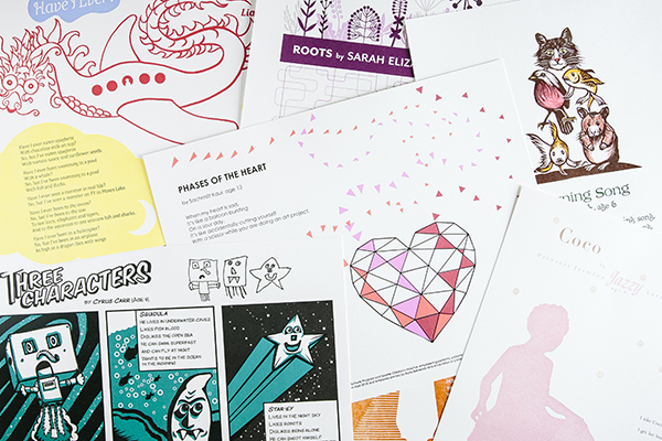
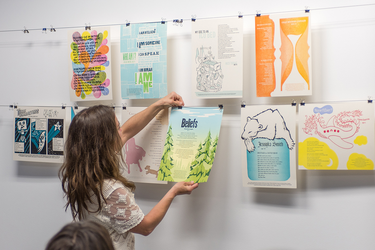
2018 Childrens Broadsides -IMG12018 Childrens Broadsides

Sarah Kulfan

There are a couple of lines from the poem by Amanda Longees, Age 11, titled Beliefs, that inspire the forest and tree theme illustrations. My goal was to create a broadside that was bright and optimistic. In the first print pass, I created a split fountain gradient that represents the rising morning sun. With a design perspective of looking out across the treetops, there is a sense of spiritual uplifting. Which also reflects the title of the poem. 

With the tree element design, it was only natural to include a wood type for the title. I worked with Boxcar Press to create plates for the poem and colophon.

Sarah Kulfan Boxcar Press 2018 Seattle Children's Broadsides

The reduction cut process includes a total of 4 colors. Each color is a successive layer that is carved from the same block.
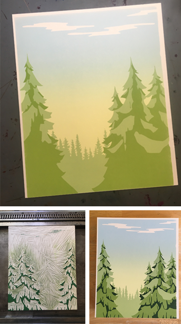
Sarah Kulfan Boxcar Press 2018 Seattle Children's Broadsides

The colors typically go from light to dark. This year’s challenge for myself was to print a full bleed and a gradient on a portrait style broadside. Which includes several rounds of careful trimming, and maxing out my press’ sheet size in order to make that directional gradient work.

Sarah Kulfan Boxcar Press 2018 Seattle Children's Broadsides

The talent and commitment of our young poets and group of printers are impressive. It is an honor to be a part of this amazing collaboration effort. I am grateful for the support of business partners like Boxcar Press – who help fuel this creative endeavor from the beginning.

Heidi Hespelt

This year’s broadside design illustrates a poem written by Ella Joy Won, Age 7, titled The Secret Place. Ella is a “sparkly girl,” and the design reflects this through the incorporation of bright colors and metallic inks. The printing of the poem starts with text which uses polymer plates from Boxcar Press. Next, is the artwork. This piece, in particular, there were 7 passes through the press. The press used a large reduction linoleum block that carves away sections of the block between each color pass.

Heidi Hespelt 2018 Seattle Children's Broadsides Boxcar Press

Printing silver over a blue background for the first cut on reduction block. Carving away the things that I want to stay medium blue and then next is the teal layer…
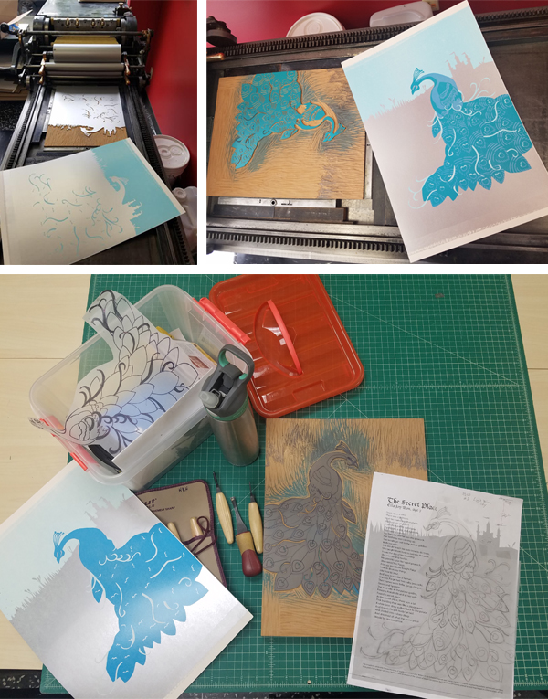
Heidi Hespelt 2018 Seattle Children's Broadsides Boxcar Press

Next, printing the gold pass. Followed by mixing ink for the purple coloring for its pass. Finally, I will print the text and trim the paper.

Heidi Hespelt 2018 Seattle Children's Broadsides Boxcar Press

Amy Redmond

As a letterpress instructor at the School of Visual Concepts, it’s a real joy to see students evolve from fledgling ink slingers into skilled printers, and this Broadside project represents a milestone in that journey. There are many new names on this project’s list of printers this year, but by no means are they new to the press. This year the stars finally aligned for them to join this kind-hearted & generous group, raising the bar of talent even higher than before.

Amy Redmond letterpress Seattle Children's Broadsides project.(Above: Photo courtesy of “Carrie Radford / Radford Creative”)

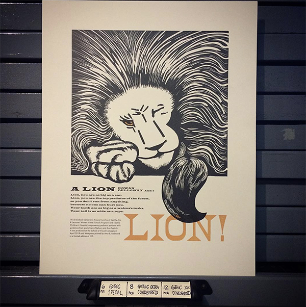
When first reading, A Lion by Rowan Delloway, Age 6, I was struck by how much power just a few words carry. Looking beyond the face value of his admiration of a lion, I interpret the lines “so you don’t run from anything / because no one can hurt you” as representing Rowan’s own fierce determination and strength. This concept was my guide through the design process to include bold elements and a careful use of color.

Amy Redmond letterpress Seattle Children's Broadsides project.(All other photography courtesy of Amy Redmond.)

It would be easy to show the lion’s power through a literal translation of Rowan’s words. However, after making some quick thumbnail sketches, I chose to illustrate it through a display of calm confidence.

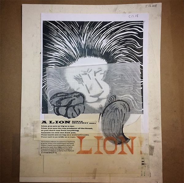
The lion may be at rest — claws in, tail curled around its body — but its one watchful eye says, “Think twice before you make your move.” I imagine it protecting Rowan, watching over him… ready to pounce and unleash that power upon any threat to his well-being. The first rough layout sketch was effortless. In contrast to how my process usually goes. When looking back at my choice to sketch on top of make-ready tells me I really didn’t expect that to happen.

Amy Redmond letterpress Seattle Children's Broadsides project.

I wasn’t sure if I would be able to capture that energy if I redrew it again. Instead, I used a thick charcoal pencil to rework the sketch on top of the original. When I removed the tape that was masking my margins and lifted the page from the table, I got a kick out of seeing my make-ready for Zack Edge’s poem (from the 2016 portfolio).

Amy Redmond letterpress Seattle Children's Broadsides project.

Moving on to typesetting, first I started with the easiest part: LION! Big and bold, the size alone limited my choices. Next, I selected a Latin wood type that when aligned to the right margin of my sketch. This left just enough room for the body text and colophon. Also, it also gave me the excuse to use the Latin Wide metal type in my collection. Typically, this is not a face I would normally choose for body text. Due to the short nature of the poem made it feels safe enough to try. I’m delighted that it worked!

Amy Redmond letterpress Seattle Children's Broadsides project.

By this point, my typesetting was complete for the day even though the colophon wasn’t done. This is my 8th year contributing to the broadside project. And my first year contributing by carving an image from linoleum. For those who are familiar with linoleum, it cuts the smoothest when warmed by the sun. Lucky for me, Seattle was having an unusually warm sunny spell in May. Time to move outside.

I usually shy away from carving. However, I had a strong vision of a bold and graphic piece, that I went for it. For the first time in over 20 years, I invested in a new set of carving tools. I also made sure to purchase extra blocks, just in case of a few errors. Careful viewers can see, right out of the gate, I forgot to reverse my image before carving.

Amy Redmond letterpress Seattle Children's Broadsides project.

On the second carving attempt, I decided to slow down and take a proof before moving forward with the paws and tail. The placement needed to be just right in order for the type to work. Refreshed by a new day, I also finished typesetting the colophon and proofed that as well. Out came the scissors and tape and Sharpies.
Amy Redmond letterpress Seattle Children's Broadsides project.

Paw and tail position decided, the remainder of the lion carving went well with only a few minor slip-ups. The sun was having a positive effect on my outlook, and I decided I could live with a few wayward marks. I moved back into the studio, locked it up, and printed the first run on my Colt’s Armory platen press.

Amy Redmond letterpress Seattle Children's Broadsides project.

With the lion in place, I now had a map from which I could now measure all future passes. I locked up the first form, gave the type a good scrub, and ran the second pass. (Shiny clean type is so satisfying.)

Amy Redmond letterpress Seattle Children's Broadsides project.

In a fit of stubborn efficiency, I decided to print the lion’s eye color with the last line of the poem (“LION!”), in one final pass of orange ink. To guarantee perfect alignment, I mounted a small rectangle of uncarved linoleum to a piece of furniture, made it type high, and composed it with the wood type.

Amy Redmond letterpress Seattle Children's Broadsides project.

Taking measurements of the lockup from the text printed in black, I was able to lock up this new form in the exact location in needed to be. Without changing my page guides on the tympan, I then pulled a blind proof on a still-wet print from the second pass to confirm that the text aligned as I wanted. The black eye of the lion offset onto the uncarved linoleum, revealing exactly where I needed to carve. I added a little trapping as a safety measure, in case some of my earlier prints had shifted alignment in the run.

Amy Redmond letterpress Seattle Children's Broadsides project.

This small series of careful acrobatics worked well, and I’m pleased with the final print. I hope others see in its design what I see in Rowan’s words. “That underneath his joyful and seemingly wild exuberance lies a trained force of powerful inner strength.”
Amy Redmond letterpress Seattle Children's Broadsides project.


Come check out Part 1 of this year’s Children’s Broadsides project!  We would like to thank all of our young writers, organizers, printers, and families who help make the 2018 Broadsides project memorable and powerful.

File Prep Tip: Pricing Previews for TIF files

Today’s tip is for designers and printers who set up and create their files in Photoshop for platemaking orders.

Our online ordering system can calculate your square inches and pricing for files that are .pdf, .ai, and .eps.  This is so helpful for seeing your costs while creating your ticket.  However, the online system doesn’t do that for .tif files.

We love .tif files from Photoshop, but saving to a PDF in Photoshop can change your black and white file to a rasterized RGB (oh, the horror!).   With the .tif, you see a big fat $0 for cost and that can make some nervous.

Here is a quick suggestion to handle that situation.  Save your .tif with one of the below methods with the words – for pricing only – in the file name and upload it to your job ticket with your tif.  We’ll get a working tif file and you’ll get your price.

Pricing TIFF file letterpress plates for Boxcar Press.

Best ways to do this:

From Photoshop:

Select FILE > SAVE AS > PHOTOSHOP EPS (under Format drop down).

Using Adobe Acrobat Pro:

Select FILE > OPEN. When the window opens, at the bottom the default is Show > Adobe PDF Files. Change to All Files to find your tif.  Choose Open.  Now select FILE > SAVE AS > the Save as PDF window will open > save with pricing only file name.

If you have other programs for saving as a PDF that you’d like to use, contact us and we can help you, if needed.

Boxcar Press Open Studio 2018

If the action and rhythmic noise of heavy metal does it for you, the Boxcar Press Open Studio is a great place to be.  Cast iron letterpress machines that thump, clang and ker-chunk will be on display for free tours on Saturday, November 10th from 10 AM – 4 PM.  This family-friendly event has printing demonstrations, crafts, a giveaway, workshop, and paper sales of Smock Paper products.

Boxcar Press celebrates their 20th anniversary this year and welcomes all to step up close to view our presses that weigh over 2,000 plus pounds.  We print on all cotton paper to make beautiful invitations.  Print shop tours on this day will let you see this in action.

In honor of Veterans day, we will be offering free thank you cards to send to veterans.  For Veterans attending, they will receive a complimentary coaster.  If you are shopping our Smock paper products sale of beautiful boxes, wrapping paper and notebooks, bring a re-usable shopping bag to receive 10% off.

Letterpress is alive and well and happens daily at Boxcar Press, with big spinning wheels and rotating windmill arms.  Visit to enjoy the sights and sounds of our print shop.

Open Studio Boxcar Press 2018 - IMG1

Open Studio Boxcar Press 2018 - IMG2

Let’s See That Printed: Mindy Belloff of Intima Press’s ‘Minotaur’

We keep tabs on the many wonderful and intriguing designs that come through doors here for our custom-made photopolymer platemaking services. One that we’ve been following for quite some time is Mindy Belloff (of Intima Press)’s highly detailed illustration and creative typesetting designs in her latest fine edition book project.

As a book artist, letterpress printer, and educator, I have been a loyal fan of Boxcar Press, having ordered plates since the beginning of Harold’s enterprises. The staff have always been helpful, especially when polymer platemaking and digital spec instructions were still in their infancy.

During this time, I have sent to Boxcar a wide variety of digital designs of artwork, student work, and job work. A few years ago, as a new livre d’artiste was in the works, they took notice of the beginning of the work. As I firmed up designs and sent a flurry of large plate orders, I was asked about the scope of this project as it had piqued their interest. I was happy to share the text, but could not stop production and take time to send images of the various pages, as I was working so intensely, designing by night and printing all day. I had close to 2,000 sheets in my studio in various stages of printing for over a year and a half.

Recently, I was asked by Boxcar to reveal more about the fine edition book I have just released, after two intense years of work, which follows.

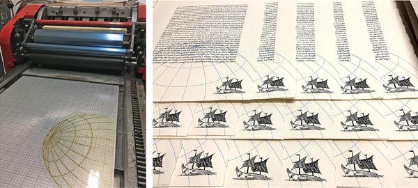
The book is titled, “A Golden Thread.” It is 92-pages, in a format of folios, featuring the text of “The Minotaur,” a short story by Nathaniel Hawthorne (1853). It is composed of 100 original drawings, some with hand painting, and 200 press runs, in an edition of 40, printed on cotton rag papers with a sheet size of approximately 15 x 21 inches. It is a contemporary twist on the medieval illumination, letterpress printed on a Vandercook Uni III automatic press.

The story begins in blue and gold ink, with our hero Theseus, as a young boy. As the story unfolds, Theseus grows to be a young man and journeys to Athens to find his father, King Aegus.

Theseus has an unpleasant encounter with the wicked Medea before he finds and is embraced by his father. He soon learns of the fate of seven young men and seven maidens, to be chosen as a sacrifice to the Minotaur, a beast housed in the labyrinth of Crete.  Theseus volunteers to sail to Crete with the youths. (By now, you may recall the details of this tragic myth.)

When the ship arrives in Crete, the evil King Minos throws them in the dungeon, to await their fate. Enter the heroine, Ariadne, who secretly releases Theseus and leads him to the entrance of a maze.

The middle section of the book, as Theseus makes his way through the labyrinth to find the Minotaur, is designed with typography that blankets the page. The plates for this section were, of course, quite large, and many pages were printed on one side of the sheet, and then turned (plates and paper), to accommodate the sheet size. Most pages have 5 to 6 press runs each.

In the third and final section of the book, Theseus emerges victorious, having slain the bull-headed Minotaur monster. Our heroine awaits, still holding the golden thread at the entrance to the maze. Theseus and the other 13 youths sail back to Athens, where they encounter more obstacles and tragedy, as expected in a classic Greek myth.

On the final page of the story, our hero becomes King. Below is an image of the page showing two of the four-color press runs, which includes ornamented initials, and border drawings.

The book is hand sewn and beautifully bound with a blue leather spine and gold gilding.

Mindy received a fine press book discount for her entire project for the plates Boxcar Press created.  We appreciate her giving us a sense of her book “A Golden Thread” with words and photos.  Mindy Belloff produces fine letterpress printed book and broadside editions at her Union Square studio under the imprint Intima Press. Her artist’s books have been included in many publications and she received an award for Excellence in Book Design.

You can visit Mindy’s website for more on the Minotaur edition at Intimapress.com.

CBAA: Broadening Book Arts Opportunities

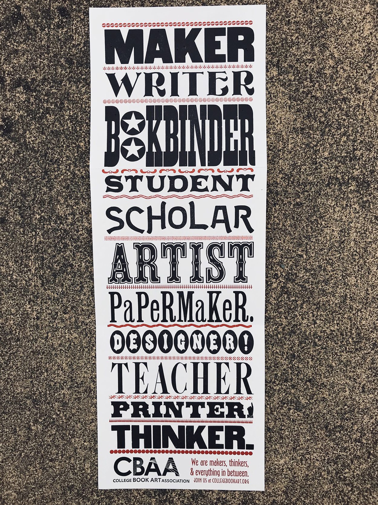
Boxcar Press is a proud supporter of letterpress printed short-run books.  We offer a 10% discount for fine press work and encourage all printers to explore projects like this.   Many printers are first introduced to book printing through their academic experience at college.  It is very likely their instructors were members of the College Book Art Association (CBAA).  Bridget Elmer, President of the CBAA,  provides an overview of this organization and the numerous options to members and those interested in the printed fine press book.     

A relatively new art form, artists’ books constantly defy a clearcut definition, as do their makers. While some books incorporate letterpress printing for text and image, others might incorporate screen printing, hand lettering, digital printing, or no printing at all. Similarly, their bindings may be in a traditional codex format, a series of broadsides, or a one-of-a-kind altered book. Teaching students both the history and methods of making artists’ books is a unique and evolving challenge.

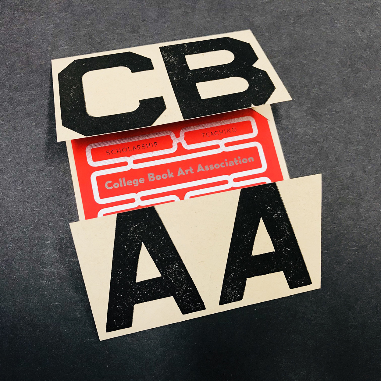
The College Book Art Association (CBAA) is a non-profit organization committed to the teaching of book art. The association strives to support education about book art, including both the practice and analysis of the medium. It welcomes as members everyone involved in teaching and all others who have similar goals and interests. In addition to the educational community of teachers and students, CBAA’s over 400 members include academic librarians, curators, independent scholars, museum professionals, international private collectors, and practicing artists.

CBAA membership has many benefits, including project assistance and travel grants that are awarded to artists, teachers, and scholars, as well as scholarships for students and recent alumni that are co-sponsored by a growing list of partners including Arrowmont School of Arts and Crafts, Mills College, the Morgan Conservatory, Wells College, and Women’s Studio Workshop. CBAA fosters book art visibility and community engagement by organizing member exhibitions and regional events. CBAA also cultivates the expansion of book art criticism by publishing the scholarly journal, Openings: Studies in Book Art, and facilitates dialogue on the Book Art Theory blog. Finally, members have the chance to convene in person every year by attending CBAA’s annual meetings and conferences.

In 2019, CBAA will hold their biennial meeting in Tucson, Arizona from January 4–5 at the University of Arizona. Themed The Photographic Artist’s Book, this meeting is an interdisciplinary landmark for CBAA—keynote speaker Christina de Middel will discuss the ways her work blends documentary and conceptual photographic practices, and discussion sessions will explore topics including Printing Photographic Images Using Letterpress. Participants will tour the UA Book Art and Letterpress Lab and a multi-venue exhibition of photo-based artists’ books will be on display at the Joseph Gross Gallery in the UA School of Art and at the internationally known University of Arizona Poetry Center. Registration opens soon for this exciting opportunity to learn more about CBAA and the history and contemporary practice of photo-based artists’ books.

CBAA’s 2020 biennial conference will be held in New Orleans, Louisiana from January 2–5 and hosted by a dynamic collaborative of academic institutions and community-based organizations, including Tulane University, Loyola University, Baskerville, and Paper Machine, among others. With a theme of Intersections, the conference program will aim to expand the discussion of book arts and foster an inclusive field that embraces both academic and independent educational programs, welcoming ideas that come from all races, classes, genders, and levels of education.

Allison Chapman and Why She Loves Letterpress – Printing Passed On

Letterpress leaves a lasting impression on a young printer who now loves to kindle this spark in others. Allison Chapman, of Ohio-based Igloo Letterpress, shares with us how a family tradition lives on in her press shop and how she came to love letterpress.

I was lucky enough to learn about letterpress printing from my grandad, Mark Gibson.  He became a hobby printer in the 1960s after finding a Johnson Peerless platen press in a neighbor’s barn.  He restored the press, joined the Amalgamated Printer’s Association and was hooked.  As his “assistant” growing up, I loved to help with whatever projects he was working on.  I soon had a small toy press that I could use while he was printing.  As a kid, I loved letterpress because of the sound of the press running, the smell of ink and paper and the pleasure of repetitive tasks.

As soon as I got to college I realized how special the time in his print shop had been.  I took every printmaking class and started making up independent projects so that would allow me continued access to the print studio.  I successfully schemed and created a study away experience that focused on letterpress history.  I began an internship under Elizabeth Harris and Stan Nelson at the Smithsonian Institution’s National Museum of American History.  At the time there was an amazing demonstration area in the museum where I learned how to knock up ink balls, change the frisket on the common press and fold newspaper hats.

That internship cemented my love of letterpress and of making.  I wanted to read and write about the history of printing, but I also wanted to increase my skills.  I began working at Minnesota Center for Book Arts and learned how contemporary artists were using letterpress and bookbinding.  The 11 years I spent working at MCBA heightened my appreciation for the finer points of the craft.  I became a better printer and bookbinder through the instruction I received and the projects I completed in my home printshop.

A surprise move from Minnesota to Ohio forced me to move the presses out of the house and into a storefront.  This became an accidentally wonderful way to build a community for myself in my new town.  I quickly found an active design community that welcomed Igloo as a print resource.  To build the business I ramped up custom work for local customers and launched a wholesale line at the National Stationery Show.  As production increased I brought in extra hands through talented interns and contractors.  Eventually, I gathered a talented crew of artists and makers to join Igloo’s staff.  Through our work as letterpress printers and bookbinders, we encourage a love of making and an appreciation for fine craft.  Visitors are welcomed to see the presses in action as they shop in our store and are encouraged to stop & make a journal at our book bar or sign up for a class to create their own project.

After 22 years of collecting and teaching, I still love letterpress and find joy in making something new every day.

Smitten for letterpress? We’d love to hear from you! Share your story in the comments below!

Rob LoMascolo: The Call of Letterpress

We enjoy hearing from wonderful members of the letterpress community on how the printing tradition has inspired them to their true calling. Aurora, NY-based Rob LoMascolo of The Press of Rob LoMascolo shares with us on why he is smitten with the printing tradition.

Why do I love letterpress? Letterpress appeals to me on many levels, but I think it is the tactility of it that appeals foremost to many of us. You can feel and see the difference. When looking at crisply printed type with just a slight bite into the paper one gets the sense that each and every letter is a physical thing, not a digital recreation of a thing, but every letter is a real actual thing that is very much part of that printed sheet.

My mom likes to tell people that in first grade we kiddos were all asked what we wanted to do when we grew up. Most of my classmates wanted to be athletes, firefighters or follow in their parent’s footsteps, but I wanted to own my own museum!

Yup, visitors always say my shop is like a working museum. Letterpress combines my loves of history, art, design, books, old machines, and above all, it has a realness about it that is lacking from so much of our digital world.

As much as I love letterpress for all those reasons, the reason I do it is simply because I have not found any better way.

Inquisitive Printers Want to Know: More Things That Caught Our Eye

Always scanning the horizons (and our internet browsers) for intriguing and cool things to bookmark, this week’s installment of the Inquisitive Printers Want to Know showcases the Austin Center for the Book’s amazing workshop offerings, horse-riding librarians in the Great Depression era, and two handy websites that help identify that mysterious typefaces & fonts. Read on to learn more!

From Cathy: I have been enjoying a little stroll through the pages of the Austin Book Arts Center website.  The Center has only been around in its official state since 2015 but was a growing idea since the 1980’s through a group of enthusiastic book workers.  They offer an amazing wide variety of workshops every week and I am drawn to the ones for teachers and kids.

Combine women, books, and horses into one bundle and you get the Pack Horse Librarians.  Started in 1934, over 50,000 families in Appalachia were served with books delivered on horseback.  This program was started as part of the New Deal’s WPA and books and magazines were donated.  When they became too worn, they were repaired or turned into scrapbooks and circulated again. Here are two websites with fascinating stories and photographs. In this age of E-books, it is neat to read about a time when books were scarce treasures.

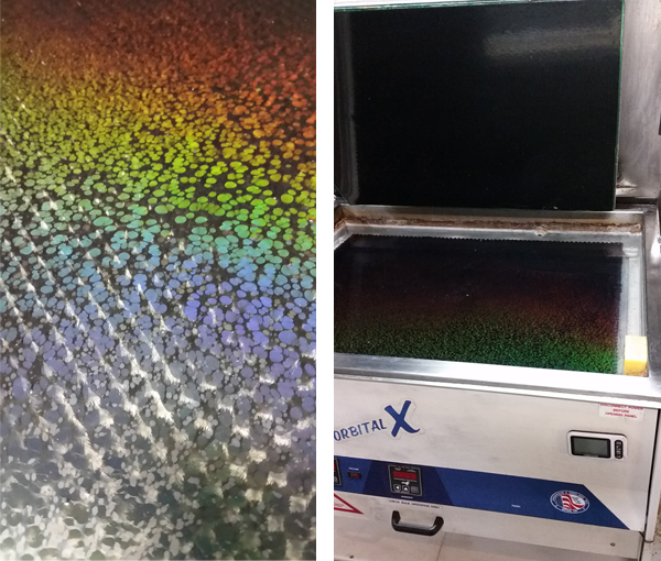
From Jake:  The printshop offers many wonders when wandering through on a daily basis. The photography captured here shows the light spectrum in all its rainbow glory in the wash-out unit in one of our platemakers. 

Jake-inquisitive-printers-platemaker

From Rebecca: Ever come across a design with such a gorgeous typeface or font….but you don’t know what the name of it is? For both computer and mobile,  WhatTheFont is a great starting point to demystifying that font that’s been on your mind for ages. WhatTheFont is a site where you can snap a photo (or upload one if you are working on your computer) and the online program will start identifying what it may be.If you are into a more answer-questions-type-of-mood, a secondary good website is Indentifont.

Have something awesome or cool that you’d like to share with us? Share with us what it is in the comments below!

Inquisitive Printers Want To Know – Even More Eye-catching Things

Keeping sharp eye on the lookout for more cool things & intriguing “must-bookmark-this!” items, this week’s installment of the Inquisitive Printers Want to Know features a Wisconsin-based printer and bookmaker, a new specialized coating that is the “blackest of the blacks”, and a celebration for a book series that inspires one of our printers. Read on to learn more!

Cathy:   I recently found a website with a blog that pleased me.  It is called Letterpress Book Publishing and it belongs to Mike Coughlin of Superior Letterpress of Cornucopia Wisconsin. He calls himself a Printer and Book Maker and his blog reflects on his love of his profession. His posts are comfortable and friendly.  He hasn’t posted since December 2017 so I am hoping some new visitors to his page will prompt him to give us something new to read.

He is at the tip of Wisconsin before it drops into Lake Superior so come “chat” with the rest of us, Mike, and let us know what is on your mind or on your press.

Rebecca Miller: While we do love a good, deep rich printing black (a printer’s bread and butter), we often wonder about Vantablack.

(Photography credit: Surrey Nanosystems)

Hailed as the “blackest of blacks”, this is borderline cartoonish-ly black coating is neither really a pigment nor paint per se. Instead, the specialized coating (made by Surrey Nanosystems) is made up of series of long, extremely tightly packed (and quite microscopically thin) carbon tubes. So dense is this “forest of carbon nanotubes” that any light shined onto it is immediately absorbed (99.96% to be exact). 

The very precise need for those densely packed carbon nano tubes to be laid in a certain way limits how the coating can be applied. Currently in the works is a not-as-dark version in a spray variety aimed at the STEM community (and it will set you back a pretty penny).

Bonus: The “Vanta” in Vantablack stands for “Vertically Aligned Nanotube Array”.

Leanna: Happy Birthday, Harry (July 31st)!  I have been a huge Harry Potter fan since it was introduced to me by my fourth grade teacher. It was subsequently banned from the school a couple months later, so I had to sneak it in my lunchbox to read during break. Over the years since last book and film were released, I took to mainly searching Pinterest for fan art and periodically listening to the audiobooks while I work in the shop (and people wonder why I’m tearing up at the press, it’s cause I’m listening to Snape die for the 100th time!).

(Photography courtesy of monsieurmonsteur.co.uk)

Did you know that 2018 is one of the years in which the book ‘The Cursed Child’ takes place? According to the timeline, Harry’s first year at Hogwarts is 1991. The Battle of Hogwarts is in 1998 making the “19 years later” of the epilogue of ‘The Cursed Child’ to be in 2017. Weird right? Now imagine the movies taking place in the early 90’s instead of the 2000’s!

In honor of Harry’s and J.K. Rowling’s birthday today, here are a few of my favorite Harry Potter things to inspire a bit of “magic” for their next print project! 

Artists to Check Out:

Wonderful Potter-related Articles and Exhibits:

Do you have a cool thing you’d like to share with us or see something that tickles your printing fancy? Email us at info@boxcarpress.com as we’d love to hear from you! We’re always on the look-out for fun + wonderful things!