2019 Seattle Children’s Hospital Broadsides: Part 2

Part two in our blog feature of the 2019 Seattle Children’s Hospital Broadside project features five more very talented printers and young poets as part of the collaboration between Writers in the Schools program, long-term patients at Seattle Children’s Hospital, and the School of Visual Concepts in Seattle, Washington. These five printers share with us how they brought each young writer’s words to life.

Justin Gonyea

I was very excited when I first read AJ’s poem because it would allow me to mix my love of comic books and letterpress. I love that AJ wrote a poem about the Incredible Hulk that a lot of kids and adults alike could relate to. His mom translated it to Chamorro, the language of the indigenous people of the Mariana Islands. I felt honored that I was trusted with creating a print using not only AJ’s words, but also the traditional language of his family.

Hulk is a character who struggles with fear, pain, and anger but also can use strength to do a lot of good as a superhero. Since AJ’s words reference all of these darker feelings, I didn’t want to emphasize the negative with imagery. What was a way that I could compliment AJ’s words and bring a little bit of that lighthearted feeling to a character who is everything but? How about Legos? I had been looking for the right project to experiment with printing Legos, and this seemed like a perfect fit! 

I looked at a lot of inspiration for how to render Hulk using pixel art, and decided to use this as an opportunity to reference something else from my childhood. I used character sprites from the Super Nintendo video game “The Incredible Hulk” (1994) as a reference. Eric Bailey and Anthony Rosbottom were the original artists that worked on this game, and there were so many possibilities for really dynamic poses to draw from for my inspiration. In Photoshop, I created a simplified rendering of one of the sprites using a grid that was 32 pixel wide. I usually try to minimize the amount of time I’m on the computer when I’m working in letterpress, but I ended up designing every aspect of this print in Photoshop and Illustrator.

My broadside had a total of six passes on press. I rebuilt the pixel art using 1×1 Lego pieces, and a base that I made with a piece of wood and two sheets of Lego Baseplate. For the first pass, I started with the brighter green. Once the first color was printed, I slowly removed all of the Lego pieces using an ink knife. I should have gotten a plastic putty knife or some other tool to help remove these pieces as the ink knife really easily slipped and scratched the Lego pieces.

Once all the Legos were removed, I set up the pixel art for the dark green layer. I continued this process for the remaining pixel art colors. As I printed, I used a pica pole to help square off any of the Lego pieces that started moving around a bit. As they moved, it created an interesting energy/vibration that I really love the look of; as long as it didn’t get too out of alignment that is! All of my additional type for the poem, colophon, and byline were printed as my last pass on press using a photopolymer plate.

I didn’t get a chance to talk with AJ about his poem, but I hope that he enjoyed how I chose to represent his words. It’s an honor to be a part of this year’s Seattle Children’s Hospital Broadside project, and it was such a fun project to work on. I can’t wait to print with Legos again! 

Leah Stevenson-Stahly

I always feel honored to participate in the Children’s Hospital Broadside project. This is my fourth year and each time it is such a treat to work with the poems and illustrate something that will hopefully resonate with the poet. 

The poet had drawn a little comic that he used as inspiration for the poem so it only seemed right to keep that idea with the 4 sections of the poem. Rather than have a grid layout that’s common of comics, it seemed more appropriate to have it a little more freeform. The 4 sections of the poem are separated and on the page in a somewhat ordered yet almost haphazard way. Because of this, I added a light grey swoosh in the background to help draw the eye through the lines in the correct order. The final print came out with 6 colors in 6 passes (I had originally planned for a 7th but decided to skip it in the end). 

I used rather non-traditional plates for this project. I have a laser cutter at home and decided to make my plates with it. I used an acrylic sheet (a break from my normal wood) as acrylics tend to warp less. I engraved the design onto the surface and while providing a great surface for inking, printing the background offered a bit of a challenge. It was not quite low or shallow enough and transferred ink so it was a little messy.

I had to do quite a bit of sanding and scraping to keep everything clean. Despite the challenges of printing with my homemade plates, I was pleased with the outcome.

Carol Clifford

My poet this year was Chance Petrone, who wrote What I Do. I was instantly drawn to this poet simply because of his cool name.

My initial idea was to play with the image of a lightning bolt based on Chance’s imagery of his lightning quick speed but felt it was too obvious. It only spoke to one aspect of Chance that he conveys in this poem describing himself. Aside from running at lightning speed, Chance points out that he doesn’t always follow the recipe and that people are drawn to him. These two descriptions led me to the magnet image with the surrounding force field. I liked that the magnet conveyed how dynamic he is and also had a lightning bolt-like shape.

The background blue I had initially planned to pressure print. I don’t know why I say I’m going to pressure print every year, as if it is some easy-peasy technique, because I just can’t seem to make it work the way I want it! While in the 12th hour, after attempting several unsuccessful approaches to pressure printing, I put out a request to the other printers on the project for a spare large piece of linoleum. I received many responses which just shows how supportive this group of printers are. BUT, as I was in the 12th hour, I needed something asap and found a small piece of leftover Marmoleum flooring from our kitchen. I had one chance to make it work.

I transferred the magnet outline and hoped for the best. Carving away this fairly simple shape was a bit more difficult than expected. The abstract pattern of the Marmoleum is the same throughout the layers. Carving into the flooring material was easy enough but once you carve out a spot it doesn’t look any different than the un-carved part. This made it hard to read. The results were fine and similar to what I had hoped from pressure printing.

I didn’t want the angled ground shape to be solid because I thought it would look better textured next to the texture of the blue background. I created a subtle texture with cloth under the draw sheet.

After these first two layers, next came the magnet fill/force field and the text which all went smoothly.

Jenny Wilkson

One of the most evocative stanzas in Audrey’s poem describes her comforting visualization of driving home from the hospital—softly, gently, like clouds drifting away. I seized the image of clouds, and her color of freedom, “real and super shiny gold.” 

When I was sketching the design for this broadside, I was on vacation in New Mexico. There, I saw Georgia O’Keeffe’s paintings of clouds from above. I admired the gradient in the sky, from a saturated blue to almost white. I decided to abstract my clouds into geometric forms and cut the printing plate from plywood on a laser cutter. I printed the sky on my Vandercook SP-15 with a split fountain of blue to opaque white, with the clouds knocked out, in the white of the paper. The gold ink in the title is made up of a two-part gold paste and varnish concoction that is the most “real and super shiny gold” I know how to print. I first printed the title in blue in order to give the gold ink something extra smooth to sit on so it would really sparkle. 

All type was printed from photopolymer plates donated by Boxcar Press. I set everything at an angle, parallel with the clouds, and curved the left margin of the poem in a long graceful swoop to echo the shapes of the clouds and to give the broadside that “freedom feeling.” 

Laura Walczak

This was my 2nd year as a printer for this project. Last year helped set my expectations for how quick the timeline moves and how to portion out my time. I had the best intentions for getting things done early, and ahead of time, but seeing my intended imagery through ended up taking a lot more time than I had hoped for. It was a relief to know what my absolute worst case timeline would be for finishing everything up. Thanks to Boxcar with the rush plates right on time!

Almost immediately after selecting the poem I was working with, I had an idea of how I wanted to accompany the poet’s words with imagery. He had listed many things that he was, and the last section of his poem he talks about going camping with his family. I thought back to the “Hidden Pictures” in Highlights magazine, where an illustration of a scene would have various items hidden within it. This seemed like a perfect fit, having a camping scene, and then including many of the other items in the poem. 

I did my illustration in Procreate on iPad pro, which was a lot of back-and-forth… I couldn’t be entirely solid on the hidden pieces before drawing the scene. And I couldn’t draw the entire scene without figuring out how the hidden pieces would be woven in. This is definitely one of the things that ended up being a longer process than I had anticipated. I had such a vivid vision in mind of what this would eventually look like and it was harder to get that out onto screen and to paper.

When I finally got my linework of the illustration where I wanted it to be (as well as the text of the poem, of course!) and had hand-lettered the title, I worked on figuring out how to use color on the final print. I really wanted to use yellow, as that color was one of the things mentioned in the poem (and, “pee”). With the lush forest setting, I wanted green to have a presence as well. Still working in Procreate, I played with some fill layers, and settled on a light yellow and a light blue, that would (hopefully) layer to make a decent green. I exported my Procreate file to a PSD, and brought it to the desktop to do the nitty gritty of file prep and fine-tune some trapping, and get files plate-happy.

Fast-forward a couple of days, my plates arrived and my paper was on hand. I had reserved some (read: full day’s worth of) press time at SVC, cashing in a vacation day to do a weekday print marathon. I pawed through a swatch book to get a ballpark idea for ink mixing, but I’m always one more to shoot from the hip with my inks rather than precisely measure out proportions (it’s been working well for me!). Since I was planning for a lot of ink coverage and overlap, cobalt drier made its way into all three of my colors.

I got ready to print, paper counted out, press set up, my first plate stuck on to the base, and my creamy light blue ink on press. I thankfully didn’t need to do too much for makeready, and getting through my stack of 110 plus sheets went pretty quickly. Then, cleaning off the press and moving on to the light yellow I’d mixed that had a good deal of translucent white in it, aiming to get a nice green on the overlap of that with the blue areas. It worked, and the green that came out was actually better than I had been hoping for. My last run-through of the press was my key plate with all the linework and my darkest color. 

The cobalt drier seemed to help, and when I went to trim my prints out a day or two later, they were plenty dry. 

I wanted to create a broadside highlighting this poem, and enticing the viewer to keep looking, or to return later and find something new. I didn’t want to create something that was one-note, and could be digested in the first glance. I’m really pleased with how the broadside turned out. I believe I was able to breathe life into the words of a child, to share them, to memorialize the spirit that delighted in so many of the little things, and to celebrate that. 

International Printing Museum

Mark Barbour of the International Printing Museum highlights unique printing presses, fun printing trivia, and fantastic finds in the Carson, California museum. Come take a look!

The International Printing Museum in Carson, California, just south of downtown Los Angeles, is home to one of the largest collections of working antique printing presses in the part of this world that enjoys a type height of .918! Besides an extensive collection of metal and wood type, somewhere around 5,000 fonts, the Printing Museum is also home to some very unusual and rare printing presses. 

Of particular interest, while we focus this week on letterpress and type high, are the platen presses in the museum’s collections, presses that became the workhorse and the staple of every printing shop in America during the 19th and 20th centuries. Today’s book artists and letterpress enthusiasts are well familiar with the C & P Press, well described as the Ford 150 of printing presses. But have you heard of Gordon and his dream with Ben Franklin that birthed the modern platen press? Have your fingers ever been close to Gordon’s early press known as an Alligator (for good reason!)? What about Ruggles and his Jobber that made it to the California goldfields, and has a story to tell about Alcatraz and the Civil War? Or maybe the press that took you to the stars in 1875, known as the Asteroid?

In celebration of Type High Day and letterpress everywhere, this is an invitation to explore the stories of these very unique and rare platen presses of the 19th century with Curator Mark Barbour of the International Printing Museum… just click on the link to his video blog (his apologies for the quality and the sound…not enough makeready on the morning of .918!)

Printing Heritage at Hamilton Wood Type & Museum

(All photos courtesy of Knorth Studios)

Jim Moran of Hamilton Wood Type & Printing Museum recounts a day in his life at this stunning printing museum. Housing aisles upon aisles of history, craftsmanship, and deep printing roots, the Museum is a testament to the old (and new) ways printing remains such a treasured part of our culture.

I always get to the museum first thing in the morning. Maybe I need to slowly gather my thoughts but there’s something else. 

Turning on the lights, I take a long walk in this place. I’m trying to see everything and what needs to be done. The sander for half-rounds has a coil of wires that I’ve never liked and ought to be cut off. There is a display of patterns that seem to have been cut a hundred years ago and they seem more like sketches in wood. The pencil marks are precise as an architect’s. And why cedar? What an awful wood to cut cross-grain. Who did them? Could it have been a William Page employee that Hamilton brought here?

Among the type displays, I pause in front of Arabesque. The smoky strokes seem sixty-ish and I think of Janis Joplin posters. The row of platen presses are out of order. They should be chronological. Some need rollers, the treadle on the Challenge should be reconnected, there’s no tympan paper on a few and what could I lock up in their chases to explain the process better. 

In the “Central Room”, I dislike the name itself for being non-descript. I want to cover the walls behind the linotypes with newspaper pages from back in the day. Nearby, a Miehle is too gummed up with ink and grease and a Heidelberg serves mostly as a source to rob parts from. When will I get the ruling machine running again? 

Now in the staff pressroom, I’m tempted to put on an apron and run posters of horse races all day long. Maybe all week. The blocks are frozen in action of galloping hooves that will only come to life in printing. They may not have seen ink since the 50s. I wonder about registering their colors and the thrill of the first print that’s never left me since age 10 when I first set and printed my own name. Magic! Random type cases lean in small spaces, hoping to be filled again with Caslon or Engraver’s Text. I think there’s a cabinet in the back they’ll fit into but I resist the urge to check. 

The classroom lights snap on and I read each switches name; House left, House center, House right. The names mean nothing until Wayzgoose, which reminds me I need to create a backdrop for the presenter’s stand. Before I can do that there are boxes of blocks, mostly musician based, that have to be archived but not today. Better to prep for a workshop this weekend and replace those lights in the corner of the room.

Finally, in the gallery, everything is lit and I look over the exhibit again. It’s a good show that I’m lucky to consider for many days. I should look at new emails. Staff will arrive soon and there’s bound to be something I ought to be doing. Maybe printing horses.

For more information and fun about the wonderful Hamilton Wood Type & Printing Museum please visit their Facebook and Instagram pages!


Paul Moxon: Why I Love Letterpress

Paul Moxon shares with us why he loves letterpress from all aspects as a printer: the fascination, the community spirit & camaraderie, and the beauty that letterpress brings into his life.

Letterpress printing specifically, and the book arts in general, are the nexus of my interest in language, literature, biography, history, and mechanics. After thirty years in graphic arts, my enthusiasm for letterpress remains. As a designer, the physical labor of printing can clarify the message, inform my digital work, and lift my spirits. As a publisher, controlling the means of production is a point of pride.

I am fascinated by the vintage equipment, tools, and accouterments made with precision and inherent beauty. And it thrills me whenever I can purchase materials made today with the same diligent care. Eventually, I became an instructor and mechanic to help sustain this vibrant community paying it forward for all those who helped me along the way.

paul moxon vandercook

Most people know that Paul also developed and continues to moderate the Vandercook Press web page. It’s the first place to visit for significant info, photos and answers to questions on Vandercook presses and similar brands of flatbed cylinder proof presses. He has added greatly to our appreciation and preservation of these presses.

Why I Love Letterpress with David Clifford: Letterpress Printing – A Life

David Clifford of the Canadian-based Black Stone Press recounts how he started working in printing and then falling in love with the beauty and the craft that is letterpress.

In the fifties, practically all printing was letterpress printing. In October 1951, I started my six year apprenticeship as a machine operator (machine minder), at the age of fifteen. It was at a small printer in London at the Borough near Elephant and Castle. There were three compositors setting type and in the basement, the machine room had two Wharfedales (cylinder presses), a Heidelberg Platen and a hand-fed Arab Platen. It was a little limited, fortunately, my apprenticeship agreement meant that I attended a technical school (Camberwell School of Arts) once a week to learn the trade.

( Indenture – The apprenticeship papers from 1951 )

After the six years had gone I worked in a few different printer shops. One of them was Ever-Ready Battery Print Works. There were about eighteen to twenty machines printing the big battery covers on card stock. Another printer specialized in cigarette cards. Roughly 1.25” x 2.5” cards, these were put in cigarette packages to make them stiffer. They were very collectible with fifty cards to a sheet printed in four-color process, one color at a time. Subjects included: butterflies, birds, flowers, sports, etc. etc. These were printed on small Dutch cylinder machines – Glockners (to get an idea of the trading cards visit this link).

( Me in 1961 on the Heidelberg Cylinder )

In 1962, I moved to Nice, France and worked at the biggest printer in Nice: Imprimerie Meyerbeer. There were fifty to sixty workers. Presses included two hand fed big Miehles, Albert cylinder presses and Heidelberg platens. After the student riots and worker strikes in 1968, I felt it was time to move. In 1970, Vancouver, Canada was chosen. Not much letterpress printing was to be found in Vancouver, so I had to run offset presses (ugh), which have never been my favorite – too many chemicals. I spent about twenty years as a Graphic Designer and in 1996 Black Stone Press was born with one Heidelberg and polymer plates made by hand. Now there are three Heidelbergs, a Golding Platen, a Vandercook 4 and an 1846 Albion, crown size hand press.

(Yasmine (Yaz) on the Golding)

I still work a few hours a week, but do not have the strength I had before. Sixty-eight years of printing, I am worn out. Fortunately, my daughter, Yasmine has taken over. She keeps everything running.

( Spring 2019 – me this last spring )

At the beginning, printing was just a job and I couldn’t wait to get off work. But the last thirty years I really appreciate the joy of letterpress printing.

Museum of Printing – Boston

Welcome to Part 1 in a series of blogs that celebrate the Print Museum. We are happy to introduce you to places that preserve, collect and offer hands-on opportunities to learn about printing in a way that enjoyably informs and educates. Read on for a quick “visit” to these places that hold our collective printing heritage.

The Museum of Printing is just north of Boston in the old mill city of Haverhill, on the Merrimack River. There are three Vandercooks, two show card presses, a Kelsey table-top, and a large-format Gordon. There are working machines, including Linotype, Ludlow, and Heidelberg Windmill. There is even a Keurig coffee maker and the fridge is always stocked with libations.

The cabinets are filled with paper. The type cabinets hold metal and wood fonts and the 40-drawer cut cabinet has almost one thousand wood and metal engravings The drawings for every font done by Linotype are here.

Craig Busteed is one of the many volunteers at the 41-year old Museum of Printing in Haverhill, Mass. He finds the Museum’s studio a mecca for himself and other members. 

He produced the poster for the Museum’s annual Printing Arts Fair with wood and metal type. Craig also assists at workshops that teach letterpress to novices, young and old. One workshop taught by veteran Ted Leigh covers printing with the hand press using the Museum’s 1888 Acorn press.

The Museum hosts school groups from all over New England. In most cases, the kids set their names and print them. One of them is now in their twenties and shared with us that they still have that print.

Craig also comes in on Wednesdays and helps his team restore vintage Kelseys and C & P’s, many of which are sold at two annual letterpress sales. The Museum Gift Shop sells type and other letterpress items. There are also two annual books sales that offer redundant books on graphic arts.

The Museum of Printing preserves the rich history and working tools of the graphic arts. It archives the largest collection of typographic art and ephemera in the world.

Letterpress City Tour: Charleston

On the next leg of our letterpress city tour series, Jamie and Allison Nadeau of Ink Meets Paper gives us a relaxing tour of their beloved Charleston, South Carolina community. From the colorful Rainbow Row Georgian houses to the great treats & eats, the historic city is a mecca for printers and artists alike. Jamie and Allison share with us their must-sees, gallery gems, and beyond.

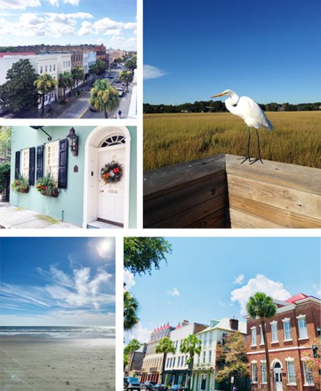
ATLANTIC COAST COMFORT We moved to Charleston, South Carolina in 2006 after Jamie graduated from SCAD for a job opportunity (unrelated to letterpress). We fell in love with the low-country and southeastern coast during our time in Savannah that we couldn’t resist an opportunity to put down deeper roots in Charleston. We love it here.

(photography credit: amarisphoto.com)

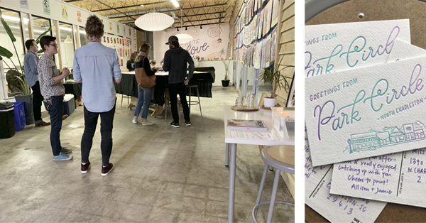
FRESH AIR + INK Our studio is located in the Park Circle neighborhood of North Charleston, and we live less than two miles away. We’re lucky to be able to commute by bike and enjoy the fresh air and charm of our neighborhood during the ride in.

During a typical week, we’ll grab an iced latte and pastry at Orange Spot Coffeehouse in the morning (or when those afternoon blahs creep in). 

We’re all pretty heads down and focused during the day, so it’s always a treat to meet friends for happy hour at our neighborhood fave: Stems & Skins.

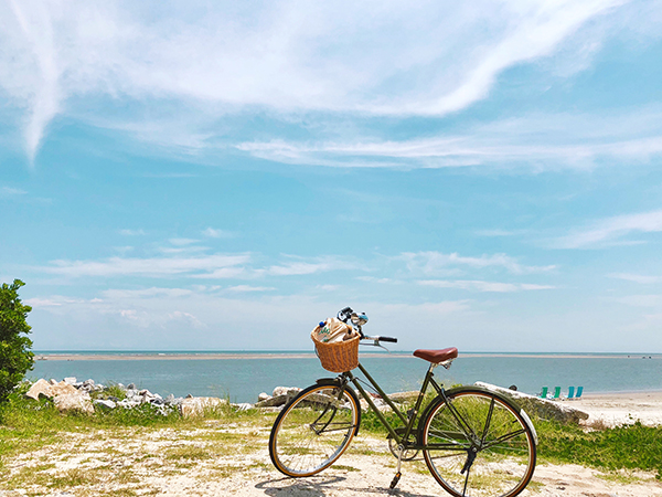
Lately, they’ve been hosting a burger pop-up with Pub Fare food truck on Mondays, so happy hour usually turns into dinner with friends. On Thursdays, we stop by the neighborhood farmer’s market for veggies and produce (and most recently duck eggs!). We’ve also really gotten into cycling, so we usually work in a longer ride on the weekends— we especially love heading out to Sullivan’s Island and Isle of Palms.

VIBRANT NEIGHBORHOOD Park Circle (and, really, the Charleston community as a whole) is especially wonderful about supporting local businesses, and we love sharing the letterpress process with them.

When we decided to move our letterpress studio out of our house in 2015, we knew we wanted to stay in Park Circle. We love the charm and quirk of the neighborhood— it’s not filled with big-box stores, and it’s community minded.

The studio is located off the main retail and dining area of Park Circle on a busier street that was pretty much surrounded by empty buildings (including a dilapidated auto repair shop that was later demolished). We were one of the first businesses along our stretch of the street, and we like to think it encouraged other vibrant and creative businesses to this area.

Our studio itself was a former convenience store and has big front windows for lots of natural light. The press room is behind a wall of windows, so customers are able to see the presses in action when they pop in for a greeting card. I think there’s really something wonderful about knowing the people and process behind the product (and people are naturally curious about these big old machines).

LOCAL PRINTING EVENTS We hosted Chris Fritton of the Itinerant Printer this past spring during his book tour. He filled our studio with prints from the road, and it was a blast to hear his stories. We also held a “For the Love of Print” event where we invited the public into the studio to learn more about letterpress printing (and to pull their own print, a “Greetings from Park Circle” postcard).

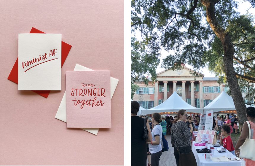
LETTERPRESS COMMUNITY ACTION Last fall, we designed and printed two limited-edition greeting cards to support the Women’s and Gender Studies program at the College of Charleston. Their “Yes! I’m a Feminist” party is a fundraiser for the WGS program and supports student/faculty activism and research, allowing them to work on issues like mothers of the Flint water crisis, women in politics, campus sexual assault, and municipal responses to the United Nations’ Convention on the Elimination of all forms of Discrimination Against Women. 

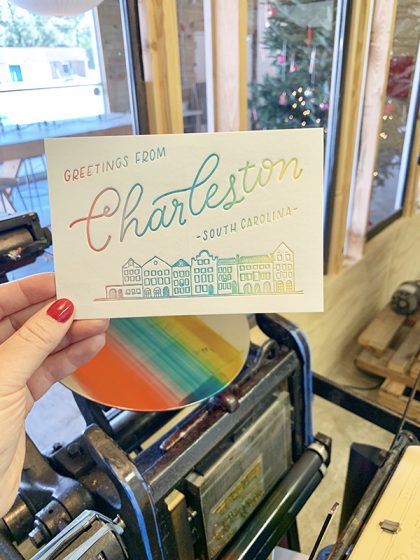
ONLY IN CHARLESTON Our “Greetings from Charleston” postcard is definitely a celebration of our city, and highlights perhaps one of the most iconic (and photographed) areas of Charleston: Rainbow Row. A series of thirteen Georgian row houses along East Bay Street, Rainbow Row gets its name from the houses’ bright and cheerful colors. We used the split fountain technique to create our Rainbow Row postcard version.

LOCAL SUPPORT  Since our primary focus is wholesale, we’re so thankful for the local shops in Charleston who stock our cards . It’s such a treat to connect with them in person and to see and support their shops as well.

ENJOYING THE NEIGHBORHOOD Of course, we’re partial to Park Circle because we live and work here; however, we love heading into downtown Charleston to meander through the cobblestone streets of the historic neighborhoods like South of Broad and the French Quarter.

Downtown can feel overwhelmingly touristy at times; however, there are plenty of streets to meander where you’re not always surrounded by so many people (and then you’ll just see the occasional local who’s out for a walk or enjoying tea on their porch). It’s in these quiet streets that Charleston really charms.

EATS + TREATS Charleston is known for its culinary scene, so it’s really hard to pick just one favorite restaurant. In Park Circle, we’re partial to EVO Pizza’s wood-fired pizzas and enormous salads, all featuring produce and meats from local farms.

(photography credit: evopizza.com)

As we mentioned previously, Stems & Skins is our go-to for happy hour. They have an incredible wine list and cocktail menu and also offer a selection of tinned seafood and other bites.

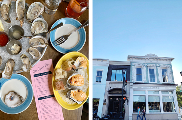
Brunch is a Charleston way of life, and our faves include High Thyme (Sullivan’s Island), Millers All Day (downtown Charleston; Jamie’s in the photo enjoying one of their amazing bloody marys), and Daps Breakfast and Imbibe (upper Charleston peninsula).

And, of course, part of the draw to living on the coast is the fresh seafood! Bowens Island has fresh off-the-dock seafood with some of the best marsh views in Charleston (and you’re definitely in luck if it’s oyster season!).

We also love The Darling Oyster Bar in downtown Charleston.

SHOP TILL YOU DROP When we moved to Park Circle in 2007, there were so many empty storefronts and buildings along the main business district; however, years later the neighborhood has really expanded in terms of independent retail shops, and we couldn’t be happier to have more local businesses to support.

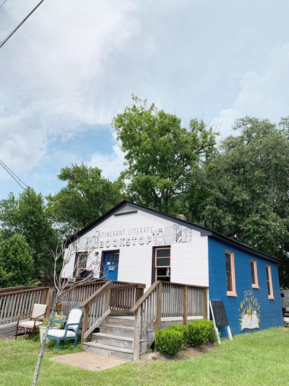
Itinerant Literate is another women-owned independent business. It’s a bookstore that got its start by doing pop-up shops around town in an Airstream-like trailer. We’re friends with the owners, and their trailer used to have a regular spot in the INK MEETS PAPER parking lot before they opened their brick-and-mortar location.

Another good friend opened Iola Modern, a modern home goods and furniture store.

Just down the street from our studio is The Station, which features over 30 vendors and local artists. It’s a great shopping destination with everything from mid-century modern furniture and handmade candles to plants and original artwork, so it’s a great place to find a gift for someone (or yourself )

FESTIVAL FUN Each year in May, the City of North Charleston puts on its annual Arts Festival with exhibitions, workshops, and art installations all throughout the city (and they really work to make art accessible to everyone). I love seeing the large-scale outdoor sculptures that are installed throughout the neighborhood (one year, an artist did an installation in a neighborhood park of giant gummy bears— definitely fun and memorable). We also always head to the block party, where the city closes cars off the main street in Park Circle and fills it with vendors and performers. It’s a fun celebration of art.

(photo credit: North Charleston Arts Festival )

St. Patrick’s Day is another huge neighborhood celebration. The city closes down the streets for a parade and all sorts of merrymaking in the streets (and lots of Guinness drinking!).

(photo credit: North Charleston FB )

A GROWING CITY Charleston and its surrounding communities have seen lots of growth over the years (it’s hard to believe we’ve been here for 13 years now!). Since Charleston is a peninsula, it can only expand so much. We’ve seen big changes to the skyline. In addition, the ever-increasing commercial rental prices have pushed a lot of independent shops out of downtown. King Street used to be filled with independent shops and boutiques, and now national retailers are pretty much the only ones who can afford the rent. Service workers also feel the pain from this growth, as it’s expensive to work downtown (those parking meters and garages add up quickly). More people also mean more cars on the road, and, as a historic city, Charleston roadways aren’t necessarily made for all of the big modern cars (cobblestone was for horse and buggies!), and it can be dangerous to bike around the city as well.

In terms of the growth our neighborhood (Park Circle) has seen, I think it’s been primarily positive. The neighborhood is a bit of a “hidden gem,” and there aren’t a lot of big streets and thoroughfares to bring extra traffic. If anything, it’s been really wonderful to see so many independent businesses open up in the neighborhood. There’s also a recent movement called Park Circle Unchained, and their mission is to prevent chain retailers from taking over the character of the neighborhood.

NOT TO BE MISSED Cypress Gardens – Swamp boat rides, walking trails, native plants— Cypress Gardens is worth the drive to experience the beauty of the lowcountry (and you might recognize the scenery from movies like The Notebook and The Patriot).

Casual Crabbing with Tia – Experience the beauty of the lowcountry with Charleston native Tia Clark, whose family has been crabbing and casting for fun and food for generations.

(photo credit The Casual Crabber)

REDUX Studios – Contemporary art gallery and studio space on upper King Street.

Robert Lange Gallery – One of our favorite art galleries in Charleston. Lots of amazing local artists, and the entire gallery space is really inspiring and engaging.

Gibbes Museum of Art – Beautiful and well curated art gallery on Meeting Street with an emphasis on American art that incorporates the story of Charleston.

Candlefish – Located on King Street, this charming candle shop is filled with all sorts of beautifully fragranced candles (and their exclusive candle library guarantees you’ll find the perfect scent). Not to mention, they also host candle making classes.

J. Stark – High-quality bags, backpacks, and totes crafted by hand right in their Coming Street shop. (We carry one of their backpacks every day!)

Abide A While Garden Center – Our favorite destination for all things plants! This family-owned shop is truly a botanical experience, and their knowledgeable employees can help you pick the perfect plant.

Magnolia Plantation – It’s a little drive away from downtown, but they have amazing gardens and grounds (filled with all sorts of SC native plants). The train tour is a nice way to see everything.

Middleton Place Plantation – Along the same road as Magnolia Plantation, Middleton Place has an entirely different feel— their gardens are much more planned/structured.

Sullivan’s Island – Our favorite pick for a beach because it’s usually pretty chill (and there’s a lighthouse!). There are great food options out here as well if you decide to make a day of it (Poe’s Tavern, High Thyme, The Obstinate Daughter)

Meandering anywhere south of Broad Street will be lovely. There are all sorts of beautiful houses, and eventually you’ll get to the Battery at the tip of the peninsula surrounded by water.

Cooper River Bridge and Mount Pleasant Waterfront Park – The suspension bridge that connects Mount Pleasant to downtown Charleston is an awesome way to get a bit of exercise (walk/bike) along with an amazing view of the harbor and city.

LAST THOUGHTS Southern Charm (the reality tv show) is not us. lol. We are a ‘unique’ southern city that is culturally aware of its past, and actively working to build a better future.

We hope you enjoyed our featured installment of the letterpress city series guide! Interested in shining a spotlight on your hometown? Contact us today!

Let’s See That Printed: Carmela Heintzelman of Fiore Press : Architectural Artwork

We were pleased to lend support to Carmela Heinztelman when she was approached with a special print request. After seeing the results, we think more professional design projects like this should come to life in letterpress.

When architect Edward Deegan contacted me about making some letterpress prints of his architectural drawings, I jumped at the chance.  I admire Ed’s work and have seen many of his designs realized in our Illinois community and his work is absolutely impeccable. Below is one of the beautiful houses he designed, and one of the prints I made from his sketch of this house.

Carmela Heintzelman of Fiore Press

(Above: photography credit: Karen Loffing)

Carmela Heintzelman of Fiore Press

I love printing personalized artwork, and this was no different.  To take a talented architect’s sketches and translate it into letterpress printed art that could be framed and hung was such an honor. 

Carmela Heintzelman of Fiore Press

Edward had five sketches that he wanted printed. The challenge was to take these sketches and adjust them in a way that worked best for letterpress and kept the details. 

Carmela Heintzelman of Fiore Press

We needed to apply a screen, which I had never done before. Enter Prepress from Boxcar Press! I called Cathy and explained this project, and she was excited to help. She looked at each of the pieces and told me the best way to prep the artwork. I converted the scans to grayscale, adjusted the contrast, brightness and threshold, then saved it as a TIFF.  It came out perfect – the client was extremely happy!


Carmela Heintzelman of Fiore Press

In addition to the house renderings, I also printed for Edward a tall ships scene and two historical facades.  He framed and hung them all in his office.

Thanks Carmela for sharing the printing of these drawings.  In addition to being a learning experience for you on the file preparation side, it was a nice treat to see something a little out of the norm come to life in letterpress. This is a very limited edition art that will be viewed and enjoyed.

Let’s See That Printed: Eleonore Lee’s Printing Tribute to Freddie Mercury

Sometimes the words on a person’s platemaking order just leap off the page and catch our attention. That was true with Eleonore Lee’s curving and falling text layout. Add in that they were lyrics by Queen’s Freddie Mercury and we just “had to see that printed”.  We hope this strikes a chord with you too.

Eleonore Lee's "Lover Of Life, Singer of Songs" fine art print tribute to Freddie Mercury of Queen strikes a chord with the heart.

In spring 2017, the Fine Press Book Association sent out a call for entries for their annual fundraising portfolio.  Since I already had a huge project to complete before heading off on a trip, it seemed fitting to add another project to my docket.  

Eleonore Lee's "Lover Of Life, Singer of Songs" fine art print tribute to Freddie Mercury of Queen strikes a chord with the heart.

This project was especially enticing as it would support their fine press journal, Parenthesis, and the portfolio would be shared among other printers. Last year was a year in which I was re-discovering myself after a good decade of hardcore parenting. An exchange portfolio would allow others to discover me too.

Eleonore Lee's "Lover Of Life, Singer of Songs" fine art print tribute to Freddie Mercury of Queen strikes a chord with the heart.

Like a lot of printmakers, I am a sucker for exchange portfolios. Something I particularly appreciate about letterpress and handmade paper exchanges is that they are a lot more lenient about format. The parameters for this portfolio were generous … produce 125 prints. Within these parameters, it was definitely possible to consider a less likely subject matter.

If you do not know, most often Fine Press work has a tendency to publish known and lauded dead poets. Always the contrarian, I felt like shaking it up a little with less-predictable words. My work aims to ask questions or bring attention to something you might not usually notice.  

Because music means so much to me, I have been considering making art about the music that pervades my life. Whilst at work I am known as “that person who wears their headphones and sings out loud”.  One epic late night, two BFA students and I had a lot of paper to make. We loudly sang through 2 CDs of Queen’s Greatest hits. That was my inspiration.

Eleonore Lee's "Lover Of Life, Singer of Songs" fine art print tribute to Freddie Mercury of Queen strikes a chord with the heart.

I was not a huge Queen fan in my youth, finding Freddie overwhelmingly exuberant. However, I grew into Queen. I learned the lyrics intimately in the same way that I spend a lot of time with the poems I work with. Singing along both joyfully and studiously, so that I could be as accurate as possible with the pacing and the sounds. By including the breaths, the uh’s and drawn out syllables, the project was most enjoyable.

I also revelled in the details: The paper is Neenah’s Flash Pearl Starwhite. Not only is it shiny pearlescent like some of Freddie’s leggings, but it also covers Flash, for Flash Gordon’s theme song, by Queen.

The font is Montserrat. Freddie had a dream to perform with and finally collaborated with Montserrat Caballé on the album Barcelona. And of course, I did my research: Freddie loved red and yellow, bold loud colors. The rhythm of the song is included in the yellow and red dots. They are foam dots, with 2” dots representing a full beat, 1” dots a half beat and ½” dots a ¼ beat.

I wanted a mix of more iconic images of Freddie as well as images from his videos. I chose the song because the lyrics combined with the video spoke volumes about Freddie.

He lived flamboyantly and boldly in public, at a time when being gay was a crime in most countries. In ‘I want to Break Free’ the band appears dressed as working class women. We first see Brian May wake up, with curlers in his hair, very rapidly followed by a hairy arm wearing bangles brandishing a vacuum. After a few swipes, all of Freddie scurries out boldly, staring right at the camera and gives us a brief, contented smirk before proceeding with some very sexy vacuuming (to the music). He dances and sings and winks appearing to enjoy himself a lot. It may seem run-of-the-mill today. It was bold back then, especially for a shy, cat-loving man wrestling with his sexuality. All of these words and images worked well on the tri-fold design I had in mind.

Eleonore Lee's "Lover Of Life, Singer of Songs" fine art print tribute to Freddie Mercury of Queen strikes a chord with the heart.

Although the images have enough small details and fine lines, I would never have attempted type with such fine details so I thank Boxcar Press for the plates. They also provided a fine press discount on the plates for this project.  

I hope others in this exchange enjoyed this project as much as I did envisioning and printing it.
You can learn more about Eleonore’s project with Parentheses at  FPBA.com.


Printing Reality with Lauren Emeritz of Abstract Orange

Graphic designer & printer Lauren Emeritz creates brilliantly colored fine artists books & punchy prints. Lauren talks about teaching printing at an area Community Art Center, creating artists books, and introducing many to letterpress at events in the Capitol area.

FOR THE LOVE OF LETTERPRESS  

I am a graphic designer, letterpress printer, and book artist in Washington, DC and have always loved type and printing. While attending the University of Delaware, they were beginning to set up a print shop. I was fortunate enough to have the opportunity to print. Now Pyramid Atlantic Art Center is my go-to print place.

Emeritz Lauren ( Washington, D.C. ) letterpress prints beautiful hand-crafted fine editions artists books.

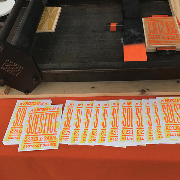
(Letterpress Demo at the Smithsonian Solstice Saturday Event)

PRINT FOR THE COMMUNITY

I print at the amazing community art center – Pyramid Atlantic Art Center (PAAC). Unique to the DC-area, PAAC offers workshops on how to learn to print, and the rental of presses to print on your own. I discovered PAAC at their Biennial Book Arts Fair. This fair is home to beautiful art made by hand. But ultimately, this created a spark in me to reconnect with making art by hand. 

Emeritz Lauren ( Washington, D.C. ) letterpress prints beautiful hand-crafted fine editions artists books.

ART ON THE HILL

I live in DC, so there is lots of cool artsy stuff. I love the Smithsonian Art Museums, the National Gallery of Art, the Library of Congress — they have so much amazing art and printed pieces! The Library of Congress was on my bucket list for a number of years. I finally made it there for an American Printing History Association (APHA) event. It was awesome and now I try to go back every couple of months. 

PRINTING MENTORS

Ray and Jill at Lead Graffiti do cool work and love to share their knowledge. Vince Frost is a graphic designer who used a lot of wood type in his designs. When I teach at Pyramid I get inspired by the people in class. I get to share my passion for letterpress: type, ink, paper, and printing with people who may love it too or may not have done it before. It is always fun to see new ideas and the directions people explore.

I did an internship at Hatch Show Print in December 2017 and it was wonderful to have access to so much wood type — one of the first things that I loved about letterpress. The people were so creative and friendly and the shop was AMAZING – I highly recommend a journey there! I would love to go back for an artist residency sometime. 

Emeritz Lauren ( Washington, D.C. ) letterpress prints beautiful hand-crafted fine editions artists books.

PART TIME PRINTER, FULL TIME FUN

My primary job is as a graphic designer for my company Abstract Orange. I enjoy printing and I do it mostly for fun. While I would love to do it full-time, I am concerned that if I printed commercially it might lose the satisfaction. Teaching at Pyramid keeps me fresh and experimenting. When I letterpress now, I use a combination of techniques. For small text and logos I usually use polymer. For hand-drawn type I usually carve linoleum or wood blocks. Each process has it advantages and I try to be intentional in my process, using the one that will best suit my goals for the project.

PRINTING FEATS

I made a Hand-Carved Alphabet book that I sold to the Library of Congress. At one of the APHA events, I sold my book to their special collections. It was one of the most exciting and validating events in my life. I started the project several years earlier without any particular goals or directions. Through a series of events, the book ended up in a show on a table next to works by Edward Gorey and Frederic Goudy! As a type nerd, Goudy has a special place in my heart!

I picked-up my bookmaking skills from a number of places along the way.  I started with different portfolio books at University of Delaware; workshops at Hamilton Wayzgoose; Ladies of Letterpress conferences, New York Center for the Book, GW Corcoran, and AIGA DC. The bookbinding associates at PAAC are always amazing and helpful.

Emeritz Lauren ( Washington, D.C. ) letterpress prints beautiful hand-crafted fine editions artists books.

(This is the artist book I carved, printed, bound and sold to the Library of Congress. (uses polymer for the colophon page)

PRESS HISTORY

My first press was probably my hands. I loved making rubbings. I own a Vandercook 99 (that is one without an inking system). My Vandercook 99 lives in my basement. I print on it sometimes, usually small runs or irregular things you couldn’t print on a larger Vandercook, such as round coasters. I have also used it for printing demos/workshops at the Smithsonian American Art Museum, Renwick Gallery, and Shop Made in DC. Because it is smaller and only 110 lbs, it is fairly portable for demos.

Emeritz Lauren ( Washington, D.C. ) letterpress prints beautiful hand-crafted fine editions artists books.

BOXCAR PRESS’ ROLE

Boxcar Press really revolutionized letterpress printing. I realized at some point that things were being letterpress printed using fonts that were more modern than lead type. Next, I figured there had to be a way to print modern computer designs on the letterpress — and I found Boxcar Press! I love the merging of old and new technology and combining my computer design skills with hands-on printing techniques. I tell my students who are interested in polymer to check out Boxcar Press because they “invented the system” we use to print polymer.

FAVORITE INK COLOR

At the moment, I have been printing some neon orange lately. It is lots of fun!

Emeritz Lauren ( Washington, D.C. ) letterpress prints beautiful hand-crafted fine editions artists books.

WHAT’S NEXT

Very recently, I did a letterpress printing demo with the Smithsonian American Art Museum to celebrate the Solstice. I’ve also taught a Hand-Carved Type Workshop at the Ladies of Letterpress Conference in October 2018.

I am not sure where 2019 will take me, but I am excited about the possibilities!