The Cutting Edge of Printing With Publicide

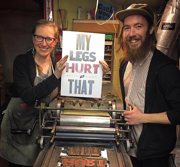
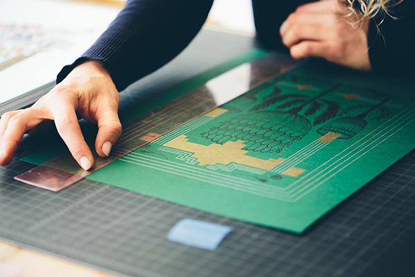
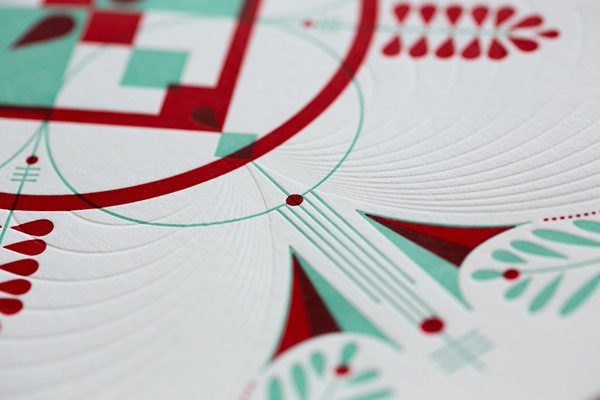
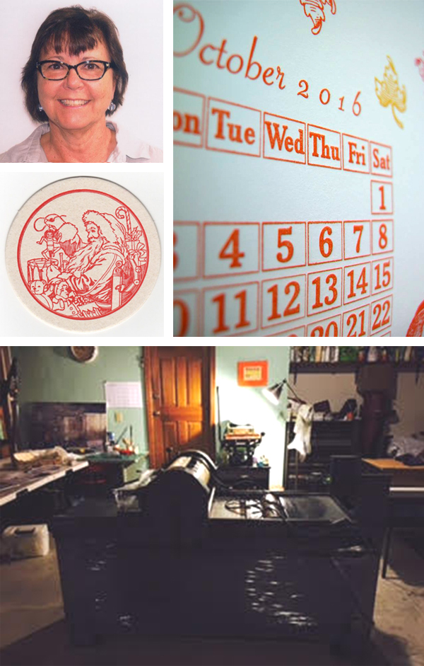
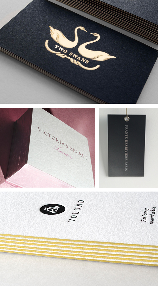
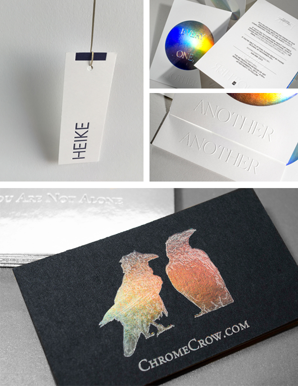
From luxury letterpress printing to honing their newest & hottest bespoke design trend, Publicide Printing breaks barriers and redefines artisan printing with fleet-footed service. The New York City-based print shop celebrates 11 wonderful years of printing excellence (and counting!), while sharing with us what’s in store for them next–from taking fresh inspiration from the bustling city around them to honoring the addictive craft that is letterpress printing and beyond.

Publicide prints letterpress, digital and beautiful business cards.

IN THE HEART OF THE BIG APPLE Publicide Printing is located in the Historical Times Square District–rife with the filth & fury New York should still be known for. At our NYC Print Shop we find the clamor of trucks, buses, freaks, geeks, tourists, and morning-shift strippers to be suitably inspiring matches to the clamor of our Heidelberg Presses and Kluge Machines. To the clamor’s credit, the racket brings a paradoxical equal/opposite effect to the print jobs rolling through our sleepless workshop. There’s nothing like broken-glass glitter, flashing signs, and non-stop commotion to provide a super-neat registration. We can fathom few other explanations for the continued presence of Holographic Foil Stamping in our personal and Commercial Printing.

Publicide prints letterpress, digital and beautiful business cards.

THE PRINTING DRIVE We attribute much of our success to situational circumstances. When we set up shop 11 years ago, we kept our techniques traditional, providing letterpress services to a totalitarian degree. Devoted to pushing the letterpress “bite,” we’d like to think we became the go-to printer for deep impression, dimensional prints. Naturally, we credit the influence of our original Hudson Square locale–the mid-century’s center of book printing & publishing–for giving us the proper juju to succeed. Speaking of books, we first began branching beyond our love for Letterpress Business Cards & Stationery as requests for unique, custom Lookbooks made their way through the door. Lookbooks & Hanging Tags have become a shop specialty as of late, prompting us to include High Quality Digital commercial printing to our cabal of custom services.

EXPONENTIAL GROWTH As the fashion world kept calling, we found our lease terminated: a gift that took us to our current post in midtown Manhattan, while honing our expertise in Corporate Stationery Printing, Brochure Printing, Spot UV Gloss & high-shine Glossy Lamination Services, Asset Management, Real Estate Printing, Emboss & Deboss, and–as the nearby ghosts of Studio 54 would have it–unlimited Event Printing.

Publicide prints deep impression letterpress business cards.

LOOKING TO THE HORIZON The future is truly unknowable. Come 2049, we know we will still be at it, no matter what form the printing arts take. We go to sleep hoping for the following: (1) the advent of 3D-printed Pantone Color & Color-Matching; (2) to find the majesty of Foil Stamping integrated into respectable Letterpress Studies; last but not least, (3) a global craving for gigantic solid color by way of oversized, overprinted Offset Floods, with boundless room to create melting duo-tones and tri-tones.

Publicide prints deep impression letterpress business cards.

An immensely huge round of thanks to Publicide for letting us have a sneak peek into their fantastic and inspiring printing world!

Letterpress Printing Journeys: Amy Redmond of Amada Press

A mindful approach to letterpress (and life) is the buzz behind Amy Redmond of Amada Press. When we last caught up with Amy, she had a ball visiting & touring the Boxcar Press press floor. Now, the Seattle-based printer, visual artist, and instructor for Seattle’s School of Visual Concepts is blending a sense of creative well-being into her craft while nurturing a closely-knit community of printers. Between collaborating on her next project, keeping the fire lit under her fingertips, and happily giving back to the community with her involvement with the SVC Childrens Broadsides project year-after-year, Amy lives up to her press’ Spanish name origins: beloved.

RENAISSANCE WOMAN + PRINTER I’m a self-employed visual designer and artist, and teach beginning and advanced letterpress classes at Seattle’s School of Visual Concepts. In my private studio, Amada Press, I work with metal and wood type, fabricating stories inspired by my collection of old ad cuts and
half-tones, and adding linocuts when inspired. In recent years, I’ve been incorporating collographs and pressure printing into my work. I primarily print on a Colt’s Armory 13×19 platen press, but also work on a Vandercook 4.

This is the form for the keepsake from my first studio tour under the name Amada Press. All photos courtesy of Amy Redmond unless otherwise indicated.

My Colt’s Armory Press has a long history of fine press book work for me to live up to; years before Stern & Faye acquired it, our friend Clifford Burke used it to produce his book “Printing Poetry.” 

View of the Amada Press studio from behind the Vandercook 4, which also came from Stern & Faye Printers.

THE LURE OF LETTERPRESS My first job out of college was as a book designer, and it turned into a quest to learn more about the finer points of typography. I was also feeling the loss of not working with my hands — computer design time had been balanced by working with tangible materials while earning my BFA. Although gainfully employed in the creative field, I was effectively starving myself creatively.

That changed when a friend saw a listing for a weekend workshop with Seattle artist Bonnie Thompson Norman (Windowpane Press), and I thought letterpress would be the perfect remedy for me. It was, and still is. Halfway through the first day, I was hooked on setting type by hand, so much that Bonnie had to politely kick me out of her studio so that she could go have dinner — promising that the type would still be waiting for me in the morning.
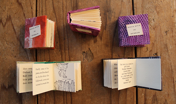
These accordion books were the first letterpress project I ever typeset and printed, in collaboration with 3 other students. Bonnie runs an admirably tight ship: we wrote, printed, and bound these in just 2 days! 

Six months later, in October of 1998, I met Chris Stern and Jules Faye (Stern & Faye, Printers) at a Seattle Literary event called Northwest Bookfest, and fell in love with their work. The following week I drove up to their Print Farm in Sedro-Woolley, Washington to share my portfolio. The interview turned into dinner, and soon after I began apprenticing one day a week in their shop, doing whatever was needed in exchange for learning. A few years later, I put all of my things in storage, moved into a small corner of the upstairs bindery in the print barn, and worked in exchange for rent.

This was Stern & Faye Printer’s “print barn” in Sedro-Woolley, WA. The concord grapes would hang heavy on the barn, and it was impossible to resist snacking off the vine every time you entered the shop. 

Here I am mixing ink at Stern & Faye Printers, sometime around 2002. This may have been taken during the 6 months I was living at the print farm. Credit: Jules Faye

The 180-mile round-trip drive up to the Skagit Valley each week was well worth it. It’s hard to believe it’s been 19 years since then; it was such a pivotal moment for me. It not only instilled a sense of creative well-being and fine craftsmanship, it also introduced me to an amazing community of artists, designers, and printers that have become dear friends.

Pictured left to right: Rebecca Gilbert, Jules Faye, Brian Bagdonas, Amy Redmond. Rebecca & Brian, of Stumptown Printers & C.C. Stern Type Foundry, recently visited me and Jules Faye at her home in the Skagit Valley. Getting together with them is always a fabulous family reunion, and never without homemade pie. Credit: Stumptown Printers

NORTH SEATTLE’S BEST KEPT SECRET My private studio, Amada Press, is just steps from my back door in a quiet neighborhood in north Seattle. I describe it as a garage with a detached house — because that’s exactly how I went about looking for space: the studio came first. When Jules Faye approached me in 2008 about becoming the next steward of Stern & Faye’s Colt’s Armory 13×19 Press, I knew it was time to get serious about buying a place. I’d been in Seattle long enough to know that I couldn’t own a press that big and be at the whim of a landlord. The stars happened to align at the right time with both work and the burst of Seattle’s real estate market, making it all possible.

Inking up the Colt’s Armory Press. Cleaning up the press, and all 8 of its rollers, takes me about 30 minutes. 

Close-up of the badge on my Colt’s Armory Press. 

In spite of being large enough for 3 cars, my shop has never had one in it — the previous owners were also artists, and built it as their painting studio. It has flat, alley access with high overhead clearance for big trucks, smooth cement floors and plenty of outlets. What really charmed me was its wood stove — that’s exactly how we heated the Print Barn at Stern & Faye. I took all of those things, along with the apple tree (Stern & Faye also had a tiny orchard), as signs that this was the right place for me. The press was the first thing that got moved onto the property — it took another week for me to move my personal things into the house. So you can see where my priorities lay.

My shop’s sunny location makes it the perfect spot to grow tomatoes. A little bit of Seattle history lives in this photo: those red bleacher chairs are from the Kingdome, saved before it was blown up to make way for a new stadium. 

What truly makes my shop special is what’s inside of it — it has all come from local printer pals, many of whom have since passed. Most of it, like my presses and type, is from Stern & Faye and Byron Scott — but I also have a cabinet and slant top from Jim Rimmer (Pie Tree Press), and a handful of choice cuts from Maura Shapely (Day Moon Press). It’s all very beloved to me… which is how I came to choose “Amada” as my press name, the Spanish word for beloved. It also happens to be the meaning of my first name.

Upper lefthand photo: Everything in my studio is up on 4×4’s so that it can be easily moved with a pallet jack.  |  Upper righthand photo: Thanks to the careful curation of past printers, I have many lovely typefaces — but Spartan (ATF’s version of Futura) claims most of the space in this row of cabinets. |  Lower righthand photo: These are my two main work surfaces: the cabinet in the foreground is a staging ground for my notes, and the larger work table in the background holds my stone.  |  Lower lefthand photo:  This photos is the view when you walk into my studio — the cabinet on the far right is the very first one I got (complete with the obligatory case of Copperplate).

PRINTING MENTORS AND INSPIRATION Chris Stern & Jules Faye will always be my number one mentors; even though Chris passed away in 2006 and the context of my work with Jules has evolved, I consider my apprenticeship to be lifelong. They have given me so much of their time and talent, and never restrained their passion for print & typography. When the two of them collaborated on personal projects, the final print was always a tapestry of fantastic stories and captivating imagery. Their print, “The Typographic Horse,” exemplifies the “love at first sight” effect their work had on me.

Shortly after Chris Stern passed away, I wrote an article about the passionate process of artwork for the Society of Typographic Aficionados . You can view more work by Chris Stern & Jules Faye on SternAndFaye.com. 

I also find inspiration from my ever-growing network of printer pals and students — they all keep a fire lit under my fingertips, and Instagram has played a big role these past few years with feeding me a steady drip of amazing work. Those who really stand out are the ones with determination and a clear vision in their work as a whole; I really admire that — it’s not something I come by easily.

From an aesthetic standpoint, I’m drawn to the graphic design work that took place between the 1910’s and the 1950’s. As a design student I didn’t understand how the work I admired by Fortunato Depero, Piet Zwart, El Lissitzky, H.N. Werkman, and Jan Tschichold was produced — becoming a letterpress printer who works with handset type brought a whole new appreciation to it. It’s like I found a missing piece to the puzzle that is myself.

DESIGNER + PRINTER I fall into the designer/printer category; they are very intricately related and it can be hard to tear one apart from the other. Design is what led me to letterpress, but letterpress is what reinforces my attention to detail and ability to think about how a design will be produced — whether it’s a website or a printed piece. When you’re printing your own work, you’re the one that pays the price when you design something that’s hard to pull off. And so you learn how to plan.

I find the mindful approach that letterpress requires to be blissfully consuming; it’s a nice contrarian lifestyle to the on-demand parts of life. As I browse my collection of metal type and ornaments, I slow down, I notice, I contemplate, I dream, and I plan. I form connections with things I’ve seen or heard. Stories materialize as excerpts from imagined conversations.
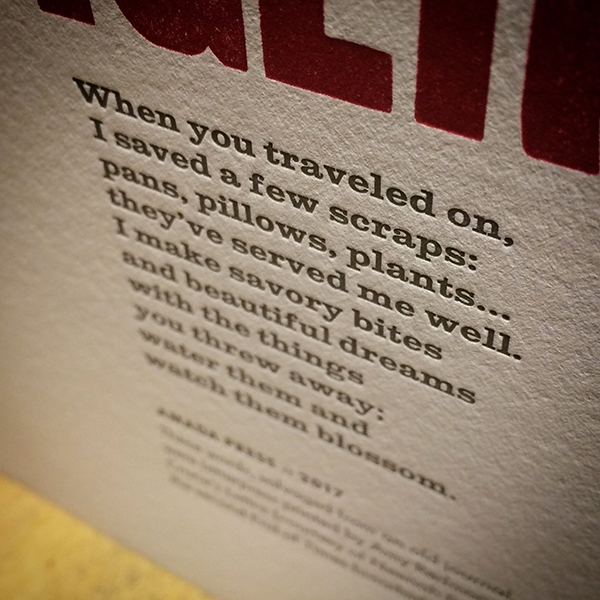
This text, from my print “Scavenger,” was taken from a scrap of paper I’ve been carrying around in a sketchbook since 2006. 

The computer has no place here — pencils, scissors, Xacto blades, and glues sticks are crucial to my work’s development; the tangible trace of my hand is evident yet invisible. Ideas become sketches, ink is drawn, mock-ups take shape. Text is set, one letter at a time. Images may be old ad cuts, or created with collographs, pressure printing, or carved linoleum.
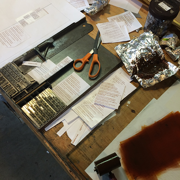
A snapshot of the design process for the broadside for “The Thirst of Things” by poet Alberto Ríos, for Copper Canyon Press. See the finished print here. 

Precision on press requires planning, but with my art I allow room for migration once ink hits paper: colors may shift, misfeeds inspire new compositions. The process of acting/reacting is cathartic; committing an idea to paper simultaneously invites resolution to old problems and invites opportunity for new ones.

In the dead of winter this mindfulness is emphasized even more: my shop is heated primarily by a wood stove, and I can’t just start printing without some planning. The night before, I bring the inks and photopolymer base into the house to warm up; I check to make sure an air quality burn ban hasn’t been triggered by a stretch of cold, windless days; I prep a pot of homemade soup for lunch. On press day I get up early and get the studio’s wood stove started so that it can pick up the electric heater’s slack, and simmer the soup on the wood stove next to my coffee. Once I get going, I hate having to stop to make lunch… and it makes for the most delicious-smelling print shop.

PART TIME PRINTER, FULL TIME FUN There are days when I think I could be a printer full time, but I don’t think I really want that — it’s having variety in my work that keeps me sane. I currently set up my work week so that I work Monday–Thursday for my design clients (web & print), and spend Fridays in my studio. Anyway you slice it I’m just a one-woman shop, so there’s a lot of pressure to stay profitable and still be able to invest in my retirement.

If I could spend my days playing on press, making art without a care for income, then yes I’d do it in a heartbeat. But if I have to take on a job printing what someone else has designed, then no — I’d rather that time be spent doing digital design, so that my print studio remains a stress-free place to be creative. There’s enough separation between how I think about the two different types of work that they fuel, rather than drain, my energy for them.

PRINTING FEATS I consider it a great honor to have been teaching letterpress at the School of Visual Concepts for the past 14 years, and to play a part in building our program. I was cautious when Jenny Wilkson first invited me, as my mentors Chris Stern & Jules Faye were also teaching there — and who was I, with just a few years at the press under my belt, to be teaching? Upon hearing my concerns, Chris and Jules invited me to assist in their class — and gave me their encouragement to accept Jenny’s offer. This wasn’t an issue of confidence; it was about respect for all the years Chris and Jules had spent in front of presses.

top photo: We have a well-appointed shop at the School of Visual Concepts, and our volunteer Teaching Assistants do their part (and then some) to making sure it remains a gem. Credit: Radford Creative. |  bottom photo: Elizabeth Mullaly (right) is one of my current Teaching Assistants. The way she quietly jumps right in when she sees something or someone that needs attention is a work ethic I admire. Credit: Sukhie Patel.

PRESS HISTORY I was about to say it was a Pilot Tabletop Press — but truly, it was a toy press given to me in elementary school, the Fisher Price Arts & Craft “Printer’s Kit”. I’m really hoping it’s still stashed in my parent’s basement, as I’d love to get it back and play around with it.

But as far as “real” presses go, the Pilot really was my first. In June of 1999, I went to Bellingham, WA with Chris Stern & Jules Faye to visit their friend Rob. We were talking about printing and I was admiring his 7×9 Pilot Press sitting in the corner on its original stand. After a while Chris turned and said, “Well Amy, you can have it if you can pick it up.” I laughed and then saw Rob nod his head — Chris was actually serious, and Jules confirmed it. Together we moved it out that day.

My first studio was efficiently tucked into a tiny breakfast nook in a shared house. We didn’t use the dishwasher, so it became my ink table— I kept ink and tools on its racks. 

Chris and Jules then helped me put together a cabinet of type from their collection, and Scotty (Byron Scott, their adopted grandfather and avid letterpress collector) contributed some things as well. I still have that cabinet today; on the back, scrawled in chalk, it says “Scotty,” and I love that. Also in that cabinet is a 50-pound case of figures from various typefaces, all displayed face-up. It had been sitting in a stack of cases in the print barn & I remembering cooing over it with Chris when he said, “Yeah it’s purdy, but ya don’t ever wanna buy a case of junk like that.” He then turned to me with a sly grin. “Ya want it?”

I lovingly refer to this 50-pound case of figures as one my apprenticeship “hazing” moments. 

I had the Pilot for 2 years, and when I moved into the bindery loft of Stern & Faye’s Print Barn, they convinced me that it was time to move on to a bigger press. To this day, the Pilot still lives in Seattle with John Marshall, former owner of Seattle’s Open Books Poetry Shop in Seattle. It’s nice to know it’s still in our Pacific Northwest literary letterpress family.

BOXCAR’S ROLE Boxcar has been making my photopolymer plates since — I think — 2003 or 2004. At that time there weren’t many options, and most required faxing in a proof of the artwork — which was a royal pain. But Boxcar spoke my design language and accepted PDF proofs (revolutionary!) and that was the hook that got me in the door.

But the real reason I keep coming back is the people — everyone is so helpful and accountable to doing good work, and I appreciate the time spent helping me troubleshoot. As an instructor I know I can direct my students to Boxcar and that they’ll be well-taken care of. And as a participant in SVC’s Poetry Broadside project with Seattle Children’s Hospital and Seattle Arts & Lectures, I know that the project would not be financially possible without plate donations from Boxcar and paper donations from Neenah. On behalf of the printers at the School of Visual Concepts, thank you!

PRINTING TIPS Roller bearers are my best friends — I never lock up a form in a chase without them. Also, always use protection: slipsheet your prints. These two simple things can prevent so many problems.

Wide, type-high rule placed on the inside edges of the chase act as roller bearers, preventing ink slur as the rollers roll on/off the form. 

Document your work. David Black, another letterpress instructor at SVC, once advised starting a shop log to keep track of press maintenance. I do, and it has become so much more than just a record of press oiling. I document ideas, typeface choices, and archive my mockups. These logs are valuable resources that I refer to often.
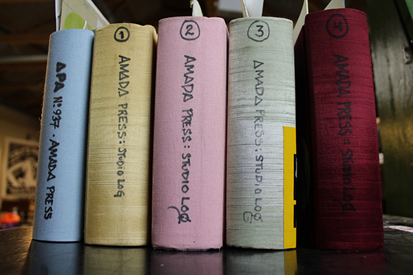
I currently have 4 studio logs, and added a fifth just for the projects I do for APA (Amalgamated Printers Association), of which I’m a member. 

And finally, when it comes to buying equipment, be patient. The right press, the right type, it will come along. Talk to people, get to know them… there’s an underground current of dedicated printers that offer a far more rewarding experience than a whirlwind bidding session on Ebay will, and you’ll meet people genuinely interested in your success if you take the time to invest in your local community.

WHAT’S NEXT I’m finally — finally!— going to set up an online store for Amada Press. I’ve been in several group and solo shows over the years, but the positive response my work received in the 2017 “Pressing On” Exhibition at Hatch Show Print really highlighted the importance of investing time into making my work more accessible.

I also have several ideas on my perpetual project list in different stages of production, including two book concepts and a long-form broadside. The more I cross off, the more room I have for new ideas. My work is fueled by motion.
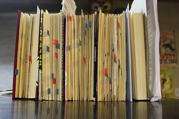
The red and blue flags in my studio logs mark ideas that have not yet been printed. I’m happy to say it’s a never-ending list. 

Immensely huge round of applause & thanks out to Amy for the gorgeous peek into the printing realm of Amada Press. Keep up the beautiful work and we look forward to seeing more of your printing adventures unfold. Find her on Instagram too (@AmadaPress)!
Press Pursuits With Texas-based STUDIO 204

From middle of the night press checks to early morning calls to her printshop mentor, Kim Neiman of STUDIO 204 has carved out a beautiful living printing to her heart’s content in her spacious Arlington, Texas studio. Teaming up with her wonderful husband, Kim enjoys the freedom of press pursuits, sharing the alluring hum of printing with workshops, and inspiring a new generation of designers & printers.

Texas-based Kim Neiman of STUDIO 204 served fresh letterpress prints in bold, colorful flavors.

A STUDIO BUILT FOR TWO I have practiced graphic design for the past 39 years. The last 10 years involved learning and practicing letterpress printing and bookbinding.

Purchasing a 219 Power Vandercook required more space, so my husband and I decided to relocate the studio to his father’s former 1950’s television shop in Arlington, Texas. Studio 204 is located in the historic area of downtown Arlington which is going through an extensive revitalization.

Texas-based Kim Neiman of STUDIO 204 served fresh letterpress prints in bold, colorful flavors.

LETTERPRESS’S ALLURE As a designer, I learned printing in the middle of the night when I received a call that my job was on press and they needed someone to approve the printing. Hardworking pressmen held the press until I arrived to review the work. There were no female printers in those days and it could be intimidating but that is where I learned to print. All those years press checking paid off when letterpress reemerged. Now “I” can print and experiment with no restrictions.

Bold prints: Texas-based Kim Neiman of STUDIO 204 served fresh letterpress prints in bold, colorful flavors.
Texas-based Kim Neiman of STUDIO 204 served fresh letterpress prints in bold, colorful flavors.

PRINTING MENTORS Casey McGarr of Inky Lips Press is my print mentor and hero. He was and still is my 24-hour print crisis line and I owe him a great deal. My husband — a print designer as well — and I share the studio and presses. He is my constant inspiration and biggest fan.

Texas-based Kim Neiman of STUDIO 204 served fresh letterpress prints in bold, colorful flavors.

FAVORITE INK COLOR Favorite ink at the moment is any fluorescent printed on Astrobrights neon paper.

DESIGNER & PRINTER I am a graphic designer, printer, bookbinder and a teacher. My process begins with research, design, experimentation and fabrication— though not necessarily in that order.

A EUREKA MOMENT One time I scanned a python skin, created a bitmap and sent it for plates. Before Boxcar made the plates they called to ask what it was? A bit skeptical, the next question was, what are you going to do with it? I told them I was going to print it on Pulsar Red Curious Cosmic. Curious Cosmic is a soft matte metallic coated paper, but when I printed on it became glossy and reflective. Eureka, it looked like I had foil stamped it. My client who designs couture handbags made from python was impressed. So we printed all her invitations with the python pattern on different metallic paper. She is now making a python clutch bag. Metallic foil is applied directly to the skin before the bags are sewn.

PRINTING FEATS For 10 years I was fortunate to work with David Carter Design developing print collateral packages for five-star resorts on many continents. My last assignment was rebranding The Stoneleigh Hotel in Dallas, Texas, the place I called home.

PRESS HISTORY First and still is my 219 Power Vandercook.

Boxcar custom-made plate on Boxcar Base. Texas-based Kim Neiman of STUDIO 204 served fresh letterpress prints in bold, colorful flavors.

BOXCAR’S ROLE Boxcar’s customer service is a rare commodity and I talk about it all the time. Their knowledge is the best in the business.

LIFE (AND SHOP) TIPS Keep print alive. Pay it forward.

Texas-based Kim Neiman of STUDIO 204 served fresh letterpress prints in bold, colorful flavors.

WHAT’S NEXT More printing, more experimentation, more design, more teaching and cooking lessons in Southern France.

A huge round of thanks & applause out to Kim of STUDIO 204. May the future printing roads always rise up to meet you!

Big Prints at The little Blue Chair

Down-home roots and printing passion drive Hope Johnson of THE little BLUE CHAIR, a Louisiana-based letterpress printer. From enjoying the whirling clinking of her C&P, the heartfelt pride of raising a family (toddlers in tow), and the bliss of walking into her backyard studio, Hope’s infectious energy & passion resonates in her close-knit client relationships and breathtaking, colorful, & airy letterpress printed goodies.

Down-home roots and printing passion drive Hope Johnson of THE little BLUE CHAIR, a Louisiana-based letterpress printer.

LETTERPRESS LABOR OF LOVE In college, I focused my course training in Printmaking. I spent many hours in the basement print-lab at Louisiana State University. My hands were callused and ink covered 90% of the time, and from then on, a labor of love was born. Fast forward six years, I’ve acquired two (new to me) presses for my backyard studio. My company, THE little BLUE CHAIR has found its home in my heart.

Down-home roots and printing passion drive Hope Johnson of THE little BLUE CHAIR, a Louisiana-based letterpress printer.

INK IN THE BLOOD My first dabbling in letterpress printing was an elective class that I opted to take in college, a book arts and binding course. I always knew I loved the texture letterpress left on fine papers, but to be honest, I had NO idea how it was done. I just knew it was something I was attracted to. After a year’s worth of printmaking courses, pulling lithography and intaglio prints off of relief presses, I finally asked my professor about letterpress printing. Unbeknownst to me, I had been working in the lab 20 feet away from a Vandercook Letterpress all this time. That following semester, I enrolled in the book arts and binding course offered and I knew I had found something special.Down-home roots and printing passion drive Hope Johnson of THE little BLUE CHAIR, a Louisiana-based letterpress printer. Down-home roots and printing passion drive Hope Johnson of THE little BLUE CHAIR, a Louisiana-based letterpress printer.

HOMEGROWN STUDIO My printshop is located about 20 yards outside my back door in a Mayberry-type town near Baton Rouge, Louisiana. My first press was a tabletop Chandler and Price that sat in my spare bedroom (now home to a head-strong toddler).

Down-home roots and printing passion drive Hope Johnson of THE little BLUE CHAIR, a Louisiana-based letterpress printer.

My husband built our home, and when he began to add an outdoor living area to our garage, we decided (well, maybe I decided) that we should build a studio attachment as well. I’ve since acquired a 10×15 Chandler and Price that proudly sits in that backyard studio. With two little ones now, it’s an unbelievable blessing to be able to have my work so close to my family.

PRINTING MENTORS While at LSU, one of the professors was Kathryn Hunter, owner of Blackbird Letterpress. My book arts teacher was a grad student that worked for Kathryn for many years. They both had such passion for the art and inspired me to continue learning and perfecting the craft. 

Down-home roots and printing passion drive Hope Johnson of THE little BLUE CHAIR, a Louisiana-based letterpress printer.

DESIGNER + PRINTER As a mother, I wear many hats. I’m a chef, chauffeur, referee, and of course their mom. When I enter my studio doors, I wear the designer & printer hat (and the accountant, social media manager, business coach, and customer service). I absolutely love having both roles as the designer and printer. I feel I have maximum control over the final product and it amplifies my pride in the finished piece of work. I primarily work with the soon-to-be-wed as their personal stationery designer. My work is extremely process driven and involves a creative input from all hands involved. It becomes a true collaboration.

Down-home roots and printing passion drive Hope Johnson of THE little BLUE CHAIR, a Louisiana-based letterpress printer.

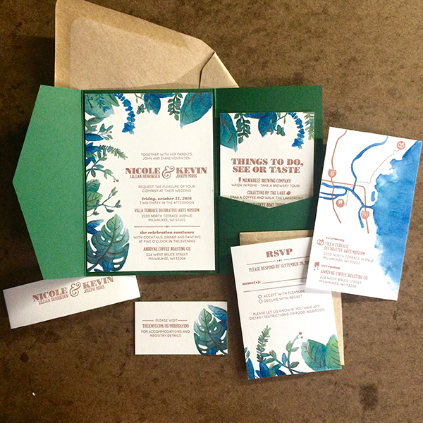
The end goal for me and my clients is to create a branded design throughout …in a way that really speaks to the wedding guests and tells the individual story. This may look like an illustrated monogram or crest, a handcrafted map of the venue’s city, along with venue illustrations that help narrate the feel of the hosted event. I love working with handmade papers as well …there’s nothing better than letterpress printing on a natural cotton, wrapped in silk ribbon, sealed with a wax seal stamp. Add on some vintage stamps and I’m a happy lady.

FULL TIME FUN Over the last five years, I have grown from part time to full time. It’s the dream to be able to wake up (walk out the back door) and have my job be what it is …creating something new every day. I’ve honestly had a hard time calling it a job, because I love it so much. People can love their jobs, right?

BOXCAR’S ROLE Boxcar has played a colossal role in my workflow process. Since 2012, I’ve outsourced all of my platemaking to Boxcar and have had such a wonderful experience doing so. I use a polymer plate for both my Chandler and Price presses and have produced work from intricate illustrations to bold typefaces.

Down-home roots and printing passion drive Hope Johnson of THE little BLUE CHAIR, a Louisiana-based letterpress printer.

I have to give a special shout-out to the printmaking department at Boxcar. The customer service I have received over the years has been nothing short of grace & love. This crew knows what they are doing, but they have such heart for their printers and a passion for the art. Boxcar is a company I will always stand behind. 

WHAT’S NEXT This year, I am excited to be releasing a wedding stationery collection that will reflect and support as many handmade artists as possible, from the platemakers at Boxcar to the papermakers around the country. This collection will be geared towards the refined and organic bride and groom with a special story to tell. I can’t wait!

Thanks Hope for the beautiful peek into THE little BLUE CHAIR. We tip our hats to you and your amazing printing adventures and keep up the fantastic work!

Letterpress Party at Bay View Printing Co

Ashley Town of Bay View Printing Co. in Milwaukee, WI cultivates printing camaraderie amongst its 75+ members while artfully conducting the printing festivities of the by-day commercial and by-night whirl of workshops, co-ops and print parties. Ashley sat down with us to talk shop about how two and half beautiful years that have flown by since buying the shop (and taking the full-on plunge as full-time letterpress owner) to how teaching, supporting her family, and sharing the joys of letterpress have more in common than meets the eye.

Ashley Town is the creative tour-de-force behind Milwaukee, WI’s Bay View Printing Co.

A PRINTING COMMUNITY TREASURE A little about me…I’m a mother, a teacher, a wife and a super curious and anxious body that prefers to be in constant motion. At the shop, I love crossing items off of a to-do list, thinking of new ways to flex my creative muscles and try really hard to stay engaged in my community. At home, I love wrestling and reading books with my son, cooking together as a family and drinking local beers with my husband. Prior to owning the shop I worked as a designer and faculty at the Milwaukee Institute of Art & Design.

Ashley Town is the creative tour-de-force behind Milwaukee, WI’s Bay View Printing Co.

A little about my shop…it’s amazing! Bay View Printing Co. is 100 years old this year and I’m incredibly lucky to have fallen into it 2.5 years ago. In 100 years of existence I’m only the third owner (first female – huzzah!). We have 8 letterpresses, 3 offset presses, a small foil press, an Intertype, and upwards of 350+ wood and lead typefaces all crammed into the basement of a once Protestant Church in the Bay View neighborhood of Milwaukee. Historically, the shop has always been very involved in the Bay View community and supportive of other local small businesses and organizations, but somehow relatively hidden and unknown to a large percentage of the public community. I lived in Milwaukee for 12 years as an active member of the art community before I had ever even heard of its existence. So, when I bought it 2.5 years ago my goal was to take that treasure chest and share it with the community, to make letterpress design and printing accessible to anyone and everyone in the community who has an interest. It’s been about two years in the making, but it’s happening! We teach one to three print-related classes a week, have a print co-op of currently about 75 members and people are making beautiful stuff within our walls on the daily. I like to say that during the day we’re a commercial design+print shop and at night we’re a print party.

Ashley Town is the creative tour-de-force behind Milwaukee, WI’s Bay View Printing Co.

THE LURE OF LETTERPRESS The tactility and the physical labor are what initially drew me to letterpress and what continue to do so today. I went to grad school at the School of the Art Institute of Chicago and spent most of my time in the writing department. I began investigating my personal memories and the lines, or blur rather, between truths, lies, memory and the construction of each. I was documenting really personal, gritty, hard memories on a daily basis and creating drawings/illustrations to accompany them. I ended up writing a book, but every time I printed proofs I knew something was off. The feeling of holding these stories, touching the letters and really feeling the experience or reliving those memories was completely gone. So I knew I had to print in a way that would allow for that. I needed the tactile quality that only letterpress printing can offer. And the physical labor and real work that went into typesetting and printing each and every page of the book just felt right. A cathartic experience that couldn’t have happened any other way.

Ashley Town is the creative tour-de-force behind Milwaukee, WI’s Bay View Printing Co. Ashley Town is the creative tour-de-force behind Milwaukee, WI’s Bay View Printing Co.

WISCONSIN’S OWN My little shop is located in Bay View, in my opinion the best neighborhood in Milwaukee. Historically, Bay View is the most diverse neighborhood in the city and there is a ton of community pride here. Neighbors still shovel for one another, have morning chats in the alley, and genuinely support one another.

Ashley Town is the creative tour-de-force behind Milwaukee, WI’s Bay View Printing Co.

Milwaukee in its entirety is also the perfect place to have a community print shop – the arts culture here is vast and growing and currently in love with craft and handmade goods.

MENTORS + INSPIRATION In terms of the letterpress community, I’m a baby so I’m constantly looking at and learning from other printers. Sometimes that means creeping on Michael Hepher’s (Claw Hammer Press) process videos or drooling over Kathryn Hunter’s (Blackbird Letterpress) linocuts on Instagram. Sometimes that means sitting down in the studio and pouring over all the boss babes and their work in my Ladies of Letterpress book. And sometimes that means calling Jim Baker (the previous owner of Bay View Printing Co) and begging him to come show me that little trick on the Kluge just one more time. Although, as I grow as a printer and a curious student the latter is being replaced by hours of tinkering on my own accord.

Ashley Town is the creative tour-de-force behind Milwaukee, WI’s Bay View Printing Co.

DESIGNED TO PRINT I’m a designer + printer + artist. Although in my opinion, anyone who prints is an artist. The decisions that go into creating perfect prints are most definitely artistic ones and the process itself is an art form. In terms of my process…I’m lucky enough to work with a lot of clients that have seen our portfolio of work or known someone we’ve worked with and they offer up complete creative freedom with their business, packaging, branding, wedding invitations, etc. etc. That means I get to make design decisions that embrace ideas that can only be realized through letterpress printing so the client truly gets unique work.

Ashley Town is the creative tour-de-force behind Milwaukee, WI’s Bay View Printing Co.Ashley Town is the creative tour-de-force behind Milwaukee, WI’s Bay View Printing Co.

I just finished a wedding suite for a bride that saw one of our “Nasty Woman” posters in the shop during our consult and said, “Can I have that for my invites?!” She was talking about the inking technique which was me going nuts with 5 ink colors and a brayer. I thought, “for an entire wedding suite? That’s insane. But oh so beautiful. YAAAS. Let’s do it!”

FULL TIME FUN Yes. Most days the hustle is real. Trying to balance designing, printing, hosting print parties, teaching classes, keeping co-op members engaged, running the business and remembering that I have and love my family is a disaster of a balance but I’m also 100% living the dream. I hear my dad in my head on most days saying, “You can sleep when you’re dead”.

Ashley Town is the creative tour-de-force behind Milwaukee, WI’s Bay View Printing Co.

PRINTING FEATS The accomplishment I’m most proud of is raising my son, Oliver. And doing so while running a business. Neither one is an easy task and every day that he continues to grow into an awesome human is a notch on our belts. I’m also proud of the change and growth that Bay View Printing Co. has gone through in the past 2.5 years. When I made the decision to buy the shop someone said to me, “Don’t buy that old man’s shop – you’ll be wearing his clothes for the rest of your life.” That was really scary. Jim is an amazing person and a super talented printer, but had zero interest in design or teaching classes or anything of the things that I wanted to do. The bulk of his work was offset printing for local small businesses and crash imprinting banking forms. The idea of taking over a business whose current focus was completely opposite of what I saw myself doing was a bit terrifying. But here we are. Doing all the things. I maintain if you do awesome stuff, you attract awesome people.

I couldn’t be more proud to work with all of the incredible Milwaukee folks that we work with in all the different capacities that we do.

PRESS HISTORY I guess my story is a little weird and atypical. Most folks that I’ve met or read about dreamt of acquiring a press for years before they found one or they spent a decade piecing together a type collection, whereas I was lucky enough (or crazy enough) to acquire the whole shebang all at once. But, the first press I fell in love with at the shop is our 8×12 C&P platen press. The model was manufactured in 1894, it’s the oldest press in the shop and still my reliable little babe. But I’m currently in a love affair with our Vandercook No 4. There’s something about hand cranking every print through the press that’s really satisfying right now. Feels like work. Really beautiful work.

BOXCAR’S ROLE Ah man, thank god for Boxcar Press!! When I first started designing and printing wedding suites it was all handset type all the time. But we just grew so dang fast and the wedding work was out of control. Designing with all handset type wasn’t sustainable if I wanted to continue to grow that part of our business. And then I found Boxcar and holy smokes did the doors fly right open. The idea that I can design digitally and send proofs back and forth to clients and then have polymer plates at my door days later and STILL get that sexy impression on paper that everyone is looking for…well, that’s mind blowing. I remember the first time I printed with a polymer plate from Boxcar I felt like I was cheating. Ha! I still do sometimes, and there is still a part of me that needs to slow down and design with our type collection as much as humanly possible, but having other options is incredible.

SHOP TIPS Focus on continuing to listen to all the advice and filter what works for BVP Co. and what doesn’t. I suppose that might be good advice for anyone, huh?

WHAT’S NEXT Keep on keepin’ on. We’re babies and we’re growing our commercial print client base and our portfolio of wedding work and our assortment of classes and our print co-op community. We’ve worked really hard to get here and I think it’s time to settle in for a bit.

Immensely huge round of thanks and appreciation out to the ever-brilliant Ashley of Bay View Printing Co. Keep up the awesome & inspiring work!

Banshee Press: Best Friends in Letterpress

When best friends Britt Madden and Ava Goldberg of Banshee Press set-up shop in the creative & booming city of Denver, Colorado, they sought to foster the true tradition of letterpress by raising the bar for elegance, quality and beautiful craftsmanship. Fast forward a few years later and the magnificent duo still prints perfection, adds to printing ephemera collection, and heckles one one another in good fun. The brilliantly cheery pair sat down with us to catch us up on the next moves for the shop, properly cut paper (the foundation for success!) and why you shouldn’t print & mix colors alone at night.

Britt Madden & Ava Goldberg of Banshee Press are the best friend duo behind the beautiful letterpress pieces that are hand printed in ColoradoBritt Madden & Ava Goldberg of Banshee Press are the best friend duo behind the beautiful letterpress pieces that are hand printed in Colorado

BUILDING FROM THE GROUND UP We are a duo (Ava & Britt) born and bred in Colorado. We met in high school and have been best friends ever since. After college, many travels and odd jobs we decided to unite our creative talents and work a job we loved and built from the ground up. We both majored in print, and decided letterpress was a perfect channel for our perfectionism and design dreams, so creating Banshee was an obvious move. Out of the studio we take advantage of all the adventure Colorado has to offer and spend our free time outside with our friends and family.

THE FIRST TASTE OF LETTERPRESS Britt didn’t have letterpresses in her school, and once she graduated decided that she needed to learn. She bought a C&P 10×15 New Style on Briar Press and taught herself in her garage. Ava’s school did have letterpresses and she learned to use them while in college. We maintained our practice the best we could until we began Banshee with the purchase of our second press, the Vandercook Uni I.

Britt Madden & Ava Goldberg of Banshee Press are the best friend duo behind the beautiful letterpress pieces that are hand printed in Colorado

CREATIVITY IN THE CENTENNIAL STATE Our shop is located in the RiNo (River North Arts District) of Denver. It’s a concentration of creative businesses, including architects, art galleries, designers, furniture makers, illustrators, wineries, breweries, sculptors, photographers, and an array of studio spaces. The buildings are covered in murals and color and the streets bustle with evening nightlife. Our space is full of natural light, plants, and presses, and we enjoy having people come and go as they walk by. Our favorite thing about it is that we can use the space for all of our creative endeavors, not just letterpress, and encourage our friends to visit us to do so as well.

Britt Madden & Ava Goldberg of Banshee Press are the best friend duo behind the beautiful letterpress pieces that are hand printed in Colorado

MEET THE PRESS FAMILY Our first press was a Chandler and Price 10×15 New Style. We now additionally have a Vandercook Universal I and a Heidelberg Windmill 10×13.

DESIGNED FOR PRINT We are both designers and printers and we print designs provided by our clients as well. We have a quirky aesthetic, and enjoy designs that utilize the unique capabilities that letterpress offers.

Britt Madden & Ava Goldberg of Banshee Press are the best friend duo behind the beautiful letterpress pieces that are hand printed in Colorado

THE CREATIVE FLOW Normally we begin any design job with close conversations with our clients. The more information we can gather, the faster and more efficiently we can design to their needs. It saves us energy and them money. We then move into our brainstorming sketch phase where we put whatever our brains come up with down on paper.

After a “would you want that to be your logo?” elimination, we come back to clients with a variety of ideas that we narrow from there.  Sometimes we know that either Ava or Britt will be more of a fit for a particular job and will work solo in those situations, but never without feedback from the other.

Britt Madden & Ava Goldberg of Banshee Press are the best friend duo behind the beautiful letterpress pieces that are hand printed in Colorado

PART-TIME PARADISE We do not print full time. Britt has two young kiddos that capture much of her attention and Ava owns and runs her own business as well. Printing full time is something we wouldn’t mind, but at this point in our lives is not something we can make the time for.

Britt Madden & Ava Goldberg of Banshee Press are the best friend duo behind the beautiful letterpress pieces that are hand printed in Colorado

PRINTING FEATS Making it onto Boxcar’s blog!  For the past two years we have published an artist series of letterpress editions that we are very proud of and enjoy doing immensely. We recently purchased a Windmill and have taught ourselves how to use it. And finally, we are best friends in business and we still love each other with all our hearts.

Britt Madden & Ava Goldberg of Banshee Press are the best friend duo behind the beautiful letterpress pieces that are hand printed in Colorado

BOXCAR’S ROLE Boxcar is our patient, kind, and understanding babysitter. We know the rules, and yet, we sometimes break them. They always call us with a smile to remind us of our errors before we make them. They have kept us from adding additional stress to our jobs, and consistently make this huge piece of our process easy. Thank You!

SHOP TIPS Bow down to King Reggie and make him your friend. Properly cut paper is the foundation to success. And don’t mix and print color alone at night.

Britt Madden & Ava Goldberg of Banshee Press are the best friend duo behind the beautiful letterpress pieces that are hand printed in Colorado

WHAT’S NEXT In 2017 we are going to focus more on our own designs and begin creating a line of products all our own. It’s easy to lose yourself in printing other people’s jobs, and we want to keep our aesthetic a priority. It makes everything more fun.

Immensely huge round of thanks out to Britt & Ave of Banshee Press for letting us take a peek at their printing paradise!

The Printing Rhythm at One At a Time Press

Patricia Barron of One At a Time Press lives life to the fullest daily in her garage-turned-studio in the picturesque Sierra Madre mountain range of sunny California. Her ambitions to pursue her passions in letterpress have been fostered by exceptional printing mentors and the thrill of the creative challenge. We caught up with Patricia to see how her part-time printing adventure is treating her.

Patricia Barron of One At a Time Press lives life to the fullest daily in her garage-turned studio in the picturesque Sierra Madre mountain range in sunny CaliforniaPatricia Barron of One At a Time Press lives life to the fullest daily in her garage-turned studio in the picturesque Sierra Madre mountain range in sunny California

THE JOY OF CREATING I am a born and raised, Southern California lady through and through. I live in Sierra Madre with my husband, Jeff. I went to college at UC Santa Barbara in 1969 and then transferred as a junior to UC Berkeley, where I graduated with a B.A. in psychology.

I began my business on my 60th birthday in 2011, after having raised two boys to men as a stay at home mom. I was lucky to be able to take art classes at Pasadena City College, the local junior college. These included drawing, life drawing, painting, ceramics, sculpture and photography. I love the challenge and joy of creating, and am inspired by nature, people, places, music, books and life. Sierra Madre has beautiful views, mountains, and green spaces so there is much to inspire.

Patricia Barron of One At a Time Press lives life to the fullest daily in her garage-turned studio in the picturesque Sierra Madre mountain range in sunny California

LETTERPRESS LOVE AT FIRST SIGHT My first exposure to letterpress began at the Armory Center for the Arts in Pasadena. I immediately became enthralled with the process, from imagining what to print to making it a finished product. At first, I though I’d have trouble thinking of enough ideas of what to do, but I’m way over that!

MEET THE FAMILY My first press was a 1950’s Chandler & Price Pilot Tabletop Press that I bought in 2011. In 2015, I was very lucky to buy a Vandercook SP-20 press that I had shipped out from Chicago.

SERENDIPITY IN SIERRA MADRE My studio is in our garage. We have two garage doors, a double and a single. The one car garage is my studio. My favorite thing about my studio is that I can open the garage door and get lots of fresh air, light and a view of the mountains. 
While it’s cold in winter, I can use a space heater. In the summer, I am up very early or very late, printing in the cooler part of the day.  I am very proud of having my own business and the quality of my work.

Patricia Barron of One At a Time Press lives life to the fullest daily in her garage-turned studio in the picturesque Sierra Madre mountain range in sunny California

PRINTING MENTORS Denise El-Hoss is my teacher and mentor, and I have been taking classes from her at the Armory for almost five years. Through her encouragement, I began my business. She is totally awesome as a teacher and friend. In fact, I bought my first press from her.

THE CREATIVE PROCESS I design my work using old blocks, my linoleum carvings, designs I create on Adobe Illustrator and have made into blocks, as well as images I find that are copyright free. I also use wood type and metal type that I either have or can use at the Armory. Lastly, I use Illustrator to create words or sentences that I need to be made into a block.

Patricia Barron of One At a Time Press lives life to the fullest daily in her garage-turned studio in the picturesque Sierra Madre mountain range in sunny California

PART TIME PRINTER, FULL TIME FUN I do not print full time, but do print as much as I can. My goal is to do more custom work and larger scale prints. I love to experiment to create original work. My process is often a combination of planning and serendipity. I often begin without knowing exactly what will come next. I love the challenge of solving for the answer! I sometimes begin with an image I like and then bring it to life with words. Or I’ll find a poem or saying that I like and come up with a background.

PRINTING FEATS My art prints, Fauve Look I & II, make me proud, having hand-carved three different linoleum blocks (one for each color) and succeeding in printing them to my satisfaction. I love the way they turned out. The image is based on a textile design from France, 1925. 

I also printed a 2016 letterpress calendar which turned out to be worth all the work involved! I was very happy with the result.

Patricia Barron of One At a Time Press lives life to the fullest daily in her garage-turned studio in the picturesque Sierra Madre mountain range in sunny California

SHOP TIPS Use AlignMate! Their product helps in making sure your text is straight and centered.

WHAT’S NEXT I have been accepted into various shows, including the Patchwork show in Long Beach in June and a show in Claremont. I also have my work in Lulu Mae’s in Pasadena and at Creative Arts Group in Sierra Madre.

Patricia Barron of One At a Time Press lives life to the fullest daily in her garage-turned studio in the picturesque Sierra Madre mountain range in sunny California

A huge round of thanks to Patricia for letting us take a sneak peek at her creative world at One At a Time Press!

Learning Letters with The Alphabet Press

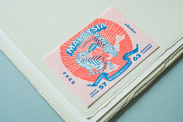
Like letterpress, the city of Selengor in Malaysia sits on the crossroads of both traditional techniques and revolutionary technology. The country also is home to Zeejay Wong of The Alphabet Press, a custom letterpress print shop that offers unique letterpress stationery featuring bold colors and bright imagery in the form of endangered Malaysian animals and favorite food delicacies of the country. We caught up with Zeejay to see how the letterpress journey started with an across-the-globe trip to Melbourne, Australia and resulted in a thirst to make print come alive again in Malaysia.

We follow the beautifully crafted designs of The Alphabet Press, a Malaysia-based letterpress print company that features the type-loving Zeejay Wong and his team of letterpress aficionados.

HANDMADE CREATIONS I was trained as a web designer and it was my profession for eight years before I got into letterpress printing. Shifting from high speed digital works to something that seems to be technologically backward; it was truly a transition. I am now a full-time printmaker at The Alphabet Press and I enjoy creating products that are made by my own hands.

FIRST IMPRESSIONS Three years ago, we were a web design company who set out to look for something special for our business cards. We believe that the first impression is very important. I have been looking for printing technique such as letterpress in Malaysia, but we lacked the knowledge and resources. We decided to fly all the way to Melbourne to learn the craft itself from Carolyn from Idlewild Press. Since then, intrigued is an understatement to how I am at awe of the attention to detail that goes into letterpress printing.

We follow the beautifully crafted designs of The Alphabet Press, a Malaysia-based letterpress print company that features the type-loving Zeejay Wong and his team of letterpress aficionados.

MARVELOUS MALAYSIA I co-founded The Alphabet Press with 3 of my fellow partners. We rented a small shop in Selangor which is the second busiest town in Malaysia. Compared to Kuala Lumpur, the capital of Malaysia, Selangor is less busy a town with good neighborhood. Everything is easily accessible. Our shop is located in a small town in Selangor surrounded by suburban neighborhood, which fits the nature of our business and choice of lifestyle a lot.

We follow the beautifully crafted designs of The Alphabet Press, a Malaysia-based letterpress print company that features the type-loving Zeejay Wong and his team of letterpress aficionados.

DESIGNED FOR PRINT I am both a designer and a printer. I graduated from Multimedia courses in a local university, and I was trained to do everything that design entails from graphic to video to 3D modeling, web design, and more. But now, I have found my niche, which is letterpress printing.

THE CREATIVE PROCESS Malaysia is a big pot of culture. The vibrant nature of our nation that makes up from different races, cultural, food, and architecture really inspires me. I like to observe the little things that happen around me. Before I start doing any design, I will walk around in the town to get myself some fresh air and let the surrounding inspire me. And hopefully, I can find something that interests me and make it into a design subject. There are too many things to learn in Malaysia and the only thing that worries me is that I do not have enough time and resources to make it into something tangible. I usually don’t see this as just design but the documentation of our culture.

We follow the beautifully crafted designs of The Alphabet Press, a Malaysia-based letterpress print company that features the type-loving Zeejay Wong and his team of letterpress aficionados.

FULL TIME FUN Yes, I have been a full-time printmaker for two years, since we started The Alphabet Press.

PRINTING FEATS We finally released a series of social cards, notecards, and notebooks featuring the endangered animals in Malaysia and favourite foods of Malaysians. We launched the debut at Kinokuniya Book Store in Malaysia and to us, it’s more than just a product launch. We did a letterpress demonstration as well to educate people about the old craft of letterpress with the lead types we salvaged from the old printing shops around Malaysia.

We follow the beautifully crafted designs of The Alphabet Press, a Malaysia-based letterpress print company that features the type-loving Zeejay Wong and his team of letterpress aficionados.

BOXCAR PRESS We’re loyal supporters of Boxcar Press! There aren’t many resources for letterpress in Malaysia, and Boxcar Press has truly been our lifesaver. We started The Alphabet Press by purchasing most of the important tools from Boxcar Press. It’s not an exaggerated statement to say, without Boxcar Press, it would be pain in the arse to start a letterpress studio here. Oh, and the videos are particularly helpful for a beginner to start to learn how to use their Heidelberg platen press.

PRESS HISTORY A 1969 Heidelberg Platen Press (Windmill). We acquired this press from an old veteran printer. At first, he was quite reluctant to let it go. It took me 2 months to convince him to sell the press to me and promise that I will take care of it. Since then, we became good friends and he is also a good mentor of mine.

We follow the beautifully crafted designs of The Alphabet Press, a Malaysia-based letterpress print company that features the type-loving Zeejay Wong and his team of letterpress aficionados.

SHOP TIPS Paper is expensive for us, especially when we import most of our papers. We used to have a big margin on our printing. Now, we have reduced it to just 14mm (0.551 inches) for top and bottom and 10mm (0.393 inches) for left and right of the paper. We usually stick the plate to the very edge of our aluminum base and use a gauge for my print jobs most of the time as I require a perfect registration. Besides, I will always have rosin powder around me to fix the most irritating problem – the ghosting when I print a large blotch of colors. Apply a little bit on the roller track and it can solve most of the problems.

We follow the beautifully crafted designs of The Alphabet Press, a Malaysia-based letterpress print company that features the type-loving Zeejay Wong and his team of letterpress aficionados.

WHAT’S NEXT We will be focusing on our bespoke services. People love their wedding and business stationery printed with letterpress. Besides that, we will keep on participating in local art festivals to promote the craft of letterpress to the people in Malaysia. We want to make print alive again in our community and to upkeep the traditional printing skill that would otherwise become obsolete in the fast-moving world of technology.

Huge round of thanks out to Zeejay Wong of The Alphabet Press for letting us catch a glimpse into his vibrant printing world!

Keeping Creative With London Bellman

Diving into the letterpress printing realm sometimes starts like an archaeology adventure: layers of beautiful history and technology are uncovered, past projects are found as remnants on the tympan paper of newly discovered (and obtained presses), and and entire chasm of knowledge is revealed when the printing press starts to clink, buzz, and whirl to life. London Bellman knows this thrilling adventure all too well. The creative virtuoso has been been discovering new ways to apply his innovative passions from past endeavors such as a toy sculptor, painter, and tattoo artist into letterpress printing. His command over line and layout in his tattoo work has translated breathlessly and beautifully into letterpress printing (and it’s quite easy to be enraptured by it all as well). We caught London in both of his ink shops to see how the printing journey started and where the creative momentum has taken him.

London Bellman (of Atomic Press in Oregon) prints beautifully intricate letterpress designs that pull from his background professions as a tattoo artist, sculptor and painter.

INKING UP PAPER AND SKIN I’m a guy who married an awesome lady who puts up with all my scattered visions. We walk a lot, garden, cook, live simple and enjoy the hell out of each other. I’m very thankful and fortunate to have Steph in my life. Career-wise, I have been in the tattoo world since 1991 and that is my primary income stream. This last year I shifted my focus on what it is that I want to convey in my work tattoo wise and personal art. I was a toy sculptor for about five years before I entered the realm of tattoo. The company I worked for did prototypes for the toy industry such as Teenage Mutant Ninja Turtles, McDonalds give-aways, Garfield, Felix the cat, etc. I learned a lot there but also realized sitting in a factory type environment was not for me. Tattooing gave me the life I have now and I owe so much to it. Almost every person I am acquainted with has been through artistic or tattoo endeavors. I also started painting and now sculpting again is in the works.

LOVE AT FIRST SIGHT Letterpress seemed like the simplest way to reproduce my art with the least amount of equipment and is the least toxic. That’s what I thought. 😉 Compared to screen printing (with lots of solvent fumes) which a close friend of mine does. I like that you can use soy solvents and not lose a liver over it.

London Bellman creates beautiful letterpress prints inspired by his own work as a tattoo artist.

I started reading Briar Press’s blog and was going crazy with all the information. Learning the difference in presses, how they worked and performed different tasks. Searching, searching, searching for the right press. In the beginning I would buy a press, dismantle it, clean it and test print primarily. It was a slow process. At one point I drove to San Francisco from here in Portland, Oregon straight through, loaded up a Pearl No.1 and drove home. My wife thought I was press crazy. I’ve had them shipped, get broken, repaired them, all to just find the right fit for my needs. When I would realize a press was not for me I would look for another one and start all over. The movement and mechanical beauty of the machines themselves is a big part of the magic of letterpress. The history of these machines is a big part as well, and where they have been & what they have done. A few times a press has come with boxes of type, quoins, all the extra printer’s goodies and there would be remnants of past projects. Sometimes layers of past projects still on the tympan paper. That part was a fun kind of archaeology. I have not printed a ton of projects, it took me most of the time gathering my equipment and momentum.

London Bellman (of Atomic Press in Oregon) prints beautifully intricate letterpress designs that pull from his background professions as a tattoo artist, sculptor and painter.

OREGON’S VERY OWN My home and studio are one and the same. I like to call it Atomic House. The actual business is Atomic Art Tattoo Studio and that’s the basement of my home. The main floor is where Steph and I live and the attic space is where my presses and paper cutter reside. I am a hobby printer at this point and really enjoy it when I do print. The best thing about my home, shop, and studio is that it’s all right here and at my fingertips whenever I want to make something — I don’t have to leave the premises to make it happen.

THE CREATIVE FLOW I would say I design for tattoos and my personal art whims but I don’t design for peoples’ personal projects. I am very low tech as far as designing goes. I play around with some small sketches, decide whether I like the composition, and let it rest in my stack of images. If I like it enough to proceed to making a print, I’ll redraw the design, ink it, and have a plate (or plates) made. I keep a sketchbook going daily and have lately been going back to my past imagery and borrowing from there.

FUTURE PRINTING As I mentioned before, I am a hobby printer but would love to make more images and find a market for my art. I have been pushing towards that lately. I haven’t fully figured it out but I have some ideas in the works.

PRINTING FEATS I am proud of what and where I am at this point in my life. I’m rich in love, imagery, where I live, whom I am surrounded by and the country I was born in (I mean this in a not crazy patriotic kinda way). I feel lucky in general when considering the state of the planet as a whole.

BOXCAR’S ROLE Boxcar Press is awesome! I have not used you for a ton of services but you did make me a couple really cool base plates for my presses and your online video tutorials are indispensable.

London Bellman (of Atomic Press in Oregon) prints beautifully intricate letterpress designs that pull from his background professions as a tattoo artist, sculptor and painter.

PRESS HISTORY I’m not sure which was my first press? I’ll try and go down the list, which are mostly tabletops. I’m sure I’ve had a couple Kelseys 5×7’s; a Sigwalt or two have arrived broken; Three Pearl No.1’s: basically a tabletop with cute cabinetry below; my largest was a 10×15 Craftsman (unfortunately I let it go but it was a beautiful beast); and one Pilot 6×10 old style which I sold. Currently I am printing on a Craftsman 6×10 and I have a Craftsman Monarch 9×12 made out of aluminum.

SHOP TIPS I’m still learning and always will be. My advice would be: don’t rush, take your time, walk away and come back to it later. If you screw it up… re-run it and print it again. I did this just the other day.

WHAT’S NEXT This time last year I started a letterpress project based on Bio-Mechanical inspired art. The artists in the first set of five prints provided me with a design of their choice in the aforementioned genre. I printed 120 of each image mailed them to the artists to sign and number.

Once they send them back to me I collate them into sets and each person gets 20 sets of prints to sell, gift, or whatever they want to do with them. I am onto a second and third set currently. I recently printed a few images in the same vein (Bio-Organic) as an off shoot of Bio-Mech, but it leans more towards nature-inspired forms. I would like to increase my inventory of prints, nature-inspired stuff primarily, sticks and stones, mushrooms, bones, landscapes etc. I have been offered a couple opportunities to show so hopefully more of that will happen in the near future.

London Bellman (of Atomic Press in Oregon) prints beautifully intricate letterpress designs that pull from his background professions as a tattoo artist, sculptor and painter.

An exceptionally large round of thanks and applause out to London for letting us get a larger glimpse of his creative world!

Printing In the Mitten: an interview with Lynne Avadenka

Following the hum and surge of industrial buzz that abounds in Detroit, Lynne Avadenka uses letterpress printing to create distinctive mixed media works in the forms of prints, artist’s books, and personal art. Coming from a printing background that boasts over 35 years of passion, printing curiosity, and a love for type, Lynne re-crafts the components of being a power printer in today’s market by combining these sought-after traits and being able to share the joys of printing by pioneering Signal-Return — a community based print shop. We caught up with Lynne between print runs to get the scoop on how life with letterpress keeps one’s heart skipping a beat.

Lynne Avadenka of Detroit, Michigan and of Signal-Return Press.

FALLING FOR LETTERPRESS I have lived in the Detroit area all my life and I studied art and printmaking at Wayne State University. I’ve always loved letterforms, books and prints, I’ve worked as a professional calligrapher, and I fell in love with letterpress printing while in graduate school.

DETROIT INK When I graduated with an MFA in 1981 there was very little communal printmaking activity in Detroit, so I set up my own studio/print shop. I now have an SP-15, but began printing on a small platen press, moved up to a Vandercook #4, and then traded that for the SP-15 around 20 years ago. I also have an etching press. I love the fact that my studio is steps away from the rest of my house and that I can go to work in my pajamas.

A look inside Signal-Return Press in Detroit Michigan

LOVE AT FIRST SIGHT When I was in graduate school, Susan Kae Grant came to teach photography at Wayne State University. She learned letterpress and book arts at University of Madison-Wisconsin and wanted to share it with Wayne students, so she set up a shop (one Vandercook #4 and some type) in the basement of the Fine Arts Building. I took her class and everything I loved ‐ books, letterforms, making multiples, and hand printing ‐ all came together.

Letterpress work samples from Lynne Avadenka of Signal-Return Press.

left: Gone I, 2014, letterpress from wood type and photopolymer, powdered graphite
right: Gone III, 2014, letterpress from wood type and photopolymer, powdered graphite

I was in graduate school before there were degrees in book arts and printing, so I learned by printing on my own, reading as much as I could, and taking workshops (thank you Center for Book Arts New York).

DESIGNED TO PRINT I am artist/printer. I use my press to create limited edition books and prints, but I also consider it a crucial art-making tool to create unique mixed media works.

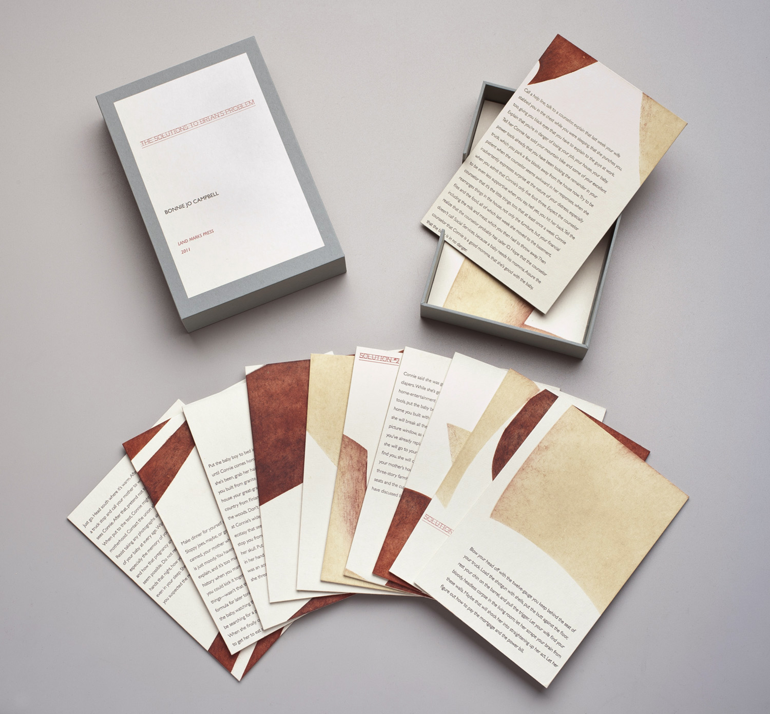
Letterpress work samples from Lynne Avadenka of Signal-Return Press.The Solutions to Brian’s Problem, 2011 (written by Bonnie Jo Campbell), pochoir, letterpress from photopolymer, wood veneer

PRINTING FEATS My limited edition books and prints have been acquired by institutions all over the world: The Library of Congress, The Meermano Museum, in the Netherlands, The Israel Museum, Jerusalem, The Detroit Institute of Arts, The Biblioteck zu Berlin, The New York Public Library, The British Library, The Jewish Museum NY and numerous university special collections libraries.

For the last three years I have served as Artistic Director of Signal-Return, a community letterpress studio in Detroit. I am one of a talented team of four sharing the beauty of letterpress printing with a wide community of artists and arts enthusiasts across the Detroit area.

Letterpress work samples from Lynne Avadenka of Signal-Return Press.
The Solutions to Brian’s Problem, 2011 (written by Bonnie Jo Campbell), pochoir, letterpress from photopolymer, wood veneer

BOXCAR’S ROLE I started using Boxcar plates on a particular limited edition project, the first in a series of works devoted to contemporary Israeli writers. I didn’t have enough Hebrew type in metal to produce the edition, so I designed the book pages using a digital design program and then had Boxcar make plates from my files. I can’t remember who first recommended Boxcar Press, but after trying several other companies, I have been using Boxcar Press exclusively for years now for both text and image photopolymer plates.

A look inside the Signal-Return Press shop.

PRESS HISTORY My first press was a small Chandler Price platen press with an 8 x 10 chase.

SHOP TIPS Years ago an excellent Detroit letterpress printer, Leonard Bahr, shared an invaluable trick with me — and although the better-trained letterpress printers might frown at this, I’ve found it to be invaluable. If you want to set type in an asymmetric shape, or “sprinkle” type on the bed, roll up snake like coils from oil based modeling clay and form them around the type to hold it in place on the press bed.

Letterpress work samples from Lynne Avadenka of Signal-Return Press. Letterpress work samples from Lynne Avadenka of Signal-Return Press.top: Lamentations 2009, (Chapter 5), woodcut, pochoir, letterpress from photopolymer
bottom: Lamentations, 2009,(title page) letterpress from photopolymer

WHAT’S NEXT I intend to make some real progress on limited edition projects that have been languishing: one is a tribute to the Dutch letterpress printer/artist H. N. Werkman, and the other is a book project based on a prominent contemporary writer’s story written and published totally on Twitter.

An immensely large round of applause out to Lynne for letting us get a look inside her wonderful printing world!