One of the biggest ways a letterpress printer (newcomers and veterans-of-the-trade alike) can make a positive environmental impact is to incorporate eco-friendly practices into their business and workflow. Actions as simple as recycling paper, re-using scrap materials, or partnering up with a non-profit organization whose vision for a greener planet is as sharp & clear as yours. We reached out to some earth-friendly letterpress printers for ideas on how to lighten your shop’s environmental footprint.
Sierra Zamarripa – Lovewild Design Sustainability is a huge priority for us at Lovewild Design. We have a full range of letterpress goods, screen printed gifts and bath products all handmade in our Brooklyn studio. We do much of our printing on a Vandercook SP-15, as most of our letterpress items are small batch. All of our papers are made from post consumer waste or renewable resources like cotton and made with the use of hydro or wind power. We also try to be pretty waste-free. Be it paper scraps, rags, etc. – everything gets reused as much as possible.

Before starting Lovewild, I worked in the public sector. This really woke me up as to how much was being wasted in day to day operations be it money, resources or materials (paper!). I knew that if I was going to do my own thing, I couldn’t in good conscious contribute to the massive amounts of waste many companies make.
We’re constantly inspired by other companies or initiatives, and we’re always looking for ways to be even more green. Eco friendly paper is a start, but is often wrapped in packaging that will end up in a landfill. We’ve switched to “plastic” that is plant based. It’s sustainably made and is compostable. Some of these materials have limits as there isn’t yet an eco plastic that is rigid. We have to be creative with our packaging to make sure it meets market standards while staying green.


Alicia Rohan – A&P Design & Co. We are a custom invitation studio & letterpress print shop. We have been in business for 5 years, and we have 10×15 C&P called Lupe, and a C&P Pilot called Lola.We are all about incorporating eco friendly practices into our print shop the best we can. We letterpress on tree-free 100% cotton paper, our printing is all done manually by hand with a foot treadle. Our cutting is also done manually. We recycle all paper scrapes, plates and shipping materials.
We love that we do everything by hand. It helps to reduce errors and allows us to make sure everything is printed to our expectations. I think our brides appreciate it when they see how their invitations are printed and when they see its all done by hand they appreciate the process so much more!


Joe & Margot Borges – Pomegranate Letterpress When we decided to jump into letterpress in 2007 and buy our first press, we made a few upfront decisions on what we wanted to be and how we were going to do it. Partly because we understood that there were already many big players, especially in the United States, and a couple in the Toronto area. So did the world need another letterpress printer? We had to carve our niche and the best thing we could do was be ourselves and make business decisions based on our values. After all, that really is the only difference between us and everyone else.

Both Margot and I are very aware of how we live our lives, and how our decisions impact the world around us. We don’t see ourselves as fanatic eco-champions, nor do we shy away from the fact that we print on paper. Our view is that we can find a way to live better by making simple personal decisions on what to buy, when to buy it and even where it buy. We shop at places we feel match our core values and to try, whenever possible, to shop local. This translates into our business goal: to lessen our environmental impact, provide a quality service and run a fun business.
Our first decision was on the types of presses we were going to go after — non-electric, non-motorized. All three of our press are hand-cranked, and that means a few things: reduced electricity use, shorter print runs and less waste. When you can only print 150-200 impressions an hour, you do everything you can to be as efficient as possible during make-ready and rarely print more than you need! This means all our wedding designs are bespoke — no catalogue and very few samples. As a result, we’ve become a well-respected, local print and design studio, working face-to-face with all our clients. When you work directly with the client you become a team and the projects are more fulfilling.

Our next big decision was our ink choice. In addition to considering the environmental impact of the ink, we wanted an ink that did not smell — our studio started in our basement and we needed something we could live with. We found and use Caligo Safe Wash inks, a smaller, independent, family run operation in Wales. The inks are non-toxic, wash up with soap and water, and there is no smell. They take a little longer to dry, and although we may not always achieve the same opaque colour and coverage as rubber inks, we feel that it’s the best choice for us and the environment. Not only are we extremely happy with the results we’ve achieved, so are our clients, and we recommend Caligo to any fellow printer who has ever asked.
Next: paper. Trust us, we appreciate the irony of printing on paper while promoting an environmentally sustainable conscience. We are constantly searching for papers that maximize the recycled content and give preference to Certified Processed Chlorine Free paper (PCF). Whenever possible, we look for the Forest Stewardship Council (FSC) certification. We have also tested other non-tree paper but we have to ensure they work well with our inks. It’s difficult to find paper for letterpress that fits all these criteria and in smaller quantities for craft printers. We use Neenah Classic Crest, which is manufactured Carbon Neutral and is Green-e certified. We also love using Saint-Armand, Crane Lettra and Mohawk Strathmore.
Some of our most popular products have been created from the off-cuts of other projects. Our PomeMini cards and gift tags are printed on the remnants from wedding invitations, our PomeNotebooks are made from repurposed posters and the inside sheets are art paper we found in the garbage. Last year we purchased some cutting dies destined for landfill. One of them was a Christmas Ball ornament. We had a few Christmas cards that weren’t selling well and with a few passes through the press we had brand new ornament cards — a popular items at the fall craft shows. If a product isn’t working, why not give it a new life?
“Going green” for some is a fad, or something to attract more customers. For us, we don’t see ourselves as “green,” we just try to be sustainable and it’s truly how we roll. Pomegranate is an extension of Margot and I together, and the core values we live by. We print everything from wood and metal type, to polymer plates and lino carving. In our studio, we currently have a Vandercook SP15 proof press, C&P Pilot table top platen and a small Showcard press. We have a very nice collection of wood and metal type as well. We love what we do, and we love when people appreciate letterpress.
Jeff Marrow – Percolator Letterpress Co. We are located in Austin, Texas, a community that is very mindful of the environment and green business practices. At our shop, we try to minimize our environmental impact as much as possible. In Central Texas, water conservation is a top of mind issue. It can be very hot and dry down here, which means we run the air conditioner a lot during the summer months to keep the shop at a practical working temperature and low humidity level. In addition to making cool air, the A/C also makes a lot of distilled water. We harvest this water and are able to use it in many ways including watering plants, trees, and grass, which then take greenhouse gases out of the air as they grow. The A/C does use electricity, but our philosophy is to maximize all the benefits we can from any machine in the shop.
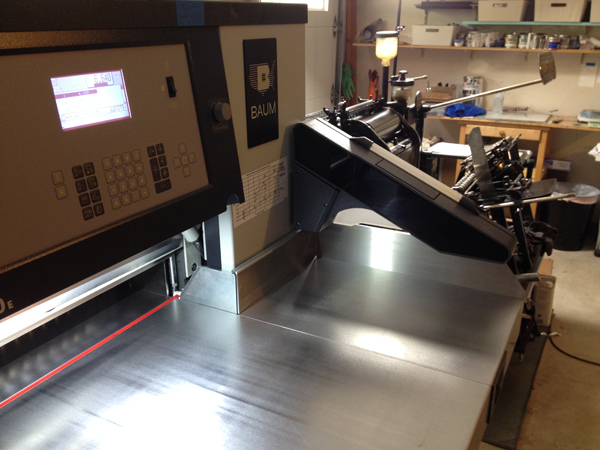
To further save on electricity, we chose a Baum paper cutter with a motor that only activates when a cut is made. It is a tremendously efficient machine. Also, our Heidelberg 10×15 Windmill is a very efficient marvel of engineering. The GE electric motor that runs the powerful press pulls very little electricity relative to its production output.
Finally, we have a shop-wide recycling and hazardous waste disposal program. Austin has a wonderful single-stream recycling program that allows us to recycle nearly 100% of our scrap papers and plastics. In addition to recycling paper, we are able to reuse some of the larger paper scraps in other project and we donate some paper scraps to a local kindergarten class for art projects. The kids love it!
Furthermore, the Heidelberg has a very clever, quick-clean mechanism that allows us to reclaim the hazardous cleaning solvents to be disposed of safely at Austin’s hazardous waste disposal facility. Also, the rags we use to clean the press are old clothes at the end of their wearable usefulness that we purchase from a large used clothing facility.
We are always looking for ways to be more eco-friendly and efficient in our shop. We love what we do and strive to create sustainable practices to help us create beautiful stationery, while doing our best to protect our natural environment.
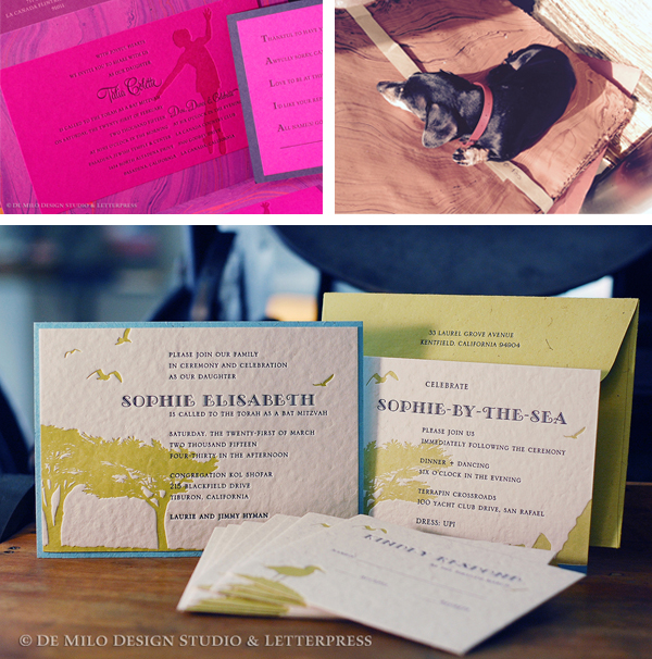
Annika Buxman – De Milo Design Studio & Letterpress De Milo Design Studio & Letterpress is a small shop located in South Pasadena, California. Two treadle presses (Franklin Gordon and C&P), one Vandercook SP15, and two C&P Pilot presses get the work done. One wiener dog named Frankie helps out when she’s not busy sleeping on top of a paper stack.

I think being “earth friendly” and “global friendly” go together. In 2007 I was fortunate to meet some fair trade artisans in Bangladesh who, along with making beautiful paper, have created a supportive and safe community for rural women who have few options for employment. I call the paper line “Sustain & Heal” because the goal is to sustain the earth and heal lives that have been adversely affected by poverty and cultural systems detrimental for women. It’s been so fun to meet customers who also care about these things. I’ve learned a lot from them and they’ve helped to shape the product.
We do other things like using Ecolo Clean press wash, soy inks, and regular trips to the hazardous waste drop off instead of dumping film chemicals down the drain. Also a lot of tricky trimming at the cutter so we get very little paper waste. We save the trim for use in handmade papermaking.
I am inspired by observing and admiring other people who live close to the earth. My grandparents on both sides of our family were farmers. They composted and reused everything. I’ve met many urban farmers who continue the same practices. I watch them and try to follow their examples.
I used to do all kinds of design acrobatics to detract from the fact that the eco paper is not as bright white. Lots of floods with bright inks and overall patterns. Now I don’t mind the less bright paper and design more simply.
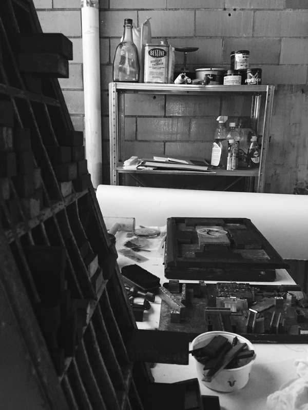
Amy Worsham – Typanum Press Since our last visit, our home studio has grown into a garage shop. Our original and ancestral 5×8 Kelsey Excelsior was joined this spring by a new style 10”x15” Chandler & Price. While proving harder to fit in our living room, the larger press has helped us to expand our capabilities and turnaround time in so many ways. We continue to offer a wide range of services including full design, hand-set type, mixed media prints, and social stationery, all with the ability to handle more jobs and with increasing complexity. We pride ourselves in our environmentally friendly practices, from press and energy usage, press inking and clean up, to paper selection and packaging. This has been an easy process for us to implement for a number of reasons.
In many ways letterpress printing has an inherently low environmental impact. Merely by continuing to maintain and use our antique presses, rather than committing them to the landfill every couple of years, we, as letterpress printers, are retaining energy. Many of these presses use hand or minimal electric power (like our C&P). In addition to this, advances in ink and the increased interest in post-consumer paper have greatly reduced the waste and toxicity of the letterpress printing process.

Like many other printers, we made the switch from oil to rubber based inks for a variety of reasons. We did a lot of research when we first began stocking our shop. We had a good deal of leftover oil-based inks that worked just fine, and were almost as old as the press, but for our situation, I wasn’t interested in using harmful chemicals with each press cleaning. We printed for a long time inside our home, with young children afoot and I use a lot of natural cleaning products with my home cleaning, why would I want dangerous and flammable chemicals in the house? Not only do we appreciate the print quality and shelf life of the rubber-based inks, but the lack of the need to use harsh solvents during cleanup has been a game changer, especially when we were printing out of our kitchen. Because we mix all of our specialty colors by hand, as needed, we also use very little ink.
For basic cleanup, we use vegetable oil with old cotton rags and newspaper. This quickly and easily removes the ink from the press but leaves an oily residue that will prevent proper inking on the next job. We had been using Bestine or other solvents [e.g. mineral spirits] to remove this, however acting on the recommendation of my fellow printer friend, Martha Beason of nearby Little Cricket Letterpress, we have switched to using a solution of dawn soap and vinegar. It works quite well and has no fumes or other noxious effects.
All our primary choices for paper are tree-free, recycled, or produced using alternative energy sources. This has been relatively easy to achieve as these types of paper often tend to lend themselves best to the letterpress process! In cutting, we order paper sizes that best match the project intended so we have very few scraps. For the times that we do end up with scraps, we are rarely at a loss to find use for them.
Packaging is, many days, the bane of my existence. It is with great difficulty that I can convince myself to throw away materials that could be reused. Depending on which day on the week you visit the shop, it may look like a trash heap or an episode of Hoarders, but the truth is, I can’t throw any of my vendor packaging away. Because of this, my customers usually receive their orders in reused boxes. There are many ways to both creatively and professionally decorate a used box to allow for continued use. I am also constantly on the lookout for better, more sustainable ways to package our goods.

Letterpress is a tradition born in a era where sustainability was just as much about economy as ecology, and we find that the same still holds true today. If we truly value our environment, its worth considering our waste for a wide variety of reasons.
We order a fair amount of Boxcar plates, but with good storage technique & care, we’ve found that we’ve been able to continue to use most of our Boxcar plates again and again. We’ll be sending them back for recycling once they are too cracked and brittle for use. We’ve recently taken on the task of creating recycling signs for local offices & friends in town and can’t wait to distribute them!
What does your shop do to help reduce your carbon footprint while creating eco-friendly letterpress goods? Share your tips in the comments section below – we’d love to hear from you! Interested in more ideas? Check out the different ways we’re a green print shop.


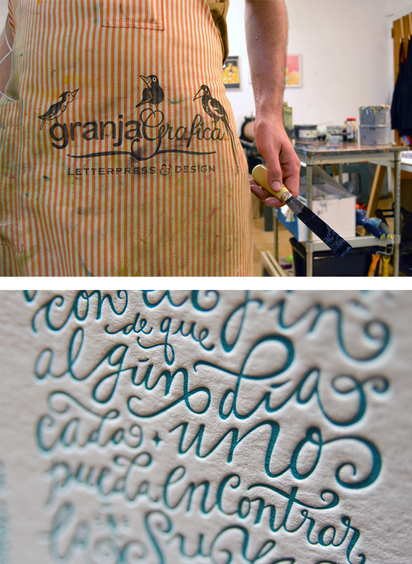
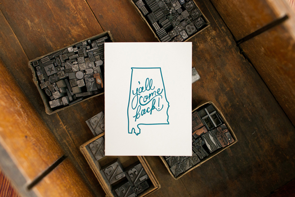
 (photography courtesy of Linzee McCray)
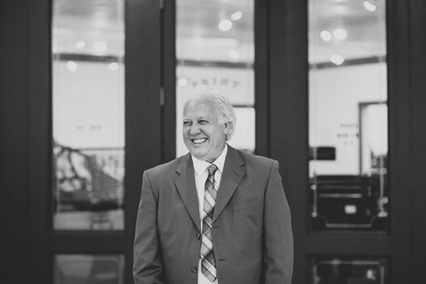