Paul Moxon shares with us why he loves letterpress from all aspects as a printer: the fascination, the community spirit & camaraderie, and the beauty that letterpress brings into his life.
Letterpress printing specifically, and the book arts in general, are the nexus of my interest in language, literature, biography, history, and mechanics. After thirty years in graphic arts, my enthusiasm for letterpress remains. As a designer, the physical labor of printing can clarify the message, inform my digital work, and lift my spirits. As a publisher, controlling the means of production is a point of pride.
I am fascinated by the vintage equipment, tools, and accouterments made with precision and inherent beauty. And it thrills me whenever I can purchase materials made today with the same diligent care. Eventually, I became an instructor and mechanic to help sustain this vibrant community paying it forward for all those who helped me along the way.
Most people know that Paul also developed and continues to moderate the Vandercook Press web page. It’s the first place to visit for significant info, photos and answers to questions on Vandercook presses and similar brands of flatbed cylinder proof presses. He has added greatly to our appreciation and preservation of these presses.
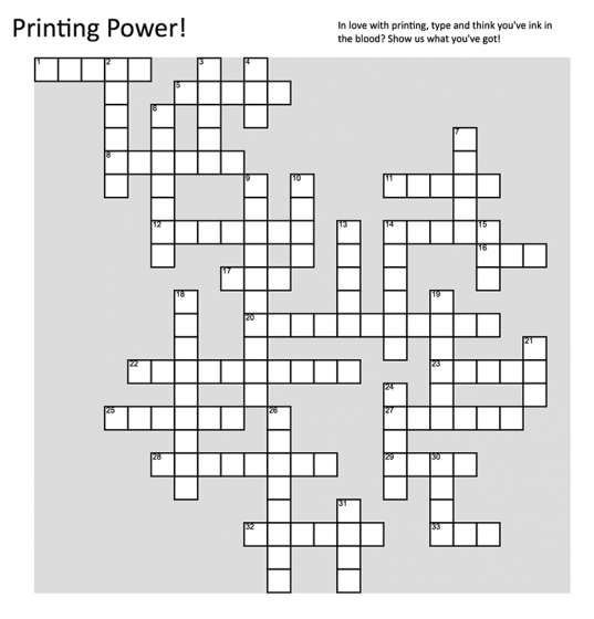
Time to roll up those sleeves and dust off those printing terminology books! We’ve got a wonderful printing-themed crossword puzzle for all you ink-in-the-blood aficionados!
David Clifford of the Canadian-based Black Stone Press recounts how he started working in printing and then falling in love with the beauty and the craft that is letterpress.
In the fifties, practically all printing was letterpress printing. In October 1951, I started my six year apprenticeship as a machine operator (machine minder), at the age of fifteen. It was at a small printer in London at the Borough near Elephant and Castle. There were three compositors setting type and in the basement, the machine room had two Wharfedales (cylinder presses), a Heidelberg Platen and a hand-fed Arab Platen. It was a little limited, fortunately, my apprenticeship agreement meant that I attended a technical school (Camberwell School of Arts) once a week to learn the trade.
( Indenture – The apprenticeship papers from 1951 )
After the six years had gone I worked in a few different printer shops. One of them was Ever-Ready Battery Print Works. There were about eighteen to twenty machines printing the big battery covers on card stock. Another printer specialized in cigarette cards. Roughly 1.25” x 2.5” cards, these were put in cigarette packages to make them stiffer. They were very collectible with fifty cards to a sheet printed in four-color process, one color at a time. Subjects included: butterflies, birds, flowers, sports, etc. etc. These were printed on small Dutch cylinder machines – Glockners (to get an idea of the trading cards visit this link).
( Me in 1961 on the Heidelberg Cylinder )
In 1962, I moved to Nice, France and worked at the biggest printer in Nice: Imprimerie Meyerbeer. There were fifty to sixty workers. Presses included two hand fed big Miehles, Albert cylinder presses and Heidelberg platens. After the student riots and worker strikes in 1968, I felt it was time to move. In 1970, Vancouver, Canada was chosen. Not much letterpress printing was to be found in Vancouver, so I had to run offset presses (ugh), which have never been my favorite – too many chemicals. I spent about twenty years as a Graphic Designer and in 1996 Black Stone Press was born with one Heidelberg and polymer plates made by hand. Now there are three Heidelbergs, a Golding Platen, a Vandercook 4 and an 1846 Albion, crown size hand press.
(Yasmine (Yaz) on the Golding)
I still work a few hours a week, but do not have the strength I had before. Sixty-eight years of printing, I am worn out. Fortunately, my daughter, Yasmine has taken over. She keeps everything running.
( Spring 2019 – me this last spring )
At the beginning, printing was just a job and I couldn’t wait to get off work. But the last thirty years I really appreciate the joy of letterpress printing.
Welcome to Part 1 in a series of blogs that celebrate the Print Museum. We are happy to introduce you to places that preserve, collect and offer hands-on opportunities to learn about printing in a way that enjoyably informs and educates. Read on for a quick “visit” to these places that hold our collective printing heritage.
The Museum of Printing is just north of Boston in the old mill city of Haverhill, on the Merrimack River. There are three Vandercooks, two show card presses, a Kelsey table-top, and a large-format Gordon. There are working machines, including Linotype, Ludlow, and Heidelberg Windmill. There is even a Keurig coffee maker and the fridge is always stocked with libations.
The cabinets are filled with paper. The type cabinets hold metal and wood fonts and the 40-drawer cut cabinet has almost one thousand wood and metal engravings The drawings for every font done by Linotype are here.
Craig Busteed is one of the many volunteers at the 41-year old Museum of Printing in Haverhill, Mass. He finds the Museum’s studio a mecca for himself and other members.
He produced the poster for the Museum’s annual Printing Arts Fair with wood and metal type. Craig also assists at workshops that teach letterpress to novices, young and old. One workshop taught by veteran Ted Leigh covers printing with the hand press using the Museum’s 1888 Acorn press.
The Museum hosts school groups from all over New England. In most cases, the kids set their names and print them. One of them is now in their twenties and shared with us that they still have that print.
Craig also comes in on Wednesdays and helps his team restore vintage Kelseys and C & P’s, many of which are sold at two annual letterpress sales. The Museum Gift Shop sells type and other letterpress items. There are also two annual books sales that offer redundant books on graphic arts.
The Museum of Printing preserves the rich history and working tools of the graphic arts. It archives the largest collection of typographic art and ephemera in the world.
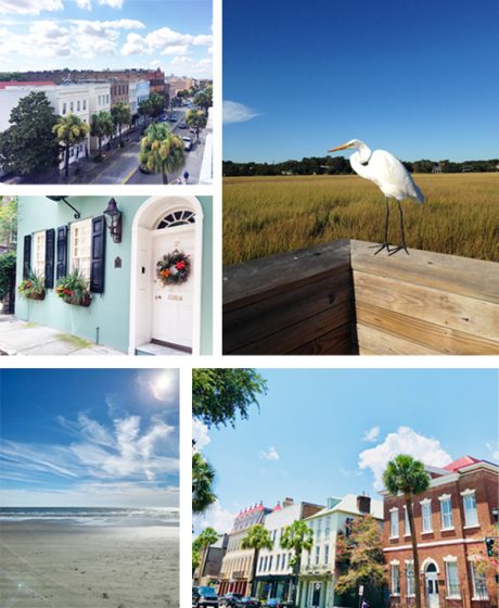
On the next leg of our letterpress city tour series, Jamie and Allison Nadeau of Ink Meets Paper gives us a relaxing tour of their beloved Charleston, South Carolina community. From the colorful Rainbow Row Georgian houses to the great treats & eats, the historic city is a mecca for printers and artists alike. Jamie and Allison share with us their must-sees, gallery gems, and beyond.
ATLANTIC COAST COMFORT We moved to Charleston, South Carolina in 2006 after Jamie graduated from SCAD for a job opportunity (unrelated to letterpress). We fell in love with the low-country and southeastern coast during our time in Savannah that we couldn’t resist an opportunity to put down deeper roots in Charleston. We love it here.
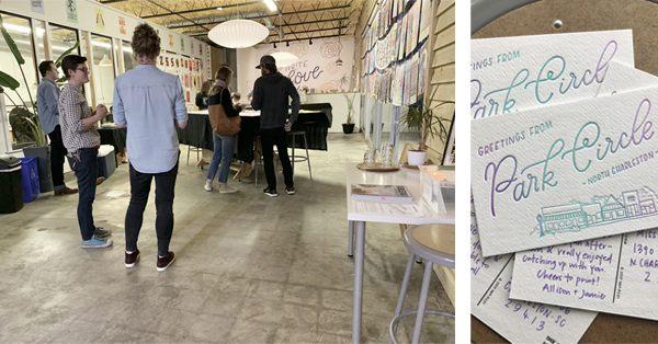
FRESH AIR + INK Our studio is located in the Park Circle neighborhood of North Charleston, and we live less than two miles away. We’re lucky to be able to commute by bike and enjoy the fresh air and charm of our neighborhood during the ride in.
During a typical week, we’ll grab an iced latte and pastry at Orange Spot Coffeehouse in the morning (or when those afternoon blahs creep in).
We’re all pretty heads down and focused during the day, so it’s always a treat to meet friends for happy hour at our neighborhood fave: Stems & Skins.
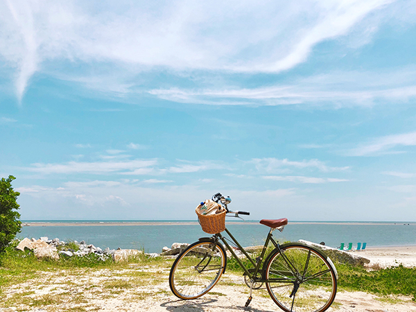
Lately, they’ve been hosting a burger pop-up with Pub Fare food truck on Mondays, so happy hour usually turns into dinner with friends. On Thursdays, we stop by the neighborhood farmer’s market for veggies and produce (and most recently duck eggs!). We’ve also really gotten into cycling, so we usually work in a longer ride on the weekends— we especially love heading out to Sullivan’s Island and Isle of Palms.
VIBRANT NEIGHBORHOOD Park Circle (and, really, the Charleston community as a whole) is especially wonderful about supporting local businesses, and we love sharing the letterpress process with them.
When we decided to move our letterpress studio out of our house in 2015, we knew we wanted to stay in Park Circle. We love the charm and quirk of the neighborhood— it’s not filled with big-box stores, and it’s community minded.
The studio is located off the main retail and dining area of Park Circle on a busier street that was pretty much surrounded by empty buildings (including a dilapidated auto repair shop that was later demolished). We were one of the first businesses along our stretch of the street, and we like to think it encouraged other vibrant and creative businesses to this area.
Our studio itself was a former convenience store and has big front windows for lots of natural light. The press room is behind a wall of windows, so customers are able to see the presses in action when they pop in for a greeting card. I think there’s really something wonderful about knowing the people and process behind the product (and people are naturally curious about these big old machines).
LOCAL PRINTING EVENTS We hosted Chris Fritton of the Itinerant Printer this past spring during his book tour. He filled our studio with prints from the road, and it was a blast to hear his stories. We also held a “For the Love of Print” event where we invited the public into the studio to learn more about letterpress printing (and to pull their own print, a “Greetings from Park Circle” postcard).
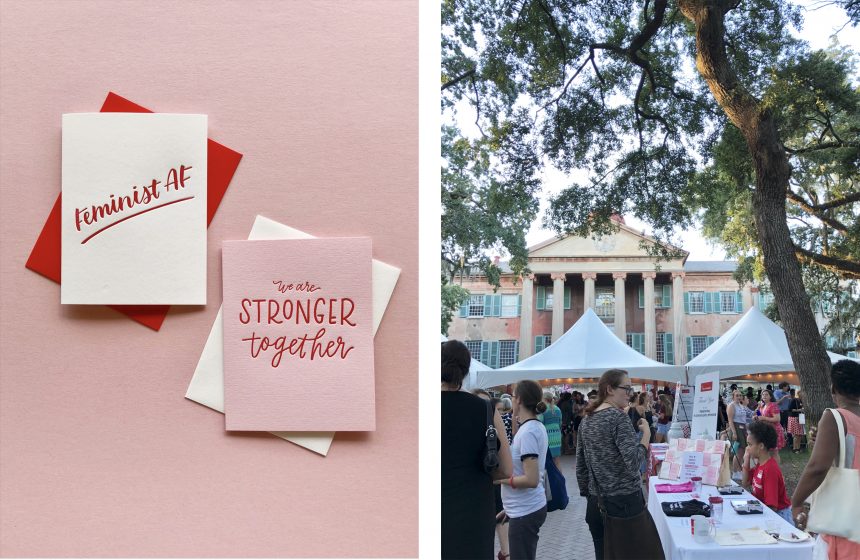
LETTERPRESS COMMUNITY ACTION Last fall, we designed and printed two limited-edition greeting cards to support the Women’s and Gender Studies program at the College of Charleston. Their “Yes! I’m a Feminist” party is a fundraiser for the WGS program and supports student/faculty activism and research, allowing them to work on issues like mothers of the Flint water crisis, women in politics, campus sexual assault, and municipal responses to the United Nations’ Convention on the Elimination of all forms of Discrimination Against Women.
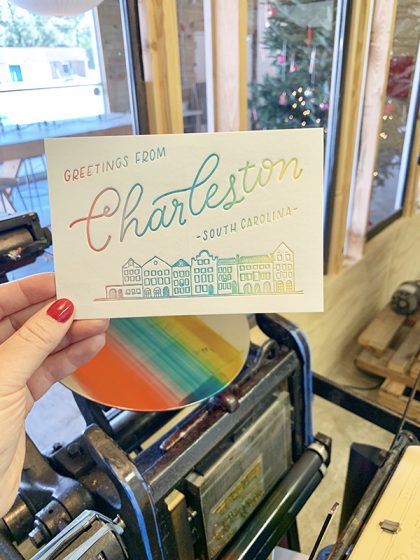
ONLY IN CHARLESTON Our “Greetings from Charleston” postcard is definitely a celebration of our city, and highlights perhaps one of the most iconic (and photographed) areas of Charleston: Rainbow Row. A series of thirteen Georgian row houses along East Bay Street, Rainbow Row gets its name from the houses’ bright and cheerful colors. We used the split fountain technique to create our Rainbow Row postcard version.
LOCAL SUPPORT Since our primary focus is wholesale, we’re so thankful for the local shops in Charleston who stock our cards . It’s such a treat to connect with them in person and to see and support their shops as well.
ENJOYING THE NEIGHBORHOOD Of course, we’re partial to Park Circle because we live and work here; however, we love heading into downtown Charleston to meander through the cobblestone streets of the historic neighborhoods like South of Broad and the French Quarter.
Downtown can feel overwhelmingly touristy at times; however, there are plenty of streets to meander where you’re not always surrounded by so many people (and then you’ll just see the occasional local who’s out for a walk or enjoying tea on their porch). It’s in these quiet streets that Charleston really charms.
EATS + TREATS Charleston is known for its culinary scene, so it’s really hard to pick just one favorite restaurant. In Park Circle, we’re partial to EVO Pizza’s wood-fired pizzas and enormous salads, all featuring produce and meats from local farms.
As we mentioned previously, Stems & Skins is our go-to for happy hour. They have an incredible wine list and cocktail menu and also offer a selection of tinned seafood and other bites.
Brunch is a Charleston way of life, and our faves include High Thyme (Sullivan’s Island), Millers All Day (downtown Charleston; Jamie’s in the photo enjoying one of their amazing bloody marys), and Daps Breakfast and Imbibe (upper Charleston peninsula).
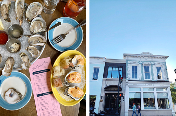
And, of course, part of the draw to living on the coast is the fresh seafood! Bowens Island has fresh off-the-dock seafood with some of the best marsh views in Charleston (and you’re definitely in luck if it’s oyster season!).
We also love The Darling Oyster Bar in downtown Charleston.
SHOP TILL YOU DROP When we moved to Park Circle in 2007, there were so many empty storefronts and buildings along the main business district; however, years later the neighborhood has really expanded in terms of independent retail shops, and we couldn’t be happier to have more local businesses to support.
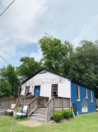
Itinerant Literate is another women-owned independent business. It’s a bookstore that got its start by doing pop-up shops around town in an Airstream-like trailer. We’re friends with the owners, and their trailer used to have a regular spot in the INK MEETS PAPER parking lot before they opened their brick-and-mortar location.
Another good friend opened Iola Modern, a modern home goods and furniture store.
Just down the street from our studio is The Station, which features over 30 vendors and local artists. It’s a great shopping destination with everything from mid-century modern furniture and handmade candles to plants and original artwork, so it’s a great place to find a gift for someone (or yourself )
FESTIVAL FUN Each year in May, the City of North Charleston puts on its annual Arts Festival with exhibitions, workshops, and art installations all throughout the city (and they really work to make art accessible to everyone). I love seeing the large-scale outdoor sculptures that are installed throughout the neighborhood (one year, an artist did an installation in a neighborhood park of giant gummy bears— definitely fun and memorable). We also always head to the block party, where the city closes cars off the main street in Park Circle and fills it with vendors and performers. It’s a fun celebration of art.
St. Patrick’s Day is another huge neighborhood celebration. The city closes down the streets for a parade and all sorts of merrymaking in the streets (and lots of Guinness drinking!).
A GROWING CITY Charleston and its surrounding communities have seen lots of growth over the years (it’s hard to believe we’ve been here for 13 years now!). Since Charleston is a peninsula, it can only expand so much. We’ve seen big changes to the skyline. In addition, the ever-increasing commercial rental prices have pushed a lot of independent shops out of downtown. King Street used to be filled with independent shops and boutiques, and now national retailers are pretty much the only ones who can afford the rent. Service workers also feel the pain from this growth, as it’s expensive to work downtown (those parking meters and garages add up quickly). More people also mean more cars on the road, and, as a historic city, Charleston roadways aren’t necessarily made for all of the big modern cars (cobblestone was for horse and buggies!), and it can be dangerous to bike around the city as well.
In terms of the growth our neighborhood (Park Circle) has seen, I think it’s been primarily positive. The neighborhood is a bit of a “hidden gem,” and there aren’t a lot of big streets and thoroughfares to bring extra traffic. If anything, it’s been really wonderful to see so many independent businesses open up in the neighborhood. There’s also a recent movement called Park Circle Unchained, and their mission is to prevent chain retailers from taking over the character of the neighborhood.
NOT TO BE MISSEDCypress Gardens – Swamp boat rides, walking trails, native plants— Cypress Gardens is worth the drive to experience the beauty of the lowcountry (and you might recognize the scenery from movies like The Notebook and The Patriot).
Casual Crabbing with Tia – Experience the beauty of the lowcountry with Charleston native Tia Clark, whose family has been crabbing and casting for fun and food for generations.
REDUX Studios – Contemporary art gallery and studio space on upper King Street.
Robert Lange Gallery – One of our favorite art galleries in Charleston. Lots of amazing local artists, and the entire gallery space is really inspiring and engaging.
Gibbes Museum of Art – Beautiful and well curated art gallery on Meeting Street with an emphasis on American art that incorporates the story of Charleston.
Candlefish – Located on King Street, this charming candle shop is filled with all sorts of beautifully fragranced candles (and their exclusive candle library guarantees you’ll find the perfect scent). Not to mention, they also host candle making classes.
J. Stark – High-quality bags, backpacks, and totes crafted by hand right in their Coming Street shop. (We carry one of their backpacks every day!)
Abide A While Garden Center – Our favorite destination for all things plants! This family-owned shop is truly a botanical experience, and their knowledgeable employees can help you pick the perfect plant.
Magnolia Plantation – It’s a little drive away from downtown, but they have amazing gardens and grounds (filled with all sorts of SC native plants). The train tour is a nice way to see everything.
Middleton Place Plantation – Along the same road as Magnolia Plantation, Middleton Place has an entirely different feel— their gardens are much more planned/structured.
Sullivan’s Island – Our favorite pick for a beach because it’s usually pretty chill (and there’s a lighthouse!). There are great food options out here as well if you decide to make a day of it (Poe’s Tavern, High Thyme, The Obstinate Daughter)
Meandering anywhere south of Broad Street will be lovely. There are all sorts of beautiful houses, and eventually you’ll get to the Battery at the tip of the peninsula surrounded by water.
Cooper River Bridge and Mount Pleasant Waterfront Park – The suspension bridge that connects Mount Pleasant to downtown Charleston is an awesome way to get a bit of exercise (walk/bike) along with an amazing view of the harbor and city.
LAST THOUGHTS Southern Charm (the reality tv show) is not us. lol. We are a ‘unique’ southern city that is culturally aware of its past, and actively working to build a better future.
We hope you enjoyed our featured installment of the letterpress city series guide! Interested in shining a spotlight on your hometown? Contact us today!
Boxcar Press is proud to display the talent and creativity of our team members via our annual mini On My Own Time exhibit. This is our ninth year participating in this wonderful opportunity. The show is in partnership with CNY Arts’ On My Own Time larger exhibit at the Everson Museum in Syracuse, New York. We hope you enjoy!
* This mark denotes an artist that was selected to have one of their pieces in the upcoming 46th annual On My Own Time exhibit at the Everson Museum of Art in Syracuse, New York. The group exhibit celebrates Central New York businesses and their creative team members. The show runs from October 12 – November 17th, 2019.
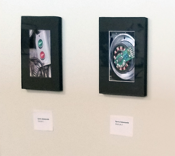
This photography work is definitely not my usual repertoire. It’s quick & immediate gratification to take a picture instead of all the process & detailed drawn-out steps that goes into printmaking or bookbinding that I’m normally used to.
I’m drawn to weird things: lots of textures, patterns, mechanical things, antiques, fossils, decay, etc. For the photos at this year’s On My Own Time show, the subject focus was obsolete machinery. The Press Lounge (our storage area here at Boxcar Press) was getting tidied up and I always love to see the old forgotten things in there. I like the shapes & the look… like 1980’s machinery with big knobs you turn with your whole hand or curvy cast iron parts with raised lettering that takes forever to fade away. These photos were like documenting fossils – blocky, colorful; the guts of the old machinery. Bins of old wires and piles of old telephones were such a contrast to modern, sleek, white plastic minimalism. I took pictures to remember how things used to look.
It’s so interesting to see what artwork everyone is doing. Everybody is busy working but there’s so many interesting people & their stories here. We have people who make incredible embroidered boxes, creepy figurines, intricate multimedia drawings, delicious macaroons, etc. Seeing what my co-workers & friends make is so fun! I love learning about their techniques, what interests others & knowing that we all want to put our hands & hearts to making something.
Much of my work combines studies and exercises done in various institutions and studios. The piece exhibited in On My Own Time showcases a collage of materials from when I screen-printed at The Ink Shop in Ithaca and from the tail-end of a master’s program in SUNY New Paltz for printmaking.
In researching On My Own Time from past years, I believe it does a great job in constructing a forum for those who wish to pursue a creative means and expand upon the skills they’ve already attained. I would say to tune yourself into the methodology of others and remain curious as to how one can manipulate the materials we often take for granted. It’s all quite limited and special to behold.
Jen De Roberts
This body of work is comprised of acrylic pour paintings.
This piece originally started as a large experiment. I wanted to learn how to best draw on tar paper in regards to painting, printing or drawing. This material was a curbside find back in 2014. I have been slowly learning what works and what doesn’t work on this roofing paper. In my artistic practice, I am fond of watercolor and inks. However, this paper is designed to be waterproof and I was forced to try out dry mediums.
In March this year, I was gifted a set of pastel pencils and a new drawing supply shifted my progress on this project. The vibrant colors and lines are all brought out by the pastel pencils and truly brought this work into completion. The vibrance from the vegetation stands out from the black background. It was also very interesting to bring out a subtle middle layer and stark whites from the black paper.
The inspiration behind the imagery is from a recent trip to Joshua Tree, CA. I really enjoy illustrating imaginary landscapes, yet I include memories of places that I travel. The high desert received a great amount of rain this year, resulting in striking spring flora in a place I understood to be dry and rather desolate.
On My Own Time is an opportunity for me to showcase my larger works. Because this is a local show in town, I do not have to be concerned with shipping and handling. Removing that hassle, I can confidently select bigger drawings and prints.
Additionally, I really enjoy the moment before the jurors select works for the OMOT exhibit when everyone at Boxcar shows their work in a mini-exhibition. Seeing other artwork and discussing artistic practices with coworkers is energizing as an artist.
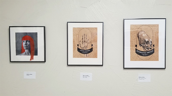
Portrait (far lefthand side of the photo) came from an idea while I was mending and doing seamstress work. All the extra thread tails heaped up on a pile looked like a mess of hair. The concept evolved from there. The piece is influenced by both contemporary textile artists working in embroidery and artists who break the fourth wall in some unusual or clever manner.
The other two pieces were part of a larger illustration series called “The Body Oddity“. The illustration series focuses on bone “oddities” — be it normal genetics or human-made alterations. The two pieces in this mini-show are “Sixth Finger (Polydactyl)” and “Elongated Skulls (Lipombo)“. Resources for the hand-drawn illustrations included x-rays of the bone conditions and photography from the Mutter Museum in Philadelphia, Pennslyvania. Osteology has fascinated me for quite some time.
On My Own Time is a great avenue for artists from all media to get a chance to share what drives them creatively. From Boxcar co-workers to team members in different business sectors across our area, this show gives local central New York artists a great opportunity to display their work.
This week’s Inquisitive Printer focuses on a new chapter for a letterpress printer, the cool printing history of Basel, Switzerland and a creative idea for sketch-booking in the summer.
It’s wonderful to see our letterpress friends grow and be on the move. Earlier this month, a cool Chicago-based letterpress printer, A Favorite Design, did just that. After a successful Kickstarter campaign, Amber Favorite & her husband have been able to move into their own brick-and-mortar store in the Albany park area. Way to go and congratulations!
A significant other’s trip to Europe became an occasion for me to do a little poking into the history of Basel, Switzerland. I couldn’t — and really, still can’t — put my finger on any one reason why Basel feels significant to me, as prominent as it has been in the back of mind. Perhaps it’s some subconscious awareness that many of my cultural heroes are alumni of the old university, like Friedrich Nietzsche, Carl Gustav Jung, and Herman Hesse.
In the Renaissance, it was home to father of pharmacology, the astrologer and alchemist Paracelsus; in the modern era, it was the site of chemist Albert Hoffman’s famous bicycle ride over the course of which he became aware of the effects of the lysergic acid diethylamide he’d just invented. What a cute set of Basel historical bookends marking either end of the modern era of hard science, between magical herblore on one side and psychedelic cybernetics on the other.
This is the time when I just want to be active and outside. Taking in as much sunlight and warm weather as possible before the next season arrives. I relish these moments, yet have the feeling that I am not focused on my studio work. This little bit of guilt follows me around, but WAIT!!! I have dissolved this worry by combining my two favorite things: drawing and playing outdoors.
Wherever I go on adventures, I make sure to always have space in my bag for a small notebook and a set for drawing tools. Pens, fine tipped markers and a handmade notebook.
The sketchbooks are simple to make and can be constructed in a pinch. Yay bookbinding skills!!! Any found and recycled materials such as copy paper, string or staples are used to bind together this booklet. And there you are, ready for summer action and capturing your favorite moments.
Above are images I have included are from a 2015 sketchbook. These were made while spending the weekend in a remote cabin in central New York. Below are this year’s (2019) sketches of some recent adventures.
I can captures new experiences and practice my artistic skills all in this small item. I have even asked my friends to contribute to some pages. These become great collection pieces over time. I can look back at these works and enjoy my artistic practice through the summer months.
Have something that you find intriguing? Let us know in the comments below!
Letterpress printer and artist Jenna Philpott adds a magical golden touch to a Jewish couple’s wedding celebration and Ketubah.
My husband’s coworker knew that I had a letterpress printing press. I had worked with him and his wife on other smaller projects, such as a custom stationery set for a house-warming gift and the like. Their son is in Rabbinical School at Hebrew University in Cincinnati. When their son got engaged, he asked for a special Ketubah.
A Ketubah is essentially a wedding contract used within the Jewish Tradition as a central part of the wedding ceremony. As I also paint and draw, so the family thought the letterpress plus unique artwork would be a great way to celebrate their son’s marriage.
My favorite part was the collaborative nature of the work. I am not Jewish and could not read the language either. I relied heavily on their community and mine to figure out the bits and bobs. It was also difficult to find just the right font for the couple so I made my own. The text makes the shading of the full pomegranate in the background.
I had 3 fluent speakers review the text multiple times to make sure I got it right! I drew 613 pomegranate seeds to symbolize the 613 commandments in the Jewish faith. I then had my 4 kids and even my hairdresser help me count the seeds while I got a few highlights in! HA! My letterpress mentor helped me with my paper selection (Wild 220# white by Neenah).
Rebecca at Boxcar Press was a patient gem throughout and helped me piece the work so that I could print it just right on my C&P. After printing each section, I hand dusted the piece with gold dust to add shimmer and interest without high shine.
Ultimately, I became friends with the whole family and was invited to a wonderful wedding weekend. It was a fun, complex project that made my heart and talents sing (and my feet dance at the reception!).
Debra Barclay of Ancora Press is a well-travelled printer who was inspired by the work of William Blake. She creates in her garage-turned-printshop and shares with us her lifelong printing mentors / friends she’s made along her print journey (as well as a favorite printing moment involving a Girl Scout Troop and a Vandercook).
WASHINGTON STATE PRINTER
My name is Debra Barclay, and I am a letterpress printer in Woodinville, WA. I live in Woodinville with my husband, 7-year-old daughter, 6-year-old son, 6-month-old Labradoodle, and two pretty lucky black cats, Uno and Tres. I’m a New Jersey transplant by way of Brooklyn, Virginia, Rhode Island, and Oregon. My favorite color at the moment is PMS 310 (light teal).
THE LURE OF LETTERPRESS
For my undergraduate degree, I attended Providence College in Rhode Island. My degree is in English Lit/Creative Writing and Printmaking. My senior year, I took a course on Romantic Literature and fell deeply in love with William Blake’s work. William Blake was a poet and printmaker who developed techniques to bring his poetry into a more visual realm. He combined text and image in a way that I had never seen up to that point. His poetry became visual as much as text-based, and he made it so the poem’s meaning was directly enhanced by the calligraphic lettering, colors he chose, and the overall design. In this way, he elevated the printing of information into a visual experience rather than just a transfer of data. At that point, I knew that I had to integrate my two passions: creative writing and printmaking.
After I graduated, I started looking into bookmaking classes. I found a school that had a very small but well equipped Book Arts Program. This was when I found the Oregon College of Art and Craft. I immediately enrolled in a few classes, packed my bags, and moved to Portland.
I really didn’t know what I was getting into, as far as letterpress printing goes. But there I was, learning to handset type and run a Vandercook under the tutelage of two women. Kathy Kuehn is a master printer at Pace Editions in NYC and Caryl Herfort, a letterpress printer from Texas who was there as the Artist in Residence. Many may know of Caryl from Roto Press (Rest in Peace, Caryl). Both of these women inspired me to experiment and play with the medium.
A CREATIVE ADVENTURE
As I continued to set the type for a short story I had written, my mind exploded. It was so crazy to be able to touch thoughts and ideas – letterforms as material objects with a history and life of their own just struck me on a very philosophical level. I then locked up my form in the school’s Vandercook Universal, and ended up a bit deflated. This was off course from my Blake path, as Blake didn’t use handset type in his work, possibly for this reason. Yes, typesetting is intimate, but once it gets on press and you print it with great craftsmanship, it does not show any of the depth or meaning that it had taken on when I handled it.
It was much more sterile and generic than I had envisioned my piece to be, given how emotionally and physically closer I had become to the words. This created some friction between me, the machine, and process. I moved my printing over to a hand rolled proof press, where I was determined to get the “hand of the maker” involved. Then, I hand-inked each pull, and ran the pages through one by one, skewing the registration so they would all be unique.
I actually still have a scar from this very first print run I did, as my thumb got caught in the cogs of the press as I was enthusiastically running pages through. The end result was a very artistic interpretation of letterpress! I created an art installation with the small edition of books I made with this experiment. I filled three walls of a gallery with the pages, and set up three of the spiral bound books on pedestals where viewers could flip-through the pages. The only requirement was that they wear white gloves, as is common practice when looking through fine press books.
However, the white gloves I provided were covered in black printers’ ink. So, the viewer/reader added and changed the book as they engaged with it – a visual representation of how we all change and alter language as we use it. It becomes a relationship where both parties – the ideas/text/ poetry and the reader/viewer – are changed through the interaction. We are all changed in sometimes undetectable ways by every interaction we have.
I then began to approach letterpress a bit differently, and started to think more about how words are laid out on the page, how the colors might interact with one another either through size, proximity, or overprint. I also started to notice the beautiful impression that letterpress machinery gives to the paper, making the text both a visual AND tactile experience for the viewer/reader.
A LETTERPRESS CONNECTION
Through this experience, I reconciled and truly fell in love with the exacting nature of letterpress machinery. It was through these experiments that I concluded that when I create, I am collaborating WITH the machine. With this finely engineered letterpress machinery, the ability to disseminate information in a way that allows for the content to be given the entire spotlight would now be possible. We are true partners. With that, my deep connection with letterpress continued to grow and develop into where it is today. I utilize the impeccable precision of the machinery to allow me to elevate letterforms, words, ideas, and everyday life moments into experiences with tactile beauty and time-tested craftsmanship.
HOME GROWN PRINTING
Ancora Letterpress is a custom letterpress print shop located about fifteen miles Northeast of downtown Seattle. We do custom designs working directly with clients as well as printing for graphic designers and other print shops who come to us with a pre-existing design of their own.
My shop feels like home. Mostly because it’s attached to it – in my garage! I have two 10×15 Heidelberg Windmills and an 8×12 Chandler and Price. I also have a photopolymer platemaker and a small guillotine paper cutter. My favorite thing about my shop is that I get to create there! Truly, it’s a dream come true. I also really like the commute.
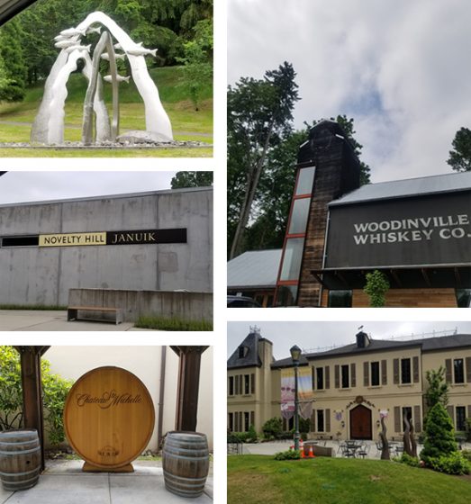
WOODINVILLE WONDERS
Woodinville is a tourist destination, as we have over 100 tasting rooms, wineries, distilleries, and breweries within a stone’s throw from my shop. This can be dangerous, but it’s really quite convenient mostly. Chateau St Michelle is probably the largest winery in the area. They have concerts on the lawn in the summers and beautiful grounds to walk around and picnic on. In the summer, we can hear the music from our backyard, which is usually a good thing. We also have a really cool theatre production company in town called Teatro Zinzanni, which recently moved to Woodinville from Lower Queen Anne in Seattle. From their website: “Teatro ZinZanni…is a three-hour whirlwind of international cirque, comedy, and cabaret artists…”
I really love living here because it’s quiet and we have lots of space. Our house is nestled into trees at the end of a cul-de-sac, yet we are incredibly close to the city. Woodinville is described as “subrural” as it is somewhere between suburban and farmland. One of our neighbors has a horse grazing in her front lawn pretty regularly, and the one across from her has over a dozen chickens on his property. We have a growing Arts community thanks to the Woodinville Arts Alliance in town.
PRINTING MENTORS
Oh gosh! This is a hard question! So many people have helped me get to where I am today. Esther Smith and Dikko Faust of Purgatory Pie Press were my first inspirations, as they were my first apprenticeship out of school. Dikko’s skills as a printer always inspire me, and Esther’s vision and ability to draw inspiration in the everyday is joyous.
My former boss Scott Hill of Workhorse Press is a great mentor as I continue to build my business. He’s readily available to help me with any questions I have about presses, printing, or the business side of things. I’ll be forever grateful to him for taking me on as an employee and teaching me so much about the production side of letterpress. Scott is a printer by trade, with a very keen eye for how to bring a design to life on paper.
Jami Heinricher of Sherwood Press is my most recent mentor and inspiration. She taught me how to run a Heidelberg platen, and for that I am forever grateful. She helped me troubleshoot one of my presses’ weird quirky problems, and even helped me back out my stuck Windmill, after my press pulled 6 sheets of 236# Flurry Cotton paper! I admire her business model, and her tips and tricks have saved me hours of time. My friend George Feakes of Impressive Inkreations has been an incredible mentor, giving me both sage printing and business advice, insights on efficiency, and an amazing amount of support.
All of my local letterpress trade guys are all absolutely my savior. After running letterpress for 40 years a piece, they collectively know everything, and there’s nothing they can’t make run correctly with just a little bit of tape and 18 point card stock. They’re also really down to earth and easy to talk to, and I love hanging out with them.
My husband, while not a printer, has been an amazing source of inspiration and strength. He single handedly moved my C&P and first Windmill up from Portland and got them situated on the garage floor. He also gave up a large portion of his workspace to allow me to have my studio. We are now looking into building him a lovely shed in the backyard for his woodworking tools for when I get a few more pieces of equipment this coming year.
GROWING THE DREAM
My business works out to be part time at the moment. I bought some equipment in early 2018, and spent about 6 months getting myself up to speed on the equipment and its particular quirks and what-have-you. Technically I’ve only been available to the public for about 7 months. I do plan to continue to solicit work and build relationships with designers, as well as develop a personal line of designs that I can offer to clients. Full time is my goal. I want to generate enough consistent job and print work so that I can take on an employee. There’s only one thing better than being a letterpress printer, and that’s sharing the workload!
THE CREATIVE FLOW
My process always begins by sitting down with the client and getting to know them a bit. I love getting to talk to people about their vision and translating that into a printed piece. I spend a fair amount of time gathering as much information as possible from the client. If it’s a wedding invitation, for example, I ask the bride to describe the ceremony and the type of event they’re going for. Is it modern, traditional, minimal, outdoor, etc? This narrows things down a bit. I get their wedding colors and match them to a PMS color that we all agree on pretty early on. I show them samples of my previous design work and see if anything stands out to them, either by way of technique (blind emboss, overprinting, etc) or if the tone of anything resonates with them.
At that point, I will begin a preliminary design. I find that this is really when the fun begins. It’s important to have a jumping off point, even if the design itself isn’t the final vision. It’s much easier for people to point out what they don’t like and for me to come up with alternatives to that, rather than envisioning something out of thin air. This has really worked well for me so far. I really enjoy the collaborative process during this stage of design.
PRINTING FEATS
I was the Arts Director of the Virginia Center for the Book from 2001-2003. While I was there, I helped run workshops and host events that built community involvement in the letterpress shop. I also created panel talks and art installations for Charlottesville’s annual Festival of the Book, which is a week-long event covering all aspects of books, from publishing, illustrating, designing, and reading. I also taught a class in the Art Department at the University of Virginia.
What I loved most about my time there was introducing the history and craft of letterpress to so many people in a variety of settings. One of my favorite moments was teaching an outreach program for a local Girl Scouts troop. I had the girls (who were all about 7 years old) run a pass through the Vandercook Universal. While I was in another room showing a group how to fold and slit the paper into a book, a girl came running out of the print shop in tears. Her mom asked her what was wrong, and she said through her sobs, “My print is over-inked!”
PRESS FAMILY
The very first presses I owned are my current ones – a 10×15 Heidelberg Windmill and an 8×12 Chandler and Price treadle that’s been converted with a motor. It’s funny that my first presses are both platens, since I learned to print on Cylinders. By the time I was ready to buy and had the space to have presses, Vandercooks were way out of my price range. Before this, I had always managed to access community print shops or presses belonging to friends.
BOXCAR’S ROLE
Boxcar has helped me in so many ways! Mainly, making resources readily available has been key. It’s a one-stop-shopping kind of place. They have given me the luxury of going slowly in building up my knowledge by offering a place to get it all done, and with such ease! The Boxcar Base has made life so much easier.
Before the Base, I was using magnesium plates. I found them to be much softer and more unpredictable, requiring more make ready due to being mounted to wood (not consistently flat on the bottom, and easily prone to warping). Being able to have predictable quality in my tools has allowed me to focus on perfecting my skills as a craftsman. The ability to buy paper, envelopes, order plates, and pick up a random thing I might need here or there (can of ink, roller gauge) has been fantastic. I can’t say enough good things about the Boxcar Press website flow. It is extremely user friendly, is quick and easy to navigate, and borders on foolproof!
I also love the How-To tutorials, which have increased my knowledge of my presses. Also, I cannot say enough great things about the staff. I have had random moments of panic where I’d forgotten to upload a small file for platemaking, only to call out an S.O.S. to Rebecca Miller, who swiftly and promptly put out the fire and saved the day! Working with Boxcar Press is like having a staff of knowledgeable and kind pre-press geniuses just an email away!
SHOP TIPS
Get the crop marks! This is something I don’t always do myself, and pretty much every time a two or three color cropless job goes to press, I spend twice as much time trying to get position. Even with one color jobs, I like crop marks once it gets to bindery. They seem like a luxury, but really they save you a bunch of time. And time is money, as well as a whole lotta frustration!
Spend the money! I’ve been there…I have tried to get away with a short cut, or making do without a particular tool or gadget (the Swing Away Lay Gauge comes to mind here). In the end, I end up spending way too much time having to figure out a “cheap” way to do something. Again, I’ve spent money, and potentially compromise the quality of the end result of the printed piece.
If you’re running a blind deboss on a stock that isn’t 100% cotton, or super plush, you can achieve a similar effect by adding a small amount of color that matches the paper stock with a ton of transparent white. Or, if you’re running a bright white sheet, opaque white right out of the can will do the trick.
I’ve also added a touch of yellow to gold ink in order to give it the punch it needs to stand out on an absorbent stock.
PRINTING ADVICE
Letterpress is a lot of troubleshooting and problem-solving. Isolate problems, ask for help from fellow printers that you know, or reach out online. One of the things I love about letterpress is how knowledgeable and helpful the community of printers is. Also, a motto I like – Stay modest, do good work, enjoy life outside the shop.
WHAT’S COMING NEXT
For the upcoming year, I will continue to grow my clientele. I also plan to add equipment so that I can add foil and emboss to my skill set. Currently, I am creating a design line, more of my own greeting cards, and some stock offerings that can be semi customized, like monogrammed note card sets and Holiday cards. I also hope to learn to paddle board!
We were pleased to lend support to Carmela Heinztelman when she was approached with a special print request. After seeing the results, we think more professional design projects like this should come to life in letterpress.
When architect Edward Deegan contacted me about making some letterpress prints of his architectural drawings, I jumped at the chance. I admire Ed’s work and have seen many of his designs realized in our Illinois community and his work is absolutely impeccable. Below is one of the beautiful houses he designed, and one of the prints I made from his sketch of this house.
I love printing personalized artwork, and this was no different. To take a talented architect’s sketches and translate it into letterpress printed art that could be framed and hung was such an honor.
Edward had five sketches that he wanted printed. The challenge was to take these sketches and adjust them in a way that worked best for letterpress and kept the details.
We needed to apply a screen, which I had never done before. Enter Prepress from Boxcar Press! I called Cathy and explained this project, and she was excited to help. She looked at each of the pieces and told me the best way to prep the artwork. I converted the scans to grayscale, adjusted the contrast, brightness and threshold, then saved it as a TIFF. It came out perfect – the client was extremely happy!
In addition to the house renderings, I also printed for Edward a tall ships scene and two historical facades. He framed and hung them all in his office.
Thanks Carmela for sharing the printing of these drawings. In addition to being a learning experience for you on the file preparation side, it was a nice treat to see something a little out of the norm come to life in letterpress. This is a very limited edition art that will be viewed and enjoyed.


