Boxcar Talk With Travis Friedrich

The man behind the up and coming Parklife Press, Travis Friedrich, lets us in on the things he can’t do without, his insatiable love for letterpress, the curious journey of his beloved C & P, and his vintage paper cutter.

Friedrich carved out a few minutes to tell us about the things that keep his rollers inked.

Travis Friedrich

(photo credit: Annemie Tonken)

EAST OR WEST, LETTERPRESS IS BEST I grew up in Oregon but have lived in North Carolina for most of my post high school life. I’m 31 now. Although my college degree is in engineering, I’ve always loved print and design. I enjoy making grilled cheese sandwiches, watching tennis, playing ping pong, drinking fancy cocktails, and printing with headphones on.

Travis Friedrich

(photo credit: Annemie Tonken)

INK IN THE BLOOD I’ve enjoyed printmaking since I was about 13 years old — although it was mostly linoleum cuts and a little bit of lithography early on. It wasn’t until about 2005 that I learned about letterpress. At the time, I was living in Portland, Oregon and working at my first post-college job as a mechanical engineer, but I wasn’t wild about what I was doing. I came across a letterpress shop not too far from my apartment, and I thought how cool it would be to be doing something like that rather than sitting in front of a computer all day. By the end of that year, I was very seriously considering trying to find a way to make printing my career.

Vintage Challenger CutterSTUDIO WITH SOUTHERN CHARM  Parklife Press exists in a cozy studio at my home. It houses a C&P 10×15, a C&P 12×18, and a 123 year old Challenge paper cutter. My favorite thing about the studio is probably the lax dress code.

PRINTING LEGACIES
Aside from two days of a community college letterpress class (I couldn’t stick with the 2 hour commute required to stay in the class), all of my letterpress education has been “virtual.”  The Briar Press discussion boards, the Letpress list-serve, and Boxcar training videos have been invaluable.

DAILY GRIND  Most of the design work I do is for wedding clients. I start by asking for as much info about design preferences and inspiration as the client can give, then I put a few initial first drafts together for the client to look at. At that point, the client inevitably loves my least favorite draft, and we go from there, tweaking and refining. It’s amazing though how often I end up loving the final design and am glad that I was pushed away from my initial preferences.

FULL TIME FUN I’m definitely both a designer and a printer. I split my time pretty evenly between the two. I’ve been doing it full time since shortly after I started in 2005, and I’m certainly amazed that I’m able to do this full time. The cubicle job that I had after college was not that awesome. During that time I remember mentioning that I’d love to have a print studio at some point in my life. But I definitely didn’t think it would happen so soon, and I didn’t think it would be a career.

BOXCAR’S ROLE The speed and ease with which I can order and receive a plate is huge. As for the plates themselves, my tiny studio appreciates that Boxcar’s plates take up so little physical space and I love how easy it is to trim, alter, and reposition them. It’s much more flexible than other plate systems.

PRESS HISTORY My first press was a Kelsey 5×8 tabletop, which quickly frustrated me. After just a few months I upgraded to the press I still use — a C&P 10×15 Old Style. I was in the bay area at the time, and came across a guy who had been storing an old press in his warehouse for years, and I bought it from him—despite the fact that I knew I would be moving across the country three months later. Transporting the press to NC from California was not easy, but it was totally worth it—I love that press.

SHOP TIPS Occasionally, take on a job that you’re not sure you can pull off.

WHAT’S NEXT The new Parklife Press website just went online in early February and folks really seem to be liking it. I designed and printed a bunch of brand new invitation designs and re-photographed everything. I also added a bunch of new business content.

Big thanks to Travis Friedrich for letting us shine a spotlight on his creative letterpress talents at Parklife Press!

Advice for letterpress printers: a letter from the machinist’s daughter.

Yesterday Harold talked about his letterpress printing mentor, Paulette Myers-Rich of Traffic Street Press. Here’s an email from Paulette that captures her generous spirit. Harold explains: “Paulette wrote this to me in 2001 and I thought it read like poetry. I turned it into a broadside for the APA, printed in Boxcar Press’s basement digs when I was working out of my house, using Zapfino back when Zapfino used to be cool.”
Harold Kyle turned this letter from his mentor, Paulette Myers-Rich, into abroadside for the APA

Harold Kyle turned this letter from his mentor, Paulette Myers-Rich, into abroadside for the APA

“Harold, Sounds like your adventures with machinery are going along right about how they should. Machines and equipment were never designed to cooperate. They are the boss. We are subservient to them and they are temperamental, destructive, dangerous, and cranky. They need lots of understanding, TLC, and grease. John Henry and his exploded heart found this out. Just finding a place to put the stuff is only the beginning. Then there are the adjustments, the cleaning, the replacement parts, the exotic, expensive obsolete tools to go with the machine, the bolts no longer manufactured, the gremlins that live inside that won’t let you do your work properly. It’s the fourth of four nuts that is rusted on or frozen and refuses to come loose as easily as its three predecessors. It is also the mastery of metal, the ability to use machines to an amazing end, to crank out stuff that few others can, to become one with gears and cylinders, to go places you couldn’t otherwise go. What a life! Take care and wear your steel toes, (I mean it!)”
Paulette Myers-Rich


Tell us about your printing mentors: a Valentine for the people who taught us how to print.

A few months ago, we sent out a survey to a whole lot of letterpress friends asking them a whole lot of printing things. One of our favorite questions was “Who are your letterpress mentors”? The list of responses was a gushing love fest to the famous, infamous, and unknown printers alike, the people who taught us, inspired us, and stay with us. You can read the list below. So in honor of red hearts and Valentine’s, share your stories with us — who taught you a love of letterpress — and what did they teach you?

Harold Kyle of Boxcar Press talks about his first letterpress printing mentor

Barry Moser a designer, typographer, illustrator and teacher from Pennyroyal Press, shared his mentor story with us:

I got started in printing in 1968. It was a late umber November afternoon in 1969. I wish I knew the exact date, because it was a day that changed my life. When I opened the door of Leonard Baskin’s Gehenna Press I heard a din of sweet noise and smelled the essence of viscera of a sort known to me in some distant and obscure way. The din was the chitty-chitty-bang-bang of the big press running. The essence was the smell of oil and grease and ink and solvents. There was an antique trestle table with stacks of books on it and a model of Gutenberg’s printing press. The books were of a kind I had never seen. Hand made paper. Fine bindings. Impeccable printing. I stood there, a little uncomfortable, and feeling like I had just stepped into another world. Continue reading

A Sweet Surprise: February Vector Set!

With Valentine’s Day coming up soon, letterpress lovers, we thought you’d enjoy a free Valentine’s Day vector set! The sweet set includes clever Scrabble messages for you and yours, as well as pair of lovebirds for all you nesting couples out there. All are free for use and in both EPS AND PDF format. Cheers!

Free February vectors from Boxcar Press

Did You Know That … Checking Line and Dot Thicknesses Is a Cinch?

One of the most common issues we face here in the Platemaking Department at Boxcar Press is determining a sufficient line thickness. Making that ruling means explaining to customers two things – how do you go about checking to see if lines or text are thick enough to hold on your particular plate? What’s the thinnest line that can hold on the plate?

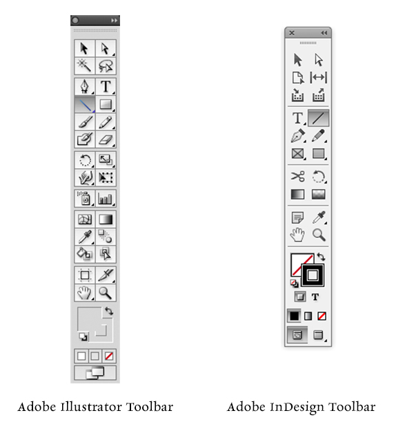
Surprisingly, there’s just one tool you need to utilize in either Adobe Illustrator or InDesign: The Line Tool. If you are using Adobe Photoshop, the Line Tool unfortunately reverts to a minimum line thickness of 1pt. If you are only using Adobe Photoshop to create your file, we highly recommend placing your final file in InDesign and using the Line Tool to check your work.

LINETHICKNESS_IMG1-1

What do we mean when we talk about our line thickness guarantee? Simply put, if your lines meet or exceed the line thickness as outlined below, we will guarantee they will hold on your plate. If they are under that thickness, it’s hit or miss. Some days you are lucky and other days, you might lose details.

The first thing you need to determine is your line thickness based on your plate type:

– If your plate type is the KF 95, Jet 94FL, or 94SB, you have a line thickness guarantee of 0.25pt or thicker.

– If your plate type is the KF152, 152SB, or 145SHSB, you have a line thickness guarantee of 0.35pt or thicker.

– For all plate types, your dots (like the ones above the letter “i”, periods, or dotted lines) must be 1pt to 1.25 pt or thicker.

THINK FAST! Quick quiz here – what is usually the most common culprit of too thin lines? Crop Marks! More on that later.

Here’s how to use the handy Line Tool to check to see if your lines are thick enough (and plate friendly, too):

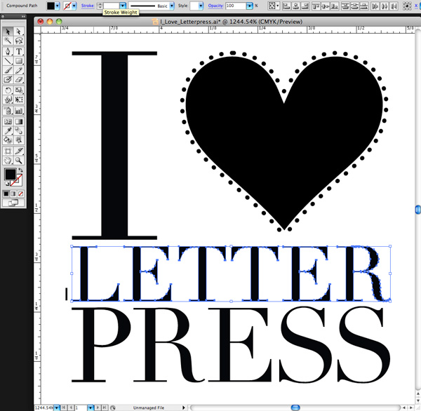
You need to first open your file in either Adobe Illustrator or InDesign. We’ll be using a small type sample in Adobe Illustrator to check to see if our lines are plate-friendly for a KF152 plate type. The KF152 plate type has a line thickness minimum of 0.35pt for lines and 1pt to 1.25 pt for dots. We can see that it looks like there are some thin lines in the serif of the Didot typeface… but will they hold?

First, click the Line Tool icon in the tool palette on the lefthand side of the screen in Adobe Illustrator to activate it. If you cannot find it, hover your mouse over the icon that looks like a line to see “Line Segment Tool ()” pop up in a yellow box .

Next, in the control panel up at the top, we’ll select the words “1 pt.” in the dropdown area next to the word “STROKE” with our mouse. You’ll be substituting the “1 pt” and replace it with “0.35pt”.

letterpress file prep tips from Boxcar Press

We’ll select the Zoom tool (Z) and move in because we’ll be doing some close up viewing in the area you are inspecting. Select the line segment with your mouse and move it so it is right next to the bottom part of the “L” in “Letter”. Draw a short line so it is parallel with the thin line you are checking on your art board. It doesn’t have to be very long but this little line segment will be our “ruler” to compare thicknesses.

letterpress file prep tips from Boxcar Press

At this close magnification, we see that our line segment set at 0.35pt is much thicker in comparison to the thinnest line in of the serif on the letter “L”. We will need to add a hairline stroke to boost our text’s thickness to correct this.

letterpress file prep tips from Boxcar Press

To add a stroke, using the selection black arrow tool (V), select all the characters in the word “LETTER.” In our Control panel at the top our screen we should see that the letters only have a fill and that we’d like to add a hairline stroke (about 0.15pt). Click the white area next to “STROKE” to activate the area so we can type in “0.15pt”. Immediately single-click the white area anywhere on the board. This will deactivate your selected text and add the hairline (0.15pt) stroke.

letterpress file prep tips from Boxcar Press

Zoom in again using the Zoom Tool around the line segment we created with the Line Tool and the letter “L”. We can now visually see that the serif on the “L” is as thick as the 0.35pt line. Success!

Delete your line segment and zoom back out. Continue around your artboard to visually check to see if other areas look “safe” as well.

For dots, such as the ones around the heart shape, we’ll need to set our Line Tool weight to “1pt” just to be on the safe side. We’ll repeat the same steps mentioned above to create the line, to zoom in, and visually compare the dots’ diameter against the 1pt line segment we just drew on our art board. Like the thinner lines on the “L”, we’ll need to correct this by adding a much thicker stroke of 0.3 pt to boost our dots’ diameter up to 1pt.

Using the Line Tool to check your work should be a “Must Do” test before submitting your files to your platemaking ticket. If anything appears too thin, you will need to correct it.

A few final instructions to help you be aware of potential trouble spots:

-When creating crop marks in your files – the program default setting is often 0.2 pt or 0.25 pt. Keep this in mind so you can make the necessary changes to your crop mark thickness when you place them.

-Thin lines that curve, particularly in wispy script or calligraphic fonts, are always suspect for being too thin. Give them the support they need to hold on the plate with hairline stroke (if needed).

Stay tuned, letterpress lovers — next we’ll solve the mystery of how to create multiple color files!

Related Blog Posts

Learn to Love Color Separations – A Boxcar Press Checklist
Did You Know That … 100% CMYK Black Is a Breeze?

Microscopic View

Here is a part of a very common printer’s tool. Can you identify it? Here’s a hint: rhymes with coin fee.
letterpress print toolsletterpress print tool