Colorful Prints With The Cranky Pressman

The printing life of Salem, Ohio’s very own Keith and Jamie Berger of the Cranky Pressman has catapulted since they first set-up shop more than three decades ago. From tight-registration and spot-on prints to changing into a decidedly full-on letterpress shop, the duo creates expertly crafted letterpress prints. We caught up between in runs with the brothers to talk shop, see how the printing world has changed, and keeping up the tradition of old-fashioned know-how.

ALL IN THE PRINTING FAMILY  KEITH BERGER It was the 70s and my father was a Graphic Artist and worked with printers. He told me, a lazy teenager without any interest in school, to “learn a trade” and printing seemed the answer. After a 2 year vocational school stint I was ready to go out and be a printer. I worked in the prepress departments, doing camera work, stripping and color separations. It was 1983 when I found a local small print shop where the owner was selling his business. I have had the shop ever since. Fighting the good fight.

 = Stacks and stacks of Cranky Bucks (the Cranky Pressman).(A fresh stack of letterpress Cranky Bucks notes. Don’t tell the cops!)

JAMIE BERGER: Cranky Pressman is a partnership between brothers, Keith and myself. The Cranky brand was launched in 2003 but the partners are good old boys who have been around much longer than their Victorian era mascot.

In 1983, Keith bought a printing business that had been around since 1938. The shop likely started as a letterpress printery, serving the local business community in Salem, Ohio, which was a thriving industrial town at that time.

Much of the equipment was very old when Keith first acquired the place, from the Chandler & Price platen press (retrofitted with an electric drive motor) to the various pieces of old bindery apparatus such as perforators, drills and cutters. Of course the old shop also had many antique line-cuts, wood and metal type, plus the 1,000s of bits and pieces of furniture and other standard letterpress printing supplies.

(Pica the cat: the mascot of Cranky Press near a beautiful specimen of vintage wood type)

I was living and working as a graphic designer and art director in New York City in the mid-1980s. At that time in my career, pretty much all of the work I was involved with was print-based. Most graphic design materials at that time were printed with offset lithography including slick 6-color presses. However, letterpress was often preferred for projects like corporate event invitations or when a classy personalized presentation was required.

Parse & Parcel letterpress printed business card shines brilliantly.(Business card for Parse & Parcel that includes foil stamping and letterpress printing on a custom duplexed stock, design by The Studio of Christine Wisnieski)

The 80s print shop did have small offset lithography presses which were the workhorses on day to day jobs. Beside invitation work though, letterpress at this time was mostly used for imprinting packaging and other pre-converted materials, die-cutting, scoring, numbering and foil-stamping.

We were always fascinated by the array of old machines, type and cuts around the place when I was in town visiting. Actually, they hand-set and printed my wedding invitation by letterpress in 1988.

Over the next decade or so, with the advent of the Macintosh and continued growth of lithography and eventually digital printing, the traditional craftsmanship of printing began to fade around the shop. In the early 2000s, Keith felt it was time to change and get back to craft-printing.

Red on yellow stock paper letterpress printed business card by the Cranky Pressman.(Close-up detail of a piece we did Carly Rounds at Design 360)

Cranky Pressman, an all-letterpress shop, was born in 2003 [and] now serves the graphic designers, ad agencies and other creative businesses throughout the country.

THERE AND BACK AGAIN, A PRINTSHOP’S TALE KEITH: The shop I mentioned [earlier] came with a C&P, a Miehle Vertical, lead type, lock-up table and a cream puff of a Heidelberg Windmill that the original owner hardly used and was unable to train me on. Me being the ever savvy businessman decided that offset printing was the way to go. So I traded in that cream puff of a windmill on a fancy single color offset.

Meanwhile I was numbering, perforating and die cutting on the hand feed and Miehle. Eventually, I started doing stuff like napkins and book covers which were fun but made no money. The offset seemed to be going the same way. Sales were becoming tough-going and everything was changing to digital. This is when we, Jamie and myself, saw that letterpress as the way to go. To make a way too long story short, eventually we converted to all-letterpress and I sold that offset and brought back in a another Windmill exactly like the one I had sold years earlier!

JAMIE: Other than the wedding invitation mentioned above, my involvement with letterpress was mostly as an observer and occasional print buyer until I moved back to Ohio in 2012. I mainly look after the creative and marketing for Cranky Pressman. This has meant spending a lot of time studying and learning about the craft, more as a journalist than a hands-on printer.

Vandercooks and type cabinents make for good printing buddies at the Cranky Pressman.

However, when you spend so much time around printers, working closely on projects as a designer and/or art director, you get the urge to have a go and making some prints yourself.

Since relocating and working out of the letterpress shop, I’ve begun to dabble in some small hand-set pieces, mainly for Cranky Pressman promotions. This inspired me to begin working in print doing personal printmaking, including hand-setting, linocuts and woodcutting.

OPULENCE IN OHIO KEITH: Our small business was located downtown in the depressed small town of Salem, Ohio, on the second floor in a back alley. What could go wrong with that! But the invention of the internet helped save the day. Then again being that savvy visionary businessman, I figured that 10,000s of lbs of equipment should probably not be located on the second floor of a 125 year old building. Luckily there was a freight elevator, so we packed up the old print shop that was in the same place since the 50’s and moved it a block and a half away. Moving a letterpress shop is a story in itself. Fortunately, I have blocked the experience from my memory so that I can begin to function fairly normal again.

BBQ letterpress invitation by the Cranky Pressman.
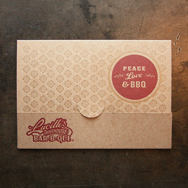
(Letterpress printed and die-cut gift card holder for Lucille’s BBQ)

JAMIE: After being at the same location since the 1950s (the first owner started the shop at another location in the 30s), the shop was recently moved two blocks down the road but in the same small town of Salem, Ohio.

The former location was on the 2nd floor of a 19th Century industrial building that was being converted to shopping and dining businesses. This was the ideal time to move the letterpress shop into a more appropriate ground floor workshop space.

Salem, is a historical old town in northeast Ohio, exactly halfway between Cleveland, Ohio and Pittsburgh, PA. There are still some factories in town but many of the old industrial buildings are empty. The town came upon some bad times, with factories and businesses closing, starting in the 1970s through the end of the last century. The closest bigger town in Youngstown, which suffered the same sort of economic downturn as Salem, but on a larger scale. The surrounding areas are mostly farmland.

Being more of an outsider myself (my family moved to this area from nearby Akron when I moved away to college) I can honestly say, the local folks are a hearty bunch. They can sometimes come across a little gruff (they’ve been through a lot after all) but there are many who never left and never intend to.

I am happy to report that over the past 10 years or so, it seems as though the little town is breathing new life. There are new shops, bars and restaurants around. The local high school stadium was recently renovated and other civic improvements are underway. Strong local historic and preservation groups are key to a lot of these good things happening around town. The Historical Society itself also went through a fairly recent expansion and the displays there are very well done and interesting. It nicely showcases the town’s rise, fall and rising again.

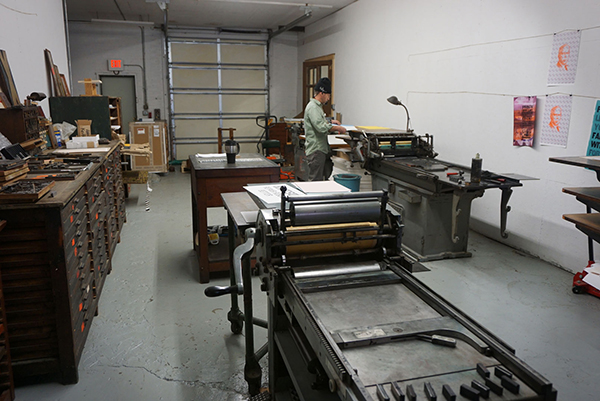
The space we recently moved from had some good old-world charm, with wooden floors and a rickety freight elevator. Our new workshop is much better organized, brighter and built for letterpress production on one side, and letterpress creative printmaking on the other side. We don’t yet have the place fully decorated or broken-in but everyone is happier working in the new space.

GOOD NEIGHBORHOOD EATS My favorite two local places to go out are among the oldest and most, shall I say, down to earth.

For eating (and drinking) you can’t beat the honest food and atmosphere at Mike’s Penn Bar and Grille. For pure drinking, soaking up local color and pool playing, I like Fernangeles. They don’t have a website and their Facebook page is only half-built, but is was the 1st or 2nd licensed bar in Ohio. The wooden walls in the bar area have paintings from the 19th Century that were done by travelers in exchange for room and board. Please note, you will likely get a good sampling of a variety of local yokels if you visit, so don’t wear your best clothes.

Keith Berger of the Cranky Pressman inspects his Heidelberg Windmill.
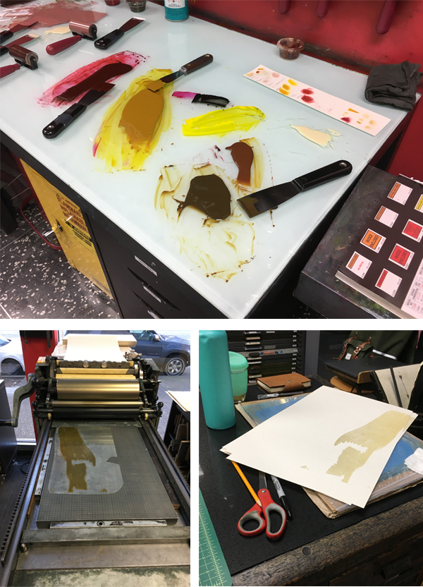
(A shot of the printmaking-studio-side of the shop. You will see Jason in the shot again. He is such a ham!)

PRINTING MENTORS KEITH:  Early on I used a hot type setter that had Intertype and Ludlow typesetting machines. Bob Lesh is his name and he loved the trade of hot typesetting and we would discuss the history, and more interestingly, the system of a letterpress shop. We both believed that the usefulness of hot typesetting and letterpress would always have its place. Easier said than done, especially for the hot type, I am trying to save his vast collection and keep it viable for future generations.

JAMIE:  Current Favorites: Dafi Kuhne, Church of Type, Brad Vetter, Starshaped Press
Been Around: Hatch Showprint, Lynd Ward, Albrecht Durer, Guadalupe Posada

DESIGNER + PRINTER  KEITH: Mainly a printer but designer’s were originally printers so both I guess.

JAMIE: I studied and began my career as a graphic designer. I then spent most of my career working as an advertising art director. I am now (re)learning to be a graphic designer and printmaker at a ripe old age.

FULL-TIME SHOP FUN JAMIE: Yes, the shop is a full-service commercial letterpress shop.

PRINTING FEATS KEITH: Staying in the printing business for 30 + years. Although it has never been pretty it has always been interesting.

JAMIE: I had two prints (1 linocut and 1 woodcut) accepted in this past year’s Regional Artists juried show at The Butler Institute of American Art. So I guess I am beginning to learn how to print a bit.

PRESS HISTORY  KEITH: It was not a letterpress, but an AB Dick duplicator that I ran in my living room!

JAMIE: Never owned a press myself but enjoy using others!

Inside the studio at the Cranky Pressman.( Jason Vaughn (our head pressman) discusses printing specifications with Keith (at left).)

BOXCAR’S ROLE  JAMIE: The Boxcar Press website and blog has been an inspiration and valuable resource for letterpress information over the years.

SHOP (AND LIFE) TIPS  KEITH: Listen to your elders. They may have a different perspective but you can always modernize their advice.

JAMIE: I am still learning so you may not want any of my tricks if I had any!

WHAT’S COMING NEXT KEITH: To save the hot type and letterpress system and to “learn a trade.”

JAMIE: We will be continuing to set up, organize and decorate the shop. We hope to have more events such as workshops and visiting artists working in the space. We also are working on some new bindery and printing offerings to be announced.

A double round of applause & thanks out to Keith and Jamie of the Cranky Pressman for letting us take a sneak peak at their wonderful printing realm!

Top 14 Valentine’s Day Letterpress Gift Guide-2018

Specially chosen with care, we tally up 14 beautiful, heartfelt, and humorous 2018 Valentine’s Day letterpress gifts, including cards, prints, and letterpress classes (date night, anyone?).  Let us know what you are getting your printing paramour this year in the comments below!

Valentine's Day Gift Guide 2018 - featuring classes, cards, and beautiful letterpress prints.

1. Tinder Love card by Steel Petal Press  |  2. Trap Valentines card by Bench Pressed |  3. Letterpress Valentine’s Day Card Making workshop (February 13th, 2018 – Pittsford, NY)  |  4. Personalized letterpress notecards by Inclosed Letterpress Co.  | 5. You & Me Letterpress Love Greeting Card by Paisley Dog Press

Valentine's Day Gift Guide 2018 - featuring classes, cards, and beautiful letterpress prints.

6. Personalized large primary notepads by Haute Papier   |  7. Main Squeeze letterpress card by Inclosed Letterpress Co. | 8. James Joyce Letterpress Quotation Valentine Card by LarryOrlandoDesign  |  9.  Tear & Share letterpress valentines perforated cards by Igloo Letterpress |  10.  Introduction to Letterpress class by Igloo Letterpress (date night anyone?)

Valentine's Day Gift Guide 2018 - featuring classes, cards, and beautiful letterpress prints.

11. e.e. cummings lettterpress print by Thimblepress  |  12. Cheers to Us – Valentine Love Lobsters letterpress card by darlinpress  | 13. Letterpress Valentines Cards class (February 11th, 2018 – Fort Lauderdale, FL)  |  14. Anywhere With You letterpress card by Permanent Collection

Taking Flight With Mejiro Graphics

Harumi Kobayashi of Mejiro Graphics is a letterpress printer whose pan-Pacific Ocean life travels have brought her zen on press, a wealth of creativity, and a patient approach to challenges on her beloved Chandler & Price. Her eye-catching, beautifully crafted letterpress work features whimsical Japanese-style artwork with bold, striking colors. Harumi fills us in on the trek so far and what lies ahead on her printing & creative horizons.

Harumi Kobayashi enjoys a cup of tea after printing on her C&P at Meijiro Graphics.
Eye popping color of whimsical and beautiful Japanese cats in kimonos grace Harumi Kobayashi's expertly printed letterpress cards.

THE PRINTING ADVENTURES SO FAR I am originally from Japan and I’ve been interested in lettering and calligraphy since I was a child. I was able to use my calligraphy experience and take a position as an assistant to a freelance book cover designer in Tokyo. After this I worked for a printing company in their graphic design department. In 2003 my husband and I moved to the US. We lived in Kauai, Hawaii and Port Ludlow, WA.

When we lived in Port Ludlow, we found a two-week-old kitten in the forest and we bottle-fed and raised him. Since then Olele is a member of our family and the inspiration for my letterpress card designs.

Harumi Kobayashi says hello with her cat; gives a tour to her printing press shop.

In 2016, we moved to Sherman, TX, where I work at a small commercial printing shop.

FINDING CREATIVITY When we moved to the States, I established Mejiro Graphics** and I’ve been enjoying working as a graphic designer. Later I taught myself web design to broaden my services.

Creating the websites was interesting, but I felt I was always trying to keep up with current trends and technologies. It was about then that my sister told me about letterpress printing. I googled letterpress and learned about people who still put value in setting lead type and printing on fine paper [and] on old printing presses. I felt I had found something that I had been looking for and was hidden inside me for a very long time. I told my husband I wanted to buy an antique printing press. He enthusiastically supported me and helped me find a press and he built me a printing shop.

**A Mejiro [may-gee-row], or Japanese White-eye, is a small olive-green songbird with a conspicuous white eye-ring.

A cozy and neatly set-up letterpress print shop is home to Harumi Kobayashi and Meijiro Graphics.

SEASIDE ENDEAVORS We moved to Port Ludlow, WA so my husband could attend a wooden-boat-building school, and we were very lucky to rent a house on Puget Sound. So my husband built his shop and my printing shop in the 2-car garage, and we each had an ocean view. It was very quiet and peaceful. We heated our shops with wood we harvested from the forest and felt quite self-sufficient.

PRINTING MENTORS I was delighted to get to know Ellie Mathews and Carl Youngmann at the North Press in Port Townsend, WA. Ellie taught me how to set type and Carl always gave us good advice and solutions when we had problems about printing. Through them we met many local letterpress printers and bookbinders.

Their work and their enthusiasm for printing inspired me a lot.

DESIGNED FOR PRINT I’m a designer and a printer. I enjoy exploring and sketching the ideas for our greeting cards. My husband and I evaluate the designs and re-sketch many times. When we’re satisfied with the design, I scan the sketch, create a digital file in Adobe Illustrator, and fine-tune the design.

Sketches for upcoming letterpress printed cards feature Japanese cats in elegant kimonos. Artwork by Harumi Kobayashi.

I order the polymer plates at the Boxcar Press. When I receive the plates, I mount it on a Base, hand-mix the ink and print it. As all you know, the press doesn’t work the same way every time and we are sometimes frustrated. But usually one of us has patience and comes up with an idea to fix the problem.

We put our hearts into the process and we’re always happy and content when we see the finished card. It’s delightful to see the colors come alive when printing on fine paper and for the image to take on the depth that letterpress printing gives.

PRINTING FEATS I’m proud that my husband restored our press completely. In addition, when we realized how important it was for the rails to be flat and of even height after a lot of trial and error printing, he began to think of ways to build up the rails. He wasn’t satisfied with the multiple layers of tape to make up for the heavily worn uneven rails so he disassembled the press again and using a metal and epoxy mixture, renewed the rails to almost new condition. Then we moved on to inking and other challenging printing issues. I’m happy that we worked together and continued to enjoy the challenge of printing our original greeting cards.

Meijiro Graphic is home to gorgeous letterpress printing and a beautiful Chandler & Price printing press. Harumi Kobayashi helms the vintage metal beauty.

PRESS HISTORY We found our first press in Portland, OR. We brought it home covered in tarps in a rainstorm, of course. It is an old-style 1890, 8×12 Chandler & Price. It is our first and only press for now. We think it is beautiful.

BOXCAR’S ROLE When we bought our press, we didn’t know anything about printing and polymer plates, and we didn’t know anybody to ask. When we called Boxcar Press, they were always happy to help us and gave us information and suggestions.

SHOP TIPS I have two Boxcar Bases of the same size. For two-color printing, I put each plate on a Base and test print without inking to adjust registration and packing. This way I can see where to add packing easily and it helps avoid the ink drying out on the plates because we use and prefer oil based ink.

Clean, beautiful Japanese-styled letterpress prints are favorites of Harumi Kobayashi's work. Fun & bright colored halloween letterpress printed card from Harumi Kobayashi features japanese-influenced cats.

WHAT’S NEXT When we moved to Texas, unfortunately we needed to put our press in storage. We don’t have a lot of extra money at the moment so we’re looking for a free or low-cost place to set up our shop. I have several new card designs and hope we’ll be able to print them in early 2018.

A huge round of thanks out to Harumi Kobayashi of Mejiro Graphics (Etsy store) as we’re eager to see what she comes up in the not-too-distant future. 

Real and Beautiful: South Carolina’s R&B Printery

R&B Printery is a letterpress haven to husband-and-wife team Robin & Brannon Carter. From down-south roots, clean printed impressions, pops of punchy color, and a whole lot of letterpress love, the South Carolina duo’s work continues to inspire. We catch up with the creative couple to talk shop, honoring their printing mentors, and the allure of pulling open vintage drawers of metal type for the first time.

FROM REFRIGERATION INSPIRATION BOARD TO TAKING THE PLUNGE My wife Robin and I were already on a journey to discover a creative outlet that we could adventure into together when we happened to open an issue of Southern Living Magazine and read an article featuring 9thletterpress out of Florida. The old vintage press, stacks of clean paper, and colorful inks intrigued us.  At the time, I really had no idea what letterpress printing even was!  We tore out the article and hung it on our refrigerator for inspiration.

Brannon Carter and Robin of R&B Printery create handmade and letterpress printed goods.

A few months went by as we continued searching and talking about what would inspire us.  One day standing in front of the refrigerator, I looked at that photo and said, “I wonder if there is anyone around us doing letterpress?  Someone we could take a class from. See what letterpress is all about”. After some internet searching and a few phone calls to local artists, we discovered that there was this old guy in Spartanburg, South Carolina (at the time we were living in the next county over) teaching the art of letterpress.  We looked him up and signed up for his introductory to letterpress class.

Brannon Carter and Robin of R&B Printery create handmade and letterpress printed goods.

We took the Intro class.  Then signed up to take his Letterpress 2 class. Meanwhile, we discovered that the printing studio where he worked was part of an artists’ cooperative.  The printing studio was amazing!  Drawers full of old vintage metal and wood type, century old printing presses, and everything you’d need to have fun printing, all ready to go!

So, having no real background in art, other than childhood art classes for both of us in high school, we took the leap, signed up to be members of the West Main Artists’ Cooperative and set out to become real letterpress artisans!  Oh, and that old guy became our mentor and cherished friend.

We ended up moving just to be near the presses when we officially launched R&B Printery!

PRINTING IN THE PALMETTO STATE Our printing studio is in the basement of the West Main Artists Co-op in Spartanburg, SC.  The Artists Co-op hosts creative spaces for 50+ local artists in an old renovated Baptist church building turned gallery and studio space just two minutes from the heart of downtown Spartanburg.

Brannon Carter and Robin of R&B Printery create handmade and letterpress printed goods. Brannon Carter and Robin of R&B Printery create handmade and letterpress printed goods.

As member artists of the co-op, we get to mingle and share creative space and ideas with some amazing artists.  From other printmakers, to fine jewelry, ceramics, glass works, fiber arts, painting and water colors, to music, photography, and videography, the co-op is home to a breadth of creative talent.

The city of Spartanburg, the only city in the United States with this unique name, has a vibrant art community centered around a Downtown Cultural District, featuring an array of outdoor art, including a new Lighten Up Spartanburg walking light bulb outdoor exhibition featuring 28 light bulb sculptures.

Brannon Carter and Robin of R&B Printery create handmade and letterpress printed goods.

We work out of the co-op for print production and our home studio (which is just a mile away – bought for that very location!) for design, inventory, and shipping.

PRINTING MENTORS The late Mr. William “Bill” Wheatley (that old guy we mentioned earlier), was our mentor for several years and helped us through the beginning stages of learning the technical aspects of printing with vintage presses and equipment.  Sadly, he died in 2015 but his legacy lives on as we try to continue what he started.  Wheatley worked tirelessly to build a printing space that could move beyond simply housing old stuff to be admired, to creating a living, breathing print studio that could run as a fully-functioning print shop.  We still miss him.

We love Instagram for its ability to find and follow amazing letterpress artists. InkMeetsPaper, Waltzletterpress, Sunnymullarkeystudio and PhilipHunterBell are just some of the amazing artists that we follow and are inspired by.

DESIGNER + PRINTING TEAM We are a husband and wife team living, working, and creating in the Upstate of South Carolina.  We both grew up as creatives.  Robin, in a house surrounded by a family and a lifestyle that nurtured the creative spark.  I grew up from an early age drawing with a pencil through my early high school years, even taking AP Art.  Our natural giftedness for art was set aside for both of us as we became involved in other school-related activities.

Brannon Carter and Robin of R&B Printery create handmade and letterpress printed goods.

But, the small flicker of that creative spark is what brought us to letterpress printing.  I love getting my hands dirty with activities such as positioning type in visually appealing arrangements.  I also handled the digital design elements for our custom clients.  Robin has always been drawn to hand lettering.  In college, she was the unofficial banner maker for her sorority, hand painting most of their event banners.  Hand lettering our line of letterpress greeting cards is now a major design focus for Robin. You can watch a short video of us working in our studio.

Brannon Carter and Robin of R&B Printery create handmade and letterpress printed goods.

We both hold Masters degrees in biology and have worked as professional teachers.  Robin also has an undergraduate degree in Environmental Science. So, we both bring this need to protect the environment into our printing.  We consider ourselves first, an eco-friendly letterpress printing studio.  Our line of greeting cards uses a 100% post-consumer waste (PCW) recycled, 110# card stock manufactured in Germany and sourced locally here in the United States. Our in-house envelopes are also 100% PCW recycled and our clear card sleeves are made of a corn-based bio-plastic that is compostable and 100% biodegradable.  We recycle papers and makeready materials through our production and packaging process, reusing and reclaiming scraps for other purposes.  We also use soy-based inks, and collect discarded and reclaimed inks to keep them out of the landfill.

FULL TIME FUN WITH A DASH OF PART-TIME PLAY Brannon has just recently, about 6 months ago, been able to devote all of his official “work” time to R&B Printery.  Robin still teaches online high school, but devotes her time away from the classroom to designs, local artist markets, and social media. Maybe one day, we’ll both be free to pursue our creative side together full-time!

Brannon Carter and Robin of R&B Printery create handmade and letterpress printed goods.

PRINTING FEATS I think one of the biggest points of excitement for us is to look back at some of our very first designs and prints.  Cards we thought were amazing and that people would just love to purchase and put in the mail.  To look back now, four years later and wonder “what were we thinking!”.  Some of our early prints were terrible!  But looking at where we are now, that we’ve been able to persevere the highs and lows of starting and running your own small business, and to see that we can now truly print some wonderful letterpress pieces that our clients love, this just makes us ecstatic!  We hope 4 years from now we will still look back and think the same thing about what we are producing today as evidence of continued improvement and ongoing growth!

Brannon Carter and Robin of R&B Printery create handmade and letterpress printed goods.

Another accomplishment we are proud of is that we’ve designed and built custom displays for participating in handmade markets and pop up shops.  Our newest display is only a few months old but we debuted it at the prestigious Indie Craft Parade in September.  It was a feat of engineering to build something modular so it would fit into our car while still being eye catching to draw in shoppers.  We are super proud of the way we built in the ability to run a video of our process on loop with our iPad Pro as a part of the display.  It’s proven to be a wonderful way to introduce new clients to our process and discuss ways we can print something custom just for them.

MEET THE PRESS FAMILY As I stated earlier, we were lucky in finding the West Main Artists Co-op and being able to benefit from all of the hard work of those who built the printing studio from scratch.

Our main workhorse press, that we started on and still use today, is a vintage 1906, 8×12 Chandler & Price old style.  We are lucky to also have access to a manual Vandercook proof press that we use for some custom projects.  We also have a newer 10×15 Chandler & Price Craftsman style that we’re in the final stages of getting operational.

BOXCAR’S ROLE Boxcar Press is our go-to provider for everything photopolymer.  We use the Boxcar base + photopolymer plate system and have found the team in platemaking to be extremely knowledgeable when questions arise.  It feels like we have a team of people working for us when we send off designs to have made into plates.  Every once in a while, I’ll get a call from platemaking to check on a rendering aspect of our design which we greatly appreciate.

The Boxcar videos on setting the roller height of our presses using a roller gauge were extremely helpful early on.  The blog and articles at Boxcar and the discussions posted on Letterpress Commons have been invaluable during the learning process.

SHOP TIPS I write and mark all over my boxcar base during makeready and setup.  Periodically, I need to clean up my base and start with a clean slate.

Brannon Carter and Robin of R&B Printery create handmade and letterpress printed goods.

I’ve found that Mr. Clean Magic Erasers do an AMAZING job of bringing my Boxcar base back to life.  Two minutes and a Magic Eraser and it looks like I’ve bought a new base!

WHAT’S NEXT Our biggest goal for 2018 is to expand our name recognition in our community, the Upstate of South Carolina, and across the State.  We are printing projects for clients all across the U.S. but we want to let people in our own state know that they don’t have to go far away to fill their letterpress needs.  We’re right here, close to home.

Immensely huge round of thanks out to Brannon & Robin of R&B Printery for giving us a look into their lovely printing world! 

The Cutting Edge of Printing With Publicide

From luxury letterpress printing to honing their newest & hottest bespoke design trend, Publicide Printing breaks barriers and redefines artisan printing with fleet-footed service. The New York City-based print shop celebrates 11 wonderful years of printing excellence (and counting!), while sharing with us what’s in store for them next–from taking fresh inspiration from the bustling city around them to honoring the addictive craft that is letterpress printing and beyond.

Publicide prints letterpress, digital and beautiful business cards.

IN THE HEART OF THE BIG APPLE Publicide Printing is located in the Historical Times Square District–rife with the filth & fury New York should still be known for. At our NYC Print Shop we find the clamor of trucks, buses, freaks, geeks, tourists, and morning-shift strippers to be suitably inspiring matches to the clamor of our Heidelberg Presses and Kluge Machines. To the clamor’s credit, the racket brings a paradoxical equal/opposite effect to the print jobs rolling through our sleepless workshop. There’s nothing like broken-glass glitter, flashing signs, and non-stop commotion to provide a super-neat registration. We can fathom few other explanations for the continued presence of Holographic Foil Stamping in our personal and Commercial Printing.

Publicide prints letterpress, digital and beautiful business cards.

THE PRINTING DRIVE We attribute much of our success to situational circumstances. When we set up shop 11 years ago, we kept our techniques traditional, providing letterpress services to a totalitarian degree. Devoted to pushing the letterpress “bite,” we’d like to think we became the go-to printer for deep impression, dimensional prints. Naturally, we credit the influence of our original Hudson Square locale–the mid-century’s center of book printing & publishing–for giving us the proper juju to succeed. Speaking of books, we first began branching beyond our love for Letterpress Business Cards & Stationery as requests for unique, custom Lookbooks made their way through the door. Lookbooks & Hanging Tags have become a shop specialty as of late, prompting us to include High Quality Digital commercial printing to our cabal of custom services.

EXPONENTIAL GROWTH As the fashion world kept calling, we found our lease terminated: a gift that took us to our current post in midtown Manhattan, while honing our expertise in Corporate Stationery Printing, Brochure Printing, Spot UV Gloss & high-shine Glossy Lamination Services, Asset Management, Real Estate Printing, Emboss & Deboss, and–as the nearby ghosts of Studio 54 would have it–unlimited Event Printing.

Publicide prints deep impression letterpress business cards.

LOOKING TO THE HORIZON The future is truly unknowable. Come 2049, we know we will still be at it, no matter what form the printing arts take. We go to sleep hoping for the following: (1) the advent of 3D-printed Pantone Color & Color-Matching; (2) to find the majesty of Foil Stamping integrated into respectable Letterpress Studies; last but not least, (3) a global craving for gigantic solid color by way of oversized, overprinted Offset Floods, with boundless room to create melting duo-tones and tri-tones.

Publicide prints deep impression letterpress business cards.

An immensely huge round of thanks to Publicide for letting us have a sneak peek into their fantastic and inspiring printing world!

Printing on Specialty Papers: Seed Paper and Handmade Paper: Part 2

Part two of our specialty papers roundtable on seed paper and handmade paper focuses in on more excellent tips and inspiring projects from three amazing printers and paper vendors. And don’t forget to check out Part 1 here for tips and tricks for getting the best print on luxurious deckled paper and the eco-friendly!

Don Martin – Bloomin Paper Keep ink coverage to a minimum [when printing on seed paper], as any place that the plate strikes, it will crush the seeds and they won’t grow. Additionally, the cracked seeds ooze an oil and stain the paper, so light minimal ink coverage is always best. Our paper are thick and packed with seeds, so even if some of the seeds are damaged by the letterpress printing, the paper will still grow.

Printing on Specialty Papers: Seed Paper or Handmade Paper -Seed paper letterpress printed on by Blooming Paper via their Garden Gram piece.

It’s not an exact science [when printing on specialty paper]. Folks should know that variations in the paper thickness can cause the printing density to vary as well. Again, minimal ink coverage minimizes that concern, as heavy solids are more noticeable.

Bloomin’ Premium papers are thick enough for any letterpress plate to get their teeth into it. Because this Premium seed paper sheet from Bloomin is packed with seeds, it grows great, even when a percentage of the seeds are damaged on press.

Printing on Specialty Papers: Seed Paper or Handmade Paper -Seed paper letterpress printed on by Blooming Paper adds wow factor to business cards and printed goodies.

The variation and handmade quality of the Bloomin papers makes each and every final piece unique and original. Handmade paper letterpress printed one-at-a-time has an old world nostalgic quality that no digital or offset machine can replicate.

Jenn Upham – Tiny Pine Press  For printing on handmade paper: If you have a natural deckle, it’s important to go slow, because sometimes the sheets don’t drop into the gauge pins on their own and you usually don’t have too much overage. I always set up on trimmed edge paper as make ready because the edges can get so wiggly. Also, you have to make sure the type is extremely clean to get a crisp pillow.

For seeded paper: You really have to watch your type because if a seed hits it could drop out and be there for a while because it mashed in the packing – so I move around the packing to make sure nothing too bumpy gets in my way! I use Of the Earth for their lotka seeded … it’s not too seedy but still nice. Greenfield Paper Company has so many colors of seeded. I love Jute from Sustain and Heal, these are all trimmed edge. I hold my natural deckle vendors closely, but unfortunately some of those have gone out of business so I can’t even refer them.

I love the pillow of both. Most handmade or seeded papers are not processed as much and they are extra soft. The type sinks in and you just want to grab a blanket and rest your head on a wedding invitation.

Annemarie Munn – Lady Bones Paper Inc.  The main challenge of printing on handmade paper is that both the thickness and density of the paper can vary enormously within a single sheet as well as between sheets, which poses a problem both for achieving consistent impression and consistent transfer of ink. There’s a bit of letting go that’s necessary for the especially exacting printmaker; the printed pieces will be neither as close to identical, nor as easy to control, as those printed on commercial paper. In order to get the cleanest prints I can on handmade paper, I generally use fairly hard packing, set my rollers as high as I can get away with, and use slightly more ink than I normally would. I use a heavy impression, so that the thinner sheets (or parts of sheets) will still get a decent hit. I also just try to relax and let the process happen!

Annemarie Munn of Lady Bones Press prints beautiful letterpress pieces on deckled handmade paper. Annemarie Munn of Lady Bones Press prints beautiful letterpress pieces on seed paper.

Another issue with handmade paper is the deckle. It doesn’t come up every time (some projects will have a clean cut edge), but often the natural deckle edge is a desirable component of the handmade sheet (especially in the wedding industry, currently). The deckle presents a problem for registration of course; tight register is not possible when printing on paper with a deckled feed-edge–if you need to achieve a tight register, it will be necessary to cut the feed edges square and then create a false deckle by tearing–but it’s far preferable to just avoid printing tightly registered pieces on deckle-edge paper, and instead use a simple one-color design that allows the paper to be the star. A deckled feed edge can also sometimes cause the print to appear crooked on the overall sheet (though it is straight to the feed edge)–this crookedness drives me bonkers, so I usually tape a gridded sheet to my feed table (on the Vandercook) so that I can achieve a feeling of overall straightness even when none of the paper’s edges are actually straight. That might sound a little over-the-top… but letterpress printing nearly always is, right?

I like a lot of handmade paper vendors; there’s something to appreciate about any handmade sheet. That being said, my all-time favorite handmade/seed paper is from Porridge Papers. I really enjoy the proletarian aesthetic of their Blue Collar line, and I love buying from small, authentic companies. I have a hard time talking wedding clients into using the Blue Collar Papers, both because of the cost and because they don’t fit the in vogue, airy, natural-deckle aesthetic as well as a paper like Silk and Willow, so I mostly covet them for personal projects, and wait around for the special client who will get on board with the workman aesthetic!

Annemarie Munn of Lady Bones Press prints beautiful letterpress pieces on deckled handmade paper.

The cover of Deconstruction/Construction, the book I wrote and printed for the San Francisco Center for the Book’s Small Plates series, was printed on a Porridge Papers seed paper. The color is sadly discontinued–it’s a fantastic neon green which I believe was called Sour Apple. I have some sheets left and I’m always mulling over what to print on them; so far, I’ve just been hoarding them away.

Annemarie Munn of Lady Bones Press prints beautiful letterpress pieces on seed paper.

I also love printing on hand-dyed or dipped handmade paper — the colors never land in exactly the same place on each sheet, so when designing for hand-dyed paper I enjoy contending with that element of chance, and while printing, it’s just a visual feast.

Seed paper is a special challenge because the seeds can be hard enough to dent the printing form. For this reason, I only print on seed paper with polymer plates–I don’t want to damage my lead or wood type! Incidentally, on the other end of the papercost spectrum, chipboard poses the same problem, because it can have small pebbles or pieces of debris in it that will dent type (I learned this one the hard way!). Sometimes the seeds can even dent the super-hard polymer, but luckily that can be re-made when necessary, so it’s not as serious of an issue.

Annemarie Munn of Lady Bones Press prints beautiful letterpress pieces on handmade paper.

One of the nicest things about printing on seed paper is the opportunity to reflect on impermanence and the cycling of physical objects. As letterpress printers, we often spend a lot of time making prints that are beautiful enough to be worthy of being saved for generations, and using archival materials so that they will be capable of lasting generations. But seed paper is intended to be planted in the ground, to rot and provide the basis for a young plant. It presents us with the opportunity to embrace ephemerality and to “kiss the joy (of printing something beautiful) as it flies.”

Fun side story: My first commercial venture as a printer, at the age of 11, was hand-printing my linoleum cuts onto handmade paper to make Christmas cards. I made the pulp out of scrap paper and dryer lint in an old blender; my dad was kind enough to make me a screen and deckle out of some 1″ x 1″s and an old window screen. The decision to make the paper myself was a classic misguided money-saving move, I just didn’t want to pay for paper, so naturally I opted to spend days making my own instead. I think I charged a dollar a card.

(Paper credits!: Deconstruction/Construction:Porridge Papers;  Mickey & Chris: The Paper RecycleryVivian & Kyle: Papel Vivo; and Kai & Jeremy: Silk and Willow)


Still feeling as energized as we are? Share your thoughts & tips in the comments section below–we’d love to hear from you!

2017 Letterpress Holiday Gift Guide

We are counting down the Top 17 Gift Picks for the letterpress lover in your life in our 2017 Letterpress Holiday Gift Guide. From vintage printed goodies, to essential pressroom must-haves, our list is sure to please the printer in your life! Let us know what’s on your wish list in the comments section below.

The 2017 Boxcar Press letterpress gift guide has gift ideas for the type-loving letterpress printer in your life - including letterpress t-shirts and more.

1. Letterpress Printing, A Manual for Modern Fine Press Printers book, by Paul Maravelas from Boxcar Press   |  2.  Babies of Letterpress onesie  from Ladies of Letterpress | 3. Letterpress Trail Set  from Firecracker Press | 4. Set of wood type (box of ampersand dots) from Moore Wood Type  | 5. Holiday Kitty Ornaments from Chandler O’Leary / Anagram Press   | 6. “Upper and Lower Case” fine art print of printshop from Fine Art America  

The 2017 Boxcar Press letterpress gift guide has gift ideas for the type-loving letterpress printer in your life - including letterpress t-shirts and more.

7. Heidelberg decal from Heidelberg University  |   8. Henry Gage Pins from Boxcar Press  | 9. Original Heidelberg Windmill History & Handbook by Jim Daggs / Ackley Publishing  |  10.  PANTONE Note pad from Pantone   |  11.  Big Caslon Ampersand Cufflinks by Ampersand & Co.

The 2017 Boxcar Press letterpress gift guide has gift ideas for the type-loving letterpress printer in your life - including letterpress t-shirts and more.

12. Keys&Quoins&Furniture&Registration Helvetica T-Shirt by Swell Press Paper   |   13. Heidelberg Safety First – Enamel Pin by Skylab Letterpress  |   14. Squintani Model letterpress poster by Briarpress  |   15.  Happy Holidays letterpress printed ornament card pack from JillyJackDesigns  |   16. Boxcar Press printing apron from Boxcar Press  |   17. 1957 Original Heidelberg T-Shirt from TEEPUBLIC

Printing on Specialty Papers: Seed Paper and Handmade Paper: Part 1

Seeking to add a special touch or extra “wow factor” to your next letterpress print project? Specialty papers (such as seed paper and handmade paper) add texture, personality, and eco-friendly advantages to invitations, business cards, and more. In this roundtable, we reach out to paper vendors and printers alike for their weigh in, tips, and advice on printing on such unique paper stock to create a lasting impression.

Annika Buxman – De Milo Design  I’ve only printed on Porridge Papers’ seed paper a few times. It’s similar to Mr. Ellie Pooh’s handmade paper in that the larger seeds (or in the case of Mr. Ellie Pooh, the chunky grass) can bust the plate. Lightweight type can break. I try to use bolder, stronger fonts. And always make two plates in case I need to replace it.

I have a handfed C&P and SP15 Vandercook. I don’t know if the following would work on a Windmill [for printing with hand-made paper]. When printing on handmade marble paper, I arrange each sheet in the stack beforehand to make sure the print will read legibly over the marbling.

Printing on Specialty Papers: Seed Paper or Handmade Paper - Annika Buxman prints elegant and memorable letterpress Happy Birthday card on handmade, marbled paper (De Milo Design).

If there’s a rough deckle edge against the guides, the print can sometimes look crooked. Here’s my hard earned trade secret. 🙂 Eyeball the paper so it looks square on a large post-it note applied to the back. That way the guides have a straight edge. This is especially helpful with registering more than one color. Even with the post-it note edges, it often won’t look perfectly aligned. Accept the imperfection…

Printing on Specialty Papers: Seed Paper or Handmade Paper - Annika Buxman prints elegant and memorable wedding invitations on handmade paper (De Milo Design).

If trimming handmade paper it can easily tweak in the cutter no matter how hard it’s clamped because it’s so spongy. I interleave cheap printer paper and that helps wtih the tweaking. I also do two cuts. The first 1/8″ away from the trim guide. The second is shaving off that last 1/8″. I don’t know why it works, but it works.

[I’d recommend] Porridge Papers for seed paper. Of course my favorite for handmade paper is my own Sustain & Heal marble and Letterpress line because it supports fair trade artisans in Bangladesh. I recently did some marbling and printing on Fabulous Fancy Pants paper and that was a lot of fun! […] The handmade fluffy surface takes the print so well. I don’t mind the extra work because the end result is so unique.

Kelly Caruk – Botanical Papers When using letterpress on seed paper, we recommend using minimal ink coverage as the pressing nature of the process may damage the seeds. Less ink coverage will ensure you get more viable seeds to grow in your finished piece. We also recommend you do some testing with a small batch of plantable paper before placing a large order.
(source: https://www.botanicalpaperworks.com/printing)

Printing on Specialty Papers: Seed Paper or Handmade Paper - Seed paper from Botanical Papers adds eco-friendly touch to wedding invitations and business cards. Printing on Specialty Papers: Seed Paper or Handmade Paper - Seed paper from Botanical Papers adds eco-friendly touch to wedding invitations and business cards.

We only produce and manufacture seed paper and seed paper products at the moment [and] we love printing on seed paper because it has a unique texture and very natural feeling to it. The fact that grows into plants that benefit the environment makes the pieces extra special and symbolic.

Printing on Specialty Papers: Seed Paper or Handmade Paper - Seed paper from Botanical Papers adds eco-friendly touch and memorable impressions.

Christopher James – Porridge Papers When printing on seed embedded paper or handmade paper with inclusions the most important thing is NOT to use wood or lead type or old cuts. Because the seeds can be hard they will dent the soft material. We recommend and use photopolymer plates.

Printing on Specialty Papers: Seed Paper or Handmade Paper - Plants sprout from eco-friendly seed paper from Porridge Paper.

While you can and most likely will create small indents in the polymer it is easy to replace. That being said, if it is small areas or type most of the time, you will not see it.

We are in the process of coming out with our new line of seed papers. There are about 8 colors, mostly all light so that they will work well for printing. While white is the dominate color we like Ecotan which we describe as the color of Khaki pants. In our new color line, the light grey and green are our new favorite colors.

Printing on Specialty Papers: Seed Paper or Handmade Paper - Porridge Papers Blue Collar Handmade Paper line prints with character and uniqueness.

Aside from seed paper, we have the Blue Collar [handmade paper] line which was specifically made for letterpress printing. There are 7 colors in that line and all made with, or inspired by, Blue Collar professions. Overalls is made from denim, Pallet is made from chipboard and cotton trimmings, [and] Brewhaus is made from spent grain from a local brewery. These papers by far have been our favorites. After years of printing, we wanted to make and offer a paper that had some interesting characteristics, was a little thicker, would make for a wonderful impression, and something that would be different from what is currently out there. We launched it almost 2 years ago and it has been exciting to hear what people have said and done with it!

Printing on Specialty Papers: Seed Paper or Handmade Paper - Stacks of colorful handmade paper from Porridge Paper. Printing on Specialty Papers: Seed Paper or Handmade Paper - In-process papermaking seen at Porridge Papers.

With handmade paper, it tends to take a wonderful impression; and a lot of times you can get away with double sided printing where with commercial paper you tend to see the “punch through” on the reverse side.

Printing on Specialty Papers: Seed Paper or Handmade Paper - Porridge Papers handmade papers print elegantly for invitations and wine labels.

Keep in mind that handmade paper, ours in particular, is soft, textured, and fibrous. Because of that it can be hard to get 100% solids. You tend to have more of a mottling effect. That can lend itself well to the design, so when we are printing, we always like to point that out ahead of time.

Printing on Specialty Papers: Seed Paper or Handmade Paper - In-process papermaking seen at Porridge Papers.

Our favorite paper to print on is Timecard from the Blue Collar line. It is such a great recycled sheet. White in color with interesting recycled bits in it. Aside from that, almost all of them can find their way into that perfect project. Our other favorite papers that we have made and love to print on our the ones embedded with silver and gold leaf or iridescent powders and if the project arises, scented paper can be a lot of fun!

In addition to our stock papers/lines, we love to work with the client before they begin the project. To have the opportunity to create a paper that specifically shows their personality, or is embedded with materials they provide, is what makes it so unique.


Feeling as excited and inspired as we are? Share your tips and thoughts in the comments section below–we’d love to hear from you! And stay tuned for upcoming Part 2 of this awesome blog article feature on these eco-friendly delights!

The Paper Giveaway To Teachers at Boxcar Has Encore

Just when we thought the last scrap of paper was carted off last week, Boxcar Press was able to secure an unexpected bonus of more paper for local area art classrooms.

Free paper and printing supplies lured Central New York art teachers to Boxcar Press’ warehouse for our annual Art Paper Giveaway on October 25th.  However, Paper Giveaway Part 2 is coming up this Friday and Saturday,  November 3-4, 2017, during our print shop Open Studio event.

Paper Giveaway encore event at upcoming Open Studio for Smock paper and Boxcar Press in November 2017.

A frenzy is not too strong of a word to describe the scene where excited teachers came, saw, and carted away boxes and armloads of paper.  The colorful papers, foil rolls, envelopes, and plastic transparencies will find their way into journals, collages, mixed media art, and more in the coming months.  One teacher was tasked with finding art supplies for her whole district, a daunting task as art budgets are trimmed every year.  

Local area art teachers benefit from annual Boxcar Press Paper Giveaway. Spurs creativity in the classroom with donated paper, envelopes, and much more.

Throughout the year, Boxcar Press employees earmark papers, print projects, and supplies for our giveaway.  We like the idea of passing on our extras to kids and creative art teachers to design new artistry. It was a nice surprise this week to get notice of more paper arriving to our dock so we could turn around and place more supplies in the hands and on the art shelves of teachers.

Local area art teachers benefit from annual Boxcar Press Paper Giveaway. Spurs creativity in the classroom with donated paper, envelopes, and much more.

Art teachers who are interested in this latest stock of papers can come to Boxcar Press during our Open Studio event at the Delavan Building during the hours of the event – Friday, November 3rd from 5pm – 8pm and Saturday, November 4th from 10am – 4pm.  Please come to our front offices at Suite 135 through the 509 entrance and tell us you are an art teacher there for the giveaway.   Picking up paper is on a first come, first served basis and questions can be directed to Boxcar Press at 315-473-0930.

2017 Seattle Children’s Hospital Broadsides: Part 2

Part two in this year’s inspiring blog feature of the Seattle Children’s Hospital Broadsides project explores the work of five more clever printers and their young poets as part of the collaborative effort between the Writers in the Schools program (WITS – a poetry program spearheaded by Sierra Nelson and Ann Teplick), long term patients at Seattle Children’s Hospital, and the School of Visual Concepts. These five printers share with us how they brought to life the young poets’ colorful imagination in a cornucopia of color, text, texture, and fun imagery.

Jane Suchan While at Seattle Children’s Hospital, 14 year old Mary McCann learned to knit and wrote the two poems used for her broadside.  I was drawn to Mary’s poems because of their emotion and imagery.  I work at Seattle Children’s, so I had the good fortune to visit and get to know Mary a bit.

Jane Suchran letterpress prints for 2017 SVC Children's Broadsides.

As Mary and I were chatting she gave me some great design input: her favorite colors, the fun to be had with a ball of yarn, the sense of coziness and comfort she feels from sitting quietly and knitting.  Mary is creative, energetic and playful, so I sought to reflect those characteristics in my design.  Since we both have orange cats, and cats and knitting just naturally go together, I knew I wanted to include a cat somehow as our shared secret.  

Jane Suchran letterpress prints for 2017 SVC Children's Broadsides- knitting imagery.

The big, cushy arm chair and a playful cat ready to pounce on a ball of yarn tells a little story to go along with Mary’s poems.  This line in Mary’s poem “Fabric coming off the end of the needle” made me think of knitted sweaters with intarsia motifs, so that’s where I got the idea to create a stockinette pattern with Mary’s name.  I printed in yellow behind the stockinette to create a fifth, blended color as a nod to Mary’s love of color.  Mary’s vision is impaired, so I kept images simple, used easy to read fonts in a larger size and high contrast colors.  My goal was to honor Mary and her poetry, to produce a keepsake that she would love and her family and friends would cherish.

Jane Suchran prints on a Vandercook for SVC Children's Broadsides.

These broadsides were printed on a Vandercook SP15 press at the School of Visual Concepts over three days.  In my first pass I used a large Boxcar base to print a block of soft yellow that would become the background for Mary’s name across the top of the broadside.  Printing the yellow behind the teal was an easy way to get a fifth color out of four passes on press.

Jane Suchran prints on a Vandercook for SVC Children's Broadsides.

 I had photopolymer plates made for the rest of the design elements, and pass number two was a run of teal for the chair, Mary’s name and the colophon.  Pass three was the orange cat and ball of yarn, followed by a fourth pass in dark charcoal for the poems.

Jane Suchran prints on a Vandercook for SVC Children's Broadsides.

The only tricky thing about my design was the tight registration of the orange cat and the back of the teal chair.  I had the photopolymer plate made with the cat and chair positioned together as they would be when printed even though I knew they would be in two different colors.  Before printing the chair I used an Exacto knife to carefully cut away the photopolymer plate for the cat and set it aside, along with the plate for the ball of yarn.  After printing the chair, I left the photopolymer plate adhered to the Boxcar base in the press bed.  I cleaned the teal ink off and added the photopolymer plate for the cat and yarn onto the base.  I pulled away the photopolymer plate used for the chair and other teal elements, re-inked the press with bright orange and was ready to roll in no time.   

2017 SVC Children's Broadsides meet-up.

Jenny Wilkson This year, Jules Remedios Faye and I collaborated on one poetry broadside. There were three letterpress processes we were excited to use: photopolymer for the text, because our chosen poem was the longest of the bunch; laser cut imagery, just because lasers are great, and collographs for detail in the illustration, which is Jules’ specialty.

Jenny Wilkson prints on a Vandercook for SVC Children's Broadsides.

First, we double-hit a solid with straight rubine red, to achieve a saturated dark pink background. After it dried, we overprinted purple laser cut butterflies, being careful to add cobalt drier to the ink so that it would dry on top of the pink pass.

Jenny Wilkson prints on a Vandercook for SVC Children's Broadsides.

Jules created a collograph for the light purple detail in the butterfly wings by gluing lace and sealing it with acrylic gel medium on an identical laser cut block, making registration a cinch. Finally, the gold text was printed using Boxcar plates.

Laura Bentley The broadside is a three color design printed with handset metal type ornaments, metal type, and photopolymer plates.   Type was set and printed on a Vandercook SP-15 printing press from the 1960s. The ornaments were arranged dripping down the page with the spacing growing such that the ornaments were breaking apart in a nod to the poem’s title.

Laura Bentley printing on a Vandercook letterpress press.

Simple shapes in dramatic colors echo the everyday and extraordinary experiences mentioned in the poem. The poem text and colophon was printed in a fourth pass on the same press with photopolymer plates and a metal base from Boxcar Press. Laura Bentley prints on a Vandercook for SVC Children's Broadsides.

I didn’t get a chance to talk with either of the young authors this time. Sometimes with all that’s going on it isn’t possible. But I enjoyed learning about their experiences through their words. Poet Ann Teplick works with patients in this classroom and helps the students express their experiences through poetry.

Laura Bentley prints on a Vandercook for SVC Children's Broadsides.

While I have a good variety of metal type ornaments to print with, and found a great font to use for the author’s names, my metal type collection came up short when it came to typesetting the poem text and colophon. Using a photopolymer plate opened up the possibility to print any typeface available on the computer, but for this design I chose a digital version of a typeface (Venus) from the age of printing with metal. While I have a couple of metal fonts of Venus, none were appropriate sizes. I like that Boxcar can fill in gaps in my metal type collection!

(Laura’s full blog article goes in-depth here on this year’s printing journey)

Leah Stevenson As I was thinking about my poem for this year’s Broadside project, I was instantly inspired by the recurring presence of red and yellow/gold. I was also struck by how much more space was devoted to the thorny devil desert lizard compared to anything else Ewan wrote about in his poem. Because of that, I really wanted to have that be a focal point of this piece.

Leah-Stevenson letterpress prints for the 2017 SVC Children's Broadsides.

Toward the beginning of my process I received an email with some scans of drawings Ewan had done. They represented what he saw in his mind as he wrote and read his poem so I really wanted to find a way to incorporate them. While beautiful, I was a little stuck on how to use the drawings I had received from Ewan while remaining true to my own style. I ended up just starting to draw a desert lizard to see where it would take me. Eventually, I realized I could use Ewan’s drawings as little ‘tattoos’ on the lizard.

Leah-Stevenson uses a Vandercook to print.

One of my favorite things about doing letterpress printing is combining my experience in digital design with the analog system of printing by hand. I was able to design the broadside digitally and used those designs to get photopolymer plates made. I printed the whole piece on a Vandercook SP15 press in SVC’s letterpress studio.

Leah-Stevenson uses a Vandercook to print.

I ended up with four passes through the press. I had actually planned a fifth pass (a blue for the baseball cap to bring in the Cubs in stanza three), but was on the fence about how much it really added. Once I pulled a proof of it, I decided it wasn’t necessary and left it out, giving me some extra time for paper cutting and sorting.

Leah-Stevenson letterpress prints for the 2017 SVC Children's Broadsides.

Unfortunately, I was not able to meet with my author this year but I did get a little insight into his mind when I received the drawings he had made for the poem. I really loved having that extra bit of my poet’s creativity and imagination that I could incorporate into the broadside. It was fun to get a glimpse into his mind and see what he had envisioned when he was writing the poem and use that as another place to take my design.

Carol Clifford For this annual project I usually work with the assumption that the young poet will see the finished piece I created for them, and in the past my hope has been to create an image for them to grow up with. This year’s piece was different though because I learned during the poem pick meeting that sadly Julissa had passed away. Knowing this influenced the feeling I wanted to convey. I didn’t want to make something too frivolous or silly. I usually don’t, but felt particularly aware of that this time. Plus, Julissa’s poem was serious and reflective, so I wanted to honor that as well as create a piece that felt more reverent.

Carol Clifford letterpress prints for SVC Children's Broadsides.

Initially, I had planned to combine several techniques: pressure printing, hand-set type, collagraphs, and linoleum cuts. However, I decided I didn’t want the “chatter” from pressure printing which is often a result. Nor did I want the heavier lines from linoleum cuts. I chose instead to use all polymer plates. In part for simplicity, but moreover for the clearer lines and shapes that I felt suited this poem.  

My hope for Julissa’s family is that I created a piece that is quiet yet witnesses her questions. I, too, would like to believe that birds walk on the clouds.

Carol Clifford letterpress prints for SVC Children's Broadsides.

Immense round of applause and thanks to all of the wonderful printers who donated their time and efforts to this truly beautiful project!