How to Easily Outline Fonts into Vector Shapes

One of easiest ways to ensure smooth sailing from file to plate is to outline your fonts into vector shapes if you are using either Adobe Illustrator or InDesign. Outlining text into shapes frees you of the troublesome worry of whether you need to send along your fonts or embed them with your file. It also lets you add strokes to thinner fonts with ease – since the text becomes a vector shape, you’ll have more control over how each character looks.

Here’s the scoop in three simple steps:

•    Select the text with your black arrow tool in either Illustrator or InDesign. The black arrow tool is your default selection tool.
•    Select TYPE>Create Outlines.
•    Click anywhere that is blank on your art board and voila! Your text is now converted into fully editable vector shapes!

If the text looks a little thicker than usual, don’t panic! Simply deselect your text or click anywhere on your art board to deselect it and you’ll find that your text looks completely normal.

The Art of Currency – The Imagery of Presses

As a coin collector, it’s very easy to appreciate the art, colors, and designs of all the national currencies in our world. And when a beautiful currency note reveals a printing press? It doesn’t get much better than that.  We have two examples of small but oh so detailed works of art depicting presses and pressmen.

On the Colombian Cien Pesos Oro – circa 1990 – is a little jewel in the corner of a common press.  There is an interesting story behind this currency and explains why a press image.  On the front is General Antonio Nariño, who was a political activist and founded a political newspaper in the 1800’s.  He was a great admirer of Benjamin Franklin and translated the Declaration of the Rights of Man, which he printed and distributed from his own private press, much to the ire of his government.

On the 50 Kronur from Iceland, circa 1981, is a wonderful illustration of two pressmen on a Gutenberg Press. On the front is Bishop Gudbrandur Thorlaksson, who lived from 1570 to 1627.  He edited and published over 80 books including the first complete Icelandic translation of the Bible.  He set up a press in his home and was also the engraver of the woodcuts in this Bible.  A rare first edition of this Bible is in the National Library of Scotland.

Not only can we appreciate the art but the stories remind us that people today are still printing books and broadsides from similar presses.

Letterpress Graces Special Edition Book of Georgia O’Keeffe

The Vandercook takes the spotlight once again, as its printing powers are drawn upon by letterpress printer, Tom Leech, for the newest memoir regarding Georiga O’Keeffe. Read on to get the scoop and enjoy the wonderful video in the Santa Fe New Mexican.com article here!

Letterpress pieces printed by Tom Leech were used for a new Georgia O'Keefe memoir.

Boxcar Talk With Bill Paulus

When he showed up on the printing scene in 1962, Bill Paulus was armed with attributes that are a trifecta of the trade: common sense, passion, and a laser-focused 24 hour workday attitude. Fast forward a half a century later and you’ll find that Paulus happily occupies a letterpress menagerie in the Atlanta, Georgia area. And life has never been peachier.

Read on to get the full story on Bill!

PASSION FOR PRINTING  I am Bill Paulus, born in 1950 in Zanesville, Ohio. I began my career in printing in the last days of June, 1962. Only have a high school education, according to establishment quid pro quo. In reality, 50 years of O.J.T. while attending the school of hard knocks.

INK IN THE BLOOD Like it or not, (and I did not like it.) I was conscripted by my mother and stepfather out of economic necessity.

LETTERPRESS MANCAVE I have a private letterpress shop, letterpress studio, or letterpress mancave (choose your preference) in the basement of my home located just a stone’s throw (no pun.) from Stone Mountain Park in Metro Atlanta, Georgia.  Equipment, or toys, to date: 1917 vintage 10 x 15 C&P New Series hand feed; 1930’s vintage 10 x 15 Kluge Automatic; 1954 vintage 10 x 15 Heidelberg Windmill; late 40’s / early 50’s vintage Miehle Vertical V50; 1917 vintage Intertype linecasting machine; 1960’s vintage Ludlow Typograph; 1920 vintage 34 inch Challenge Diamond power paper cutter; 1940’s vintage Challenge floor model paper drill with round corner attachment; 1954 vintage Rosback auto stitcher; and a 1936 vintage 14 x 20 Baumfolder.

PRINTING LEGACIES The Late George Lilienthal, Donald Mathis of Zanesville, Ohio, and Ben Franklin.

DESIGNED FOR PRINT My forte has always been printing production in the areas of letterpress (my first love), offset, flexo, diecutting, embossing, and foil stamping.

FULL TIME FUN From 1962 until 2009, I was printing full time. During this time, a day variously consisted of 12, 18, 24, 36, 48, or 72 hours. There were a couple of times I was printing one way or the other seven 24 hour days non stop. Take note: The word “work” has not been mentioned. I was having too much fun to classify what I was doing under the category of “work”. Adding to it all, if I was moving printing equipment, well, that was fun in overdrive.

PRINTER’S PRIDE The many letterpress and offset printing production awards ranging from honorable mention to best in category presented by peers in the graphic arts industry.  Also, a period of 44 years of moving printing equipment without any kind of mishap.

BOXCAR’S ROLE  They have provided an alternative to corrosion prone magnesium plates, created a very useful web site, provided free equipment manual downloads, and, best of all, provided customer service that is second to none.

SHOP TIPS

  1. Always have clean hands and a pure heart.
  2. Safety is always the first priority. Period!
  3. Never, ever lose a customer’s order.
  4. When moving printing equipment, never yank or jerk; be slow and methodical, using common horse sense, and never place your body or body parts in a pinch or crush zone.

WHAT’S NEXT As health permits: Keep on learning. Print. Connect the Intertype to the gas line and cast my first line of type on it. Print. Also build up the Ludlow and cast my first line of type on it. Print. And just for kicks and grins, seek out some of the still living pundits, who in the 60’s and 70’s were chanting “ Letterpress is dead,” and rub their haughty noses in the face of the letterpress renaissance. (Recreation?)

Big thanks to Bill for letting us take a sneak peak into the mind of a fellow letterpress aficionado!

Boxcar Talk With Nina Interlandi Bell

Like Nina Interlandi Bell from Tweedle Press, deep dish pizza got its start in the Windy City of Chicago, where people know their dough. Like an artisanal slice, her printings are filled to the brim with flavorful creativity. Whether you get the tried & true cheese style, a smorgasbord of meat toppings home-run, or the more well-honed and inspired artichoke and basil, Nina’s letterpress work and these pizza pies never fail to delight.

Read on to find out more on the commanding and captivating Nina Bell.


THE NATURAL PRINTER I’m a a graphic and web designer, letterpress printer, paper maker, and lover of nature and local/organic food, with a dash of rock and roll. Also, I want to be a cowboy.

FOR THE LOVE OF LETTERPRESS When my husband (iHub, also know around the shop and our house as “Minister of the Office Of Fun”) and I got married 5 years ago, I helped to design and assemble our invitations. I had them letterpress printed by a local printer, and knew when I saw them that I wanted to learn how to do it. I took several series of classes at Columbia in Chicago where I learned to work with cylinder presses, type, and plates, and also helped out up at the Platen Press Museum in Zion where Paul Aken taught me my platen press chops. I wouldn’t necessarily claim one particular moment of insight when I realized I wanted this to be my full time job, but everything just sort of coalesced: my lifelong love of paper and desire to own a card shop, all my years of experience with graphic design, my (apparently) genetic desire to be a business owner, and the fact that I love to get dirty and tinker with dangerous equipment.

PRINTING LEGACIES I knew when I saw the miniature empire that Jen from Starshaped Press had built that it would be possible for me to do what I envisioned. I wanted the flexibility of creating my own schedule, the satisfaction of having people choose to spend their hard earned money on beautiful things that I design and print for them, plus the ability to take time off for kids when I need to (which will be March, 2012!). Paul Aken too, of course, without whom I would never have acquired any of my equipment and who I credit with helping me move closer to accepting imperfection. Still working on that.

THE DESIGNER & THE PRINTER I do everything! My career experience has been 11 years of graphic and web design, and I’ve been printing for the last 4 years. However, I didn’t actually go to school for any of this – my music degree was supposed to help me be a recording engineer for when my band got famous, but that didn’t work out so well. Luckily I have always been a designer at heart, and creating show posters and websites for my band ended up giving me the experience I needed to land real design jobs. It all looks very intentional in retrospect.

THE DAILY GRIND Usually I end up procrastinating on big design jobs because getting over that initial hurdle of inspiration is so intimidating. Once I’m up against a deadline and have assured myself that there are no other “important” internet tasks for me to complete, I usually end up staring at the blank screen for a while. Once something gets me into the zone – it could be an image, a piece of text, or a color combination – then there’s no stopping me. Coveted episodes of TV on the DVR be damned! I can remain glued to my computer, despite iHub’s desperate attempts to force me to “relax”, for a very long time indeed.

FULL TIME PRINTER BY DAY, CREATIVE CHAMP BY NIGHT Just about. I still do a bit of freelance design work here and there that is unrelated to Tweedle Press, but most of my time is spent working at the shop. It has been a slow transition from my full time design job to what I’m doing now, but I’m very lucky that the owner at my previous company let me step down my days there gradually as Tweedle Press got busier. I’m still only making about half as much as I was when working full time at my previous design job, but I’m lucky iHub is so darn supportive and the business is growing every year. Continue reading

Hunting In the Type Drawers

Here at Boxcar Press, it’s not all about the photopolymer.  People shouldn’t be surprised to know that Harold has a secret room with California Job cases and type cabinets.  Some have never even been unwrapped.

So many of you can understand the feeling, then, when we get a chance to pull out drawers and search through for treasures.  I am partial to the larger wood type and the ornaments.  We hope you enjoy a few of the ornaments and type we find.


These two images are sending the silent message that we should go get a cold one and a jumbo burger – loaded!


The other one is our salute to the military with insignias from the United States Marine Corp, United States Navy W.A.V.E.S (anchor with propeller) and the United States Coast Guard.

A Sweet Surprise: February Vector Set!

With Valentine’s Day coming up soon, letterpress lovers, we thought you’d enjoy a free Valentine’s Day vector set! The sweet set includes clever Scrabble messages for you and yours, as well as pair of lovebirds for all you nesting couples out there. All are free for use and in both EPS AND PDF format. Cheers!

Free February vectors from Boxcar Press

Did You Know That … Checking Line and Dot Thicknesses Is a Cinch?

One of the most common issues we face here in the Platemaking Department at Boxcar Press is determining a sufficient line thickness. Making that ruling means explaining to customers two things – how do you go about checking to see if lines or text are thick enough to hold on your particular plate? What’s the thinnest line that can hold on the plate?

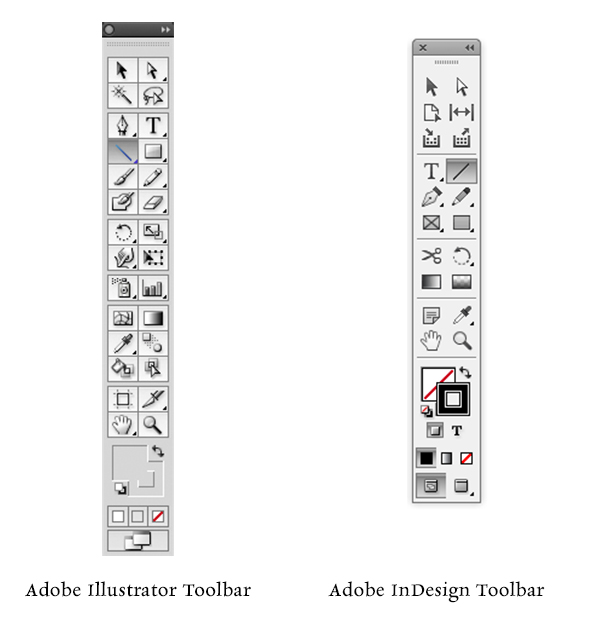
Surprisingly, there’s just one tool you need to utilize in either Adobe Illustrator or InDesign: The Line Tool. If you are using Adobe Photoshop, the Line Tool unfortunately reverts to a minimum line thickness of 1pt. If you are only using Adobe Photoshop to create your file, we highly recommend placing your final file in InDesign and using the Line Tool to check your work.
LINETHICKNESS_IMG1-1

What do we mean when we talk about our line thickness guarantee? Simply put, if your lines meet or exceed the line thickness as outlined below, we will guarantee they will hold on your plate. If they are under that thickness, it’s hit or miss. Some days you are lucky and other days, you might lose details.

The first thing you need to determine is your line thickness based on your plate type:

– If your plate type is the KF 95, Jet 94FL, or 94SB, you have a line thickness guarantee of 0.25pt or thicker.

– If your plate type is the KF152, 152SB, or 145SHSB, you have a line thickness guarantee of 0.35pt or thicker.

– For all plate types, your dots (like the ones above the letter “i”, periods, or dotted lines) must be 1pt to 1.25 pt or thicker.

THINK FAST! Quick quiz here – what is usually the most common culprit of too thin lines? Crop Marks! More on that later.

Here’s how to use the handy Line Tool to check to see if your lines are thick enough (and plate friendly, too):

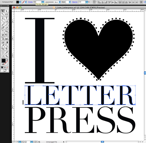
You need to first open your file in either Adobe Illustrator or InDesign. We’ll be using a small type sample in Adobe Illustrator to check to see if our lines are plate-friendly for a KF152 plate type. The KF152 plate type has a line thickness minimum of 0.35pt for lines and 1pt to 1.25 pt for dots. We can see that it looks like there are some thin lines in the serif of the Didot typeface… but will they hold?

First, click the Line Tool icon in the tool palette on the lefthand side of the screen in Adobe Illustrator to activate it. If you cannot find it, hover your mouse over the icon that looks like a line to see “Line Segment Tool ()” pop up in a yellow box .

Next, in the control panel up at the top, we’ll select the words “1 pt.” in the dropdown area next to the word “STROKE” with our mouse. You’ll be substituting the “1 pt” and replace it with “0.35pt”.

letterpress file prep tips from Boxcar Press

We’ll select the Zoom tool (Z) and move in because we’ll be doing some close up viewing in the area you are inspecting. Select the line segment with your mouse and move it so it is right next to the bottom part of the “L” in “Letter”. Draw a short line so it is parallel with the thin line you are checking on your art board. It doesn’t have to be very long but this little line segment will be our “ruler” to compare thicknesses.

letterpress file prep tips from Boxcar Press

At this close magnification, we see that our line segment set at 0.35pt is much thicker in comparison to the thinnest line in of the serif on the letter “L”. We will need to add a hairline stroke to boost our text’s thickness to correct this.
letterpress file prep tips from Boxcar Press

To add a stroke, using the selection black arrow tool (V), select all the characters in the word “LETTER.” In our Control panel at the top our screen we should see that the letters only have a fill and that we’d like to add a hairline stroke (about 0.15pt). Click the white area next to “STROKE” to activate the area so we can type in “0.15pt”. Immediately single-click the white area anywhere on the board. This will deactivate your selected text and add the hairline (0.15pt) stroke.

letterpress file prep tips from Boxcar Press

Zoom in again using the Zoom Tool around the line segment we created with the Line Tool and the letter “L”. We can now visually see that the serif on the “L” is as thick as the 0.35pt line. Success!

Delete your line segment and zoom back out. Continue around your artboard to visually check to see if other areas look “safe” as well.

For dots, such as the ones around the heart shape, we’ll need to set our Line Tool weight to “1pt” just to be on the safe side. We’ll repeat the same steps mentioned above to create the line, to zoom in, and visually compare the dots’ diameter against the 1pt line segment we just drew on our art board. Like the thinner lines on the “L”, we’ll need to correct this by adding a much thicker stroke of 0.3 pt to boost our dots’ diameter up to 1pt.

Using the Line Tool to check your work should be a “Must Do” test before submitting your files to your platemaking ticket. If anything appears too thin, you will need to correct it.

A few final instructions to help you be aware of potential trouble spots:

-When creating crop marks in your files – the program default setting is often 0.2 pt or 0.25 pt. Keep this in mind so you can make the necessary changes to your crop mark thickness when you place them.

-Thin lines that curve, particularly in wispy script or calligraphic fonts, are always suspect for being too thin. Give them the support they need to hold on the plate with hairline stroke (if needed).

Stay tuned, letterpress lovers — next we’ll solve the mystery of how to create multiple color files!

Related Blog Posts

Learn to Love Color Separations – A Boxcar Press Checklist
Did You Know That … 100% CMYK Black Is a Breeze?

Boxcar Talk With Ivan Gulkov

Printer and designer Ivan Gulkov first molded his passion for print in the colder climates of Siberia, Russia before turning out clean, modern collections at Pillowface Press that pay homage to the printing roots in the sunny state of California. Now, Gulkov balances the cool with the fun, with a nod to the old while creating the new. And he does it in spades.

Read on to get the full scoop.

Ivan Gulkov of Pillowface Press shares the full scoop on his background and printshop

SMOTHERED IN INK My name is Ivan Gulkov. I hail originally from the frozen wastes of Siberia, though currently reside in sunny California. PILLOWFACE PRESS is a small printmaking studio I set up to experiment with handset typography and photopolymer. Until recently, ours was one of the most traditional and conservative trades. For five hundred years, the tools and techniques of assembling type have not changed. Fonts were discreet, tangible things, you experienced on a physical level. In every letter, every space and ruler, there was a trace of the creators hand. Computers changed everything.

Continue reading

A Facelift For Brittle Photopolymer Plates

Are your polymer plates starting to curl at the edges?

Like our skin, plates can be affected by the weather and age. When humidity levels are low, the plates can look and feel brittle. And with the passage of time, the thinner polymer on the edges of the plates are pulled towards the denser polymer text and images on the front which causes curling. There is a natural aging of the plates as they do have a limited life expectancy but we can offer a few simple steps that can hydrate and give extra life to your plates.

Printight, maker of Toyobo plates KF95 and KF152, offers these suggestions if you have a platemaking system. Boxcar also gives similar steps for the majority of you who are without such equipment.

1. Place your plate back in the washout system for one minute or immerse in water. We suggest room temperature for a quick dunking, a minute may only be necessary if your plates are severely curled.

2. Sponge off the water and place back in the drying oven of the platemaker for 5-10 minutes. We also suggest, alternatively, a hair dryer to warm the plate and make it more pliable (placing your plate in a box and blowing the hair dryer into the box will keep the warm air more contained).

3. After the plate warms and starts to uncurl, place the plate in its bag and set a heavy object on it to keep the shape.

This should help your plates relax so you can adhere them to your base for additional print runs. Some warnings for you – take care to avoid putting your hair dryer too close to the plates and be patient as warming the plates takes time. And watch that you don’t handle them too roughly after the wash and during drying so your relief images don’t chip.

Store your plates flat. One last tip, you may have to check your adhesive backing to determine if it needs to be re-applied to the back of your plate for a secure hold on your base.

If you have some storage and uncurling tips, tell us about them so we can share. It’s great when we can all learn from each other!