The Creative Buzz of Wasp Print

Through nearly a decade of printing adventures (from printing with Hello!Lucky to opening up shop in his current printing abode in the creative neighborhood hub of East Williamsburg, Brooklyn), Nicholas Hurd of Wasp Print continues to deliver whether it’s serving up a fresh batch of letterpress printed goodies or being inspired by the non-stop creative forces that swirl in New York City. We were able to catch Nicholas for a hot minute to talk shop, where to get the best delivery for those late night print runs, and of course… the mesmerizing awe of watching a Heidelberg Windmill & his beloved Vandercook in action.

Nicholas Hurd of Wasp Print shop in Brooklyn

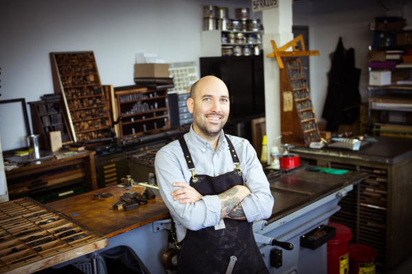
CREATIVE MAVEN  I am a printer, artist, tattoo collector, maple syrup snob, whiskey drinker, paper fanatic, amateur gardener, drummer, and lover of ink. I live in Brooklyn with my wife Erin, who is an excellent printer on the Vandercook and a poet & writer. We have a 9 lb chihuahua named Reno, who is an extremely accomplished and obsessive fetcher.

Nicholas Hurd of Wasp Print shop in Brooklyn

LETTERPRESS OBSESSED I was first introduced to letterpress while studying printmaking at the San Francisco Art Institute. After spending three years learning etching and lithography I was excited to print something where the machine was doing most of the work and large editions were made with ease. After school I worked for 4 years mostly printing greeting cards for Hello!Lucky. They were a wonderful company to work for and it gave me a lot of experience in production printing. The deeper I waded into letterpress printing the more obsessed I became. It’s pretty much the only thing in the world that makes any sense to me.

Letterpress samples from Wasp Print shop in Brooklyn

EAST WILLIAMSBURG WONDER I share the space with another awesome designer/printer, Dan from Sheffield Product. We both love collecting old equipment but operate in a tiny space. Together we have a 10×15 Windmill, 219 Old style Vandercook, 305MC Challenge Paper Cutter, a ton of type and other little bits of equipment. We’re located in a big warehouse building in East Williamsburg in Brooklyn. I print a lot of business cards and some personal stationery as well. I love the hustle and bustle of the city and feature quick turnaround times for those New Yorkers who are moving at lightning speed. We also love collaborations with artists and making political posters with hand set type.

Nicholas Hurd of Wasp Print shop in Brooklyn

DESIGNED FOR PRINT I’m both a designer and a printer. I enjoy designing but really love collaborating with other artists and printers. It is fun to work with people who don’t understand the process because they always bring something new & challenging to the table.

CREATIVE INFLUENCES I really enjoy looking for old printed design elements. I love bright colors and patterns. New York City has a wealth of inspiration for me. Hand painted signs, architecture, and mosaics all influence my design work. A meandering walk through the city always leads to exciting inspiration. I once made a design based on chewing gum on subway platform. I was designing something that looked spacey and noticed that the gum on the platform looked like planets in a solar system.

Letterpress samples from Wasp Print shop in Brooklyn

Behind the scenes at Wasp Print shop in Brooklyn

FULL TIME FUN Yes, this is a full time operation. After working for other printers and stationers for 10 years I finally set up my own shop a year ago. I work some seriously long hours. Fortunately there are tons of awesome food delivery places nearby and Fleetwood Mac albums to keep me sustained. I see a lot of old printers going out of business who are not keeping up with the design aesthetic and print needs of people in this city. It’s sad to see them go but they are operating on an outdated model of what printing is presently used for. I have found that there is actually a huge market for printing and letterpress. There’s a real longing in this digital age for a well made and tangible object.

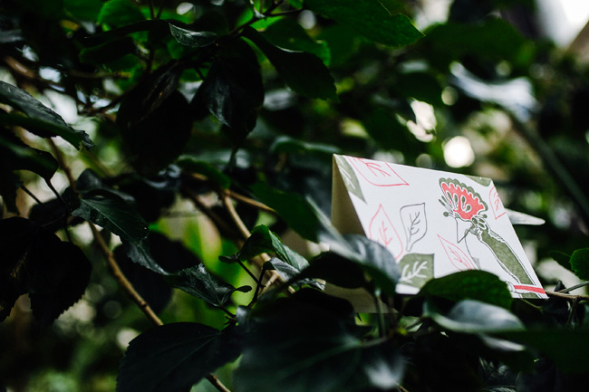
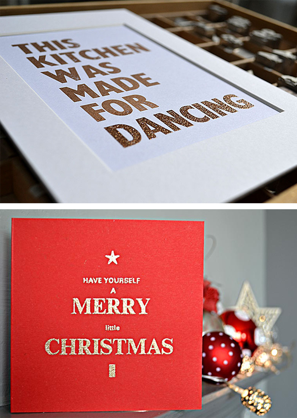
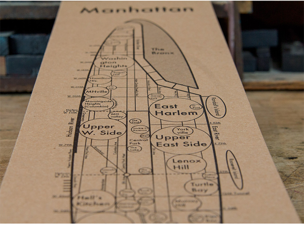
PRINTING FEATS I love making wood type posters and every time I make one I am proud of it whether it’s a political poster that I can distribute at a demonstration or a poster for a local whiskey distiller.

Letterpress Posters by Wasp Print

BOXCAR’S ROLE The Boxcar Base and plate system has been great to letterpress printers everywhere. Plate switchover on a Boxcar Base is the easiest and fastest system.

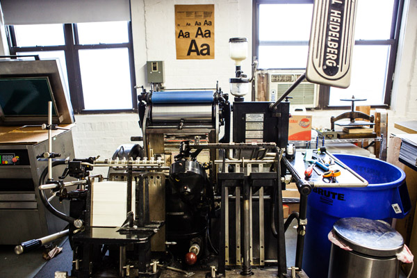
PRESS HISTORY I learned how to print on Vandercooks but the first real press I ever bought was a Windmill. It really is the most beautiful machine. Once you start using one of these it’s hard to go back to any other machine. The feeding, registration, inking and impression are all top notch with this press. It looks like a perfectly choreographed ballet every time I turn it on.

Heidelberg Windmill at Wasp Print in Brooklyn, NY

SHOP TIPS I keep my best tricks a secret, but the best advice I can give anyone who is interested in letterpress is to have patience and enjoy the problem solving aspects of the work. We do this not because it is easy but because the finished product looks great. Expect every job to be a struggle – you might have to fight the paper, ink, press or design- but hopefully not all four.

Letterpress samples from Wasp Print in Brooklyn

WHAT’S NEXT I plan to keep on printing, expanding our equipment and making more posters with members of NYC’s passionate and amazing activist community. I would like to get into making ‘zines and books too!

Huge round of thanks out to Nicholas Hurd of Wasp Print for letting us take a peek into his inspiring world of letterpress!

2015 Valentine’s Day Letterpress Gift Guide

With Valentine’s Day right around the corner, why not indulge your letterpress lovin’ sweetie with one of our hand-picked gifts sure to inspire l’amour this cozy Valentine’s Day weekend! Let us know what you’re getting your sweetheart this year in the comments below!

2015 Valentine's Day gift guide from Boxcar Press

1. Handbound Leather Journal from That Grace Restored | 2. Paper Swatch Sample Kit by Twinrocker  (to introduce your printer to fab handmade paper options) | 3. For the Love of Letterpress book by Cathie Saunders | 4. C.S. Lewis Letterpress Print by 9th Letter Press| 5. Printing Press Letterpress Coasters by Boxcar Press | 6. Famous Person Printers Blocks from Damosels Printers Blocks (a great gift to inspire your favorite printer)  | 7. And Furthermore Valentine’s Day Letterpress Card by Paprika Letterpress

2015 Valentine's Day gift guide from Boxcar Press

8. Swing Away Lay Gauge by Boxcar Press | 9. Lettepress type throw pillow by Marieken | 10. Letterpress Type Shower Curtain by Headcase Press | 11. Letterpress Postage Stamps by alicing | 12.MoMA Cubes Perpetual Calendar in CMYK from the MoMA store | 13. Chocolate Type by Typolade | 14. Pantone Storage Container from Pantone

Letterpress inspiring hope this holiday season

Rebekah Tennis of Wild Ink Press says it so simply, “The wonderful thing about printing for a cause is that you can spur others on to action as well.”  Rebekah is one of our spotlighted printers who incorporate their creativity and presses in the art of doing good. These printers firmly believe that they benefit as much as their receiving charities in their enjoyment and satisfaction with making a difference.  Whether it’s a global cause or a local one, these printers lend their talents and hearts and urge others to take on a non-profit to help out.

Smock

A few years ago, Smock launched a Change the World card series, where 100% of profits from card sales are donated to specific environmental charities. The latest card in the series is the Rainforest card, and 100% of the profits from this card are donated to the Amazon Conservation Association to help protect the rainforests. The cards are sustainably letterpress printed on Smock’s bamboo paper, and are paired with 100% post-consumer recycled, FSC-certified kraft envelopes. Smock also offers Sunflower, a card that benefits the Pesticide Action Network; Fracking, a card that benefits Earthworks; and Fin, a card that benefits the Monterey Bay Aquarium Seafood Watch. Smock also donates 1% of sales to environmental organizations as a member of 1% For the Planet.

Smock rainforest cards

That Grace Restored –  Kate McGaughey

At Atlanta, Georgia based That Grace Restored, we collaborate with women who have been exploited in the commercial sex industry to make fine quality handmade journals and letterpress products with the purpose of seeing the women reach self-sufficiency and renewed personal dignity. Our product itself speaks to the healing and repurposing of each woman’s life – we craft handmade paper out of used, seemingly unwanted scraps of paper and make them into beautiful, unique pieces.  Letterpress enhances the quality of our product while complementing the texture and character of the handmade paper.

ThatGraceRestored-IMG1

That Grace Restored is a social enterprise of Serenity’s Steps, a 501c3 in metro Atlanta that helps women step out of the sex industry. That Grace Restored was launched as an employment and vocational development opportunity provided through Serenity’s Steps in October 2013. We currently employ two women at approximately full-time hours and two women on a contract basis. We print on a Vandercook 215, a Vandercook SP15, or a Chandler & Price Old Style platen press 8×12.

We are selling holiday cards currently. We keep our designs simple and elegant to allow the marriage of our printing and handmade paper to tell a story. Each product speaks to the beauty found in the imperfect. We use rubber-based inks. Our paper is soft and takes on beautifully deep impressions well without straining the relic machinery. By purchasing this product, our women have an opportunity to receive a fair wage as artisans and achieve goals through vocational development.

May Day Studio – Kelly McMahon

In the fall of 2011, Hurricane Irene swept through the state of Vermont, causing the water levels in all of the rivers to rise, and subsequent widespread flooding and massive destruction. A few months after the hurricane, Kelly McMahon of May Day Studio was driving though one of the hardest-hit areas, and was astounded that entire towns still seemed destroyed and abandoned, fields of flattened crops where thriving farms once were, and the amazingly new wide and deep rocky paths of the rivers. Many of Vermont’s towns are built on rivers–which makes them lovely to live in, and terribly dangerous during high waters.

MAYDAY-IMG2

Kelly saw patterns in the destruction and out of this, designs were born, She started with small, simple sketches, thinking that a little card line or something would come of it…but the designs couldn’t be contained! They are now 18″ x 24″ hand-carved linoleum blocks which she has turned into gift wrap and tote bags. She calls her design Field print, which represents Vermont’s gorgeous fields of thriving crops.

It seemed a natural leap to think of the Vermont Disaster Relief Fund and donating 10% of her sales from these items to this organization particularly because it was founded by Vermonters, for Vermonters, in a time of great need.

MAYDAY-IMG1

She prints her wrapping paper on a Vandercook SP20 at Green Mountain Letterpress in Fairlee, Vermont, since her little Vandy SP15 isn’t big enough. The wrap is printed from linoleum blocks, onto Mohawk text weight paper using Van Son inks. It’s available online through her Etsy shop and in stores around the country. Her design has also launched a screen printed tote bag whose sales generate a donation to the Vermont Foodbank.

Bristol Letterpress – Tracy Oakley

Working small and from your kitchen table can also reap donations to worthwhile charities. Tracy Oakley runs Bristol Letterpress from her studio (kitchen table…) at home, working on a vintage 8×5 Adana letterpress machine, which is gorgeous but sometimes temperamental.

Tracy sells through her Etsy shop, local shops, craft fairs and Cappuccino Cards. Cappuccino Cards is an online shop selling a fabulous range of beautiful artists cards and prints, all of which donate to charity. Helena Golunska, a good friend, runs this business – they set it up together, along with Bristol Letterpress, and so both are involved with each venture.

Bristol-IMG2

The letterpress Christmas cards printed this year are generating funds for Bowel Cancer Research and St. Mungo’s – the more money the charities get, the happier they are. Bowel Cancer Research is a cause dear to our hearts as Helena and Tracy have both come into contact with the disease through close family and friends. St. Mungo’s does some great work supporting those affected by homelessness – an issue that is particularly hard to deal with at this time of year when winter nights are cold and long.

Bristol-IMG1

When Tracy is not printing, she’s quaffing endless cups of tea with her South West England based Home Working Collective – a group of like minded people who work from their residences. Many of their items are sold through Cappuccino Cards, which is based on the principle that every card you send, all year round, could make a difference to a great cause. Each card sold on the site donates a whopping £1 to charity (a third of the price) and the customer gets to pick from 12 well deserving causes. Prints donate 10% of the retail price – so everything you buy on the site does some good!

Wild Ink Press – Rebekah & Matt Tennis

Over on the West Coast in California, Rebekah and Matt Tennis live their cause – Orphan Care. All three of their amazing children were adopted internationally, as orphans, so this cause is very personal and dear to their hearts. There are over 150 million orphans in the world. “Orphan” doesn’t just mean a boy or girl who has lost one or both parents, but it can describe a child who faces the world without the provision, care and nurturing that a family provides. There are also many ways to help the orphan – not just adoption, but also fostering, feeding, mentoring and providing for health and education. She and Matt give each year to several wonderful organizations with services that include foster care, feeding, education and clean water for orphans in the birth countries of their children (Pakistan and Korea).

Tennis-IMG1

“People love to be generous, I’ve found, which is wonderful. So, instead of Matt and I just giving money towards orphan care ourselves only, we can do that, but we can also say ‘here, let’s do this together and we can raise even more and make a big difference.’ It’s been great to involve other people in the cause.”, says Rebekah.

Rebekah’s four card designs are very influenced by the cultural heritage of her sons. They are from Pakistan and Korea, so the notecards were inspired by an intricate wall pattern found in Lahore, a tile pattern from Islamabad, as well as a lovely Korean celadon vase pattern, and lattice wall from a temple. She has interpreted and hand-drawn the pieces, and printed them in cultural colorways. It’s fun to have these pieces to show her boys their heritage. The notecards are sold as boxed sets of six and a little over $2.25 of each boxed set goes to orphan care – it adds up quick!


Tennis-IMG2

In their recently expanded and renovated digs — which used to be an old soda bottling plant — they print on three Heidelberg Windmills, old style Chandler & Price 10 x 15, a 1912 Golding Jobber, and a Vandercook Uni III.


Many thanks to these inspiring printers for sharing their cards (and causes!)! Are there some charitable letterpress cards that we missed? Share details with us in the comments section below!

Printing Festivities at Fitzgerald Press

If you are looking for a printer to work elbow to elbow with and soak up some letterpress magic, consider John Fitzgerald of Fitzgerald Press in New Orleans. John works solo in his shop down in the Deep South, but he recently opened his doors for us to see his creative and functional printing workspace.

john-fitzgerald-img1

COMING BACK TO THE BEGINNING. Let me introduce myself by saying that I feel like I occupy a place in the ever changing print scene. When I was in Junior High School I took Print Shop. I was drawn to printing even earlier after seeing my older sister’s art class lino cuts. This was the 1960’s and the last of letterpress was still hanging on in the commercial print world. In Jr. High they still started us on letterpress, even though the advanced students were doing offset lithography. By the time I got to trade school it was all offset as was my career in commercial printing, until the digital takeover. By the late ’80’s jobs were getting harder to find and I never really liked offset printing anyhow. I’d always done little lino cuts and special letterpress jobs on equipment that I scrounged from old letterpress shops and could fit in the garage. So I turned to letterpress printing as a full time job as the ‘90s began. All this to say that I saw commercial letterpress die and be re-born as high craft. I never went to art school and my orientation is towards production. Still I treasure the artistic side of the trade and find myself right at home in this revived letterpress world.

PRINTING CHIC DECOR By far my favorite thing in my workspace is my old cherry wood handled copper riveted ink knife that I’ve had for 30 years. My space has two big windows that let in natural light. I also have an overhead fluorescent fixture and use these with a combination of clip lamps and floor lamps. I think of my shop as a working shop, and decoration is definitely an afterthought. I have prints and posters from friends and colleagues on the walls but that’s about it. Equipment and workspaces line the walls, and I have an island in the middle, that includes the proof press, pilot press and galley.

MEET THE FAMILY  I have five presses – a C & P Craftsman, an original Heidelberg 10″ x 15″ (Windmill), a C & P Pilot 8″ x 10″, a Printasign Duplicator Model 40 Sign Press (that I use as a proof press) and a Kelsey 3 x 5″  (that I use to bring to shows for demonstrations).

HEAVY METAL HOME I rent space in a one story cinderblock building, on Saint Bernard Ave, in the Seventh Ward of New Orleans, between the Treme and Saint Roch neighborhoods. My space is a 18′ x 25′ rectangle, and the rest of the building is occupied by the owner (Red Metal) who is a blacksmith artist.

DRESSING THE PRESS  My most valuable tool is my C and P Craftsman 12″ x 18″ press. I have two Boxcar bases, one thats 7.5″ x 4.5″ and one thats 12″ x 9″. I use a jet 94 FL plate and I’ve been using this set up for about 8 years now.

GOLD IS THE NEW BLACK  I use regular commercial offset inks (Zip Set). I mix custom colors using the Pantone system. My current favorite color is an improvised mix of dense black and 875 gold. This makes a super dense, warm and delicious black.

PROTECTING THE EQUIPMENT For clean-up, I scrape as much ink off the disk as I can, then run the press with a little kerosene to loosen things up. I do my major cleanup with kerosene and then finish the rollers with a roller wash (Varn V-120). I don’t like to use mineral spirits because it’s too strong. Kerosene leaves an oily residue that doesn’t seem to hurt ink colors and helps protect metal in this humid climate.

A PLACE FOR EVERYTHING THAT IS TYPE  I have no pied type! Over the years I’ve rescued a lot of type – much of it is now stored in gallery trays, but I keep it all sorted. Pied type is an offense!

SYSTEM THAT WORKS FOR ME  In terms of organization, the main problem I have is that I’m a solo operator and I fly by the seat of my pants. Every active job has a file folder in a rack on the wall, so I don’t lose track of things, but that’s about as far it goes for organization.

PROPERLY ATTIRED When I come into the shop, the very first thing I do is put on my apron. It’s like being in costume – I know I’m here to work.

YOU HEARD IT FROM ME   “Be attentive to ink roller height” is the best advise I have – getting the ink to contact the form just right is the key to good letterpress printing. I’d been printing for years before I really understood that.

john-fitzgerald-img2

Huge round of thanks to John for letting us take a tour of his wonderful shop!

Let’s see that printed: Dia de los Muertos letterpress cards from Pablo Delgado

From start to finish, watching the production of a custom photopolymer plate is fascinating. From the genesis of a digital design file to hand-inspection of a pulled proof, the transformation of light-sensitive photopolymer to a vehicle for endless hours of printing fun is curiously intriguing. We followed one of Pablo Delgado’s recent plate orders as he had fun using the plate on the at-home Fiskars Fuse system to create letterpress cards.

Delgado-img5-1 Delgado-img6-1

Starting out, I went with the Fiskars Fuse because of the maximum size for the platform. At 12 inches it is double the max width on the Quickutz Epic Six. The first problem was that there wasn’t a platform available at the 12 inches that would allow me the registration necessary to print on the precut A-6 size cards. So I ordered two 12″x12″ clear cast acrylic sheets from Tap Plastics. The bottom piece was .472″ thick and would work as my base for the cardstock, and the top piece was .236″ thick and would act as the chase for the photopolymer plate. I cut a heavy white plastic in two strips to work as hinges and put it all together. It looked a bit crude, but it worked great and I am able to take advantage of the wider roller length. I adhered a sheet of hard heavy white plastic to help achieve the thickness necessary, and a couple of thinner sheets with grids on them to help with placement. The ink I am using for the particular card I am showing are both Great Western Ink oil based Pantone 185 and Reflex Blue.

Delgado-img1

I began with a one color card to figure out the process, and this went fairly smooth. I played around with packing to get the depth I wanted and when I accomplished this I took the leap into a two color card. This was a challenge. Keeping an even consistency of the two inks on the brayer was difficult to figure out at first. I had to try different ways of getting enough but not too much ink on the rubber roller without causing ghosting or plugging up the detail. In the end a couple of thin coats seemed to work best as the perfect balance. One trick I learned to keep the messiness down was to put some transparent tape on the plate strips so when I rolled out the ink on the plate, I could lift off the inked  tape and the strip remained clean. I had a lot of fun figuring out this process. It definitely requires a good bit of patience, the ability to look at things analytically, and organization to keep the ink only where it belongs. The rewards of seeing your art reproduced in vibrant colors and beautiful stock outweighs any of the downsides you experience.

Delgado-img2

The art I am using is original. It is inspired directly by the traditional “Dia de los Muertos” style of images that depict “calacas” (skeletons) and “diablitos” (little devils) in humorous and satirical poses. “Amor Eterno Artesanias” is the name that I am creating under.

Delgado-img3-1

It has been a journey that has taken several years to come together, and the work is only just beginning. I had not been able to find the right medium to share this art through before, so I am very thankful to Boxcar Press for not only putting out information on how to create these letterpress images, but also the personal assistance they offer. Whatever this venture may turn in to, it’s reassuring to know that Boxcar Press is there to help out in any way they can.

Huge round of thanks out to Pablo for letting us get a closer look at his beautifully printed pieces!

Step Right Up to the Letter Haus

When you step over the threshold and into the clean, modern interior of Letter Haus, the alluring smell of printing ink and cheery natural light filtering in above through the windows draws you in further to an elegant display of letterpress and passion. Lillian Barbosa, of Belo Horizonte, Brazil gives us a tour of the cozy space and remarks on her letterpress journey from blogging about the want of having a dream job to realizing it full force.

Lillian-Barbosa-img1

FINDING LETTEPRESS Hi! I’m Lilian. I’m from Brazil. Born in Rio, lived 15 years in São Paulo, and now am living in Belo Horizonte. I studied advertising in college and then worked for two years as an art director at an ad agency.

In 2012, a friend and I started a blog about people who gave up their unhappy professional life to chase their dream jobs: we interview people who graduated with a certain degree, worked and found out that it wasn’t what made them happy, so they decided to leave everything behind to follow their hearts and found work that fulfilled them. With the blog going on, last year I found out that what I was doing wasn’t making me happy, so I decided to look for what I really wanted. Then I found letterpress.

LOVE AT FIRST SIGHT I fell in love with the art, the beauty and what printing represents to people. So I decided to research a little bit about it: the presses, the material, paint, paper, everything. I found a beautiful Heidelberg Windmill here in my city. In January I bought it! For 2 months I had a printer to teach me how to setup my press, but now I’m on my own and I’m having a lot of fun!

Lillian-Barbosa-img4Lillian-Barbosa-img6

BEAUTY IN BRAZIL I found a place in an 8-store gallery next to my house in a really nice neighborhood with a lot of trees, nice houses and stores that was perfect for my press & me. It has a mezzanine where I made my office, and the production floor is downstairs. At the back I have a room that stores paper, ink, oil, tools and all the messy stuff!

Lillian-Barbosa-img2

PRINTING INSPIRATION I got really inspired when I was about to start my letterpress business with all studios I could find and follow on the internet. A special thanks to you guys at Boxcar, 9th Letterpress, Sugar Paper LA, Press Haus La, Studio On Fire, Iron Curtain, Printerette, Clove St. Press, Ladyfingers, 1canoe2, The Hungry Workshop, Thimble Press, Bespoke Press, The Alphabet Press, Ink Meets Paper, Gus & Ruby, and many more. You guys don’t know me, but you were really important! In Brazil we don’t have as many studios as you have in the US, so I found really beautiful prints, cards, wedding suits, and decided to create beautiful things as well!

DESIGNED FOR PRINT I’m the woman in a one-man studio! I create when the clients don’t have their design, I answer e-mails, I print, buy supplies, everything! When I design, I always try to meet with the person over at my studio, we find references, and I create based on our talks as well as on the event or the person’s style.

Lillian-Barbosa-img5

FULL TIME FUN I do print full time. It’s been 4 months already since it all got setup here at the studio and it’s been a really fun challenge!

PRINTING FEATS I’m really proud to have my studio opened. It’s been a lot of work and improves everyday. Since I’m new to the letterpress business everyday is a new challenge – a hardworking, but rewarding challenge!

PRESS HISTORY My first was my Heidelberg Windmill. This complex beast prints beautifully. I’m loving it!

Lillian-Barbosa-img3

BOXCAR’S ROLE When I got my press I was a little bit lost and by reading some of the posts on your blog I got a lot more confident with my business. Your videos made me understand when at the time it didn’t make any sense to me. And just knowing that if I have any questions you guys will happily answer me is a relief. Letterpress Commons also came up and with the studio map I’m actually planning a letterpress trip!

SHOP TIPS Pay attention! Always. Listen to the press’s noises, its movements, and understand all of its German mechanics. Try to keep your hands clean and don’t panic when something is not going the way you expect. Try to keep focused, put some nice music on and start over.

Lillian-Barbosa-img7

WHAT’S NEXT Hopefully 2015 will be an awesome year, I’m planning on going to NY to meet some printers over at NSS. I’m creating greeting cards lines with really nice partners and I expect to print beautiful invitations, business cards, and stationery. I’m looking forward to have a nice year full of colors and prints!

Huge round of thanks & applause out to Lillian for letting catch a glimpse at Letter Haus!

How to Create a Cutting Diagram for Steel-Backed Plates

While steel-backed plates are fun to print with, cutting them down is not so wonderful. If you do not have access to either a heavy guillotine paper cutter or tin snips,  we can (and would be happy to) cut down your steel-backed custom-made plates for you. Simply include a simple, separate cutting diagram file when uploading your file.

We ask that you create a separate file showing your cut mark lines in magenta (Cyan=0, Yellow=0, Magenta=100, and Black=0). The smallest plate size we can trim is 1.5″ x 1.5″ as we use a heavy board shear (heavy guillotine cutter) to make the straight cuts. Please add spacing on either side of each magenta line equal to at least 0.75″ (keep in mind the safety of the tips of our fingers). Only use straight lines and no diagonals, please. Save your cutting diagram file with the words “cutting-diagram” in the file name to alert us that the file is for cutting purposes.

workspace-cuttingdiagram-2

(Notice that the correctly set-up sample has straight lines with enough spacing on either side of the magenta cut lines)

When you have your cutting diagram file and original file ready, upload both to your ticket during the ordering process. Make sure to “decline” all previews for the cutting diagram file as this will ensure accurate plate cost calculations.

Fantastic Prints at Foxhill

Less than five miles away on the sunny and serene campus of Syracuse University in the spacious  Comstock Art Facility, Landon Perkins is layering fine arts printmaking with hand-set type, letterpress, and relief cuts with a touch of mixed-media curiosity. Between ink runs, we caught up with the graduate student on pursuing his MFA, his love for combining a hybrid of old-school printing techniques & the buzz of photopolymer plate technology, and his work at Foxhill press.

Landon_Perkins_IMG1

PRINTING NEIGHBORS My name is Landon M. Perkins and I also go by the press name “Foxhill.” I’m a printmaker and designer currently pursuing an MFA in printmaking at Syracuse University in New York. I’m a native to Tallahassee, Florida, where I attended Florida State University and achieved a BFA in Studio Art in 2014.

LETTERPRESS LOVIN’ I first became aware of letterpress when I visited Denise Bookwalter’s SCAP (Small Craft Advisory Press) in Tallahassee, Florida. I was immediately drawn to letterpress because it seemed to be a hybrid of my favorite mediums of silkscreening and relief printing. I interned at SCAP earlier this summer for a few months and learned how to make photopolymer plates as well as helped assist book artist Jessica Peterson in letterpressing an edition of artist books she was creating.

Landon_Perkins_IMG2

EXCITEMENT IN THE EMPIRE STATE The printshop I currently work in is the Comstock Art Facility at Syracuse University. We have so much great equipment it’s hard to list it all! I think what really stands out about our printmaking facility is just the huge array of presses available. You can literally walk 20 feet and pass various presses ranging in relief, intaglio, litho and letterpress. We also have some of the original Goudy type in our letterpress room!

PRINTING MENTORS I’ve always been a “do-it-yourself” kind of person. I used to think I was only good at design work and was afraid to dive into the fine art field, until one day, I grew bored of simply creating designs on a computer and then printing them out on standard size paper with an ink jet printer. I had no  control over the quality of the paper and ink fed into the printer. I felt like I was doing myself an injustice by not knowing how to really print the designs I was creating at the end of the day. This all changed when I met Denise Bookwalter at Florida State University. She taught and mentored me in the field of printmaking until I graduated from FSU in the Spring of 2014

THE DESIGNER & PRINTER I am currently a printer and a freelance designer. To me, design and print go hand in hand with each other; you can’t successfully do one without the other.

THE CREATIVE PROCESS My process normally begins with some type of light bulb or thought going through my head regarding the general work I am creating at that moment in time. I then try to sketch out what’s in my head and translate that to paper. Sometimes it works out, often times it doesn’t. Once I get past that initial phase and like the direction that my general design is heading, I open up Adobe Illustrator and re-draw my design, which can be eye twitching sometimes, but as the saying goes, “the devil is in the detail.”

Landon_Perkins_IMG4

Once that’s finished I normally drag that design into Adobe Photoshop and tinker away, changing little things I’m not sure anyone else would even notice at the end of the day. The hardest part about design for me is realizing when you’re at a stopping point and when something is finished. I find that simplicity is key when making a good design and that’s often the hardest thing to do as a designer.

Landon_Perkins_IMG8

FULL TIME FUN I am currently printing full-time as a graduate student and couldn’t be happier about it! I’ve been working in the field of printmaking now for three years and feel like I am still learning something new everyday that makes my jaw hit the floor and realize, “you can do that in printmaking!?” My ultimate end goal is to one day become a professor teaching in the field of printmaking.

PRINTING FEATS While I don’t have a lot of accomplishments yet (as I am only beginning to work in the field of printmaking), what I am most proud of right now is just to be given the opportunity to work towards an MFA in printmaking at Syracuse University. My heart sank for a while when I was applying to graduate schools and looking at the statistics of applicants accepted into any given school.
Landon_Perkins_IMG3

The other accomplishment I am very proud of is finishing a three-month long piece for my graduation thesis titled “Metropolis III.” It is the largest piece I have ever worked on, weighing 200 pounds and measuring 5 ft by 8ft. For three months, I layered a giant custom-built piece of wood with relief prints I created, papers of different textures, sizes and colors and miscellaneous items. I was working to mimic the complexity of a city district building on top of itself. I am very much interested in the marks humans and machines are leaving in the world. The destruction of the human environment you find in most cities is just as important as its construction.

Landon_Perkins_IMG5

PRESS WISH LIST I have yet to own my own press, as one is not rolling in money as a graduate student. But I hope to one day buy a Vandercook 219 and if need be, refurbish it on my own as a do-it-yourself project.

BOXCAR’S ROLE  I first learned about Boxcar from Allison Milham who is a printmaking teacher at FSU and, long story short, she told me all about Boxcar Press and their very quick turnaround with photopolymer plates for letterpress. Funny story, I’m actually in the middle of designing and ordering my first plate from Boxcar to letterpress some business cards!

Landon_Perkins_IMG7Landon_Perkins_IMG6-6

SHOP TIPS The only advice I can share this far into my printmaking career is to work hard and don’t be afraid to try new techniques and fail at them. I like to consider myself a good printmaker, but that’s only because I’ve failed a lot learning the practice and I know I am going to continue to fail as I work toward an MFA in printmaking. Hopefully if I fail enough, that one day I’ll become a great printmaker.

WHAT’S NEXT My plans for 2015 are currently to visit and explore Canada and various northeast cities in my free time, get the ball rolling on finding clients for freelance design work. I’m also planning on attending the annual printmaking convention at SGC in Knoxville, Tennessee for the first time!

Huge round of thanks out to Landon of Foxhill for letting us get a sneak peek inside his wonderful printing world!

How to Prepare Calligraphy & Hand-drawn Text for Letterpress Printing Plates

One of the more popular questions we get asked here in the Platemaking Department at Boxcar Press is the curious query: “What’s the best way to prep calligraphy and hand-drawn text or artwork for letterpress printing plates?” Understanding how to prepare scanned-in calligraphy and artwork starts first with knowing what file type/format works best for the type of artwork you are scanning in and utilizing the software programs that are accessible to you or your designer.

The most basic formatted file from scanned-in artwork or calligraphy is a TIFF (file extension) in Bitmap color mode. This pixel-based file type is good for keeping tiny details & linework and also produces crisp, solid shapes on the plate. This also means that if you zoom in very closely and examine the edges of shapes, they are slightly jagged, pixelated, and not 100% smooth. If the artwork is scanned in at high-quality resolution (600-1200 DPI), this pixelation is not as visible to the naked eye when you print with the plates.

A great software program that excels in this arena is the pixel-based editing program, Adobe Photoshop. Adobe Photoshop is a powerful editing program that offers a wide range of editing & manipulating options and tools. When scanning in your artwork, hand-drawn text, or calligraphy, make sure that you are using the highest resolution possible (at least 600 DPI) and in a grayscale color mode. This high resolution will ensure that the maximum amount of data will be scanned in and result in a better quality file that you can edit later on. A low-resolution scan (72 DPI-150 DPI) is not recommended as it will not produce the best results. Lower qualities scans and files will show extreme pixelation, illegibility, and “fuzziness” when zoomed in closely on the artwork.

inset-workspace

Above is a example of scanned-in calligraphy file set in grayscale and at 600 DPI. Notice the grayscale and slight pixelation of the edges of the letterforms.

Before converting to TIFF in Bitmap Mode, make sure to edit & fine-tune the artwork by removing blemishes & extra noise as well as fixing breaks in the linework and forms. Once you have your finalized high-resolution grayscale digital file, we recommend the following steps to create a TIFF in Bitmap Mode using Adobe Photoshop:

  • Open your grayscale image in Photoshop.
  • Select Image> Image Size. Change your resolution so that is high (300-600 or more). Make sure all of your artwork is 100% the size you need.
  • Select Image > Mode > Grayscale.
  • Select Yes if a window asks about discarding color.
  • Select Image > Adjustments > Threshold.
  • Move the slider to “preview” what 50% Threshold Bitmap will look like.
  • Move the slider as far to the right to thicken up your objects as much as you can bear. The thicker the object, the better chance it has to hold to your plate type.
  • Click OK (if it prompts you).
  • Then Select Image > Mode > Bitmap. A window will pop up looking for info – use the same output resolution number as the input (e.g. Input: 1200 and Output:1200) and an output method of 50% threshold.
  • Save your file as a TIF (with LZW Compression). Your program may be set to the default of NONE.  LZW compression is the next choice down.

Calligraphy-Bitmap-file-sample

Above is our sample of scanned-in calligraphy that has been treated so that it is a TIFF in Bitmap Mode. Notice the smoothness of the shapes and the minimal pixelation on the letterforms.

When you have your scanned-in artwork file saved as a TIFF in Bitmap mode and want to take the file to the next level, we recommend turning the rasterized artwork into vector-based artwork via a software program such as Adobe Illustrator. Depending on how detailed your artwork or calligraphy is, converting to vector may not be the best option as some of the finer details and smaller objects may be lost. Simple calligraphy or hand-drawn text that has strong forms & shapes may be suitable for vector conversion whereas extremely frail strokes and tiny details may not.

In Adobe Illustrator, you will need to open your TIFF in Bitmap mode file. Then select the artwork using the black arrow (default arrow) tool and select Object>Live Trace. If you have Adobe Illustrator CS5.5 or higher, it will be Object>Image Trace. You can edit and tweak the setting of the Live Trace (or Image Trace in newer versions of Illustrator) to display different vectorized results. Try first the default setting and then experimenting with the “Lettering” setting.

Remember, you can always Edit>Undo if the results are not want you like. Vector conversion with Live Trace / Image Trace may not suit every occasion. We’ll be covering tips and tricks on how to get the best Live Trace results in an upcoming blog post so stay tuned! Additionally, for more amazing information on file formatting, Letterpress Commons has a brilliant section on Raster Vs. Vector: When to Use and Why.

We’d love to hear your thoughts and any tips you’d like share in the comments section below!

The Printing Power of Archie’s Press

Sometimes the letterpress journey takes you by surprise. When we spoke to the incredibly talented Archie Archambault of Archie’s Press, he hinted at the curious turns printing has taken him. From humble beginnings of learning the value of patience & process to his travel-bug that combines printing letterpress maps and exploring new cities. We caught up with Archie to spill the beans on the best kept secrets in the cities he’s traversed through and what destinations lay on the horizon.

Archie Archambault prints on his Chandler & Press in Portland, Oregon.

PRINTING IN PORTLAND My name is Archie Archambault. I’m a designer and letterpress printer in Portland, Oregon.

LOVE AT FIRST SIGHT I first learned letterpress during a short session in college. It was a really thorough 2 week course with Barbara Henry who was militant in teaching us the proper and methodical way to print. Being a rather messy person, I resented this at first, but in reality, learned the value of patience and process. I realized it was a passion when I figured out I could grow a business doing something with my hands.

OREGON AUTHENTIC The studio where I print, Em Space, is in a beautiful old factory building with white floors, white walls, more than seven presses, 10 type cabinets, a board sheer, two guillotines and all sorts of fun equipment that I don’t know how to use. It’s in a great location with coffee and food nearby to keep us going when we have late nights printing. We have two Vandercook 219’s, a large C+P, a small treadle-powered C+P, three hand presses, a large sign press and a small sign press.

PRINTING MENTORS My printing mentors are: Rory Sparks (Director of Em Space) and Barbara Henry who taught me all the ins & outs of the process.

Archie Archambault of Archie's Press locks up a Boxcar Base and displays fine letterpress printed maps.

DESIGNED FOR PRINT I design minimalist maps that explain the major gestures and neighborhoods of cities. It has been a great blessing to find something that allows me to travel, design and print for profit.

THE CREATIVE PROCESS My process starts by visiting a city and meeting as many people as possible and exploring the city as thoroughly as possible. With feedback from the locals and hours on the computer, I create a conversation with the city until everything is in the right place for the utmost clarity. Although printing is only one aspect of the business, it can take up entire weeks at a time. I would love to get a Windmill so I can save my back a little. It really takes a toll on the body.

Festive holiday letterpress cards are printed by Archie Archambault of Archie's Press.

PRINTING FEATS I’m very proud to have finished 17 maps with plans to grow much more in the next year. I’m very proud to have built a great network in every city I visit and to have a completely self-sustained business that feeds me and helps me travel even more!

Archie Archambault of Archie's Press prints fine letterpress maps of Manhattan / New York City.

PRESS HISTORY The first press I used was an Asbern of all things. Asberns have this cool clutch thing on that gets the press into trip, and remains my favorite press to use. It also has a variable carriage so it’s super-easy to adjust pressure. I still don’t own a press, but as my business grows, I want to hunt down anything I can find. They’re going so fast!

Archie Archambault of Archie's Press prints beautifully crafted letterpress maps of Los Angeles.

BOXCAR’S ROLE The first time I tried to order a plate from Boxcar, they immediately called me and told me what I was doing wrong. That was invaluable!

Archie Archambault of Archie's Press sets up a printing job on his Chandle & Price press.

The whole process was so painless and the customer service impeccable. That makes my life as a printer much, much easier.

SHOP TIPS My best piece of business advice is to decide early on if you’re interested in doing custom work or starting a product line. When people visit your website, they want to know what you do. Don’t half-ass either of them. A product line can take a lot longer to get going and is much riskier, but can sometimes offer more freedom in the long run.

A fine letterpress card of vintage engravings by Archie Archambault of Archie's Press.

WHAT’S NEXT I’m going on several mapmaking tours over the next several months including: Milwaukee, Chicago, Detroit, Toronto, Philadelphia, Portland (Maine), Montreal, Baltimore, Indianapolis and Columbus.

Big round of thanks and applause out to Archie of Archie’s Press for letting us get the full story!