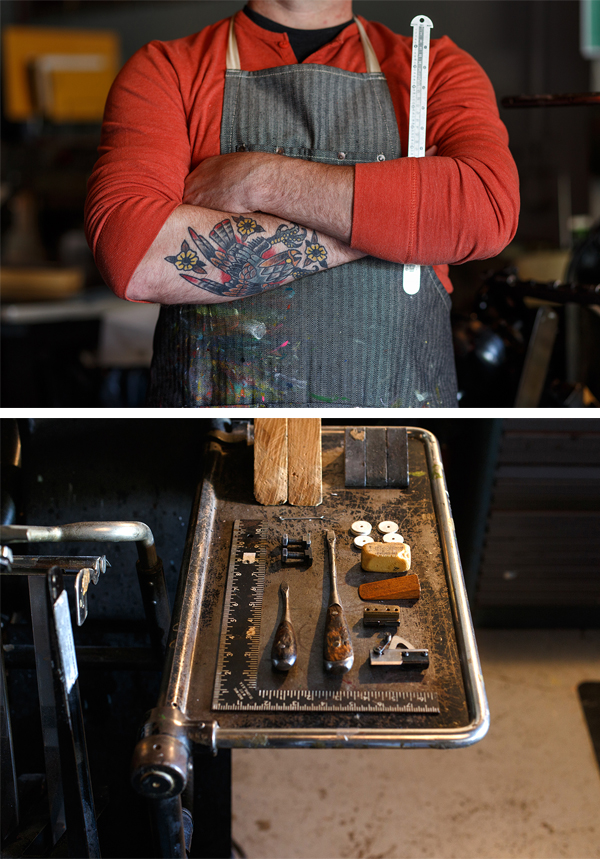
Following the hum and surge of industrial buzz that abounds in Detroit, Lynne Avadenka uses letterpress printing to create distinctive mixed media works in the forms of prints, artist’s books, and personal art. Coming from a printing background that boasts over 35 years of passion, printing curiosity, and a love for type, Lynne re-crafts the components of being a power printer in today’s market by combining these sought-after traits and being able to share the joys of printing by pioneering Signal-Return — a community based print shop. We caught up with Lynne between print runs to get the scoop on how life with letterpress keeps one’s heart skipping a beat.

FALLING FOR LETTERPRESS I have lived in the Detroit area all my life and I studied art and printmaking at Wayne State University. I’ve always loved letterforms, books and prints, I’ve worked as a professional calligrapher, and I fell in love with letterpress printing while in graduate school.
DETROIT INK When I graduated with an MFA in 1981 there was very little communal printmaking activity in Detroit, so I set up my own studio/print shop. I now have an SP-15, but began printing on a small platen press, moved up to a Vandercook #4, and then traded that for the SP-15 around 20 years ago. I also have an etching press. I love the fact that my studio is steps away from the rest of my house and that I can go to work in my pajamas.

LOVE AT FIRST SIGHT When I was in graduate school, Susan Kae Grant came to teach photography at Wayne State University. She learned letterpress and book arts at University of Madison-Wisconsin and wanted to share it with Wayne students, so she set up a shop (one Vandercook #4 and some type) in the basement of the Fine Arts Building. I took her class and everything I loved ‐ books, letterforms, making multiples, and hand printing ‐ all came together.

left: Gone I, 2014, letterpress from wood type and photopolymer, powdered graphite
right: Gone III, 2014, letterpress from wood type and photopolymer, powdered graphite
I was in graduate school before there were degrees in book arts and printing, so I learned by printing on my own, reading as much as I could, and taking workshops (thank you Center for Book Arts New York).
DESIGNED TO PRINT I am artist/printer. I use my press to create limited edition books and prints, but I also consider it a crucial art-making tool to create unique mixed media works.
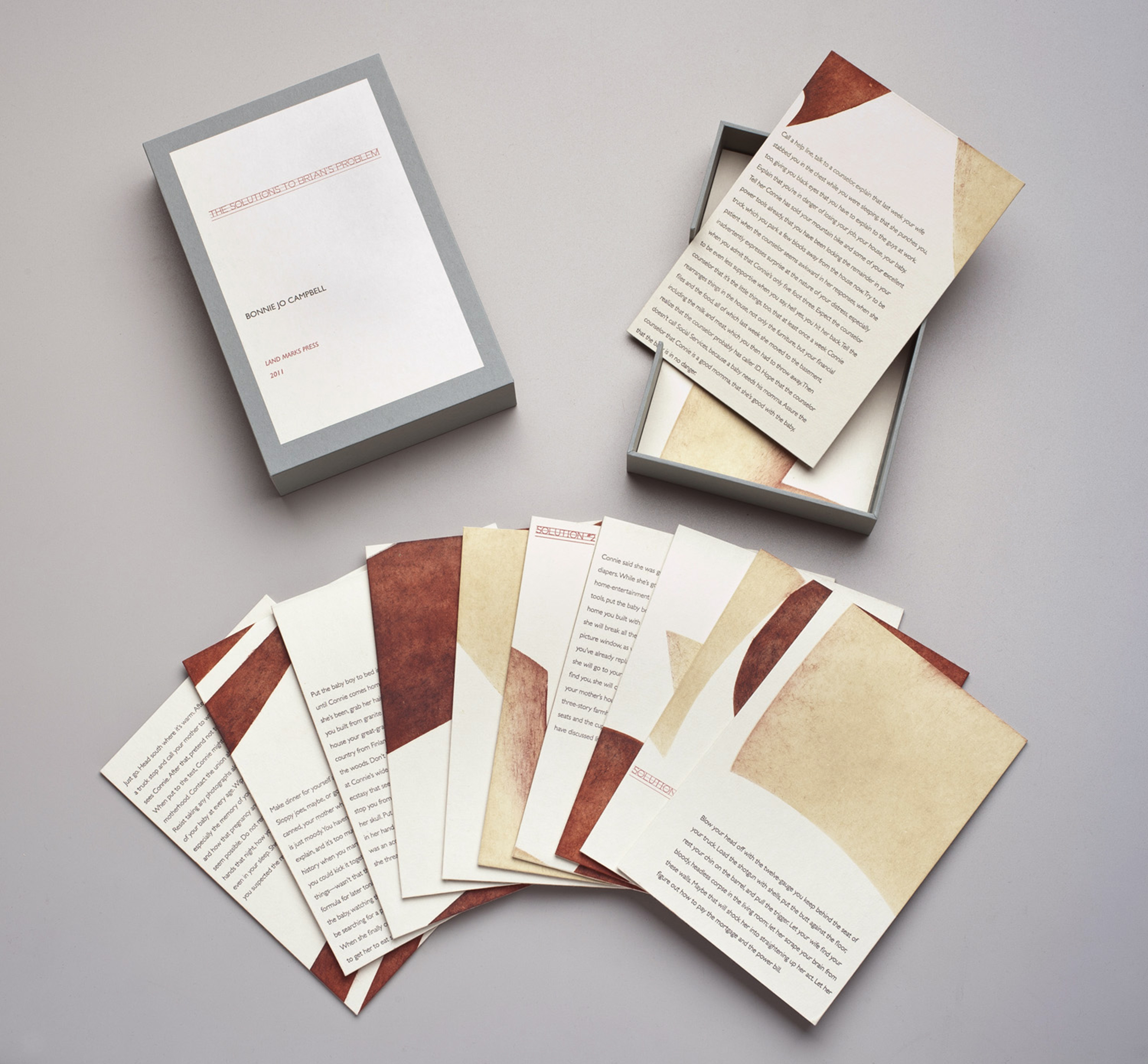 The Solutions to Brian’s Problem, 2011 (written by Bonnie Jo Campbell), pochoir, letterpress from photopolymer, wood veneer
PRINTING FEATS My limited edition books and prints have been acquired by institutions all over the world: The Library of Congress, The Meermano Museum, in the Netherlands, The Israel Museum, Jerusalem, The Detroit Institute of Arts, The Biblioteck zu Berlin, The New York Public Library, The British Library, The Jewish Museum NY and numerous university special collections libraries.
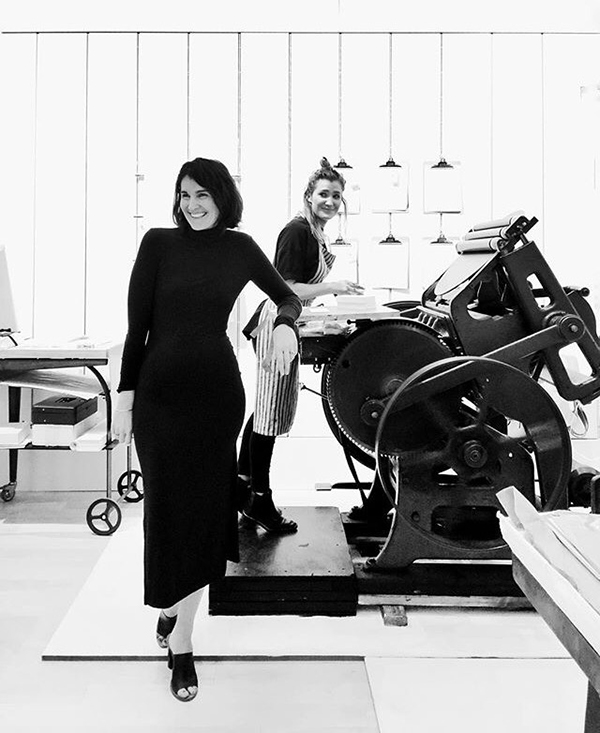
For the last three years I have served as Artistic Director of Signal-Return, a community letterpress studio in Detroit. I am one of a talented team of four sharing the beauty of letterpress printing with a wide community of artists and arts enthusiasts across the Detroit area.

The Solutions to Brian’s Problem, 2011 (written by Bonnie Jo Campbell), pochoir, letterpress from photopolymer, wood veneer
BOXCAR’S ROLE I started using Boxcar plates on a particular limited edition project, the first in a series of works devoted to contemporary Israeli writers. I didn’t have enough Hebrew type in metal to produce the edition, so I designed the book pages using a digital design program and then had Boxcar make plates from my files. I can’t remember who first recommended Boxcar Press, but after trying several other companies, I have been using Boxcar Press exclusively for years now for both text and image photopolymer plates.

PRESS HISTORY My first press was a small Chandler Price platen press with an 8 x 10 chase.
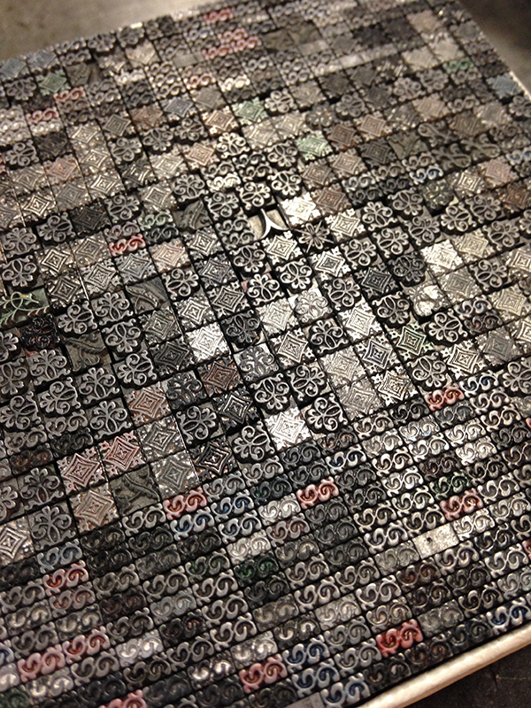
SHOP TIPS Years ago an excellent Detroit letterpress printer, Leonard Bahr, shared an invaluable trick with me — and although the better-trained letterpress printers might frown at this, I’ve found it to be invaluable. If you want to set type in an asymmetric shape, or “sprinkle” type on the bed, roll up snake like coils from oil based modeling clay and form them around the type to hold it in place on the press bed.

 top: Lamentations 2009, (Chapter 5), woodcut, pochoir, letterpress from photopolymer
bottom: Lamentations, 2009,(title page) letterpress from photopolymer
WHAT’S NEXT I intend to make some real progress on limited edition projects that have been languishing: one is a tribute to the Dutch letterpress printer/artist H. N. Werkman, and the other is a book project based on a prominent contemporary writer’s story written and published totally on Twitter.
An immensely large round of applause out to Lynne for letting us get a look inside her wonderful printing world!