Like letterpress, the city of Selengor in Malaysia sits on the crossroads of both traditional techniques and revolutionary technology. The country also is home to Zeejay Wong of The Alphabet Press, a custom letterpress print shop that offers unique letterpress stationery featuring bold colors and bright imagery in the form of endangered Malaysian animals and favorite food delicacies of the country. We caught up with Zeejay to see how the letterpress journey started with an across-the-globe trip to Melbourne, Australia and resulted in a thirst to make print come alive again in Malaysia.

HANDMADE CREATIONS I was trained as a web designer and it was my profession for eight years before I got into letterpress printing. Shifting from high speed digital works to something that seems to be technologically backward; it was truly a transition. I am now a full-time printmaker at The Alphabet Press and I enjoy creating products that are made by my own hands.
FIRST IMPRESSIONS Three years ago, we were a web design company who set out to look for something special for our business cards. We believe that the first impression is very important. I have been looking for printing technique such as letterpress in Malaysia, but we lacked the knowledge and resources. We decided to fly all the way to Melbourne to learn the craft itself from Carolyn from Idlewild Press. Since then, intrigued is an understatement to how I am at awe of the attention to detail that goes into letterpress printing.
MARVELOUS MALAYSIA I co-founded The Alphabet Press with 3 of my fellow partners. We rented a small shop in Selangor which is the second busiest town in Malaysia. Compared to Kuala Lumpur, the capital of Malaysia, Selangor is less busy a town with good neighborhood. Everything is easily accessible. Our shop is located in a small town in Selangor surrounded by suburban neighborhood, which fits the nature of our business and choice of lifestyle a lot.

DESIGNED FOR PRINT I am both a designer and a printer. I graduated from Multimedia courses in a local university, and I was trained to do everything that design entails from graphic to video to 3D modeling, web design, and more. But now, I have found my niche, which is letterpress printing.
THE CREATIVE PROCESS Malaysia is a big pot of culture. The vibrant nature of our nation that makes up from different races, cultural, food, and architecture really inspires me. I like to observe the little things that happen around me. Before I start doing any design, I will walk around in the town to get myself some fresh air and let the surrounding inspire me. And hopefully, I can find something that interests me and make it into a design subject. There are too many things to learn in Malaysia and the only thing that worries me is that I do not have enough time and resources to make it into something tangible. I usually don’t see this as just design but the documentation of our culture.

FULL TIME FUN Yes, I have been a full-time printmaker for two years, since we started The Alphabet Press.
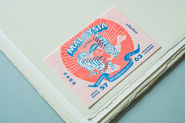
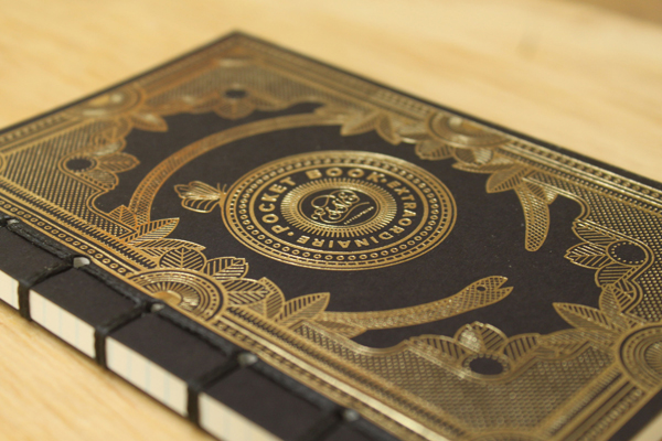
PRINTING FEATS We finally released a series of social cards, notecards, and notebooks featuring the endangered animals in Malaysia and favourite foods of Malaysians. We launched the debut at Kinokuniya Book Store in Malaysia and to us, it’s more than just a product launch. We did a letterpress demonstration as well to educate people about the old craft of letterpress with the lead types we salvaged from the old printing shops around Malaysia.

BOXCAR PRESS We’re loyal supporters of Boxcar Press! There aren’t many resources for letterpress in Malaysia, and Boxcar Press has truly been our lifesaver. We started The Alphabet Press by purchasing most of the important tools from Boxcar Press. It’s not an exaggerated statement to say, without Boxcar Press, it would be pain in the arse to start a letterpress studio here. Oh, and the videos are particularly helpful for a beginner to start to learn how to use their Heidelberg platen press.
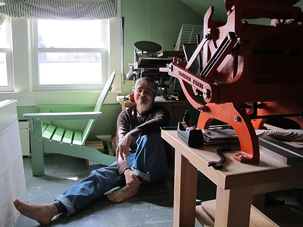
PRESS HISTORY A 1969 Heidelberg Platen Press (Windmill). We acquired this press from an old veteran printer. At first, he was quite reluctant to let it go. It took me 2 months to convince him to sell the press to me and promise that I will take care of it. Since then, we became good friends and he is also a good mentor of mine.

SHOP TIPS Paper is expensive for us, especially when we import most of our papers. We used to have a big margin on our printing. Now, we have reduced it to just 14mm (0.551 inches) for top and bottom and 10mm (0.393 inches) for left and right of the paper. We usually stick the plate to the very edge of our aluminum base and use a gauge for my print jobs most of the time as I require a perfect registration. Besides, I will always have rosin powder around me to fix the most irritating problem – the ghosting when I print a large blotch of colors. Apply a little bit on the roller track and it can solve most of the problems.

WHAT’S NEXT We will be focusing on our bespoke services. People love their wedding and business stationery printed with letterpress. Besides that, we will keep on participating in local art festivals to promote the craft of letterpress to the people in Malaysia. We want to make print alive again in our community and to upkeep the traditional printing skill that would otherwise become obsolete in the fast-moving world of technology.
Huge round of thanks out to Zeejay Wong of The Alphabet Press for letting us catch a glimpse into his vibrant printing world!


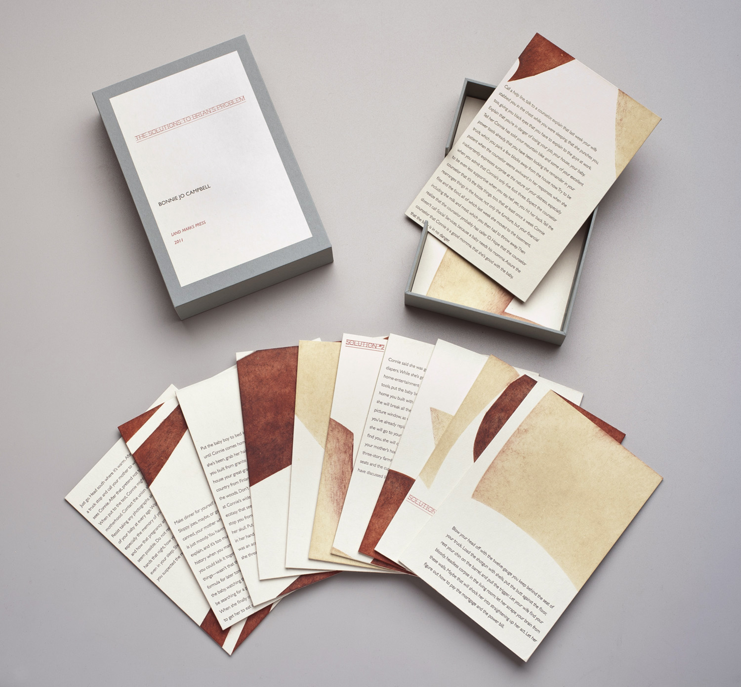 The Solutions to Brian’s Problem, 2011 (written by Bonnie Jo Campbell), pochoir, letterpress from photopolymer, wood veneer


 top: Lamentations 2009, (Chapter 5), woodcut, pochoir, letterpress from photopolymer


 (photography courtesy of Linzee McCray)